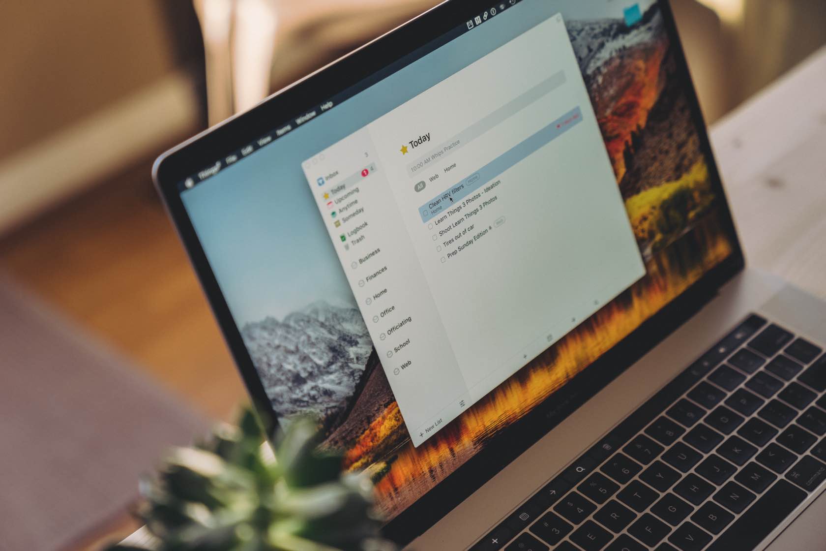
The task manager and GTD app suite for Mac, iPhone, and iPad
Things
The “Getting Things Done” methodology and all the apps that work within the GTD system are near and dear to our hearts here at The Sweet Setup. As a result, we’ve spent days and months (even years) testing as many of the best GTD apps as we possibly can.
And no matter how many times we test these apps, we come back to believing Things 3 is the most well-rounded, best designed, and easiest-to-use GTD app available for iPhone, iPad, and the Mac. There are numerous contenders nipping on Things 3’s tail — such as Todoist, which has made some of the biggest strides of any GTD app in recent years — so we’ll continue to watch this space in the coming days and months.
As Apple users, we’re spoiled when it comes to managing our tasks. There are several cross-platform and web-based task management tools we can use. But, even better, this is a category of apps that are well-represented by Apple developers.
In fact, the options are plentiful enough that choosing just one task management app to use is not easy. And for those of us who naturally focus more on process than outcomes, it can be downright debilitating to land on the best task management app.
Managing Knowledge Work in 2024
There are a couple of factors to keep in mind when choosing the best task management app for Apple users.
This is a competitive space. Teams like the OmniGroup, Todoist, Cultured Code, TickTick, and even Microsoft have taken turns making the products of choice for many app users. And, as a result, we’ve all benefited from having more than one option.
Second, how knowledge workers manage their work has had a lot of attention. Since David Allen first published Getting Things Done in 2001, personal productivity has become a household term. However, over the past two decades and then some, there have been numerous other types of “systems” and methods shared online. It turns out that not all knowledge workers care for GTD’s long list of lists and specific processes.
As a result, there are a lot of styles of tools available to choose from today.
Some folks make a case for ditching your task manager and using the calendar instead, while others advocate that habits are more important than goals and projects. And no matter what system you use, Pomodoro timers can help maintain your focus and energy levels while you work.
And let’s not forget the resurgence of pen and paper — do you “Bujo”? Or are you into the Scribble features that debuted back in iPadOS 14?
Needless to say, choosing a tool to meet your needs in 2024 requires a level of self-awareness about how you do your best work.
Design Your Ideal Weekly Schedule
Free → Video Workshop + Productivity Templates
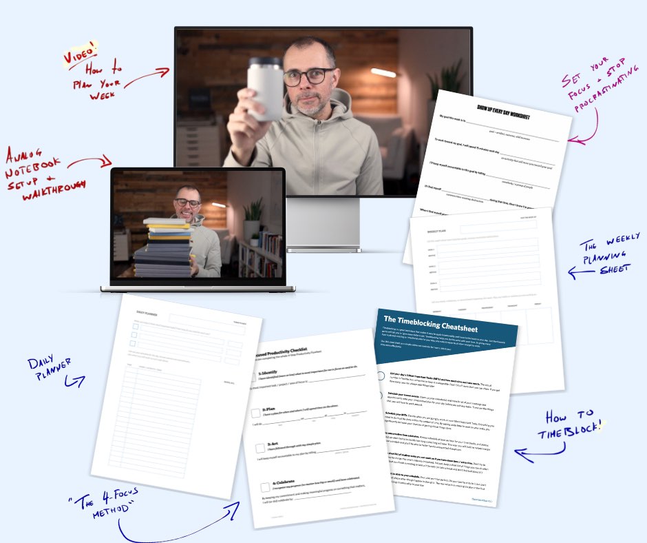
If you want to reduce the busywork and distractions, then sign up here for instant access to a brief video workshop on How to Plan Your Week.
♥️ Quick Note: You’ll get access to the workshop, plus a few additional bonuses to help you overcome procrastination and deal with distractions so you can spend more time on the important work that matters.
What We’re Looking For in the Best Task Management App
In many ways, our list of criteria has not changed much since 2014 when we first published our recommendation for this space. A task manager needs to be easy to get our ideas into, it should offer several organizational options, and it needs to be available on all our devices.
However, other considerations have melted into the background. Do we need to look for apps that offer syncing? That’s pretty much a solved problem now, and implicit in all our favorite tools. Do we need to look for support of iOS’s features like Split View, or Drag & Drop, or Shortcuts support? No matter — all the best contenders support the best iOS and iPadOS features available.
And although some of the newer alternatives to this space deserve a look, our recommendation will be limited to those tools that are genuinely focused on managing projects and tasks. Here are the criteria we considered in more detail:
- Easy input: No matter what productivity method you practice, getting tasks, reminders, and ideas into your system must be as smooth and frictionless as possible.
- Multiple types of work: A good task manager handles everything from large complex projects, to smaller projects, to single recurring tasks, to management of your personal or work calendar. While how you focus your time may be better suited to using a calendar, we still need a place to document all the required tasks for a specific goal.
- Various methods of view: The best task managers allow users to configure views of their tasks that fit their needs. This is a tricky one, as we don’t want too much customization lest we succumb to fiddling. Still, some flexibility is required.
- Flexible organization: Not everyone needs tags or folders, but for those who do, it’s usually essential.
- The ability to document: This may be a factor that not all people consider, but documentation is a need in this space. Much of the work we do as knowledge workers requires some related information. If our task management tool allows us to include resources and commentary, that is a vital addition. Otherwise, we need to store all that information in another location. Elements we’re looking for here may include the ability to add notes and separate projects into sections, and could also include the ability to attach other file types directly to a task to reference in your to-do list.
- Aesthetics: While function is more critical, with two equally capable options, form can play an important factor as well. We want to want to use our tools!
- Multi-platform: The majority of Apple’s customers have multiple types of devices in their arsenal. Most will have an iPhone and use a Windows PC, while others may own an iPhone, iPad, Mac, Apple Watch, and more. Increasingly, web apps have become useful to maintain consistency across platforms and to ensure you can access your GTD list from anywhere you can open a browser.
Contenders for The Best Task Management App
We considered the following task management apps when coming up with our recommendation:
- OmniFocus (all Apple platforms): As our previous “power user” recommendation, the most powerful of all the GTD-esque Mac apps is often at the top of our list of apps to watch. It continues to offer the highest level of customization and power features that many people find essential for their workflows. Plus, OmniFocus for the Web brings the power of OmniFocus to every browser on the planet, ensuring you can manage your tasks no matter which device you’re using.
- Things 3 (Mac / iPad / iPhone): Though previous versions of Things received very few updates, version 3 has received 20 point updates to the time of writing and continues to be the most aesthetically pleasing task management app for Apple users. Additions such as full keyboard support, beautiful and interactive widgets, intuitive use of the Scribble feature, and deep integration with Apple Shortcuts all have Things 3 firing on all cylinders on iPhone and iPad.
- Todoist (Mac / iOS): The first truly cross-platform service included, Todoist is a very solid — and very popular — option. Although it started as a web-based service and is not focused solely on Apple users, its feature set and design have improved dramatically over the last few years. Natural language parsing and advanced calendar support in particular have Todoist pushing the longstanding winners to new heights.
- 2Do (Mac / iOS): Another very solid and enjoyable option that is only for Apple users. Unlike other products, 2Do is developed and supported by a very small team. However, it sports a pleasing interface and offers a sweet spot for customization without being too fiddly. 2Do has struggled the last few years to keep up to date with the latest macOS, iOS, and iPadOS features, but it is a highly rated app on the App Store that deserves testing.
- TickTick (Mac / iOS): TickTick has cropped up on our radar over the last few years thanks to some very high praise from folks like Marques Brownlee, The Verge, and more. TickTick’s hallmark feature is how well it works for time blocking — the idea of molding together your task list and calendar, and blocking time each day to complete each task. TickTick’s great design also pushes it to the top of our radar.
- Microsoft To Do (Mac / iOS): Subscribers of Microsoft 365 (formerly Office 365) will be pleased to know the included GTD app has improved dramatically over the years. The improvements include an improved aesthetic and design, great sync, multi-platform support, and the ability to collaborate on tasks with other members in your team. This collaboration feature isn’t entirely unique to Microsoft To Do, but offices which use Microsoft and Exchange will be excited to have this type of support included in the package.
To be sure, there are plenty of other options. The productivity category of the App Store is full — ridiculously so. There is a lot to sift through, and not all of it is high quality.
There are also plenty of web-based applications that may suit your needs best (see Asana, Basecamp, Flow, Remember The Milk, or Trello). Many of these are more focused on teams and less on personal productivity. We’re of the opinion that native apps offer the best experience overall. (That said, if one of the native apps offers a web version, we’d classify that as a “bonus” and not a caveat.)
You can also use knowledge management and note-taking apps like Notion and Obsidian as GTD task managers as well.
- Obsidian has a whole host of task and project management plugins you can install on top of the core Markdown writing app, though diving into that world is something best left to the most dedicated productivity nerds.
- The power of Notion can’t be shrugged at either — if you want to create the world’s most advanced project management system inside Notion, it’s likely you can pull it off.
As far as picking the very best GTD apps for iPhone, iPad, and Mac, neither of these two options top the list due to their scope. However, we’d be remiss not to note that you can use these apps for GTD if you please.
Our Pick for Best Productivity and Task-Management App Is Things 3
Our choice for the best GTD app for iPhone, iPad, and Mac remains to be Things 3. The relaunch of Things 3 in 2017 has resulted in continued, iterative development ever since — such as advanced keyboard support, interactive widgets, Apple Shortcuts actions, etc — and it continues to be one of the most pleasing and satisfying pieces of software we’ve ever used.
While not as customizable as some of the other options, Things is just so well-designed and hits enough of our criteria that it comes out as our top choice.
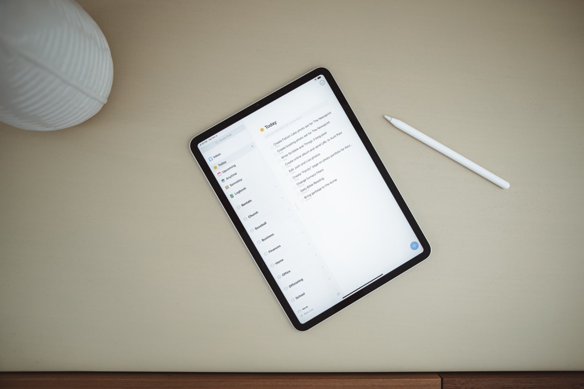
However, this is a difficult choice to make. There are really no wrong choices here. While Things is our choice as the best option, you cannot go wrong with any of the contenders we listed above.
OmniFocus is still a powerful tool that may fit better for those with more complex needs (aka “power users”) or for users looking for a web version to use on a Windows PC. Todoist is also a very solid option that works well with a team, gives a consistent experience across devices, has natural language parsing, and has had one of the speediest rates of development in recent years.
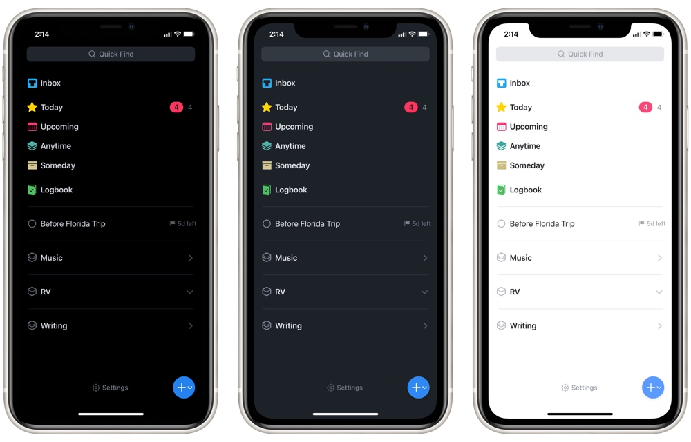
All that to say, whatever your preference, you’ll find a solution that fits for you, and Things 3 is the one we’d recommend for most users before all others.
Let’s look at why.
Good Design
While aesthetics were near the bottom of our list of criteria, the look and feel of Things 3 is so good that I want to start there. To be clear, the design of this app goes far beyond how it looks.
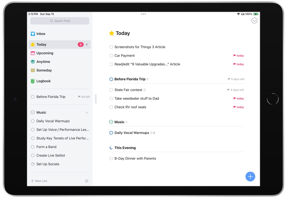
Things has always been a pretty app, but Things 3 brought that aspect of being pleasing to another level. It still looks as sharp as can be, but it’s the feel that makes it stand out.
A lot of apps use animations to add cues to their interface; Things makes it buttery smooth. Animations are tricky. When done right, they can add context, give subtle hints about what is possible, and add delight. Done wrong, they scream “gimmick” and corrode the user’s trust. With Things 3, Cultured Code nailed the balance between subtlety, utility, and delight of interactions throughout.
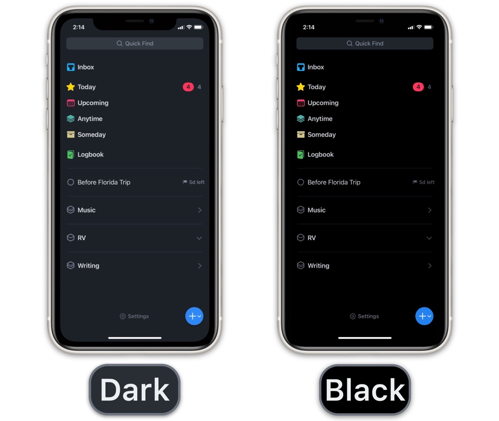
Things 3’s dark mode is one of the best dark modes available (although OmniFocus 4’s comes close). You can select between a dark mode, which is more of an extremely dark grey mode — very soothing on the eyes at night — and a true black mode, designed specifically for the OLED displays on the latest iPhones.
Usually I prefer true black themes, but Things’ regular dark mode is stunning 😍
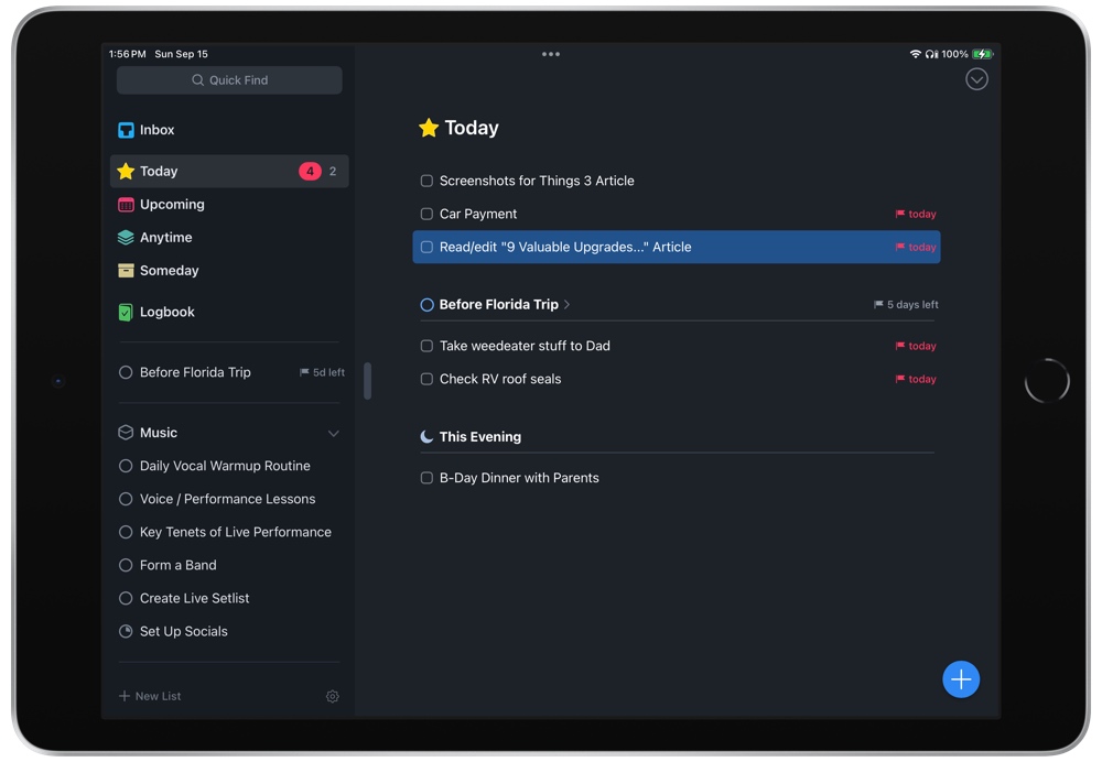
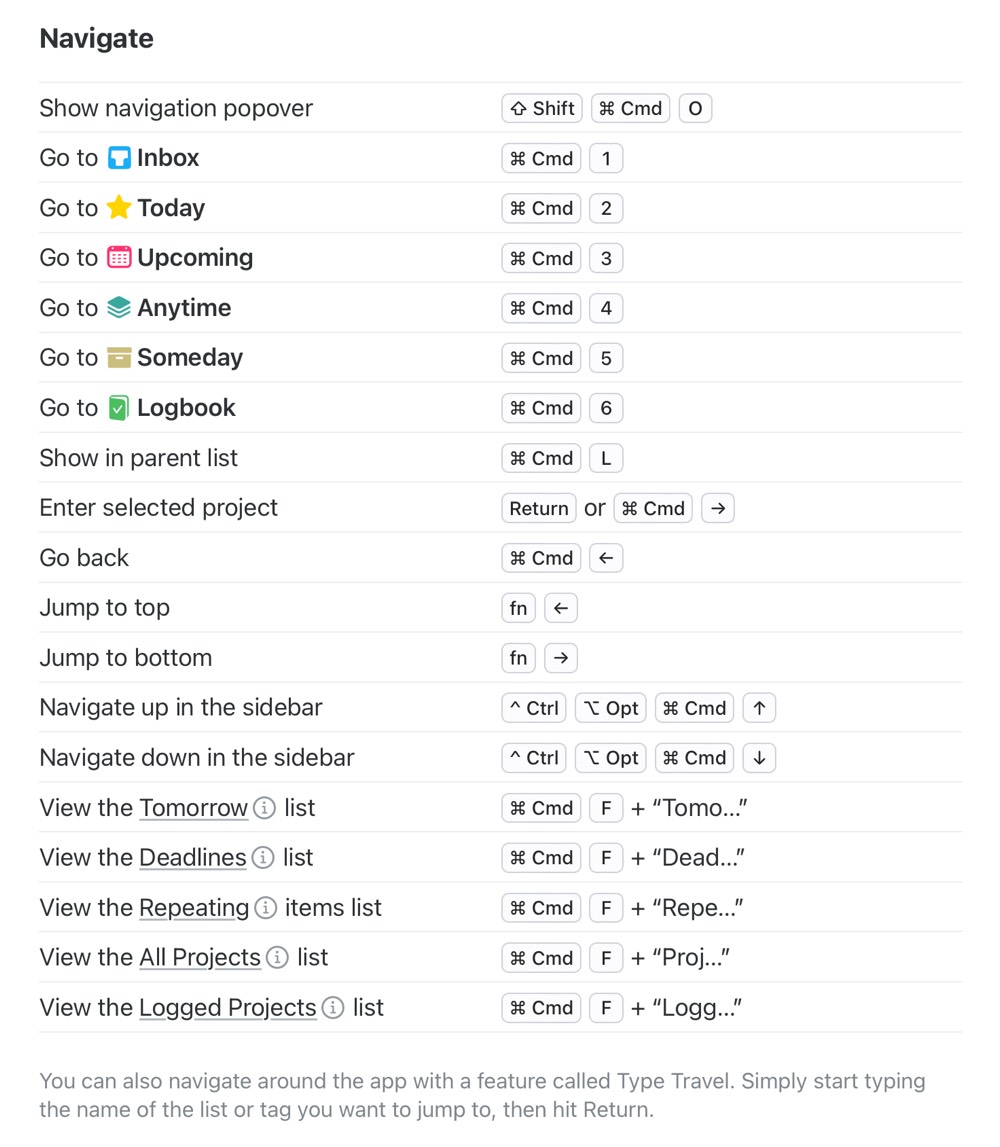
When we talk about the design, we should also include the navigation of the app itself. Any good Mac app includes keyboard shortcuts that enable the user to be more efficient. Things 3 nails keyboard navigation on not just the Mac, but also on the iPad and Vision Pro.
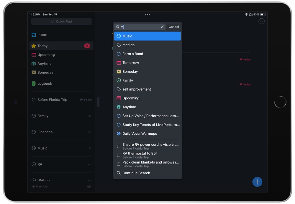
Open the app and just start typing. Anywhere. Rather than force you to open the Quick Find modal, Things starts displaying search results when you type anywhere in the app that is not an input.
Sure, Quick Find can be invoked with the standard CMD+F, but the designers of Things apparently ask the question of whether the user should have to take that step. Why not just show people what they need immediately? Quick Find even has “Areas” that aren’t visible in the rest of the app — typing “Repeating” or “Tomorrow” will bring up two views you can’t otherwise click into in the left sidebar.
It’s this kind of careful consideration that makes the experience what it is: a pleasure!
The rest of the application’s navigation is also good. One has to search to find a piece of functionality that is not available via the keyboard.
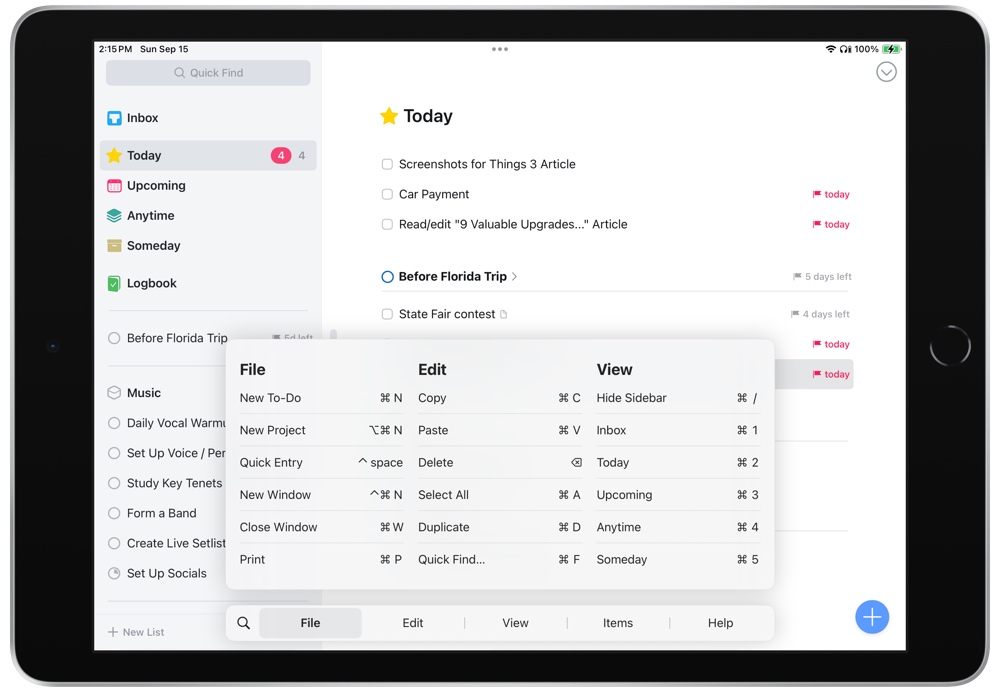
In fact, Things 3’s keyboard support — especially on the iPad — is trailblazing. You can navigate the entire iPad app with the keyboard — jumping in and out of tasks and their notes, moving between projects, searching for specific tasks, and jumping between your Inbox, Today, or Upcoming views.
Plus, these keyboard shortcuts are uniform across both iPad and the Mac, meaning you don’t have to develop special muscle memory for each device you use. On many occasions I’ve wished for Things’ keyboard shortcut support to become the default for all other apps I use on my iPad.
When it comes to design, there is one characteristic of Things that got my attention more than any other, and that is…
Project Documentation
When I first gave Things 3 a look, this is the feature that sold me. A long time ago, Things was my first task management tool as a new Mac user, but with the then-slow development times at Cultured Code and a lack of sync support, I made a move to OmniFocus. For the better part of 5 years, I never gave Things any further consideration.
When I first tried Things 3 however, something clicked for me. I wrote about it in my initial review:
In all the services I’ve used over the years, there has been a gap between managing the actual tasks and the information that is required to work on those tasks. There always needed to be a secondary piece of software required. That might be apps like Yojimbo or Evernote or Ulysses, or it might be parts of the macOS (files/folders in Finder).
Things 3 is the first tool that made me think there was a chance I could handle it all in one place.
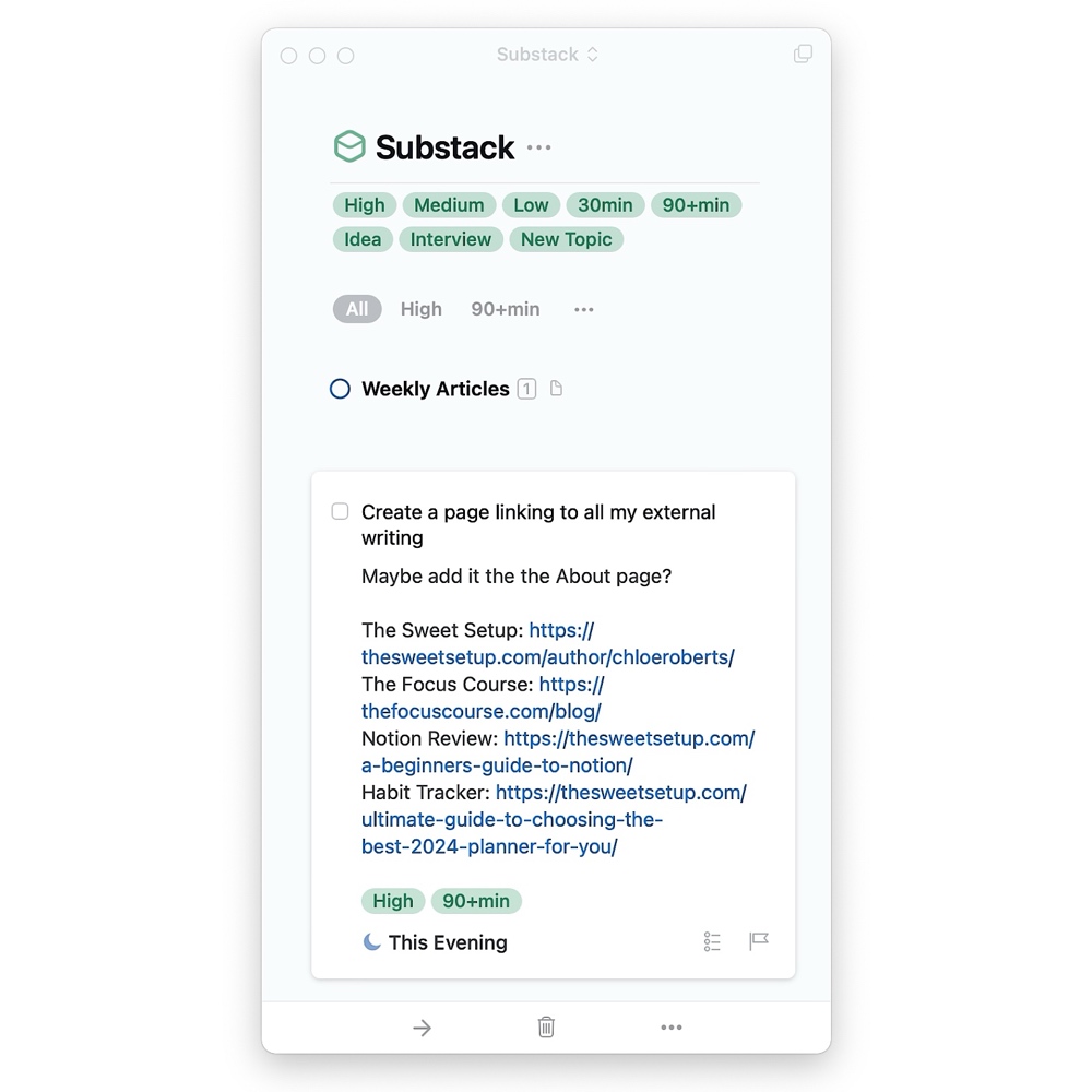
And indeed, a project in Things feels very much like a blank document rather than a rigid checklist. There is space for notes and reference information that never feels like a second-class citizen in the app’s UI — like, say, a simple free-form text field.
Easy Input
Like many of the apps in this space, Things 3 does a good job of making it easy to get stuff into it. Using the Quick Entry dialog, you can quickly type a (customizable) shortcut and enter in a new task. Most task management apps offer this feature, but what I like about Things is, again, the usability. The form includes all the necessary fields, while also including excellent support for using just the keyboard.
Even better, with the Things Helper you can create tasks from a currently selected item in other apps. Using this, Things will include a link back to the original item. Using one master inbox for all your inputs becomes a lot more feasible with this type of functionality.
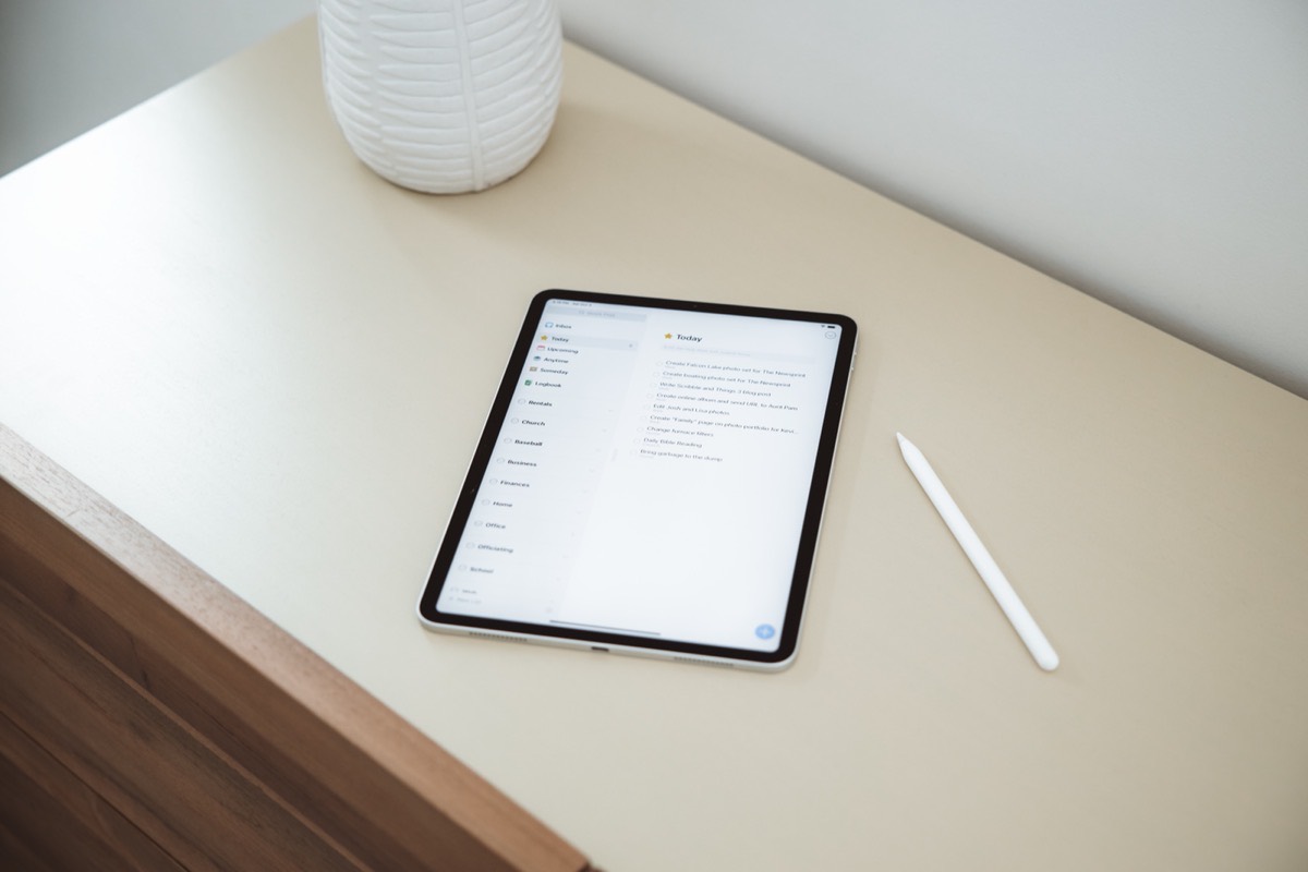
On iPhone and iPad, Things is increasingly supported by other third-party apps thanks to its behind-the-scenes URL scheme. Spark, our favorite email app for the Mac (and for iPhone and iPad as well) plays nicely with Things. You can simply swipe an email in your email list to send the entire email message (or just a link) to your Things inbox, where you can act on the email as though it were a task.
Finally, Things 3 includes Mail to Things, a simple workflow that provides you with a custom email address for adding tasks to your Things inbox via email. This is handy for working cross-platform — if you’re working on a Windows PC, you can forward emails or other tasks to this custom email address and manage your task list in Things.
💡 A handy tip: You can create a shortcut in iOS and iPadOS that can be tapped to automatically send an email to the custom Mail to Things email address. You can add the shortcut to your home screen as an icon or you can add it as a widget, which works great as part of a Smart Stack.
The Structure of Your Life
One of the aspects of Things that has always been important is how it structures the tasks that make up your life. At the highest level, it uses GTD’s Areas of Responsibility. This allows you to structure your projects, tasks, and checklists according to the various roles you play (project manager, designer, accountant, parent, volunteer, coach, etc).
It’s possible to set up a similar structure in other task management tools, but I’ve always appreciated the treatment given to areas in Things. It even gets its own icon!
This approach to the foundational structure in Things makes it easy to focus on one area at a time. So if you’re at work and don’t care to see your chores around the house, you can view a specific area with all its contained projects and miscellaneous tasks.
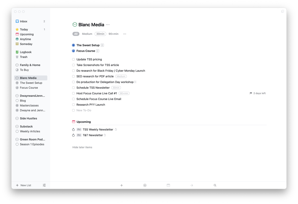
Further down the structure, each project is also given a nice visual treatment. Again, this concept of a blank document works well. A project can include notes at the top of the “document,” and then you can include its tasks, sub-tasks, and headings.
This allows you to include any background information or reference materials required at the top of the project (though you will have to drop the actual reference material right into Things or include a URL — Things 3 does not support actual attachments such as PDFs or images).
From there, you create the tasks required to complete the project. If your project has specific categories of tasks or is broken into segments, Things lets you create headers to add structure to the project itself.
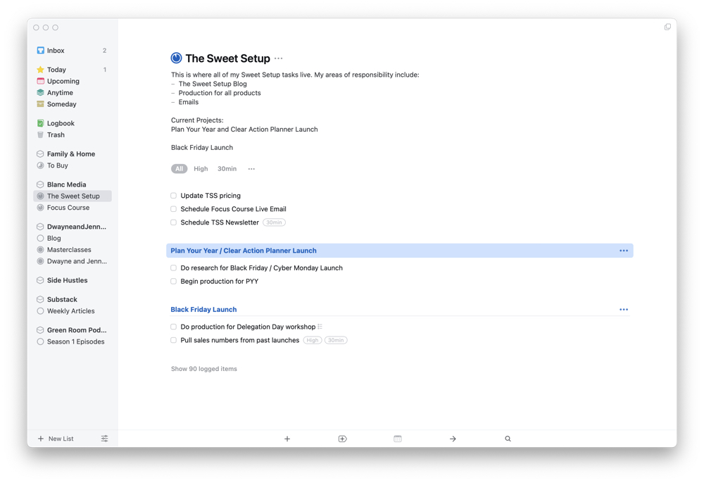
Further, each task can include notes or documentation, and tasks can be recurring or include a checklist. Add it all up, and you get this beautiful document of what needs to be done. You can set this view up to sit on the side of your screen as you plug away.
A Wrinkle In Time
Another aspect of Things 3 that I admire is the consideration of how to use time. Yes, you can assign a due date for tasks or projects, but you can also specify a time when you want to work on your tasks (but they are not necessarily due). This is how you add items to Today.
What’s great here is that this separates intention from deadlines.
This implementation in Things is very well thought out. If I have a task I want to complete tomorrow, I set that value in the task itself (all from the keyboard, mind you).
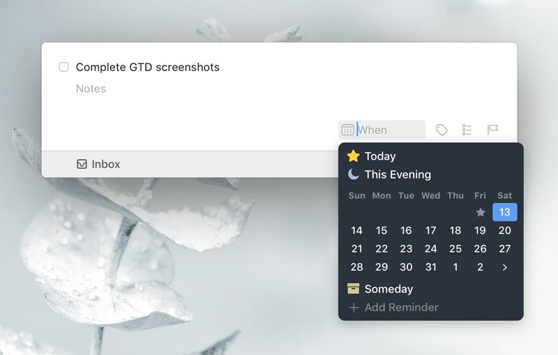
But, if a fire breaks out tomorrow and I’m unable to get to this task, it simply rolls over to the next day. Most other task managers would treat this as an overdue item and give you a glaring read badge. Things just shrugs its shoulders and lets you get to it when you’re ready.
This is a far friendlier way of allowing you to address intention when managing your tasks. Due dates are still there for when needed. For me, hard due dates are rare, so the more relaxed approach to time in Things is welcome.
Tags
Most task managers give you the option to use tags. In 2024, tags feel a little like Linux; we’re always waiting for them to get the attention they deserve. Yet I — and, I believe, many other Apple users — never seem to get around to using them. Not in the file system, and not in my main applications.
However, I really like the way Things handles tags. Of course, adding a tag to a task or project is quite easy (like OmniFocus and our other contenders), but it’s the treatment of tags in the structure of Things that works so well.
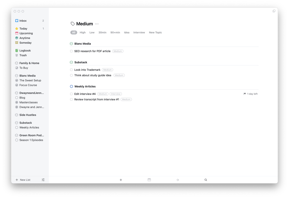
The basic structure of Things is as mentioned above. You create high-level Areas of Responsibility or add high-level projects to Things. From there, areas can include multiple projects and tasks. In this way, Things operates a lot like folders on your file system.
Tags are how you can view tasks across the different areas and projects in your life. You can view any given tag by using the high-level keyboard-based navigation. Simply start typing the name of a tag and then select it from the search modal. The result is a view that looks like a project.

Except it can include tasks that are located in different projects, grouped by area. Since there is little ability to create custom views in Things (more on that below), this ability to view tags allows you the most flexibility. You can even filter your list of tagged tasks by other tags. So meta.
What Could Improve
Things is not perfect, and it’s not for everybody. Compared to some of the other options, a lot of people will find it too rigid. Whereas a tool like OmniFocus allows you to configure things in a myriad of ways, Things only gives you a minimal set of options.
Nowhere is this more apparent than creating custom views. Where OmniFocus or 2Do allow you to build highly customized and specific views for your tasks, Things has almost no options at all. If you like to focus on one day at a time, the Today view is a good option. But if you want to look at all items set for Today that only apply to your job, then you’ll have to use tags in order show / hide sets of tasks.
The same is true for viewing an entire area of your life. If you view an area that includes projects and single tasks, you cannot see all the tasks for the entire area. All tasks for a specific project can only be viewed by clicking into the project itself. Once you do that, you’re down a level and lose the high-level view.
Apart from the lack of customization — which, I should add, some people would see as a positive feature — there are a few other missing features in Things.
For one thing, there is no ability to attach a file to a task. Things does support URL schemes for macOS and iOS, but that usage must also be supported by the external app. So Mail.app will provide a link, but Ulysses does not. Files in Finder will include a link, but if that file is moved, the link is not updated. So the usage here is limited.
The best option I’m aware of is to use an app like Bear to store note attachments for each of your tasks.
As well, other apps in this category provide options that some folks will not want to be without:
- Tasks in an area or project are not connected to one another, and there is no option to make them sequential; you tackle one at a time in any order. For projects that require tasks be completed in a specific order, this can be problematic (especially for teams).
- On that last note, there are no collaboration features of any kind. It’s task management for individuals.
- Things does not support location-based features, such as reminders.
- And oddly, you still can’t complete a recurring task before it comes due.
All things considered, these are small items that do not take away enough from Things. It’s the most enjoyable way for Apple users to manage their work. Period.
I should also like to point out that a previous complaint of ours has been rectified: Things 3 used to lack support for Markdown or any sort of text formatting really, but now I’m happy to report that there is now robust Markdown syntax available to add more structure and style to your notes! 🥳
iPhone and iPad Apps
One last item to mention is that there are different versions of the product. Apple users in 2024 are people using more than one device. So, how does Things 3 shape up on an iPad or iPhone compared to the desktop? That’s an important question to answer because of the multi-device reality of our day.
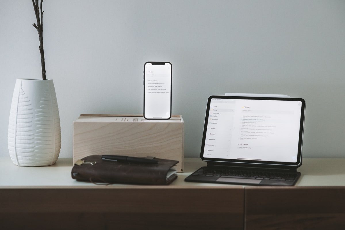
Personally, I downsized to two devices over the last three years. Where I used to use all three options, I currently only use a phone and a laptop. And in my usage, Things is perfect. Where the desktop app allows me to see what I need as I go through my day and throw new stuff into the inbox for later processing, the iPhone app is a wonderful experience for planning.
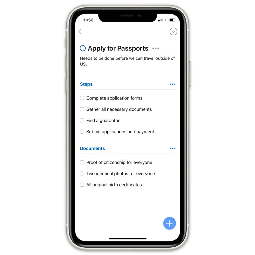
My morning or evening quiet times start with meditation and prayer but often end in review and planning. Things on my phone gives me a very nice view using Areas, Projects, and Tags. And where the keyboard navigation is spot on in macOS, the touch-based navigation (and accompanying animations) on iOS are just as good. And so too is the support for drag-and-drop. Things is above all else a very smooth feeling app.
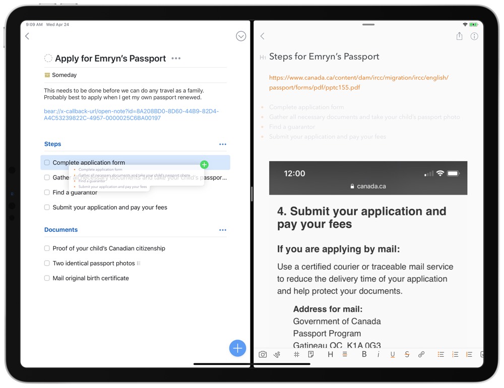
Drag-and-drop in Things for iPad works a bit differently than in OmniFocus for iPad. OmniFocus was one of the first iPad apps to support drag and drop, where you could drag multiple lines of text in from a notes app like Bear and each line becomes its own task. Things, however, takes the dragged text and inserts the text as a note inside a new task.
Which method you prefer will really depend on how you work. It’s very easy to create project templates for OmniFocus that can be dragged and dropped in — simply type out each task as a new line inside a text document and save that document somewhere accessible on your iPad. Then, drag in your tasks and you have a pre-determined list of tasks.
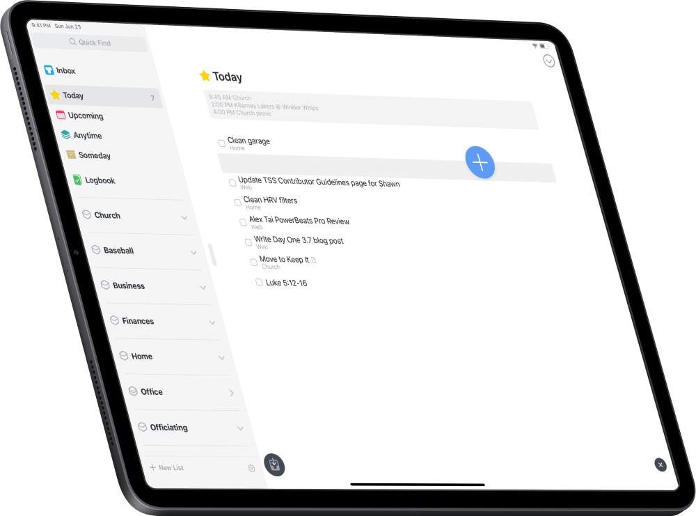
Things requires an extra step to create a task using drag and drop on the iPad, but the app assumes you’re bringing in background information from a different app and want to summarize that information as the task name. For those looking to use Things as an increasingly complex task manager, this may be the superior form of drag and drop implementation.
Widgets on iPhone and iPad
Ever since they first released on iOS/iPadOS 14 back in 2020, Things’ powerful and customizable widgets have seen plenty of upgrades over the past few years. (And their major version releases always drop around mid-September, meaning we’re due for another one soon as of this writing!)
Right from the beginning, widgets like these took the Apple world by storm, with iPhone and iPad users alike now able to create entire productivity dashboards on their home screens if they choose. For many, this has completely revamped how they interact with their to-do lists and projects.
On iPhone, Things offers a simple, customizable “List” widget in three different sizes that looks great on any home screen and can speed up the process of entering tasks into your Inbox.
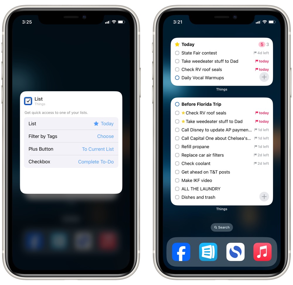
The small, medium, and large size widgets display a list of your choosing, with the Area in the top left corner, the total number of tasks and events in the top right corner, and a list of tasks in the bottom ⅔ of the widget. The medium and large widgets add a big plus button for immediately jumping into the app to create a new task.
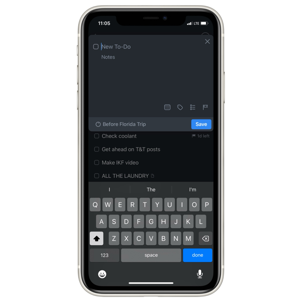
Each widget can be customized to view any area or project you have in Things, and you can drill in a step further by filtering that area to a particular set of tags. These two customizable options mean you can view literally any element of Things right from the widget(s) on your home screen.
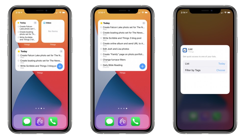
For this reason, we think the Things 3 widget is best used in a medium or large size on iPhone, and we’d lean towards the medium size if only to bring attention to a certain subset of tasks without the feeling of overwhelm from a long list of tasks in the large widget.
Over on iPad, you also have access to an extra-large version of that same List widget, along with an “Up Next” widget that gives you a view of your next few days.
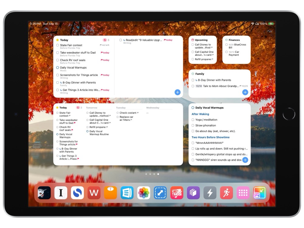
Across the board, Things’ List widgets are fairly interactive. You can check off tasks right there in the widget without having to actually open the app itself, or you can tap the title of a to-do item to open it in Things, or you can tap the aforementioned plus button to open the app and jump straight into creating a new to-do (it goes to your Inbox by default, but you may choose to have it go to the widget’s currently displayed list instead).

Overall, these widgets offer a great deal of flexibility in how you view and interact with your task lists.
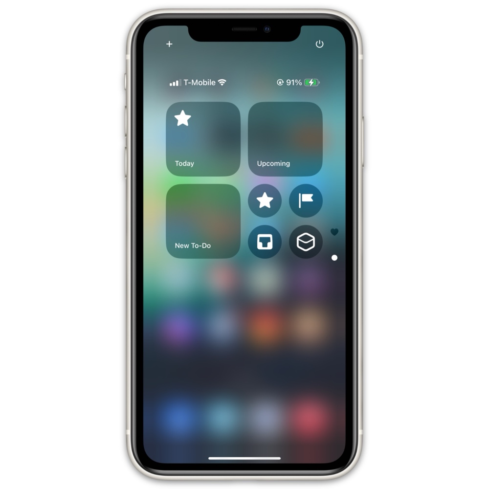
And, if you still need more ways to interact with Things, the 3.21 update for iOS 18 brought some new Control Center buttons that allow you to either quickly create a new to-do or jump into any list (Today, a project, an area, or a specific tag).
Scribble on iPad
Ever since the release of Things 3.13, using Scribble on iPad has been super simple: Grab your Apple Pencil and write your required task anywhere to the right of the left-hand sidebar. As soon as your Pencil touches the screen, your handwriting (which is surely fancier than my own) will appear on-screen.
Once you’re done writing, you’ll notice the “ink” slowly fade to a dark grey before being converted to typed text inside a new task.
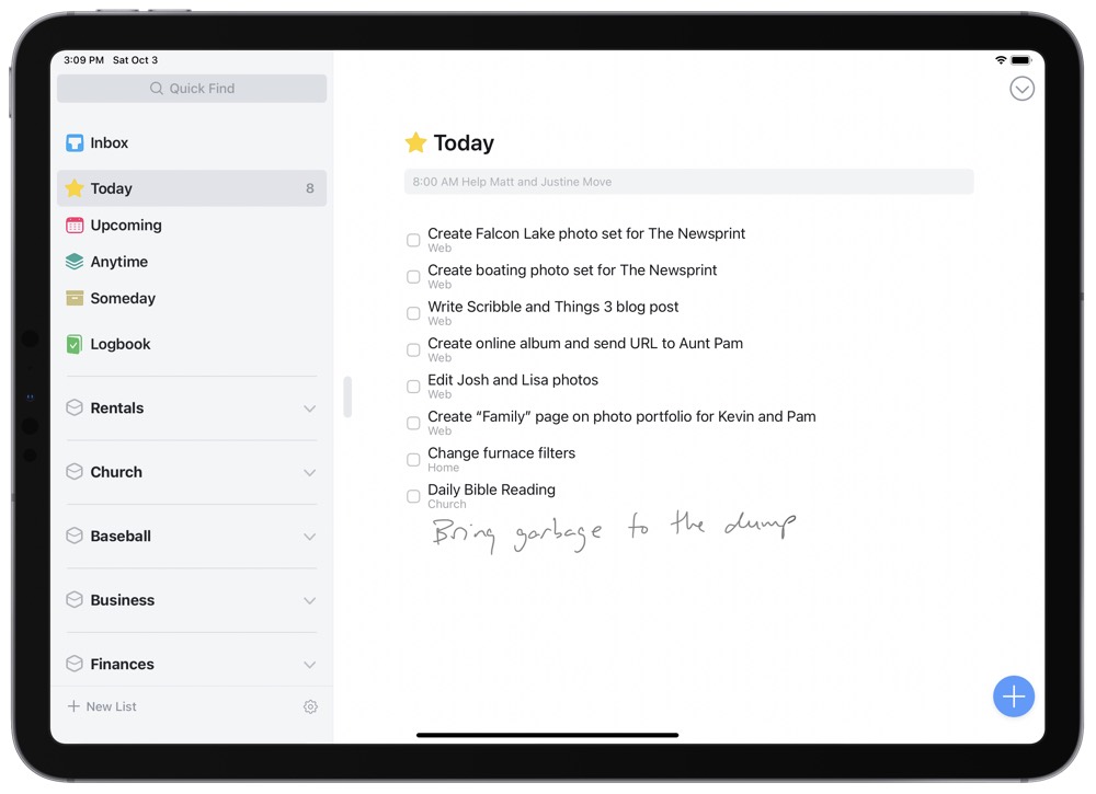
Once Scribble has converted your written text to typed text, you can use the Pencil to write in a note in the Notes section, or you can use the Pencil to tap any of the task’s buttons to schedule or move the task around to your liking.
Scribble’s nomenclature also kicks in once your written text has been converted to typed text. In case you need a quick memory job, you can edit text with Scribble in the following ways:
- To select a word or group of words, circle the words or draw a line through them.
- To insert text between words, tap and hold between the words with the Pencil. Scribble will separate the words and provide greyed-out lines for you to handwrite additional words.
- To add or remove spaces, draw a vertical line where you’d like to add or delete the extra space.
- To delete a word, scribble — or “scratch” — out the word out with your Pencil.
Design Your Ideal Weekly Schedule
Free → Video Workshop + Productivity Templates

If you want to reduce the busywork and distractions, then sign up here for instant access to a brief video workshop on How to Plan Your Week.
♥️ Quick Note: You’ll get access to the workshop, plus a few additional bonuses to help you overcome procrastination and deal with distractions so you can spend more time on the important work that matters.
Runner-Up: OmniFocus
At the time of our most recent article update, we are aware that OmniFocus 3 — which we focus on below — is no longer around due to the release of OmniFocus 4 nine months ago. We apologize for the delay in getting you an updated version of this review to reflect that, but we are definitely looking into the newer app and this article will be changed accordingly once our findings are complete.
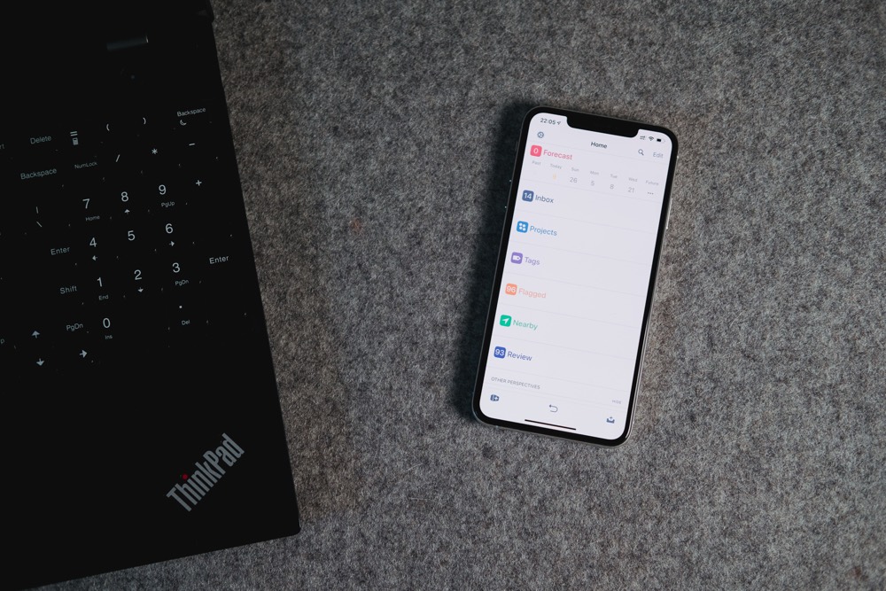
As part of the upgrade to version 3, OmniFocus 3 has changed in many ways — and for the better. If you were using version 2, there have been very few changes that would force you to change your workflows and setups, but many ways you could likely enhance them. For those new to OmniFocus 3, it is the same, extremely powerful, task manager with even more flexibility than before.
Capture
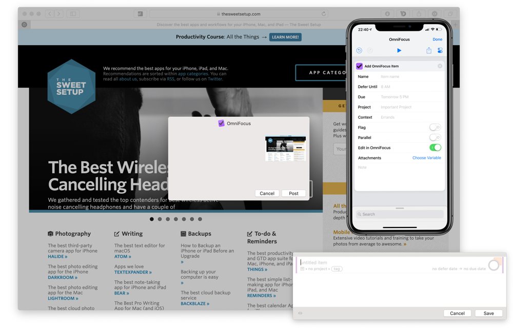
OmniFocus has many ways to capture tasks — from quick entry and services on the Mac, to the share sheet and 3D Touch on iOS — and of course you can use AppleScript, URL Schemes, and Shortcuts too. Naturally, there are also buttons to add new (inbox) tasks inside the app. With the customizable inspector on iOS, you can really set it up to meet your needs.
OmniFocus is also integrated into many other apps, which means you can easily capture from a whole host of applications including Drafts, Airmail, Spark, and more! On the Mac, OmniFocus has a powerful quick capture window, allowing you to add one or more tasks, along with tags, dates, notes, and projects as you get on with your work.
Structure
OmniFocus will let you configure your system however you like. You can keep it simple with just a few projects as lists, or make it more granular with folders and setting your projects to parallel, sequential, or single action.
One feature that sets OmniFocus apart from other task managers is infinite depth. A project contains actions, but by adding sub-tasks to those (which can also contain sub tasks, and so on) you can create a very complex hierarchy of tasks should you need it.
Tags

One of the headline features for OmniFocus 3 is tags. Every task and project can have an unlimited number of tags assigned to it, giving you a very flexible way to view your tasks as needed. Tags can also have a status such as on hold, which is ideal for a dependent task, or dropped if those tasks should all disappear.
Tags can also be nested so you can have People as a main tag and Josh, David, and Michaela inside of People if you want. Tags are useful on their own by letting you see all the things you’re waiting on, or all the things Josh is tagged on, but you can combine this and more with custom perspectives.
Perspectives
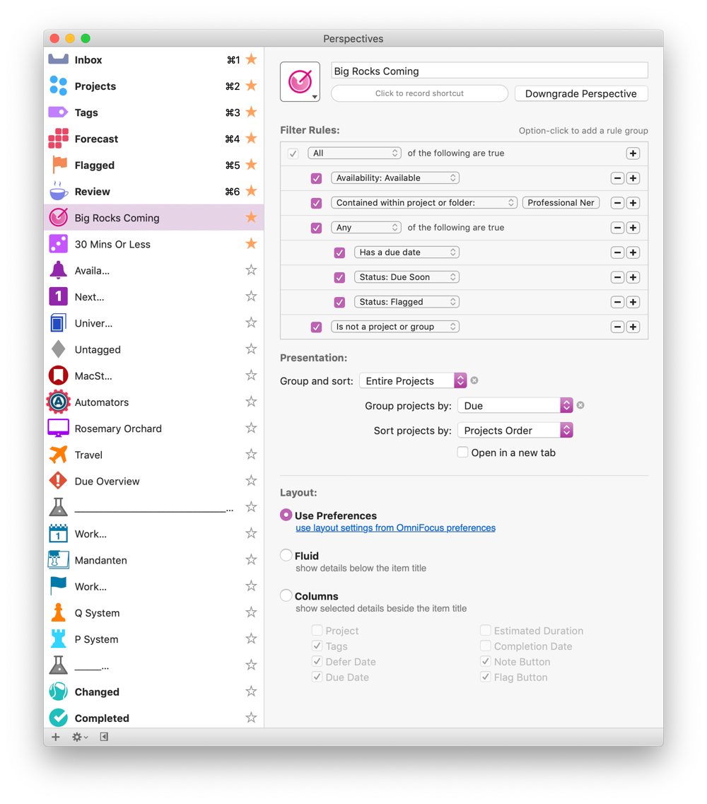
Hand in hand with the tags comes perspectives. After all, what good does it do to categorize your tasks if you can’t find them? Custom perspectives are a pro feature in OmniFocus, but they’re most definitely worth it. You can craft a series of rules and nest them if necessary. This lets you view a list of all of your available projects ordered by due date, or tasks tagged with errand but not supermarket.
You can also set custom icons and colors for each perspective, allowing you to represent your tasks in an iconic fashion. As perspectives can be starred to show in the sidebar on macOS, or added to the toolbar, these icons make sense.
On iOS, the perspectives are shown in the home area of the app, so they’re at most one long press on the back button away from wherever you are in the app.
Notifications
Notifications are an important part of every task management system, and OmniFocus has lots of choices for notifications. You can set it to notify you by default for all defer dates and/or due dates of tasks, and also modify these on a per-task basis. On top of this, for each task you can add extra notifications such as Latest Start, so if you have an estimated time set for a task it will notify you that amount of time before the due date to get it done.
You can add notifications relative to the due date of a task, so if you want a heads up two days before something is due, you can have that happen without needing to set a fake due date — and if you use this with a repeating task, those notifications will repeat with each instance of it.
The last option is for completely custom notifications at fixed times and dates. This is extremely useful for projects that have a due date far enough away in the future where you might forget about it, and you want a reminder to work on a particular action on a specific date without setting a fake due date. While you can use notifications at specific dates and times on repeating tasks or projects, they will disappear in the next repeat.
Review
Review is ingrained into Getting Things Done, with the idea being that you should review all of your active projects on a regular basis — typically weekly. OmniFocus has the review feature built in, and by default projects come up for review weekly. Review doesn’t have notifications nor does it prod you or force you to do it, so if you don’t need review you can ignore it entirely.
On the Mac, you just see a little colored stripe next to the review perspective in the sidebar if one or more project is due for review, and on iOS you see how many items are in the Review perspective. On the Mac, you can un-star it to remove it from the sidebar, and on iOS you can move it right to the bottom of all of your other perspectives.
Reviewing a project is simple. You’re presented with the whole project and all remaining actions. At this point you can add any other actions that come to mind, complete any you have done, and delete those you won’t do — as well as add or modify due and defer dates and tags. From the project inspector, both in the review mode and everywhere else, you can modify the review frequency.
This means for some projects you can set them to come up once a year for review, others once a month, and some even as often as every day. Once you’ve completed your review, you mark the project as reviewed, and it will disappear from the review section until the next time it should show up.
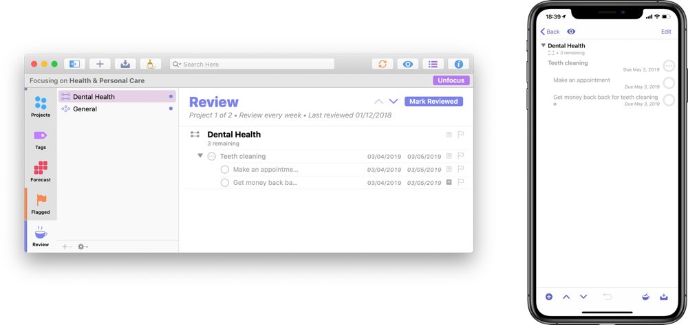
You can also use the pro feature, Focus, on the Mac to restrict what you see in the review section. This is really useful for those of us who like to use one system to manage both personal and professional obligations. You can select folders, or a range of projects, focus on them, then go to the review section and only the subset of that selection which is eligible for review will appear.
Aesthetics
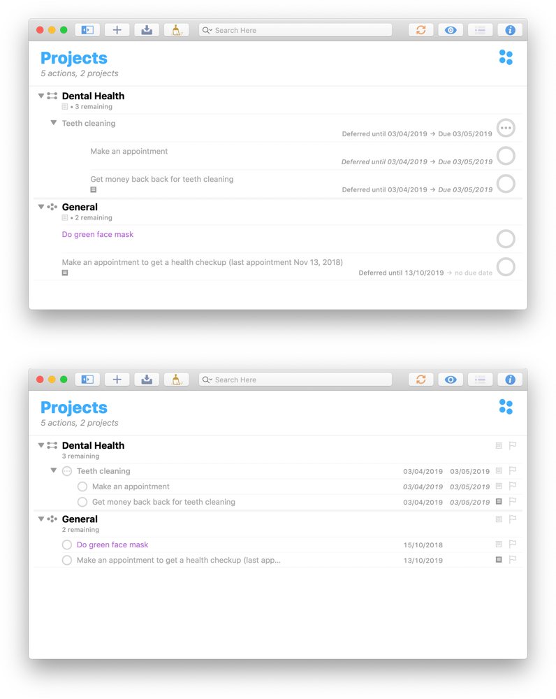
Looks aren’t everything, and, perhaps more importantly, what makes an app look good varies from person to person. I am not a fan of massive amounts of whitespace in a task management app. I prefer to have as many tasks, projects, and other information displayed as possible. I feel that OmniFocus strikes a nice balance between showing you all of the information you need, whilst not overwhelming you.
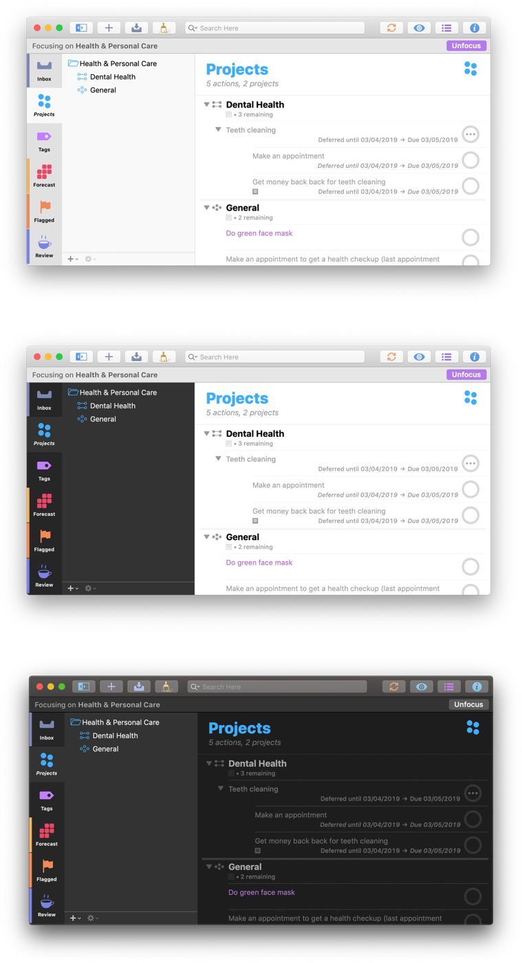
With version 3, OmniGroup removed the fiddly custom theming in favor of being able to offer light and dark themes that can switch automatically with the system colors on macOS Mojave. Inside of the light theme, you can also choose to have a dark sidebar, which naturally focuses your eyes on the tasks in the outline area.
There are two sections of the sidebar: the perspective icons that are always visible (and you can choose which perspectives, including the defaults, to show) and the second area offers more information, such as lists of projects, tasks, or a calendar view in Forecast. If you choose, you can collapse the sidebar. In the center, you have the outline view, where your folders, projects, and tasks are shown.
Pro-license owners can set this to show these items with either column view or the default fluid view which is reminiscent of iOS. On the right, you have the inspector, which allows you to edit whichever items you have selected.
OmniFocus for iOS looks somewhat different depending on if you’re using an iPhone or iPad. The former is limited to a single view at a time — be that the home menu, the outline, or the inspector. On iPad, you can see all three at once in full-screen landscape mode, or unpin the menu and the inspector if you want just the outline view with your tasks and projects.
Todoist
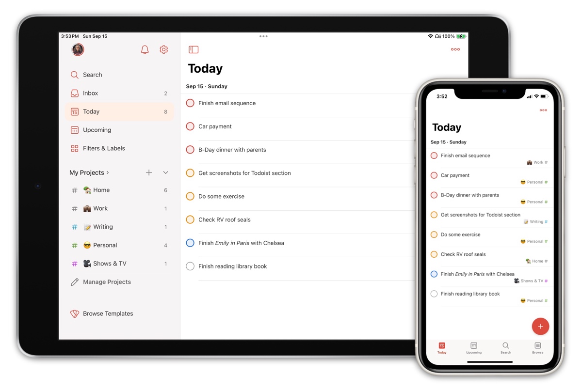
Todoist is a powerful, nimble, and extensively cross-platform tool for task management that remains one of the most compelling options in the space.
Todoist’s Best Features
Unlike most contenders in our list, Todoist is almost universally available. You can access Todoist from native apps on every major platform — iPhone and iPad, Android, Windows, macOS, Linux, Apple Watch and Wear OS, on the web, and even as an integrated email plugin for Gmail and Outlook. This alone is a big advantage for those who want to have easy access to their tasks no matter where they are.
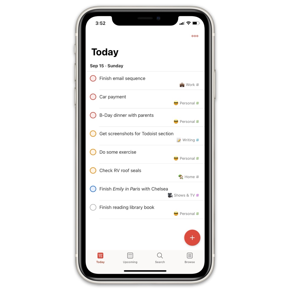
Perhaps more compelling is Todoist’s sheer speed of input; no other task management app handles task creation as quickly as Todoist does. Their legendary natural language processing remains best in class, allowing you to add, categorize, assign, and prioritize tasks right from entry instead of having to do it after the fact.
You accomplish this using basic language, with a few syntax tricks for specific features. It understands dates, times, and repeat intervals — including sophisticated ones like “every other weekday” that can’t be accomplished in Things at all.

As an example, you could type Perform my weekly review every Friday at 6pm p1 #personal @productivity and Todoist would create a task of priority level 1 in your “Personal” project that has the “productivity” label attached and repeats every Friday, with a reminder at 6pm. Of course, there’s an autocomplete system for the project and label syntax to speed things up even further.
Besides its speed of entry, Todoist also benefits from a robust sharing and collaboration layer. Tasks and projects can be shared, each task has its own comment thread for discussion (it can include file attachments and links too), you get an activity view where you can see each task’s full history, and there’s a global system for notifications from your collaborators.
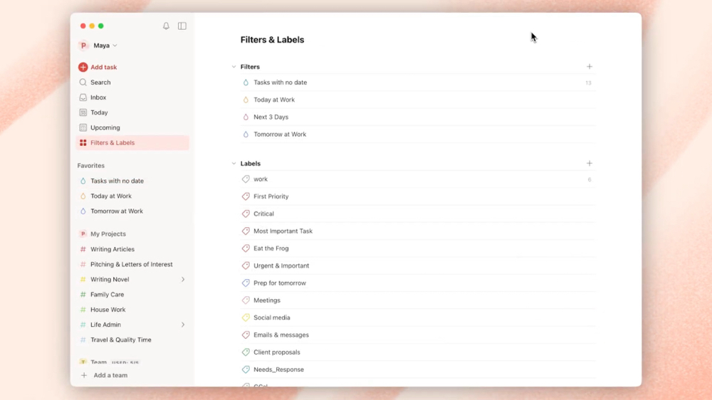
Another major differentiator is Todoist’s ability to create sophisticated saved searches called Filters. Filters can help you refine what tasks you want to see based on all sorts of criteria, and they can be saved and pinned to the sidebar for quick access.
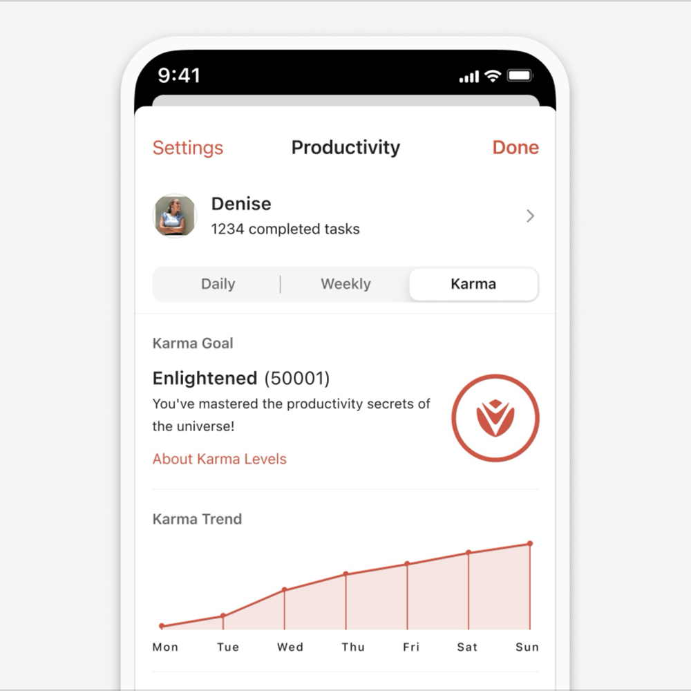
One of Todoist’s more whimsical features is an optional system for quantifying your productivity called Karma.
You earn Karma points for adding, completing, and re-scheduling your tasks — in other words, being actively involved in your task management. You can set Karma goals, view your Karma trends over time, track streaks, and otherwise keep yourself accountable if you want to.
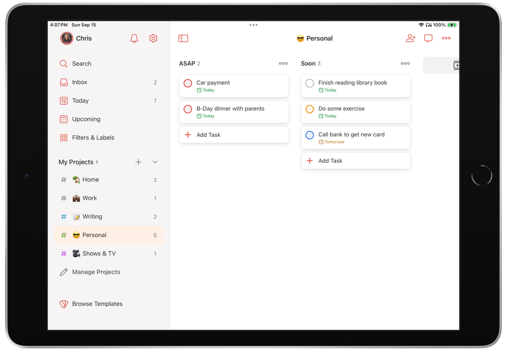
Some of our favorite improvements in recent years have included an overhauled design for task entry, more intelligent handling of project sections, as well as the transformative addition of a full kanban-style board system back in 2020.
This feature alone put Todoist in a different league for workflows that are heavily process-based. Since the board layout can be toggled on for any project, you have total flexibility to showcase each part of your task management system in the way that makes the most sense: either as a familiar flat list, or as kanban-style columns of boards that you can drag-and-drop tasks through.
They are always adding great new features too, so Todoist is always an option worth keeping an eye on.
Some Areas Todoist Falls Short
There are downsides of course, but many of them are cosmetic. Todoist lacks the degree of platform-specific interface and interaction polish that Things has (a trade-off for being available on every platform), and while it’s far faster at task entry, it’s not as fast at keyboard-based navigation.
Todoist also lacks small niceties like Things’ progress charts for projects in the sidebar, and is more typical in its handling of tasks and priorities. Incomplete tasks show up as overdue the next day instead of gently carrying over, and there’s a more complex priority system (ex: Priority 1, 2, 3, or 4) instead of a simple day/evening division like in Things.
Other trade-offs are more or less relevant depending on your needs. For instance, Todoist doesn’t have a way to show you your calendar items in the app the way Things does, but it allows for the reverse instead. It has a robust two-way sync with Google Calendar that lets you organize your tasks alongside events in the calendar itself — including through apps like Fantastical.
This may be preferable, particularly for folks who like time blocking as a productivity approach.
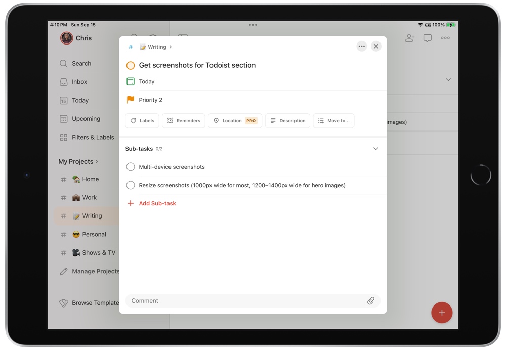
Another limitation of Todoist is the absence of start vs. due dates. In Things, you can set these independently so a task can show up in your Today view when you intend to begin working on it, despite it not being due for a while yet.
In Todoist, there’s only one date assigned to a task (assigned with the flag button), so if you need to start a task before it’s due, then you must assign your intended start date to the task (calendar button) and keep track of when it’s due separately — or, use workarounds like adding a subtask with a different date for starting the parent task.
Depending on your needs, Todoist’s extra powers of collaboration, filtering, quick task entry, and cross-platform support might make it worth the trade-offs in design, fluidity, and general friendliness compared to Things.
Todoist is a subscription service, with a generous free tier, along with both a Pro plan ($4/month when billed annually, or simply $5/month) and a Business tier ($6/user/month when billed annually, or simply $8/user/month).
Other Options for Consideration
If you just need a place to store your projects and tasks but want a little more customization than Things offers, there are a few other options to check out as well.
2Do
Like Things, 2Do sports a more pleasing interface than OmniFocus or Todoist. But where Things is more simplistic and includes carefully considered constraints, 2Do offers the ability to tweak what you see in the app and how you use it. It’s similar to OmniFocus in that regard, but with a nicer looking UI. If OmniFocus is the second choice for the power users, 2Do is the second best choice for everyone else.
Microsoft To Do
Microsoft has really jumped forward in the last few years in the productivity and task space, specifically thanks to many of the company’s acquisitions. The Wunderlist acquisition (among others) have resulted in a surprisingly refined task management app in the form of Microsoft To Do.
The major benefit of using Microsoft To Do is that it’s available and completely baked into the Microsoft 365 subscription at large. Apps like Teams or any of Microsoft’s project or team management apps can dive into To Do’s data, ensuring everything is streamlined across your Microsoft 365 apps.
Of course, for those who don’t find themselves inside the Microsoft 365 world each day, there are many Mac-specific options that perform and look better.
TickTick
TickTick has burst onto the scene over the last few years as well and is one of the best GTD app picks if you subscribe to the time-blocking methodology.
TickTick combines your calendar and task list into one, eliminating the need to manage your calendar and to do list in two separate apps. TickTick also includes a kanban view (like Todoist), which is great for visual workers who manage each step of the project.
TickTick falls short when it comes to task entry speed and in the project template department (though Things 3 isn’t all that great at project templates either, we should add.) TickTick is loved by many popular creators and is worthy of consideration if any of the other options here aren’t working for you.
Obsidian and Notion
We here at The Sweet Setup have grown quite fond of both Obsidian and Notion as of late. Notion appears to be taking over the team’s publication and editorial calendar, as the app’s ability to link databases and display different views — from kanban to calendar to lists and more — makes for a powerful app for managing projects.
Notion’s scope, however, falls well outside and far beyond the scope of a more-specific GTD app. While you could use Notion for GTD and task management, we believe Notion excels at other areas (specifically in linked databases and their management). GTD and task management are just extra pieces on that cake if you want to consolidate your tools.
Obsidian is somewhat similar in that regard. As our own Mike Schmitz will tell you, it’s really a note-writing app at heart, but it does have a plethora of awesome plugins that allow you to, say, craft your own Task management console, generate Markdown-backed kanban boards, tackle your GTD TODOs in text form, or just about anything else, really. While Obsidian offers a ton of flexibility, it’s simply too fiddly for most people to set up and isn’t likely to see mass adoption as a primary way of managing tasks and projects.
Design Your Ideal Weekly Schedule
Free → Video Workshop + Productivity Templates

If you want to reduce the busywork and distractions, then sign up here for instant access to a brief video workshop on How to Plan Your Week.
♥️ Quick Note: You’ll get access to the workshop, plus a few additional bonuses to help you overcome procrastination and deal with distractions so you can spend more time on the important work that matters.
Conclusion
Sometimes I imagine going back in time to visit the 2007 version of myself and showing off the task management software of 2024. What a stark difference!
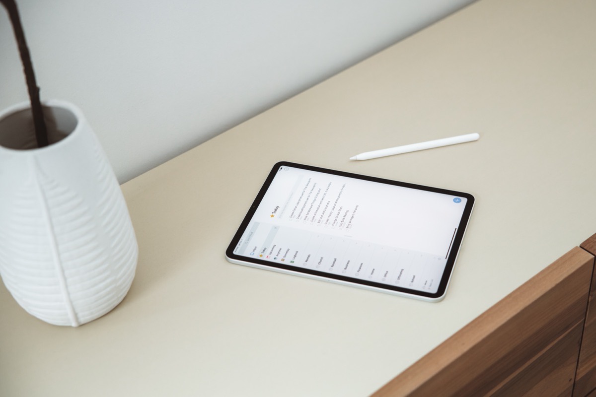
No matter your method of productivity, Apple users can find a service that fits their tastes. The Things app is currently the best of the bunch and we’re happy to recommend it. Two or three years from now? Who knows, but we’re looking forward to seeing what the amazing community of developers can do by then.
