The Best Email App for iPhone and iPad
Spark
After spending an inordinate amount of time reading, responding to, and processing email on our iOS devices, we believe that Spark is best email app for iPhone and iPad users who (like us) are passionate about their productivity. But there’s another great option for people who just want a little instant calm in their inbox and don’t mind making a few tradeoffs for that peace of mind.
Why Not Just Use Apple Mail?
Apple Mail is a decent email app. The keyboard shortcuts are a bit weird and basic actions (like saving an email to a PDF) can be maddening, but for the most part it gets the job done. It’s also free to use and comes pre-installed on every iPhone and iPad.
But we’re Apple power users. We don’t want decent — we want the best. And Apple Mail is a far from being the best option for those who are serious about boosting their iOS productivity. And with each major iOS release, Apple Mail remains unchanged and falls farther behind. In fact, Apple Mail has remained largely unchanged since the last major update it received in iOS 8.
iOS 14 also brings the ability set a new default email client, making this a great time to reconsider email on your iPhone or iPad. This makes third-party email apps first-class iOS citizens, and allows you to finally open something besides Apple Mail when you tap an email link. For example, if you are in your web browser and tap a link on a contact page in iOS 14, you can now create your email message in your app of choice.
The continued improvement seen in third-party apps combined with the ability to set them as system defaults means there has never been a better time to upgrade your iOS email experience.
Criteria for the Best iOS Email App
In selecting the best email app for iPhone and iPad, we used the following criteria to select the winner:
- Ability to Keep Your Inbox Calm — For most people, email is not their primary job. It’s a communication tool. So in our opinion, a good iOS email app will help you communicate more effectively, and then allow you to get on with other things. Yes, that means notifying you of things that are important and need your attention right way, but it also means keeping all the other stuff out of your face so you can focus.
- Overall Design — Email is annoying enough, but a poorly designed email app can increase your aggravation exponentially. The iOS email app you choose to use should provide a well-designed user interface that is carefully considered, giving you the tools you need to process your email quickly and get back to doing more of what’s important.
- Innovative Features — Third-party apps are what push iOS email forward. The email app you decide to use on your iPhone or iPad should give you features that aren’t just impressive as a technical demo, but actually help you be more productive in your day-to-day work on your iOS device.
- Ease of Use — The iOS email app you use should give you the tools you need to process your email, then get out of your way as much as possible. But striking the right balance between power and looks can be tough. A good iOS email app should have discoverable features without needing complex menus or cluttered toolbars with tiny touch targets.
- Support for Different Account Types — There are many different email providers, and the the iOS email app you decide to use needs to support yours. The common ones include Gmail, iCloud, Yahoo, O365, Exchange, and IMAP, but there are many more. If an email app doesn’t support your email provider, then it’s just not an option for you — no matter how new and shiny it looks.
- Update Schedule — Email apps are a tough category on iOS. We’ve seen many promising third-party email apps slowly fade into irrelevance due to lack of updates. The iOS email app you decide to use should have a track record of being well-supported to minimize the risk of it suddenly disappearing and forcing you to figure out a new tool for your email workflow.
- Privacy — Third-party email apps sometimes take too much liberty with the data you grant them access to. You can decide for yourself where the line is between privacy and features, but we believe that third-party email apps should respect your privacy and never take your data without your permission.
- Integrations with Other Apps/Services — We believe the best way to handle email on your iPhone is not to reply to every email message, but to triage it. In order to do this effectively, your iOS email app has to integrate with the other productivity apps and services you use.
- Customization — Your email app should fit the way that you work, not the other way around. It should let you customize swipe gestures to speed up common actions, and should also let you customize the appearance of the app to your liking.
- Price — There are many options available for iOS email apps. Because the market is so competitive, you can demand a little more from your email app. The email app you choose should have a clear business model that makes sense and gives good value for what they’re asking you to pay.
Bonus: EMail Quiz
We have put together a simple quiz that will help you find the ideal email app for your needs. Simply answer the questions and get your recommendation right away.
Moreover, if you want to get a free video that we have made specifically for your recommended email app, then you’ll have the option to have that sent to you.
Our Approach to Email
Let me just get this out of the way because I know it will be controversial:
If you really want a calm inbox, the best way to achieve it is to remove email completely from your phone.
The smartphone is great for a lot of things. Since you always have it with you, it can alert you to things that are important and need your immediate attention. But it can also break your focus when you’re in the zone. If you don’t take the time to configure your notifications settings properly, it can do a lot more harm than good.
Which is why, for many people, the best iOS email app is none at all.
Unless you have a herculean amount of willpower (spoiler alert: you don’t), it may be better for you if you don’t leave the doorway to distraction open at all — not even a little bit.
You’re probably thinking, “Well, that’s great for you, Mike, but unfortunately I have a boss that gets upset if I don’t respond within 20 minutes. It’s better for me to avoid the pop-in follow-up by getting back to them, even if it’s from my iPhone. You may be an email unicorn, but here in the real world I can’t just walk away from my email for an extended amount of time. I need email on my phone!”
Fortunately, there’s a compromise.
Several of the apps we reviewed have a VIP-type feature, which allows you to be notified when someone important (like a boss, manager, or significant other) sends you an email message. But it also silences the notifications that typically come in by default telling you that someone looked at your LinkedIn profile or liked your Facebook post. This ultimately increases the signal to noise ratio and makes the notifications you do receive more meaningful. It takes a little time to set up, but the peace of mind it gives you is worth the initial investment.
But even after you wrangle your notifications, the iPhone in particular isn’t a great form factor for replying to email. But there is one area the touch interface in iOS really shines, and that is for email triage.
The term “triage” is frequently thrown around when dealing with email. But did you know it actually originated as a medical term during the Napoleonic wars? You can read more about the history here, but splitting your messages into buckets can be effective on iOS if your email app gives you customizable swipe gestures. This is especially powerful if your iOS email app integrates with other productivity apps, letting you send emails directly to your task manager or reference file so you can archive the original messages and get them out of your inbox.
The Best Email App for iPhone and iPad: Spark
In our opinion, Spark is the best iOS email app for most people. It works with just about every email provider, and balances looks and power by giving you powerful email features inside of a clean and carefully considered user interface. It’s a serious productivity tool that can be customized to work the way that you do, has a clear (and fair) business model, and offers innovative features for teams that need to collaborate on email.

How Spark Helps Keep Your Inbox Calm
One of the features we like best about Spark is the Smart Inbox. This tries to determine which emails are important to you and group them together. Spark can use this Smart Inbox processing to only show you notifications from things that you actually want to see.
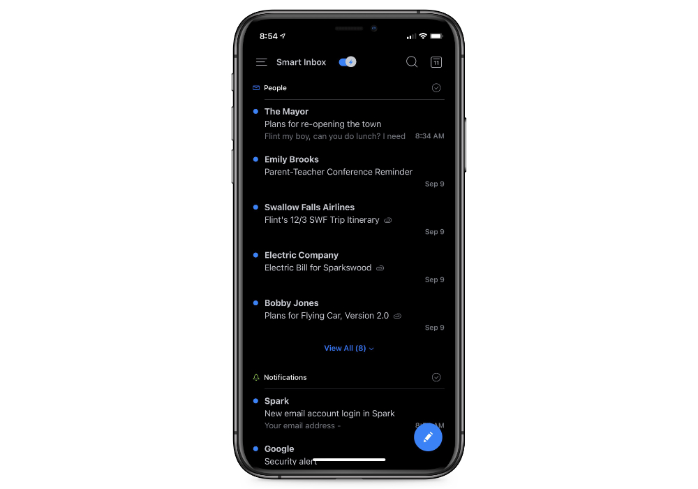
It’s Spark’s take on VIP notifications, and overall it works pretty well. For the most part, the Smart Inbox does what it says — shows you the good stuff, and filters the rest. Spark handles everything here, and it is nice not having to configure anything. It even works on Spark’s Apple Watch app, though I do wish Spark would allow you to designate individual senders as VIPs to make sure that you always receive email messages from them. The line between important and unimportant can be hard to define in the Smart Inbox, and it would be nice if you could clearly separate them by identifying individual VIP senders. If you always want to see something but you don’t always reply, Spark may have a tough time identifying those emails as important.
An Email Productivity Powerhouse
One of the reasons we think Spark is the best email app for iPad and iPhone is because of all the useful productivity features it has built in. Spark allows you to manage and respond to emails both efficiently and effectively.
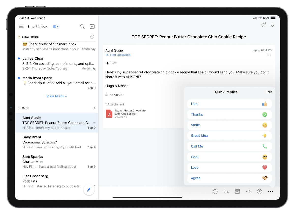
For example, Quick Replies allow you to say things like “Thanks,” “Great Idea,” or “Call Me” with a single tap. The content of these quick replies can be customized in the Settings, making it a great tool for dealing with email that doesn’t require a lengthy response. In our testing, this feature was incredibly useful and a big asset to a mobile triage-based email workflow.
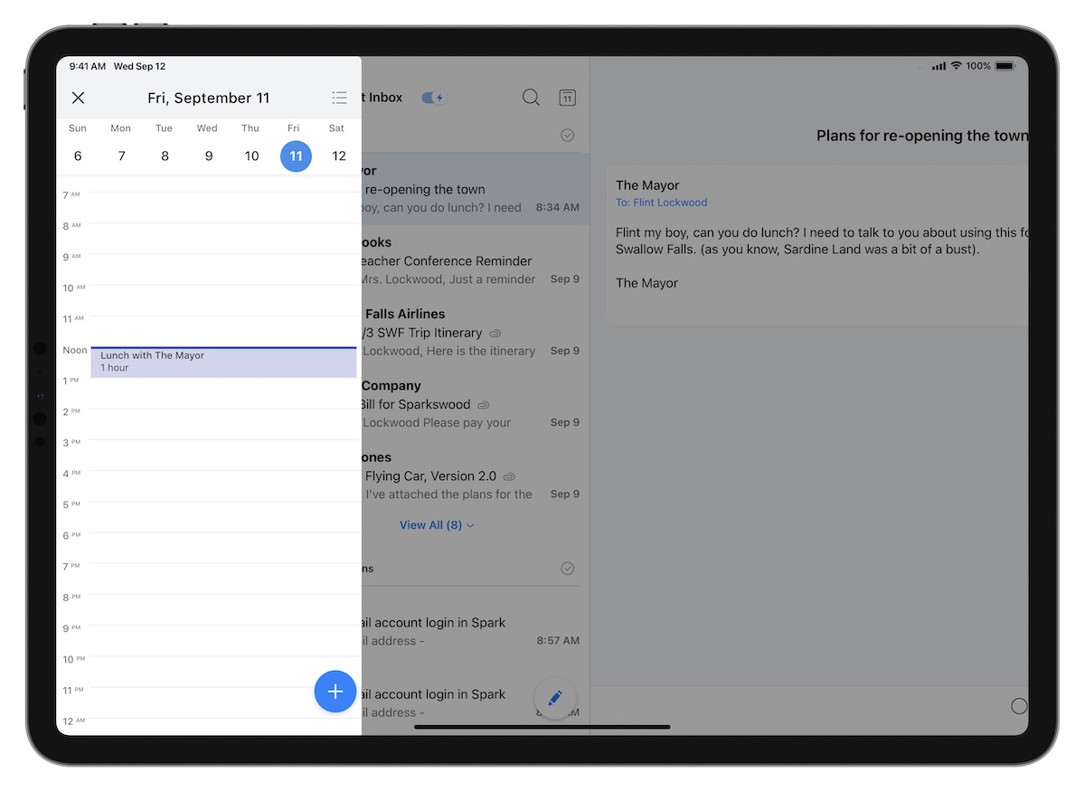
We also liked how Spark includes a built-in calendar view. This can be really useful when you want to quickly see if that meeting request will work without even having to leave the app. While switching to another app to look at your calendar isn’t a huge deal, it is nice (and often more efficient) to have your calendar and your email in the same application. (And yes, we’re aware Outlook users have been doing this for decades.)
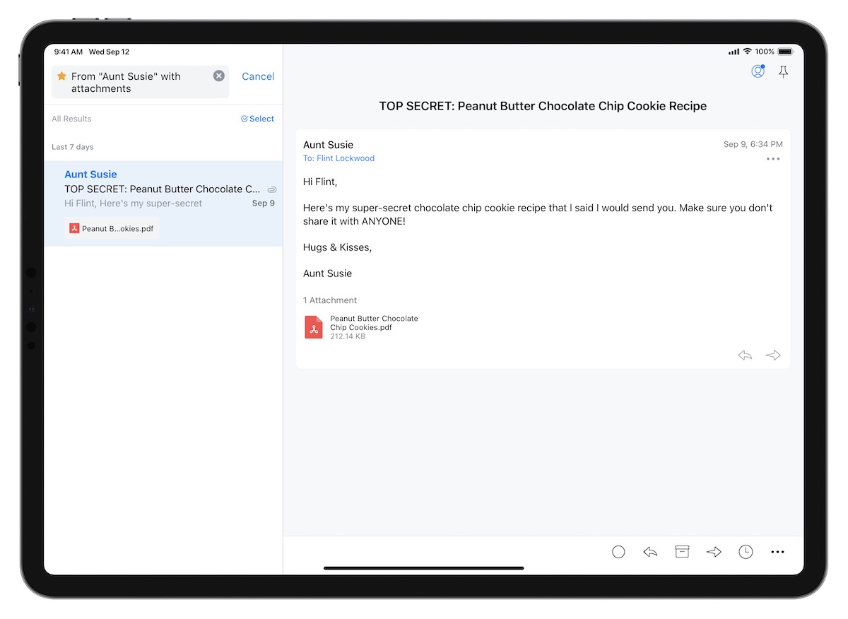
Another incredibly useful feature in Spark is Smart Search. Searching for emails can be an art form, and learning how to combine and use search modifiers together is a worthwhile skill to develop. But thanks to Spark’s natural language search, you can quickly find what you’re looking for even if you know nothing about how to properly structure a proper search query. Just search for something like “Attachment from Aunt Susie,” and Spark will parse the command and apply the modifiers to help you find what you’re looking for. It’s really well done, and makes finding things in Spark easier than just about any other app we tested. You can search links and files as well as the email itself, and can even save searches to reuse them in the future.
Spark also has Snooze functionality, allowing you to snooze email with swipe gestures until you have time to go through them later (i.e. Next Week, Weekend, Later Today, etc.). While we’re not big fans of snoozing email ourselves (we think it’s basically email procrastination), we understand it can be an important part of mobile email workflows and if it’s important to the way you work, then Spark has got you covered.
You can also schedule email to be sent at a later time, which can be helpful when you’re going through email at night or on weekends but you don’t want other people to know you’re available. While we advocate for getting out of your inbox completely in the evening, Spark at least lets you process email without giving other people an invitation to email you after hours by delaying the sending of those emails. Choosing when you want the email to be sent doesn’t require that you be in the app or even have it open — just schedule it, and Spark takes care of the rest.
Dealing with Email Attachments, Files, & Tasks
Another of Spark’s strengths is the built-in integrations and what they allow you to do with the email messages that you send and receive. For example, Spark makes it incredibly easy to save an email as a PDF. While you can technically do this in Apple Mail, it’s needlessly complicated:
- Tap the message you want to save
- Tap the Action button (which actually looks like the reply arrow)
- Scroll down through a huge list of actions (kind of like a junk drawer) and select Print
- Reverse pinch to open the thumbnail image from the Printer Options
- Tap the Share button in the upper right
- Select the app you want to save the PDF to (i.e. Files)
This is insane. Unless you are an iOS ninja, there is absolutely no way you will discover this feature.
Saving to PDF in Spark is so much simpler, this feature alone may be worth the upgrade:
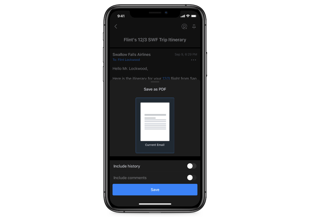
- Tap the three dots in the toolbar
- Select Save as PDF
Spark will 1) save the email message as a PDF file, and then 2) open up the Share Sheet so you can do something with it (like save it to iCloud or Dropbox).
Speaking of files, attachments on iOS can also be a little messy. The Files app makes this a little better, but attaching an image or a document from another application can still be a pain. Spark makes this easy though using the Share Sheet: just send photos or documents from other apps via the Share Sheet, then select Spark from the available options to open up a new email message with the files already attached. And if you prefer, you can still save or attach files from a number of cloud-based storage providers, like Dropbox, Box, iCloud Drive, OneDrive, EverNote, or Google Drive.
Spark also integrates nicely with task managers like Things, OmniFocus, 2Do, Todoist, Asana, Reminders, Trello, MeisterTask, and TickTick. This is perfect for triaging emails that require action. When sending an email to your task manger, Spark opens up your task manager and creates a task with the subject line of the email as the task title. It also provides you a direct link back to the email, making it easy to respond when the time is right to do so. Tapping the link will take you straight to the email message without having to search for it, allowing you to send those emails to your task manager and archive the original messages as you move the todo out of your email inbox.
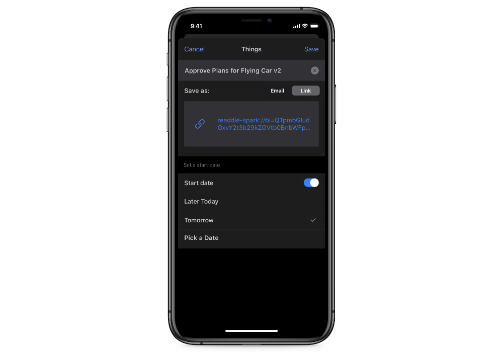
The one downside to this is that Spark uses a proprietary URL, using the spark:// URL scheme instead of the system default message:// URL scheme. This isn’t a huge deal, but it means that when you use this link to respond to the email later the email must be opened in Spark. If you use a different email client on a different device, you won’t be able to access that original email. It’s a minor thing, but since you can change the default email client in iOS 14 I wish Spark would just the use the built-in message:// URL scheme. This would allow more flexibility for people who prefer to try out an app before committing to it.
If you prefer not to use the task manager integration, Spark does offer their own Follow-Up Reminders. This eliminates the need to send an email to a task manager, and can help surface emails that haven’t received a response yet. While this can be useful for keeping the flow going, we still prefer the true task manager integration for emails that require more work than just a simple response.
Customization
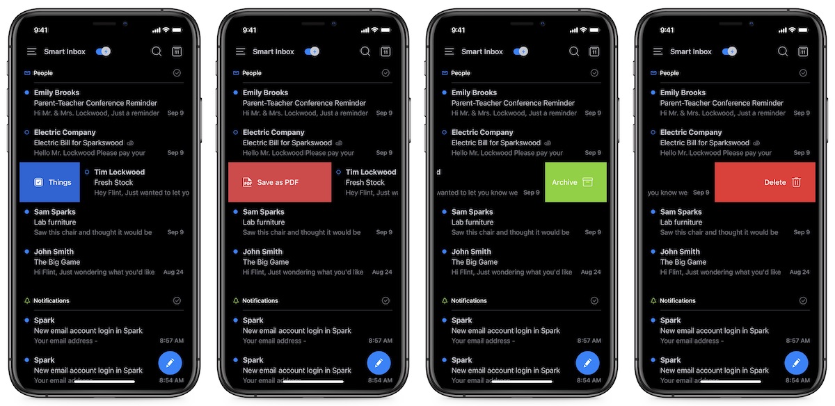
Spark also offers a ton of customization options, including the ability to customize swipe gestures on iPhone and iPad. You can customize both long and short swipes for both left and right swipe gestures, giving you a total of four customizations in all. Available options include built-in actions like Mark Read/Unread and Delete, but also supports the integrations mentioned above (i.e. Send to Things, Save as PDF, etc.). With a little bit of setup work, these customizable swipe gestures can turn Spark into a powerful email triage tool.
You can also customize a good bit of the app itself, like the ability to use light or dark mode. This sounds fairly straightforward, but it’s harder than it sounds for an email app. Many of the marketing emails you receive are actually HTML, so simply turning dark mode on in the app means the message itself may still burn out your retinas by displaying the hard-coded white background color. Spark does a really good job though of formatting emails so that they look good in either light or dark mode, which makes Spark’s dark mode more usable than some of the other apps we tested.
You can also turn on or off avatars (the pictures next to the emails to indicate the sender), compact toolbars, and change the default browser options (using Safari, Chrome, of even Spark’s built-in browser).
Email as a Team Sport
Spark’s pricing model is built on charging for team email features. While the average user won’t need these and can use everything we’ve covered up until this point for free, Spark has done a great job of pioneering some innovative collaborative email features that can be useful for small teams.
For example, instead of paying for help desk software, you can actually use Spark to delegate email to your team. You can assign emails to team members, set deadlines, track progress, and even get notified when the task is closed.
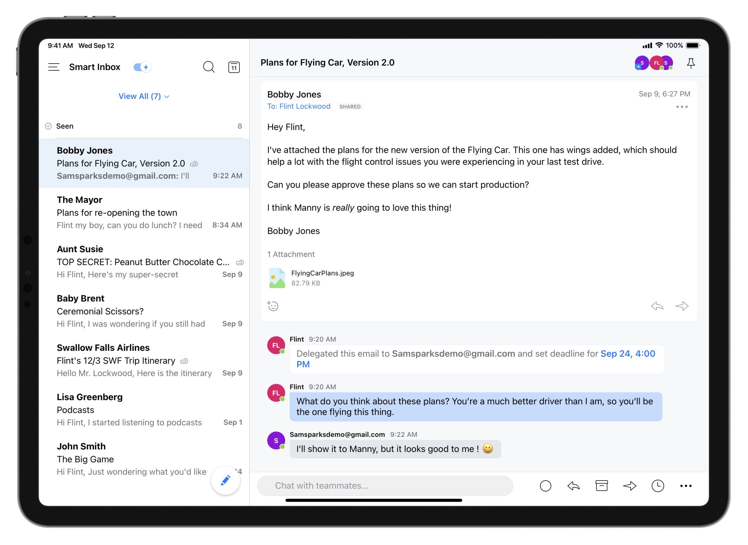
You can also collaborate on email, by inviting teammates to create emails together in real-time. The real-time editor offers a side-chat you can use to talk to colleagues, ask questions and give feedback about the email you’re composing. This can be helpful when writing email reports for clients, proofreading sales pitches, or compiling project updates.
It can also be helpful to share and discuss email. You can discuss specific emails and threads with teammates, and make private comments on an email to add context you need for a better response. This allows you to keep internal and external communications together in one place, and all internal communication is kept private from clients or customers.
The Bottom Line
Even if you never use Spark’s collaboration features, it’s still an incredible email client. Some organizations may have a need team-based email, like when sending a proposal to a potential customer, and Spark gives you the ability to do this from within the email client itself. But for everyone else, it gives you powerful features and a clean user interface to instantly make the time you spend processing email more productive.
Spark also has an interesting pricing model built on its unique team-based features. If you’re going to use Spark for personal use, it’s completely free. The Free version even allows you to get started with the team features, giving you up to 5GB of team file storage, 2 active collaborators (perfect if you work with an assistant), and up to 5 email templates. You can upgrade to the Premium plan for a larger team, which includes 10GB per team member of file storage, unlimited collaborators, unlimited email templates, and even advanced link sharing options. The Premium plan is $7.99 a user per month (or $6.39/user per month if billed annually).
A Great Option for People Who Want Some Instant Calm in Their Inbox: Hey
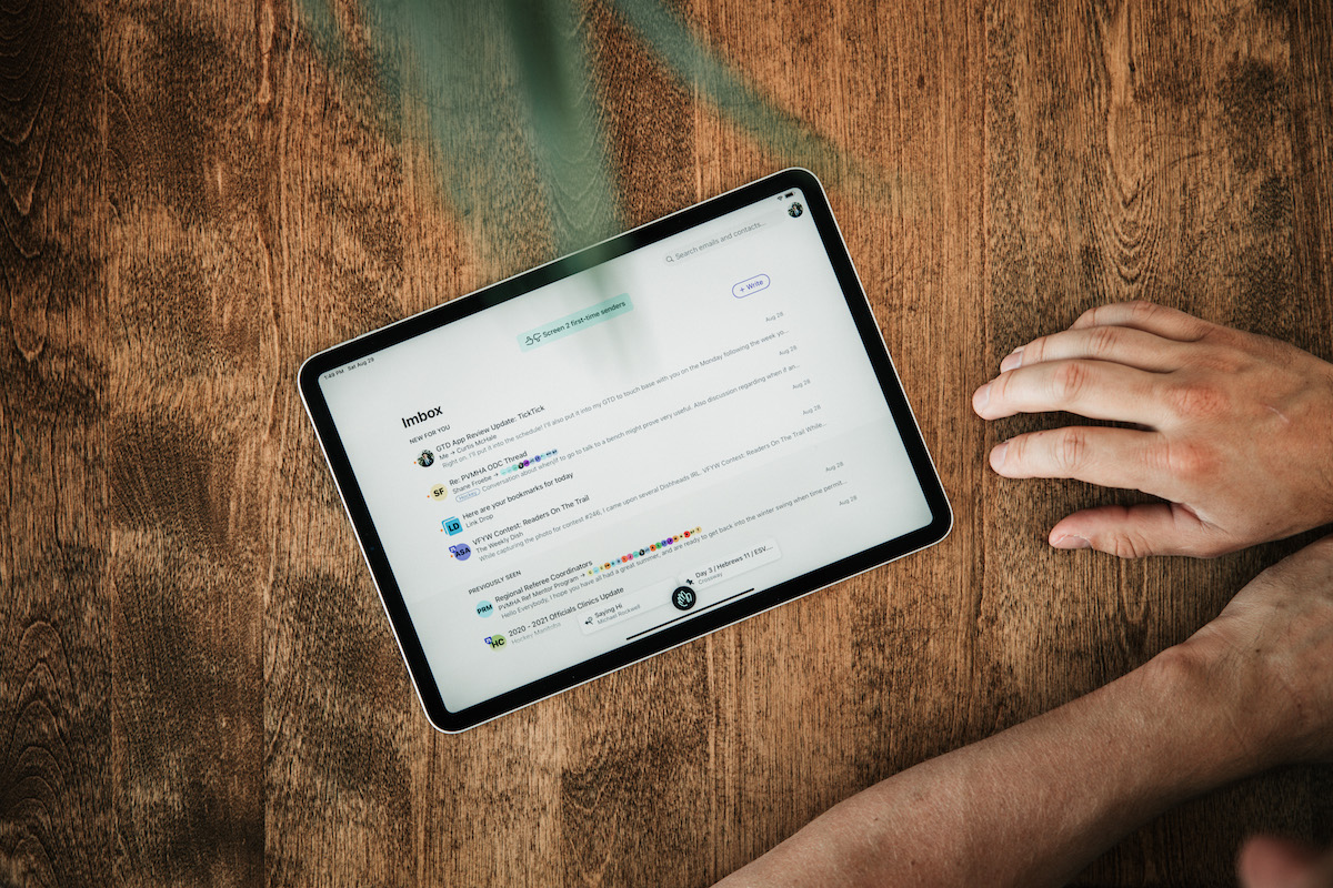
Hey is a new email app from the Basecamp team that made news before WWDC with its public spat with Apple over the rejection of an update that Apple didn’t feel met the terms of the developer agreement. But App Store politics aside, it might just be the biggest evolution of email since the switch from POP to IMAP.
Josh Ginter has shared his experience with Hey here, and there’s a lot to like about this one. If you’re looking for a fresh take on email and don’t mind using a hey.com email address, this might just be for you.
Important + Inbox = Imbox
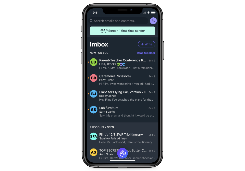
The flagship feature in Hey is the Imbox (no, that’s not a typo). It differs from a traditional inbox by highlighting what’s important. With the Imbox, there is no inbox zero — just messages that are new and messages that have been previously seen.
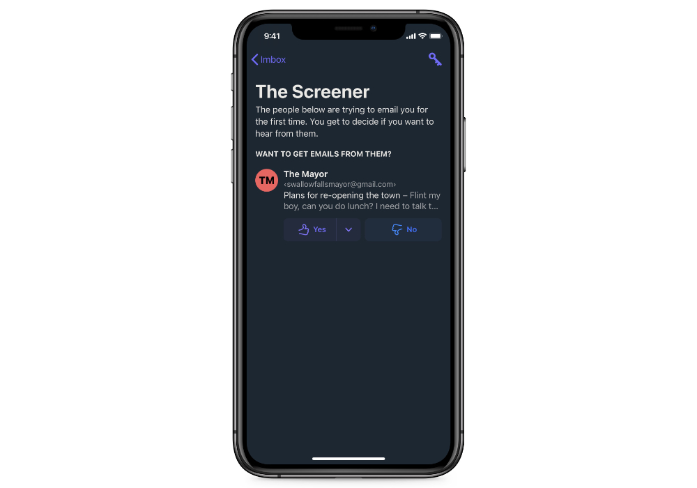
The thing that makes the Imbox work is The Screener. This is a simple tool that forces you to answer the question about whether you want to allow email from a sender into your Imbox. It’s a simple yes or no question, but Hey forces you to answer it about every sender the first time you get an email from them. There are other tools that do similar things in an effort to help you curate your inbox, but Hey does a great job of making you decide and giving you a great interface to do so. The net result is that by forcing you to make the decision to allow something before you see it, a lot of junk doesn’t make it and the messages you receive are ones you want to see.
You also won’t be getting notifications by default. Hey doesn’t send notifications unless you explicitly turn them on for either a sender or a thread. It’s kind of like VIP notifications, except you have turn on the ones that matter instead of silencing the ones that don’t. If you really want to eliminate distractions, this opt-in approach to notification management is pretty brilliant.
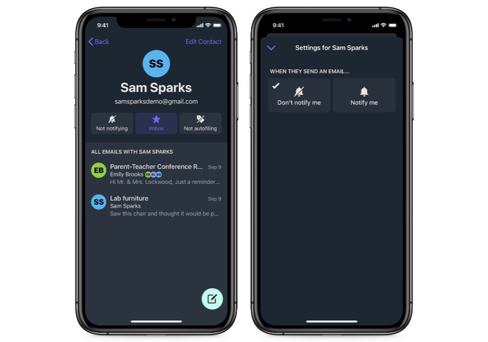
Hey also does a great job of protecting your privacy by blocking trackers and telling you when they’re present in your messages. While there can be good reasons to use trackers in email, in our opinion the majority of them don’t need to be there. By blocking the trackers and telling you when they’re present, Hey is effectively public shaming the people who use them without justification — and we’re just fine with that.
We don’t like the name, but the Imbox is a pretty brilliant approach that solves the problem of accumulating junk as a result of popping in to see what’s new. While we’d still recommend you process the email in your inbox when you see it if possible, if you can’t do that all the time, then Hey does a great job of making your email inbox more calm. If you’re one of those people who currently has thousands of messages sitting in your inbox, Hey will help you immediately feel better about your email situation.
A Fresh Take on Email
In addition to the Imbox, Hey has a bunch of other well-designed features.For example, Hey pulls together all the messages that aren’t important (don’t end up in your Imbox) into something it calls The Feed. Instead of a long list of messages, The Feed is exactly what it sounds like — a social media type feed of emails, organized by date. Each message contains a preview and a See More link, a lot like RSS readers. But there is no read/unread distinction, which eliminates the pressure to read and respond to every single message. This will make some people uncomfortable, but we like it a lot as it forces you to be okay with not being an email completionist.
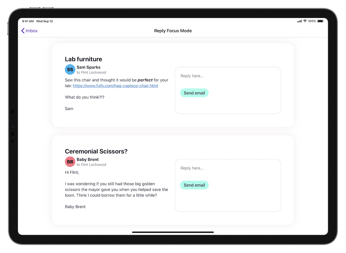
Hey also has a feature called Stacks that allow you to sort messages into piles, like Reply Later and Set Aside. Once you collect emails into Stacks, you can batch process them all at once using a feature called Focus & Reply, which shows you messages from your stack with adjacent quick reply fields.
When using Focus & Reply, you just reply to the message and then move on to the next one. There is no “done” when replying to email, which again will make some people a little nervous and break some traditional email workflows. But that’s kind of the point, and in our opinion this a great way to batch process email.
Finding Things in Hey
If you have trouble finding things in your email client when you need them, Hey has a couple of features that can help.
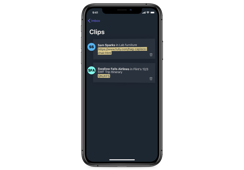
First is Clips, which is kind of like Kindle highlights for your email. Just select a portion of an email message and clip it to easily access it again without having to re-read the entire message. This is a pretty genius feature, and a very handy way to keep tabs on important information that comes to you through email.
File management in Hey is also pretty great, as Hey automatically collects things like receipts and subscriptions into a separate section called the Paper Trail. This is perfect for all those things you want to keep but don’t really need to see, like digital receipts for things purchased online that you might need when it’s time for filing taxes. There’s also a section called All Files that shows you every file you’ve ever received, and you can upload and send files without having to worry about size limitation (Hey will host the file and give the receiver a download link to retrieve it).
The Bottom Line
Hey is a great email app. If you want something simple that will restore balance to the email force, check out Hey. The only real downside is that you have to use a hey.com account, which costs $99/year. It’s completely fair for what you get, but you can’t use other accounts like Gmail or IMAP, and they currently don’t offer custom domains. You can forward email into Hey from another account, but any email you send will come from your hey.com email address. If you’re okay exclusively using their service and don’t rely on integrations with other apps for your email workflow, Hey is a great option.
An Add-On Service Worth Considering: SaneBox
If you want the filtering features of Hey but don’t want to use a hey.com email address, you may want to consider adding SaneBox to your current email service provider.
(Full disclosure: SaneBox has sponsored the site in the past. But we personally pay for and use this service ourselves, and did so long before they ever sponsored the site. It’s a great service and well worth the money in our opinion.)

SaneBox basically takes all your incoming email and looks at the subject, sender, and what you do with it (not the contents of the email), and does a remarkably great job of deciding if it’s something you want to see. If it’s important, it goes to your inbox. If if can wait, it goes to a folder called SaneLater that you can go through whenever you have time. If SaneBox makes a mistake and sends an important email to SaneLater, simply drag it to your inbox and it will go there next time.
The trick with SaneBox is that you have to train it. It doesn’t happen often, but at the beginning SaneBox needs you to help it understand what you want to see and what you don’t. If you just turn it on and don’t make any decisions, it will provide limited benefits.
The brilliance of Hey is that it forces you to make these decisions using the Screener. You won’t get any email until you let it in, whereas SaneBox will take your existing workflow and try to tidy it up. The end result can be the same, but the approach is different.
But SaneBox also gives you a ton of additional features. Here’s just a couple of our favorites:
- Snoozing – this was revolutionary when it was announced with Mailbox back in the day, and has become an essential part of email workflows since. With SaneBox, you can add snoozing to any email account. Just forward messages to a timeframe (i.e. [email protected]) and the email disappears from your inbox. SaneBox will pop it back in at the appropriate time.
- SaneReminders – simply include a timeframe in the BCC field when sending email (i.e. [email protected]) and SaneBox will pop the message back into your inbox if the person hasn’t replied yet (if they have, the reminder simply disappears). This is even better than sending email to your task manager for following up with people because your task manager can’t tell if the person has replied!
- SaneBlackHole – drag a spam message to the SaneBlackHole folder and SaneBox will block all email from that sender without having to click an unsubscribe link.
- SaneDoNotDisturb – lets you pause receiving messages during a specific timeframe. Can be for certain dates (i.e. going on vacation), or regular times throughout the day when you need to focus.
- SaneAttachments – downloads large files to your cloud service provider (i.e. Dropbox, Google Drive, etc.) and inserts a link in the message to download them separately, saving space and speeding up your email client.
- SaneNews – recognizes which emails are newsletters and bundles them together so you can read them later when you have time.
And the best part about SaneBox is that is works with any email app. It’s basically an easy-to-use server-side rule generation tool that helps sort your email before it lands in your email client. If you want a little calm in your inbox but don’t want to completely disrupt your email workflow by switching apps, check out SaneBox. It starts at $59/year, but if you’re going to go all in with it you’ll probably want the Lunch plan which is $99/year and lets you use SaneBox’s features across two different accounts.
Other Apps We Considered
Here are the other iOS email apps we tested for this review. Not every app we tested is listed here, but these are the ones worth mentioning.
Airmail
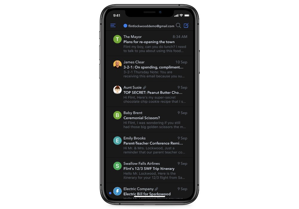
Airmail is actually a really good iOS email client with a ton of customization options. We really liked all of the integration options with other productivity apps (Airmail offered the most of all the apps we tested, and it wasn’t even close). If a particular app is essential to your productivity workflow and you you have trouble finding an email client that supports it, try Airmail. It also offers VIP notifications similar to Apple Mail, and tons of automation and customization options. You can even build your own custom actions — perfect for the iOS power user who really wants to show off everything they can do on their iPhone or iPad. If we had an honorable mention category, Airmail would be the only thing listed.
I admit that I’m biased here, but I frankly don’t trust Airmail. The app in isolation is impressive, but they also have a bit of a history. They’ve had issues where emails failed to send, and while those issues seem to be in the past, they also botched the switch to a subscription pricing model last year. At $9.99/year (or $2.99/month), you get a ton with Airmail Premium and it’s easy to justify the cost. I’m just not comfortable personally trusting them with my email, but if you want something customizable without sacrificing any power, give it a look.
Outlook
Even though long-time Apple fans may be put off by the mention of a Microsoft product, Outlook is actually a pretty decent iOS email app. The swipe gestures are great for triage, and it has a nice feature where you can share meeting times in the app and even create calendar events directly from emails (which may or may not be important to you). You can even open Microsoft Office files and edit them from within the app.
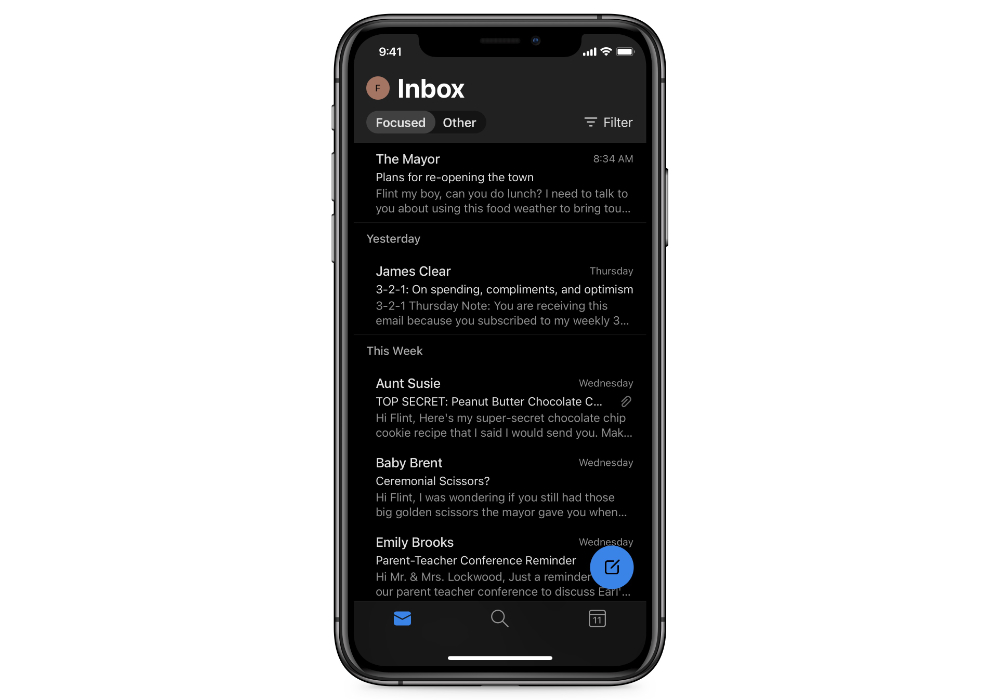
While Outlook does support other account types, it really shines with an Office 365 subscription. If you use Office 365 and want to make the most of it, Outlook is for you. But for everyone else who uses a non-Microsoft email provider, we like Spark better because of its customization options and integration with other productivity apps.
Gmail
For a long time, the Gmail iOS app has been the best way to make the most of your Google email account on an iOS device. We were pleasantly surprised during our tests to see the support for other email account types and addition of features like a unified inbox, scheduled sending of messages, and even snoozing email.
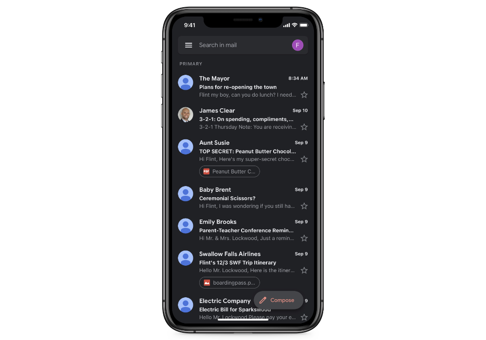
Unfortunately, there are disclaimers that pop up with these features saying that your email provider may or may not support them. So while the app is a great free option for Google users, your milage may vary depending on your provider and we hesitate to recommend this for everyone. It also doesn’t offer nearly as much customization options as either Spark or Airmail, and doesn’t integrate with other productivity apps.
Yahoo Mail
Yahoo Mail is another app that has come a long way over the years. It offers one-tap unsubscribing from newsletters you don’t want to receive anymore, and a bunch of views that can be useful, like Travel View (which displays all your flight information in one spot) and Deals view (which shows offers that are about to expire). You also get 1 TB of storage so you never have to worry about running out of room.
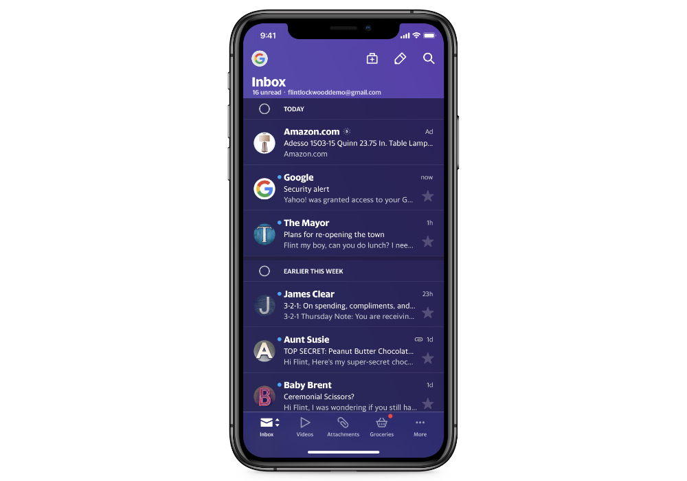
One thing Yahoo Mail has that none of the other apps we tested did was ads. The ads are annoying, appearing at the top of your inbox like messages. Yahoo Mail Pro removes the ads and gives you priority support for $9.99/year, but it still doesn’t match what Spark gives you for free. It also only supports a couple of account types (Yahoo, Google, AOL, and AT&T). If you’re willing to spend $10/year, you can get a lot more from Airmail.
Canary
Canary is an interesting iOS email app. Unlike many of the apps we tested, it doesn’t try to do a bunch of things — it just does a couple, but it does them really well. It’s a very privacy-focused email client, offering full end-to-end encryption of all email messages using PGP. If you’re worried about prying eyes spying on the email you send and receive, that alone is reason to check out Canary. It also offers a nice (and simple) user interface with swipe gestures that feel a lot like the ones in Apple Mail, and gives you the ability to unsubscribe from email lists with a single tap.
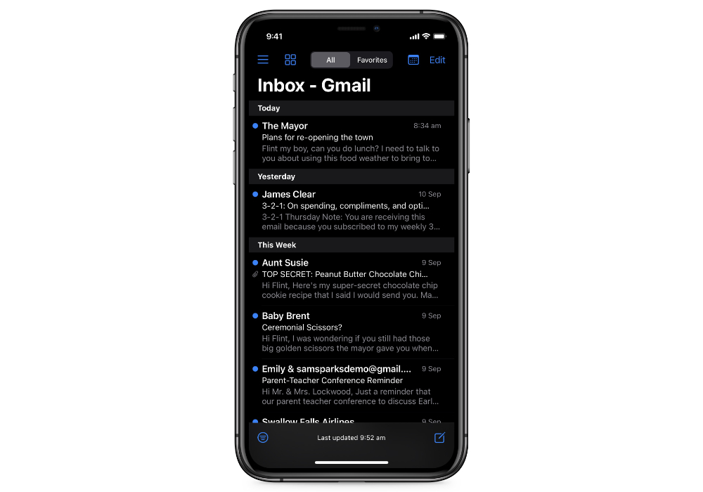
It’s purely our opinion, but we just don’t think Canary is the best option from a productivity standpoint. It doesn’t offer a lot of customization, doesn’t integrate with other productivity apps, and lacks features like Spark’s Smart Inbox to help keep your inbox calm. But if privacy is your thing and you like the feel of Apple Mail, give Canary a look. It’s a one-time cost of $9.99 on the iOS App Store (the Mac version is also available via SetApp).
Chuck
The website for Chuck touts it as “the fastest way to clean up your inbox,” and that may be true. Chuck is an interesting app that shows messages in your inbox as cards or stacks, allowing you to quickly select a bunch of messages at once so that you can archive or remove messages in bulk. Chuck Pro ($3.99/month or $39.99/year) gives you even more tools to clean up a messy inbox, and the app is very well-designed.
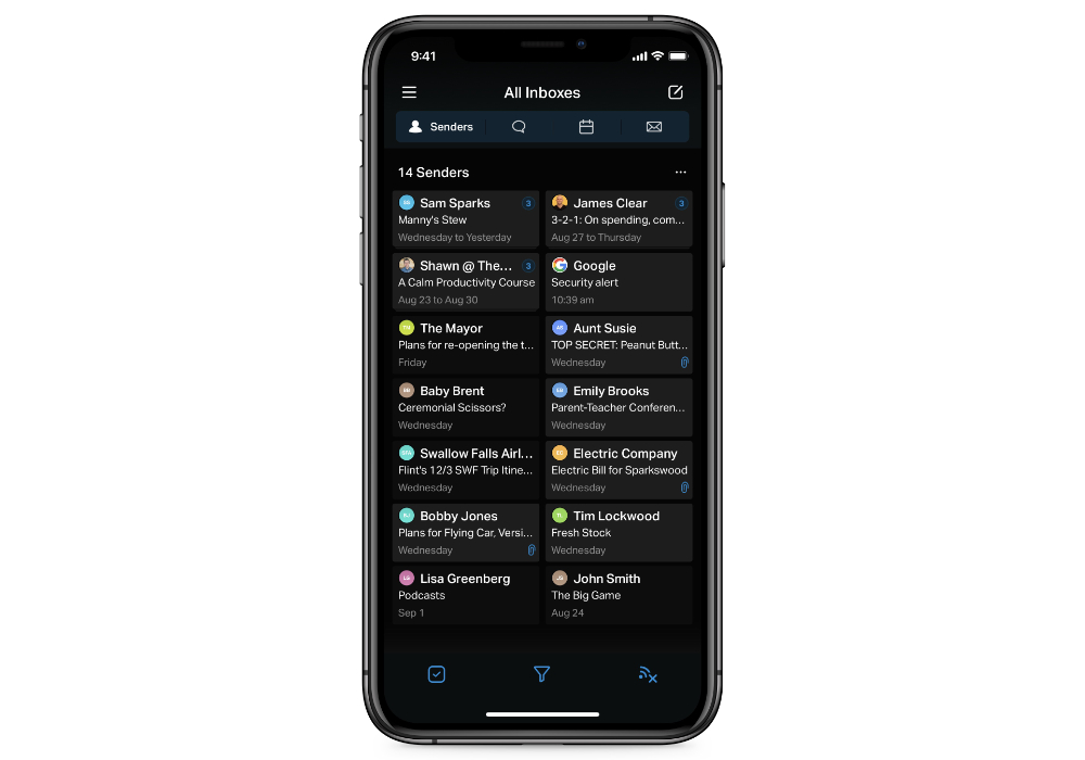
In our opinion though, Chuck is very specialized in its approach to email and is missing several of the productivity features present in the other apps we tested. Call it a difference of opinion (it’s not you Chuck, it’s us), but we think there are better options available.
Newton
Newton is a premium email app designed for efficiency. At $49/year it’s still expensive, but not nearly as expensive as other apps like Superhuman (or even Hey). It does have some nice features, like Recap, which automatically brings back conversations that are waiting for your reply or that need following up. It also surfaces messages with due dates and reminders so that nothing slips through the cracks.
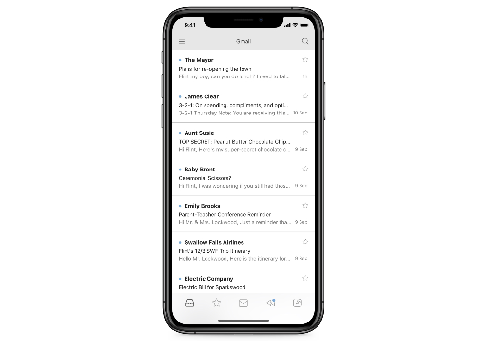
One of Newton’s flagship features is read receipts, which a couple other apps (like Hey) specifically try to block. It’s fine if read receipts are important to your email workflow, but in our opinion they’re kind of creepy. Newton also integrates with other general productivity apps like Asana and Todoist, but not the ones we use and recommend here at The Sweet Setup (like Things or OmniFocus). In our opinion, Spark fits better for most Apple user productivity workflows. And if you’re willing to spend some serious coin on an app to try and solve your email problem, we still think Hey is better.
Spike
Like Hey, Spike is another effort to revolutionize email by combining all the pieces of your entire workflow into your inbox. The goal is to make email more conversational and prioritize the people by giving you email, chat, notes, tasks, calendars, and video calls in a single app.
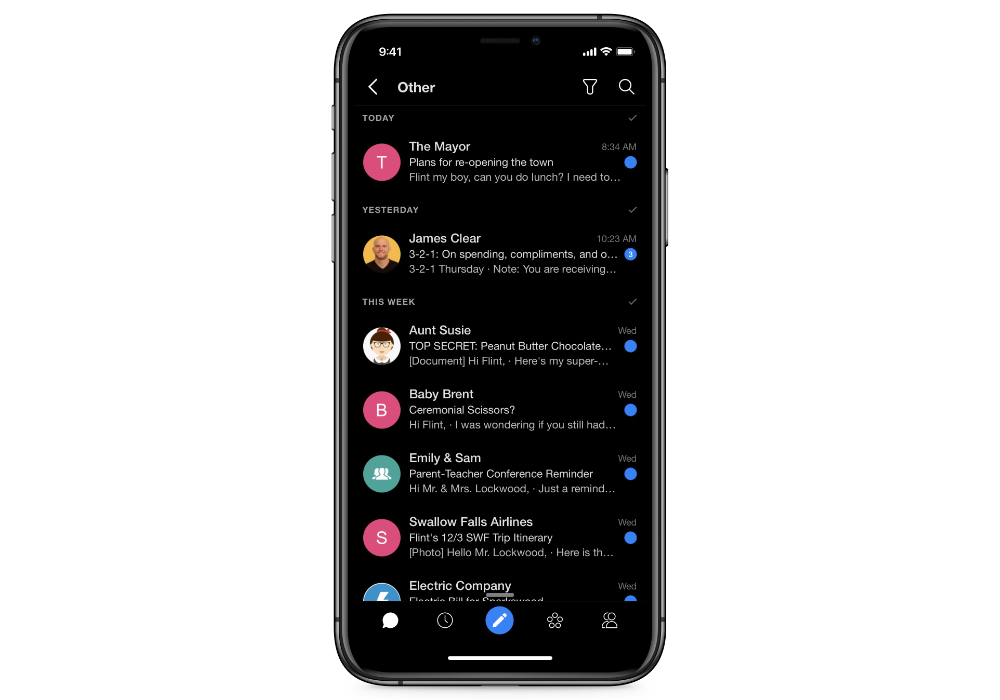
If that sounds like a lot, we agree. There’s pieces of Spike that show promise, but in our opinion it’s just trying to do too much. By trying to turn email into something it’s not, it feels cumbersome. We can’t recommend this one.
Superhuman
There’s some cool features in Superhuman, and I know people who swear by the $30/month email service. The snippets are handy when creating email, and A.I. Triage is helpful for sorting things and keeping your inbox clean – but with a little training, we think you could get similar results (and more features) with a much less expensive SaneBox subscription instead.
Edison Mail
Edison Mail was already on our bad list for scraping users’ inboxes to sell the data to their clients. But then in May of this year, they shipped a bug that gave iOS users access to email accounts that didn’t belong to them. This is completely unacceptable. Stay away from this one.
Conclusion
-
We think Spark is the best email app for most people. It works with a bunch of different account types, and it strikes a great balance between powerful features and a clean user interface. It has a bunch of customization options and integrates with other productivity apps, has a clear (and fair) business model, and offers innovative features for teams that need to collaborate on email.
-
If you want a simple solution that includes a beautiful rethinking of how email works, check out Hey. It requires a proprietary email account from hey.com, but allows the app to do some really cool things with email that are impossible with standard IMAP accounts. It costs $99/year, but will provide instant calm to any inbox.
-
If you don’t want to switch email clients but wish your email could do a little more to help you see what’s important and hide what’s not, check out SaneBox. It works alongside your email service provider to add email superpowers to whatever email client you deice to use.
Bonus Quiz
We have put together this simple quiz that will help you find the ideal email app for your needs. Simply answer the questions and get your recommendation right away. And then, if you want to get a free video that we have made specifically for your recommended email app, then you’ll have the option to enter in your email at the end so we can send the video to you.

