The Best App for Editing Photos on the iPad
Lightroom for iPad
There is a journey every photographer walks through.
The first step involves realizing you want to take better photos than what your iPhone can provide. This leads to intense research on the latest camera technologies and the latest photo editing apps. Then, after acquiring the lust-worthy gear, after working with the camera for a few years, and after working through every photo editing app available, the pure craft of photography takes over.
In essence, the end game of the photography experience is just the craft itself. Not kit, not apps, not locations — just the craft.
Fortunately, there are apps for every step along that journey. No matter where you find yourself in your budding photography hobby — or brimming photography career — there’s an app for you that will meet and exceed your needs.
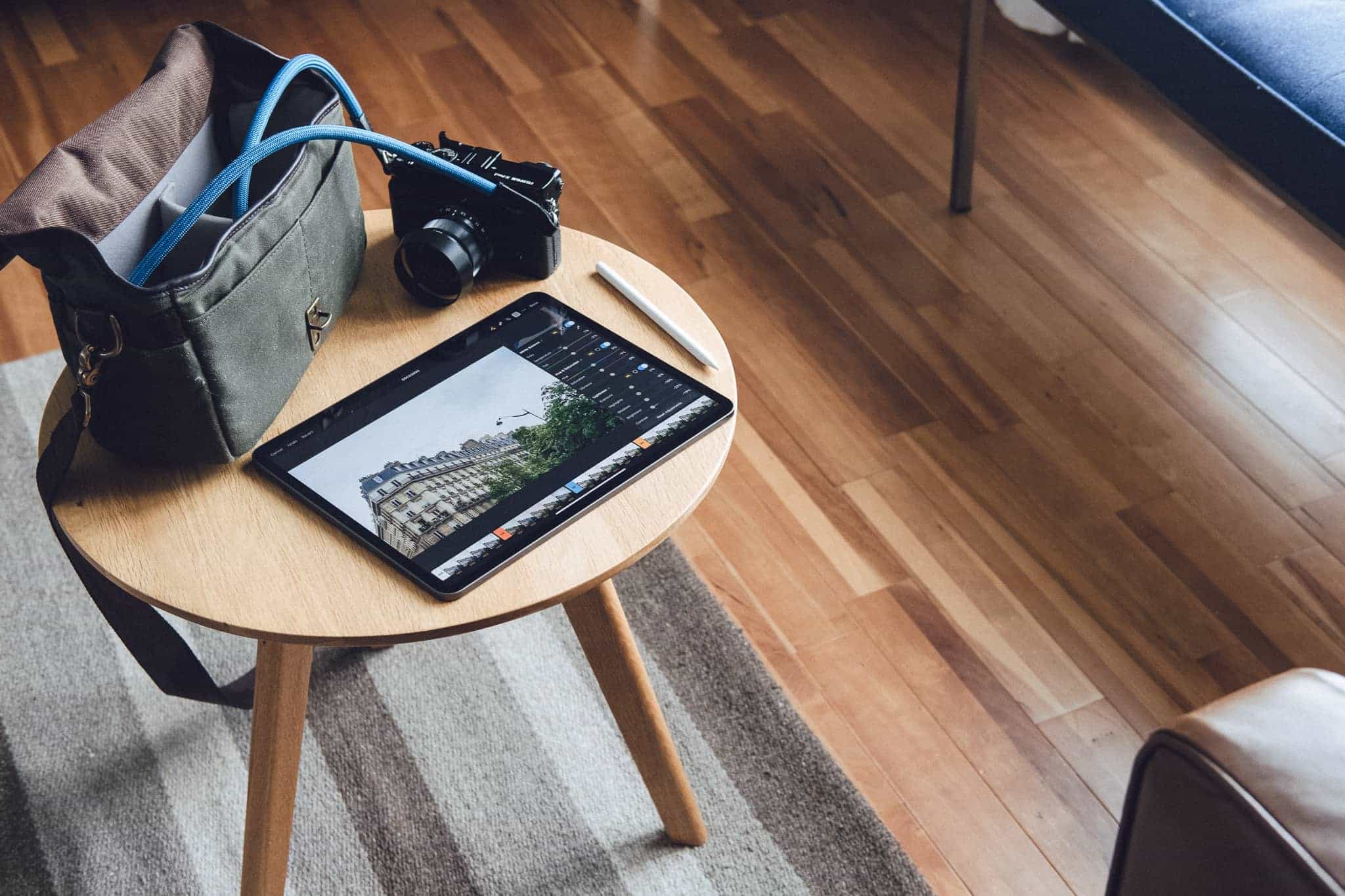
We’ve already named Adobe Lightroom the best photo editing app for the Mac and Darkroom the best photo editing app for the iPhone, but with how the iPad Pro has grown as a photo editing device over the last two years, it only seems natural to choose an app specifically for the iPad as well.
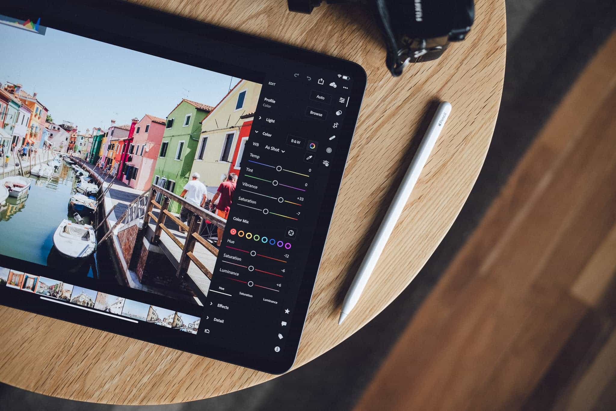
We believe Adobe Lightroom for iPad is the best photo editing app on the platform. Lightroom is that end game photo editing app — the one that experienced photographers turn to after years of experience mastering their craft.
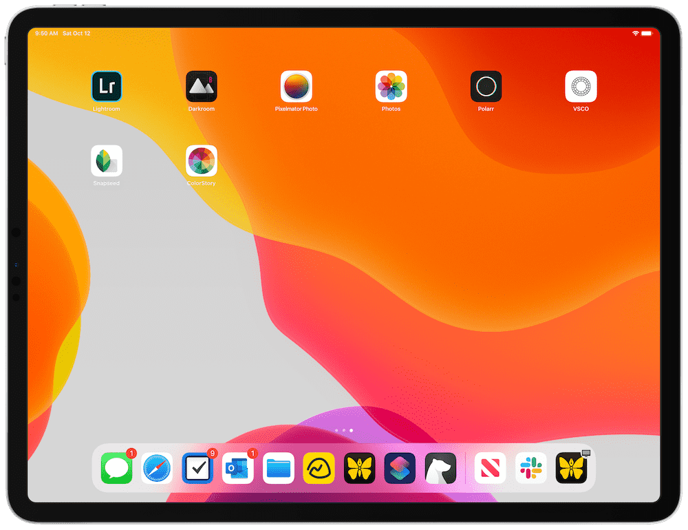
In all likelihood, that photo editing journey begins with Apple’s latest Photos app — completely overhauled for iOS 13 with a very strong array of tools — and morphs through apps like Darkroom, Pixelmator Photo, VSCO, Snapseed, A Color Story, and more. Each of these apps are strong contenders and will find a passionate user-base of their own.
Darkroom in particular (our runner-up selection) takes advantage of all of iOS 13’s latest features, including multi-window support, the ability to edit the foreground and background of Portrait Mode photos, and even includes Siri Shortcuts support. We don’t believe Darkroom will be an experienced photographer’s end game photo editing app, but we wouldn’t be surprised at all if this is the app iPhone photographers gravitate to in the long run.
As it stands, Lightroom continues to be the best package of editing tools, cloud storage, customizable presets, and price available on the market today. Lightroom is one of the most widely loved photo editing apps in the world, and that same love transfers to Lightroom for iPad in a big way.
What the Experts Are Saying
This is a big category with both a skilled and opinionated working base. All sorts of individuals have their own needs and preferences, so we figured it’d be best to reach out to some of our favorite photographers to better understand their thoughts on the best photo editing app for the iPad.
Om Malik, founder and former senior writer for GigaOM, has one of our favorite photography blogs on the web right now. Malik:
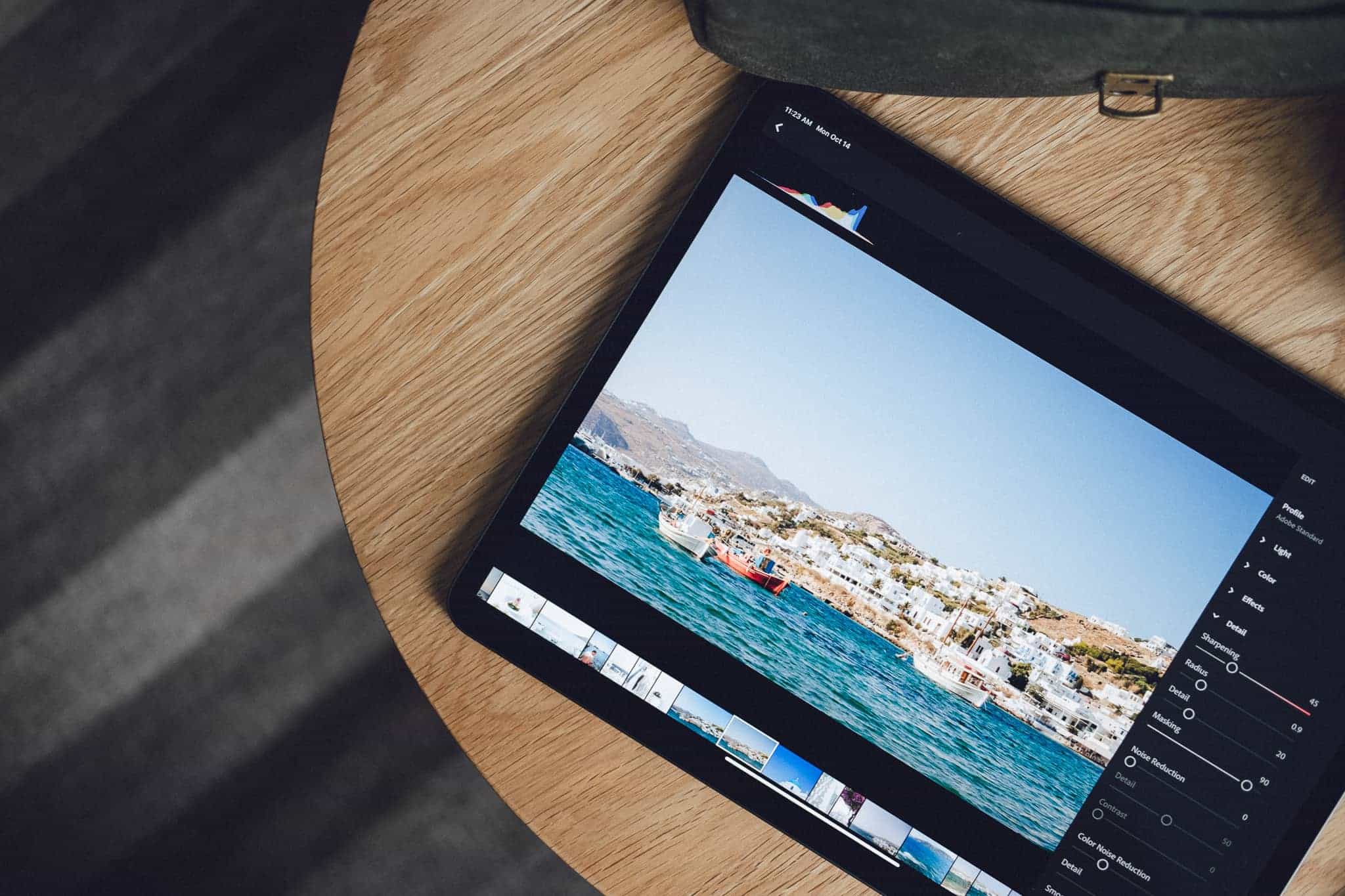
My go-to photo editing app now is Lightroom CC on the iPad. It allows me easy storage/backup, and it has very good and fast editing features. I have now been able to use it to basically rank, sort and clean up my photos in the field and not have to wait to come home and deal with everything. I love editing with the Apple Pencil as it allows me to do highly localized edits that feel more natural. For RAW on iPad, Lightroom CC wins hands down for me. On the iPhone however, I prefer to use Darkroom for my iPhone related work.
Erin Brooks, a photography contributor here at The Sweet Setup, but also a photographer who has shot campaigns for the biggest brands (including Apple), had this to say:
I like Lightroom Mobile best on my iPad because it provides the most options, freedom, and because I can use my Pencil for tons of control. It’s great that I can tweak and make small adjustments to my photos, as well as create and save presets.
And Marius Masalar, another major contributor here at The Sweet Setup, but also a photographer, videographer, (and musician) who works with big companies in Toronto, Canada, chimed in:
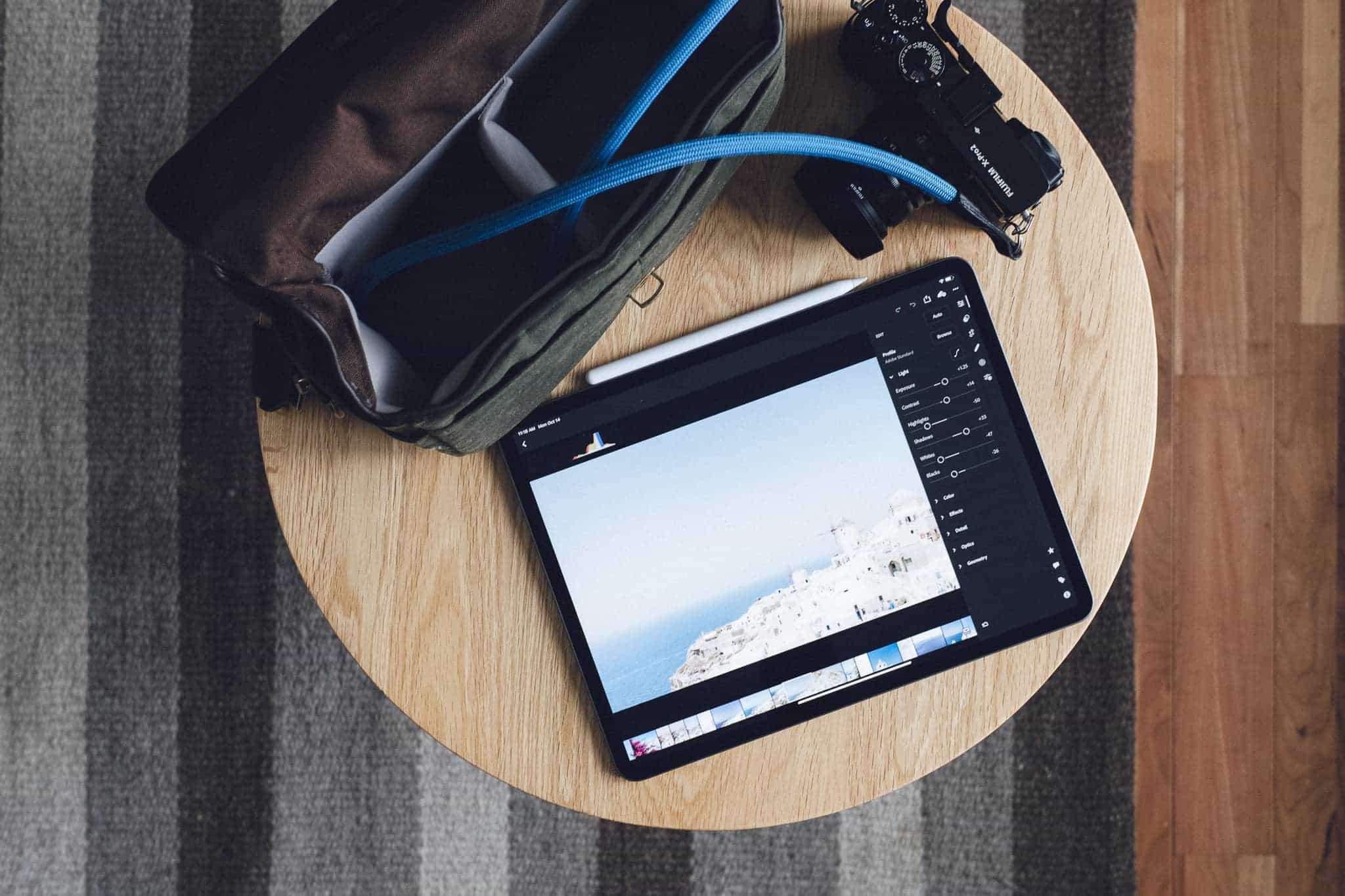
It’s tempting to think of Lightroom CC for iPad as a companion to the desktop app, but it’s grown beyond that. Pencil support makes editing on iPad even better than on a desktop in many cases, and the ability to access your entire library, along with your presets, from anywhere in the world feels decidedly more flexible than the way I used to work. Adobe has been aggressively filling in any functionality gaps and taking advantage of new iOS capabilities, elevating the entire experience. With Photoshop for iOS waiting in the wings, the iPad is becoming a photo editing powerhouse for photographers on the go.
How We Chose
The iPad and the Mac are far from identical in terms of photo editing apps, but they both suffer from the same lingo issue. The term photo editor describes two very different types of apps. Some photo editors, like Lightroom, have digital asset management (DAM) features, walking photographers from import to editing and through to exporting, and include library management features for storing and organizing your photos.
Other apps, like Pixelmator (the regular Pixelmator, not Pixelmator Photo) are standalone photo editing apps, in that they shed the ability to manage your photo library and provide more expansive editing (think, manipulating) tools. So in an app like Lightroom, you can lighten or darken the sky around your subject. But in an app like Pixelmator, you can cut that sky completely out of your image, add another layer from a completely different sky file, and have a completely different sky than what was shot.
This review will focus on the first set of “photo editors” — or those with digital asset management features.
Criteria
Photography is an especially personal journey, and every person’s criteria for the best photo editing app will differ. Some may focus on the specific editing tools — like the ability to merge photos or HDR-related editing tools — while others may prioritize presets, exporting, and Instagram-ready features like hashtag support. Here are the criteria we’ve used to make our pick:
-
Features and editing tools: What good is a photo editing app that doesn’t have a proper set of editing tools? Generally speaking, the more tools an app provides, the more tools a photographer can use to shape the photo to their vision.
What we found interesting, in the context of the iPad Pro, is how much the apps in our contending list differ in this section. Some include direct Apple Pencil support for making selective or brush edits, while others don’t have the ability to make selective edits at all.
-
Design and ease of use: Something many iPad photo editing apps fall prey to is the use of unmarked glyphs prevalent across the iOS design language. In the world of iPad user interfaces, a “paintbrush” can mean a wide variety of things, and having a “paintbrush” differ from one app to the next will inevitably lead to headaches and lost time in the early days of testing.
It’s important for the best photo editing app to present editing tools and controls in a way that not only feels natural to use, but feels natural to use on an iPad. This can mean how tools are laid out for two-handed landscape use (with navigational and tool buttons on each side of the display), and how specific tools look (like, say, a histogram).
-
Ecosystem: The photography journey is a path well-traveled by many, many skilled individuals. Those individuals have laid an enormous foundation of guides, tutorials, presets, courses, and overall general knowledge for each individual photo editing app to keep newbies entertained for months on end.
In the context of this review, “ecosystem” is generally going to refer to guides and tutorials you can find on YouTube to better help you understand the app, as well as the volume of preset packages available.
-
iOS feature support: This is an iPad-specific app review, and thus it’s important that the best photo editing app take advantage of as many of the latest iOS features as possible. Apps that support features like multiple windows, Split View, Siri Shortcuts, iCloud Photo Library, and the ability to import photos directly from an SD card are more than likely going to catch our eye.
Unfortunately, this direct iOS feature support has the tendency to work against cross-platform apps. Apps that are available on the Mac, iPad, and iPhone — and specifically cross-platform apps vying for feature parity — may tend to take longer to adopt the latest iOS technologies or may opt to jettison those technologies altogether. The best photo editing app for the iPad should at least have some support for iOS’s latest features.
-
Price and cost structure: We’ve never been shy to recommend software that costs money. That being said, we’re well aware of subscription overload — there is a finite amount of money in our pockets, and we’re all working to spend it (or save it) as wisely as possible.
If you’re going to invest in your photography habit, we expect the best photo editing app to provide good value. Photography isn’t exactly an inexpensive hobby, so the price threshold in this criteria can be quite high. If you’re looking to save a few bucks, a few contenders even opt for one-time purchases to keep you from shelling out more money each month.
Adobe Lightroom is the Best Photo Editing App for the iPad
In naming Lightroom the best photo editing app for the iPad, we’re assuming a few things:
- Your journey has led you to purchase a dedicated camera — be it point-and-shoot, mirrorless, or DSLR — and you’ve moved away from shooting with just an iPhone (I was going to say “beyond an iPhone”, but the iPhone’s camera quality is so great these days, it’s more of a tool choice than necessity).
- You have either already moved through the journey of testing a whole range of apps, or you want to skip over the testing entirely.
- You have more goals than just photo editing.
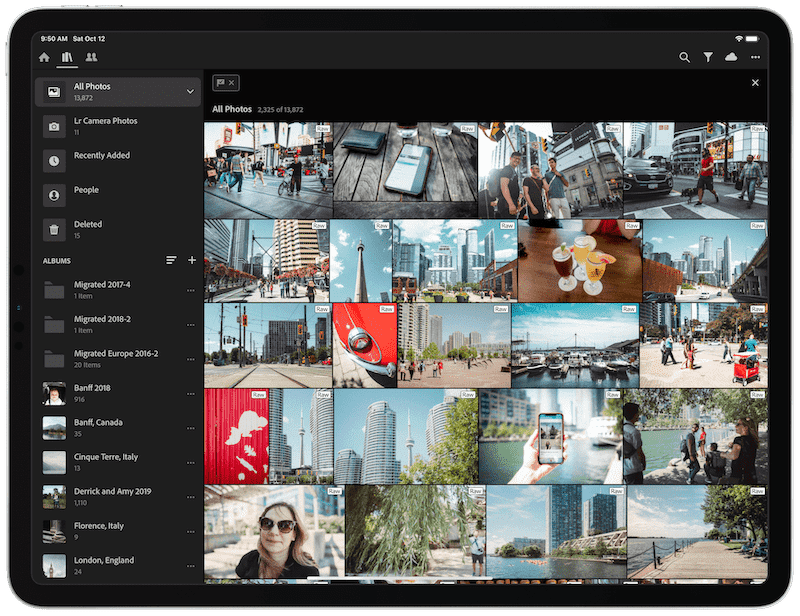
Adobe Lightroom for iPad excels in all of our criteria above:
- Lightroom has a vast array of editing tools, from HSL and curve tools, through to selective, radial, and graduated filters that can be applied with an Apple Pencil. These latter features (selective/radial/graduated filters) are surprisingly hard to find in iPad photo editing apps.
- Lightroom opts to use words to help navigate tools and sliders rather than glyphs. Further, if you are coming from the Mac or the iPhone, the same design language in Lightroom for any other platform is the same as it is on the iPad.
- Lightroom’s ecosystem is second-to-none. From tutorials and guides on YouTube to the incredible third-party preset market, Lightroom has enough external material to keep the inspiration flowing for years and years.
- Lightroom doesn’t lead the pack in terms of supporting the latest iOS features, but Lightroom has the best Apple Pencil support of any photo editing app we tested.
- Lightroom is one of the more expensive options in this review and comes with a variety of subscription plans for your choosing. However, for the price, Lightroom provides an ample amount of cloud storage (the $9.99/month plan offers 1TB of cloud storage), cross-platform support with near-feature-parity apps on the Mac and iPhone, and access to other Adobe Creative Cloud apps like Portfolio.
Features and Editing Tools
When Adobe first debuted Lightroom CC — which is the cloud-based photo editing app that launched as a counterpart to the more traditional Lightroom Classic CC — the number of core features missing was a bit disappointing. Since its debut, Adobe has updated Lightroom CC at a lightning pace, introducing features like synced presets and synced profiles to speed up the mobile editing process. There are still a few features missing from the traditional Mac version of Lightroom Classic CC, but the list is short.
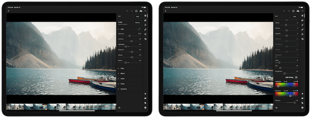
Standard editing tools like exposure, contrast, white balance adjustments, curves, HSL, detail, and more are all available in Lightroom for the iPad. Those who are looking for more powerful edits like split toning and color mixing will also be happy, as not only are these tools present on the iPad, they always work identically to Lightroom on other platforms.
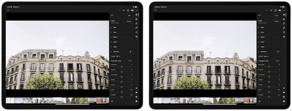
Even geometry editing features are available in Lightroom for iPad — if you have some distortion on a wide angle photo or you weren’t able to nail straight vertical lines when passing by a building, you can use Lightroom’s Upright geometry feature to quickly correct (or provide guidelines to correct) the angles in your photo. These geometry features, alongside lens correction profiles, are two of the first edits I do on every photo in Lightroom.
Lightroom’s crop and rotate editing features are fairly standard and provide the standard range of pre-defined aspect ratios. Unfortunately, the straighten tool doesn’t have an automatic setting like it does on the Mac app.
What sets Lightroom apart from the rest of the competition are the healing and selective brush editing tools, made even better thanks to high-end Apple Pencil support. Lightroom for iPad has a general healing brush, allowing you to correct maladies in your photograph by softening or by cloning the pixels around an area of a photo. You can apply this healing brush with the Apple Pencil, and it works entirely as expected — draw over an area of the photo and Lightroom will first mask the area you’re intending to heal and then showcase which pixels it will draw from to heal (or clone) your selected spot.

This is even more powerful with the selective brush editing tools in Lightroom for iPad. Want to dodge a specific person or subject in your photo, but want to leave the rest of the photograph as is? Grab your Apple Pencil, hit the “+” button in the top left corner of the screen, select the Paintbrush, and color over the area of your photograph you’d like to lighten. Lightroom will again provide a mask over the area you’re intending to edit. Once you have the area you want to edit selected, you can play with a variety of light, color, effects, details, and optics tools to set that area of the photograph just right.
The same can be done with graduated filters (where your edits are made strongest in one area and gradually subside across your selected area) and radial filters (where your edits are strongest at the center of your selected area and subside away from middle point).
These selective features are less common in competing apps — and lag further behind when competing apps do adopt them — and truly punctuate Lightroom’s position at the top of this category.
Lightroom’s discovery features take advantage of Adobe’s Sensei cloud intelligence, which is designed to intelligently search across your entire Lightroom library without you having to manually keyword each photograph. Simply typing the word “slide” in Lightroom’s search bar yielded five photos I took of my daughter at the park one spring evening. Only one photo was flagged, two were edited, and all the photos contained a slide. I’ve been extremely impressed with Adobe’s Sensei technology, even if the yielded results are organized in no particular order.
There are, however, some missing features, at least when comparing Lightroom on the iPad to Lightroom on the Mac. Marius Masalar’s note in our Lightroom for Mac review holds true here:
Lightroom CC has no Print module or proofing tools, no Map module or support for geotags, no tethering support, no HDR or panorama merging, limited batch editing, limited keyword support, no smart collections (there are only “albums”), no face recognition, no file renaming, no adjustment history, JPG-only export (and only in the sRGB color space), and support for a single catalog only (you can’t create multiple catalogs like you can in Classic CC).
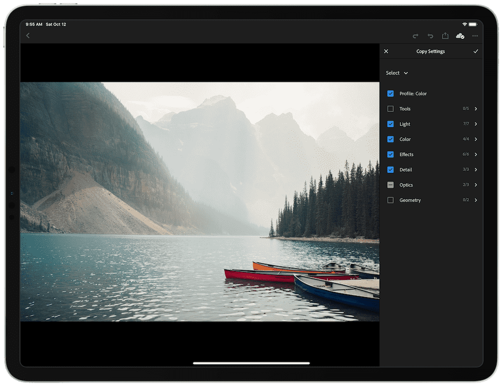
Many of the missing features mentioned by Marius above hold true today — Lightroom CC for the iPad does not have a Print module or proofing tools, no Map module or support for geotags, no tethering support, no HDR or panorama merging, limited keyword support, no smart collections (there are only “albums”), no face recognition, no file renaming, and no adjustment history.
However, since we first published this review, Lightroom CC has introduced a variety of previously missing features. You can now batch edit multiple photos across Lightroom CC. To do so, simply copy the settings of one photograph, navigate back to your main library view, select the photos you want to apply the edit to, and hit Paste on the bottom navigational row. Keep in mind, though, that batch editing in this iteration of Lightroom CC is a “destructive process,” in that once you apply the edit across a batch of photos, you cannot revert those photos back to their original settings.
One of my original complaints with Lightroom CC for the iPad was a lack of defringing tools. Of course, after a little patience, Adobe debuted these selective defringing tools in Lightroom CC for the iPad, eliminating the need to do some fancy color work to get everything to work.
Finally, Lightroom CC for iPad has also adopted better exporting features since we first published this review. You can now choose Export As at the bottom of the sharing menu to choose a variety of export settings. You can also choose where to save your photos (either to your Camera Roll or to the Files app).
We believe the currently missing features inside Lightroom on the iPad are made up for thanks to the high value in Lightroom’s standard monthly subscription price, its synced presets and overall ecosystem, and its top-notch Apple Pencil support for selective edits. Batch editing is a legitimate must-have feature that’s currently missing, but major editing tools like HDR or panorama merging are best suited for a desktop editor.
Design and Ease of Use
Lightroom for the iPad has the exact same design language as Lightroom on the Mac and Lightroom Mobile for the iPhone, which is to say it’s relatively easy to pick up, understand, and implement with only a little bit of practice.
One specific area where Lightroom excels beyond the competition is in its navigational elements. Symbols are used to denote different modules on the right side of the iPad UI, but the remainder of the editing tools and sliders are all showcased in written English. This is a stark difference to other photo editing apps on the iPad, where your guess is as good as mine as to what all the different navigational and tool symbols mean.
There are a few head-scratchers in terms of user experience in Lightroom on the iPad, however. Some fundamental gestures are completely hidden and very hard to find in Lightroom’s iPad UI. A two-finger tap on the image will toggle the overlaid metadata with the photo’s histogram. A swipe up in the rating module (denoted by a star in the bottom right corner of the display) will mark the photo as picked, while a downward swipe will mark the photo as rejected.
Other operational methods of the app could use a touch of polish as well. It’s not immediately clear how to both create a selective edit (you have to hit the “+” button first in the top left corner to create a selective/graduated/radial filter, then color over your selected area, then edit the area with the sliders on the right) and how to edit a selected area after you’ve completed your edits (you have to actually tap the little dot on your photograph, which denotes the very start of your selective edit area). These operational methods are identical between Lightroom on the Mac and on the iPhone, but for brand new users with no experience using any version of Lightroom, this is bound to be a little challenging.
Although we prefer the way Lightroom denotes its navigational elements with words rather than symbols, the app has a few areas that could be a little more user friendly (or perhaps new-user friendly).
Ecosystem
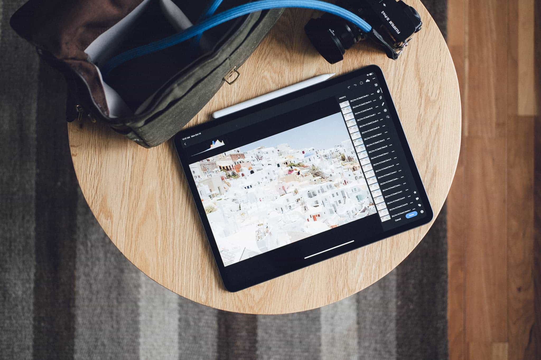
Lightroom’s ecosystem is by far the greatest ecosystem in this review — it may even be the biggest ecosystem of any creative app on iOS. There are hundreds — thousands — of tutorials and guides on YouTube for how to get more out of Lightroom. And since Lightroom has near feature-parity across multiple platforms, guides that pertain to Lightroom CC on the Mac are mostly going to pertain to Lightroom on the iPad as well.
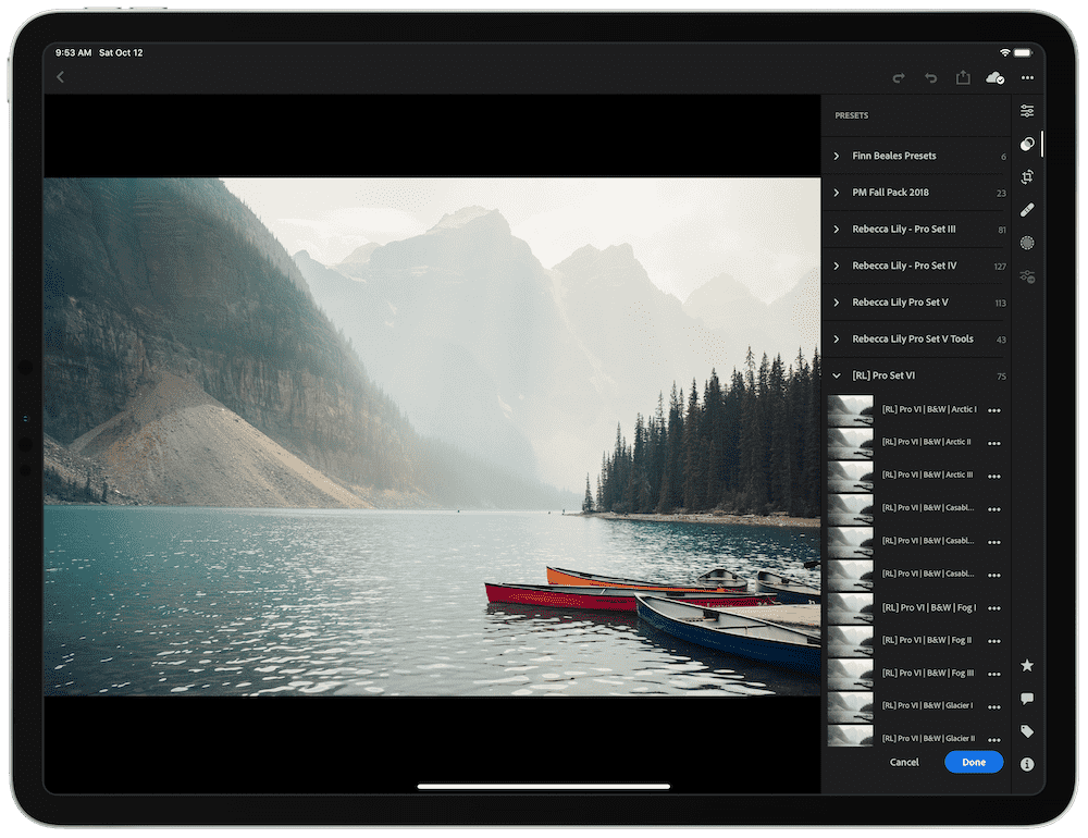
This ecosystem is most noticeable in terms of the sheer wealth of third-party presets available for Lightroom. Masters of their craft — like Rebecca Patience, who creates the Rebecca Lily Pro Set packages, or like Peter McKinnon, who has some killer preset packages with some bold looks — have preset packs available for purchase that can be imported and synced to Lightroom on the iPad to speed up the editing process. You can find preset packs all over the web, from individuals who struck it big in Hollywood to boots-on-the-ground wedding photographers who have a special look.
While tutorials and guides are available to be consumed on the iPad, synced presets have one major shortcoming: third-party preset packs must be imported in Lightroom CC on the Mac and synced over to Lightroom on the iPad via your Adobe Creative Cloud account. Once you have your presets imported in Lightroom on the Mac, they automatically show up in Lightroom on the iPad. But for those who are trying to cut the Mac cord out of their editing life, Lightroom on the iPad hasn’t been fully weened off its desktop counterpart.
iOS Feature Support
Of all the main criteria, major iOS feature support — or perhaps, rather, the speed at which Lightroom adopts iOS’s latest technologies — can be a bit lacking. While Lightroom on the iPad has the best Apple Pencil support of any contender in this review, there are a few glaring iOS feature omissions that will have some users pointing to Darkroom as the front-runner.
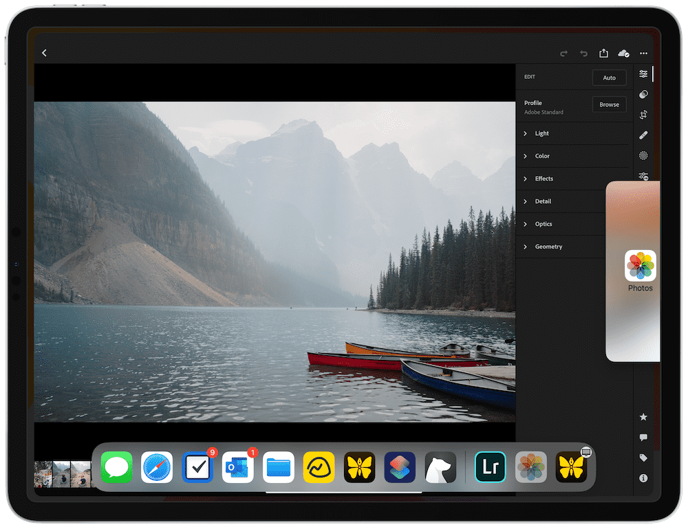
For instance, Lightroom for iPad doesn’t have Split View support — an iOS feature that debuted years ago. You cannot have Lightroom open in Split View, nor can the app be open in Slide Over. iOS 13’s multiple window support is also missing in Lightroom for iPad. In essence, there is one Lightroom window open on your iPad, and that’s it.
Other contenders have adopted Siri Shortcuts support (beyond merely importing into Lightroom), or direct iCloud Photo Library and Files integration to allow you to maintain one photograph library rather than two. Other contenders have features designed specifically for editing iPhone photos — Portrait and Depth photos, which have a foreground and a background, and don’t have special editing features inside Lightroom for iPad.
Lastly, as of the time of writing, Lightroom CC for the iPad doesn’t have deep cursor support. If you’re using your iPad like a laptop with a Magic Keyboard or external trackpad, you’ll notice the pointer flying around the screen and you can use the pointer to control all the tools and navigational elements of the app. However, trackpad gesture support doesn’t really exist at this point — if you want to swipe between photos with two fingers while in the editing view, you’ll have to instead click, hold, and drag the photo right or left to navigate through your library.
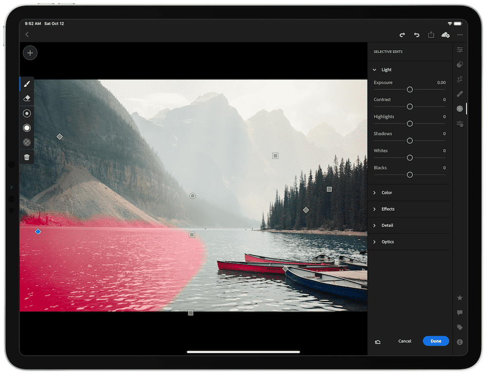
The saving grace for Lightroom on the iPad — at least under this criteria — is the app’s high-end Apple Pencil support. No other contender utilizes the Apple Pencil to the same extent as Lightroom for iPad. This is surprising because the notion of using the Pencil to “paint” your edits on your photographic art seems very, very natural, and we’re surprised more contenders aren’t pushing for more advanced Apple Pencil support in their apps.
The overall lack of immediate iOS feature support begs one important discussion: Adobe Lightroom is the best photo editing app for non-iPhone photos. All the elements that computational photography brings to the iPhone’s table yearn for an app that’s designed and/or dedicated to editing iPhone photos. As mentioned at the top, this review assumes a photographer has gone through the journey of researching different cameras and tools and inevitably ending up with a specific dedicated camera. Lightroom is the best photo editing app on the iPad for dedicated cameras, while Darkroom is the best photo editing app on the iPad for editing iPhone photos thanks to Darkroom’s incredible iOS feature support.
Price and Cost Structure
Adobe’s Creative Cloud subscription covers a broad web of applications, tiers, and packages. If you need to use any of Adobe’s apps, there will be a Creative Cloud package with your name on it (and a price to match).
For photographers, there are two plans, each with their own specific tiers:
- The Lightroom Plan: Includes Lightroom and 1TB of cloud storage for US$9.99/month.
- The Photography Plan: Includes Lightroom, 20GB of cloud storage, Lightroom Classic (available only for Mac) and Photoshop (not yet available for iPad) for US$9.99/month.
- The In-App Premium Plan: Includes Lightroom for iPad only, 100GB of cloud storage, and premium tools (like selective edits and RAW editing) in the iPad app only for US$4.99/month. Note this plan is only available as an in-app purchase in the Lightroom for iPad app — this plan isn’t even mentioned on Adobe’s own site.
The “Photography Plan” has a second tier that pushes cloud storage to 1TB and includes all of Adobe’s photography apps for US$19.99/month.
The Lightroom and Photography plans also include access to Adobe’s Portfolio app (among other apps), which is a great option for showcasing your best photographic work in a portfolio-styled website. Simply purchase your own domain name, point it to your Adobe Portfolio webpage, and you have a professional-looking portfolio for all to browse.
Should you need additional cloud storage, the Lightroom and Photography plans can be boosted up to 10TB of cloud storage for extra money each month. The Lightroom plan, for instance, jumps to US$20.99/month for 2TB of cloud storage, US$52.49/month for 5TB of cloud storage, and US$104.99/month for 10TB of cloud storage.
We believe the most valuable subscription available is the 1TB of cloud storage in the Lightroom Plan. For iPad photo editors, neither Photoshop or Lightroom Classic provide any value, so for US$9.99/month, you gain access to all the tools Lightroom provides as well as a staggering 1TB of cloud storage. The US$4.99/month Premium plan is a great option to get started, but it’s amazing how quickly you can burn through 100GB of cloud storage when working with 25MB RAW photos.
This is another area where Lightroom for the iPad really pulls away from the competition. Apps like Darkroom and Pixelmator Photo dig directly into your iCloud Photo Library, where you can subscribe to one of Apple’s plans and store your photo library in the cloud as well. Under Apple’s plan, you can purchase a 2TB cloud storage plan for the same US$9.99/month, but that plan is eaten up by all apps that utilize iCloud storage. Depending on the size of your device backups and document library, that 2TB storage plan could drop in size quickly.
Secondly, Adobe’s subscriptions unlock Lightroom on all platforms, including Lightroom on the web. Yes, should you need to edit photos from your browser, Lightroom has a web version that is perfect for accessing your library from anywhere, and even allows you to make the edits you need on-the-go.
Adobe’s Lightroom subscription is the most expensive option in this review, but it provides the most value of any photo editing app available on the iPad today.
Our Runner-Up Pick for the Best Photo Editor for iPad: Darkroom
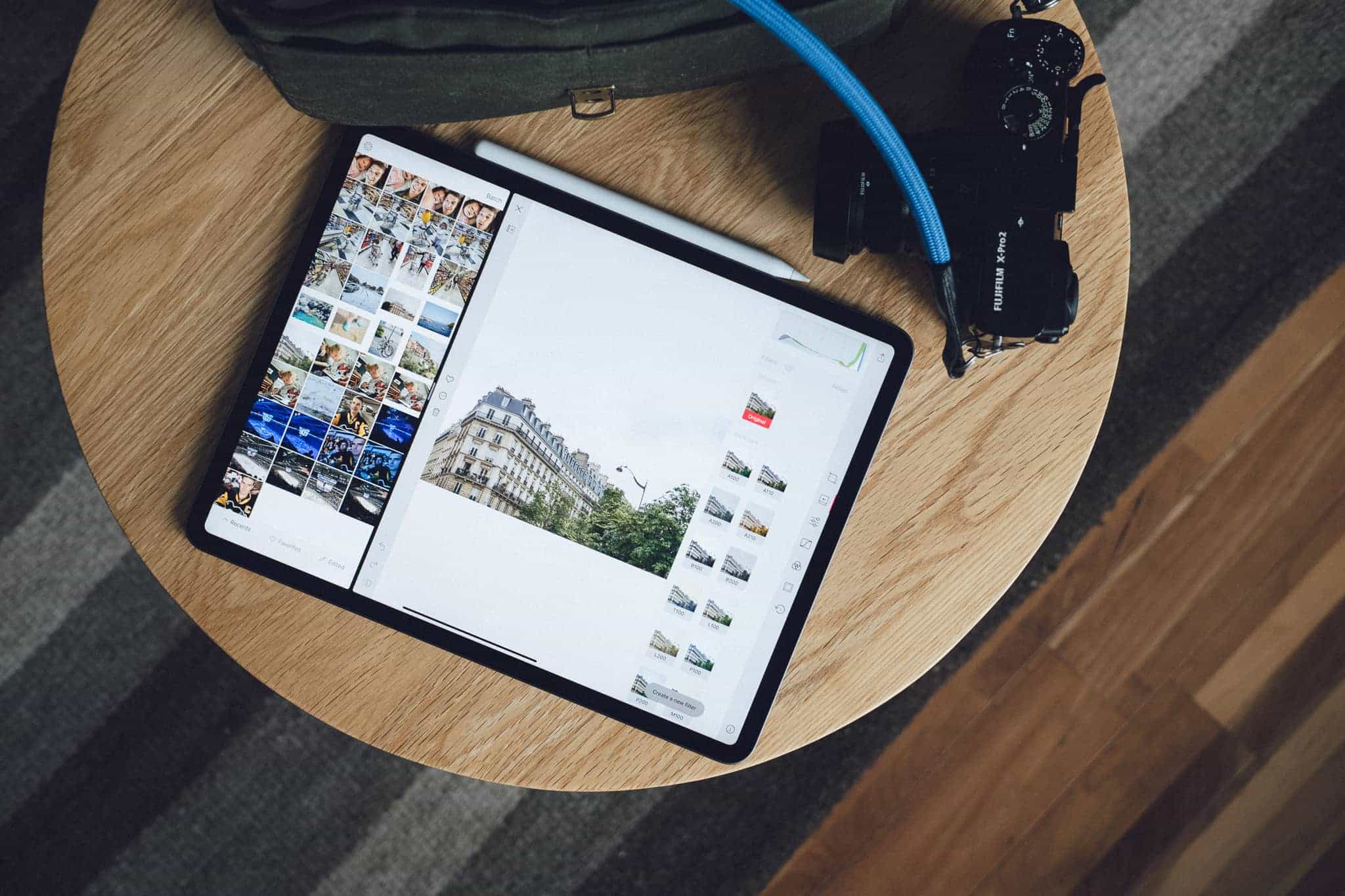
Darkroom for iPad didn’t even exist 12 months ago, but there may not be an app on the App Store that has seen such incredible growth and development ever since. Darkroom for iPad has blossomed into a full-fledged iPad photo editor and, in many ways, excels beyond Adobe Lightroom’s capabilities.
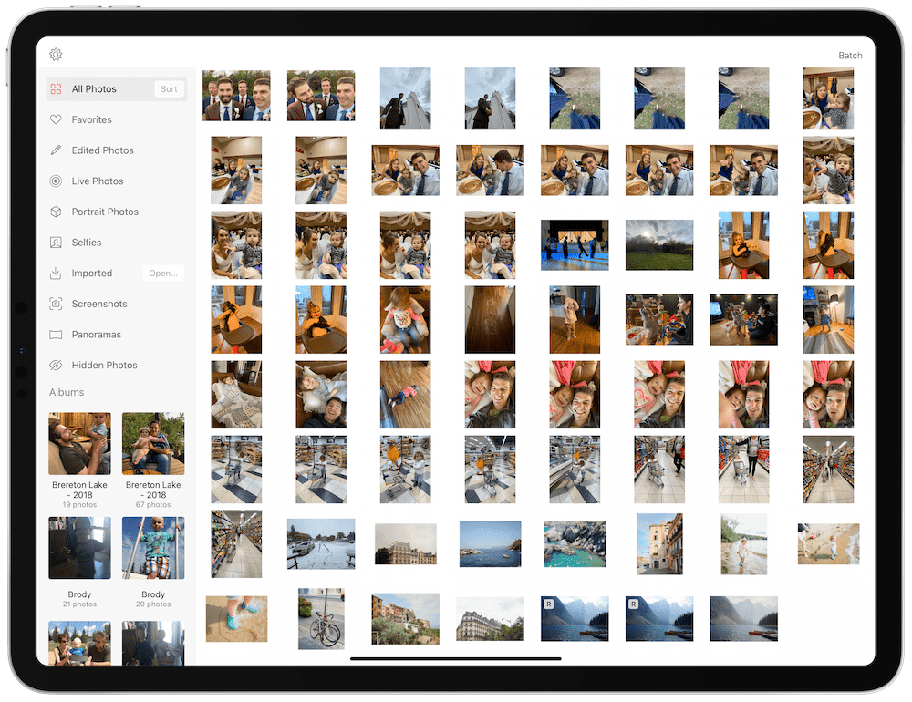
In fact, this entire review came down to the wire between Darkroom and Lightroom. As far as our criteria goes, Darkroom measures in neck-and-neck with Lightroom, thanks to Darkroom’s expedient adoption of iOS technologies, its super-affordable price, its array of editing tools, and its easy-to-use design. If Darkroom had a more vast ecosystem and more third-party assets available to expand the app’s capabilities, Darkroom would explode to the top of our list.
Features and Editing Tools
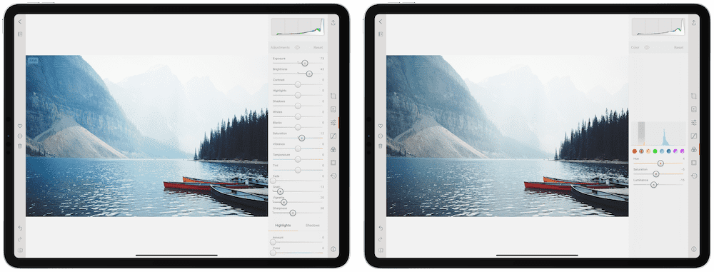
Darkroom on the iPad replicates all the same tools found in Darkroom for iPhone, which is to say that Darkroom is a well-rounded app with nearly all the editing tools you’d ever need.
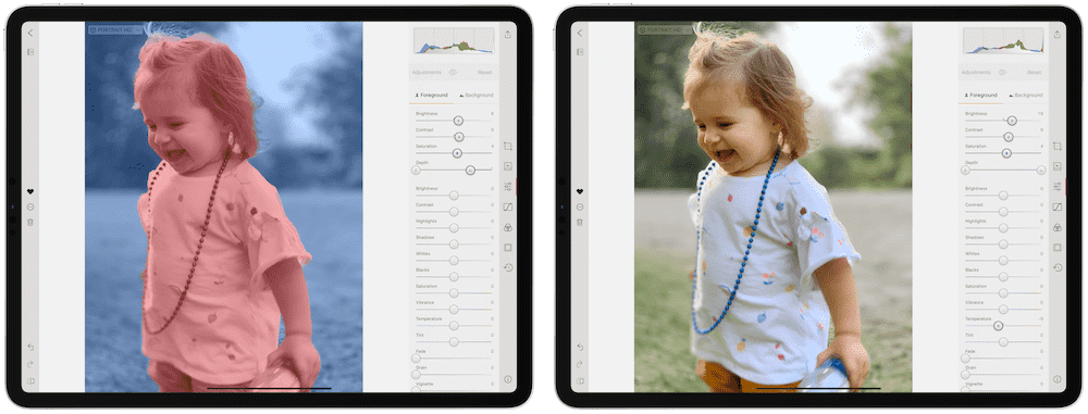
There are a few editing tools in Darkroom that aren’t in Lightroom, specifically in regards to iPhone photo edits. If you’re looking to edit a Portrait Mode photo shot with an iPhone, Darkroom should be your editing app of choice — you can split your edits between the foreground and background, allowing you to more specifically apply your edits.
Portrait Mode photos also benefit from Portrait-specific presets built into Darkroom. These presets apply a different and complementary set of edits to the foreground and background, helping to speed up your Portrait edits and keep everything balanced.
The latest updates from Darkroom allow you to use all the app’s editing tools on your videos as well. If you have a favorite preset or a favorite way to edit your imagery, Darkroom makes it as easy to edit your videos as it does to edit your photos.
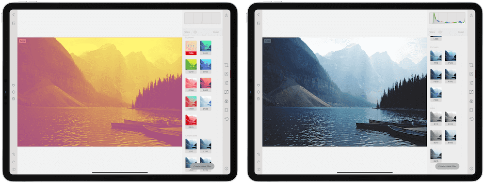
The remainder of Darkroom’s presets are a little lackluster — we only find Darkroom’s “Landscape” and “X-Pro” presets worthwhile, with the remainder feeling overdone or overblown.
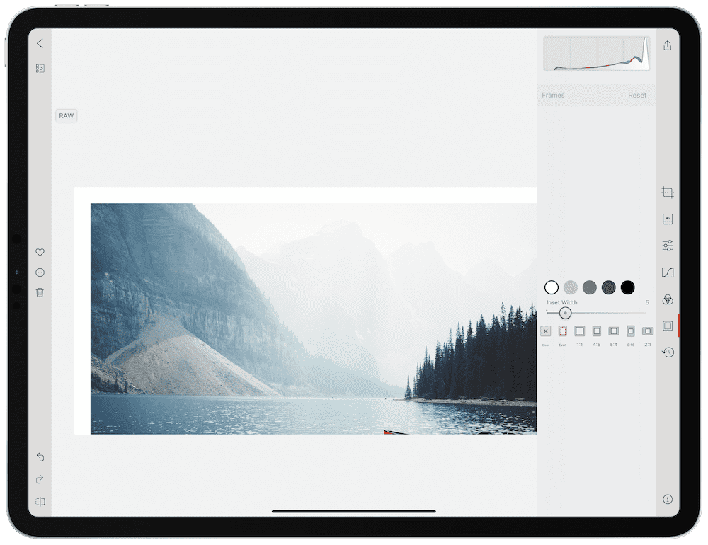
Darkroom feels built for iOS devices, in that it takes the photo editing workflow beyond edit and export. You can export your photos with an inset border, like you see by many photographers on Instagram. Further, Darkroom can act as a repository for your Instagram hashtag sets — simply copy your saved hashtags in Darkroom before heading over to Instagram to share your photo.
A major omission in Darkroom are selective, graduated, and radial filters. All sliders and edits are applied to the entire photo (unless you’re editing Portrait photos with a foreground and background). This omission is more common than it is rare in the iPad photo editor category, so Darkroom isn’t necessarily behind the competition — Lightroom just has Darkroom beat in this area.
Design and Ease of Use
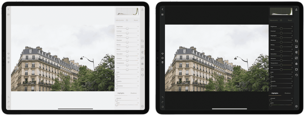
Darkroom is a dream to look at, especially now with the release of the iOS 13 design. Darkroom has always had an easy-on-the-eyes dark mode, utilizing deep greys and comfortable tones to both bring out the color of your photographs and to be gentle on your eyes at night, but with iOS 13, Darkroom adopted a light mode — including a light app icon — to take advantage of the new system default features.
Darkroom greatly excels in its iPad UI, in that controls are comfortably placed at the edge of the screen where your thumbs are situated when holding the device. Tap any module on the right to expand the slider bar and love, delete, or export with the buttons on the left.
Darkroom’s histogram is also a sight to behold. The histogram sits at the top of the tool slider bar and adjusts as you make edits. There’s something particularly alluring about the look and feel of Darkroom’s histogram. In many ways, this histogram is the epitome of the design differences between Darkroom and Lightroom.
Ecosystem
This is the major area where Darkroom falls short in the race for the best photo editor for iPad. Darkroom is a relatively new app — at least in comparison to Lightroom. The iPad app has only been around for 10 or 11 months, and there just isn’t the same ecosystem depth available for Darkroom users.
For me, this is most noticeable in terms of third-party presets to purchase. In fact, there isn’t a way to import third-party presets into Darkroom — you can create your own custom presets, but you can’t import them into the app. The Darkroom team has hinted at improving how presets are shared, saved, and imported in the future, but as of the time of writing, these latest features are not included.
From tutorials and guides through to importable and synced presets, Lightroom for iPad has the entire competition beat. Darkroom can’t measure up here.
iOS Feature Support
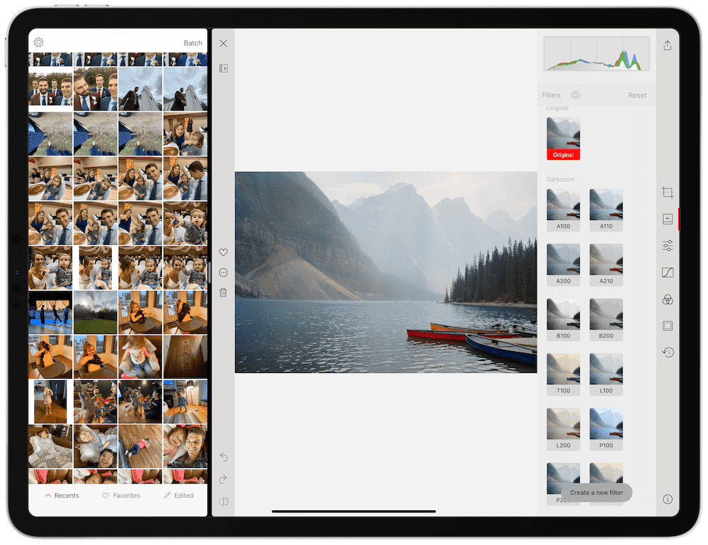
I’ll take a deep breath after the last paragraph, as Darkroom completely flips the competition on its head with its quick adoption of the latest iOS technologies. Like the ability to edit the foreground and background of a Portrait Mode photo, Darkroom has a few other iOS tricks up its sleeve that few other apps replicate.
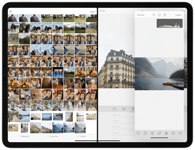
Darkroom quickly adopted multi-window support with the launch of iOS 13. You can grab a photo in your library and drag it to the opposite side of the display, opening up the photo and your photo library in Split View. Multi-window support opens up different types of workflows that only Darkroom can provide.
Darkroom has also adopted Siri Shortcuts. You can have Darkroom edit a set of chosen photos with a pre-defined (or chosen from a list) preset, put an inset border around the photograph, and prepare the photo for export, all via Shortcuts.
Darkroom has support for iPadOS 13.4’s new cursor and trackpad support. You’ll notice your pointer morph into navigational buttons as you move around the app, and unlike Lightroom, you can navigate through your photos while in the editing view by swiping with two fingers. This is a major improvement over having to click, hold, and drag the photo to navigate.
And Darkroom’s deep integration with iCloud Photo Library means you don’t have to duplicate your photo library in Darkroom — you can make direct, non-destructive edits to all your photos in your camera roll, and the edits are synced via iCloud Photo Library in a jiff. This can all be done on raw photographs as well.
Lastly, Darkroom’s iPad keyboard shortcuts are the best of any app in this review.
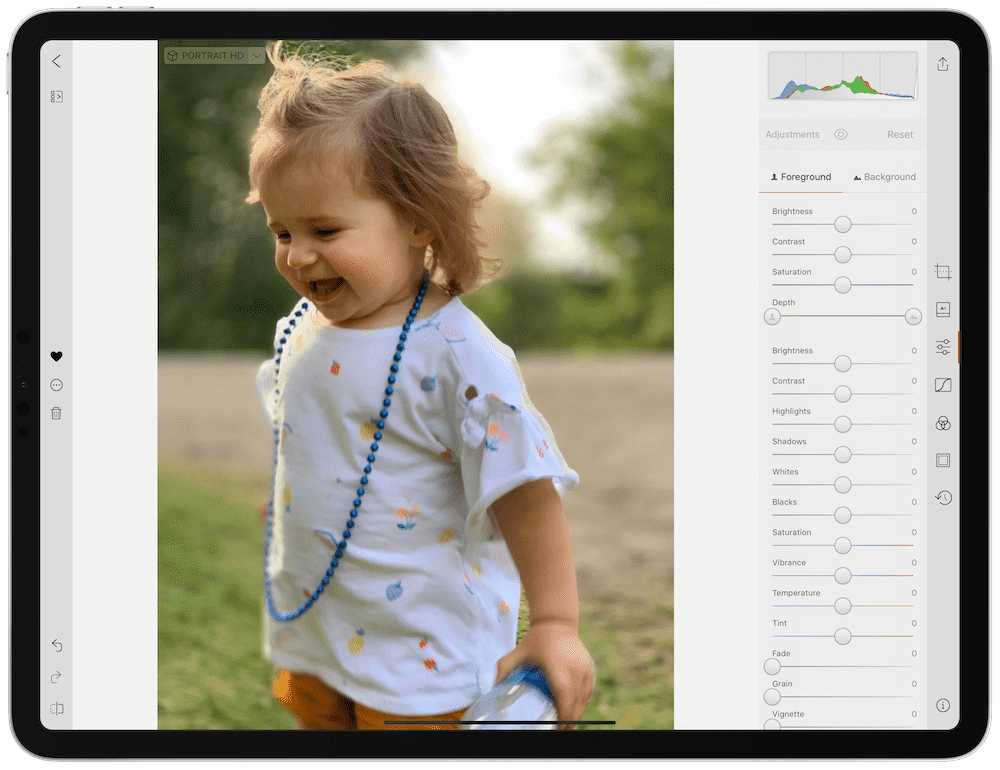
In terms of iOS technology support, only Pixelmator Photo comes close to matching Darkroom’s prowess.
Price and Cost Structure
Darkroom weighs in at a much more affordable scale than Adobe Lightroom. You can download Darkroom for free and access the app’s most basic features and get to know the app. To really dive into Darkroom’s feature set, you’ll need a subscription to Darkroom+.
From Darkroom’s press release (dated February 22, 2020) noting the new business approach:
Starting today, anyone who paid for anything prior to this release will have access to all our premium features for free. To be crystal clear, even if you only bought a single filter set 4 years ago, you’ll now have access to all the filters and all the tools! We’re doing this to honor the commitment we made to you when you supported us before this switch.
Evidently, if you made an in-app purchase in the past, you’ll have access to all filters and all tools inside Darkroom.
New users will have an option to subscribe to Darkroom+ according to the press release:
For new users, a $3.99 per month or $19.99 per year subscription will unlock access to every filter and tool in Darkroom, on iPad and iPhones, now and in the future. As we grow and our product offerings expand, all new features and services will be included in this single subscription. For those who prefer to pay once and not have to reaffirm their commitments, we offer a one-time $49.99 purchase option.
Since Darkroom+’s debut, most of the best new features have debuted exclusively for Darkroom+’s members.
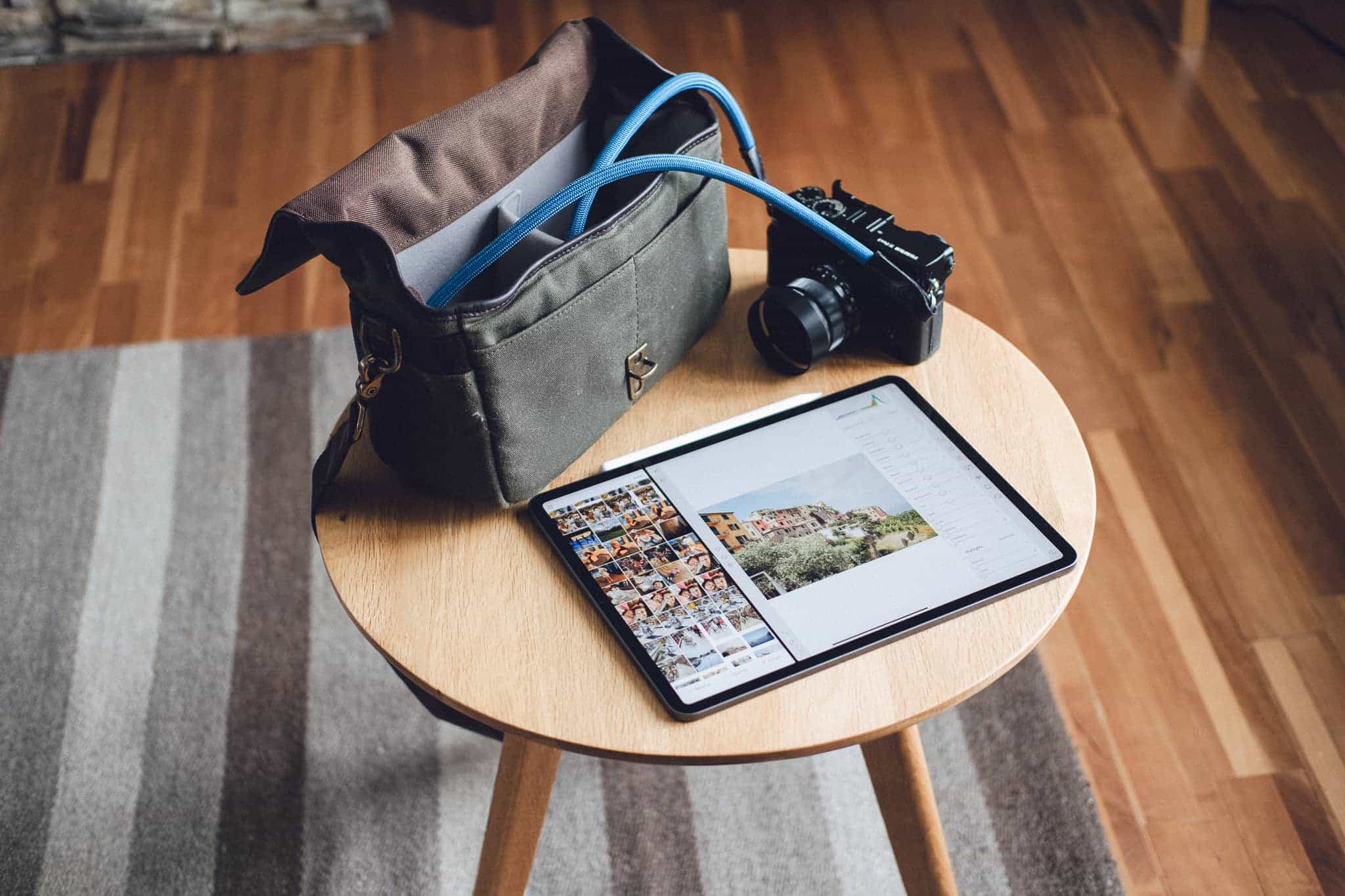
These prices are substantially less than Adobe’s Lightroom CC plans for iPad, as it’s easy to spend $20 in the course of two months if you’ve subscribed to Lightroom. We do, however, recommend remembering that you have to also subscribe to a larger iCloud storage tier in order to save your photos in your iCloud Photo Library for Darkroom to access. If you add on a larger plan there, you may get closer to the $10/month charge that Lightroom requires.
And finally, if you’re one of those individuals who prefers to make a one-time purchase only, we’re very happy to see Darkroom+ be available for a one-time $50 fee.
An iPad Photo Editing App with Great Potential: Pixelmator Photo
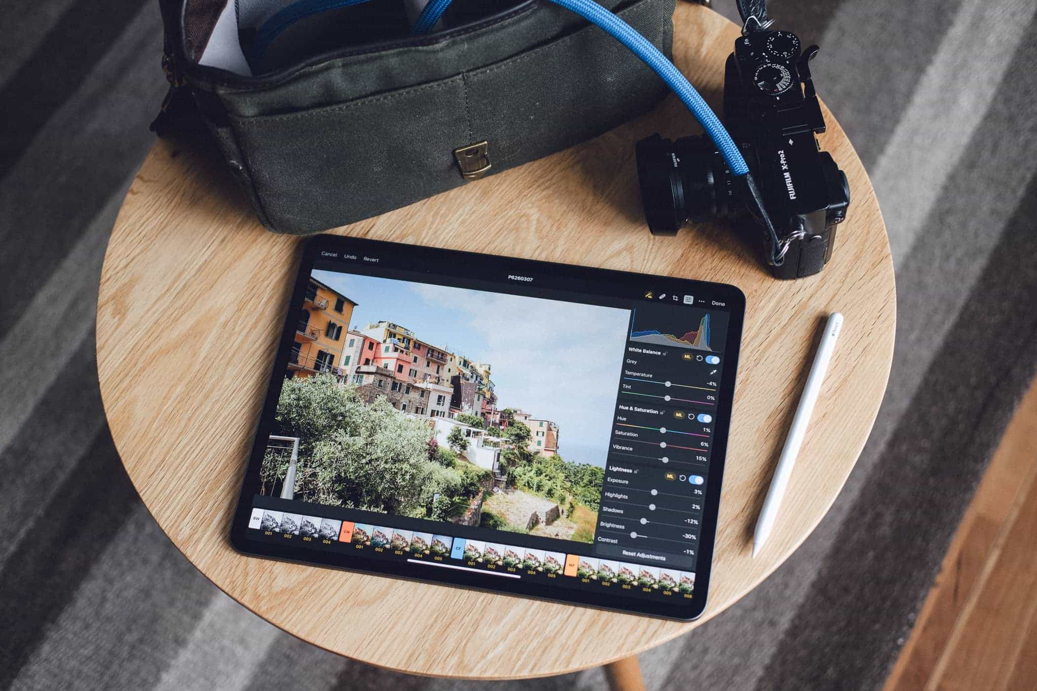
Both our winner and our runner-up picks will have about 99% of users covered. But for those looking to experiment with the deepest iOS technologies and who want to be on the forefront of one of the newest photo editors on the iPad App Store, Pixelmator Photo may do the trick.
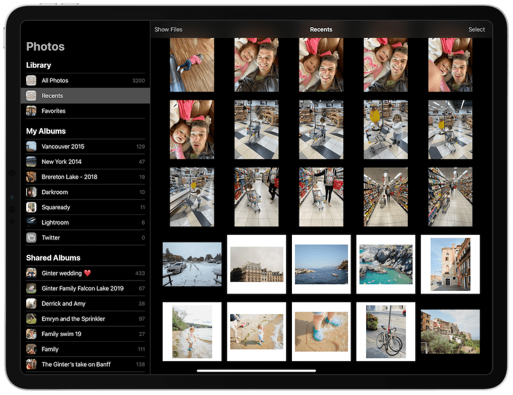
Pixelmator Photo is the photo-centric sister app to Pixelmator on the iPad, and it draws a lot of its editing power from Core ML 2 — iOS’s machine learning arm.
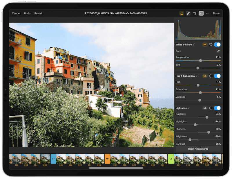
Machine learning appears to branch into nearly all the major editing tools in Pixelmator Photo. Machine learning powers the batch editing tools (released in version 1.1), as well as enhancement editing tools like Lightness, Color Balance, Selective Color, a repair tool, and more. The ML Enhance feature is effectively a machine-learning auto-enhance button that applies a range of machine-learned edits for a one-stop-shop. ML Enhance is incredibly powerful and, were it available on iPhone as well, would be my go-to tool for enhancing my iPhone photos.
![]()
Pixelmator Photo’s ML features have become so good, I had to write an entire article about the latest ML Match Colors feature that debuted in April 2020. ML Match Colors is one of the easiest ML features to use: Simply drag and drop a photo from your Camera Roll on top of the photo inside Pixelmator Photo and the app will automatically match the color palettes. This is an ideal way to ensure you have consistent looks and edits across a batch of photos, and it provides the baseline colors you’ll need to emulate your favorite photographers. ML Match Colors does not implement changes to hue, saturation, or luminosity of each respective color, but it does give you a good foundational start in matching your color choices across a range of photos.
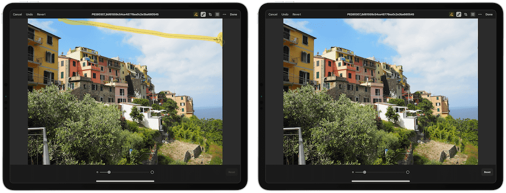
Pixelmator Photo’s repair tool might be the best repair tool I tested in this review. Simply draw over the area you want corrected with the Apple Pencil (or your finger), and Pixelmator Photo will do the rest. This feature alone may keep Pixelmator Photo in my overall editing workflow — start there to get rid of unwanted objects before moving into Lightroom for final edits.
Machine learning extends to Pixelmator Photo’s range of presets (which are better than Darkroom, in my opinion) and useful non-destructive RAW photo editing tools. Photo can handle over RAW files from over 500 camera models and all the machine learning features bring out the best that your RAW photo has to offer.
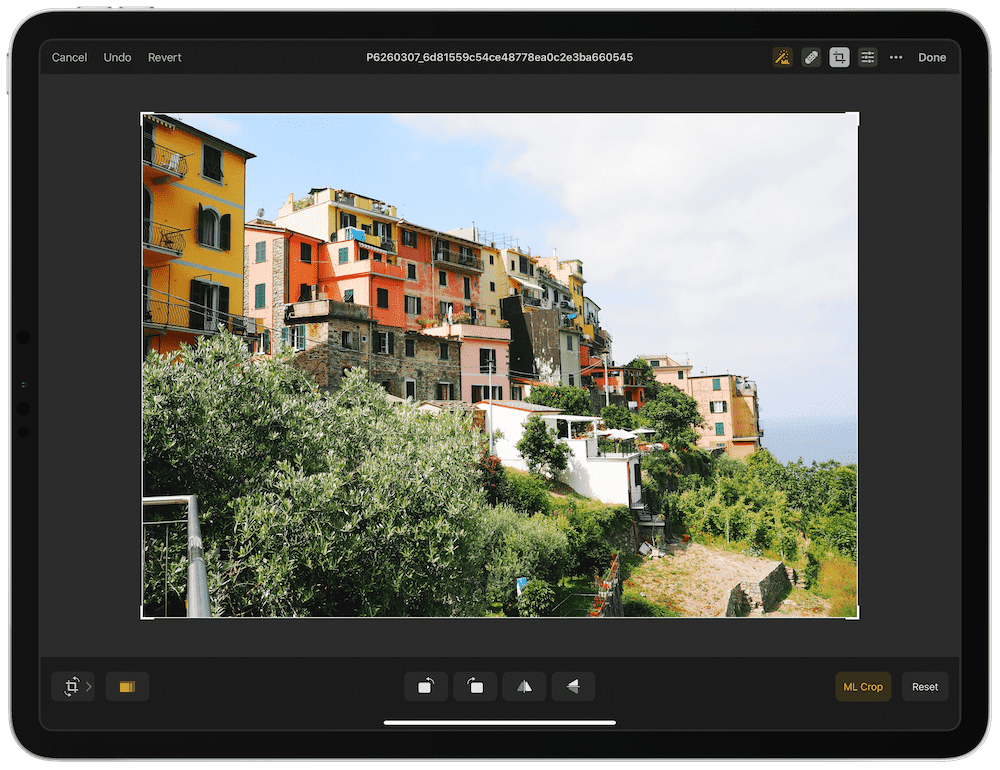
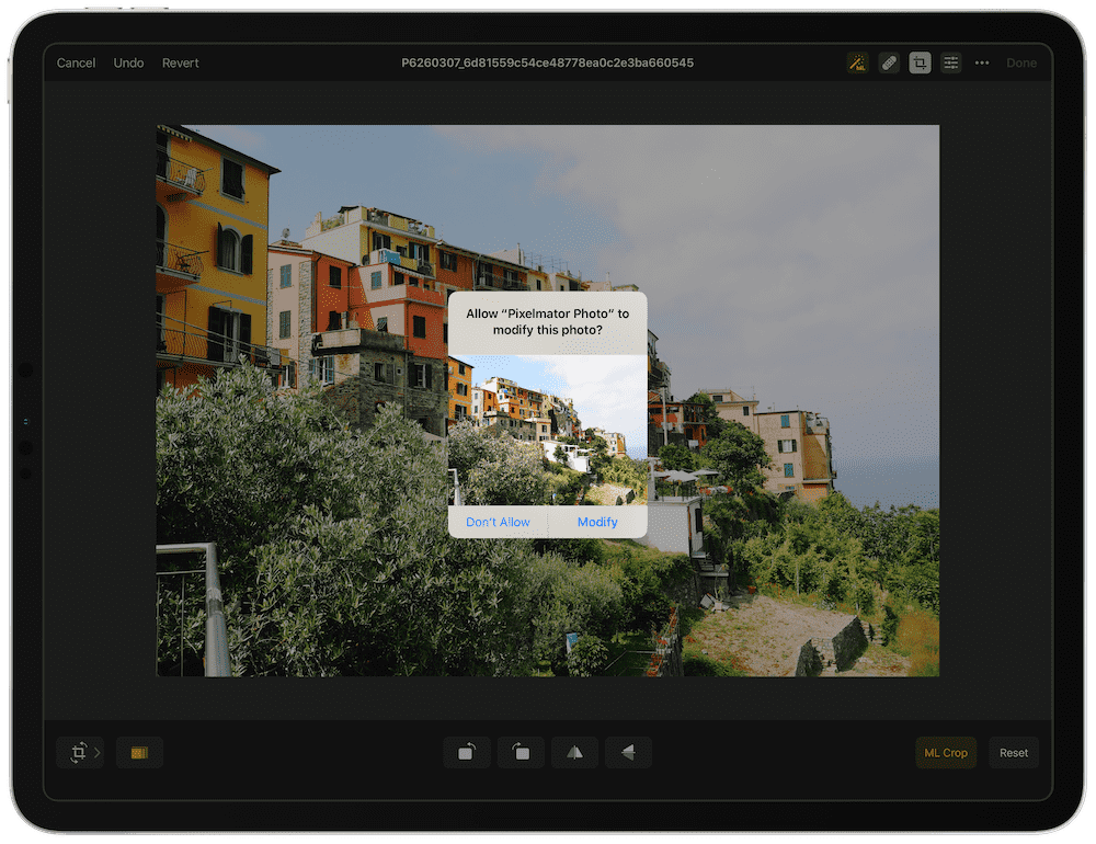
Finally, machine learning even extends into composition, framing, and perspective corrections as well. Pixelmator Photo has an ML Crop and ML Crop Presets that use algorithms to improve your compositions.
As a whole, Pixelmator Photo really dives deep into the heart of iOS technologies. I love how simply flicking the toggle on a section of editing tools automatically applies some form of edits to your photo — you can simply scroll down flipping all the toggles in the editing bar and you’ll be left with a pretty outstanding photo, all thanks to machine learning. The latest Pixelmator Photo also incorporates deep cursor support from iPadOS 13.4, ensuring you edit your photos and navigate through them comfortably with a trackpad. If you’re wanting to see the power of iOS in action, Pixelmator Photo is likely to impress.
But Pixelmator Photo isn’t our winner in this category for a few reasons:
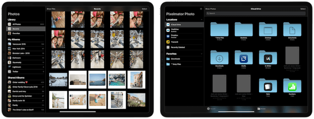
- Despite claiming an intuitive and simple view for managing your photos, I always get tripped up in Pixelmator Photo when looking for recent photos or when trying to pull photos in from the Files app. After an embarrassing amount of time spent searching, I found the Show Files/Show Photos button in the middle of the screen, which switches between Photo’s library and its Files integration. Sometimes these types of things are the fault of the user instead of the developer, but I found myself zooming around other brand new apps (to me) much faster when testing for this review.
- Pixelmator Photo is iPad-only, and appears to be explicitly iPad-only, with no apparent intention to spread into the iPhone or Mac. While this isn’t a huge dealbreaker, it may inhibit some photographers when all they want to do is make a quick edit before sharing on their iPhone. Note: A tweet from the Pixelmator team states an iPhone and Mac version of Pixelmator Photo are in the works.
At $4.99, Pixelmator Photo is almost a no-brainer app to pick up and try. The app is powerful and takes advantage of everything the iPad has to offer. In the end though, we don’t think Pixelmator Photo will be the end game photo editing app for most photographers.
Other Contenders
There are many — and a growing number — of photo editors available for the iPad. It’s almost impossible to test all of them and keep this review from becoming a textbook. Here are a few others that initially caught our eye, but inevitably ended up falling short.
Polarr
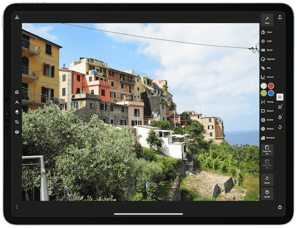
Polarr really blurs the line between digital asset management apps (DAM) and more powerful photo manipulator apps and is one of the strongest contenders for taking you from a beginner to a pro in photo editing. You can make local (selective) and global (entire photo) adjustments to your photographs, as well as go a step further by creating and applying masks to your photos (a la Photoshop or Pixelmator). You can also create your own filters and presets and quickly adjust your photos with a strong auto-enhance tool. Lastly, you can even customize the UI to your liking by re-arranging icons.
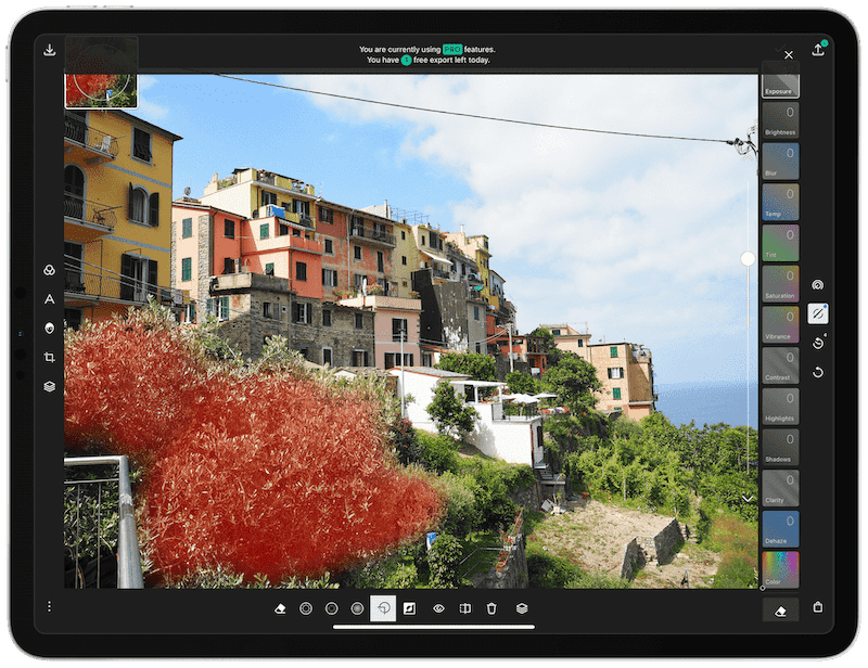
There’s a lot to like about Polarr, including its $2.49/month (or $23.99/year) subscription price. However, Polarr relies heavily on symbols to navigate through the UI, and requires a fairly sound knowledge of what “masks, blending, and stacking” mean — which implies a fairly steep learning curve.
VSCO
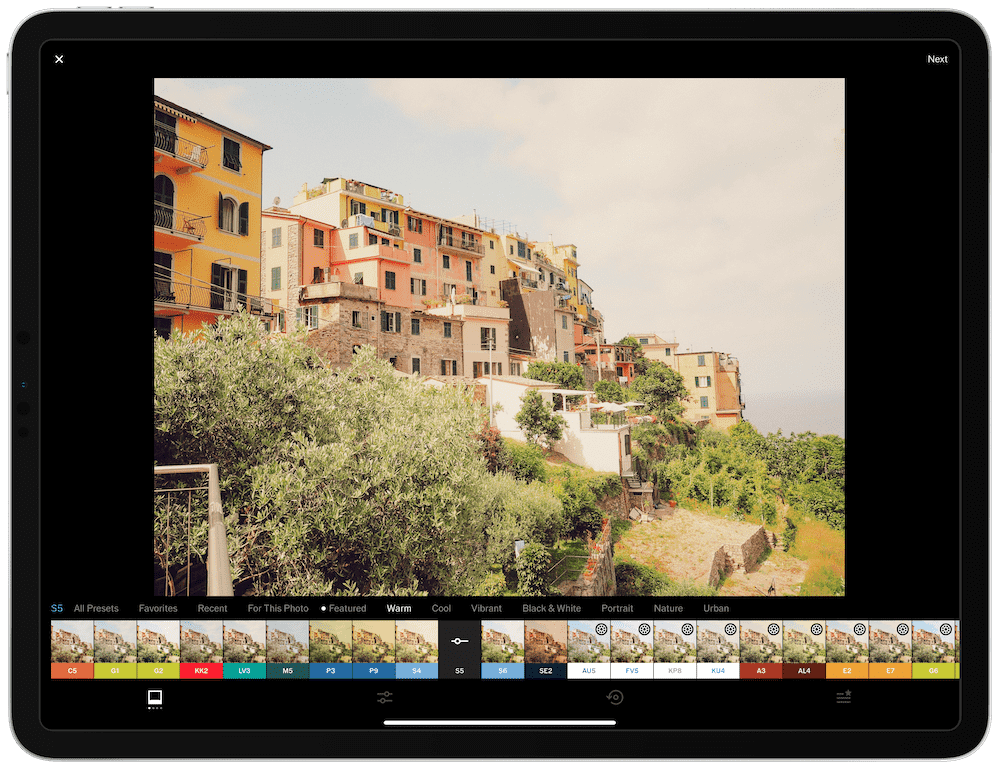
VSCO has been around forever — if memory serves, it’s the oldest app in this review. At one point, VSCO reigned supreme as the best photo editing app for the iPad, but has since been surpassed.
VSCO has the best array of built-in presets of any app in this review (which makes sense, considering VSCO initially sold a large number of Lightroom presets). Many of the best presets require a VSCO membership at $19.99/year, and most are nostalgic, drawing from an era of old-fashioned filters during the dawn of Instagram.
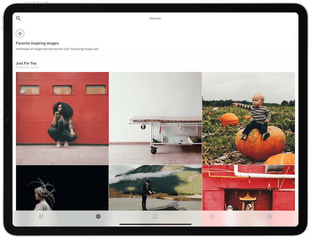
One of the best ecosystems and communities in this category is also available for VSCO. A VSCO membership opens up a whole new social network for photographers to enjoy and connect with. In many ways, VSCO provides a higher level of content quality than Instagram.
VSCO’s editing tools are a lot simpler to use now than they were even a year or two ago. Where VSCO relied heavily on symbols for navigation, all editing features now have a word shown to denote which edit tool you’re utilizing. After tapping on an edit tool, VSCO provides you with a huge cross-screen slider to adjust the power of the edit on your photo.
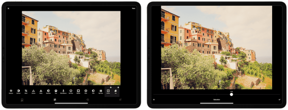
This huge slider is my biggest gripe with VSCO — the app doesn’t feel like it was designed for larger screen iPads, and instead feels best suited for smaller iPhones.
Nevertheless, if you’re looking for a range of old-fashioned presets and another photography community to interact with, VSCO could be a great option.
VSCO is available for free on the iOS App Store.
Snapseed
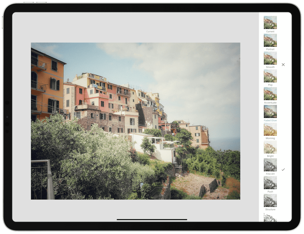
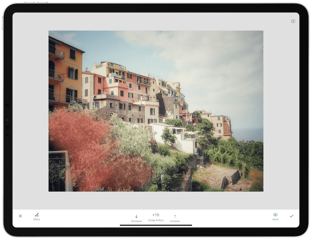
Snapseed is another rare app that provides the opportunity to use the Apple Pencil for local/selective adjustments.
After importing a photo into Snapseed, you’re met with three options on the right side (presets, edit sliders, and export/share). If you tap on the edit slider option (the middle option), Snapseed slides a grid of editing tools over top of your photo. Pick one, choose the strength of the edit, and go.
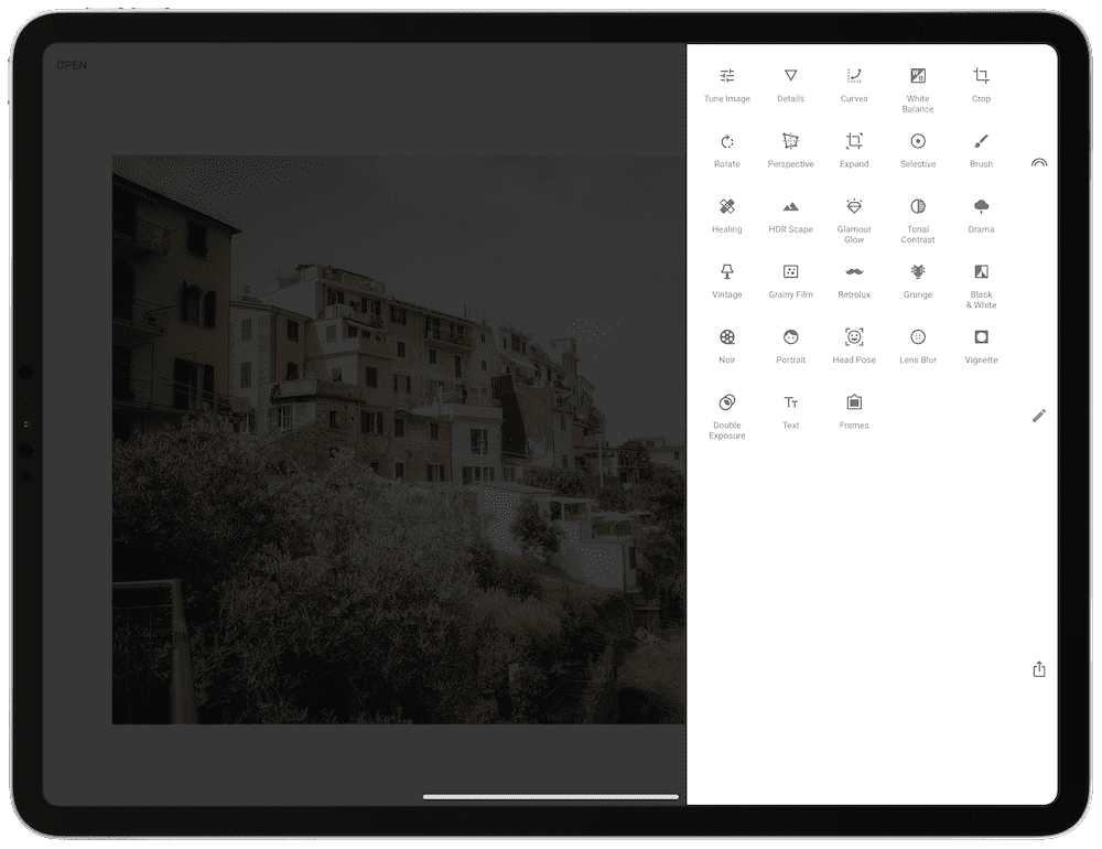
There’s just not that much to love about Snapseed’s user interface, though. From the slide-in tool palette to how edits are applied, I’ve found myself bouncing around a fair bit trying to make heads or tails of the app.
That said, if you’re looking for the ability to make selective adjustments with the Apple Pencil and don’t want to pony up for Lightroom, Snapseed at least provides you another option. (I’d recommend Polarr over Snapseed for this task as well.)
Snapseed is available for free on the iOS App Store.
A Color Story
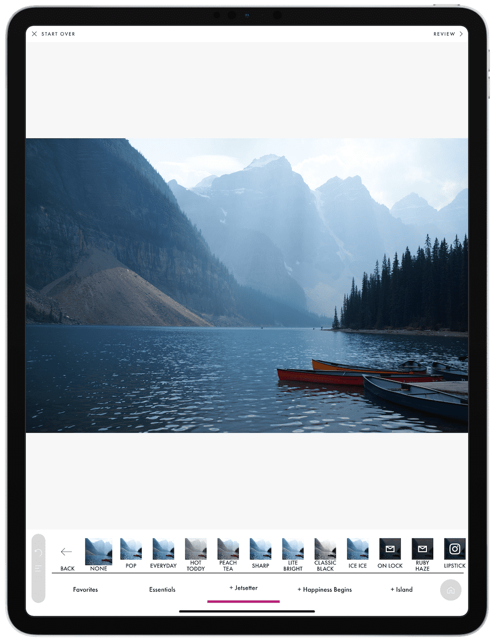
A Color Story is one of those photo editing apps that few have heard of and that has flown under the radar for a little while. Though, some may not have heard of it for good reason.
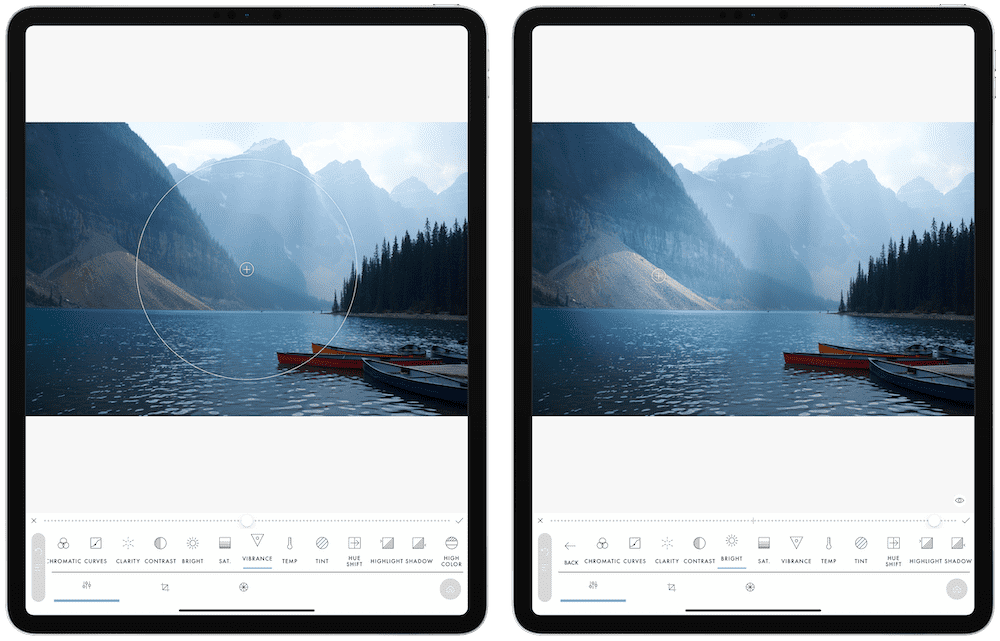
A Color Story lives up to its name — you import a photo, and take the photo through a “story” of edits. A Color Story provides a step-by-step approach to editing your photo, from compositional and framing adjustments at the start, through to filters, effects, and other editing tools. You traverse through your photo’s story as you work through A Color Story’s tools.

But this app is particularly frustrating. For one, the app only works in portrait orientation on the iPad Pro. Second, every time you change a screen, the app flashes another ad to purchase premium tools, premium filters, and ACS+, which is the app’s annual subscription to unlock all the tools.
You can generate some incredible color inside A Color Story, but for $25/year, it’s hard to stomach an app that doesn’t change to the iPad’s landscape orientation.
Wrap Up
A category as big and vast as photo editing presents difficulties when trying to name the absolute best tool for the job — no matter what you pick, there will be a different tool that works better for a different person. That has to act as a disclaimer on this entire review.
This is even the reality when it comes to using an iPad for editing photos. From my chair, the iPad feels like the perfect form factor for editing photos — a glowing slab of glass with a magical pen in your hand, neatly applying adjustments and edits to a large photo canvas on the screen. Yet, others will shake their head at my utopian photo editing vision and say nothing is better than a big, perfectly color-accurate desktop monitor.
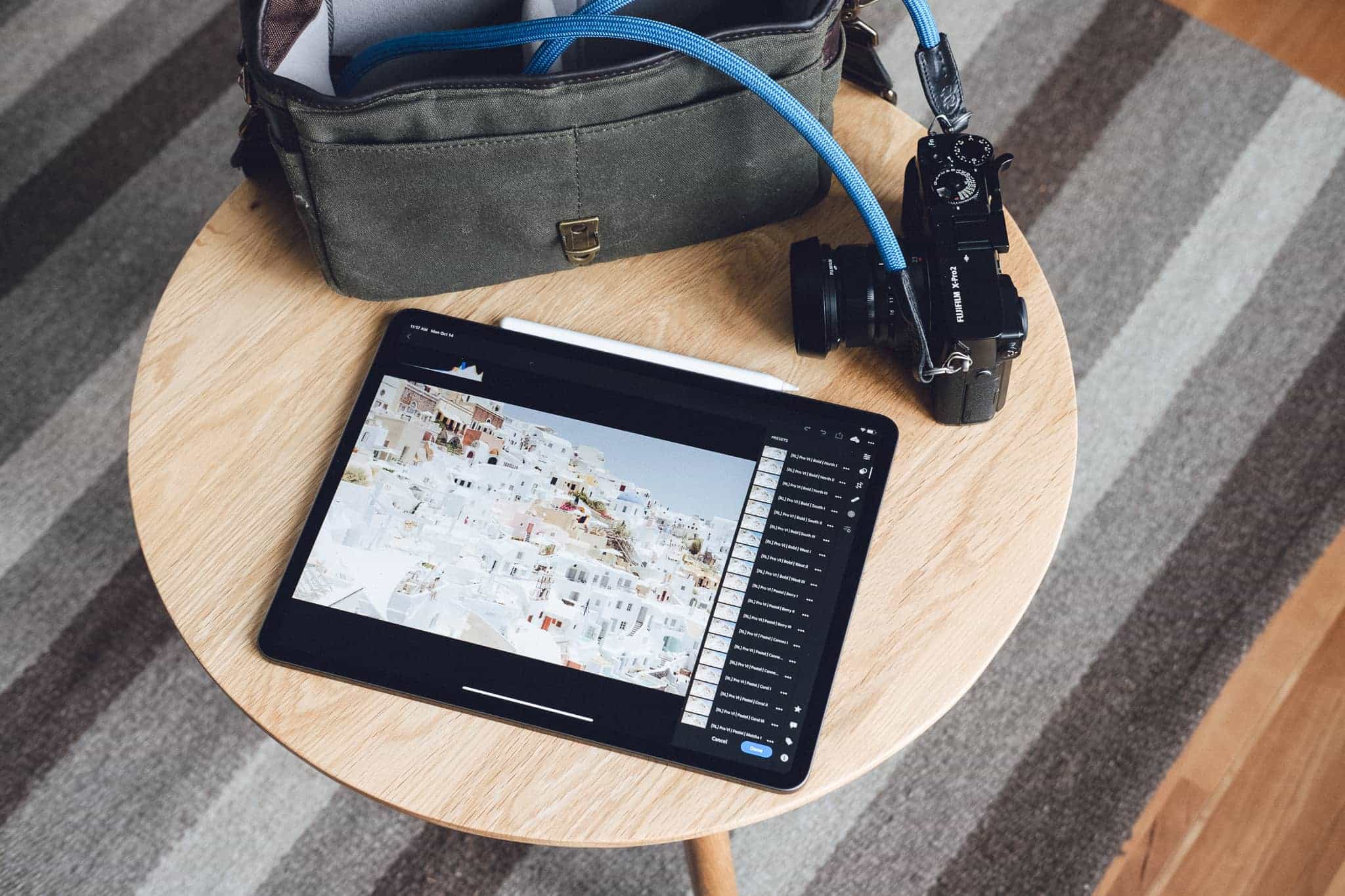
For photographers on the general photography journey — from smartphone photography through to point-and-shoot, mirrorless, and DSLR photography — Adobe Lightroom for iPad is likely to be the last photo editing app you ever need. Once you sign up, begin uploading photos to your 1TB Creative Cloud online storage, and begin finding great third-party presets to utilize, it’ll be very difficult to adopt any other app for your photo editing needs.
But this completely discounts the power of Darkroom for iPad and the potential of Pixelmator Photo.
To my way of thinking, Adobe Lightroom for iPad is the best photo editing app for someone who shoots photos with a non-iPhone camera. But if you only shoot with an iPhone, Lightroom falls short to Darkroom’s iOS-first functionalities. Darkroom does a better job of bringing more out of your iPhone photos than either Lightroom or Pixelmator Photo, and it does so with all the latest iPadOS features. Darkroom is no slouch.
And if neither of these fit the bill, or if you’re wanting to spend the least amount of money on any app in this review, take a look at Pixelmator Photo. The synergy of photo editing with the power of the iPad’s on-board chip yields an algorithmic approach to photo editing that isn’t duplicated anywhere else on the platform. For $4.99, Pixelmator Photo is an app you should try, even if it doesn’t become your end game photo editing app.

