Using Blank Space to Make a Minimalist iPhone Home Screen
According to recent statistics, the average American checks their phone 344 times per day (about once every four minutes).
And before you say, “other people may struggle with this, but I’ve got it under control,” I dare you to go into your Settings and look at your Screen Time stats.
The truth is, we all struggle with this stuff. And the deck is kind of stacked against us.
As Jake Knapp & John Zeratsky (two ex-Google engineers) say in their book Make Time:
“When we use our smartphones to navigate an unfamiliar city, or have a video call with a friend, or download an entire book in mere seconds, it’s like having superpowers. But by default, we don’t just get the best of modern technology. We get all of it, all the time. We get futuristic superpowers and addictive distraction, together, on every screen. The better the technology gets, the cooler our superpowers will become — and the more of our time and attention the machines will steal.” — Jake Knapp & John Zeratsky, Make Time
The book makes a compelling argument for being intentional with our technology. (It was one of the major inspirations for starting the Mindfulness category here at The Sweet Setup when I first read it several years ago.)
There are two specific things they advise us to avoid when using our devices:
- Infinity pools or endless feeds that continue to feed content into our eyeballs.
- The busy bandwagon or constant stream of notifications telling us what to do.
The trick is to do what we want with our devices without letting them steal from us.
So over the years, I’ve done quite a bit to protect my focus when using my iPhone. I’ve removed email from my phone, changed my Home Screen apps for widgets , set up Focus Modes, even tried running everything in grayscale mode for a while to make using my phone less appealing. I even considered using a device called The Light Phone, a minimal phone with a text-based launcher that gives you tools (podcasts, notes, calendar, etc.) instead of apps. But I could never get myself to actually do it because I use MindNode every day to take notes on the books that I read, and use Drafts to capture ideas essential to my creative workflow.
Then I came across an app called Blank Spaces, which I’ve been using for a couple of months now to give me the power of the iPhone with the focus of the Light Phone.
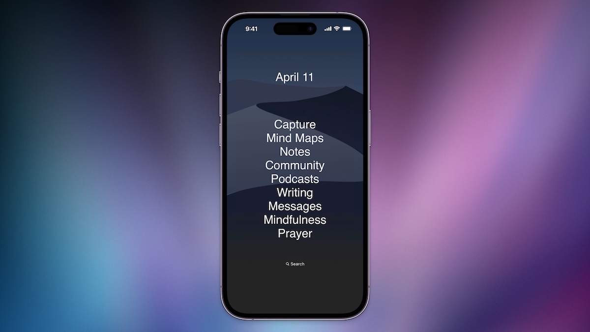
Let me start by saying that this is definitely not for everyone. I totally get why people would take one look at this and immediately write it off.
But I’m loving it. And if you want something to help facilitate intentional technology use, you might love it too.
Design Your Ideal Weekly Schedule
Free → Video Workshop + Productivity Templates
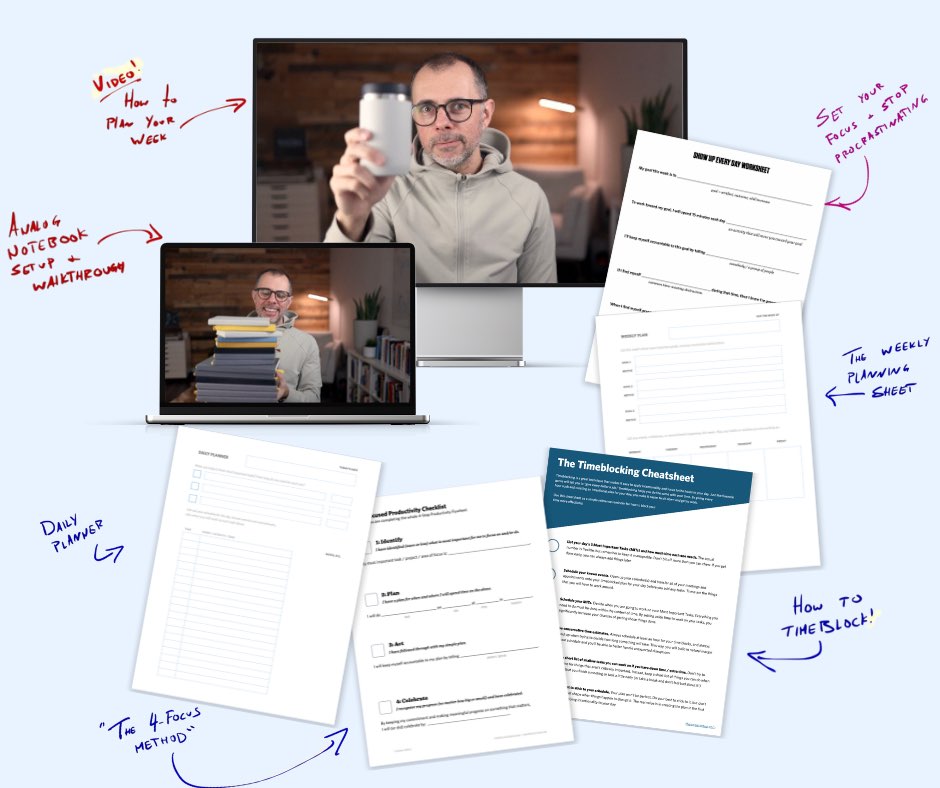
If you want to reduce the busywork and distractions, then sign up here for instant access to a brief video workshop on How to Plan Your Week.
♥️ Quick Note: You’ll get access to the workshop, plus a few additional bonuses to help you overcome procrastination and deal with distractions so you can spend more time on the important work that matters.
How it Works
The app gives you two widgets which comprise the Home Screen layout I shared up above: one smaller one at the top, and one larger one in the middle. The top one lets you choose from a few basic options which include blank space, the date, day of the week, an analog clock, weather, and a 5-day forecast. The middle widget acts as a launcher and contains text-based links that you can use to either open an app or run a Shortcut. All of these links are configured inside the app on your iPhone, and can be both reordered and relabeled to include custom text instead of the app or Shortcut name.
Customizing the Appearance
You can customize a couple of options like font and text size, but to achieve the visual effect of a transparent text-based launcher, the app does a couple of clever things.
First, the name of the app once you install it on your iPhone is completely blank. This allows you to add widgets to your Home Screen without having the app name appear below the widget itself, keeping your Home Screen clean and minimal.
Second, the app uses a neat trick to remove the background color from the widgets and achieve the illusion of the text sitting directly on top of the wallpaper. To do this, you take a screenshot of the wallpaper on an empty Home Screen and then import it into the app. The app then slices the image and applies the background to the widgets so that they match the wallpaper positioning perfectly. They have a couple of dark and light wallpapers you can download from the website which work great for this, though it works best when you have Reduce Motion enabled.
Another thing may stand out if you look closely at the screenshot up above: the Dock appears to be completely missing. It’s still there — you just can’t see it. It just looks like it’s gone because all of the apps have been removed and the bottom of the wallpapers shared by the app makers match the color of the dock perfectly.
Adding the Links
Once you open the app, you add links to appear in the widget by tapping the bit white + button.
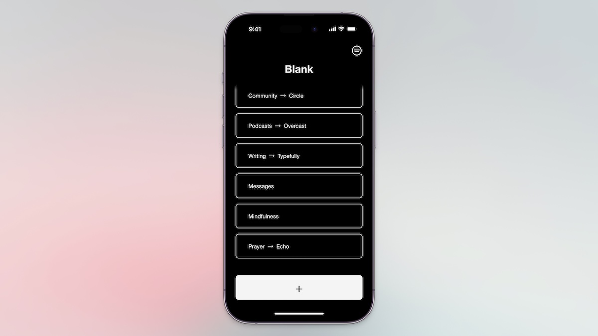
Next, you add a link to an app by selecting it from the list or by searching for the app name. If the app doesn’t exist, you can click the Not Listed button to create a link by using the URL scheme (if you know it) or by choosing a Shortcut to run from the Shortcuts app.
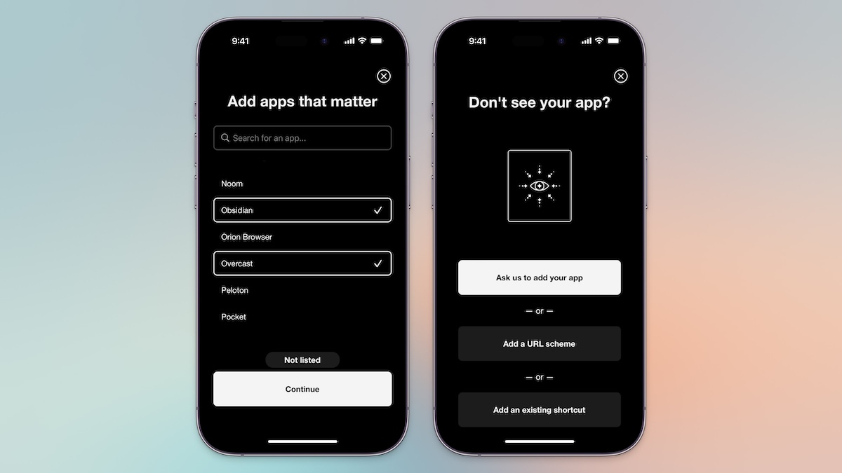
Once you set up your links in the app, then they appear in the large middle widget on your Home Screen.
Customizing the Appearance
You can customize a couple of options like font and text size, but to achieve the visual effect of a transparent text-based launcher, the app does a couple of clever things.
First, the name of the app once you install it on your iPhone is completely blank. This allows you to add widgets to your Home Screen without having the app name appear below the widget itself, keeping your Home Screen clean and minimal.
Second, the app uses a neat trick to remove the background color from the widgets and achieve the illusion of the text sitting directly on top of the wallpaper. To do this, you take a screenshot of the wallpaper on an empty Home Screen and then import it into the app. The app then slices the image and applies the background to the widgets so that they match the wallpaper positioning perfectly. They have a couple of dark and light wallpapers you can download from the website that work great for this, though it works best when you have Reduce Motion enabled.
Another thing may stand out if you look closely at the screenshot up above: the Dock appears to be completely missing. It’s still there — you just can’t see it. It just looks like it’s gone because all of the apps have been removed and the bottom of the wallpapers shared by the app makers match the color of the dock perfectly.
The Details of My Setup
If you look closely at the screenshot up above, you may notice I frequently didn’t use app names for my links. I like to use descriptions for the activity or mode I will be in when I’m using the apps instead. This helps reinforce the intention for unlocking my iPhone in the first place.
Here’s a breakdown of what’s what:
- Capture opens Drafts
- Mind Maps opens MindNode
- Notes opens Obsidian
- Community opens Circle
- Podcasts opens Overcast
- Writing opens a web bookmark for Typefully (which allows me to post to social networks like X and LinkedIn without having to open the apps)
- Messages opens the Messages app
- Mindfulness opens the Do Nothing app
- Prayer opens the Echo app
Some of these apps are added through the integrations in the Blank Spaces app, but others are simple Open app Shortcuts. In the future, I’d like to take this a bit further and add more Shortcuts (like my Daily Questions Shortcut). But right now, I’m really enjoying this super simple Home Screen.
Design Your Ideal Weekly Schedule
Free → Video Workshop + Productivity Templates

If you want to reduce the busywork and distractions, then sign up here for instant access to a brief video workshop on How to Plan Your Week.
♥️ Quick Note: You’ll get access to the workshop, plus a few additional bonuses to help you overcome procrastination and deal with distractions so you can spend more time on the important work that matters.
