Shawn Blanc’s iOS 14 Home Screen

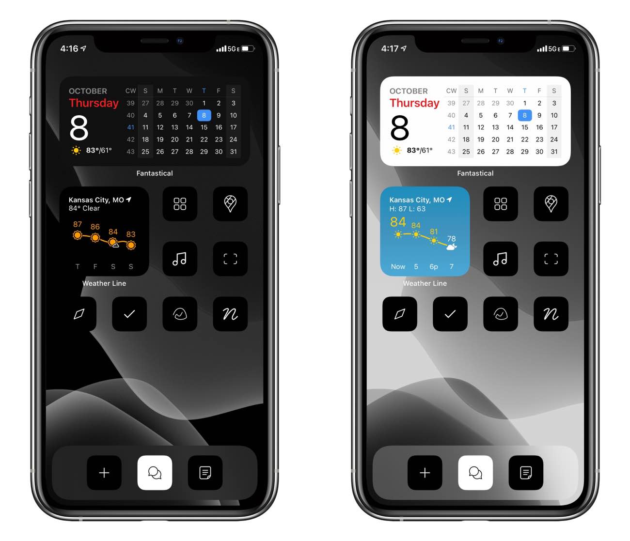
This is what my current iOS 14 Home Screen looks like on my iPhone. From Left-to-Right, top-to-bottom:
- Fantastical widget
- Weather Line Widget
- Sonos, Maps
- Apple Music, Halide camera
- Safari, Things, Basecamp, Notion
- (Dock:) Quick Note, iMessage, Ulysses
Now, let me explain what is going on here…
To start, as you can see, I’ve only got a couple of widgets: calendar and weather.
And the apps… well… if you’ve gone off the deep end of Home Screen customization then you already know that these black and white app icons are not real apps. They are shortcuts from the Shortcuts app, which I’ll explain more in a bit.
The wallpaper is simply one of the “still” wallpaper options that you can find inside the Settings app, and which has a light-mode and dark-mode option so that it dims when my iPhone is in dark mode.
The Widgets
First, the widgets. Nothing too wild or fancy right now.
Up top, I have the standard-issue Fantastical calendar widget. And below that, on the left, is my own Smart Stack of Weather Line widgets — one for the hourly and one for the daily.
Though I prefer CARROT as my main weather app, I think Weather Line just crushes it with the widget options and its functional design.
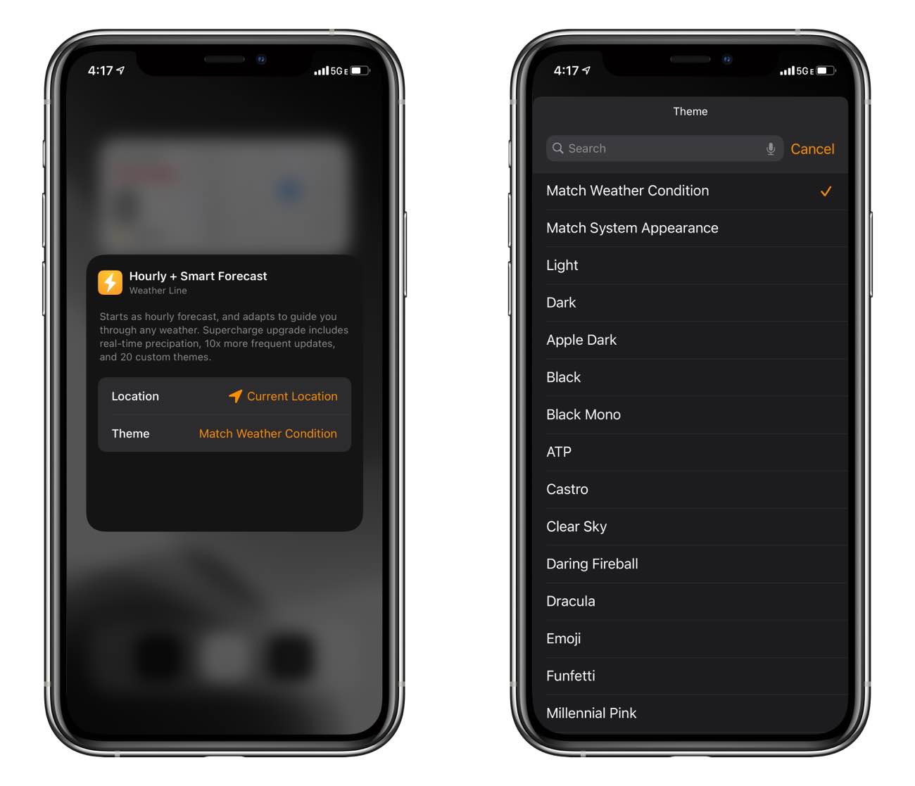
Hands down, Weather Line has the best widgets. The way the hourly and daily forecasts are presented as color icons on a graph, I can quickly see exactly what is going to happen with the weather. And Weather Line also has the best looking widget thanks to its various themes and theme preferences. You can choose between a bunch of different color themes, including several that are styled after other indie apps and makers. 1

With Weather Line, I can quickly glance and see what the weather will do over the next few hours, and I don’t have to read a list of individual weather data. Instead, I can just look and see the chart and the icons and quickly discern what the weather will do over the next few hours.
Moreover, if it is raining outside, then the Weather Line widget switches to a “Dark Sky” prediction graph showing the timeline.
(Let’s just say that when you drive a vehicle with no doors and no roof, it’s important to always be abreast of the weather.)
The App Icons
As mentioned, the black and white app icons are not actually apps. They are each their own Shortcut bookmark which then launch into a specific app.
The icons I’m using are a set by desiger Traf that I purchased here. (Traf also just recently updated the icon set to include some additional colors and more app icons.)
The app icons are each an individual custom shortcut that I added to my Home Screen as a Shortcuts bookmark. Tapping the bookmark launches a Shortcut that launches the app I have specified. The detour through the Shortcuts app is certainly a bummer, but for now I’m dealing with it. ?♂️
What I like about this iOS 14 Home Screen
It’s fun! It’s new! It’s something different!
Over the years, I’ve experimented with various Home Screen layouts, and this is one of my favorites. Not only in terms of “design,” but also in terms of functionality.
One of the added benefits of using Shortcut bookmarks as replacements for apps is that you can create multiple instances of the same “app shortcut,” which then allows you to have multiple Home Screens where you have some of the same apps on each screen.
With the traditional, native app icons, that app icon can only be on one Home Screen. But, by using a Shortcuts bookmark, you could have the same app be present on more than one Home Screen.
So, suppose you wanted to have a “work” Home Screen that has email, music, maps, project management, and a task manager on it. And then another Home Screen for your “weekend” that has your journal, photos, music, maps, and task manager. With iOS 14 and Shortcuts, this is now possible.
With native apps, the maps, music, and task manager apps could only be on one Home Screen or the other. But if you use Shortcut Bookmarks, you can create more versions of the same app shortcut and thus have that app on more than one Home Screen if you want.
And then you can show / hide those Home Screens thanks to the new App Library and the ability to edit your Home Screen pages with iOS 14.
What I don’t like about it (maybe…)
By far and away, the biggest downside to this super-custom setup is the way Shortcut Bookmarks function.
Every time you use one of these custom icons to launch an app, iOS first takes you on a detour through the Shortcuts app. It only takes about half a second, but it’s not ideal. It would be great if Apple made an update to iOS and the Shortcuts app to allow these custom Shortcut bookmarks to run in the background when triggered, so that it launched users directly into the app.
Secondly, there are no app badges. Which…. doesn’t really feel like a bad thing. :)
At times it can be annoying to have no badges. Because without badges, when I glance at my iPhone Home Screen, I have no way of knowing if I have a new ping in Basecamp, a new text message, or a new notification in Notion.
I’ve considered setting up another Home Screen that has all of the native app icons so I can quickly swipe over there to see if there are any app badges. But that just seems silly, and, honestly, I’m not sure that I even miss the app badges.
I’m not sure how long this experimental Home Screen will last. But it’s fun for now. It has me thinking of other ways I can build functional Home Screen pages. And, with no app badges, this Home Screen is certainly less distracting. And that’s definitely a win.
Curated List of Must-Have Apps
We spend an inordinate amount of time sorting through hundreds of apps to find the very best. Our team here at The Sweet Setup put together a short list of our must-have, most-used apps in 2022.
You will get…
- The current list of The Sweet Setup’s top 8, must-have apps.
- A special, pro tip for each app to help you save time and become more of a power user.
- A hidden feature of each app that you may not have known about.
The Sweet Setup Staff Picks for 2022

These apps work on iPad, iPhone, and Mac. And they range across several different categories but are mostly focused on productivity. They will help you get the most out of your devices and your day.
-
Alas, no Sweet Setup theme. ↩
