See How Chloe Revamped Her iPhone Home Screen with Widgets
I have loved slowly fidgeting with my iPhone Home Screen, especially with the new updates to iOS over the years.
But I think it’s time for a total revamp. My Lock Screen image has been the same for at least five years. Some of my apps have been in the same place since I got my first iPhone, almost 10 years ago. So, I decided it was time to change it up.
When I sat down to think about what I wanted my iPhone to accomplish for me, it was easier to figure out what changes I wanted to make. I see my iPhone as a tool. A tool for connection and communication. A tool that also sometimes needs some limits so my screen time summary doesn’t tell me I could have gotten a part-time job with the time I spent on my phone.
After thinking about what I wanted to use my iPhone for, I decided on what I wanted to update:
- Clean out outdated/old apps
- Create a better flow
- Use Widgets more effectively
- Create better Focus Modes
- New wallpapers
My Starting Point
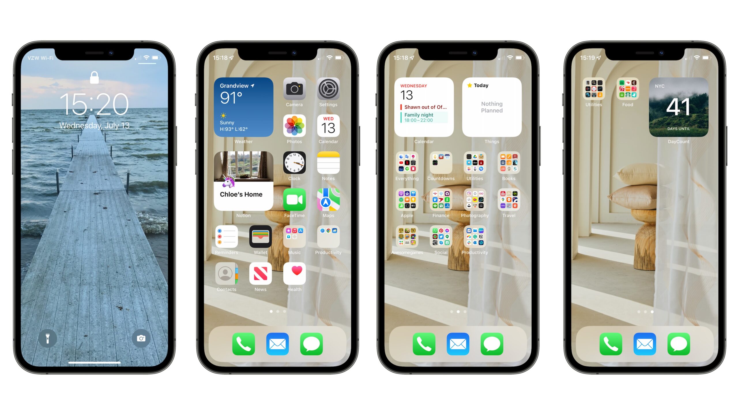
First off, let’s take a look at my screen pre-revamp. I have three main pages. I almost never go to the third page — I just dump random apps there. It’s not bad, but I think it can be better.

The apps on my dock are currently Phone, Mail, and Messages. Full disclosure: Instagram used to be there, but then I got my screen time report that almost gave me a heart attack, so I moved it to a far-off folder and added a screen time limit.
App organization
I then went through all of my apps in all of my folders and deleted old or unused apps. Remember, you can delete apps OR just remove them from your Home Screen if you think you’ll need them again later.
To remove an app, just long tap on your Home Screen until the apps start jiggling, and then hit the – next to the app you want to get rid go.
I renamed my folders to have better, more descriptive names (one of my folders was called “Awesome Games” thanks to my 14-year-old-self). I tried to use one-word descriptions. For all of my apps for reading or listening to books (like audible, scribd, Likewise, Goodreads and Books) I just called it Read.
A lot of my apps were in random folders, so I moved them to their rightful places. I also put some more folders on the third page — the ones that I don’t use as much. I hate clutter and notifications. So I’d prefer to spread things out so I don’t feel overwhelmed when I look at my phone.
It was kind of nice walking down old-app-memory-lane and seeing all the old coolest-ever-photography-apps that are now old news. And of course all the old games, like Temple Run and Tiny Wings. Classics.
Creating a better flow
I also wanted to create a better flow for my apps. I organized my folders so that my most visited folders were on the second page, and I dragged my less used folders to the third page. I organize all my apps by their function. Many people choose to organize their apps by color, alphabetically, or some other random order that works for them. The key here is to create a flow that works best for you.
I mostly didn’t touch the apps on the first screen. They are some of my staple apps (and some of the prettiest) and I like them on full display, as opposed to being in a folder.
Widgets
Next, I looked at the widgets.
I love Widgets and I think it’s a brilliant way to quickly see important information. But as I’ve used them, I’ve realized that I use some widgets more than others and haven’t used them to their full potential.
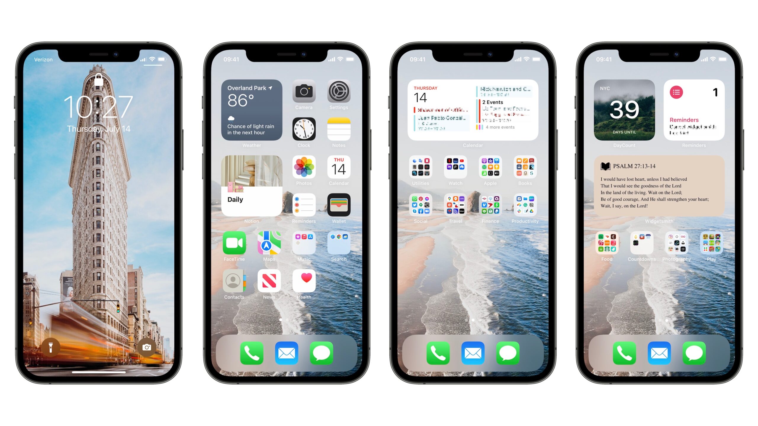
On my first screen, I had a small weather widget and a Notion widget. I have recently changed my Notion setup a bit, so I had to change which page the Notion widget was connected with (I use my Notion widget for tracking my habits, but you can use other apps that have helpful habit tracking widgets). On my second page, I decided to lose the Things widget and add a medium-sized calendar widget so I could see my day at a glance. I love Things, but I’m not using it much these days as I’m relying more heavily on Notion.
I also created a Widget using Widget Smith to show me one of my favorite Bible verses on the third page. I’ve used Widget Smith for something like this before when I wanted an easy way to display my core values(check out this article to see how to do it step by step).
If you are looking for an even more customized experience, you can use a Smart Stack Widget that combines several widgets into one and shows you relevant information throughout the day. Widget Smith is also a great tool to create customized widgets (you can use the free version or upgrade to premium for more customizations).
I am the kind of person that starts letting everyone know my birthday is coming up 6 months in advance. So naturally, I have a plethora of different countdown apps. So many that I’ve deemed it worthy of a whole folder called Countdowns. So on my third page, I have my countdown folder and a countdown widget that lets me know how long until I get to go on my next trip (I love trips). I also put a small Reminders app widget there.
If you are unfamiliar with widgets or are, like me, looking for a better way to use yours, they are a great way to quickly see information. I can see the calendar events for the whole day by checking out my calendar widget. I love seeing the weather as soon as I open my phone to remind me how blisteringly hot it’s going to be that day. Some people use a fitness widget. I personally think the passive-aggressive notifications on my watch reminding me to close all my rings is already enough for me.
Here’s how you can add a new widget:
- Go to your home screen and long-press on an app to bring up the contextual menu, then tap Edit Home Screen. You can also long-press anywhere on the home screen to enter jiggle mode.
- Tap the + button in the top left corner.
- Find the widget you want (you can also use the search bar to find a specific widget).
- Tap the widget you want and then select the size and configuration you want.
- Tap + Add Widget.
- Drag the widget to the perfect place.
- Tap Done in the top right corner.
Focus Modes
After hearing Josh Ginter talk about Focus Modes (and watching the Social Dilemma), I decided to take better advantage of the feature. I created a Personal Focus Mode that kicks in every day from 6pm until 8am the next day. I allow a handful of apps to have notifications (Phone, Messages, FaceTime) and muted the rest.
We also have a general rule here at Blanc Media that when the work day is done, it’s done. If there is an emergency, my colleagues will call or text me. So I am guilt free when I mute Slack and Notion because I know that if someone really needs to get ahold of me they will call or text me.
To add a Focus Mode, just go into settings and tap the search bar at the top of the screen and search for Focus Mode. Click Personal and configure it to your liking. The schedule feature is great because it can automatically kick on when the work day is over. You can also create a Work Focus Mode, Sleep Focus Mode, or even a custom Focus Mode.
Wallpapers
Last but definitely not least, I switched out my wallpapers. This is a very important decision. You stare at these images a whole lot, so you better like them. I look for images that aren’t too messy. Otherwise, they clash will all the apps (I am also not the type of person who uses a bunch of workarounds to change the cover of all of their apps to look picture-perfect, so I just look for images that don’t clash).
My Lock Screen wallpaper has been the same for five years, so it feels like it’s time for a change.
My favorite place to find cool images is Unsplash. You can specifically search for images that are Portrait orientation so they fit your screen. I am personally not a fan of Dark Mode (I know, I know I’m basically the only one) and I prefer brighter, happier images especially since it’s summer (at least here in the Northern hemisphere). Dark pictures of ominous mountains aren’t really what I need when I wake up in the morning.
I searched around for a while and picked a photo of a beautiful beach (reminds of the when I used to live on an island in Brazil). For my Lock Screen, I went a little bit of a different direction and chose a photo of NYC that was pretty cool.
So here is the final result:

New iOS Update
I am really excited about the new iOS 16 update coming out in September. The customizable Lock Screen is going to be a game changer. The new update will allow you to customize your Lock Screen and have a few different versions of it. There will also be a big upgrade to Focus Modes.
In the meantime, while I wait patiently, I am excited about my new iPhone setup. I am getting a lot more use out of my widgets, my iPhone flow is much better, and I finally said goodbye to my old Lock Screen wallpaper.
There are more Sweet Setup interviews right here.
Want to share your setup? We’d love to hear from you. Just fill out this form with some basic information and we’ll be in touch.
Wait. There’s a Bonus….
Custom Productivity Templates
We have a set of custom productivity templates that work well with the iPad app, GoodNotes. And if you want to try them out, we’ve put together a free guide that can help you.
We’ll show you…
- How to create and save custom page templates in GoodNotes.
- How to use those page templates to transform GoodNotes into your own productivity notebook (or any other type of notebook replacement).
Plus, we also have included a couple of our custom productivity templates for you to get started with. These templates are right out of our popular productivity course.

The custom templates and the guide are available for FREE to our email subscriber community. And you can get it right now. By joining the Sweet Setup community you’ll also get access to our other guides, early previews to big new reviews and workflow articles we are working on, weekly roundups of our best content, and more.
