Our favorite photo editing apps for iOS
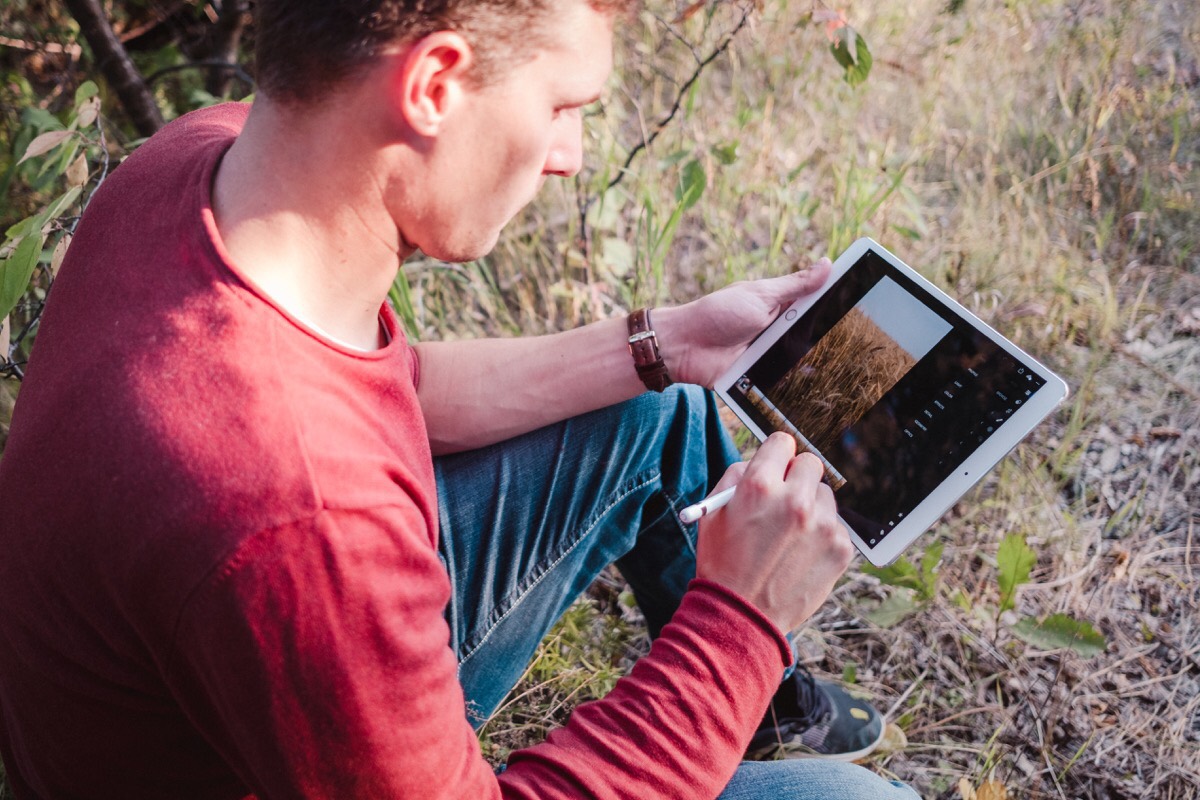
SB: My approach to photography is to keep it simple. When I first began taking photography seriously, I went a bit overboard with my workflow. It was fun for a few months, but over time it become too much to keep up with.
What I used to do was take Sunday evenings to dump the previous week’s photos onto my iMac. I’d then go through them all in Lightroom, tagging and ranking the ones I liked, and then editing them. This whole process took about 3 hours per week. If I missed a week, then it quickly added up.
Editor’s Note: ”SB” denotes Shawn Blanc, the founder of The Sweet Setup. “JG” denotes Josh Ginter, The Sweet Setup’s Editor-in-Chief.
Get Our Best Photography Tips & Workflows
Transform your photos and edits from average to awesome with our in-depth, mobile photography course. It’s jam-packed with training, ideas, and lessons that can literally transform your photography overnight.
JG: Interesting approach, and I can see how this could quickly become a chore.
Admittedly, I too find it a chore to get to my computer, take out the USB-C to SD Card adapter (mine is a Satechi kind that’s not as great quality as I’d like), plug in the SD card and drag and drop photos into backed up folders on my hard drive.
Plus, I do this two times over, as I currently have two SD cards in the Fuji X-T2 — one that shoots RAW photos and the other that shoots JPEGs with the awesome Fuji film simulations. You can add those film simulations to the RAWs in an app like Lightroom CC, but they’re automatically applied to the JPEGs straight out of the camera. Hence, I have to do the whole “import into my Mac” thing twice.
This is pretty much a terrible way of doing things.
SB: My whole aim with photography is to have fun taking pictures, review and edit the best ones, and then share them in one way or another. And I have noticed that, for me, the more “advanced” my overall workflow becomes, the less likely I am to do it.
While an “advanced workflow” sounds more awesome and, well, advanced, it isn’t helpful to me. The more process that is involved, then the more barriers there are for me.
Since I’m not a professional photographer, this is something I do on the side. And thus, for me, simple is best.
Additionally, since I work from home, my iMac was also my work computer. Which means that literally anything and everything I did which required a computer was a task spent in my office at the iMac.
After 6 years of working from home, I finally set a boundary for myself to not go into my office after work hours nor on the weekends. This has been great — I highly recommend it, and it’s an article for another time.
And so, my iPad became my “personal” computer. And, all this to say, having a mobile-centric workflow for the editing, sharing, and organizing of my photos has been great.
Here are my (Shawn’s) favorite apps for editing photos on iOS
VSCO — My favorite app for editing photos
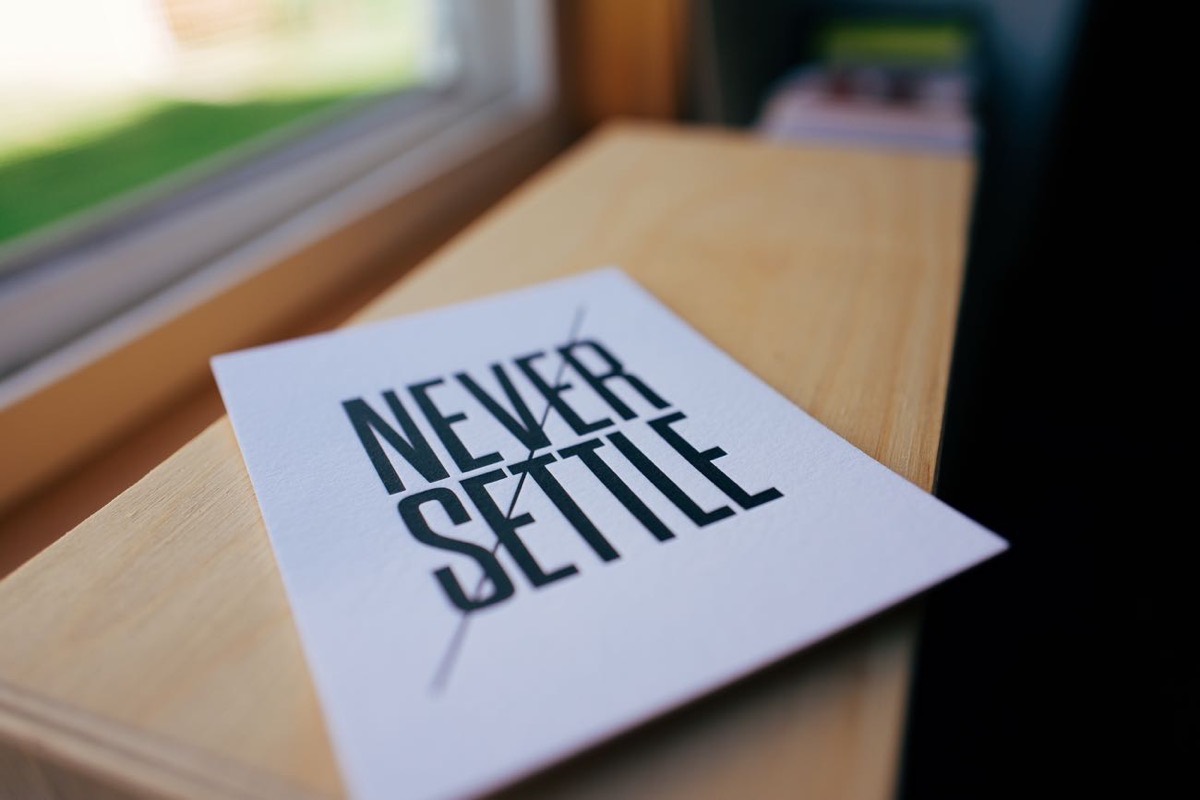
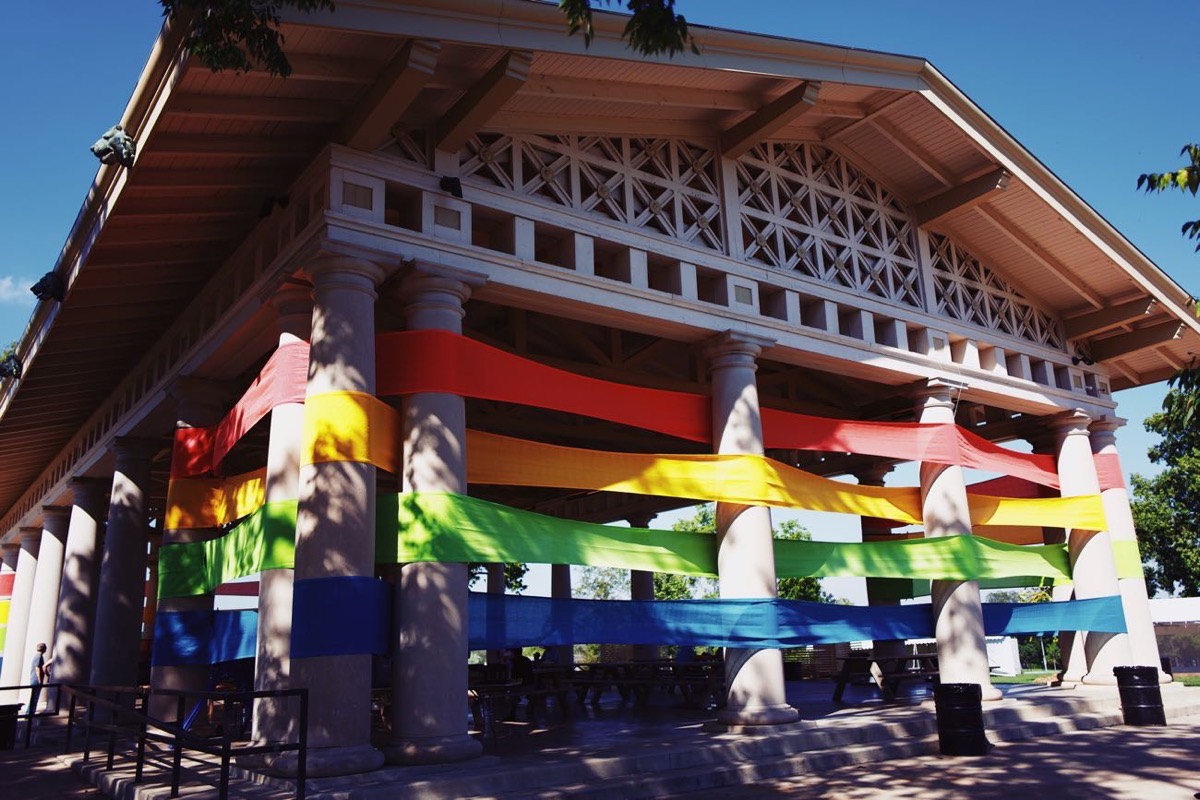
There are so many apps out there for editing photos, and VSCO is the one I use. As I mentioned in my iPad Photography workflow article, the VSCO filters lean toward that vintage, moody, film look which is something I’ve always loved. After using my favorite VSCO preset (currently “AV4”), I usually will brighten the photo up just a bit by popping the exposure and adjusting the white balance to be a bit on the cooler side.
Here are a few photos I’ve recently taken that were edited in VSCO:

Snapseed — Great for fine tuning a photo after editing
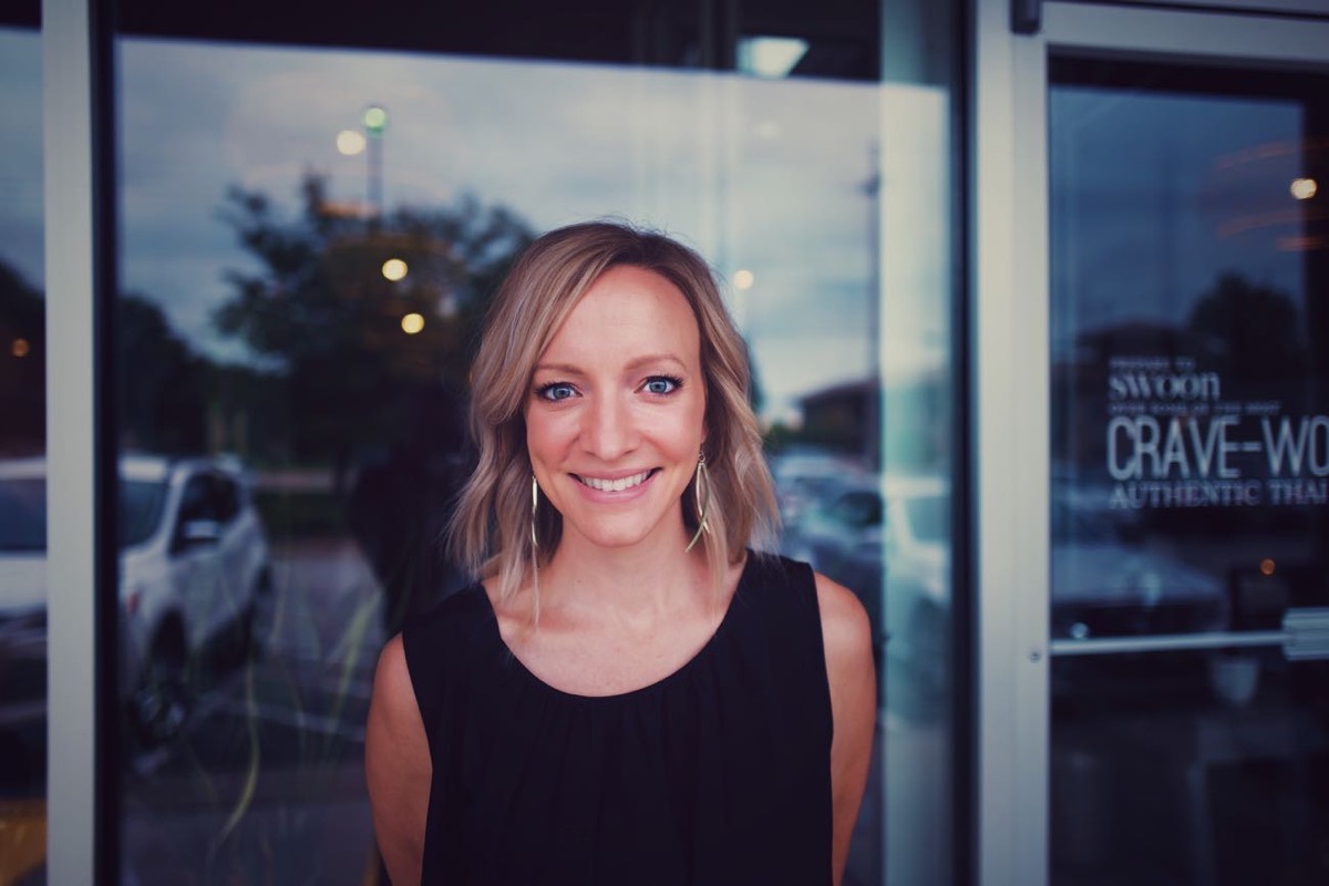
If I’m working on a portrait, then after I’m done editing in VSCO, I like to drop the image into Snapseed to apply one of the portrait presets.
These portrait-specific presets are fantastic for subtly smoothing the skin, helping brighten the eyes, and/or adding some light to the face. When used in moderation, those adjustments help make the portrait subject look even better in their photograph.
Here are a couple of recent portraits I took that were first edited in VSCO and then tweaked in Snapseed using one of their “Portrait Combo” presets.

iOS Photos App and iCloud Photo Library
Since I’m doing all this photo work on an iPad, Apple’s Photo app has to be at the center of it all.
It’s the required, central spot on iOS to import photos and work with them. But, to be honest, I’m a fan of the app. It’s fast to navigate, it’s easy to create new photo collections, iCloud Photo Library keeps all my images in sync across all my devices, and quite a bit more.
While it would be nice to be able to import the photos from my Leica directly into my editing app of choice, the extra step of going through the Photos app isn’t too bad (and, it is something that will be significantly improved with iOS 12 in just a few weeks).
I love to share my photos, and Instagram is the biggest network there is. I’ve become significantly more engaged on the network, check-in in every day to post something and to comment on and like the photos of those I follow.
iMessage
This is my second favorite network to share photos on. I am constantly messaging photos to friends, family, groups, etc.
And, side note about sharing… In addition to Instagram and iMessage, I also get printouts every few months and then go around my house to replace all the images in the frames with new ones.
JG: Clearly Shawn’s iOS photography app list is diverse — far more diverse than my own. We do share the same test for Instagram and iMessage, however.
Let’s take a quick look.
Here are my (Josh’s) favorite apps for editing photos on iOS
Lightroom CC — The only app I use to edit photos
This is the only editing app on my list, and this is all thanks to the advancements Adobe has pushed to Lightroom over the last year and a bit. Lightroom CC is our pick for the best photo editor for the Mac, but its iOS counterpart continues to push Darkroom for our pick for pick for the best editor for iOS. With every new update to Lightroom CC, photo editing on the iPhone and iPad gets easier and easier.
For me, it all started to click when synced presets were introduced. Once you sync presets from your Mac to your iPhone and iPad, all the years of hard work you’ve put in to creating your own presets triples overnight. (Or, in my case, all the presets I’ve purchased over the years triple their range overnight.)
I’m a particular fan of Rebecca Lily’s Lightroom presets. Rebecca has launched five Pro Set packages already and each have their own trend and sense of style. I apply one of these presets to about 99.9% of every photo I shoot, and the included tools (like adding grain or vignettes) help cater to each photograph’s style.
Same goes for synced profiles. Profiles are a little different than presets, as they don’t affect the editing sliders in Lightroom (meaning you can actually apply a preset on top of a profile).
All this, combined with selectively editing portions of an image with an Apple Pencil, make the iPad the picture-perfect tool for editing photos.
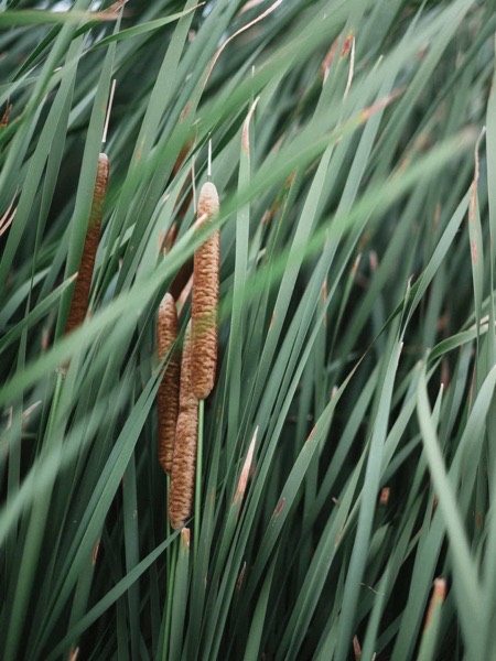
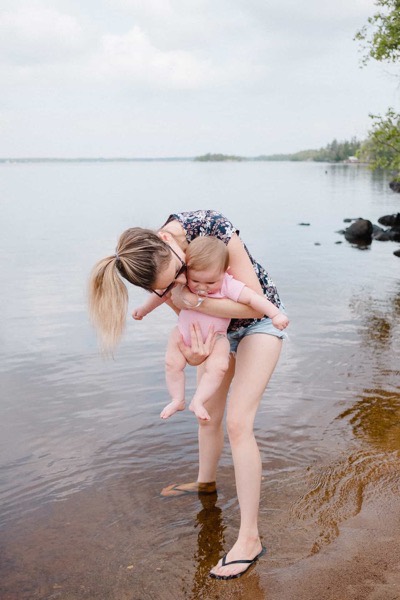
Here are a few photos I’ve edited recently using Lightroom CC and the Rebecca Lily presets:

The only thing I need is an iPad with more storage space.
Squaready Pro — For great borders around your photos
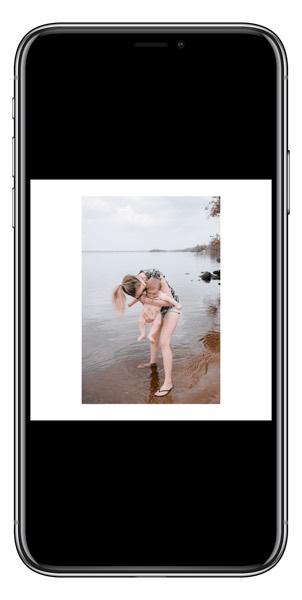
I’ve talked about SquareReady Pro before on The Sweet Setup and it’s actually become one of my go-to editing apps on iPhone. Once I’ve edited the photo inside Lightroom and exported it back to my Camera Roll, I jump into Squaready Pro to add some white borders around the photo before sharing.
There are a few hiccups inside Instagram which have caused me to delve into Squaready Pro a little deeper recently. When you share multiple photos in a single post on Instagram, you can only expand the first image in the photo set — all the photos after that are more constrained, making white borders around your photos a little more difficult to implement. Fortunately, Squaready allows you to save your photo with borders inside a 4×4 square as well as 4×3 or other portrait/landscape/non-square dimensions.
You can also add non-white borders to your images and make other sorts of edits in Squaready as well.
Here’s that photo of my family above, but after I’ve put it through Squaready Pro:
The app is a bit rudimentary in design, but there’s no better app for this task (although Darkroom’s new border features are pretty cool).
Instagram – For sharing all the photos
I’m with Shawn on this one — I’ve really jumped into Instagram lately. The app is so full of awesome photographers and creators. There’s a never-ending expanse of inspiration to be had.
There are some algorithmic and advertisement woes, but it’s hard to find a great app without that stuff these days.
JG: And that’s all I’ve got for iOS photo editing apps. Just about everything is done in Lightroom. Like Shawn, I have to import into Lightroom from iOS’ Photos app (and, on occasion, I do use the Photos app for applying very, very quick edits to a photo before sharing through iMessage), but everything after that works through Lightroom CC.
Get Our Best Photography Tips & Workflows
Transform your photos and edits from average to awesome with our in-depth, mobile photography course. It’s jam-packed with training, ideas, and lessons that can literally transform your photography overnight.
