Mike’s iOS 14 Widgety Home Screen
iOS 14 introduced Widgets to the iPhone, which has allowed for some very creative home screens to be created to suit an individual’s preferences and personality. Here’s a look at my current iOS 14 Widgety Home Screen, and the thought process that went into designing it.

Remember Why You Came
I don’t know about you, but I know that I can’t trust myself. If I open up my iPhone and I even see the Twitter or Instagram icons on my home screen, there’s a good chance I’ll get sucked into the infinity pool and who knows when I’ll come back out.
That is why I intentionally try to design my main screen to show me only the apps that I consider to be a positive use of my technology. I’ve written about this before, but the TL;DR is that I want to design my interaction with my iPhone so that I can do what I came to do and then leave again. I don’t want to get distracted by things I don’t consider to be important. That means the apps I want to see need to fall into one of three categories:
- Apps that assist me with my routines.
- Apps that assist me with the creative process.
- Apps that allow me to communicate intentionally with others.
Routines
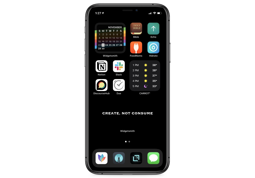
In the upper-right I have a block of icons that help me create healthy habits:
- The Bible app that I use for my daily group reading plan
- The Echo app that I use to manage prayer requests
- The FoodNoms app that I use to track my food intake
- The Hidrate app that I use to track how much water I drink
I go back and forth with tracking habits in my fancy notebook or in Streaks, but currently I’m tracking them the old school analog way.
Communication
The next block is primarily communication apps:
- Notion for tracking progress on projects here at The Sweet Setup.
- Slack for real-time communication with the rest of the TSS team.
- DiscourseHub for participating in several discourse forums (a much more pleasant experience than social media, in my experience).
I also have the Messages app in the Dock, but I keep Due up here instead because I like the aesthetic of the white icons all grouped together.
Side note: I am fully aware that you can customize app icons for Shortcuts in iOS 14 and add them to your home screen. I’m also aware that as of the 14.3 beta, you can even run these Shortcuts in compact mode (so you don’t have to jump all the way to the Shortcuts app before the app launches). But it’s still slower than just launching the app, and every time I try to use this method for aesthetic reasons I end up switching everything back after about 5 minutes.
Creating
The rest of the apps fall into this category:
- MindNode for taking notes on books that I’m reading and fleshing out ideas for articles like this one.
- Drafts for quickly capturing ideas when I think of them.
- Due for making sure I never forget about a deadline (thanks to the nagging reminders).
- Overcast for podcast listening.
There’s an important distinction that needs to be made here about Overcast. Yes, I do consider this a part of my creative routine. I personally believe that creativity is a formula, and that the more quality ideas (or dots) you collect, the easier it is to connect those dots in new and interesting ways. And I also believe that podcasts are a great source of dots/ideas. I typically don’t take notes when I listen to podcasts, but I carefully curate the ones I subscribe to and make sure to jot down ideas in Drafts when I get one while listening to an episode.
The Widgets
There are three places where I use widgets on my iPhone:
- My Home Screen
- The Today View
- The Time Tracking Page
Those are the only three screens I have on my iPhone. Every other app is in the App Library and I find and launch them using Spotlight.
The Home Screen
You may have heard of an app called Widgetsmith, which exploded in popularity after being featured by some prominent TikTok users. And if so, I’m sorry to say that I don’t use it like that at all. I use it because it’s a great way to customize the look of your Home Screen by providing basic information in a very clean looking widget. For example, Fantastical has a bunch of incredibly powerful widget options, but I don’t want or need to see a big list of upcoming appointments. I just want a cool looking monthly calendar that highlights the current day.
The other place I use Widgetsmith is in a medium size custom text widget. My wife and I have a mantra in our house that we use to teach our kids about how to engage with their tech responsibly and intentionally, and I’ve got it emblazened on my iPhone Home Screen to remind me not to get sucked into the endless feeds that are available here (there be dragons).
The other widget that I have here is the CARROT Weather widget. I almost never actually open the app, but currently it’s the only weather app I can find that has a vertical hourly forecast in a small widget size. But as soon as this gets added to Widgetsmith, I’ll gladly drop CARROT Weather (and my subscription, required for the widget to work).
The Time Tracking Page
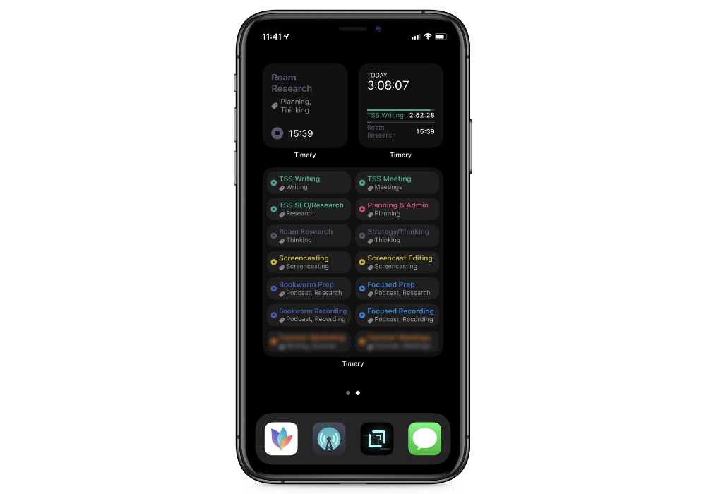
To the right of the Home Screen is the only other true page on my iPhone:

The only thing on this page is a bunch of Timery widgets that I use for time tracking via Toggl. The one in the upper-left shows the currently running timer, the one in the upper-right shows my time tracked so far today, and the large widget below has 14 different saved timers that I can use to quickly start tracking my time.
What’s cool about the Timery widgets is that they are quite customizable. You can choose a specific background color if you like, you can control which timers show up in the Saved Timers widget, and you can even toggle on a Compact Mode that allows you to fit more buttons in the Saved Timers widget.
I am aware that Timery actually lost a little bit of functionality with the changes in iOS 14, but these are good enough for me. I also know that there’s more automation goodness to be had with Shortcuts and automatically launching the appropriate apps, but most of the work happens on my Mac. I only use the iPhone to start/stop the timers.
Now if only Timery would come to Big Sur in the Mac App Store…
The Today View
The Today View is where I stash all the other widgets I might use. It’s kind of like the widgety junk drawer on my iPhone.

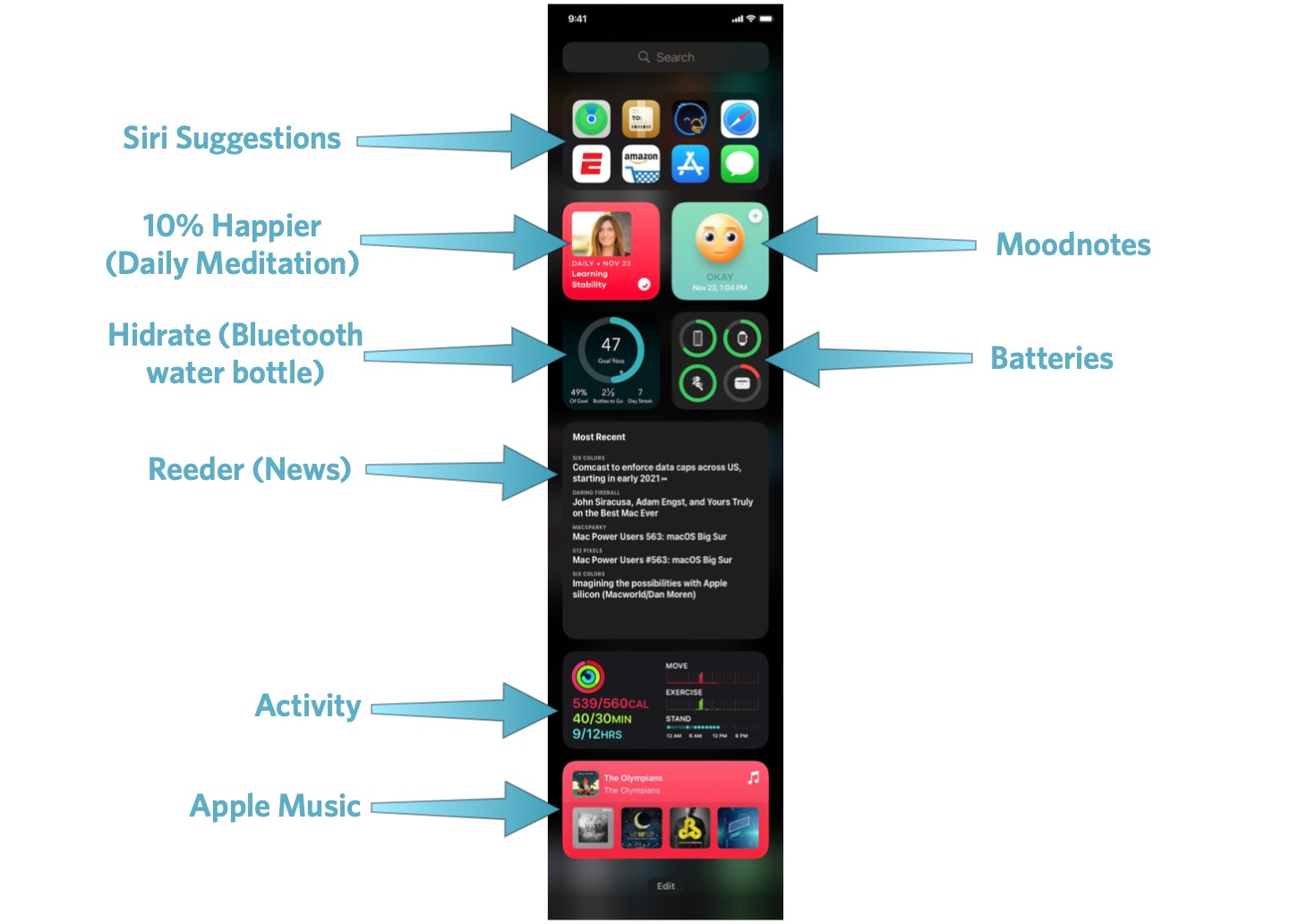
Here’s a breakdown of what’s here:
- At the top is the Siri Suggestions widget. I don’t often use this, but it’s occasionally helpful.
- I use the 10% Happier Daily Meditation widget for my daily mindfulness practice. This was Headspace for awhile, but unfortunately Headspace doesn’t allow me to jump straight to the daily meditation from the widget like 10% Happier does.
- I use MoodNotes to track my moods. I don’t do this on a regular basis, so I added the widget here and try to do this every time I pick up my phone and go to the Today View.
- While I have the Hidrate app on my Home Screen to log water that I drink, the widget shows me my current progress and tells me how far I have to go to reach my hydration goal.
- The Batteries widget shows me the current battery levels for my iPhone, my Apple Watch, and my AirPods (time to charge the case again!)
- I do my best to avoid the news, but I do keep up with RSS. Reeder has a fantastic widget that lets me quickly see the headlines that I might care about.
- The Activity widget shows my progress toward closing my rings (I find the numbers here more helpful than the ones on the Apple Watch).
- The Apple Music widget allows me to jump quickly to recently played albums from my music collection.
Most of the time, I’m just using the widgets at the top of the Today View. Very rarely am I scrolling down to the bottom to play an Apple Music album, but when I do it’s still often faster than launching the Apple Music app and finding it there.
Must-Have, Most-Used Apps for Thinkers
We spend an inordinate amount of time sorting through hundreds of apps to find the very best. Our team here at The Sweet Setup put together a short list of our must-have, most-used apps for writing, note-taking, and thinking.
