How To Create A Productivity Dashboard in Notion
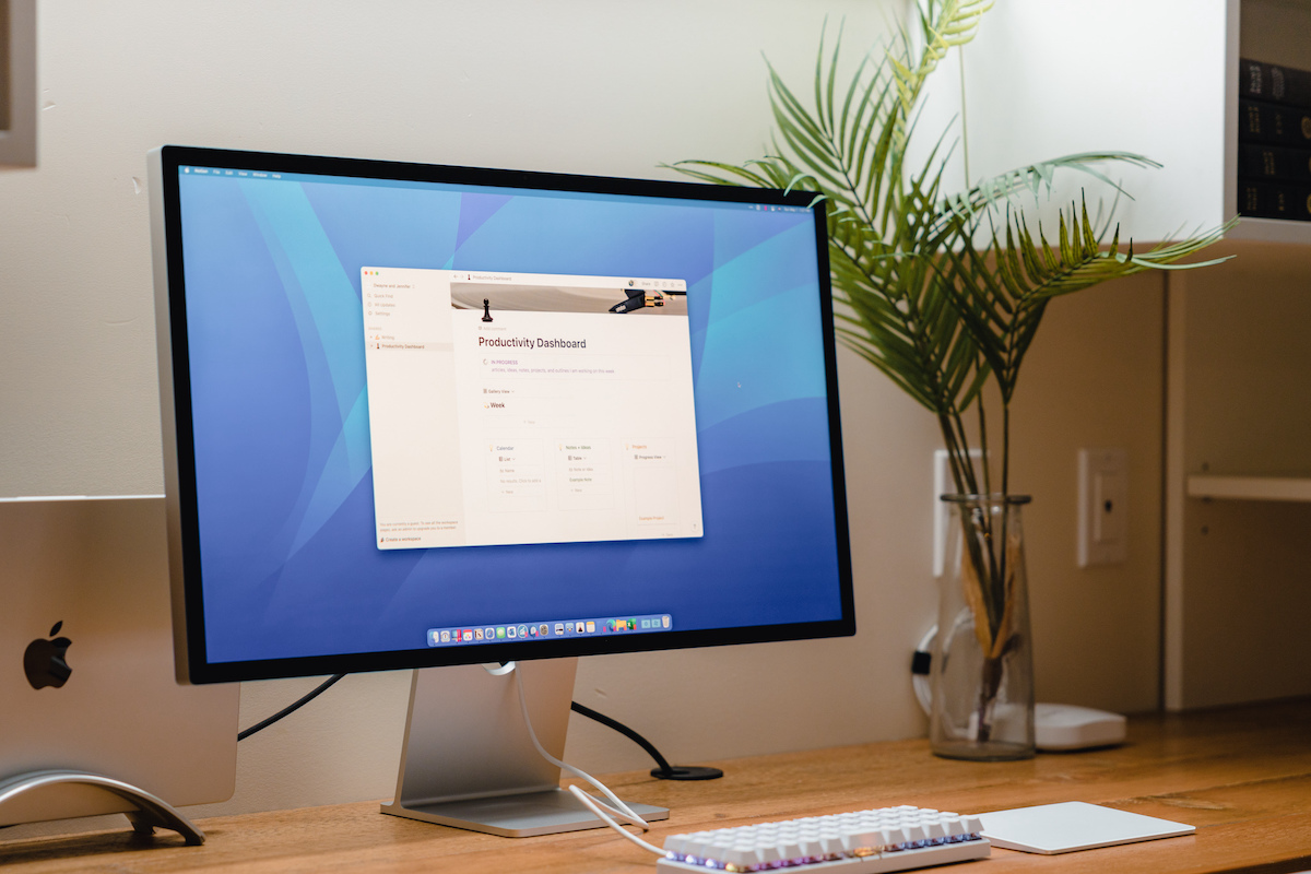
A couple of years ago, Shawn created a productivity dashboard in Ulysses. As you can read more about in that original article, Shawn was working to build a central spot to hold everything he was working on that week: his schedule and most important tasks as well as a place to easily access and work on his notes, ideas, and writing.
But, Shawn ran into a few issues that added some friction because Ulysses (a writing app) didn’t have some important functionality that he was looking for (such as native task management or easy document backlinks).
Anyway — Shawn challenged me to create something similar in Notion that could include the functionality he was looking for.
When Shawn was first creating his dashboard in Ulysses, he needed a place to see everything that was in progress. A section that contained the articles, ideas, notes, projects, and outlines that he was currently working on. Second, he wanted a weekly planner. A place where he could log his goals, take notes, and track daily tasks.
Again, the goal of a dashboard like this is to be able to see everything in one place — a central source of truth. It is extremely helpful to have one place to go to where you can see what projects you’re working on, your schedule, and the article that you need to finally finish. This saves time and helps to focus on what is actually important.
Note: I turned this Productivity Dashboard into a Notion Template. There is a download link at the bottom of the article.
Components of the Notion Productivity Dashboard
At first glance, you’d think this dashboard would be pretty straightforward. But it has quite a few moving parts in order for it to be helpful. It needs to show me what I am working on currently, my notes and ideas, my top priorities for the week, and my schedule.
Let’s take a look at what I came up with.
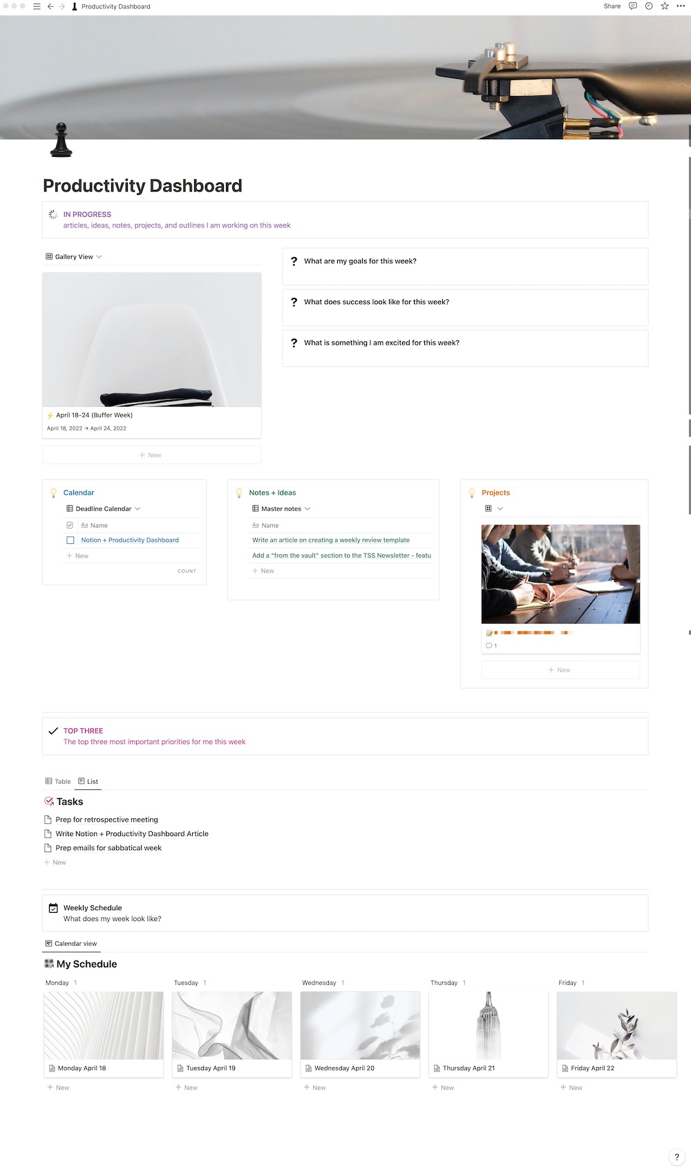
As you can see, there are a few moving parts. Let’s dive into each of them.
In Progress Section
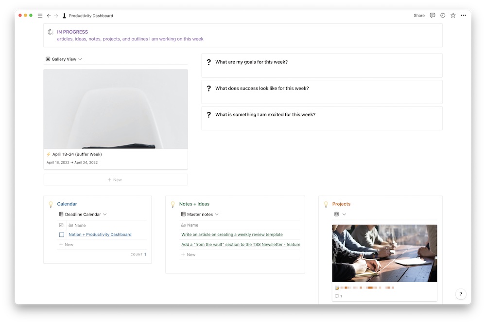
In this section, I can quickly see everything that I am working on this week. I have a database called “Week” where I have a card (like the one pictured here) for each week of the year. This is mainly used to categorize other cards I use (like for each day of the week, which I will get into a bit later). This was a system I learned from Marie Poulin. I have the filter set to show me the card for the current week I am in. This way I don’t have to switch it out every week, it does it automatically.
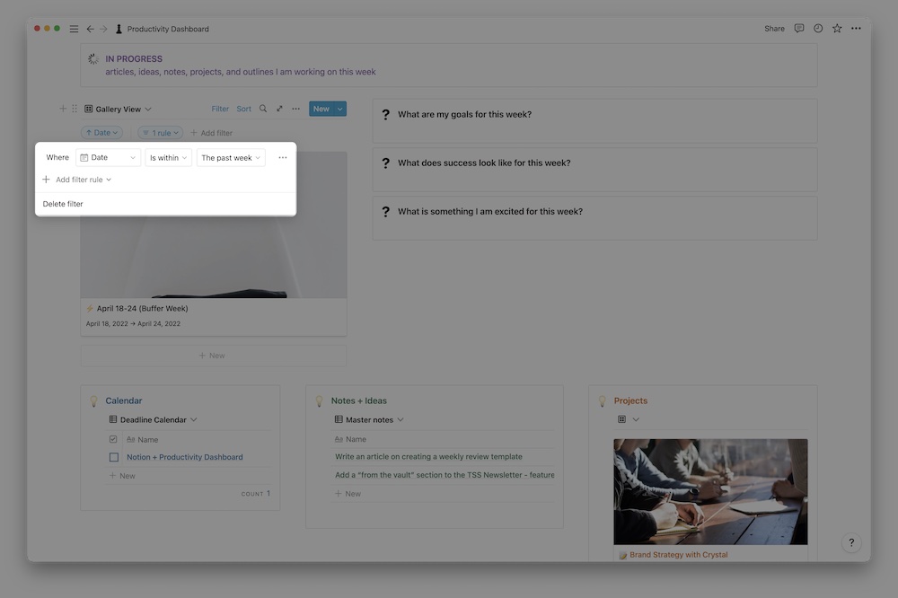
Right next to the week card are some basic questions that I can answer every week. Shawn uses similar questions to help set himself up for success when he plans his week. These are simple callout boxes where you can just type the answers to the questions. I used Canva to create a custom icon for these boxes (I pretty much created custom icons for all of the icons on this dashboard).
I set these callout boxes to simply be a place where I can input text. So every week I have to delete what I wrote the previous week. There could potentially be a better way to save the answers from each week and automatically clear them out each time using some fancy database relational stuff, but I like the clean look of these callout boxes, and I’m okay with the bit of inefficiency.
Let’s look at some of the related databases below the callout boxes. Here is where there is some real Notion magic.
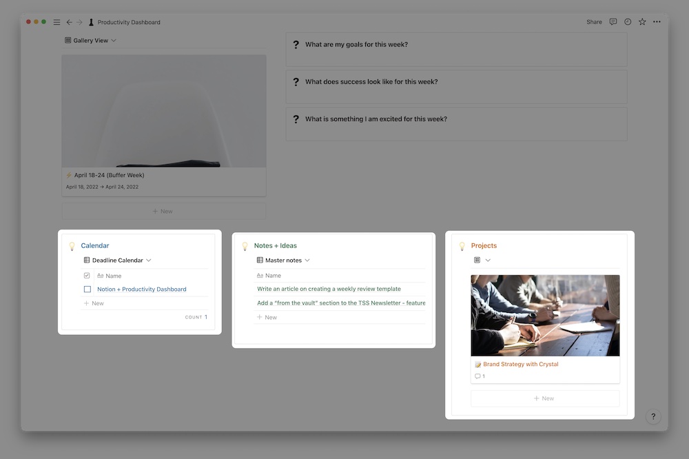
I have some pretty cool databases, thanks to what I’ve learned from Marie Poulin. I created three callout boxes and dragged each database into the callout boxes and then made them into columns. Sounds complicated. It kind of is (you have to do a lot of workarounds in Notion sometimes to get exactly what you want), but I like how I can see everything all at once without doing much scrolling.
On the left, I have the calendar database. This is filtered to show me articles or emails that are assigned to me and where the publication date is after today. You could adjust the filters to show just what is to be published this current week, but I like to start working on articles a few weeks ahead of the publication date.
Secondly, I have brought in my Notes + Ideas database. This database is pretty self-explanatory. It’s a place where I can quickly jot down different notes or ideas. I filter this database to show me notes or ideas that were created in the last week OR notes or ideas that have been marked for this week.
Let me explain.
I have a checkbox property in my Notes + Ideas database and my projects database called This Week. If there’s an idea I want to noodle on for this week or a project that I’m working on, I check that box. Now it shows up on my dashboard. It’s an easy way to filter through the mountains of notes, ideas, and projects I have so that I see only what I’m working on this week. Helps to get rid of distractions and overwhelm.
My projects database is set up pretty similarly to my Notes + Ideas database. It only displays projects where I have checked This Week?.
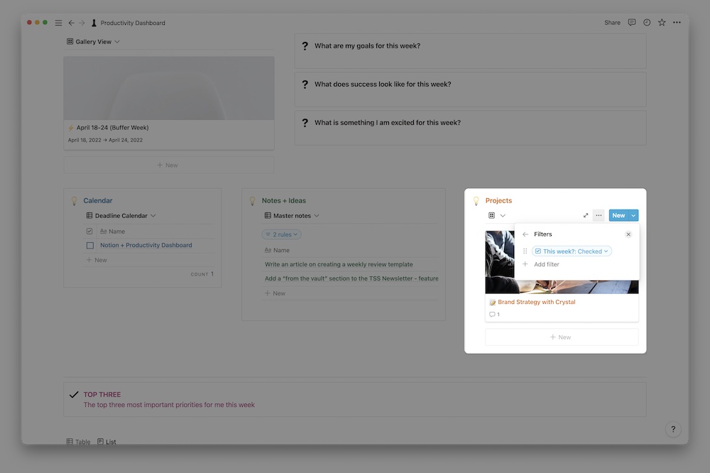
I really like this setup because it’s a one-stop reference point for what I am currently working on and focused on right now.
My top three
This takes us to the next section of the dashboard. My top three. You might have heard this phrase around here. We use it a lot. Your “top three” are the three most important things you need to get done in a given day or week. It helps you spend your time focusing and working on what matters.
So, of course, I made a section for my top three in my dashboard.

This is pretty straightforward. Well, sort of.
I brought in my master task database as a relational database and then filtered my view to see tasks that are:
- unchecked (undone)
- assigned to me
- checked as one of my top three tasks
This is a similar property to the one I used in my projects database. I simply check the Top 3? box if it’s a top-three priority task for the week. This doesn’t mean, however, that I don’t have other tasks that are set for this week — it just means that the top three are the most important.

You can see all tasks assigned to you in another view of the database so you can get a broader idea of what needs to be done. You can also decide what properties you want to see in each view. In this list view, I only see the name of the task. In my table view, I see the due date and a few other pieces of information. Having several views of the same information is one of my favorite features of Notion.
My schedule
There are a lot of different ways to manage your personal schedule. I personally don’t like scheduling out my day in 15-minute increments. I typically take more of a time blocking approach. I also reference my iCal quite a bit.
But I also like managing my schedule on Notion to be able to track my habits and see what tasks are due that day. Notion announced that they are rolling out some new features later this year that includes an easy way to integrate Google Calendar into Notion. That’s a feature I’m pretty stoked about.
(Side note: I would like to say that I left the pink and unicorns behind for this dashboard, but don’t worry — you can still see them in all their glory in my Habits article.)

Remember when I mentioned that I mostly used my “week” cards to categorize other cards? Well this is where I do that. This is filtered to show only the cards for this week. I have a relational database in these cards between “My Schedule” and “Week” where I assign each card to a certain week. That way I can easily filter this dashboard to only show me one week at a time.
I don’t typically use cards for my weekends. All I want to do on Saturday is sleep until noon and rewatch The Office for the umpteenth time. So, there’s not really a need to schedule that (or track it for that matter).
Within each of these cards I can track a number of my habits (I won’t get into it all now since I already did here) and also see what tasks are due that day. If I want, I can also schedule out my day.
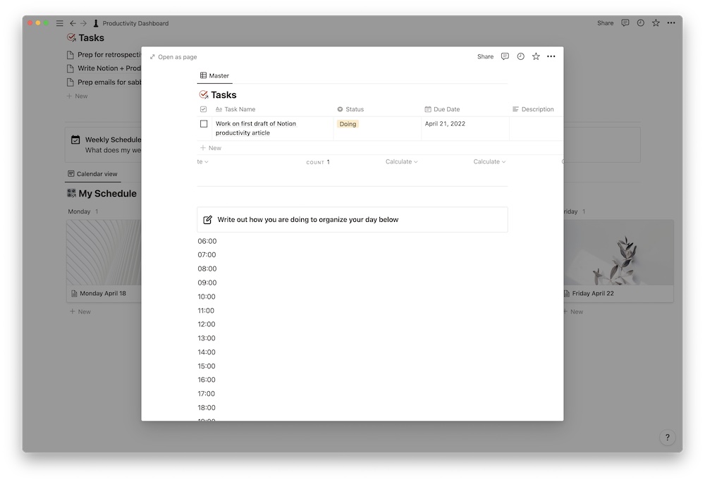
This view filters the tasks to show me what is due today. You can mess around with the filters and create several views based on what you want to see.
As you have probably noticed, I love using callout boxes. It catches my eye so I also pay extra attention to what it’s reminding me to do.
One of my favorite aspects of Notion is how flexible and visual it is, but it does come at a cost. It requires a lot of finicking, but it’s worth it if you stick with it. We’ve been using Notion for a while now here at Blanc Media, and we’re big fans.
Does this setup flow better than Shawn’s setup in Ulysses?
Shawn enjoyed the process of creating his dashboard in Ulysses, which is one of the main apps he uses. But, as mentioned, it did have a few drawbacks. Let’s take a look at each:
- It was not easy to interlink documents
- No native checkboxes or easy task management
Notion has an amazing interlinking feature. Anywhere inside of Notion you can easily link to another page by simply using the @ symbol and the name of the page or document. This makes it easy to quickly reference articles you’re writing or outlines you’ve created. Also, having the Notes + Ideas, Projects, and Calendar databases linked to the dashboard makes it easy to quickly jump to key pages. You can also easily upload images and documents to any Notion page.
Notion definitely has checkboxes. And task management. As I showed earlier, I link my task master list into this dashboard and can quickly see my task list and check things off, which, let’s be honest, is half the reason I add tasks into Notion anyways. I just want to check it off. Best. Feeling. Ever.
And since this page brings in and filters every database to show information that is relevant to that week, you don’t have to recreate the page each week. You just have to create a new week card and make sure the filters are showing that week. Easy.
So does this setup on Notion solve Shawn’s original dilemas? Yes. Does it have the functionality he was missing from Ulysses? Yes. Does it look way cooler? Yes.
Adding a Notion widget to your iPhone
One of the motivations behind this dashboard is removing friction and making it easier to do the important work. Once the dashboard is created, I don’t need to chase down my task list, what article I’m supposed to finish this week, and what project I’m working on. It’s all in one place.
I am an avid Apple user, and I use my iPhone a lot. I want to check my task list on the go and reference certain articles or projects, so I have Notion downloaded on my phone. To make it even easier, I’ve created a widget on my Home Screen that takes me straight to my dashboard.
I can just jump onto my phone and quickly cross off an item from my to do list or add what I’m excited for this week.
Here is how you can add your Notion Productivity Dashboard (or whatever you want to call it) as a widget on your iPhone (or iPad):
- Go to your Home Screen and long-press on an app to bring up the contextual menu, then tap Edit Home Screen. You can also long-press anywhere on the Home Screen to enter jiggle mode.
- Tap the + button in the top left corner, and search for Notion.
- Choose the first widget called Page (you can also swipe and see all the different kinds of Notion widgets you can add).
- Tap + Add Widget.
- Move the Widget around until you find the perfect spot for it on your Home Screen. I put mine on the first page front and center so it’s easy to access and reminds me often to track my habits.
- The widget will say Tap and hold to set up. Tap and long-press on the widget to bring up the contextual menu and tap Edit Widget.
- Choose your Productivity Dashboard and then tap back on the Home Screen and voila, you can now easily access your dashboard throughout your day!
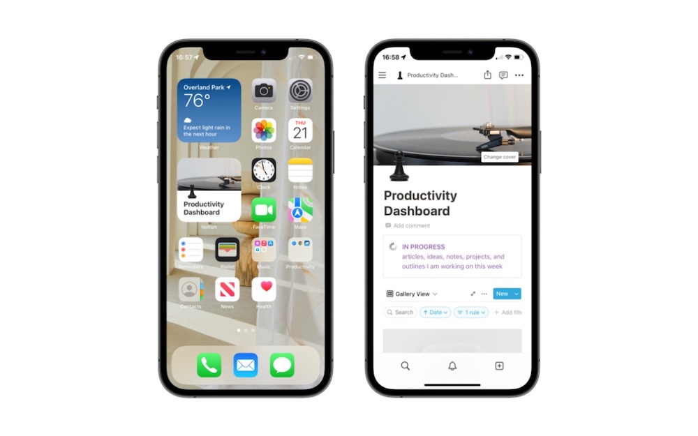
Although this dashboard took some time to mess around with, I really like how it turned out. I see everything I need to see in one place. This helps me to get into gear and actually do the work.
If you like this dashboard, you can get the template for free!
