Darkroom Developers Weigh in on Bringing Version 4.0 to the iPad
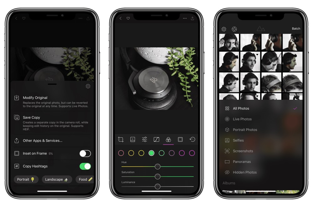
Since its launch three years ago, Darkroom has quickly gained a following among iPhone users looking for a capable, quick, and intuitive photo editing tool. It’s why we named Darkroom the best photo editor for iPhone, after all.
With its fourth version, the app extends its reach to the iPad with a brand new interface, full support for multi-tasking and keyboard shortcuts, and a ton of refinements on iPhone as well.
Get Our Best Photography Tips & Workflows
Transform your photos and edits from average to awesome with our in-depth, mobile photography course. It’s jam-packed with training, ideas, and lessons that can literally transform your photography overnight.

The team’s energy and ambition is palpable: “We want to be the dominant photo editor for iOS.” That’s Majd Taby, founder and CEO of Darkroom and the man responsible for the app’s engineering.
I wanted to understand what fuels that ambition, and where Majd and his co-founder and designer Jasper Hauser see Darkroom’s place among the myriad photo editing apps on the platform.
“Photo editing for us is more than a few sliders and a couple of filters,” they told me. “It’s a workflow that starts with capture and ends with sharing. That’s why we’ve partnered with Halide, built support for Frames to support the Story format, and built a full-featured hashtag manager to streamline the sharing process. This holistic approach to mobile photography is unique to Darkroom.”
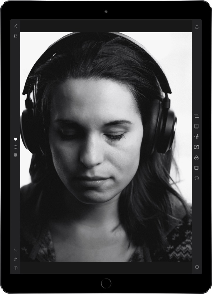
Streamlining the path from capturing to editing to sharing is at the heart of the app’s design, and it manifests in all sorts of ways throughout the interface. The seamless integration with the native photo library eliminates any import hassle, and the thoughtful selection of tools and export settings makes each step of the process feel frictionless.
Maintaining that feeling was part of the reason the iPad version of the app took so long to develop.
“The easy approach is to simply scale up the iPhone interface, but who wants that?” they admitted. “Pro-grade apps on the iPad tend to go one of two ways: An upscaled iPhone UI, or a downscaled desktop UI. Neither is ideal for the iPad. We wanted the Darkroom experience to be first-grade at every size and orientation.”
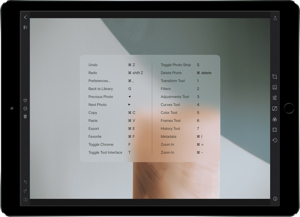
“We spent a lot of time iterating on every detail of the app to ensure that it’s clear what every element does, and what state you are in. Our bet is that pro-grade software and usable software are not mutually exclusive.”
The result was beneficial not only for the iPad, but for the iPhone version as well. Adopting a single codebase with a responsive interface depending on device allowed for natural support of landscape orientation on the iPhone, as well as RTL language support. The iPhone also inherits the new colour histogram, as well as a brand new integration with the Moment Pro Camera app for users of those lens attachments.
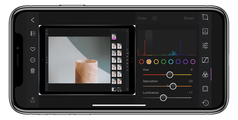
“Experientially, the screen size really helps us expose the power of Darkroom in a way that an iPhone just can’t due to design constraints. Two examples of this are the new Photo Strip in the edit interface which allows you to navigate through your library while in an editing context, helping you cull a large collection of photos very quickly.”
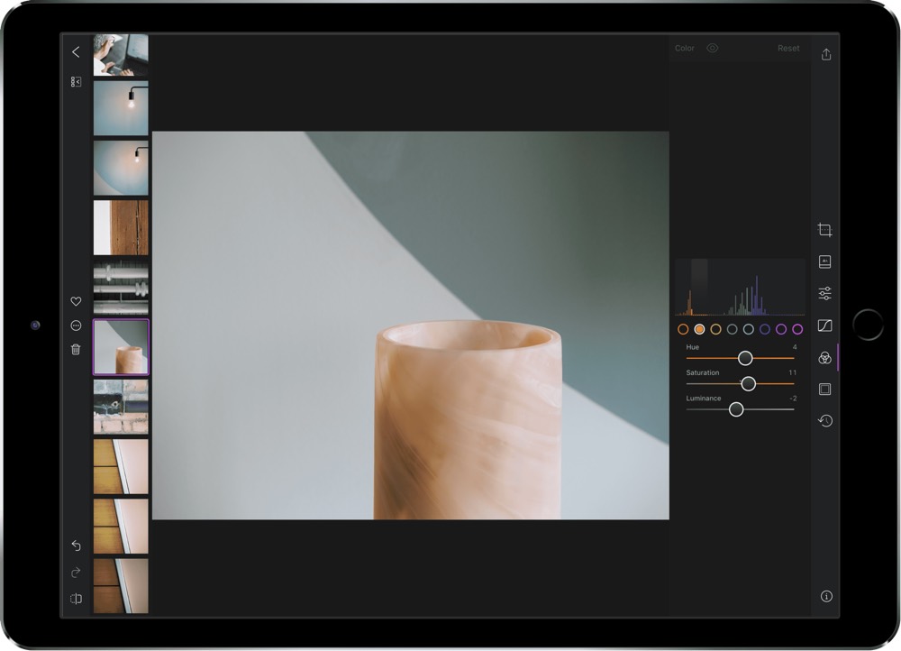
It also establishes a strong foundation from which the app can continue to build out new features and stay current as photographic technology evolves.
“We’re in the nascent golden age of computational photography. It was accepted wisdom that mobile cameras faced a physical barrier (lens size, light sensitivity, optical zoom, etc) that prevented them from presenting a serious challenge to DSLR cameras. With Portrait Mode on iOS and Night Sight on the Pixel 3, you’re seeing a serious challenge to that accepted wisdom. Year to year, mobile photography leaps ahead at a remarkable pace. Consider the qualitative difference between Portrait HD and Standard Depth on iOS over just one year. There’s no reason to believe that will slow down anytime soon”
What comes next? The team is keeping a close eye on our changing habits and looking for new ways to further integrate platforms, workflows, and processes.
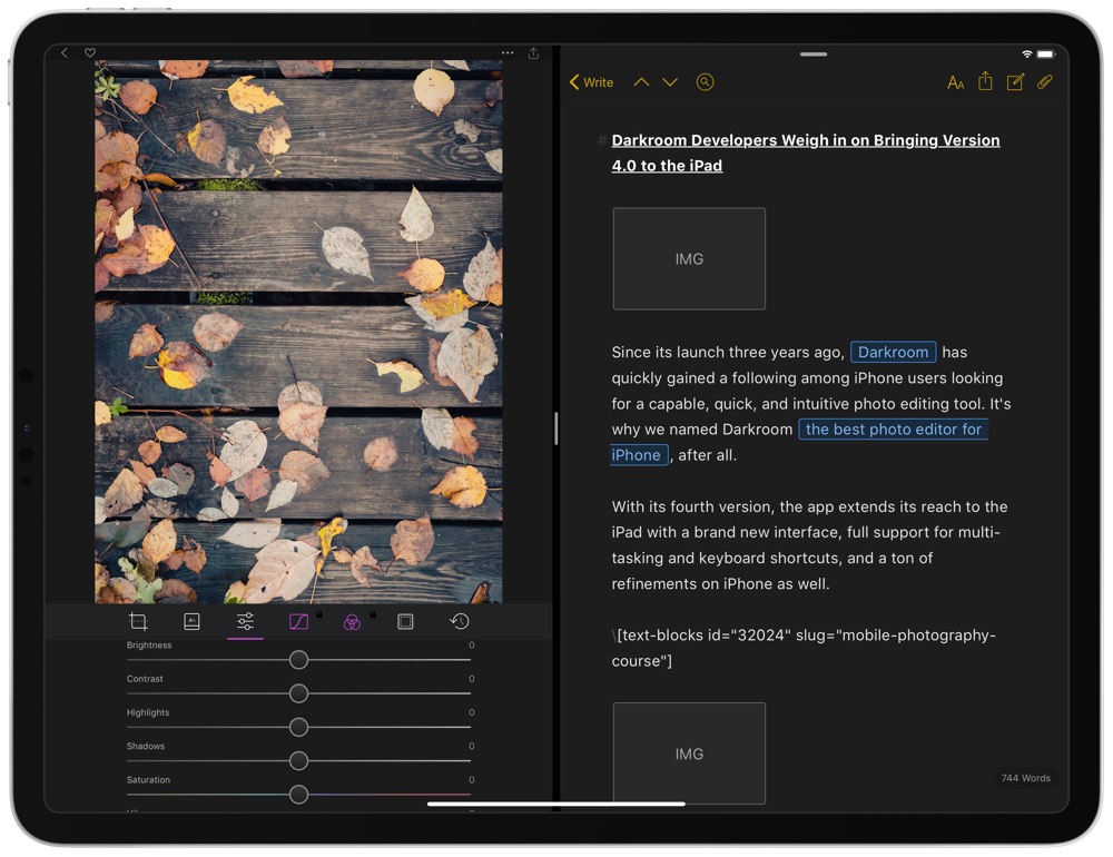
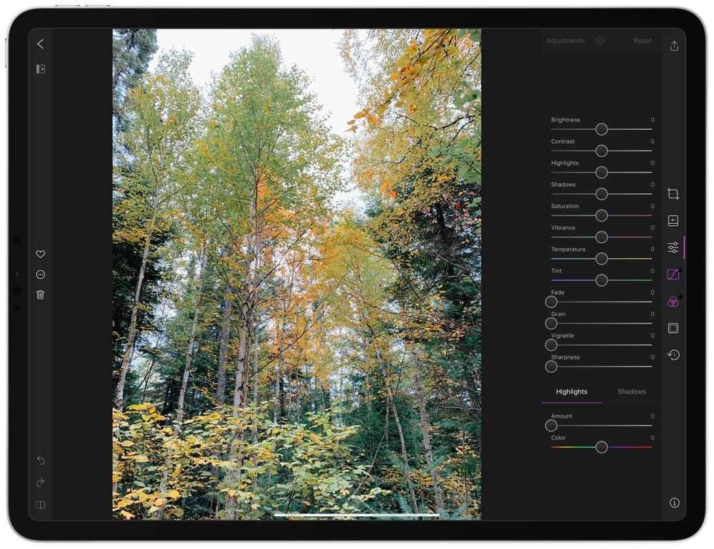
“Photographers still go through multiple apps to edit a photo, and we hate seeing that, so we look forward to vertically integrating the primary photo editing experience.”
You can download the brand new Darkroom 4.0 for iPhone and iPad right here on the App Store.
Get Our Best Photography Tips & Workflows
Transform your photos and edits from average to awesome with our in-depth, mobile photography course. It’s jam-packed with training, ideas, and lessons that can literally transform your photography overnight.
