A Roundup of Apps With Great iPad Trackpad Support
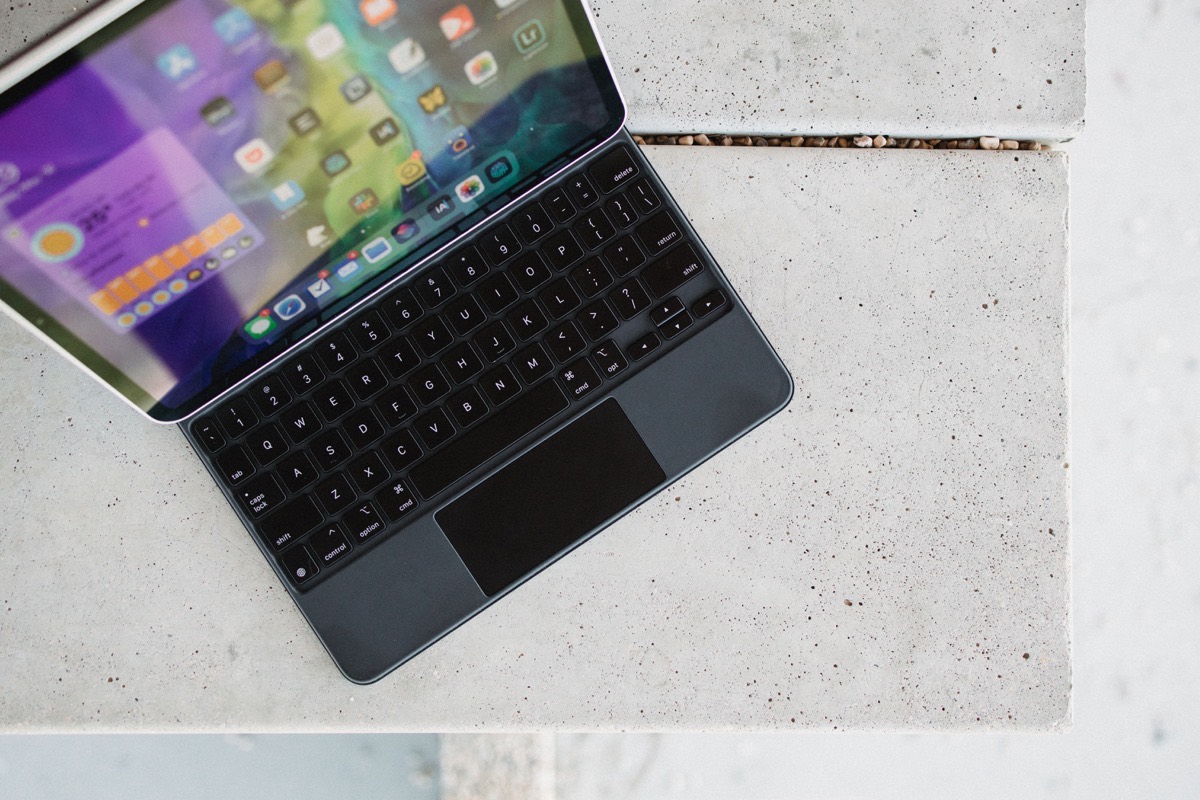
Much has been made of iPadOS 13.4’s out-of-the-blue trackpad support, but one of my favorite takes on the matter comes from Matt Gemmell:
What I like about pointer control on the iPad isn’t that it’s now available, but rather that I only have to use it when I want to.
Matt’s article is particularly fluent on the matter. The crux of his argument: While the pointer in macOS is effectively fundamental to using the Mac, pointer control on the iPad is not fundamental to how you use the iPad — it’s just another way to move about the screen.
Smart, of course.
Which is why iPad users aren’t screaming from the rooftops at apps that haven’t yet been updated with proper trackpad support. Apps that haven’t officially adopted the new input method can still be used, like they always were, but with a few clicks, holds, and drags where a trackpad is concerned.
It’s feasible. Usable, even. And not particularly detrimental to using an iPad.
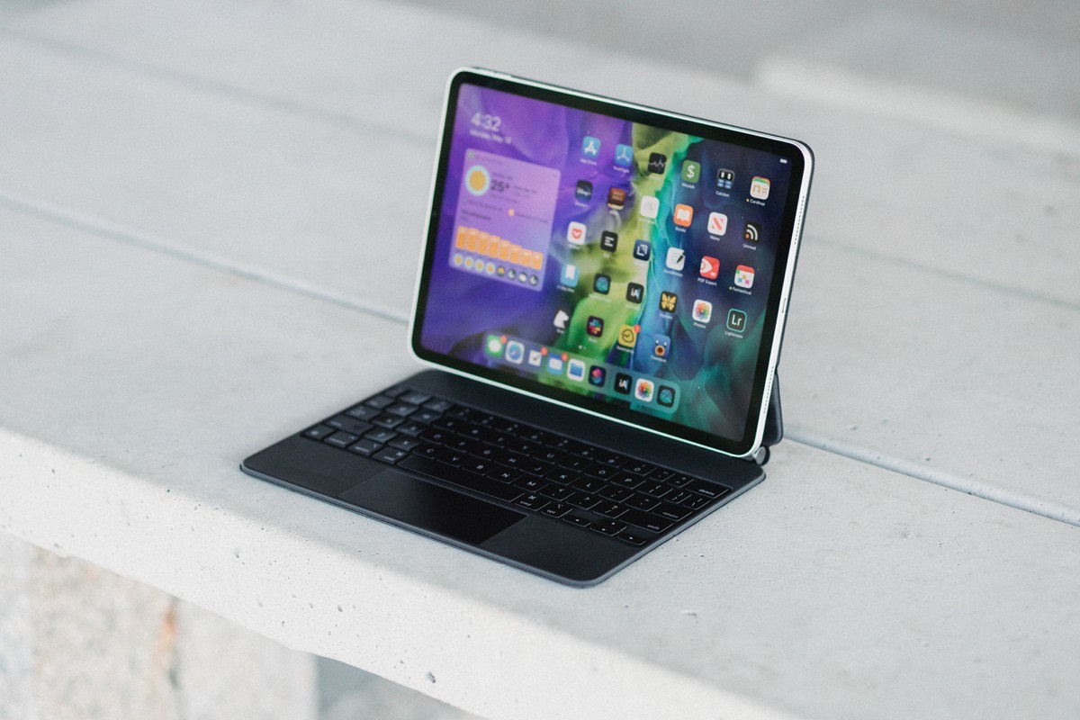
That said, should you be interested in using the iPad on a desk, trackpad support feels and works wonderfully. The whimsy of the amoeba-like pointer — Marius’s words, not mine — has already evolved and taken new shapes and effects in some of our favorite apps.
Here’s a roundup of our favorite implementations of trackpad and cursor support so far, along with a few we’re hoping see an update sooner rather than later.
Things 3
Of course, we love Things 3. But this is about trackpad support, and we find a few of Things’s trackpad implementations to add some more character and whimsy to the app.
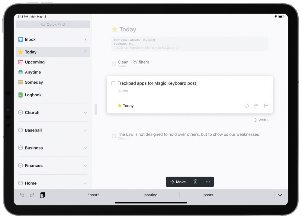
For instance, if you take the iPad cursor and maneuver through your list of checkboxes, you’ll notice the cursor morph into each individual box, highlighting the box and bringing it to the forefront of your attention.
Nearly all of Things’s interactable buttons now have a cursor morph — chevron arrows for dropping down an area now zip to the cursor, the Quick Find menu in the top left corner boosts in size as you hover over it, and the Magic Add Task button in the bottom right corner takes on a whole new life when the cursor whips around. The trackpad is just large enough to be able to click the Magic Add Task button and drag across the screen to an area or smart list for adding a task.
Things 3’s minimal personality has always ranked near the top of its most notable features, and cursor support manages to stay within the realm of minimal and functional without losing what makes Things feel so great.
Available now: our video course for Things 3 users…
MindNode
While the technical implementation of trackpad support in MindNode isn’t going to cause anyone’s jaw to drop in amazement, it does have a rather substantial impact on the usability of the app.
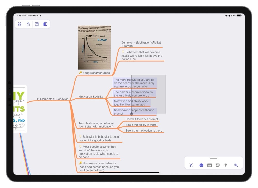
One of the things we love about MindNode on the iPad is the ability to physically touch your nodes when you move them around. It may sound silly, but the physical connection to your ideas makes them seem more real. This approach causes some crazy multi-touch workarounds for things like selecting multiple nodes, which requires you to tap and hold on one node while tapping another node to add it to your selection. It’s an exercise in finger dexterity that ends up feeling more like gymnastics than working with your ideas.
This is a problem easily solved with a trackpad, though. Just click and drag a selection box around the nodes you want to move. Or, if you want to select nodes that aren’t right next to each other, you can click one to select it, then hold the Shift key on a connected keyboard and click another node to add it to your selection. This kind of control has always been possible on the map, but there is something to be said about being able to physically touch your ideas in your mind map. And with the improved trackpad support in 7.2, you now have the best of both worlds on your iPad.
Of course, MindNode supports the other trackpad niceties, too. The cursor changes shapes and snaps to buttons in the MindNode interface, making it easy to select what you want on screen via the trackpad. One area where this is especially nice is when trying to select a task, note, or tag applied to a node. Just like the buttons in the Action Menu, the cursor snaps to the touch targets for toggling a task as complete or viewing the notes and tags attached to a node. Depending on your zoom level (which can be adjusted with pinch gestures on the trackpad), these touch targets can be fairly small. But the ability to snap the cursor to the appropriate control makes this a breeze.
Unread 2
When we first dreamt up this roundup idea, Unread 2 was one of the only major RSS contenders that had proper cursor support. Since then though, most of the other best RSS contenders have adopted trackpad and cursor support, including Reeder 4. Reeder is a beloved RSS app for many users, so those folks can rest assured that Reeder 4’s trackpad support is entirely functional and very simple to use.
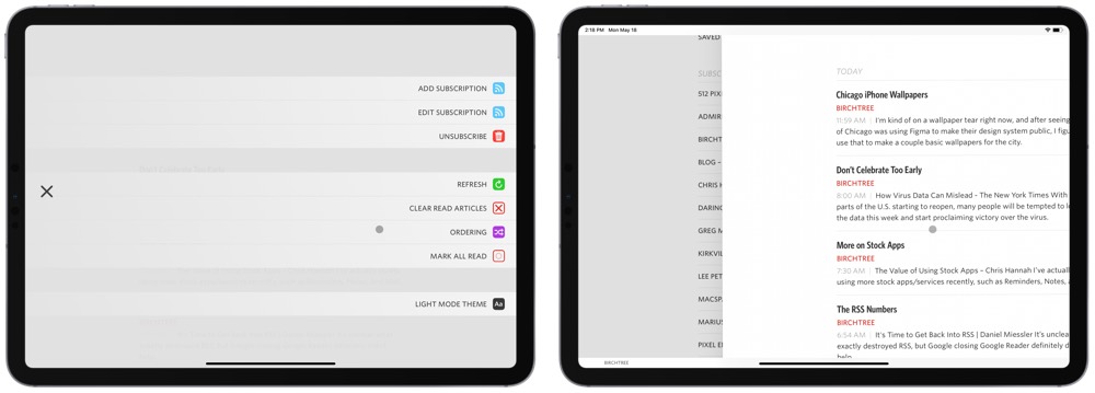
That said, Unread 2’s cursor support is more notable, in that the app has always been designed around swiping to navigate between RSS lists, articles, the share sheet, and more. Golden Hill Software has effectively replicated Unread’s swiping navigation in the form of two-finger swipes on the trackpad, allowing you access to all of Unread’s menus using two-finger swipes.
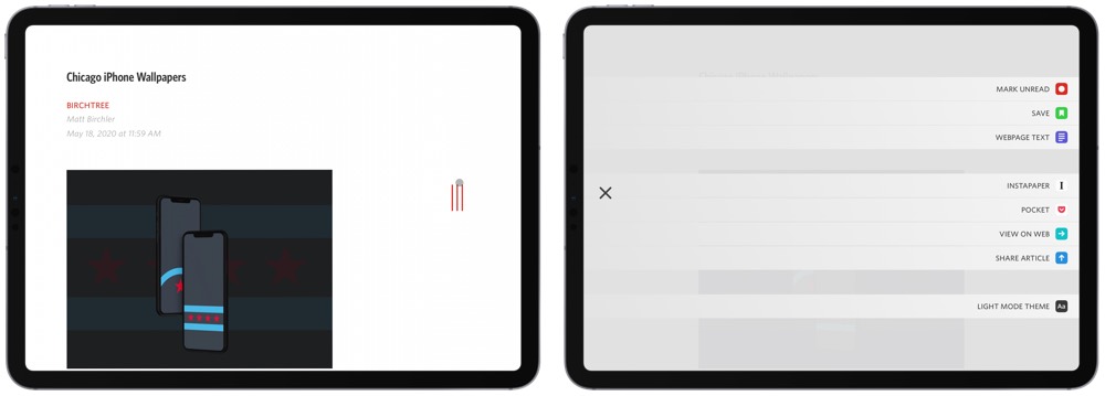
From any menu, a two-finger swipe from the left sends you back a menu, just like a regular swipe. Any two-finger swipe from the right pulls up Unread’s special settings menu, allowing you to change themes, add subscriptions, etc. In the article view, a two-finger swipe from the right reveals Unread’s Article Actions feature, which provides a far faster method for saving to a read-it-later service (like Pocket or Instapaper) than the system-wide share sheet.
Lastly, because Unread is built around swiping, I’ve found you can process and triage your RSS feeds faster using just two-finger swipes than in any other RSS app available. After drilling into a feed’s article list, marking all the articles as read is as simple as swiping with two-fingers beyond the bottom of the list, revealing a Mark All as Read indicator before sending you to the next feed’s article list.
All told, Unread 2’s trackpad and cursor support has naturally morphed from the app’s still-great swiping-only navigational system, and, at least in my world, has made Unread as good a desktop RSS processor as it was a comfortable RSS reading app.
Fantastical 3
If there was a competition to see which app would add the most whimsy from the new trackpad and cursor support, Fantastical 3 would take the cake. So many elements in the app have been refined for cursor support, from subtle highlights within the calendar ticker to little boosts in size to text buttons throughout.
Two specific cursor support areas really stand out in Fantastical 3.

First, the cursor morphs into each of the rectangular Day/Week/Month/Year navigational buttons at the top of the view, reducing the need to be precise with the cursor as well as adding a touch of personality I haven’t seen in other apps.
Second, just for kicks, take your cursor and swipe back and forth over the bell notification button in the top right corner. The bell magically swings back and forth as you hover back and forth over it. This little animation is only visible after closing the notification window when using the touch input method. Thanks to the cursor, that little bell can swing back and forth endlessly.
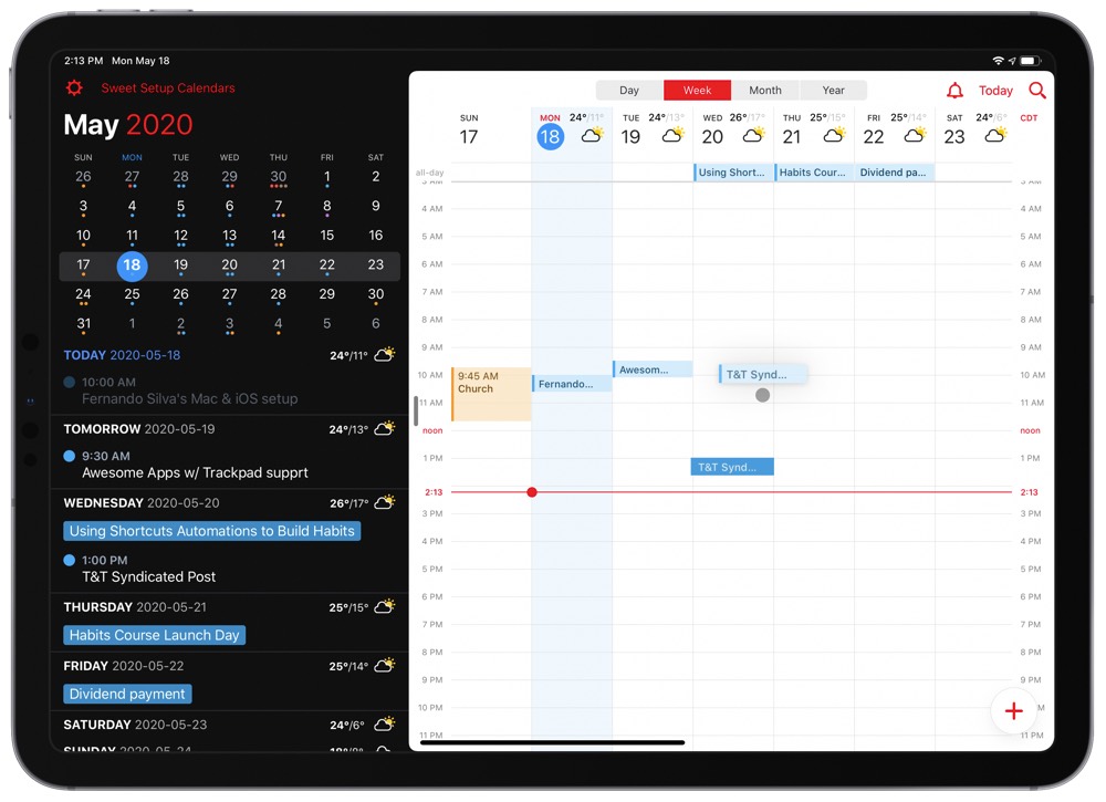
There are a plethora of other notable trackpad support additions in Fantastical 3. You can two-finger swipe between days in the Day view and between weeks in the Week view. Clicking and dragging on an individual calendar event and moving the event to a new time feels more natural than tapping, holding, and then dragging (in my opinion), and the ability to be more precise with the cursor makes choosing a new time easier. A two-finger right-click reveals the former 3D Touch menus for different events, providing faster ways to move events around, creating new event templates, and more.
Fantastical is a great example of an app that feels like it has two different methods of use depending on the way you’re interacting with the app. If you’re using a trackpad in the app, Fantastical becomes more efficient than ever before in adding, processing, and rescheduling events. In touch-mode, Fantastical is as comfortable as ever at perusing your calendar and mentally planning your week.
From Fantastical’s horizontal Day/Week/Month/Year cursor support and the way that little bell swings back and forth, Fantastical has shown new ways for other developers to implement trackpad and cursor support. This is one of the funnest updates we’ve seen thanks to iPadOS 13.4.
Pretty Much Any Text Editor
If you write on your iPad, you probably don’t need to be told what a pain it can be to get your cursor exactly where you want it using the touch interface.
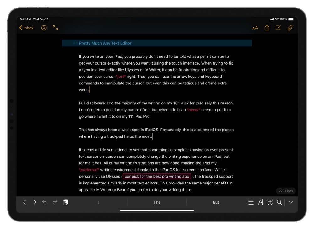
When trying to fix a typo in a text editor like Ulysses or iA Writer, it can be frustrating and difficult to position your cursor just right. True, you can use the arrow keys and keyboard commands to manipulate the cursor, but even this can be tedious and create extra work.
Full disclosure: I do the majority of my writing on my 16″ MBP for precisely this reason. I don’t need to position my cursor often, but when I do I can never seem to get it to go where I want it to on my 11″ iPad Pro.
This has always been a weak spot in iPadOS. Fortunately, this is also one of the places where having a trackpad helps the most.
It seems a little sensational to say that something as simple as having an ever-present text cursor on-screen can completely change the writing experience on an iPad, but for me it has. All of my writing frustrations are now gone, making the iPad my preferred writing environment thanks to the iPadOS full-screen interface. While I personally use Ulysses (our pick for the best pro writing app), the trackpad support is implemented similarly in most text editors. This provides the same major benefits in apps like iA Writer or Bear if you prefer to do your writing there.
Stop losing your ideas and notes to multiple apps…
An online course to help you save time, organize your notes, and master the best writing app for Mac and iOS: Ulysses.
Screens 4
Screens is the best VNC app for iPad and Mac and its trackpad and cursor support truly brings out the best way to operate a Mac from your iPad. Where before, you’d need to tap around on the iPad to navigate around your Mac from afar, trackpad and cursor support blur the line of where the iPad starts to truly feel Mac-like.
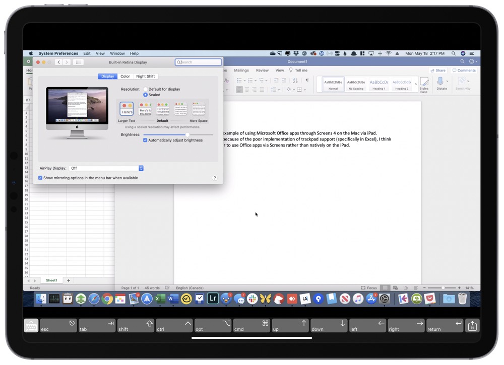
With cursor and trackpad support in Screens 4 for iPad, the cursor on the iPad becomes the cursor on the iPad. The transition is very natural and familiar; moving and scrolling on the Mac via the trackpad is just like you’re used to (albeit with a slight amount of lag), clicking and right-clicking work identically, and even gestures work the same inside of apps like Safari.
In fact, cursor and trackpad support work so well inside of Screens that you may lose yourself into thinking all trackpad gestures work the same. The biggest change: three-finger swiping gestures are saved for the iPad, meaning you will be jumping between iPad spaces and apps rather than the Mac’s spaces and full-screen apps.
Further, because the line is so blurred between the Mac and the iPad when using Screens, you’d also expect keyboard shortcuts to work perfectly as well. While a good number of keyboard shortcuts work as they do when operating the Mac directly, there are a few keyboard shortcuts that remain glued to the iPad or that otherwise don’t work Mac-side:
- CMD + Q: Quitting apps with the standard keyboard shortcut doesn’t work, at all. CMD + W is the closest thing I can find to being able to close out a window of an app.
- CMD + Tab: The standard app-switching keyboard shortcut is glued to the iPad-side, ensuring a CMD + Tab shortcut switches away from Screens itself and into a prior iPad app. My solution to move between apps Mac-side: Option + Tab opens the app switcher, and then you can click on the app in the overlaid bar.
As a whole, Screens 4’s implantation of trackpad and cursor support quickly makes the iPad feel like a Mac, provided you can work around the hiccups in three-finger gesture support and keyboard shortcuts.
Drafts
Drafts is great for capturing bits of text and then sending somewhere else, but managing those bits on your device can be cumbersome. This isn’t a big deal most of the time since Drafts is really the place where text starts – once you have it captured in Drafts, it usually gets sent somewhere else before it’s finished.
That being said, Drafts 20 was just released and it offers some of the better contextual menus that we’ve seen. For example, you can right-click on a trackpad now to access additional sorting options for collection spots in Drafts. This allows you to sort your texts by date accessed, date created, date modified, or the title from the text itself in ascending or descending order. You can even choose whether to include flagged text, and whether you want those flagged texts displayed at the top.
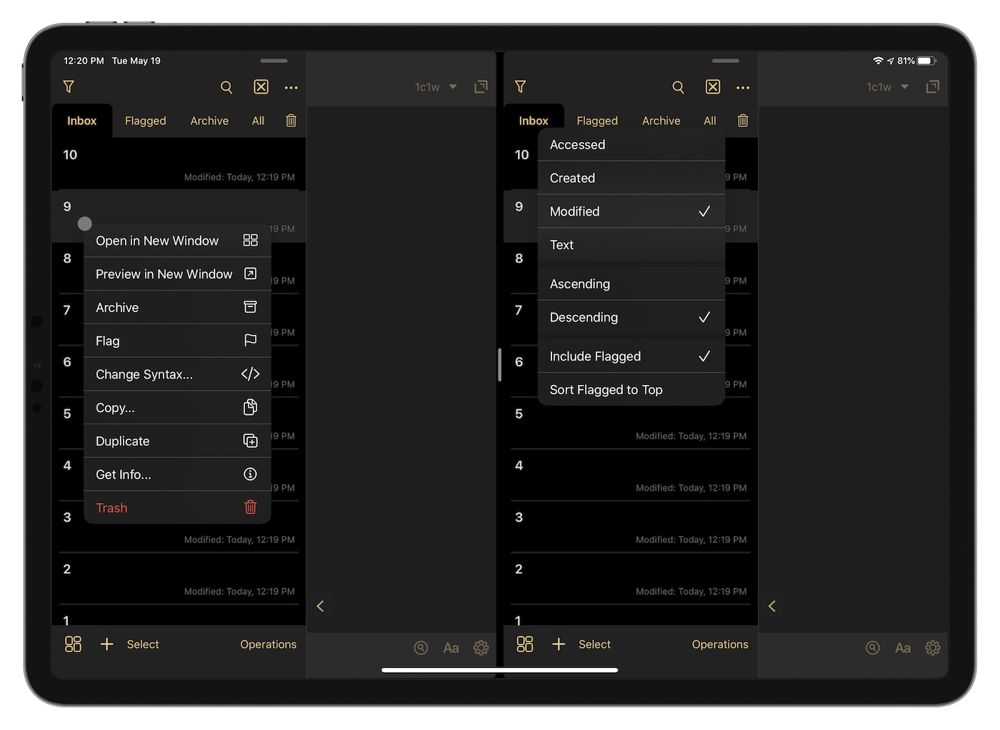
You can also access additional features via the contextual menu by right-clicking on any individual draft. This allows you to do things like open the draft in a new window (or simply preview it there so the rafts app goes back to full-screen when you’re done), change the syntax, and more. The contextual menus accessible via the trackpad coupled with the addition of wiki-style links between drafts makes the app much more robust as a potential information management system.
Notable Omissions
Though I mentioned at the start that apps without trackpad support still operate normally, there are a few apps that are dying for proper trackpad and cursor support. In general, these are apps that carry over more traditional mouse and keyboard input paradigms, but they are important apps and experiences that, at least right now, hinder the ability to bend the iPad into a more productive use.
Microsoft Word and Excel
Microsoft isn’t as bad as Google at bringing the latest iOS features to its apps, but there is certainly a lag time between the release of new iOS features and Microsoft implementing those features in its core Office apps. Split View, for instance, was only launched within the last few weeks for Microsoft Word.
It can be expected, then, that Microsoft is going to take its time in implementing trackpad and cursor support. At the time of writing, Microsoft has stated mouse and trackpad support will come to Word and Excel in the fall, providing ample time for current users to become frustrated.
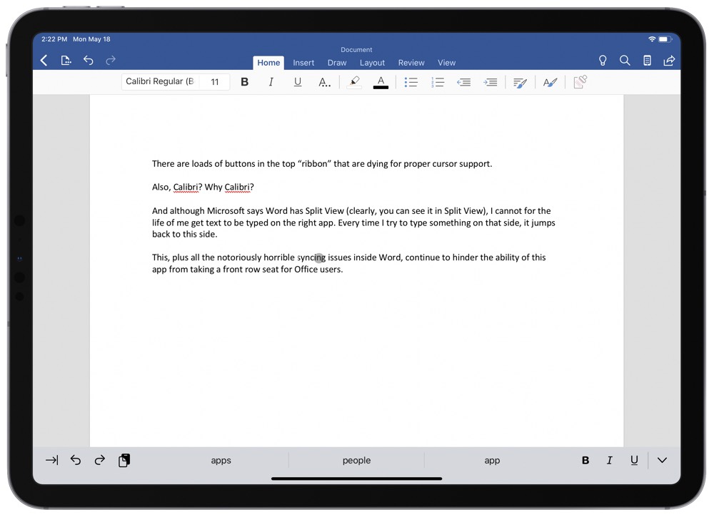
Microsoft Word, for instance, has carried over the traditional header ribbon that houses all its formatting buttons. The size of these buttons are relatively small for a fingertip and are screaming for cursor support. Having the iPadOS cursor slurp into each button in the fall should greatly improve the experience inside Word.
Plus (unbelievably), the cursor itself inside Word doesn’t transform into a text-selecting bar (formerly known as an I-bar) when hovering over text like it does across iPadOS. We mentioned text editors earlier as being one of the app categories that most benefited from trackpad and cursor support, yet Word has missed every single shot in this department.
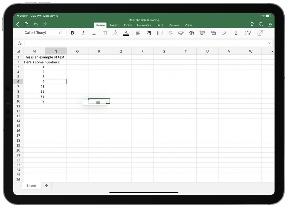
Excel is another beast that is dying for cursor support, especially since Craig Federighi noted the vast improvements to spreadsheets in the Cursor Support debut video. All those improvements are exclusive to Numbers as of right now, ensuring you can’t use Excel on iPad with a trackpad the way you’re used to. You can’t click and drag across multiple columns or rows to highlight all cells within those columns or rows. You also can’t click and drag on a cell and highlight a block of cells. Add in all the same header formatting buttons like in Word, Excel quickly becomes a nightmare to use with the app’s current iteration of trackpad support.
I’d rather use Excel on the Mac with Screens 4 than use Excel on the iPad, at least at this point.
Tweetbot (and Pocket)
Whatever you think of Twitter these days, it’s clear there is a cavern between the official Twitter app and third-party Twitter apps. Though third-party apps have been purposely crippled, Tweetbot still rages on as one of our favorite Twitter apps thanks to its personality, chronological timeline, and no-ad experience.
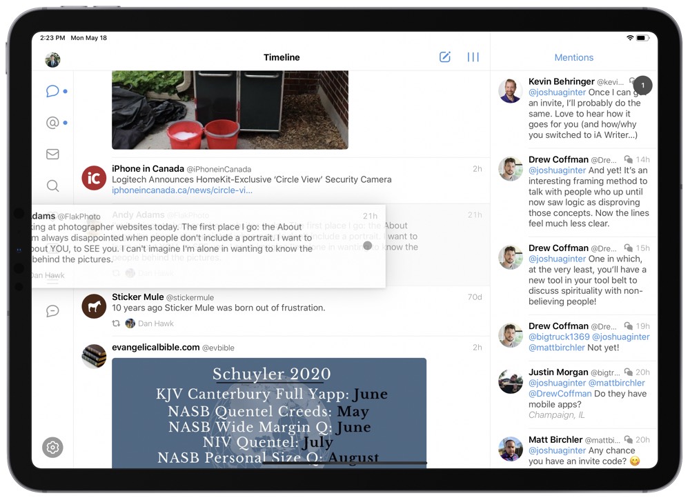
That said, Tweetbot hasn’t seen a meaningful update in some time, ensuring iPad trackpad and cursor support hasn’t yet been properly implemented. The hiccups are most notable when you want to see the conversation around a specific tweet in your timeline. Like other unsupported apps, you currently have to click and drag the tweet to “swipe” the tweet to the right or left to open the tweet’s page itself. This should be a simple two-finger swipe like it is in Tweetbot for Mac. As it stands right now, I couldn’t actually capture a screenshot with the “…” exposed behind a tweet because of the poor trackpad support — it’s very hit and miss right now.
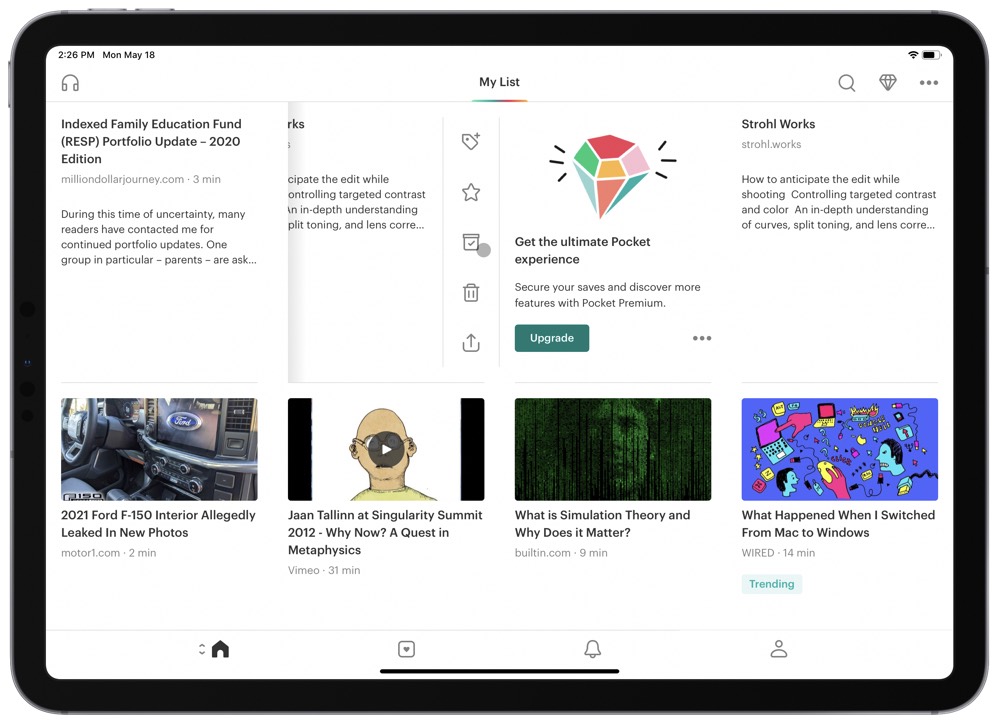
(It should be noted that this exact same “click, hold, and drag” behavior of unsupported trackpad apps is most notorious in Pocket. Pocket’s grid view promotes the use of a swipe-to-the-left to share, open, or archive an article. This is my most used gesture in Pocket, and right now it requires a “click, hold, drag” maneuver to find those sharing buttons.)
Other little touches, like the amoeba-cursor zipping between navigational buttons in the left sidebar would also look great.
Cursor support isn’t going to make or break your usage of Tweetbot for iPad, but the lack of current support does have Tweetbot standing out for negative reasons.
Adobe Lightroom CC
If there was a cherry to put on top of the notable omissions list, it would be Adobe Lightroom CC for iPad. One has to wonder if apps that are built with cross-platform support in mind (Lightroom is effectively duplicated across Mac, Windows, iPad, iPhone, and even the browser right now) are bound to suffer the most from a lack of trackpad support on the iPad.
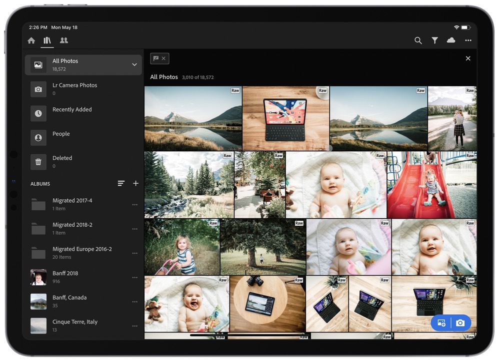
Since Lightroom CC for Mac sets the expectation for how trackpad support should operate, it’s very easy to spot the shortcomings in the iPad app. I mean, as of the time of writing, you can’t even scroll through your library with two fingers. When viewing an individual photo, you can’t swipe between photos.
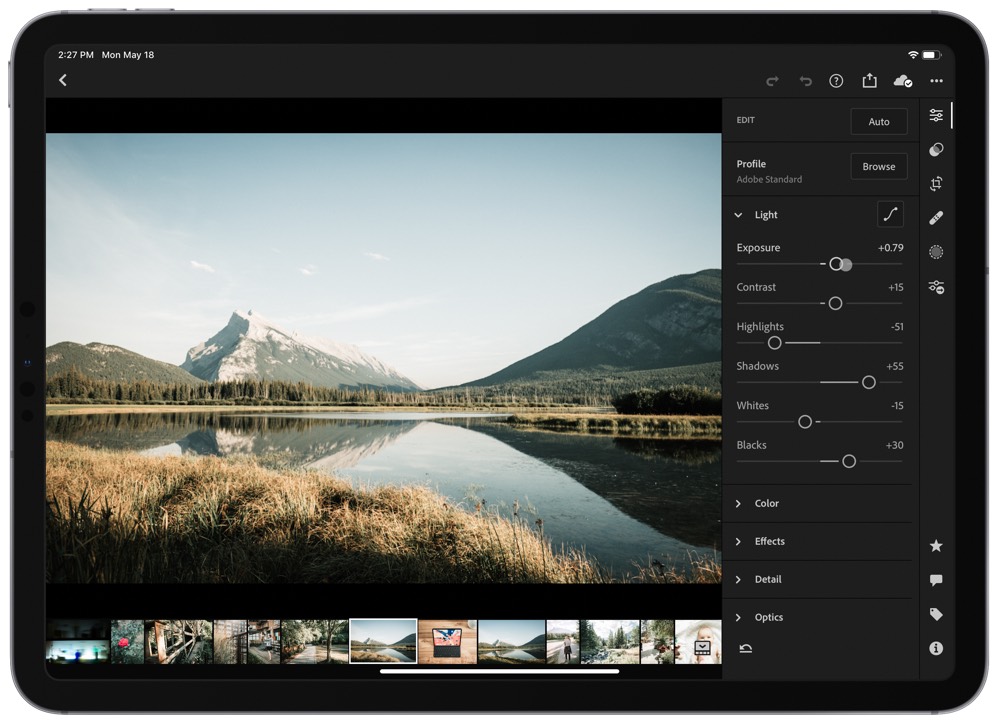
And if you’re attempting to click and drag an editing slider, there is a slight lag (I assume due to the software assuming the input is your fingertip and the sloppiness that comes with a blunt fingertip) between your slide and the actual slider moving. This isn’t present on the Mac app and is incredibly frustrating if you’re moving to the iPad.
It’s not all doom and gloom at this point — you can, fortunately, pinch to zoom into a photo, and using selective edit brushes with the trackpad feels a lot like it does on the Mac. (Which is to say, you should probably opt for the Apple Pencil if using selective edit brushes on the iPad.)
As a whole, Lightroom CC for the iPad is one app that causes me to immediately disconnect from the iPad Pro Magic Keyboard. The experience of using the trackpad is borderline awful right now.
Fortunately, as Matt Gemmell suggests, the trackpad and cursor are not mandatory input methods in the world of iPad.
Get Our Best Photography Tips & Workflows
Transform your photos and edits from average to awesome with our in-depth, mobile photography course. It’s jam-packed with training, ideas, and lessons that can literally transform your photography overnight.
Summary
In short, trackpad support for the iPad has seemingly come from nowhere to somewhere extremely quickly. Where in January and February we were required to use accessibility features to implement a half-baked external pointer device experience, we now have a full-fledged trackpad on a Magic Keyboard created by Apple. Time has flown by.
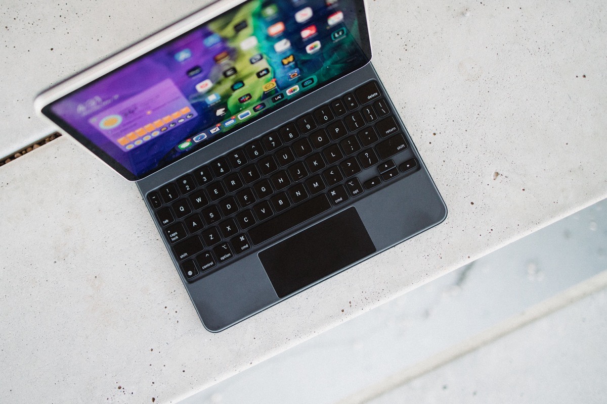
Apps and their developers have done a great job in adapting to the latest input methodology. We’ve noted a few of the best or most unique trackpad and cursor support experiences above, and we’re sure there are more coming down the pipe.
More than ever before, you can use the iPad exactly how you want.
Now, where’s that external display support?


