Ulysses 19: Updated with iPad Cursor Support, Material Sheets, and More

Ulysses, our favorite writing app for iOS and macOS, takes another step forward in version 19 with full support for the new cursor in iPadOS, along with some important cross-platform refinements.
Cursor Support for iPadOS
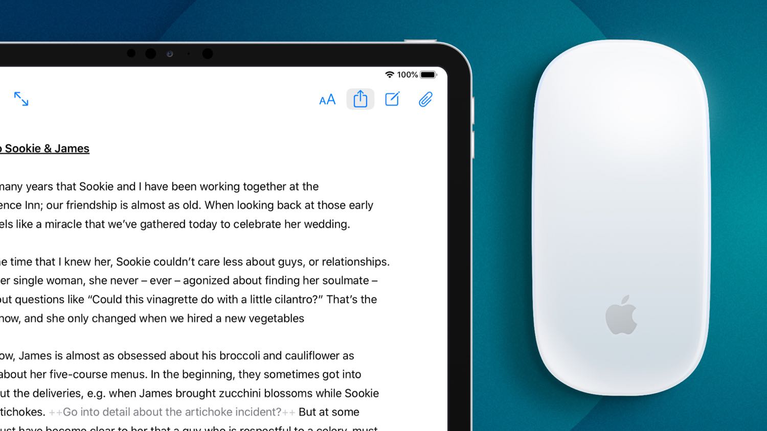
Ulysses is quick to adopt new iOS technologies, and cursor support is just another example of this rapid development pace.
There’s nothing too surprising about how it’s implemented; you get the charming hover states for buttons, the ability to right-click to reveal contextual menus for sheets and groups, and you can use your mouse or trackpad to drag-and-drop sheets around.
Since Ulysses is a text editor, it’s also a prime example of how much quicker editing text can feel when you have the precision of a cursor to manipulate text or place your insertion point more precisely.
One of the nicest improvements now with native iPad cursor support inside Ulysses is that you can two-finger swipe to show and hide the library list views.
Material Sheets
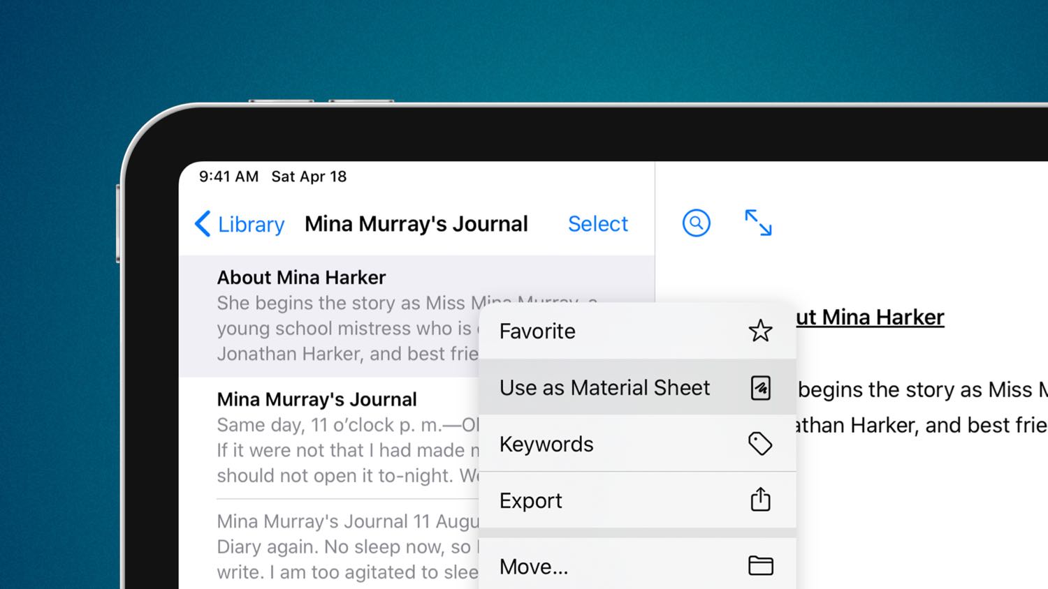
Chief among the updates to Ulysses 19 is the concept of material sheets, a way to designate certain sheets (Ulysses’ version of “files”) as supplementary to the core material in that group.
It’s easiest to think of it as a way to exclude sheets from export. If you’re working on a novel and you have the various chapters and sections as sheets in a group, you can now keep additional notes, character studies, or other ancillary written material in that same group.
It isn’t just useful for fiction though; Ulysses’ extensive shortcuts support and ability to house sheet attachments makes it a viable note-taking environment too. As a result, non-fiction writers can take advantage of material sheets as a way to keep their research in the same place as their drafts.
When it comes time to export, any of these new material sheets will simply be skipped as Ulysses assembles your final manuscript or publishes to a connected blog. Similarly, material sheets don’t count toward writing goals or other group-level statistics.
Stop losing your ideas and notes to multiple apps…
An online course to help you save time, organize your notes, and master the best writing app for Mac and iOS: Ulysses.
Keywords & Storage Locations
There are two additional improvements specific to those of us who use external files in Ulysses.
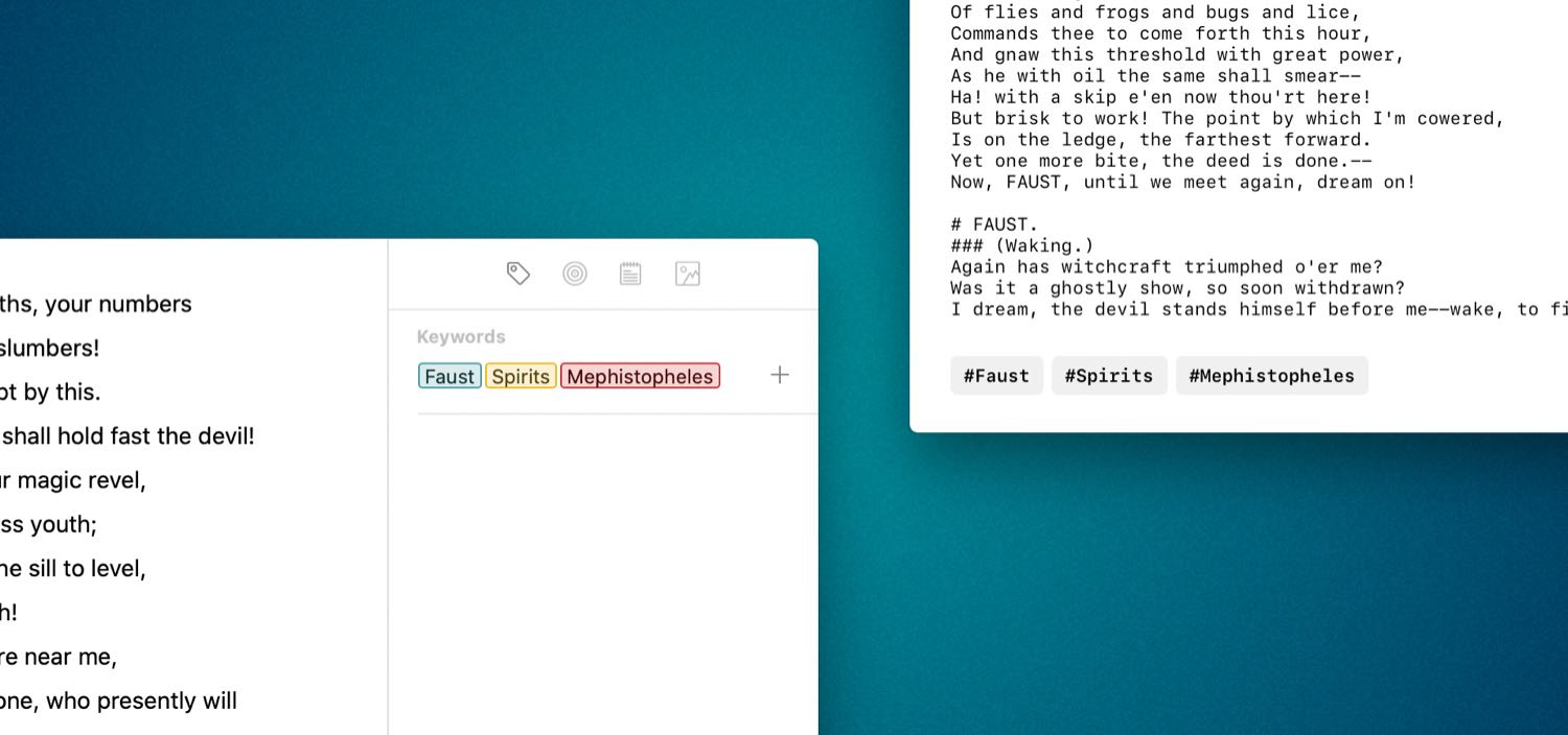
The first is the addition of keywords to Markdown files. It used to be the case that keywords could only be attached to native Ulysses sheets, but now you can make use of them for plain Markdown files as well.
The implementation is clever too, designed to maximize compatibility with other markdown-based editors like Bear or iA Writer. Ulysses appends the assigned keywords as hashtags to the end of the file, making them immediately visible and functional in other apps that use keywords/tags.
This works the other way around too — files from other apps that use hash-based tags will be imported with the tags as keywords in Ulysses.
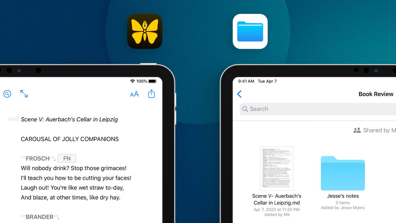
Secondly, iPhone and iPad users now have the ability to add external storage locations from any storage provider in the Files app. This means you can now add any folder from a third-party cloud storage service, or the local working directory for a remote Git repository, for instance.
I’ve been using this functionality to write and post drafts to my blog using Github and Working Copy on my iPad Pro.
Odds & Ends
There are a number of smaller quality-of-life improvements in this release as well:
- Filters have new assignable criteria, including “has goal,” “has note attachment,” or “is material.”
- Backups can now be exported as single files, and imported back in to restore from that file.
- The Ghost and WordPress preview themes have been updated to reflect the latest default themes for each platform.
- SF Mono, Apple’s own monospace typeface, has been added as a font choice for the editor.
And, perhaps most importantly, there is now a toilet paper icon available for customizing your groups and smart folders — use it wisely!
Room for Improvement
While I’m constantly delighted by the way Ulysses evolves, I do have a few lingering concerns that I look forward to seeing addressed:
- Multiple Statistics: I would like the ability to show two stats simultaneously like you can in iA Writer; I tend to want to see word count and approximate reading time.
- Drag & Drop External Folders: I’m not sure why, but you can’t drag-and-drop to re-order external folders like you can with groups in the iCloud container.
- Pinned Sheets: I wish you could “pin” sheets to the top of a group; for example, as a way keep templates handy regardless of the chosen sort order for the group.
- View Other File Types: When using external folders, I wish I could toggle the ability to see other file types, even if I can’t actively edit them (HTML, PDF, etc.); among other things, it would make it easier to pull them in as attachments without having to drag them in from another app.
- More Cosmetic Choice: This isn’t an important one, but I do wish we had the ability to choose a custom accent color for the app on iOS, and perhaps even choose from a few different icon variants.
Steady Improvements
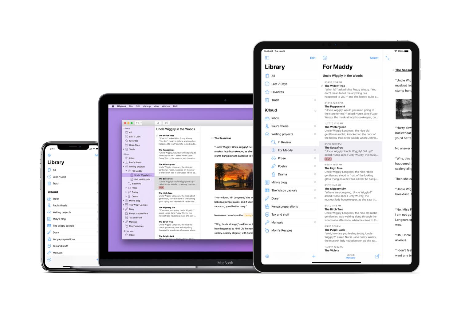
Even before the switch to a subscription pricing model back in 2017, Ulysses has been one of the most consistently updated apps on my devices.
The updates regular, and they almost always bring notable improvements to the experience of using the app, polishing an already excellent piece of software and elevating it to the upper echelons of design and functionality.
Stop losing your ideas and notes to multiple apps…
An online course to help you save time, organize your notes, and master the best writing app for Mac and iOS: Ulysses.

