A review of the 15-inch MacBook Pro with Touch Bar
I purchased my first camera in 2015.
Along with entering into the endless photographic grip on my wallet, I was also entering into a world of different computing needs. I was using a 2013 13” MacBook Pro at the time (my wife and I split time between a non-Retina, optical drive MacBook Pro and a newer Retina model) and quickly discovered how incredible an improvement that 13” Retina Display was over the non-Retina MacBook Pro.
But the 13” Retina MacBook Pro under-the-hood left a little to be desired in the photography department. First was the small screen size, second was the small internal storage, and third was the notebook’s performance.
I eventually sold the non-Retina model and picked up a Late 2014 Retina 5K iMac, which I’ve been using ever since. At the time, the iMac solved all my problems: a large, high resolution display, lots of internal storage, and plenty of horsepower for my needs.
Free Productivity Guide: Download our simple guide to productivity to help you improve your workflows and be more focused with your time and attention. Get it here.
Had there been a notebook that could drive a high-resolution 27” display, offered plenty of internal storage capacity, and boasted equally impressive horsepower, I would have purchased it in a second.

But there wasn’t. Apple’s 15” MacBook Pro at the time could run the Thunderbolt Display just fine, but lacked the ability to drive that lustworthy 5K display. Internal storage capacity was capped at 1TB as a build to order (BTO) option, but carried that hefty Apple premium. The horsepower under-the-hood was nothing to shake your head at, but it couldn’t match the newly released 5K iMac.
As much as I loved that iMac, I always said I would revert back to a notebook if — or when — Apple introduced a notebook capable of driving that 5K display.
We finally have it.

What I will say is this: Apple’s newest 15” MacBook Pro with Touch Bar is the first computer to check every box on my list of writing and photography needs.
- It has an awesome display and is capable of driving a wide color, 27” 5K display.
- It has ample performance to smoothly run RAM-guzzling Adobe Lightroom.
- It has enough internal storage (especially in its BTO options) to store my past year’s work.
- It’s thin, light, and unequivocally portable, especially for a notebook of its size.
What I didn’t realize was the checklist of tradeoffs I was asking for when crafting my list of writing/photography needs.
- I never expected battery life would need to take a hit.
- I never expected to have to lose the SD card slot.
- I thought two or three years of butterfly-mechanism keyboards would iron out the original keyboard’s kinks.
- I never knew I needed a larger trackpad.
These eight items have governed my experience with the 15” MacBook Pro with Touch Bar so far.
I ordered a silver, 2.6GHz Core i7 MacBook Pro with 512GB of storage (a BTO option) and the higher-end Radeon Pro 460 graphics chip (also a BTO option). This model has yet to ship, so I took advantage of Apple’s lengthy holiday return policy and picked up a 2.7GHz Core i7 MacBook Pro with 512GB of storage and the lower-end Radeon Pro 455 graphics chip. The model I’ve tested for the last month is the model you can pick up when you walk into the store.
Design & Build Quality
Apple has always led in the design and engineering department when it comes to notebooks, and the 2016 15” MacBook Pro (herein, just “MacBook Pro”) — or the 2016 MacBook Pro line in general — is no different.

We’ve all seen someone with a pre-2016 15” MacBook Pro, so the newest design isn’t coming from left field. All aspects, from fit and finish, to design compromises and benefits, appear to be iterative and carried over from other Apple notebooks.


Apple’s pursuit of thinness and lightness pays dividends in the design category. The thinner display sheds the illuminated Apple logo in favor of a polished logo, which looks phenomenal on the silver MacBook Pro. The thinner hinge is now color-coordinated with the rest of the notebook, while also finding a way to be more sturdy. The thinner USB-C/Thunderbolt 3 ports are smaller overall and provide a fresh, clean, and almost-symmetrical look to the sides of the MacBook Pro.1

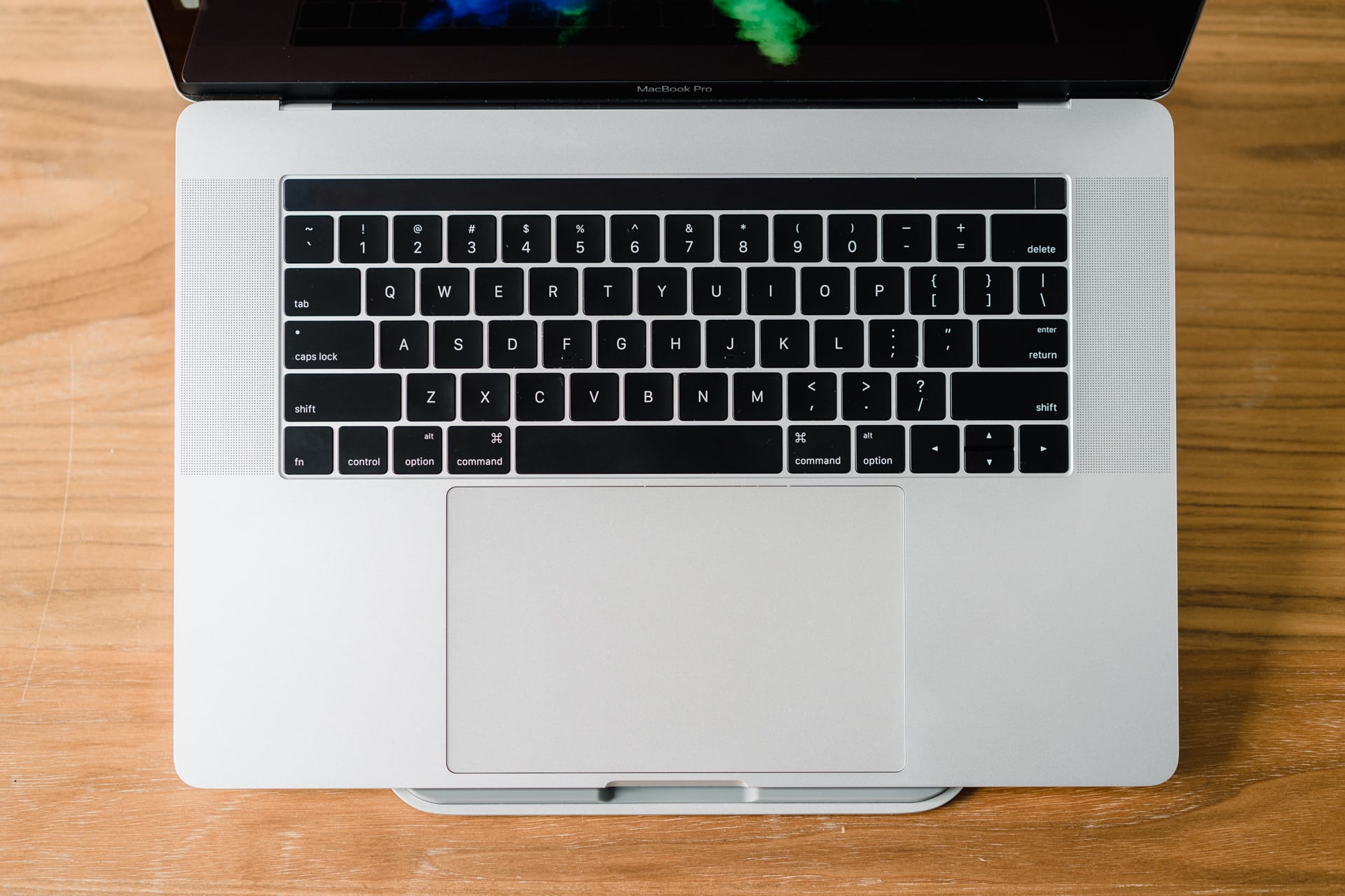
Open the lid and you’ll notice the dramatically thinner bezels, the return of “MacBook Pro” on the bottom bezel, and a symmetrical keyboard/trackpad layout, reminiscent of the outer aesthetic. Even the escape key in the Touch Bar has been pushed in about a half inch from the outer left keyboard edge to maintain symmetry with the half inch sized Touch ID sensor on the right. Much has been made of the redesigned arrow keys to include large right/left keys and smaller up/down keys, but the symmetrical look they provide is far superior to Apple’s older keyboard designs.

It’s not all perfect in design land, though — at least not for the smaller 13” MacBook Pro. The 15” MacBook Pro’s speaker grilles do indeed provide areas for the MacBook Pro’s speakers to fire. Apparently this is not so with the 13” MacBook Pro — the 13” MacBook Pro’s speakers are actually downward firing and the speaker grilles are little more than a fake ornament. For all the intentionality in Apple’s design approach, this is a misstep for the 13” MacBook Pro.
Along with the MacBook Pro’s design, its build quality is equally unmatched. I think much of my original impressions of the Apple Watch Series 2 are relevant here:
Both the aluminum and stainless steel Apple Watches begin and end with tolerance. Glass meets aluminum or stainless steel without a seam on both models, and buttons press firmly with a commanding click. The front face glimmers in the sun. The polyelastomer band is soft, light, and stays fastened almost beyond logic.
Same goes for the MacBook Pro. Aluminum meets the glass trackpad and screen with nary a mark. The glass Touch Bar seamlessly meets the rest of the unibody chassis. The MacBook Pro is an engineering marvel.

The new MacBook Pro has a smaller footprint and is noticeably lighter than older 15” models, but that doesn’t change the density of the 2016 model. The only current notebook experience I have is with the 12” MacBook. When you pick up the 12” MacBook, it feels no heavier than the air surrounding it. Not so with the 15” MacBook Pro. Despite being smaller and lighter, it’s still just as dense and feels utterly premium in your hand.

I’m surprised by the sharpness of the MacBook Pro’s edges, though. The thinner notebook makes for less rounded tapers when transitioning from the display to the MacBook Pro’s side. The new MacBook Pro’s edge is more immediate, with less of a smoothed-out, rounded edge. You’re not going to cut yourself or anything, but the edges are more sharp than previous MacBook Pros.
As with any Apple device, design and build quality are the MacBook Pro’s most immediate impression. The fit and finish of this notebook, somehow, easily bests the prior generation. No company makes their old products feel old like Apple. And the 15” MacBook Pro succeeds in making this impression within seconds.
Display
Does every photographer need the best display on the market? Do I need wide color, pin-sharp resolution, whiter whites, and blacker blacks? I can’t look anyone in the eye and say so.
But, once you experience these less apparent features, it’s very difficult to imagine working on anything else.

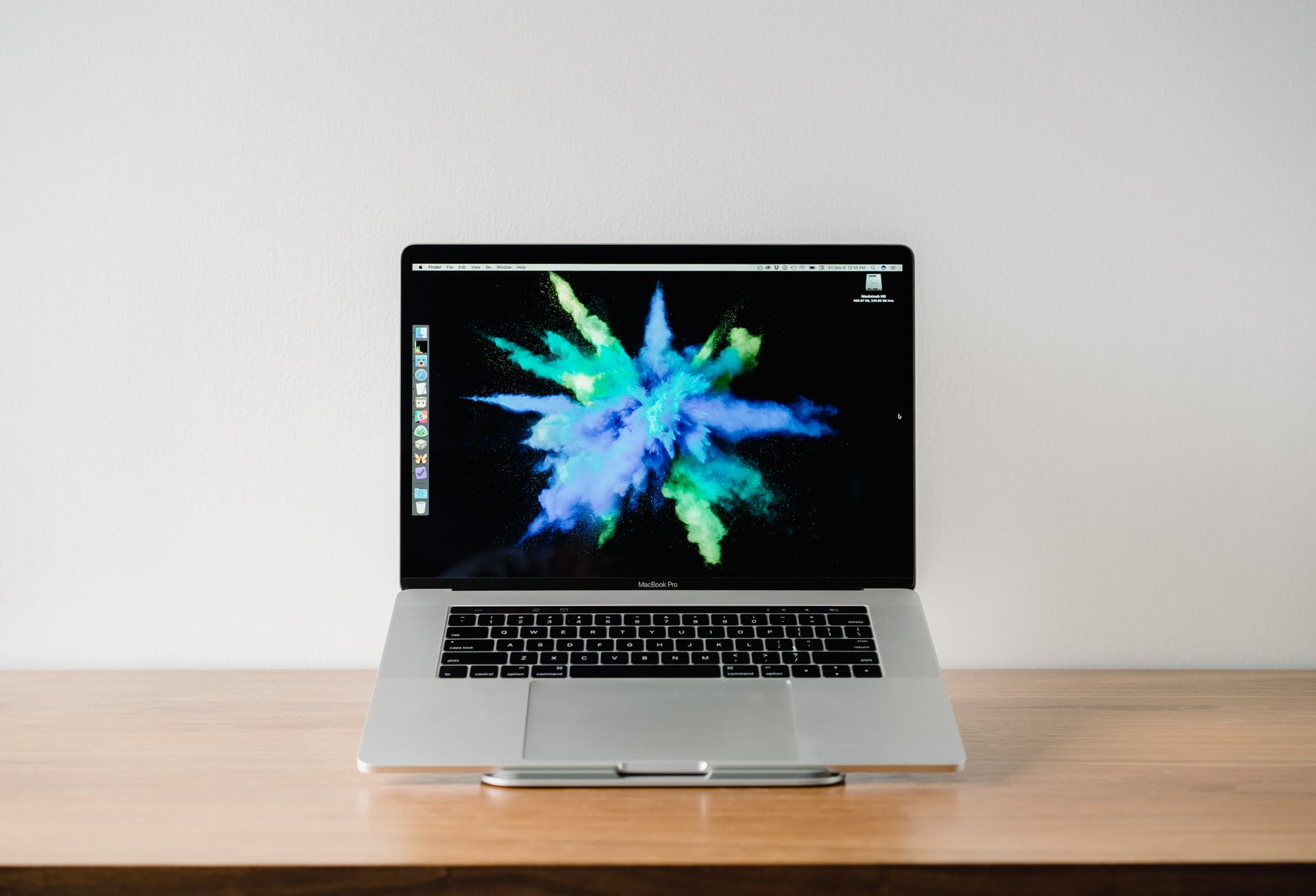
Apple’s newest MacBook Pro display is the best display ever put into the company’s notebooks. The display is 25% brighter than older displays and ships with a P3 wide color gamut.
Why does stuff like this matter?
A brighter screen will be handy for many — if not all — MacBook Pro users. As a photographer, if you’re interested in printing photos onto physical paper, screen brightness is incredibly important. If you edit your photos in the dark and have screen brightness turned all the way down, you’ll edit your photo’s exposure settings based on the brightness of your screen at that time. When you go to print that photo, it’s likely your exposure will be far too low for the photo to turn out properly. You always need to check your histograms to ensure proper exposure, but having increased brightness will always help with a printed photograph.


Same goes for the P3 wide color gamut included with the new display. Although not really a fair comparison, head over to this link to see the difference between wide color gamut and sRGB color settings. If you’re on a wide color gamut display, you’ll notice the orange shoes in that link are far more orange (open up the URL in two separate tabs and compare the sRGB image to the wide color image). If you’re on a non-wide color gamut display, you won’t see a difference between the first image and the second image. In real life, there is a difference, and having a display that can show that difference is essential.
If you’re printing photos, this new 15” MacBook Pro display is wonderful. I can’t wait to match it with the LG UltraFine 5K Display.
I/O
The new MacBook Pro ships with four USB-C/Thunderbolt 3 ports and an analog headphone jack. The last inclusion is more of a surprise than the other four ports.
Yes, having only four USB-C ports has current disadvantages. Gone is the beloved SD card slot, which I used each and every day. Gone is MagSafe, one of the best charging inventions of the computing era. Gone is the HDMI port for quickly linking up to your HDTV. And, gone are any USB Type-A ports.
Aside from the SD card slot, good riddance in my books.


There will be a momentary blip on the heart rate scale when you realize you don’t have the proper adapter to connect to your old USB 2.0 external hard drive at the office. It’s happened to me. It’s ticked me off.
I’m not going to let it happen again, and that’s the point Apple is trying to make. By doubling down on Thunderbolt 3 in one of the highest selling notebooks available, Apple is essentially forcing the hand of manufacturers and consumers everywhere. I, for one, know I’ll be buying a nifty USB Type-A/Type-C thumb drive to quickly transfer documents between my old PC at the office and my personal computer at home.

The four Thunderbolt 3 ports are easily the most versatile port ever shipped in a notebook, and they are likely the most powerful ports ever created. Charging, running external displays, linking to external storage units, and potentially linking to external GPU modules make Thunderbolt 3 a seemingly perfect port to go all-in on. With the upcoming LG UltraFine 5K Display and Other World Computing’s Thunderbolt 3 dock, there is potential to run a 5K display, connect multiple USB 3 external hard drives, and connect to the internet via ethernet all with one single cable. This is the future of computing: impressive power in a thin and light package that can tether to an ultra-powerful rig when needed.

The new MacBook Pro’s I/O is a lesson in long-term gain for short-term pain. Carrying adapters is a current annoyance that the best of us have to endure, but the future is very, very bright for Thunderbolt 3. And I can’t wait to see the potential it unlocks.
Speakers
Each year, the MacBook Pro’s speakers get better. It almost defies logic.

I’m not a heavy music listener, nor do I edit videos or create music where audio quality is a necessity. My music listening is done to create an ambient noise environment that is conducive to working, and the only other time the improved speakers come into play is when watching videos.
Under both scenarios, the speakers on the MacBook Pro are impressive. They are loud, don’t seem to distort at any part of the range, and are upward firing on the 15” model, making for an immersive audio experience. In fact, they get so loud that I have a hard time showing off how loud the speakers can get — the subject of my showing off usually meets the demonstration with an “Ok, that’s loud enough.”

That’s my extent of audio knowledge. These speakers are loud, don’t distort, and fire upwards from the speaker grills on the 15” MacBook Pro.
Moving on.
Trackpad
In my introduction, I put the new trackpad in the list of deemed negatives. If that didn’t raise your eyebrow, I’ll try to raise it here.
I’m all for the Force Touch trackpad — in fact, I love Force clicks and being able to click anywhere on the trackpad — but I have little to no use for the added size of the new trackpad. I might be on my own for this one — many have given Apple high praise for the two-times-larger Force Touch trackpad.
But I just don’t see the point. I have trackpad sensitivity set one notch above the medium setting. I can move the pointer from the bottom right of the screen to the opposite corner by the time I reach the middle of this trackpad. The pointer moves faster based on how fast you are moving your finger on the trackpad, that much is true. But my general interaction speed renders about 50%-60% of the new trackpad’s real estate largely unused.

This doesn’t take into account palm rejection. I mean, it works when you’re typing. But, say your left hand is resting on the keyboard while you are interacting with the trackpad with your right hand. If you rest your palm on the corner of the trackpad, every click turns into a second click. Or scrolling actions turn into zooming actions. This isn’t prevalent, but it does happen. And when it happens, it’s annoying.
The bigger trackpad is far from being a deal breaker. What bugs me more is that I don’t remember anyone specifically asking for a bigger trackpad. Most will be happy with the larger trackpad, even though they weren’t asking for it. For me, the occasional palm rejection hiccups are enough to be annoying and outweigh the benefits of having more real estate to work with.
Keyboard
Apple’s butterfly-mechanism keyboard was introduced with the 12” MacBook to much affliction. Some loved it, but many hated it. Everyone agreed the keyboard had a very unique feeling.
I had a chance to try the original 12” MacBook for about two weeks and went through two MacBooks thanks to jammed up keys. I wasn’t alone either. The first generation 12” MacBook’s keys were notorious for jamming.
I was sure Apple fixed the jamming issues with the second generation 12” MacBook. We purchased my wife’s MacBook in April of this year and have yet to run into jammed or sticky keys. Like usual, second generations of every device remove many of the first generation’s kinks.
Apparently, Apple decided to revert the third-generation butterfly-mechanism keyboard in the new MacBook Pros. We’re right back to square one.
Now, the new MacBook Pro’s butterfly keyboard is wonderful to use when it works. Even though Apple says the keys don’t actually travel further than the 12” MacBook, the MacBook Pro’s keys undeniably feel like they travel further. They are more accurate, more tolerant, and snap back with wonderful speed. Out of the box, the new MacBook Pro’s keyboard is the best keyboard I’ve ever used, even besting my beloved Apple Wired Keyboard with Numeric Keypad.
But, lo and behold, my keyboard has jammed up again. The return key on this MacBook Pro now feels muddy, doesn’t sound the same as the rest of the keys, and is irritatingly one of my most used keys (the other being the delete key, naturally, but that one feels good as new). The right side of the space bar also feels slightly muddy, as though it’s on the verge of being jammed. There’s no worse feeling than thinking you hit a button, but then realize you didn’t. Or, thinking you didn’t hit the button, but actually did.
(I just hit the enter button twice to get to this paragraph, but thought I only hit it once.)
Fortunately, I am going to return this MacBook Pro when my BTO unit arrives. If that one jams up on me, I won’t be a happy camper.

Aside from the feel and travel, many have commented on the increased noise of the new keyboard keys. To say it’s louder is probably true, but it would be more true to say the sound the keyboard makes is different, and therefore it’s more noticeable right now. It’ll also largely depend on how hard you press each key — I’ve found this keyboard to be quieter than the Apple Wired Keyboard. I’m also a very quiet typer in general, so everyone’s mileage will vary with this keyboard.
The polarization of this butterfly keyboard was introduced with the 12” MacBook, but I think we’re seeing an increase in that polarization now that this keyboard has hit the large scale. I love this keyboard. It’s my favorite keyboard ever made.
When it’s not jammed.
Also, I love the large right/left arrow keys and smaller up/down arrow keys. Finally, some consistency between Apple and PC makers.
Touch Bar
Throw the Touch Bar into the category of “features you never asked for.”
Unlike the larger trackpad, though, I think the Touch Bar’s benefits outweigh its consequences. Those benefits and consequences are also relative to this point in time — surely the Touch Bar will evolve as developers learn how people use it.


Some extra-critical users have labelled the Touch Bar as a gimmick, which I can’t help but feel is unfair. Unless those users had major scripts and automation hacks mapped to a function button on old MacBook Pros, I can nearly guarantee every single person will use the Touch Bar more than they used the function row. In terms of functionality, the Touch Bar is far and away an improvement over the old hardware keys.
This is just in comparison to workflows. We know the Touch Bar will be more expensive to manufacture, thereby playing a role in the overall price hike on the newest MacBook Pros. We also know the OLED strip sucks battery power of some sort, likely adding to the MacBook Pro’s battery life woes.
Overall though, the Touch Bar will come out with more benefits than consequences 99 times out of 100. All the old system settings are still immediately available in the Control Strip on the right, and even come with improved usability in terms of pressing and sliding brightness and volume sliders. There’s no major tradeoff here, aside from perhaps price and battery life. Apple has given developers a new canvas to work with and we can only wait and see how the Touch Bar is implemented going forward.

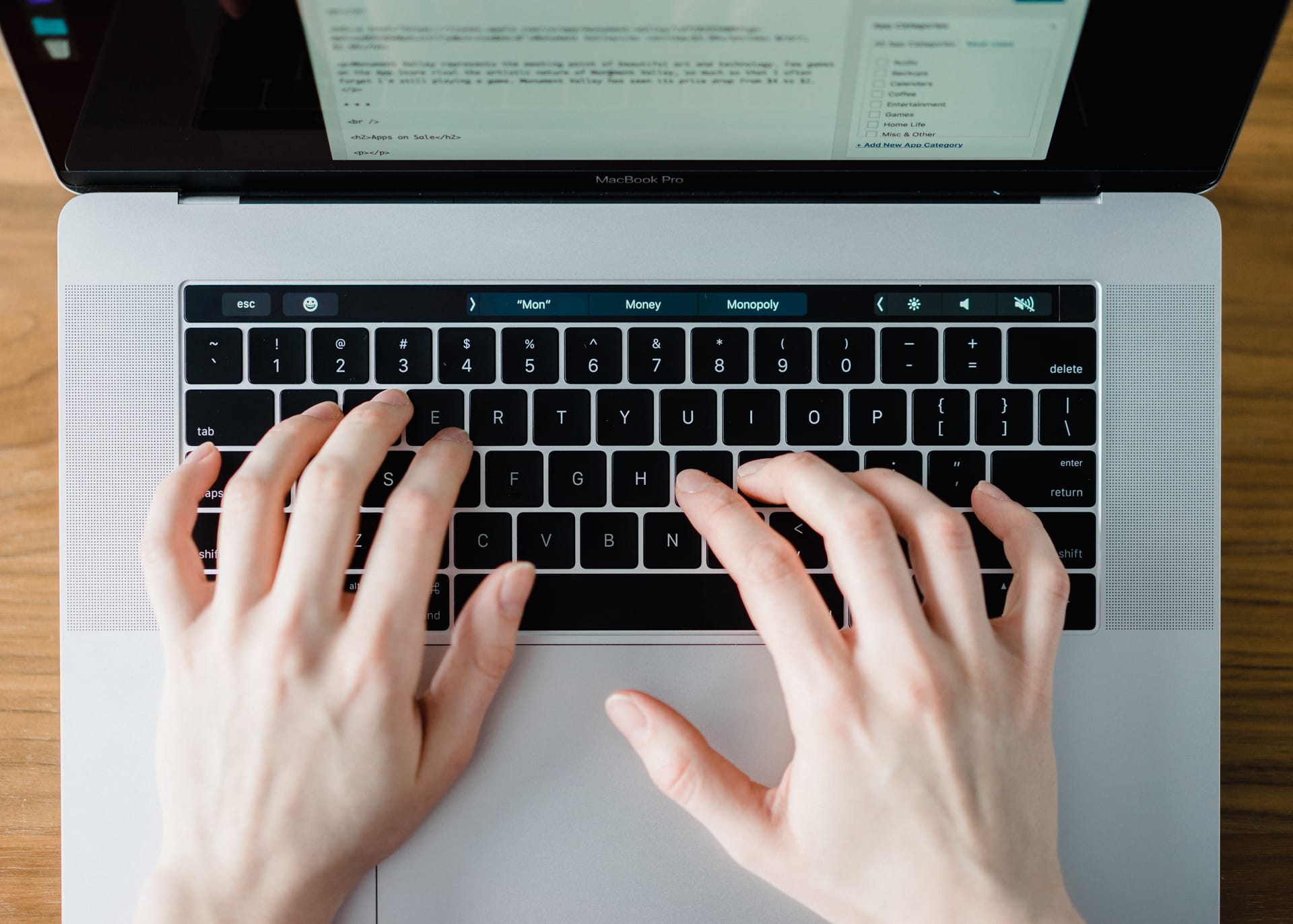
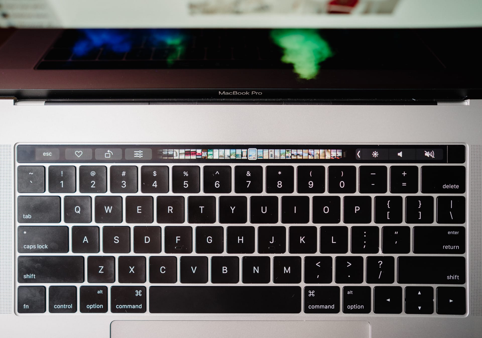
Now, how the Touch Bar currently works is a bit of a head scratcher. First, under most circumstances, you can customize the Touch Bar with different buttons by going to the View menu and selecting Customize Touch Bar within a specific app. How you use the mouse to drag new buttons into the Touch Bar is well executed.
However, the consistency of editing that Touch Bar is not well executed.
- These settings shouldn’t be in the View menu, they should be in the Preferences window under each app’s system menu.
- Customizable Touch Bar settings aren’t available in every app, even Apple’s own stock apps.
- Specific Touch Bar settings should be available by default whether the app is optimized or not (I’m thinking about the emoji picker or predictive typing).
Between odd customization settings and inconsistent layouts between optimized and un-optimized apps, the current Touch Bar experience is a bit fragmented.
There are also numerous software glitches with the Touch Bar.
- Once I close down iTunes, the fourth Control Strip slot is still visible, albeit empty and untouchable. Same goes for a YouTube video.
- Opening saved bookmarks via the Touch Bar is unbelievably satisfying, but opening four or five in a row reveals some jankiness and hiccups.
- If you’re typing in a text box in Safari, the Touch Bar reverts from its tabbed buttons to its predictive typing features, which means you have to reach for the mouse to switch to a different tab to see the tabbed buttons again. This is an obvious break in workflow and is incredibly annoying.
- Safari’s iCloud Keychain logins prepopulate in the Touch Bar, but pressing the login isn’t enough. You have to hit the return key once you’ve hit the Touch Bar button. This doesn’t make much sense.
These are most — not all — of my current complaints. Now, it’s not all bad. In fact, I’d say the Touch Bar itself is a wonderful idea.
Physically, the Touch Bar is more matte than the shiny display. It doesn’t pick up many fingerprints — certainly less than the fingerprints you’d leave if this was the same material as the display — but it doesn’t look unsightly unless you just ate greasy french fries. The indent of the escape key in the upper left looks odd at first, but makes symmetrical sense when compared to the placement of the Touch ID sensor in the upper right. And although the Touch Bar isn’t as high resolution as what we have come to expect with Apple’s latest iPhones and iPads, the small screen does have great color and sharpness.
I think it would make sense to have haptic feedback of some sort, mind you.

Apps that are optimized to use the Touch Bar immediately become more intuitive. Here are a few examples:
- In Ulysses, instead of using five keystrokes to insert an image, one single tap on the Touch Bar inserts an image. Same goes for a footnote or a Markdown link.
- In Mail.app, a single tap on the Touch Bar triages email faster than keyboard shortcuts.
- Scrubbing your journal timeline is faster in Day One and switching between journals is as simple as tapping an arrow and selecting the appropriate journal.
- Opening Safari bookmarks is wonderfully fast with the Touch Bar. I find scrubbing between open tabs is also more efficient than clicking through them or using your Cmd + number row to find your tab. I also setup a Reader button in Safari’s Touch Bar to quickly switch to a more comfortable reading backdrop.
- Scrolling your calendar and pressing the Today button to return to the current date in Fantastical 2 is much faster than clicking the Today button in the top row.
That’s five examples of current workflows improved by the Touch Bar. Just imagine what the future holds. Microsoft has already committed to Office support for the Touch Bar, making short work of Excel formulas and other keystroke-heavy tasks in Word or Powerpoint. Many of our favorite apps have yet to be optimized — apps like OmniFocus, Adobe Lightroom, and Tweetbot (at the time of writing) have yet to make use of the new hardware. Considering the improvements the Touch Bar makes for Photos.app, I can only drool at what Adobe will do for Touch Bar support in Lightroom.
I’ll conclude on the Touch Bar thusly: too many people have acted too decisively for or against (mainly against) the Touch Bar. We only need to look at the time devices like the iPad or Apple Watch needed to solidify how they were most appropriately used. The Touch Bar isn’t a device in and of itself, but it is a new format and new interface. This technology will surely grow as time goes on. I’m already satisfied with many of its current features. If users force themselves to maneuver their muscle memory (a long shot in most circumstances), there are efficiencies to be had in the Touch Bar as well.
Touch ID
I’m not sure we can say “Finally!” in regards to Apple bringing Touch ID to the Mac, but it sure felt like an obvious new feature for the latest MacBook Pro line.

It certainly makes sense. In much the same manner as Touch ID on the iPhone and iPad made tapping a passcode feel old and archaic, Touch ID on the Mac obliterates the frustration of typing passwords. Switching between users is fast and easy. Logging in after waking from sleep is blazing quick. And apps like 1Password have quickly jumped aboard to secure the rest of your credentials behind your fingerprint.

This Touch ID sensor appears to be the second generation sensor we saw in the iPhone 6s/6s Plus, making for near instantaneous recognition and authorization. There aren’t any software scenarios where the recognition could be too fast — like the iPhone’s lock screen — so Touch ID’s extra speed feels even better on the Mac.

Touch ID on the Mac was obvious, necessary, and expected. And it’s just as good as we could have hoped for.
Performance
This section will be dependent on the model and specifications you order. I’m using a 2.7GHz, Core i7 quad-core processor with Radeon 455 graphics and 16GB RAM. This model comes with 512GB internal flash storage, while others can have up to 2TB storage. Hopefully my statements are as blanketed as possible.

In short, the new MacBook Pro is underwhelming in the performance department. To the extent that some users have found their year-old 15” MacBook Pros to outperform the newest generation. It appears Apple chose to go with more energy-efficient processors for the 2016 MacBook Pro line instead of high-end processing power. As a result, many Geekbench scores, 4K video exports, and other processor intensive tasks either slightly lag behind or meet the standard set by last year’s MacBook Pro.
For me personally, single-core Geekbench scores have the iMac marginally ahead of the 2016 MacBook Pro (4158 vs. 4107 respectively). Multi-core scores favor the MacBook Pro (12907 for MacBook Pro vs. 11524 for iMac). Technically speaking, I’m not gaining or losing much in the processor department.
Just based on experience, my late-2014 5K iMac exports large batches of images out of Adobe Lightroom faster than this 2016 MacBook Pro. To be honest, this surprised me. I thought for sure the MacBook Pro would blow the iMac out of the water.
Graphically, Apple boasts 130% improvement with the Radeon Pro 460 over last generation’s graphics card. My workflow is hardly governed by processor or graphics performance, so commenting beyond Apple’s claims is tough. Anecdotally, I feel like I see the very-very-occasional stutter in the OS when flipping between desktops or when swiping up to show all my desktops (I just swiped up on the trackpad to do so and saw an honest-to-goodness stutter). I hope the Radeon Pro 460 eliminates many of these stutters, but never once have the hiccups hindered the experience.
Enormous improvements over my older iMac are thanks to the MacBook Pro’s blisteringly fast SSD. In many cases, the new MacBook Pro’s SSD breaks former applications designed to test SSD read and write speeds. The SSD reads and writes in the 2000mb/second range, making any disk intensive task lightning quick.
This rears its full head when editing photos. Coming from a Fusion Drive, most images ended up being stored on the spinning disk, making for torturously long editing issues. I would use the brush tool to make some local adjustments on a photo in Adobe Lightroom and I’d have to wait between 3 and 5 seconds for the edit to appear on the screen. Viewing a photo in the Library module generally resulted in a 7 to 10 second wait for the image to load in full quality. And switching between modules was an absolute test of my patience.
The MacBook Pro’s fast SSD (and doubled RAM) make for a night-and-day improvement in Adobe Lightroom. Photos load nearly instantaneously. Edits appear on screen the moment I make them. Switching between modules takes place without spinning beach balls. And the application itself launches within five seconds.
Within the first week of using the MacBook Pro, I noticed I had been editing more photos than on the iMac. Why? Because I wasn’t as afraid to enter into the “Develop” module on a photo that didn’t pass the “first impression test.” Because I can get in and out of the Develop module so quickly and because I can make edits faster than ever, I take more chances on photos I wouldn’t have had before. As a result, I have more keepers than I originally thought.
So, do the marginal, underwhelming, and even non-existent improvements add up to a poorer experience? Absolutely not. Instead, I’m able to work faster than ever and have more photographs to show off as a result. If you make photographs for a living, photographs are money. Which means this MacBook Pro’s improved storage performance can essentially pay for itself in the long run.
Battery Life
Up until this MacBook Pro, Apple’s battery life claims were usually spot on. If Apple said you would get 10 hours of battery life under normal usage, there’d be a possibility you’d experience more than 10 hours.
But, as they say, it takes years to build a reputation, and only one single mistake to bring that reputation crashing down.
This is how I feel about the MacBook Pro’s battery life.
Apple has claimed up to 10 hours of battery life in the new MacBook Pro and I have yet to find a scenario where I would ever experience 10 hours of battery life. When writing this review, for example, I opened Activity Monitor, Pastebot, TextExpander, iTunes, Basecamp 3, and Ulysses. That’s it. I turned the screen brightness to 75%, listened to music through a pair of Apple’s EarPods, and had Wifi turned on.
Estimated time remaining immediately after pulling the power cord: eight hours. No apps were using significant energy. Nothing was abnormal in Activity Monitor.
This is head-scratching.
Another example: When searching for new deals for this site and Tools & Toys each morning, I often run on battery power for the 30 minutes to an hour it takes to complete the tasks. There was a little less going on this morning, so I was done in around 30 to 35 minutes. In that time, I used Safari, TextEdit, Pastebot, and TextExpander. Battery power went from 100% to 91% in that time frame.
Apple decided to shave 25% of the battery’s capacity in the new 15” MacBook Pro, allowing for a thinner and lighter chassis. It appears Apple’s thought process centered around more efficient processors making up for the drop in battery capacity. From what I’ve experienced, this just isn’t the case.
I’m lucky. I don’t work in many environments where long hours of battery power are necessary, but others won’t be as lucky as I am. And the fact Apple digressed in battery life for the sake of thinness is only going to frustrate potential buyers that much more.
A definite misstep here.
Conclusion
Accountancy may reflect many other industries in this regard, but many of my studies have centered around one specific lesson: cost-benefit analysis. If the cost of an activity doesn’t yield net benefits, the activity is generally not worthwhile.

That exact lesson can be applied with Apple’s 2016 15” MacBook Pro. In fact, this notebook is a walking, talking cost-benefit analysis example. Trading a set of fading function keys for a dynamic Touch Bar is a no-brainer. Trading an illuminated Apple logo for a non-illuminated logo and a wide color gamut display is equally obvious. Trading a few legacy ports to fully adopt Thunderbolt 3 may not seem immediately beneficial, but will surely end positively in the long run.
Negatively, Apple was faced with adopting nearly year-old processor technology to ensure a 2016 MacBook Pro refresh instead of waiting another few months and adopting Kaby-Lake architecture. As a result, these new MacBook Pros have no 32GB RAM option and perform largely the same as year-old notebooks. In addition, Apple’s obsession with thinness and lightness (which is a strong positive, I might add) has led to a 25% smaller battery and even worse battery performance during more intensive tasks.
And of course, all of these tradeoffs melt into something to come out of your wallet: price. This latest lineup of MacBook Pros is the most expensive notebook line from Apple in many years. Add in fluctuating foreign exchange to the equation and these notebooks can cost significantly more than last year’s MacBook Pro. Of all the tradeoffs mentioned above, the ever-bearing price increase may be the hardest burden of all.
How these tradeoffs come out in the wash will really depend on how you use the notebook. I write in Ulysses, work in spreadsheets, and edit photographs in Lightroom. Every single one of the tradeoffs mentioned above have very little impact on me (except for price, of course). Instead, the one big upgrade to the display has little to no apparent compromise attached to it.
Developers, filmmakers, musicians, architects — you name it — may not view these tradeoffs in the same light.

It feels to me like the notebook progression train has either hit a snag or slowed down slightly. Not every single Apple notebook is immediately, completely, 100% greater than the prior generation. I still believe this notebook is superior — far superior, for me — to the 2015 15” MacBook Pro.
But whether or not the scales tip in your favor will depend on how much you’re willing to spend on this set of tradeoffs.
Just know you’re paying for the difference in the long run in that hefty price tag.
-
That Apple didn’t remove the MacBook Pro’s headphone jack for the sake of symmetry shows their realization of the importance of analog audio. ↩