Using WidgetPack to Make Custom Widgets and Increase My Productivity
Widgets can be a gateway into a more productive life, without the overhead of building new habits and routines. For me, they have significantly improved my life, and without much work beyond the setup and deciding where on my iPhone they should live.
The key to this has been WidgetPack. WidgetPack is a small app that doesn’t seem to be very powerful alone, but I can use Shortcuts to build widgets with it — this allows me to have a widget like an Astronomy picture of the day, or show amount of year we’ve already gone through (helpful when it still feels like March!). But with a little creativity, you can get nerdy with Shortcuts, pull data from a variety of sources, and use that to create widgets that provide you with the information you need to live a productive life.
The first question had to be: “what do I need to see at a glance?” And this varies. I always want to be able to see upcoming deadlines, my podcasting schedule, and my plan for the day. But other information only needs to show up when I need it, and not always in its entirety. For example, I only want to know that I have items on my grocery list, not what they are, and only if I have more than five items to purchase or something is due soon (e.g. if I have to buy toilet paper before the end of the week!). By making sure my calendar, reminders, task manager, and other systems are complete and up to date, I can provide myself with this information at a glance and have a good level of awareness of what is going on without being overloaded, overwhelmed, or distracted.
When iOS 14 launched, I spent weeks playing with widget apps and apps with widgets. Fantastical has a great calendar widget, and Carrot a great weather widget, Drafts lets me jump straight to different workspaces and tools, and these are all great. But getting just the information I want and need to show up in one place is a pretty big challenge especially when apps aren’t designed to give everything, just their speciality. This is why I started exploring the ability to create my own widgets. WidgetSmith was an obvious first choice, and it is a great app. However, it lacked the granularity and customization I wanted, and this is the problem WidgetPack solves for me. I can use Shortcuts to get information from my systems, and the web, and use that to build a widget. One widget, with all the information.
Shortcuts has access to nearly everything on your iPhone. With your permission, it can see health data, access your calendar, read Reminders, check RSS feeds, and even check if your smart lights are on at home.
Building a widget can be a daunting task, so there are some key things you need to understand before you get started:
- Horizontal Stack: This is a collection of items going from left to right.
- Vertical Stack: This is a collection of items going from top to bottom.
- Z-Stack: This a collection of layers, such as a background, and vertical or horizontal stacks.
With some core understanding out of the way, it’s time to dive into widget design. I love widget stacks — the ability to flip through a virtual Rolodex of information that updates itself appeals to my inner nerd. The problem with this is I need to know what I’m looking at, and for me color and icons are a great way to do this — along with a title for when I’m really tired! As well as figuring out how to tell the difference between my widgets, I needed to decide what information to put in them. The first few widgets I made were all based on my calendar. I wanted a podcasting schedule that would pull appointments from three calendars to tell me when I’m podcasting, a deadlines calendar that would look for all day events in some calendars, and my daily plan, which would tell me what I’m up to today, including planned items. Fortunately, the calendar is one of the easiest things to access through Shortcuts, and the data is relatively easy to manipulate.

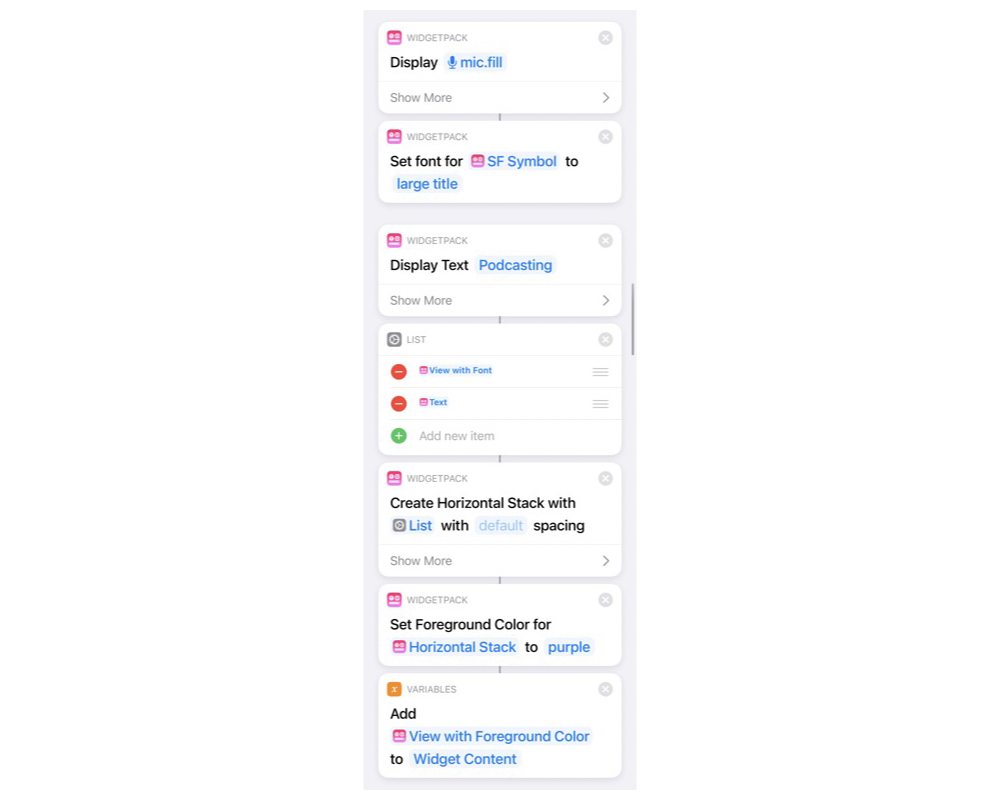
First of all, I wanted a title, something similar but elegant. I chose to use SF Symbols, icons from Apple, and text. For my podcasting widget, I used the mic.fill icon. This with the Display text action and setting them both to use the Large Title font style were my base. Then I added both of these items to a list and created a horizontal stack so they would be next to each other. The final step in my title section was to set the foreground color — I chose purple. This affects the text and the icon. Then, I use the Add to Variable action to add this to Widget Content, which I will use again shortly.
Next, I used the Find Calendar Events Where action and set my filters — any of the following and my choice of calendar. After this, I used Repeat With Each to go through the calendar events. Here I used the Display Text to format the start date and time, and the name of the calendar (I could use the name of the event, and in most cases, I would recommend it, but for podcasting this ensures consistency), then both of those are added to a list again, and I create another horizontal stack (so the time is displayed next to the name), and add this stack to my variable Widget Content.
I then use Widget Content to create a vertical stack, which means my title and calendar items are all added in a list to my widget. After this, I added some finishing touches — setting the background color to black (to blend in with my wallpaper). To do this I use the WidgetPack Color action to create the black and then stack that and the Widget Content vertical stack with a Z stack. Then I changed the foreground color to white — this only affects the things that don’t already have a color set (so not the title), and the final step was to update the widget.
This sounds complex, but once I had the first widget for checking my podcasting schedule, I could go ahead and duplicate it to get my deadlines, and again for a plan of my day (where I got events on my calendars for today rather than events from specific calendars). These three widgets now sit in a stack at the top of my home screen and provide useful information throughout my day.
One critical thing with any widget is making sure it’s updated often enough to be useful — after all, there’s no use in having a theoretically perfect dashboard on the home screen of your iPhone if the information is stale! To help me keep my widgets up to date I moved all my widget Shortcuts into a folder (called Widgets). Then in All Shortcuts I created a shortcut called Widget Updates1 that uses the Get Shortcut action to get all the widgets in the widget folder, and then inside a Repeat with Each it runs each Shortcut. Once I had this shortcut, I added it to several automations. Whenever I put my iPhone on charge or take it off charge, I have the automation Run Shortcut, which runs the Update Widgets shortcut. This also happens at 9am and 9pm and when I wake up in the morning. For me, this updates the information often enough that the data is always up to date, but you may find that you need to have an automation run every hour to update your widgets, which is also possible. Just make sure to disable “Ask Before Running” so that the automations really do run in the background, and then your widgets update automatically.
Now when I unlock my iPhone and look at my home screen, I see the information I need at a glance, and with a simple swipe I can switch from my daily plan to my podcasting calendar or my upcoming deadlines. Other people have even created custom widgets to display tasks. I’m in the process of creating a Home Status widget, which shows me which windows are open, heaters are on, the temperatures in different rooms of my house, and more. Fortunately, with the power of Shortcuts in iOS available to us today, the world is your oyster when it comes to fetching data — it’s just up to you to decide how to format and display it!
-
https://www.icloud.com/shortcuts/942a3a6a498f47319225466496736477
[Podcasting Widget]: https://www.icloud.com/shortcuts/942a3a6a498f47319225466496736477 ↩
