Shooting and editing great photos with Halide and Darkroom
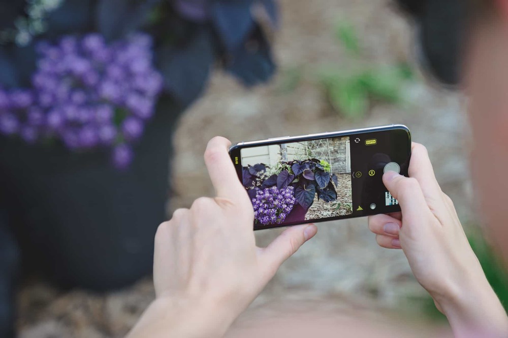
We love Halide — we picked it as our favorite third-party camera app for the iPhone. We’re also big fans of Darkroom, which is our favorite photo editing app. Not only great on their own, these apps work brilliantly together to allow you to shoot and edit fantastic photos. Let’s take a look.
Get Our Best Photography Tips & Workflows
Transform your photos and edits from average to awesome with our in-depth, mobile photography course. It’s jam-packed with training, ideas, and lessons that can literally transform your photography overnight.
Halide
We’re starting not in the first-party Camera app, but in a third-party one: Halide. While Apple’s app can take advantage of all sorts of optimizations and private APIs, your photos are going to be saved as JPEG or HEIC images. That’s great for storage space and — at least in the case of JPEG images — universal compatibility, but it also means that your photos are going to be subject to noise removal algorithms and compression, both of which hamper the amount of post-production adjustments you can make. So, if you want that flexibility and freedom, you’re going to need a third-party camera app that shoots RAW.
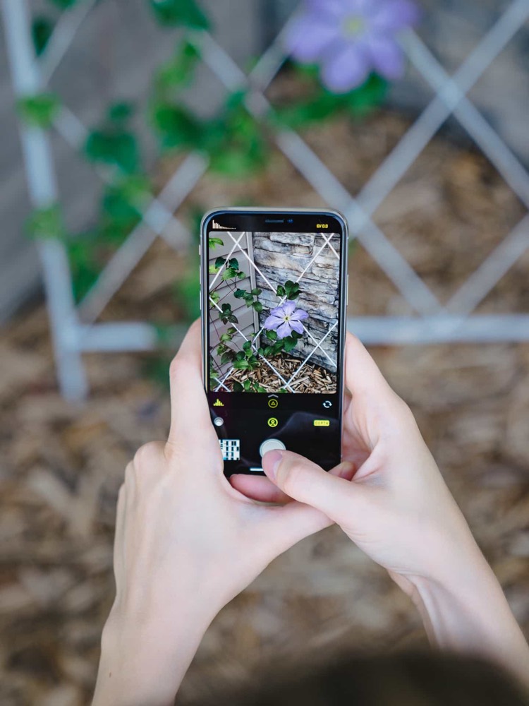
Why Halide? We recommend reading our full review for why we chose it over the competition. In short, it has a lot going for it, and we have very few complaints. If you’re just getting started with more comprehensive iPhone photography, Halide makes the leap manageable. Its UI is like if you added a few extra controls to the default camera app. You can leave everything in auto, of course, but you can also manually set shutter speed, ISO, white balance, and more. If you have an iPhone X, you can enable a nice histiogram in the upper-left “ear” of the display, and there’s an exposure value/shutter speed indicator in the upper-right. You don’t even have to shoot RAW — if you’re just taking a few casual pictures, keep it in JPEG or HEIC mode and save the space on your phone.
No matter which camera app you use, you’re still going to need some interesting pictures to start with. So, get your shoes on and head outside. Is it within an hour of either sunrise or sunset? Great — your photos will have naturally great lighting conditions. It’s not? That’s okay too. Head somewhere with interesting textures, or beautiful views, or interesting people — please ask permission! — or whatever else makes your eyes happy.
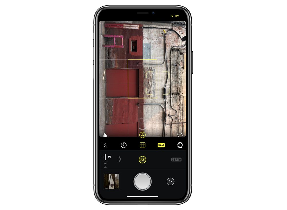
Something to keep in mind when taking pictures on your iPhone is that its sensor is tiny. That means that there’s not a lot of space for light to be captured, which impacts picture quality in the form of noise. The less light you have, the more noise you’ll see. The size of the sensor also impacts the amount of detail that it can capture, particularly in brighter areas.
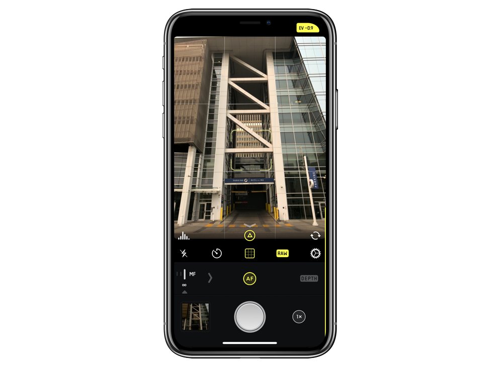
Therefore, in some photos, you may wish to slightly underexpose your image to produce a picture that’s just a hair too dark. You can easily do that without fiddling with ISO and shutter speed by sliding your finger down in Halide’s viewfinder. This adjusts the exposure compensation of the image, measured in “EV” units. Depending on the photo, I typically aim for -0.3 to about -1.0.
Another recommendation: take lots of pictures. An iPhone is not the easiest device to hold steadily; even with image stabiliziation, you can still find yourself taking some pretty shaky pictures. Also, experiment with angles. An urban canyon looks very different if the camera is resting on the road, or if the picture is captured from a pedestrian overpass. Don’t put yourself in danger or trespass, but do see how you can play around with your viewpoint.
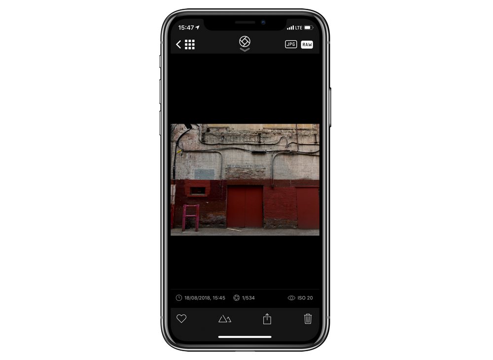
If you tap on the thumbnail in the lower-left of Halide, you’ll open the app’s photo review section where you can see recent pictures you’ve taken. It’s tempting to delete pictures you’re uncertain about — maybe they’re too dark or too bright, or perhaps something is cut off — but I’ve found that you should wait. Go ahead and get rid of hilariously bad pictures, of course, but keep the ones you’re on the fence about, because you never know what you’ve really captured.
Once you’ve found a picture you like, it’s time to make some edits. Go ahead and tap the Darkroom icon to launch it.
Darkroom
We really like Darkroom. Its advanced editing features are wrapped in an app that’s simple to use and easy to understand. It can take just a handful of taps of your thumb to turn your good photo into a great one.
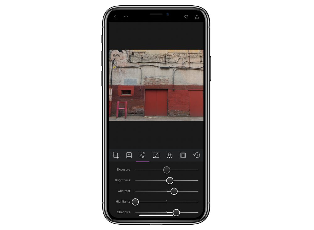
So why does the picture that you just took and which you were so happy with in Halide now look so bad in Darkroom?
Well, remember how I mentioned that the uncompressed RAW photos don’t get the noise reduction benefits of compressed images? In unedited form, these photos also lack some of the post-production magic that makes them look vibrant and punchy. That’s where Darkroom and your eyes get to play a role.
Across the bottom of Darkroom, you’ll find editing tools for cropping and perspective, filters, adjustments, curves, color, and frames. I often find it helpful to start on the third tab — adjustments. This is where you can dial in the overall look of your photo: exposure, contrast, saturation, sharpness, and more.
With RAW photos, you have a lot more data and detail to work with, even with the parts of your image that you may feel are near-black or near-white. You can independently tweak the highlights and shadows — pulling highlights down often reveals more detail in clouds and neon signs, for example, while pushing shadows up can give you much better range in portraits.
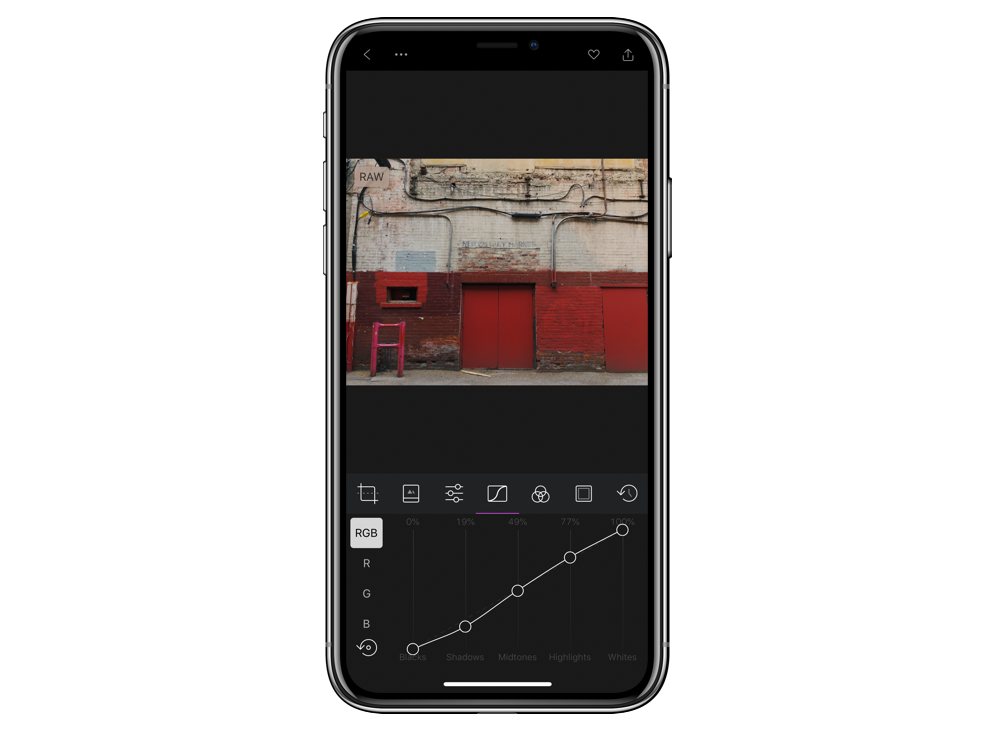
The next tab in Darkroom is for curves — a tool I struggled to understand for ages in Photoshop, until one day it just clicked for me. Basically, it’s a graph of how you want light to be interpreted in an image. The x-axis represents luminosity, from 0 to 100; the y-axis represents the difference between the actual luminosity and how it is displayed. Confused yet? Let’s experiment with it.
In RGB mode, try dragging up on the handle of the Blacks part of the graph. Notice how all of the darkest areas of the image start to become a little bit washed out and turn more of a dark gray. The curve of the image’s light has changed, crunching the blackest tones into the darker parts of the shadows so there’s less difference between them. You can undo this, of course, if it isn’t what you intend to do, but try experimenting with the curves tool to see how you can use it to subtly alter your photo. Switch it from RGB mode to each of the primary colors by tapping the R, G, and B on the left-hand side; you can add more red, green, or blue to different areas of your photo or, by subtracting those colors, you can introduce more cyan, magenta, or yellow, respectively, which are their opposites.
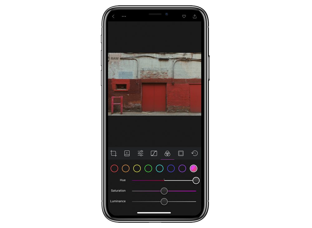
The color adjustment tool in the next tab gives you precision control over specific hues in an image. This is where a lot of magic happens and where the tone of your image could really change. For example, let’s say you’ve got a picture of a field of wheat under a blue sky. If you dial up the saturation and slightly darken the blue, you’ll end up with a bucolic farm scene; if you pull the blue saturation back until it’s almost gray and punch up the orange and yellow tones instead, you could end up with an image that looks spooky — very Children of the Corn.
Of course, if you don’t want to play around with every adjustment individually, Darkroom has amazing filters that will take care of much of this for you. The cool thing about these filters is that you can select the same tabs as above — adjustments, curves, and colors — and make your own tweaks.
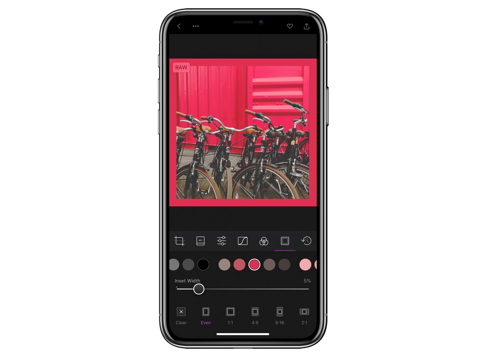
The most important thing you can do is experiment with these tools and figure out what works best for each image to your eyes. Play around with the content-aware frames tool, for example, and see how adding borders of different sizes can radically alter how your photograph is perceived.
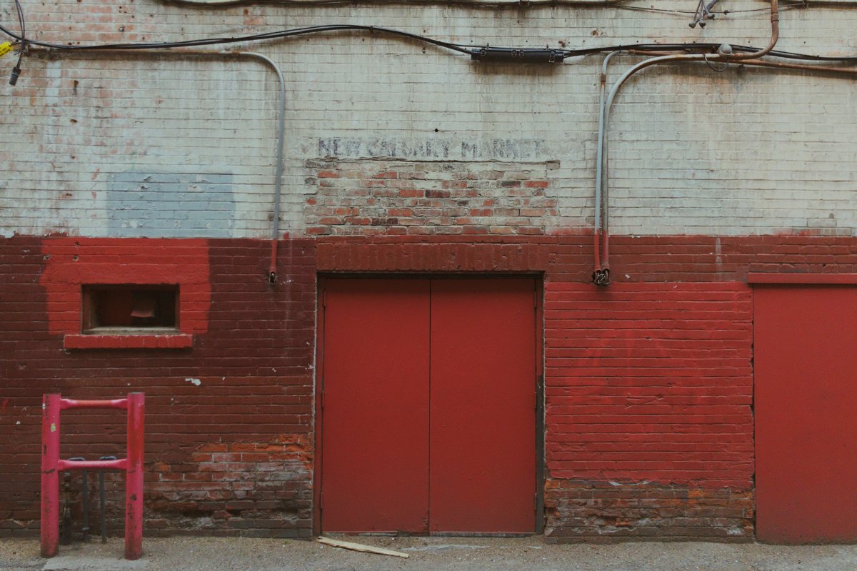
Once you’re happy with an image, you can export it in the upper-right, or you can return to your image browser to continue making edits to your other photos. Darkroom will preserve your edits, so when you open that picture again in the app, you’ll be able to make further adjustments. Just tap the Library button in the upper left to see all of the photos you’ve taken. Darkroom automatically hides screenshots from this view, and clearly indicates which of your photos are RAW files, Portrait images, or pictures you’ve already edited in the app.
Portrait Mode
For most people most of the time, the above guide to shooting and editing RAW photos entirely on your phone should get you through the kinds of pictures you’re most likely to take. But every so often, you’ll want to dip into portrait mode to more clearly delineate the subject and background. Don’t worry: Halide and Darkroom handle portrait mode beautifully.
Start in Halide by tapping the “Depth” button in the lower-right. Like engaging macro mode on a Leica Q, the focus controls will slide out of the way and be replaced by depth-specific controls. The leftmost one will display the depth map, with white areas being the most foreground elements; the middle button previews the depth effect.
You’ll also see an animation in the viewfinder area that radiates from the focus point. You can tap to focus; the depth map button can also be useful to confirm your point of focus. When you’re ready, snap the picture, then tap the thumbnail in the lower-left to head into the browser and confirm the shot. Happy? Great; tap on that Darkroom icon just as before to begin your edits.
There’s some good news and some bad news here. The bad news is that your photo is not a RAW file. RAW images, by definition, are direct sensor data, and the depth effect requires far more than just plain image data to work. That means that you simply won’t have as much range in highlights or shadows as with a RAW file, and you can’t directly manipulate the colours and white balance of the image — any edits you make are going to be applied on top as opposed to directly to the image.
The great news, though, is that you now have more sliders to play with in Darkroom. Opening the adjustments tab of a portrait photo will yield separate saturation, contrast, and brightness controls for the foreground and background, as well as a slider to control how deep the depth map should go.
As with any other file in Darkroom, you can add filters, adjust curves, add a frame, and more. And when you feel finished, share it with anyone who will take a look.
Wrapping it Up
The beautiful thing about these two apps is how well they work together. In the above guide, we’ve shown you how you can start by shooting great pictures in Halide, then hop into Darkroom seamlessly for making your edits. In fact, they’re so good that we really wish there were a way to set them as the default camera and photo viewer, respectively; and it would be awesome if they had iPad apps — particularly Darkroom.
If you’re even a little bit interested in photography and don’t know where to start, we think you’re going to have a fantastic time by using the camera you already have in your iPhone coupled with two of the best apps around for getting the most out of it.
Get Our Best Photography Tips & Workflows
Transform your photos and edits from average to awesome with our in-depth, mobile photography course. It’s jam-packed with training, ideas, and lessons that can literally transform your photography overnight.
