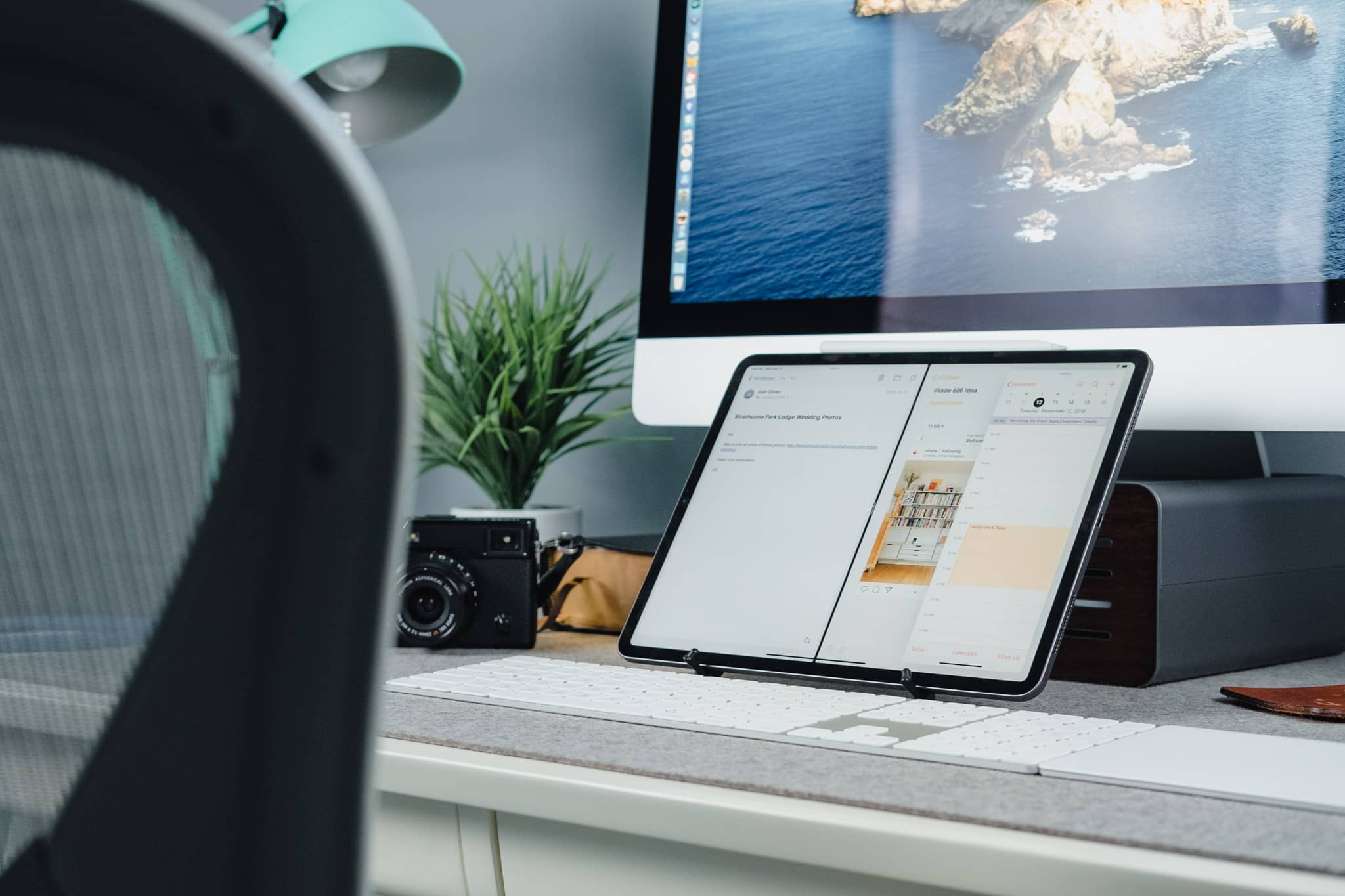
Revisiting the Apple Stock App Experiment
Every year around WWDC, a new version of iOS debuts with a plethora of new features and capabilities, and there’s a feeling of upbeat enthusiasm towards the future of Apple’s iDevices. This was especially the case at WWDC 2019, as iPadOS was launched with a whole host of new multitasking features and quality-of-life improvements. Alongside all that, iOS debuted fresh new looks in Notes, Reminders, Calendars, and Mail.
In early September, I put myself up to the task of converting all my third-party apps in these categories to Apple’s own stock apps. For as long as I could handle it, I made the following experimental switches:
- Things 3 → Reminders
- Fantastical → Calendar
- Bear Notes → Notes
- Spark → Mail
I figured it was time to revisit this experiment and see how everything turned out. To better relate everything, here’s a quick recap of my initial thoughts and impressions:
- Notes: First-party system-wide integration, rich URL previews, direct scanner support, importing and exporting pains, no Markdown support, poor design.
- Reminders: Better Siri integration, natural language parsing, rich task attachments, messaging and location-based reminders, no project management tools, no GTD methodology.
- Mail: Great design, system-wide integration, security, inability to share emails, no power user or team features, poor inter-app integrations.
- Calendar: Great design, live app icon, system-wide integration, finicky event creation, the overall design of the app icon.
Reading my initial impressions two months after the fact provides a few instances to nod and agree, shake and disagree, or flat out laugh at myself. Here’s where I ended up two months later.
Back to Bear
Of all the apps I was thinking — and even hoping — would stick, it was Apple’s Notes app. The premise of having an immediately accessible note-taking app on the lock screen on the iPad was delectable, as was the surety of knowing that Notes will likely be around in some shape or form for a very long time.
But the first-party and system-wide integrations that make Notes great were the only real checkmarks for me. Bit by bit, the frustrations grew with Notes, and I found myself redownloading and returning to Bear.
Why the Return?
In the case of Bear, this is really simple:
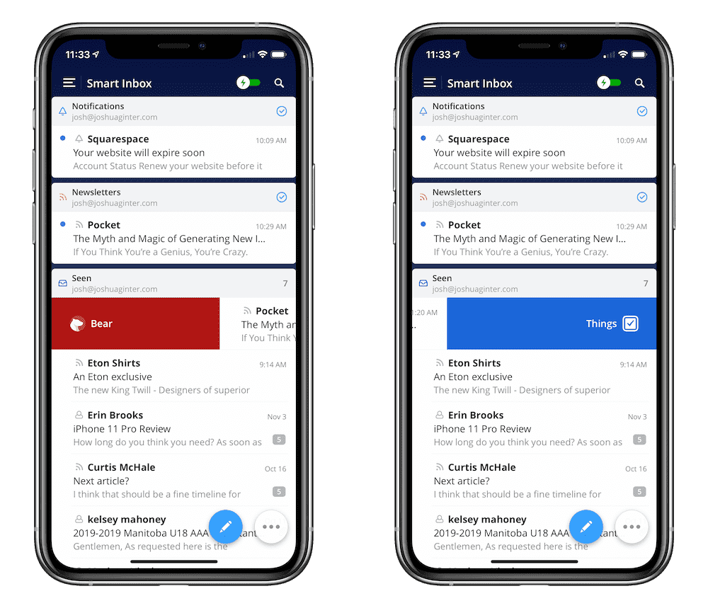
Organization and Triage: This wasn’t anywhere on my list of initial impressions, simply because I expected there to be no issue. But in reality, this was the dealbreaker — the folder structure inside Notes simply isn’t as malleable as I’d like.
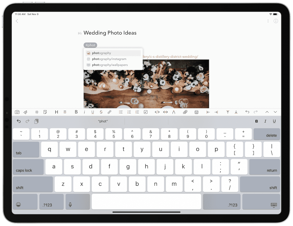
Say I drop a screenshot inside a note of a unique home design that I either want to incorporate into a future renovation or into a future build. I generally want to organize that note a couple ways: as a “Home Renovation” note, as a “Future Build” note, and perhaps as an “Interesting Design” note. Well, in Notes, there’s no immediately noticeable way of putting that same note inside three different folders.
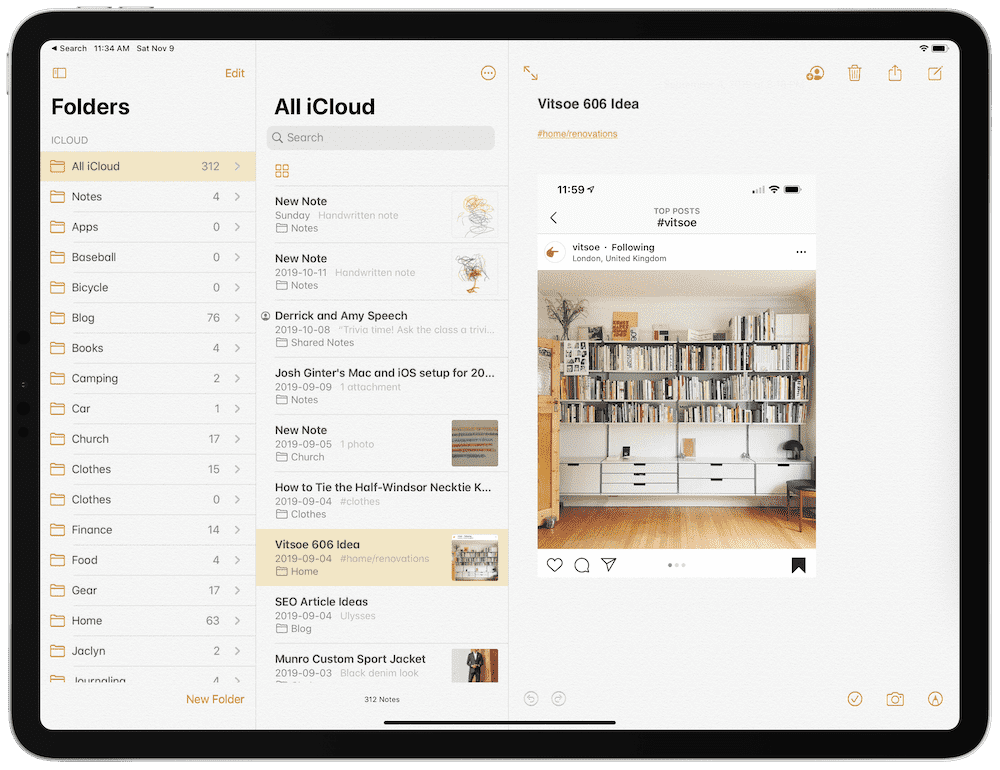
There’s also no fast and easy way to find your unorganized notes, nor is there a fast way to create new folders when a new type of note idea pops up. Bear succeeds vastly in this department — tagging notes with a hashtag is super fast and super easy, and there is an “Untagged” category right at the top of the left sidebar to find all your notes that need to be organized.

This, among all other aspects, is the single biggest reason for returning to Bear for my notes. Note-taking can’t be laborious. It needs to be quick, easy, and even more quick to access when inspiration starts in the future. Bear blows Notes out of the water in this regard.
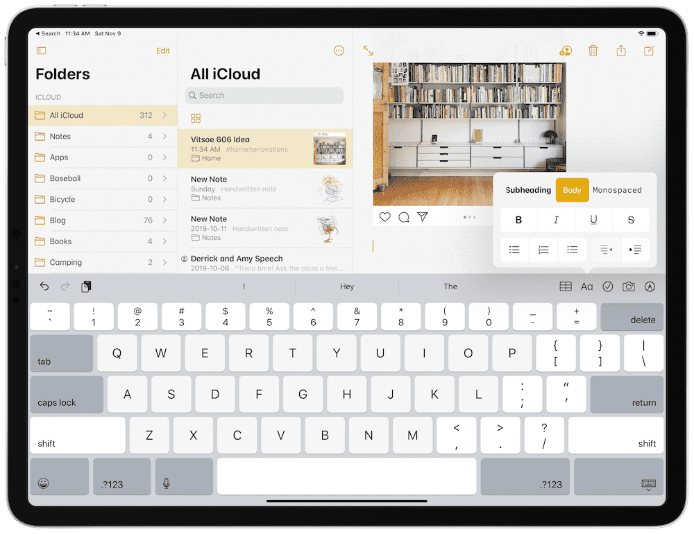
Also, Markdown: Yes, I didn’t expect this to be a huge consequence of using Apple’s Notes app, but muscle memory was hard to overcome when typing out notes. Markdown is so much quicker for formatting than the rich text formatting that Apple uses. Adding links, headers, bulleted lists, and more inside Apple’s Notes app was tedious and annoying, and only served to quicken my move back to Bear.
Trusty Things 3
The Reminders refresh in iOS 13 and iPadOS came with much fanfare, as the previous Reminders app was one of the most long-in-the-tooth iOS apps in recent memory. iOS 13’s Reminders app has come a long, long way to shore up the app’s shortcomings, but it also requires a different productivity approach than many have become accustomed to with third-party options.
To me, this is purely due to the GTD methodology.
Why the Return?
I’m a little late to the “rain-on-Reminders” parade, as Stephen Hackett effectively beat me to these arguments just last week. In his piece titled Reminders Isn’t for Met… Yet, Stephen had three main reasons for Reminders falling on its face in an early switch:
- Sorting in Reminders
- Clunky task creation
- UI decisions, specifically regarding metadata presentation
Nodding and more nodding, at least in my camp. For me, it was specifically task creation and the following organization which did Reminders in for me.
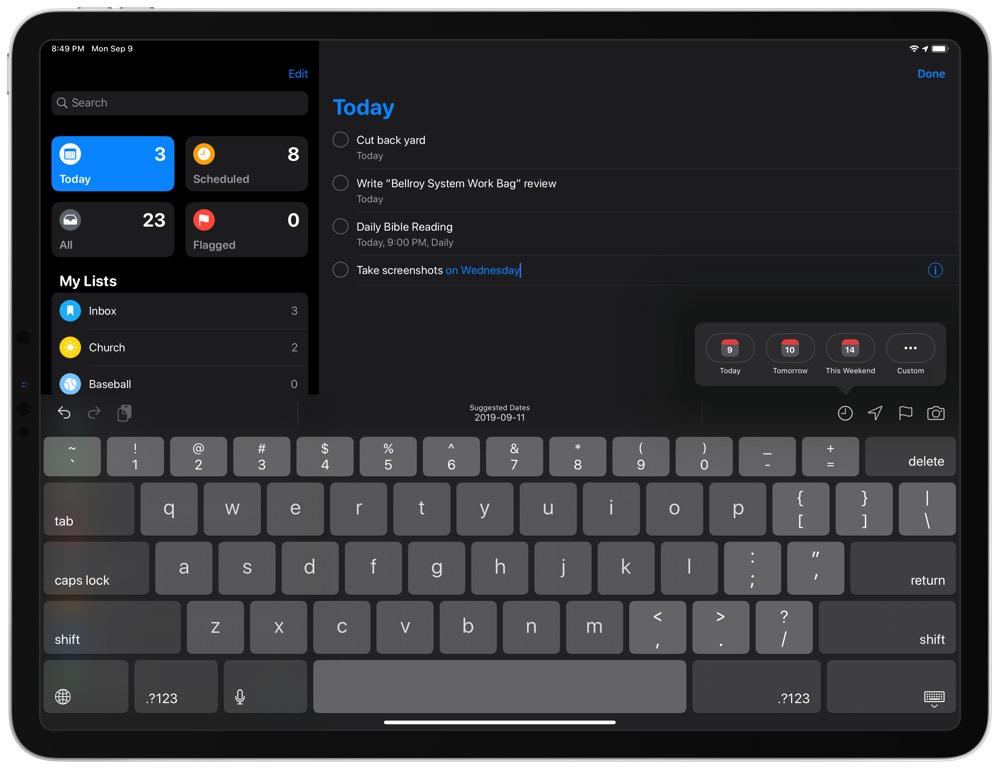
Clunky Task Creation: I expected the new support for natural language parsing to absolutely rock when it came to quickly creating new tasks inside Reminders. Hackett:
On iOS, Reminders relies on the QuickType bar for making the typed word “Tomorrow” the due date for the task. It’s awkward, and in this example, I’ve typed the word “tomorrow” in the task name field, but to make it the due date, I have to tap it above the keyboard. Reminders should be confident enough to use what I type as metadata.
There are so many little icons and buttons inside Reminders, I felt overwhelmed at all the steps I had to take to enter a task in the app. Natural language parsing was simply not as effective as I expected.
Also, GTD methodology: Once that task was created, I ran into more headaches. It could be years of habit at this point, but I’m particularly good at brain dumping all sorts of stuff into a list. I can think of all the things quite easily. It’s the next step — organization — that requires more thought than I ever want to give.
This methodology effectively requires an “Inbox” for brain dumping. In Reminders, if this is how you work, you actually have to create an “Inbox” list where you can leave all your un-triaged tasks. But of course, because Reminders isn’t built with the GTD methodology in mind, Reminders treats that “Inbox” list like any other triaged list. There needs to be a 1, 2, 3, orderly process, and Reminders doesn’t have that.
It wasn’t long before I realized how I work, how I organize tasks on paper and in my head, and how Things fits this nearly perfectly. Brain dump into the Inbox, then keyboard shortcuts to shoot those tasks into their appropriate areas with their appropriate due dates.
I never actually expected to be able to turn my back on Things 3. But I didn’t expect to have to return to Things so quickly.
Messy Mail
Ah, yes, my undying infatuation for Apple’s own Mail app. There’s something so serene, so default, so generic about the Mail app that calls for me at least a few times a year. Generally speaking, this isn’t solely due to Mail’s design — usually Apple makes handy improvements to the Mail app each year (like swiping, or threaded conversations, etc.) that have me revisiting the app with wide, loving eyes.
But iOS 13’s Mail app is one of the biggest swings-and-misses for Apple’s Mail app in recent memory. In no way do I feel iOS 13’s Mail app is a step forward. Not only did prior shortcomings not get shored up (why can’t I share anything out of the Mail app via the share sheet yet?), weird UI decisions have led to the most awkwardly designed bottom action bar of any of Apple’s apps.
Why the Return?
First, to be candid, my email life has gone around the bush and back again over the last two months. We adopted a new email service at the office, which meant adding another email address to my email app. I’ve also gone through a major Office 365 push at the office, further opening my eyes to Microsoft’s Outlook app.
So with that in mind, it’s easy to see why Mail wasn’t going to live for long.
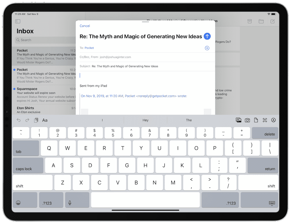
Lack of Integration: I’ve never been stopped in my tracks so often as I have been in Apple’s Mail app. An email flows in with a task that needs to be completed, I move my eyes around the screen looking for a way to share that email, be it with a colleague, or to my task manager, or both, and boom, dead end.
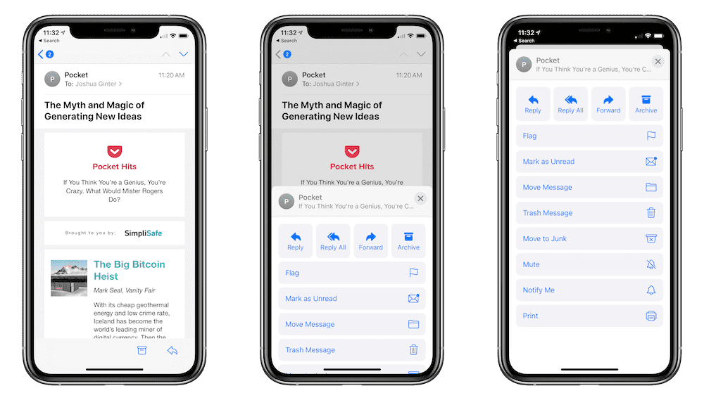
Instead, I’m met with two buttons on the bottom of the screen: an archive button and a reply button. Tapping the reply button opens up an entire screen’s worth of options, where you can reply all, forward, move the email, and more. Nowhere in this list is the ability to share the email outside the app, like Notes. If you want to forward the email, it requires two taps, which is important because this is the only way to get a task out of Mail and into Things.
(I would have said Mail to Reminders above, but the only way to make an email as an actionable task inside Reminders is by dragging and dropping the email on the iPad. There’s no way to do this on the iPhone, which is almost stunning in and of itself.)
The last thing I need is a second task list to try to tackle each day. And, as expected, emails were read and tasks weren’t completed, as my productivity attention was split between two different lists.
Also, UI decisions: More annoying than anything else: the reply button at the bottom of the email is situated in the bottom right corner (I guess assuming most folks use their right hand to navigate their iPhone?) and the corresponding reply button in the pop up menu is on the far left side of the screen. Two taps to reply or forward an email, and a long, awkward stretch of the thumb across the screen to reply — who made this decision, Apple?
iOS 13’s Mail app is a complete mess right now. I’ve almost never felt this way about Apple’s Mail app — it’s normally rock solid with just the right amount of features to keep it as my main email app. This time around, I feel like we’ve taken a step back in this department.
Clunky Calendar
I’m not much of a calendaring kind of guy — most of my events are created by my wife in our shared family calendar, or I add work appointments via Outlook on my Windows PC at the office. It’s a pretty rare occasion that I have to add something to my calendar from my iPhone or iPad.
As a result, Calendar is the one app that had a chance to stick in my stock app experiment. If I didn’t have to create events inside Calendar, I figured the app would stick thanks to its live app icon and immediate first-party integration whenever a date showed up in an iMessage or email.
In the end, habit prevailed — I’m back to Fantastical.
Why the Return?
Because I use a calendar app to reference more than create, I tend to want my calendar app to present events quickly and with minimal effort. iOS 13’s Calendar app isn’t strong at this and this is my main point of contention with the app. Further, for the few times I do need to create an event, there’s nothing quite like scrolling and tapping through dates and times to drive me bananas.
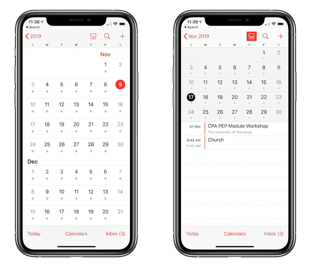
Displaying Event Information: Referencing your schedule in iOS 13’s Calendar app is more tedious than I anticipated. The app opens to a view of your current schedule for the day, and tapping on the month in the top left corner returns you to the overall monthly view. This monthly view is where I’ve been trained to live, as an outlook for the next week or two is more important than my current day’s schedule.
The monthly view is super bland — days with events have a single gray dot in them, indicating almost zero information about your future schedule. Tapping any specific day in this view shoots you back to the daily schedule view — in order to see all your events in that day, you have to scroll through the daily schedule. You can shorten this process somewhat by tapping the ambiguous button in the top right corner — once you tap this button, you’ll be provided with a list of your events on the chosen day, rather than be shot to a daily schedule view of that specific day.
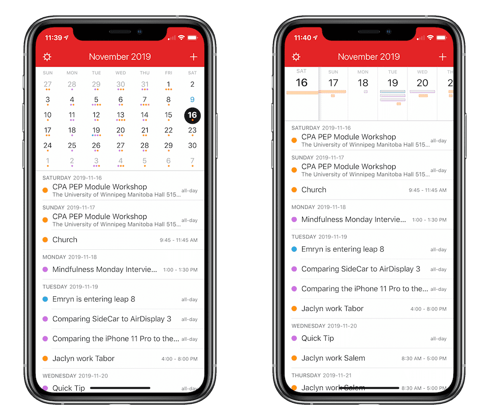
Contrast this to Fantastical’s monthly view and you’ll see why I find myself annoyed with Calendar’s processes. Any day in Fantastical that has an event has a colored dot corresponding to the event’s specific calendar. Anything orange in my Fantastical view is a family event. Anything purple is a Sweet Setup event. Anything blue is a baseball event. And so on.
When referencing your calendar, Fantastical far exceeds the capabilities of the stock Calendar app.
Also, Natural Language Parsing: And if referencing your schedule inside Calendar wasn’t awkward enough, creating events in the Calendar app sure will be. There’s just no substitute for typing Supper at the in-laws at 7:00PM on November 25th /f to create a perfectly timed event in my shared family calendar in Fantastical. This same event creation in Calendar would take some typing, some swiping, some scrolling, and some more list choosing to put in the right spot in your calendar.
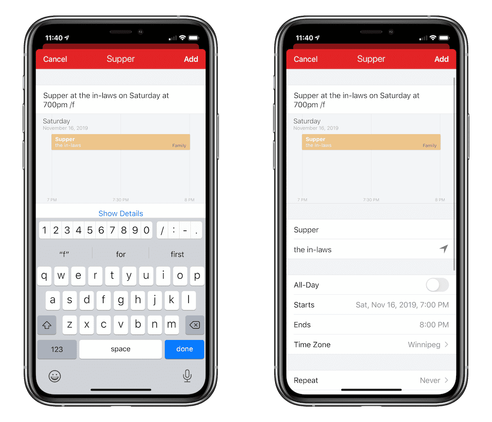
If there’s one feature I expect Apple to make to its Calendar app in iOS 14, it’s natural language parsing. Natural language parsing is already available as actions in Shortcuts as well as inside the Reminders app. It seems all but destined to make its way to the Calendar app.
Until Next Year
My fear is that the results of this experiment somewhat reflect every major iOS (iPadOS, specifically) release of the last few years. By that, I mean that there’s an exuberant “This will change how you use the iPad forever” moment in the weeks and months following WWDC, followed by an overall return to prior form. There’s enormous proof that the iPad and Apple’s own stock apps have changed how people work, but that change has been far more gradual than expected — it’s over the course of multiple iterations of iOS and iPadOS where we’ve seen larger impacts on workflows and productivity.
It’s this slow, gradual trudge forward that creates frustrations for third-party developers to meet and fix, and it’s why there is such a large group of people who are reliant on the best third-party apps on their iPhones and iPads. Apple just won’t introduce the share sheet to its email app, so developers created an email app that thrives with the share sheet.
This has happened in every category in the iOS App Store, and it’s happened for good reason.
Apple’s stock apps are good. Some of them are even great. But, for every annoyance or roadblock in Apple’s apps, it’s almost a certainty there’s a third-party app out there that fixes that annoyance.
I’m a man of habit. As it turns out, Things, Bear, Spark, and Fantastical have entrenched themselves in those habits.
It’s going to be very difficult for a different app to weasel its way in there.
You can read our full reviews for these great third-party apps here:
Our Must-Have, Most Used Productivity Apps
We spend an inordinate amount of time sorting through hundreds of apps to find the very best. We put together a short list of our must-have, most-used apps for increasing productivity.