Our First Look at Apple’s New Journal App

If we were to dig deep into The Sweet Setup’s archive, you’d likely find our pick for the best journaling app to be one of the first ever app reviews we published. Day One is still the best journaling app available on the App Store. But there’s a new kid on the block, and we’re excited for the renewed energy for journaling.
Apple launching its own journaling app is sure to have lasting implications.
First, it acknowledges the benefits of journaling. One of the world’s largest companies has marketed the benefits of journaling and pointed folks to its newly created app for addressing those benefits. This can only lead to more people journaling than ever before.
Second, it provides new competition in an otherwise increasingly-stale space. There have been new journaling apps pop up here and there since 2010, but no app has ever really come close to Day One. A company like Apple putting some pressure on Day One should ensure Day One continues to strive forward and continue improvements.
Third, Apple’s new Journal app showcases a potential new route for Apple to take — one that opens up its in-house app capabilities to third parties. I’ll discuss more below, but opening up Journal Suggestions across iOS through a new API has enormous implications.
Let’s take a look at Apple’s new Journal app for iPhone and how it stacks up to one of the perennial apps on the App Store. The app has a long way to go, but it has some very intriguing elements to start.
Design Your Ideal Weekly Schedule
Free → Video Workshop + Productivity Templates
If you want to reduce the busywork and distractions, then sign up here for instant access to a brief video workshop on How to Plan Your Week.
♥️ Quick Note: You’ll get access to the workshop, plus a few additional bonuses to help you overcome procrastination and deal with distractions so you can spend more time on the important work that matters.
Design
Apple’s built-in design language feels so beautifully entrenched, anything that ventures outside of that language quickly feels out of place. Journal most certainly feels like an Apple app, but it does break away from some other built-in apps in certain design aspects.
For one, the Journal app icon is gorgeous — it’s perhaps Apple’s most beautiful app icon yet. Journal on your Home Screen isn’t going to leave anything to be desired.
Inside the app, the big bold “Journal” header feels much like other Apple apps and is the single most ubiquitous design element across all of macOS and iOS right now.
But this is where most of the similarities end.
Journal is very, very simple at this point in time. Where Reminders uses square buttons and lists of items for categorization, or where Notes and Freeform rely heavily on list views, Journal is really just one long list that can be filtered using a dropdown menu in the top right corner. In this first iteration, you’re presented with little more than your entries, a hamburger menu, and giant New Entry button.
The New Entry button is a new design element from Apple as well. The button is placed in the same spot as the shutter button when taking photos in the Camera app, so there could be some muscle memory here. Nonetheless, that giant button makes it clear Journal wants you to get into creating entries as often as possible.
Journal looks and feels like an Apple app, to be sure. It just doesn’t feel like a fully finished or built out Apple app at this point. It’ll be interesting to see if some of these new design elements — particularly the giant New Entry button — make its way into other apps in some shape or form.
Creating Entries
There are effectively two ways to create new entries in Journal:
- From the iOS share sheet.
- From the New Entry button.
The New Entry button has some sub-features though:
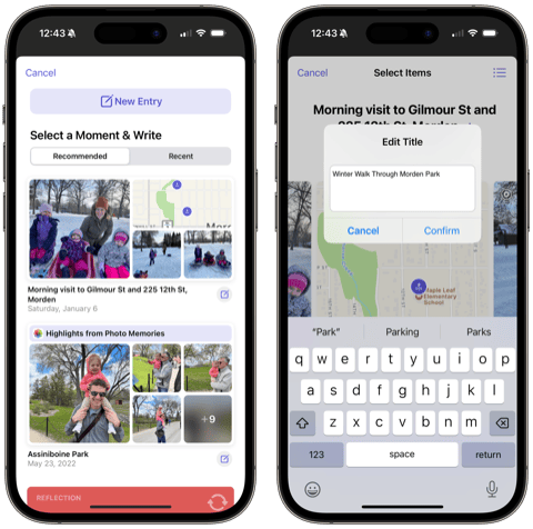
- You can tap the purple New Entry button at the top of the pop-up screen. This provides you a blank canvas for writing manually.
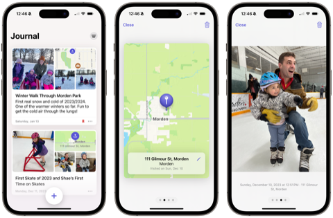
- Select a Moment & Write — this allows you to see recent and recommended events from your camera roll or location tracking stored securely on your iPhone and create entries off of those events.
The second of those two options is by far the best part about digital journaling, so I’ll discuss more below.
For now, manual entries are very manual and quite limited. In true Apple fashion, entries are formatted in rich text, requiring you to highlight your writing and format it to your needs. There are no headers or titles at this point, just bold, italic, underline and strikethrough. There also aren’t any bullet point lists, link formats, or any other formatting you’re likely accustomed to. To an extent, I expected to see more of the Notes editor built into Journal. For now, the editor’s limitations will likely act more as a distraction and frustration than it will help you create new journal entries.
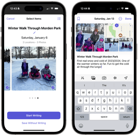
You can pretty quickly jump into your Camera Roll, take a snapshot, add a voice memo, or include/pick your location to any entry. All these options are located right above the keyboard. The current list of media that you can add to an entry is limited compared to the best journal apps, but it does show Apple’s intent here: you can quickly tell that creating journal entries is equally or more about the photos you’ve taken, the places you’ve been, the music you’ve listened to, or the activities you’ve undertaken than it is about writing out every single thought in your head.
This is an encouraging part about Apple’s Journal app. You don’t need to commit to writing all your thoughts and dreams into the app. Instead, you can use the app to effectively log your activities throughout the day. Both are effective for helping your mental health in some way.
Journaling Suggestions
Journal’s superpower — and, well, every other app’s superpower now — is the new Journaling Suggestions API. Apple’s marketing is as follows:
On-device machine learning provides private, personalized suggestions to inspire journal entries, and customizable notifications help users develop their writing habits. With the new Journaling Suggestions API, third-party journaling apps can also suggest moments for users to write about.
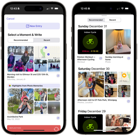
Journaling Suggestions are at the heart of the new Journal app. When you hit that big New Entry button, Journal presents you with a list of recommended and recent options. Tapping on any of the presented options gives you options for picking which photos to include in your entry, which mini-maps for showcasing your location, and more. You can quickly edit the title of the entry and add in some of your thoughts in the text section at the bottom of the entry. These quick suggestions make it very easy to build out your journal with events and activities you’ve had in recent weeks. They also spur a ton of creativity and inspiration in the process.
The kicker though: the Journaling Suggestions API is not limited to just the Journal app, like many of Apple’s other core features. Quick Notes are limited to Notes and Notes only. Date-changing app icons are limited to the Calendar app. The large News Today Widget is limited to News.
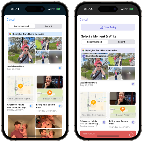
And since Journaling Suggestions aren’t limited to Journal, you can experience the best parts of quickly creating new entries with on-device machine learning in other journaling apps. Day One (pictured above left) nearly instantly offered Journaling Suggestions in its app, providing a new and consistent way to fill your Day One with media-filled entries. Journaling Suggestions are responsible for getting me into my Day One journal more than any other feature of the last five or six years — it’s so quick and easy to create fun entries in Day One and I love seeing the new Map view fill up as I go.
The long and short: You don’t need to use Apple’s Journal app to use its best feature. If you don’t want to pay for Day One, Journaling Suggestions are sure to fill your Apple Journal quickly and easily. If you already pay for Day One, you may find yourself filling your Day One faster — and with richer media — than ever.
How Journal Stacks Up Against Day One
I compare Journal to Day One if only because Day One is one of the best apps ever released on the App Store. Day One has set the bar for design, longevity, feature growth, quality, and more over its nearly 15-year existence. This isn’t to say Day One hasn’t had some hiccups over the years. It’s just a top-shelf app that Journal can aspire to over the coming years.
And aspire is the best it’s going to do in the short term. There are so many feature differences between Journal and Day One right now, I’m not sure I can list them all. The biggest of all is the fact Journal is available only for iPhone while Day One is available on every Apple platform. Here are a few other big ones:
- Text formatting — As mentioned above, the inability to format your text beyond basic bold and italics make building out your entries in Journal more annoying. You aren’t able to type out longer thoughts on a Mac (unless, I suppose, if you write them out in Notes and copy/paste them into your entry on iPhone) and you can’t build out lists or other options. This is a huge downside to Journal right now.
- Templates — Day One has dramatically ramped up its number of built-in templates in the app, making for consistently formatted entries and making for an easier time building a journaling habit. At the time of writing, Journal has no templates anywhere in the app.
- Tagging and Organization Features — Journal currently has no ability to tag or organize your entries into categories or topics. All your entries populate one giant list and you can filter your view based on the types of media included in the entry. In Day One, you can tag your entries with any tag you want. You can create multiple journals. You can filter your view to any type of media or location or tag. You can even create a shared journal with a spouse or friend if you want (upcoming feature that may not be officially launched as of the time of writing). Day One takes organization to an entirely different level.
There’s more, of course. Different app icons, transcribed audio notes, vastly improved daily prompts, Pencil handwriting, PDF and other file embeds, and third-party app integrations are but a few. You can also print books out of the Day One app!
But you also pay for all these improvements in Day One. Day One Premium is $35 a year to access all the above features and more. This is a very, very easy $35 if you already have a journaling habit. For those who are brand new to journaling though, Apple’s free offering is a great start.
Design Your Ideal Weekly Schedule
Free → Video Workshop + Productivity Templates
If you want to reduce the busywork and distractions, then sign up here for instant access to a brief video workshop on How to Plan Your Week.
♥️ Quick Note: You’ll get access to the workshop, plus a few additional bonuses to help you overcome procrastination and deal with distractions so you can spend more time on the important work that matters.
Wrap Up

Journal is one of the most intriguing and anticipated built-in Apple apps in a long time. The implications of the world’s largest tech companies creating its own journaling app will have lasting positive impressions for people’s mental health and wellbeing. I can’t state the positive implications here enough.
And Journal is a great start, for sure! For free, you can gain access to a number of quick and easy journal creation features. If you’ve been looking to start journaling, Journal provides the most accessible option ever on any Apple platform.
But the fact Journaling Suggestions are available across iOS in any journaling app means Apple may have propped up its journaling competition better than ever. Journal’s single best feature can also be had in Day One, where you can also have a plethora of premium journaling features in one of our favorite apps ever made.
We’re excited to see Journal hit iPhones across the world and we can’t wait to see how Apple improves it, how competition improves to stay ahead of Journal, and how folks choose to use the app to improve their health and wellbeing.