New Notion Feature: Charts
When I was a kid, I had quite an elaborate system to track all of my candy. I would get candy for Halloween, Christmas, and Easter and never finish all of it. But my greatest fear was that someone else would eat it.
I had a massive novelty pizza box that I kept on my wall, cause you know art, and I would tape all of my candy inside that pizza box. I then had a tracker to make sure that I could tell if anyone (specifically my siblings) broke into my candy vault and ate some. I think I created my own little spreadsheet on a piece of printer paper.
I think the addition of Notion charts to my 12-year-old self’s life would have been revolutionary.
Notion came out with their new chart feature a few weeks back and to be honest, it’s pretty great. It’s still V1 of the new feature, so there are a few improvements needed. But I’m looking forward to seeing how it gets better.
How they work
Notion charts are basically an additional database view. Before we just had Calendar, Board, Gallery, List etc, and now we have Chart. So you can take your pre-existing databases and view that data as a chart.
The Chart feature takes the data that you’ve inputed into another view (such as a Table) and previews it as a chart. If you build a Chart from scratch, you will need to have at least one view that is a table or another view to input your data. The Chart just displays data that already exists.
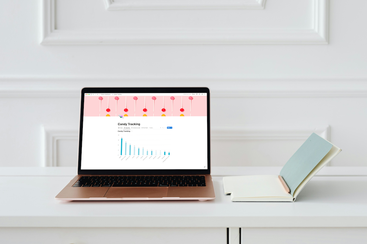
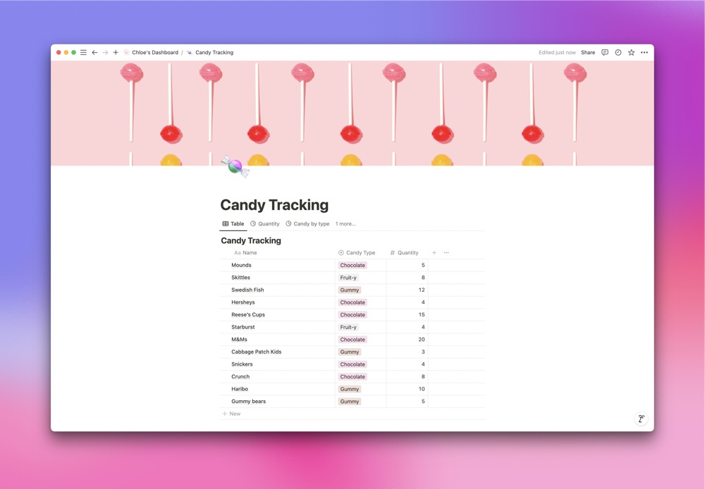
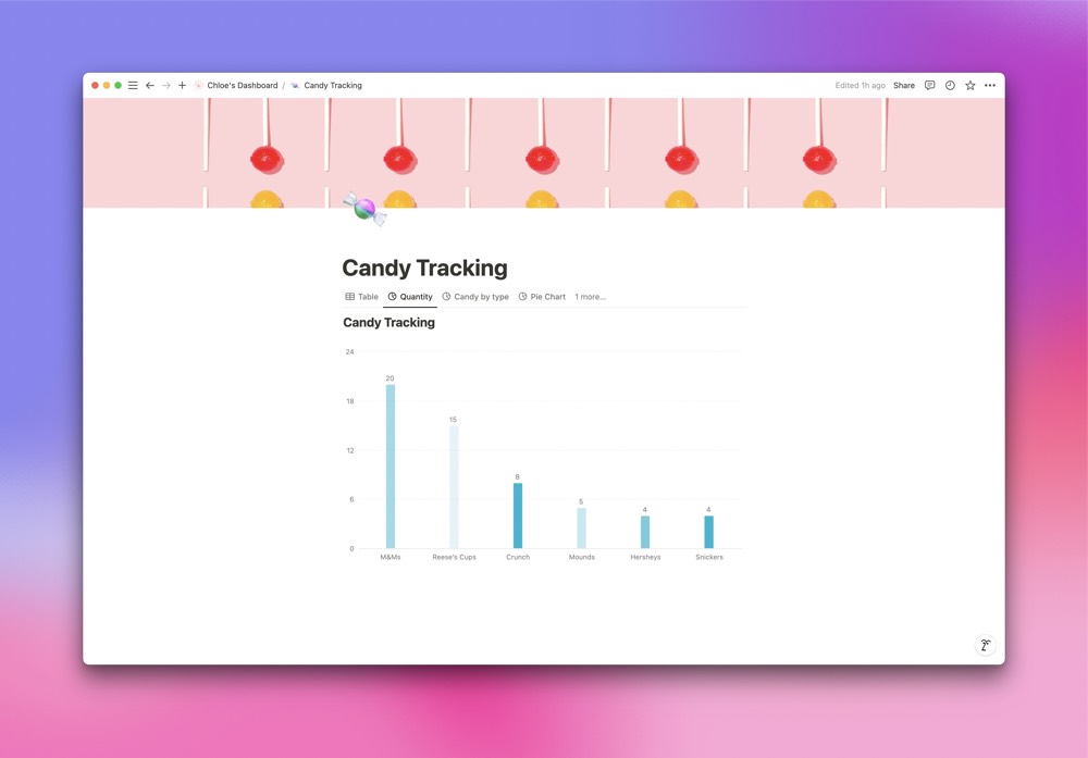
For this example, I am obviously going to track candy. In my database I have added several different types of candy. For each card, I use the select property to indicate the type of candy and enter the quantity of said candy that I have in a number property.
With this data I can easily create a Chart view to see my candy tracker in a more visually appealing way.
To create a Chart view, just create a new view of your database and select Chart.
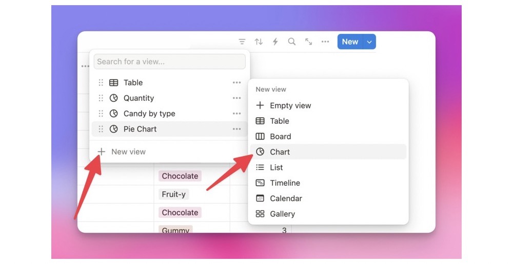
You can also type /chart and you’ll be prompted to create a new database with a chart.
When you select New Database, it will create a chart and a table where you input data. The default property is Status. Notion and others are giving a lot of examples of using Chart to track tasks.
Different Kinds of Charts
When you create a Notion Chart or a new view of a Chart, you have a few options to choose from.
You can create a:
- Vertical Bar Chart
- Horizontal Bar Chart
- Pie Chart
- Line Chart
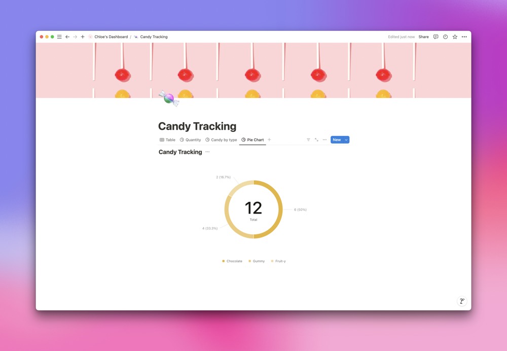
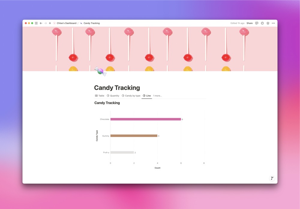
Chart Configuration
So how do you actually configure the data? There are a few different ways.
When you edit a chart (by clicking on the 3 dots next to the New button), you can choose what data you want displayed on the X and Y axis.
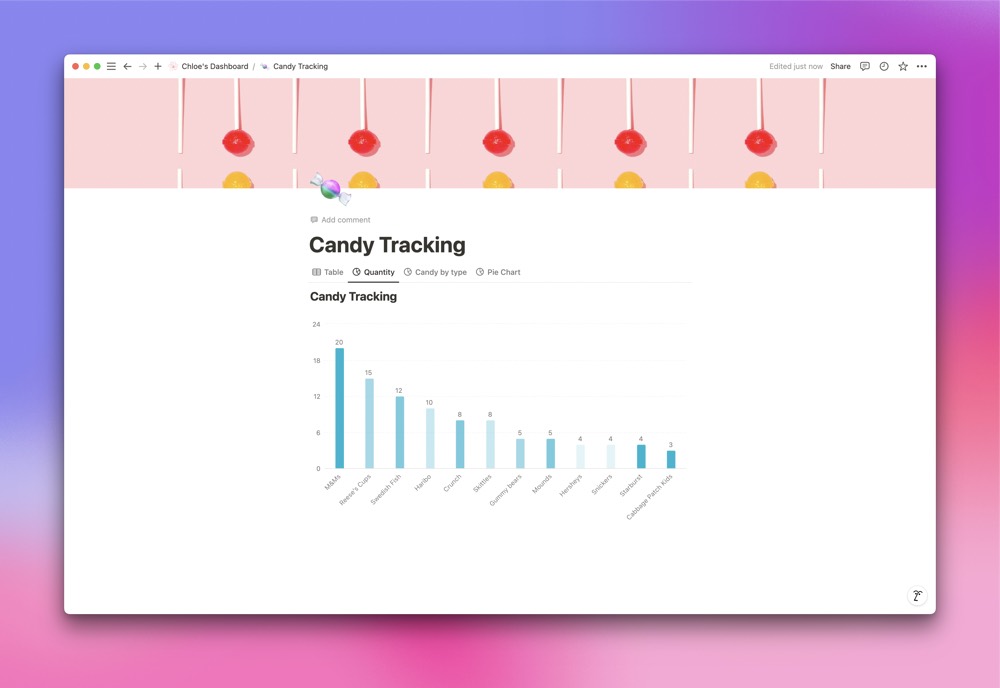
I want a chart that shows me how much of each type of candy I have, so I created a vertical bar chart. I chose the X axis to display the name of the candy and the Y axis to display the quantity of each candy.
Remember, the charts are pulling from the table I already created, so I can choose for each axis to display any of the properties that I have in my database.
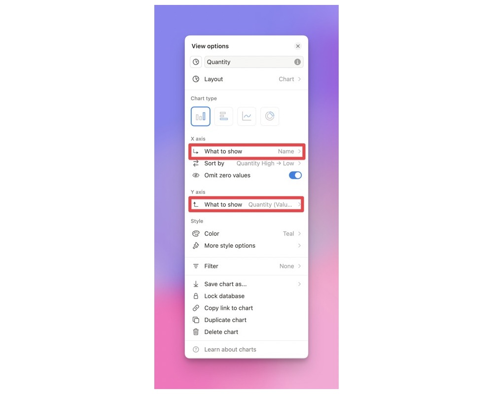
If you’re unsure of what to choose for each axis, just experiment. I tried a few different things before I settled on the above. It’s easy to switch what each chart and axis displays.
You can choose to omit zero values, which means that if I added a candy bar to my database and I hadn’t added a quantity (zero value), it won’t show it on the chart. You can always choose to show zero values if you prefer.
Of course I love that I can choose different colors for my chart to display.
But let’s say that I want to see the quantity of candy I have for each type of chocolate candy. That’s where filters come in. In this same chart, all I have to do is set up a simple filter to only display chocolate candy.
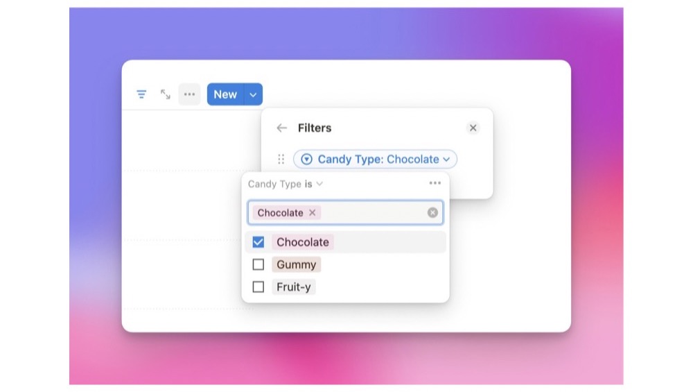
Now I can see how many chocolate candies I have.
There are a couple other configuration settings in charts, but these are the main ones. It’s pretty intuitive, and with some experimenting it’s easy to get your chart to do what you want.
Usage
I’ve seen a lot of people use charts to display how many tasks they have in different statuses, like not started, in progress, and completed. A boss can also see how many tasks are assigned to each employee. There are a lot of use cases here.
What I’ve found really helpful is displaying sales data. Instead of creating a new Google Sheet, I can just input sales data into a table and display it as a chart.
There are, however, a few limitations to this current version.
Say that I wanted to look at sales data month over month. I want to see how much we made on August 1-31 verses September 1-30 on each day. This would be easy enough to do in Google Sheets, but not so easy in Notion Charts.
It has a hard time displaying two sets of data from the same database on the same chart. There are a few work arounds, but they require some serious finessing. And at this point I’d rather head to Google Sheets than put in extra time into the Notion chart.
But like I said, this is version one. I am guessing that pretty soon they are going to update Notion charts and we’ll have some more use cases to try.
Wrap Up
Notion is continuing to evolve. I really get the feeling they want to be the One App to Rule Them All, and I’m okay with it.
The addition of the Chart feature is just another example of their quick and continued innovation with the app. I expect I am going to use Charts more and more in the coming month while moving away from Google Sheets.
And of course I’m also excited that I can make all my charts pink.