Fenix: the Full-Screened, Full-Featured iPad Twitter Client
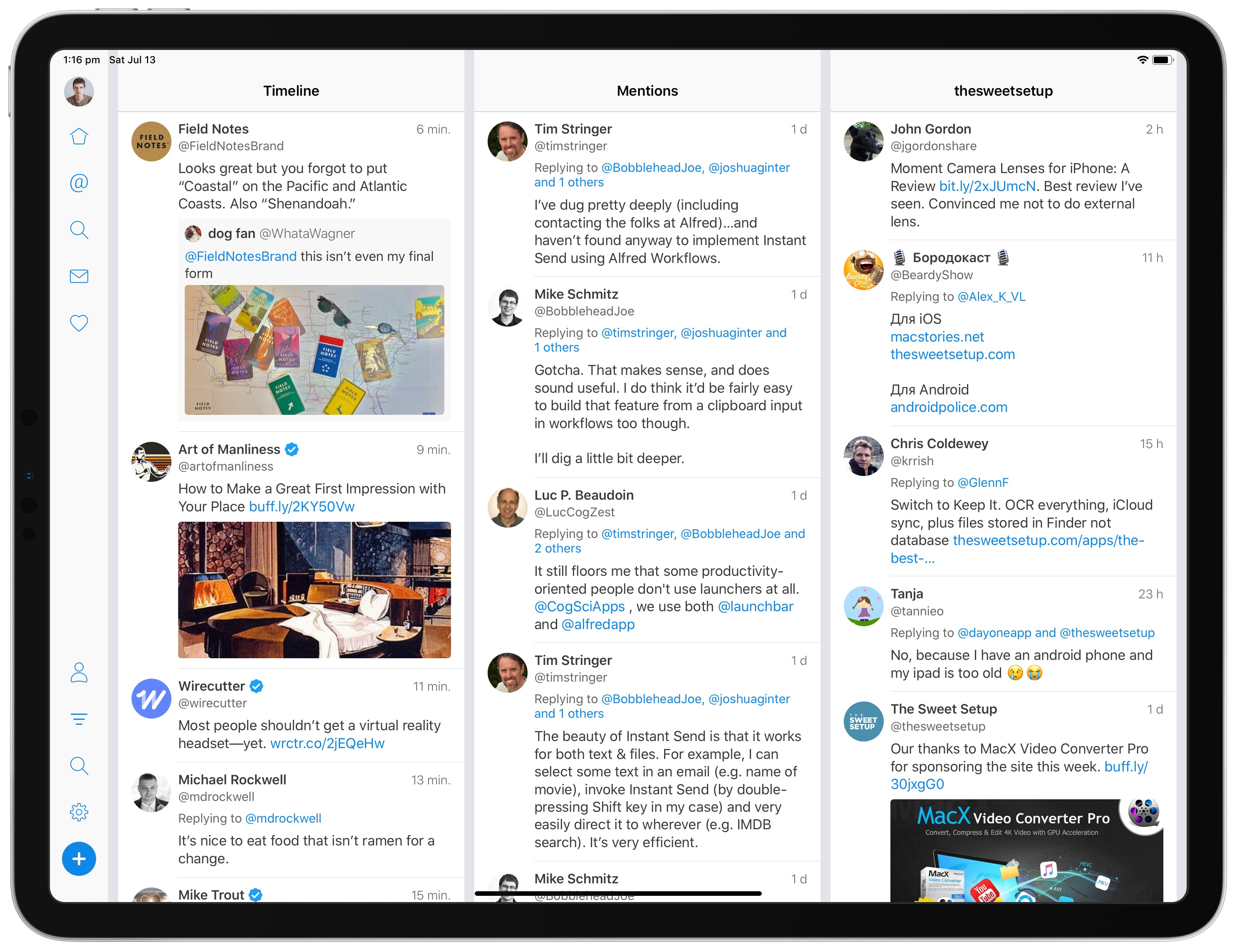
There has long been a two-pronged iOS Twitter client race in terms of design, usability, and overall experience: Tweetbot and Twitteriffic. Both apps look right at home on any iOS device, come pre-loaded with a ton of character (I love Tweetbot’s audio cues), and are rock solid.
But neither Tweetbot or Twitteriffic offer a great experience when used in landscape on the iPad Pro. Case in point:

Neither app utilizes the full screen real estate of the largest 12.9-inch iPad Pro, and neither app offers true customization beyond Tweetbot’s second column.
An app I discovered very recently via the Club MacStories newsletter (such a great newsletter, I might add) is Fenix: a full-featured Twitter client designed to better utilize the full screen width of the largest iPad Pro.
Fenix’s main premise is to provide a customizable, chronological, and multi-columned Twitter client option, and it seems to pull these off, all for a simple price of $2.99.
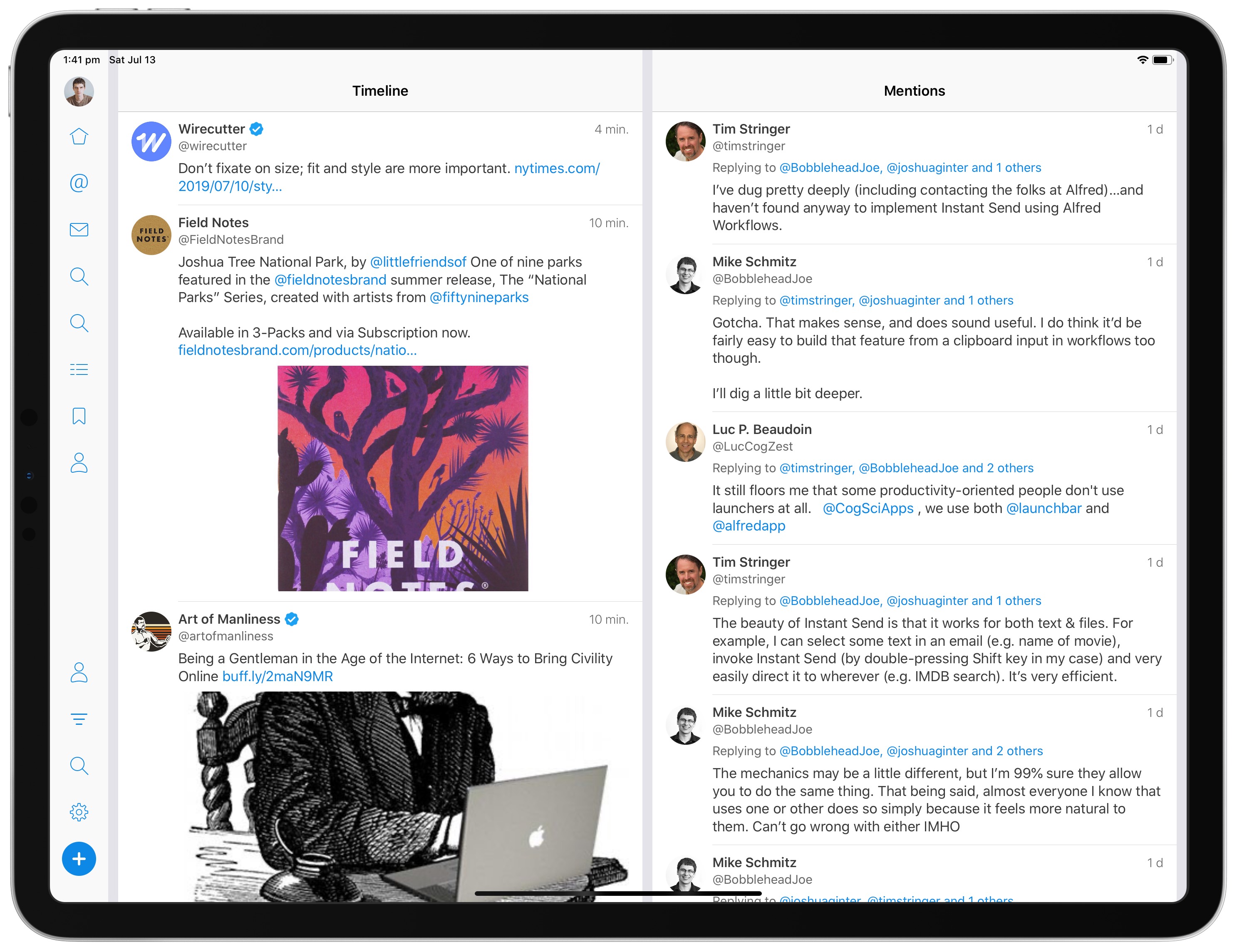
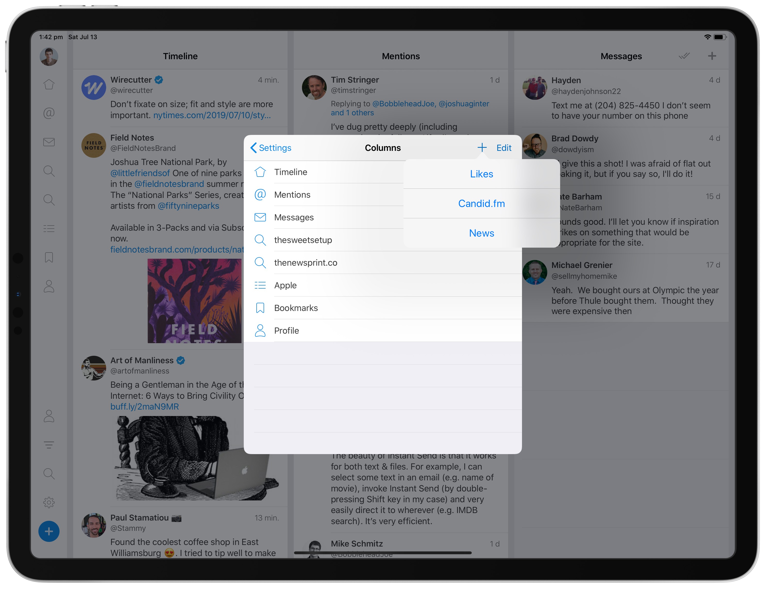
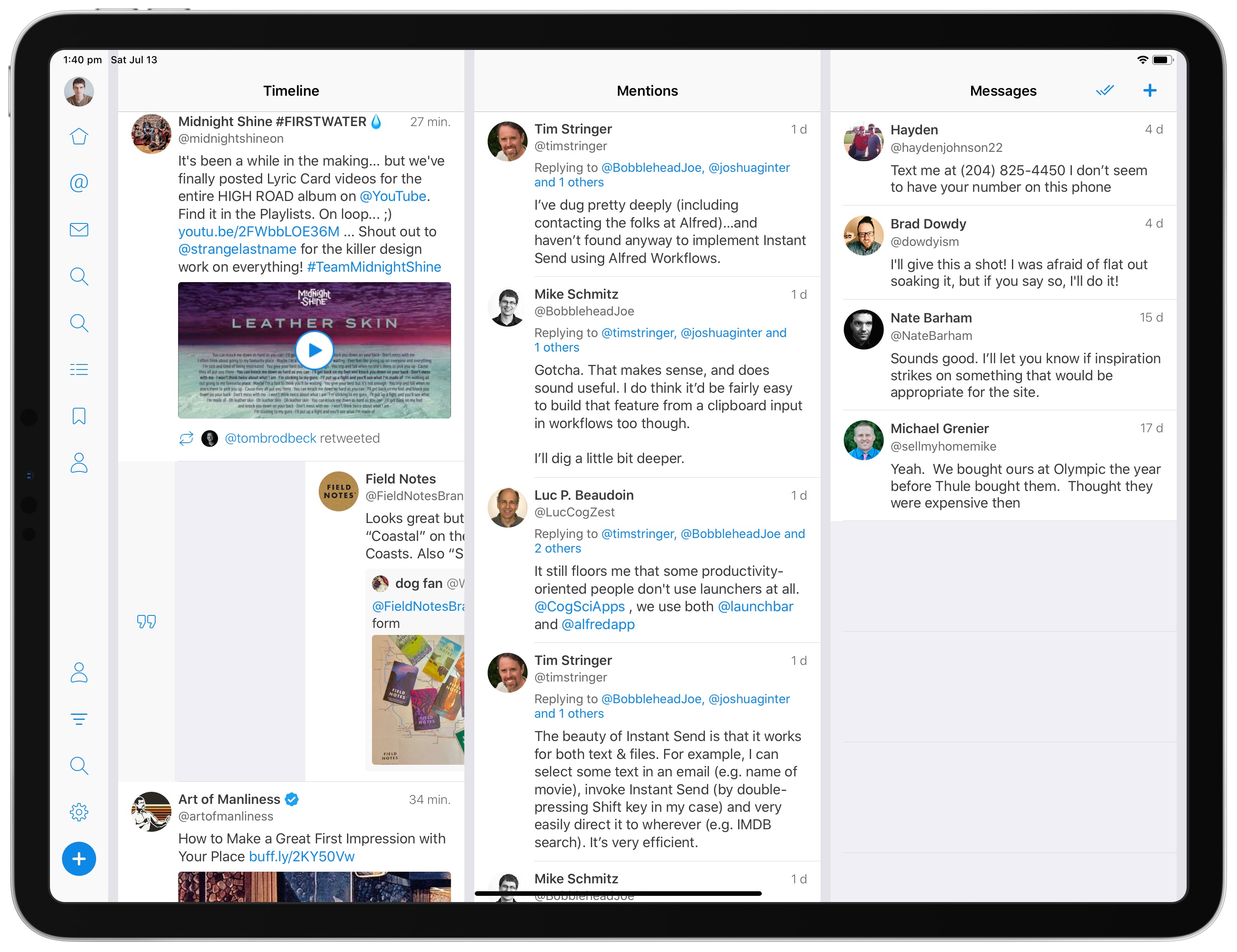
Fenix’s main view begins with regular, chronological timeline on the left and mentions on the right, splitting the screen about 50/50. In Fenix’s settings, you can adjust both the column sizes to allow for more columns and you can customize what each of those columns presents.
Of course, you can also go beyond the three-column landscape format as well. By swiping to the left in the header row of any column, between columns, or in gray space below content in any column, you can slide between more columns hidden in the right side of the screen.
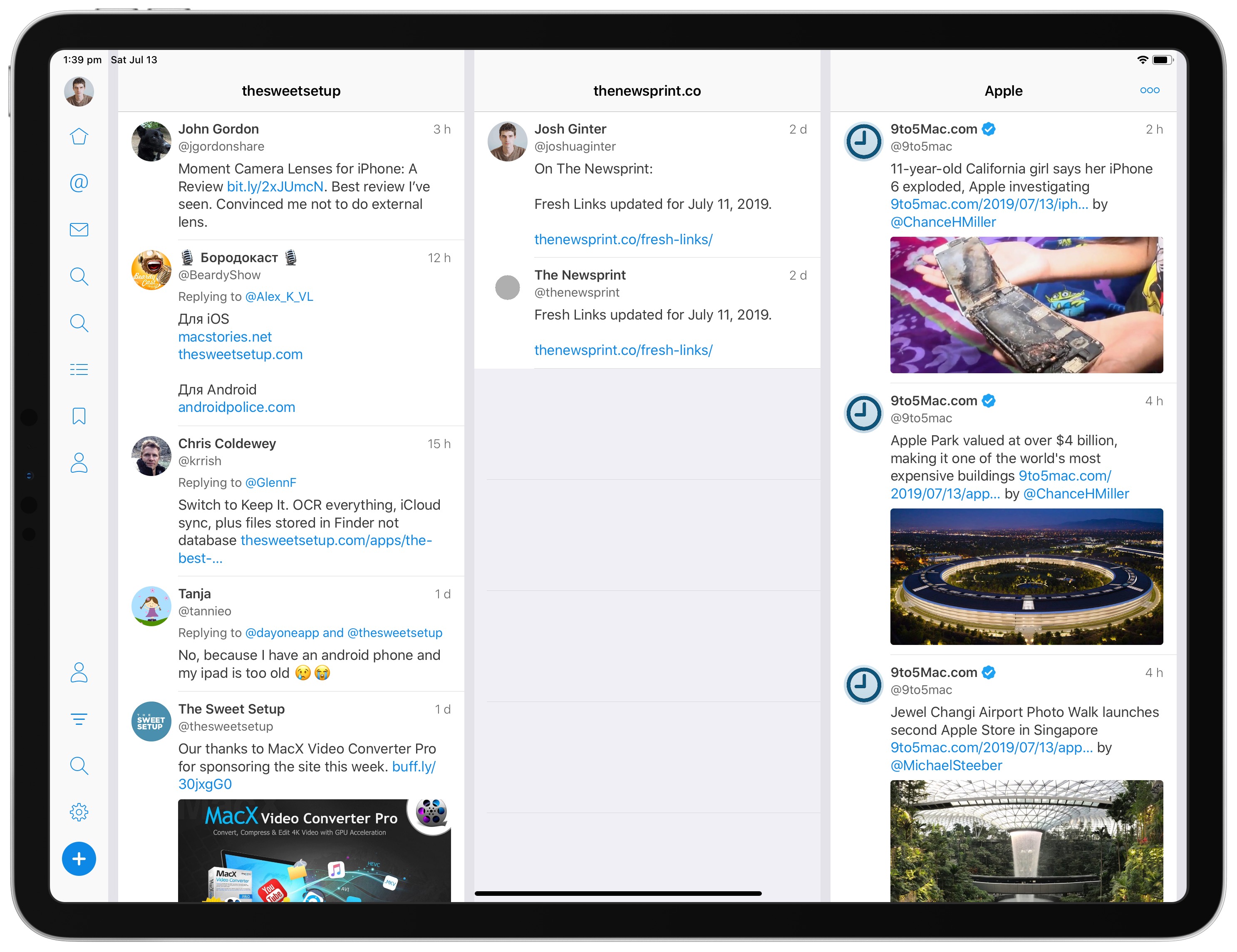
Overall, this multi-columned format feels a lot like Tweetdeck, Twitter’s own “power user” Twitter client. You can pin saved searches, messages, likes, and other Twitter users to any of those columns and maneuver between them to your heart’s content.
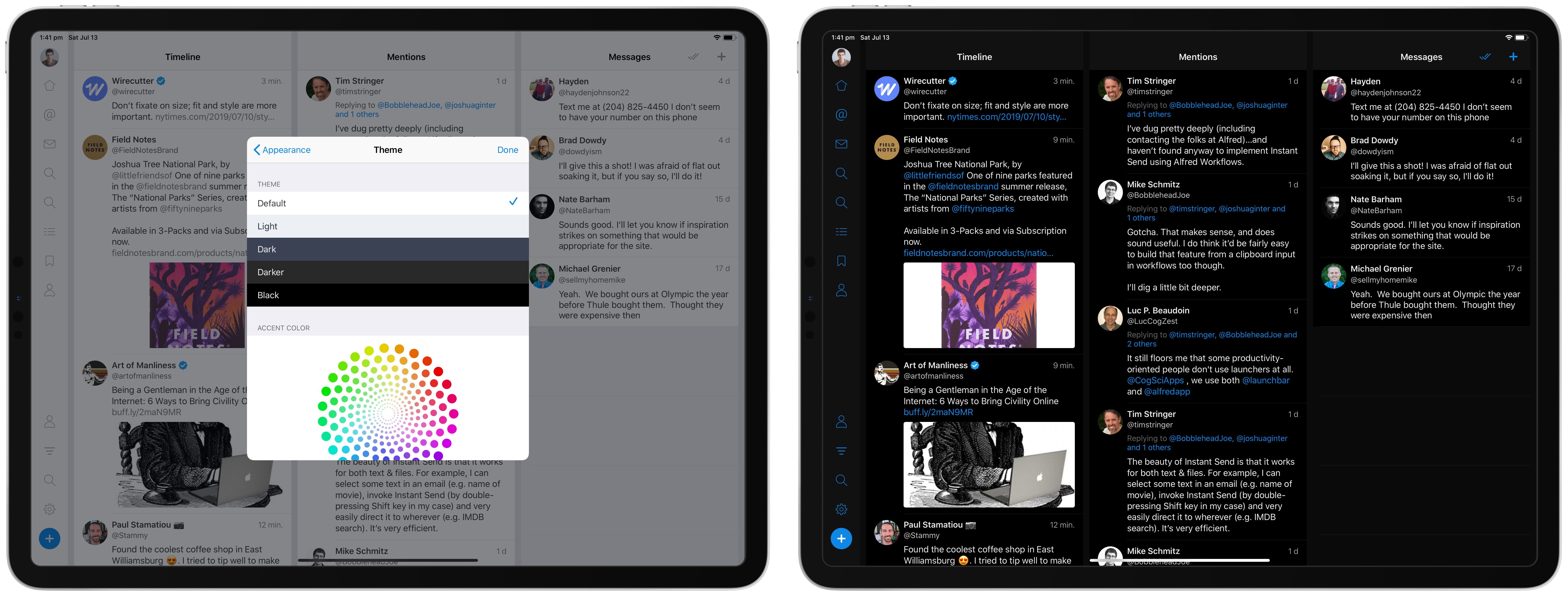
Fenix goes beyond just offering a superior multi-columned layout, though. You can customize a range of other features as well, such as the app’s theme, the app’s accent color, different layout options, and more. You can make Fenix look and feel almost any way you want.
I have yet to come across a Twitter feature that I haven’t been able to use inside Fenix, save for those specific Twitter features that are held back from third-party clients. Fenix provides mute filters for filtering out your timeline and profile editing, both of which aren’t consistently available in other new third-party Twitter clients.
Interacting with tweets is done through a swipe, and there are a couple unique features here that I’m excited to try out. Short-swipe to the right on a tweet to reply and long-swipe to retweet with comment. Short-swipe to the left to like a tweet, mid-swipe to retweet, and long-swipe to bookmark a tweet.
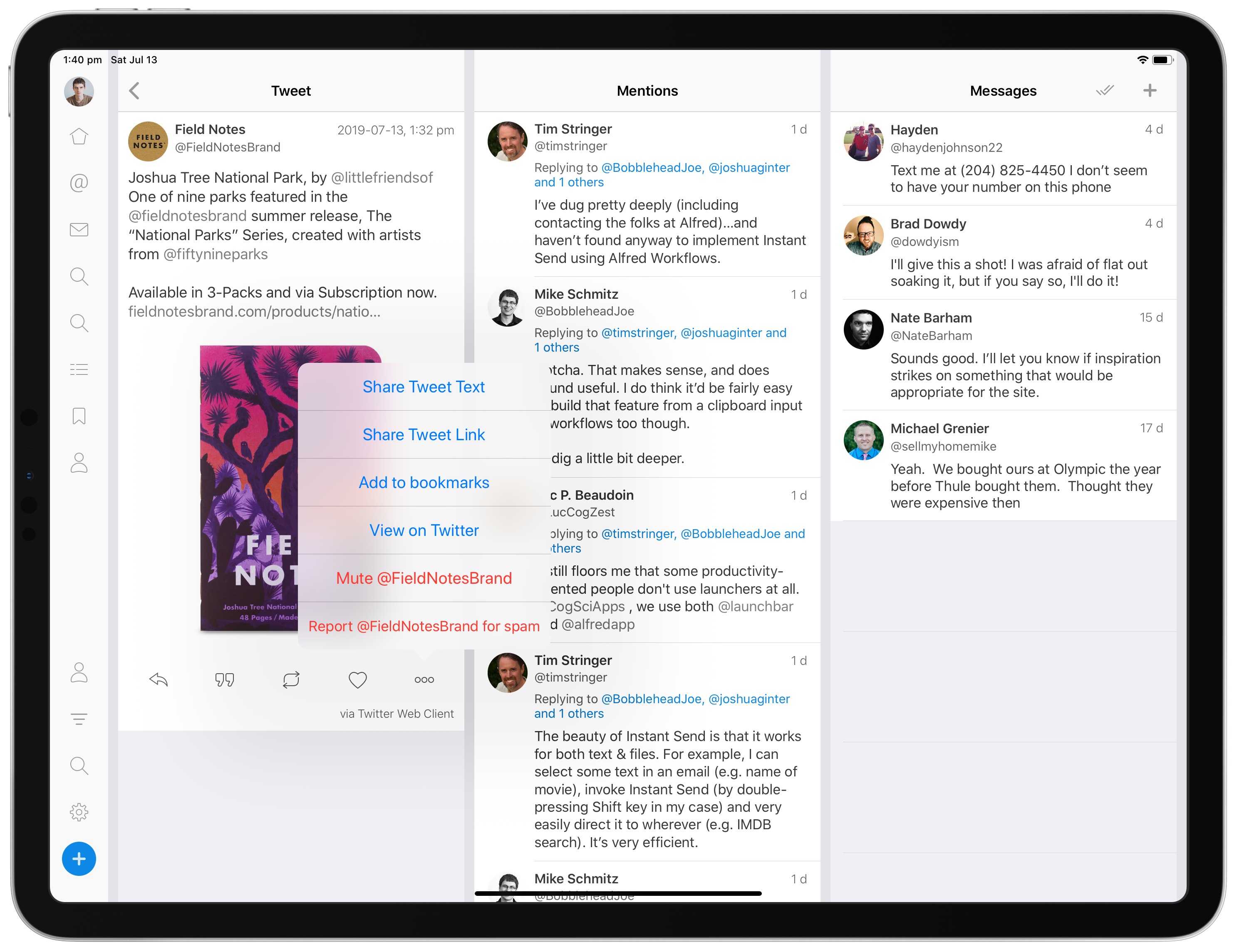
Tapping a tweet brings you to that specific tweet’s window, where you can share the tweet with the iOS share sheet, view the tweet’s replies, and more.
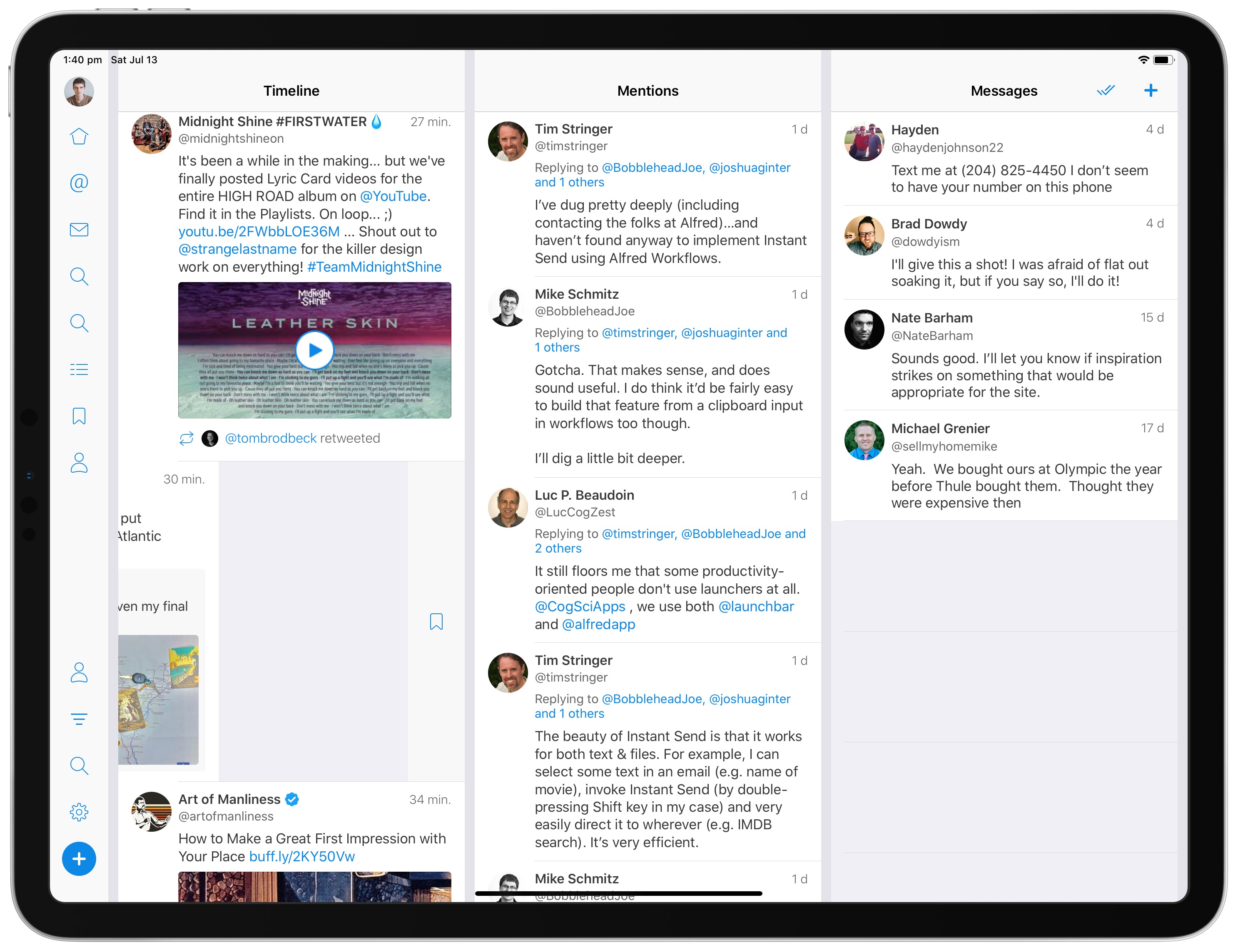
Bookmarking a tweet is basically Fenix’s own “read-it-later” service built into the app. Once a tweet is bookmarked, it’ll show up in a specific Bookmarks column, which you can read through and triage by swiping either left or right on the tweet. I often save individual tweets directly to Pocket to read later, but Fenix’s bookmarks implementation is much smoother and keeps random tweet crud out of my Pocket queue.
Overall, Fenix appears to be a great option for Twitter users, especially those who use an iPad. Having the ability to customize the app to suit your Twitter habits is worthy in and of itself, but unique features like bookmarking make the app an easy option to purchase, especially at only $2.99.
You can download Fenix for the iPhone and iPad on the App Store.
Wait. There’s a Bonus…
Curated List of Must-Have Apps
We spend an inordinate amount of time sorting through hundreds of apps to find the very best. And based on our own usage, plus the feedback of our readers, we have put together a short list of our must-have, most-used apps in 2022.
You will get…
- The current list of The Sweet Setup’s top 8, must-have apps.
- A special, pro tip for each app to help you save time and become more of a power user.
- A hidden feature of each app that you may not have known about.
These apps work on iPad, iPhone, and Mac. And they range across several different categories but are mostly focused on productivity. We hope this will help you get the most out of your devices and your day.
This guide is available for FREE to our email subscriber community. And you can get it right now. By joining the Sweet Setup community you’ll also get access to our other guides, early previews to big new reviews and workflow articles we are working on, weekly roundups of our best content, and more.
