Day One for iOS hits version 3, introduces audio snippets, dark mode, and tons more

There are a few apps on the iPhone and iPad that we consider cornerstone apps. Using 1Password to store all your most personal and sensitive information and passwords should be a must for iPhone users. Using productivity software like Things 3 to stay on top of all your tasks can make you infinitely more productive. And, if you’re a writer, there is simply no better writing software than Ulysses.
Day One continues to be one of those cornerstone apps. From the start, Day One has been the best app for journaling on iPhone, iPad, and the Mac thanks to its great design and wide-ranging feature set. Simply put, Day One holds that unique spot where it stores your fondest, most treasured memories, automatically catapulting it into must-have territory. These are just a few reasons why we created a massive course explaining Day One from top to bottom.

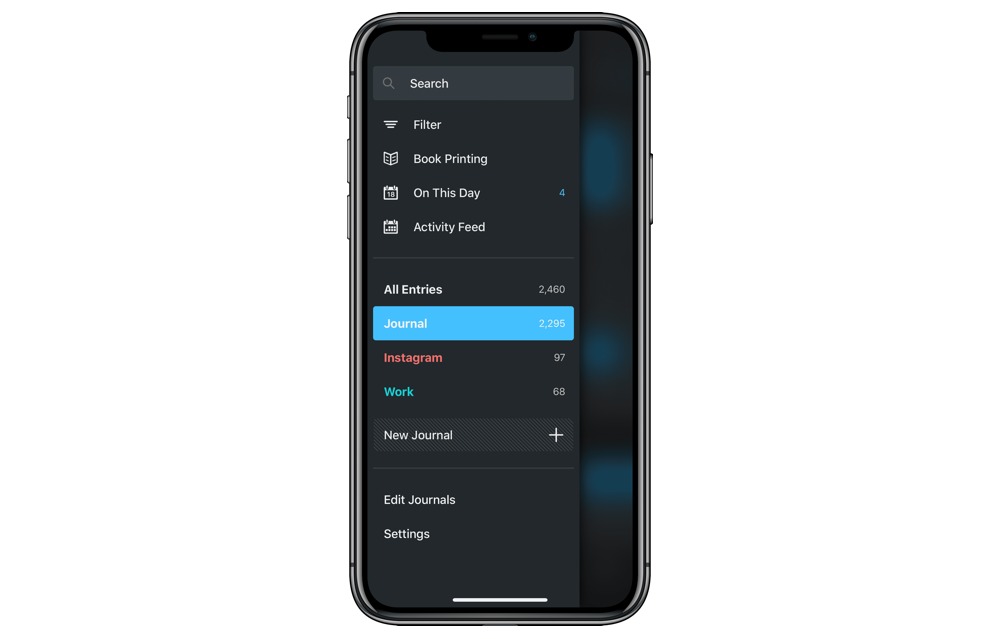
Bloom Built launched the original Day One back in 2011 and included more than 40 new releases, some of which included an iPad version, photo entries, improved metadata support, tags, and much more. Day One 2 was introduced in early 2016, bringing with it support for multiple journals, a fresh redesign, Activity Feed, and a list of features too long to name.
Today marks the introduction of Day One V3 for iPhone and iPad. As expected, Day One continues to evolve and expand its feature set, enabling you to capture more of those treasured moments. A completely overhauled editor is ready to make editing entries easier and faster than before. A new dark mode brings out the dark side of Day One. And my most loved new feature, support for the addition of audio recordings to your entries is sure to capture an entirely new range of memories to be relived in the future. Day One V3 for the Mac is due out in the near future, bringing the latest features to Apple’s desktop platform soon enough.
New editor
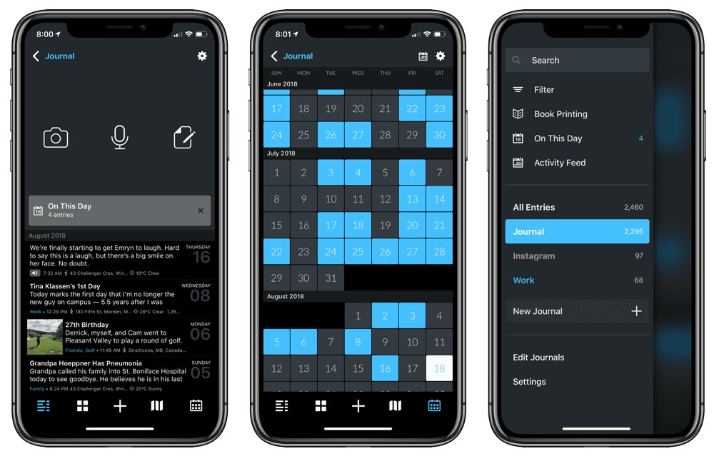
Day One V3 looks largely the same as Day One 2, but how you create and edit entries has undergone a dramatic overhaul. Tapping the + button at the bottom of the main screen shoots you over to Day One V3’s new editor, just like before. But now, there are a range of changes to be aware of to ensure you have all the data you need in each entry.
Done button
Day One V3’s Done button is the biggest habit existing Day One users will have to overcome. If you jump into an existing entry, simply tapping anywhere inside the entry will bring up the editor. In Day One 2 and prior, you had to explicitly hit the Edit button in order to edit the entry or add new media. Now, by tapping into an entry, the entire editing workflow inside Day One has been overhauled.
Once you’re done with your edits, hitting Done now dismisses the entry and brings you back to the prior view. This takes some getting used to. Day One V3 eliminates this extra screen and Done now dismisses the entry.
Again, this takes some getting used to, but for new users of Day One, I expect this to be a more intuitive way to create and edit entries on iPhone and iPad.
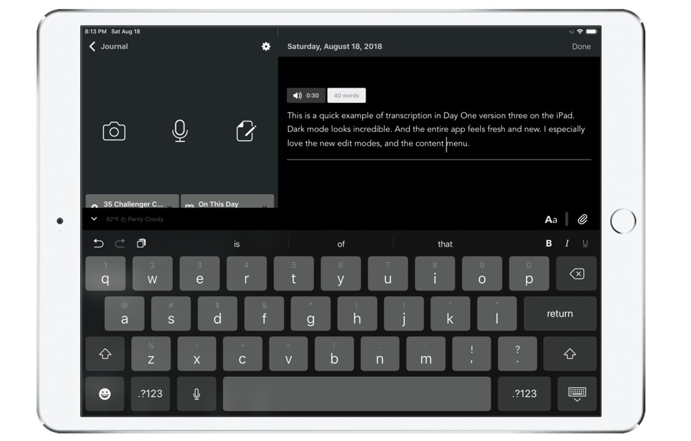
Editor menu
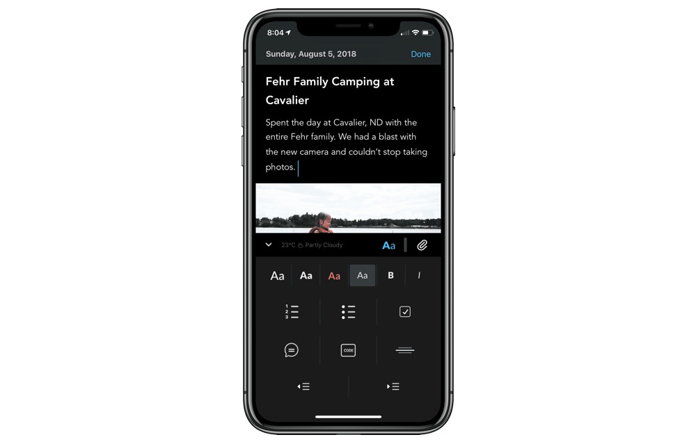
When making those edits to your entries, you’ll find two new buttons on the right side of the editor: an Aa button for the editor menu and a paperclip button for the entry content menu. The editor menu houses all the Markdown and formatting options you need to properly format your entries.
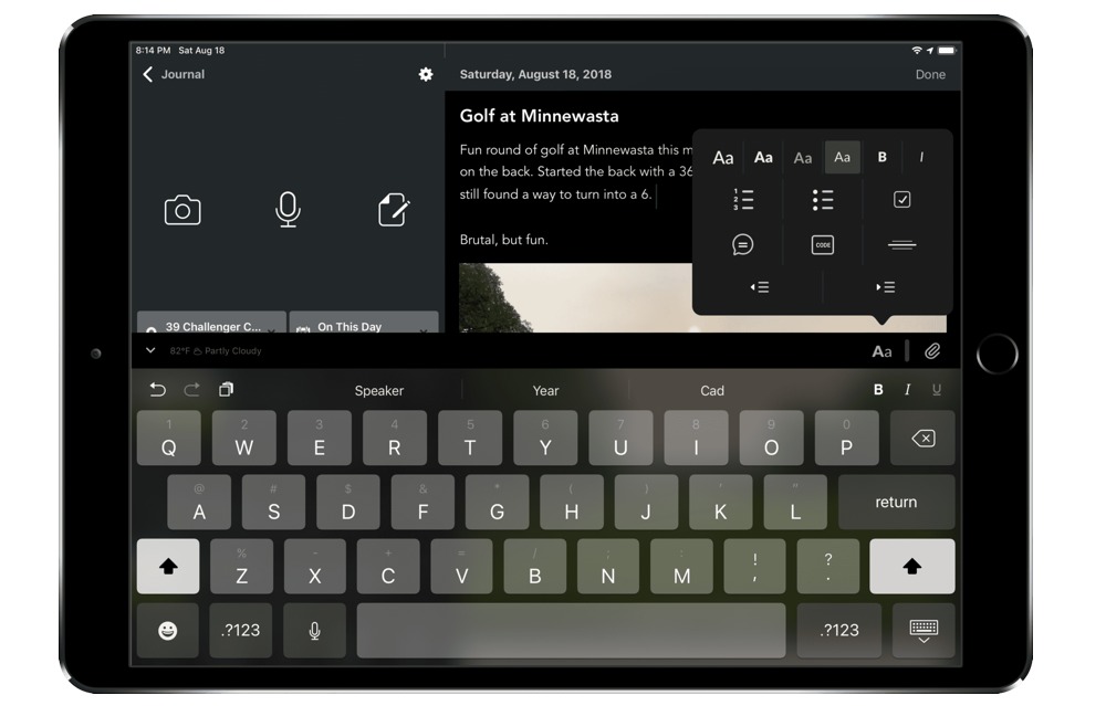
This editor menu replaces the extra keyboard row from Day One 2, which housed regularly-used formatting options like bold, italic, and header levels. Now, by tapping into the editor menu, you’ll find header levels, bold/italicize, bulleted/numbered/checklists, quotation, divider, and indentation buttons all at the ready.
Also new in Day One V3 are dynamic code blocks, which can also be found in this editor menu. Advanced Markdown, like tables and HTML are now supported with this new code block and any existing content that falls into this category is auto-detected and wrapped in a code block to be rendered properly.
In some instances, there are extra taps to bold or italicize your written content inside an entry. To this end, the editor menu adds some complexity, but for all other formatting options, the new editor menu greatly decreases the friction for properly formatting your entries. Having all these options under one roof maintains consistency and ensures new and old users alike will be able to find the formatting option they’re looking for as quickly as possible.
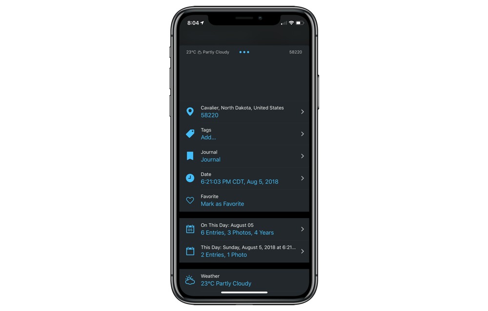
Entry content menu
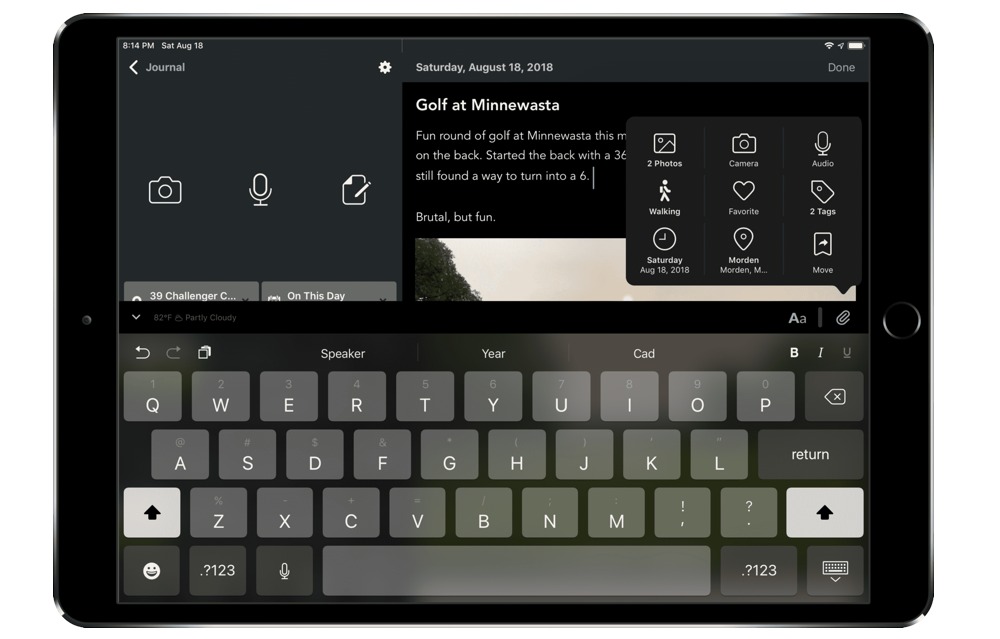
Alongside the new editor menu is the new entry content menu, which houses all of the entry’s metadata. When you tap on the new paperclip button just above the keyboard, Day One V3 presents you with nine options to add media and metadata to your entry:
- Add a photo from your Camera Roll or shoot a photo directly from the camera.
- Add an audio snippet (transcribed or untranscribed)
- Change the activity (i.e. walking, running, biking etc.).
- Favorite the entry.
- Add tags.
- Change the entry’s date.
- Change the entry’s location.
- Move the entry to a different journal.
I tag all my entries to ensure they are easy to find in the future, so there was an initial learning curve to find the tags function inside the new entry content menu. After using Day One V3 for over a month now, this new tagging method has become second nature and is vastly superior to the old method in Day One 2.
Both the new editor menu and entry content menu collect entry options and house them under two separate roofs, perhaps increasing the number of taps necessary to add metadata or formatting to your entry. But I suspect both will become second nature after a little habit adjustment.
Dark mode
Dark modes have become the rage over the last year or two and has peaked with the introduction of a dark mode in macOS Mojave. While there are a few dark modes that I’ve come to like over time (I’m thinking namely of Tweetbot and Bear’s “Dicci” theme), Day One V3’s dark mode is the new winner — hands down.
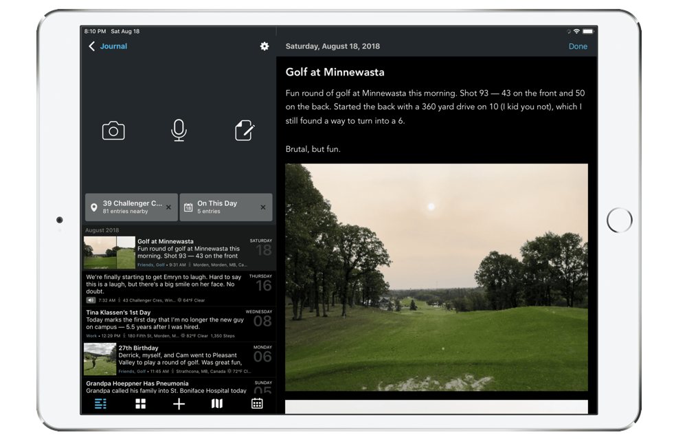
Day One V3’s dark mode strikes a balance between striking and elegant. I feel Day One’s design team has found a way to make the dark mode feel completely natural, as though the dark design has been around since inception.
This dark mode is best experienced on the larger iPad screen. The iPhone X’s OLED screen and true-black themes are striking, for sure, but dark mode on the silver iPad Pro is something to behold. Plus, the dark keyboard on the iPad is particularly fun to type with.
Like other apps, Day One V3’s dark mode can be set to come on after sunset and before sunrise, allowing you to experience the normal light mode during the day and rest your eyes when the sun goes down. This has become commonplace amongst apps with dark modes.
For the first time, however, I’ve decided to turn off light mode entirely. I’m singing the praises for Day One’s dark mode not because I love the app, but because I feel this is the first dark mode worth writing home about.
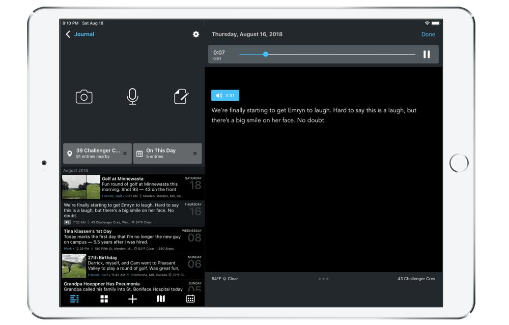
Audio recording
Last among Day One V3’s headline features is the inclusion of audio entries. Audio entries have been on the long-term development list for quite some time (see Day One 2’s introduction blog post where it’s mentioned) and have been added in the app’s third major iteration.
Transcription mode
Day One’s new audio entries provide two options: transcription mode and audio-only mode.
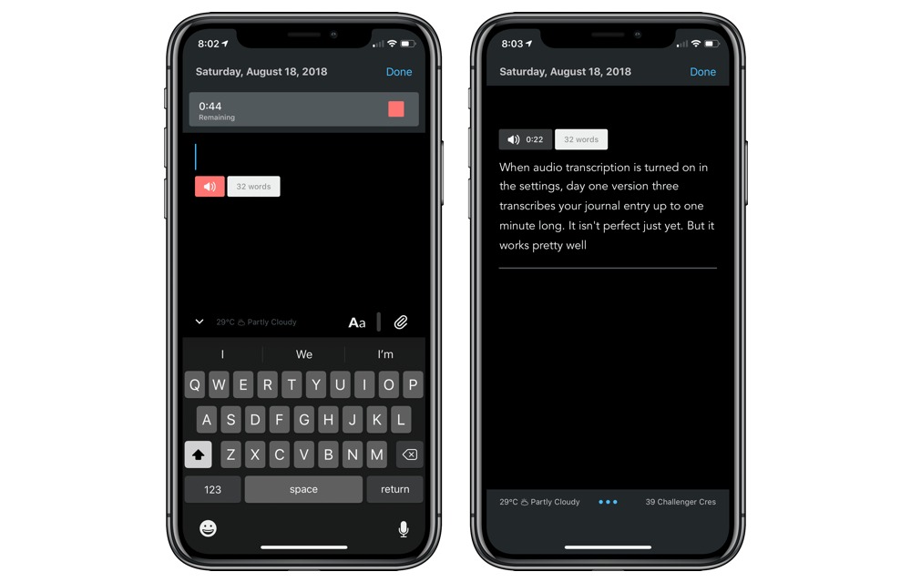
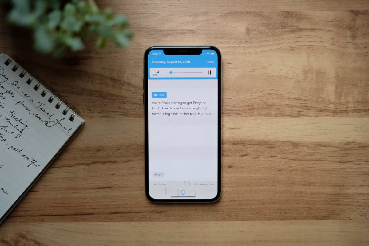
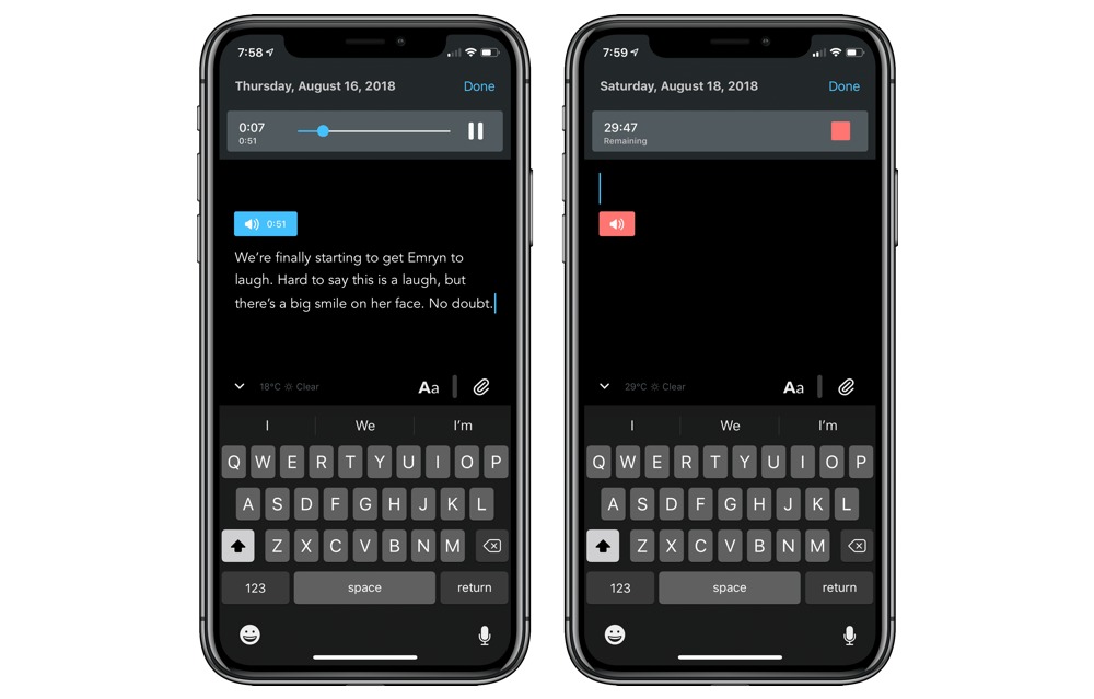
In transcription mode, Day One records audio for up to one minute and immediately transcribes the audio after you hit the stop button. The transcription immediately shows up as written text underneath the recorded audio and the recorded audio remains as part of the entry. As a result, under transcription mode, you’re able to have recorded audio and transcribed text.
Should you want to transcribe more than a minute of text, you’ll have to stop recording, allowing Day One to transcribe the audio, and record a second minute of audio for transcription. You can continue this until you’ve completed your journal entry, or until you have 10 audio recordings saved in the entry. This limitation is due to iOS’s inherent audio transcription limitation and, at this point, Day One does not have a work-around to record longer than single minute recordings.
Audio-only mode
If you don’t need to transcribe your audio, you can record up to 30 minutes of audio per recording and include the audio in your entry.
I initially turned off transcription mode when I tried Day One V3, as I found myself using the audio recording option more to capture new sounds I was experiencing each day. Things like my daughter’s first laugh or her fun babbling in the back seat of the car were perfect types of audio for Day One’s audio-only recording, and I really wish I would have had this option for recording bits from a concert or capturing the whistling wind on the coast during our travels.
Transcription and audio-only modes can be quickly changed in Day One V3’s settings menu in the Advanced section, so you don’t have to worry about committing to one format of audio recording and sticking to it.
Other updates
A major X.0 release always includes a smorgasbord of new features, most of which will either go unnoticed in blog posts like this. There are a few new features included in Day One V3 that need to be mentioned, though:
- Photos added together now create a basic dynamic photo grid.
- Check lists can be interacted with whether you’re in read-only mode or if you’re editing an entry.
- Entry metadata can be opened via a swipe gesture at the end of an entry.
- Markdown support continues without all the markup and now auto converts headers, lists, and bold and italic text into rich text.
Of course, there are other improvements under the hood to bring more polish and speed to the Day One experience.
The Tab Bar Plus button (the big + button at the bottom of the main screen) has also been altered, perhaps requiring another habit adjustment. Now, when you tap the + button, Day One will open a new entry ready for textual input. Under Day One 2, pressing the + button would give you an option to choose from media and data in your Activity Feed, to create a text entry, to create a photo entry, etc. This required one extra tap before you were able to jump into the entry and begin creating.
In Day One V3, accessing the Activity Feed now requires a long-press on the + button. This took a little research on my end when I first tried V3 and has since become old hat. I start 90% of my entries from data collected in my Activity Feed, so accessing this list is fundamental to my journaling habits. Long-pressing is a better option than having to tap twice to enter the Activity Feed (like in Day One 2), so this is all around a great change for habitual Activity Feed users.
Conclusion
Day One continues to be our pick for the best journaling app for iPhone, iPad, and Mac, and V3 continues to prove there’s really no competition. The inclusion of audio entries will be groundbreaking for new and existing users, as audio-transcription allows entries to be created on the fly and at a faster pace than having to write them out, and you now have the option to capture sounds and experiences you were unable to capture before.
The new editor, Done button, editor menu, and content menu will take some getting used to, but I expect this to become natural for users in no time. The initial change to your journaling workflow may be a hiccup, but these menus and user experience improvements are sure to make the app feel more consistent as the app gains more features in the future.

And Day One V3’s dark mode is the best in the business. Day One has always had a highly regarded design, right from its first days on the Mac App Store. With V3’s dark mode, this design has reached a new level of sophistication and pizazz — one which other app designers are sure to model going forward.
These new features aren’t yet available on the Mac, as Day One V3 for Mac is slated for release later this year. The latest version of Day One 2 for Mac will include support to playback audio entries, but that heralded dark mode and audio entry creation will have to wait for another day.
At this point in time, I don’t believe there is any other option for journaling on the iPhone, iPad, or Mac — it’s Day One or bust. Day One continues to harbor my most sensitive memories and the most magical thoughts and moments of my life — memories like my very first thoughts after I asked my wife to marry me and photos from the first few minutes of my daughter’s life all rest inside Day One’s walls. Version 3 continues the evolution upward and onward, allowing capture of an entirely new media.
Only video support is needed to round out the entry types now.
If you want to learn more about Day One and how to maximize the potential of the app, check out our course, Day One in Depth.