Day One 3.4 Introduces New Fonts, Drawing, and Apple Watch Improvements
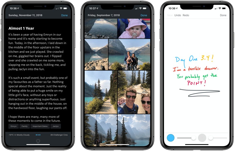
The best journaling app for iPhone and iPad received a big update last week. Day One hit version 3.4, introducing new Hoefler fonts for the typographically-inclined, new drawing capabilities for the iPad Pro’s new Apple Pencil, new dynamic photo layouts, and improvements to the Apple Watch app. Day One has gone about some of these new features in unique ways, so let’s take a quick peek.
Wait! There’s more….
How to Use Day One in Your Life
For a the best journaling app, you won’t do better than Day One. And if you want to discover how to use this app more regularly, and take full advantage of all its features, then we have some video screencasts that can help you.
In our course, Day One in Depth, you get 8 video screencasts that will take you line by line through every feature, setting, preference, and option found in Day One.
We’ll show you…
- Complete walkthrough of the Mac and iOS apps.
- How to create and customize your journal entries (from text, to photo, to audio)
- How to find, filter, export, and more.
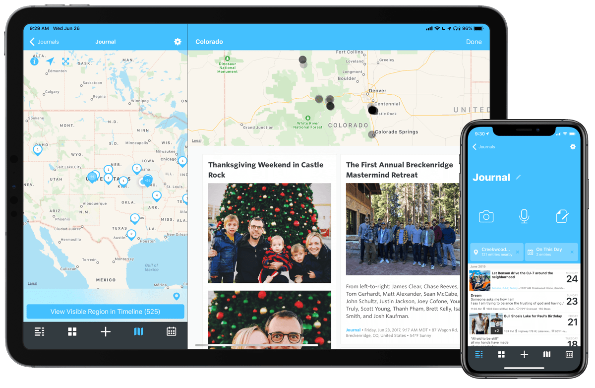
Plus! You will get bonus tips, workflows, and tutorials for how best to use Day One to suit your own needs: from a morning writing time to a photographic travel log, to weekly reviews and productivity journaling — Day One can do it all and we will show you how.
New Typography Options
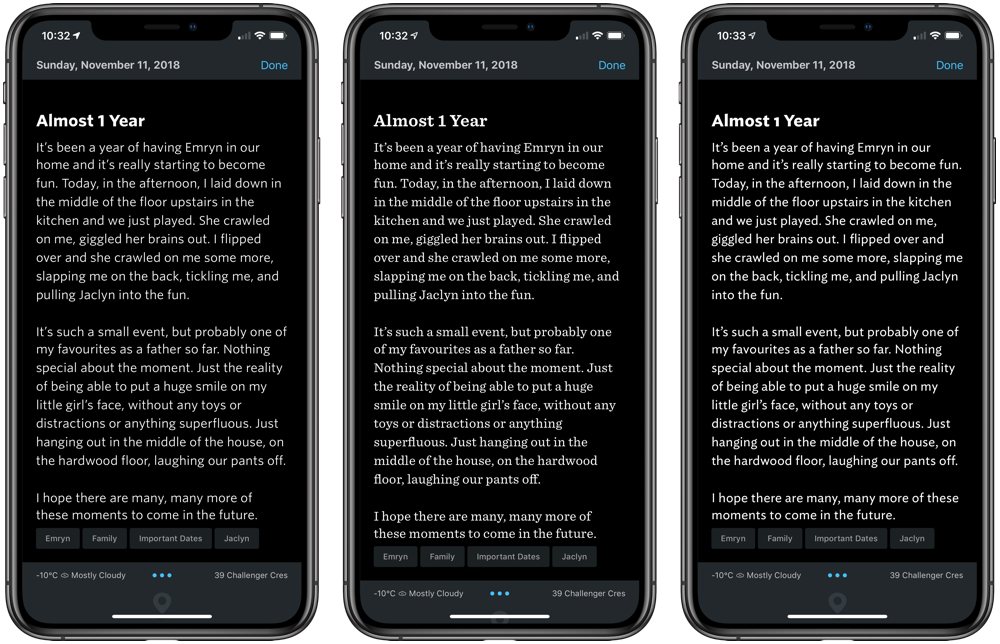
If you’re currently reading this in a web browser, there’s a good chance you’re looking right at Hoefler’s Whitney font. Whitney, along with Ideal Sans and Sentinel (as seen on Shawn Blanc’s personal site) have made their debut in Day One. These special fonts are only available in the text editor, not throughout the app. However, these new typography options give the app a new dash of elegance.
Day One isn’t specifically a text editor, so my wishes are probably somewhat misplaced. However, I’d like to see the ability to assign a font to headers and a different font to body text. This would give each entry that much more personality and style, and would give your journal an almost blog-like feel.
Drawing
Day One’s Premium subscribers can now insert a brand new type of entry into their journal: drawings. Although not limited to the Apple Pencil, Day One 3.4’s new drawing capabilities are best used with either of Apple’s drawing utensils.
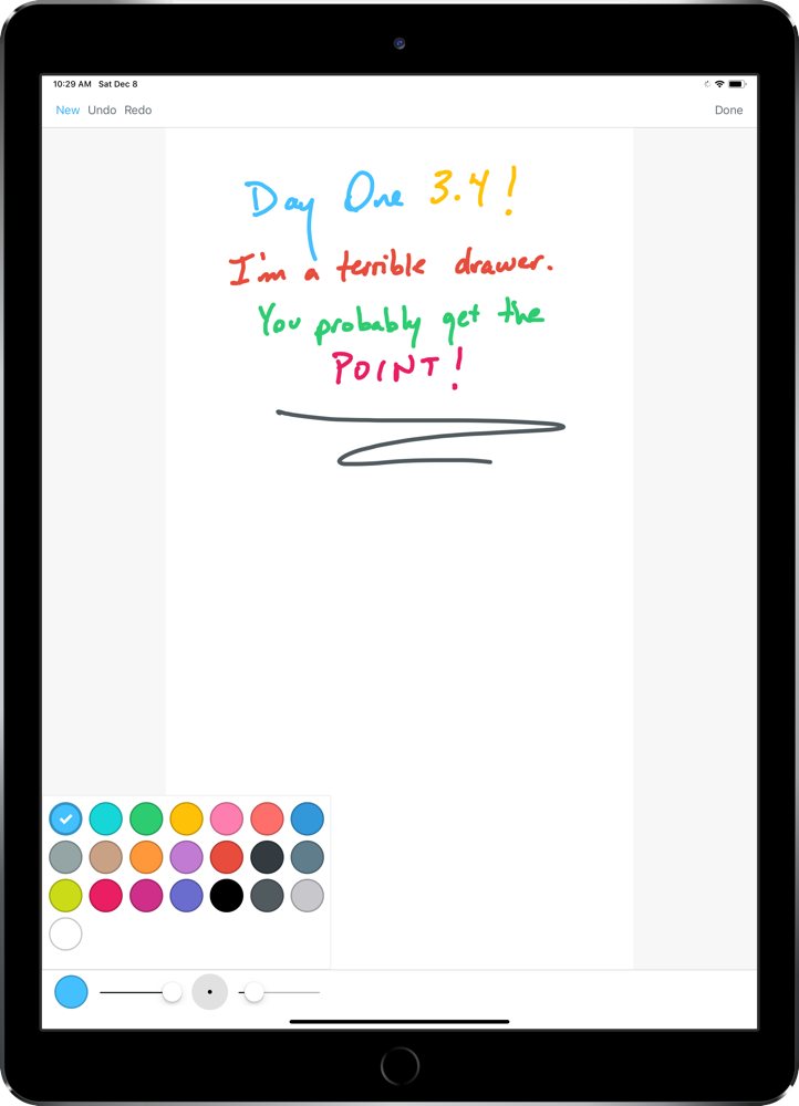
When you hit the + button to create a new entry, you can now select the “Drawing” journal entry type, and Day One will open a drawing specific view. At the bottom left, you can change the color of your ink and use the slider to change opacity of the ink. Next to the color selector, you can tap on the big circle with a dot to change to predefined thicknesses for your line, or you can use the slider to find a custom thickness.
This is the first time I’ve seen a color and thickness selector designed like this. At first, I had no idea what was going on with my lines and color. But after a little bit of tweaking and understanding what the selectors are trying to achieve, the sliders do make sense.
This can all be done with your finger instead of a Pencil, of course. I try to keep my journal free of finger paintings, mind you (unless they are my daughter’s), so I’ll stick to the Pencil.
I hope to see Day One adopt the second generation Apple Pencil’s double tap gesture control to flip between an eraser and the drawing tool. At this point in time, the only way I’ve been able to go back a step is by hitting the undo button in the top left corner.
Dynamic Photo Layout Improvements
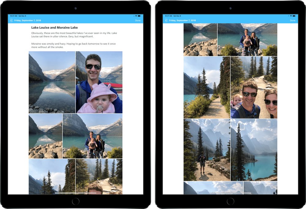
In prior versions of Day One, photos could be added to an entry as a group and they would stay in a dynamically laid-out group of images within the entry. However, if your photos weren’t properly sized, you’d be met with some photos that had awkward crops and cut out subjects.
Day One 3.4 fixes this for good. Instead of those awkward crops, Day One now adjusts photo layouts based on the photo’s width and properly aligns the grouped photos for the best display.
Other Improvements
There are a host of other improvements in Day One 3.4:
- New Apple Watch App Design: Day One’s Apple Watch app has been redesigned from the ground up with a paged interface. The first page allows you to create a new entry or record an audio entry with two giant buttons. A right swipe brings you to your Activity Feed’s saved locations for creating an entry, and a left swipe brings you to an audio recording interface for grabbing a now-custom duration audio snippet.
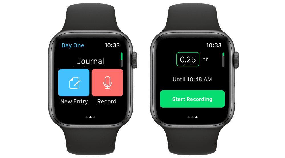
- Apple Watch Recording Updates: You can now Force Press on the Watch’s “Recording” screen to start a new audio recording or stop the current recording. You can also discreetly record with Day One on Apple Watch — simply swipe to the right to bring up a big, green “Start Recording” button with a default duration. “Discreet” may have a specific connotation, but this is perfect for discreetly recording young children saying new words or telling you stories, all without distracting them with another glowing screen.
- New Main Menu Design: A small improvement, but a helpful one: Day One’s top navigation now displays the Journal name. This is helpful when you have multiple journals and constantly find yourself adding entries to the wrong journal.
Summary
Day One continues to be the hallmark journaling app for iPhone, iPad, and the Mac. The latest iOS version 3.4 introduces another new method for capturing a journal entry and for capturing audio entries with your Apple Watch, both of which should broaden the scope of the app. There are always areas for improvement, but if we’ve seen one thing over Day One’s history, it’s that the app’s creators are not afraid to make changes and fix things that don’t work.
Day One 3.4 is a free update for iPhone and iPad users, with the “Drawing” journal entry type limited to Day One’s Premium subscribers.
Wait! There’s more….
How to Use Day One in Your Life
For a the best journaling app, you won’t do better than Day One. And if you want to discover how to use this app more regularly, and take full advantage of all its features, then we have some video screencasts that can help you.
In our course, Day One in Depth, you get 8 video screencasts that will take you line by line through every feature, setting, preference, and option found in Day One.
We’ll show you…
- Complete walkthrough of the Mac and iOS apps.
- How to create and customize your journal entries (from text, to photo, to audio)
- How to find, filter, export, and more.

Plus! You will get bonus tips, workflows, and tutorials for how best to use Day One to suit your own needs: from a morning writing time to a photographic travel log, to weekly reviews and productivity journaling — Day One can do it all and we will show you how.
