The iPhone X Review
If you’re one of those people (like myself) who upgrades their phone every couple of years, the cycle in which Apple recently found themselves might have seemed troubling.
For a while, the annual upgrade cycle seemed to bring at least one major change with every new iPhone.
A year after the original device was released, the iPhone 3G opened the device up to a world of apps. The 3GS brought a major speed increase to the device, but left the design alone.
When the iPhone 4 came out two years later, it put those apps into a new form factor and gave users a beautiful Retina Display. The iPhone 4s brought us Siri, and the iPhone 5 introduced a taller screen, LTE support, and the Lightning connector. The iPhone 5s unveiled Touch ID, and the iPhone 6 and 6 Plus provided the biggest screen size changes ever, along with Apple Pay and a bevy of new features. After that, the iPhone 6S and 6S Plus brought some incremental updates to the 6 line. After that, the iPhone 7 and 7 Plus brought further incremental updates, like water resistance, at the cost of the headphone jack.
The iPhone X feels like one giant leap.
Wait. There’s a Bonus….
Custom Productivity Templates
We have a set of custom productivity templates that work well with the iPad app, GoodNotes. And if you want to try them out, we’ve put together a free guide that can help you.
We’ll show you…
- How to create and save custom page templates in GoodNotes.
- How to use those page templates to transform GoodNotes into your own productivity notebook (or any other type of notebook replacement).
Plus, we also have included a couple of our custom productivity templates for you to get started with. These templates are right out of our popular productivity course.
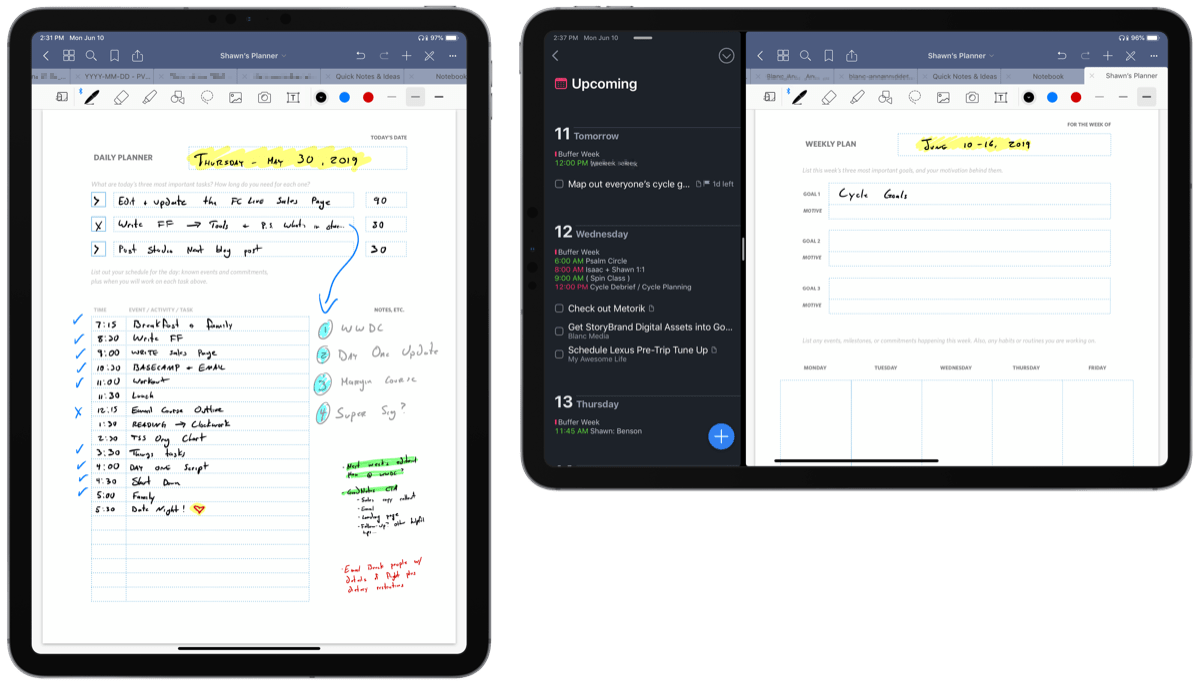
The custom templates and the guide are available for FREE to our email subscriber community. And you can get it right now. By joining the Sweet Setup community you’ll also get access to our other guides, early previews to big new reviews and workflow articles we are working on, weekly roundups of our best content, and more.
Look and feel
The iPhone X fits perfectly into the new ecosystem that Apple is creating, which is all screen and no wires.
The iPhone X has a new form factor that manages to be both the biggest departure from Apple’s previous design language while at the same time harkening back to the iterations that came before it. The most notable comparison is in the stainless steel band that wraps around the device, which — especially in the silver model — gives the device an uncannily similar aesthetic when compared to the original iPhone. This band retains the rounded feel that started with the iPhone 6; it is not a return to the flat edges found on the iPhone 4 and 5 designs.
While the volume buttons and mute switch have remained the same, the side button has been made much longer, a wise choice as its taken on a few new responsibilities. With the iPhone X, this button has lost its old name: the “Sleep/Wake switch.” It now shares the lowercase “side button” designation with the button on the Apple Watch. Poor thing.
Flipping the phone around reveals a back wrapped in glass as opposed to the aluminum design we’ve grown accustomed to in recent models. It’s strange to see the iPhone’s iconic Apple logo underneath a pane of glass, and the cutout for the camera is so sharp that it didn’t dispel the illusion. The glass on both the front and back of the phone curves perfectly into the stainless steel band, each piece melting into the other. It’s a stunning object, though its looks and design choices are, in a way, a double-edged sword.
I haven’t been so worried about shattering a phone since the iPhone 4 era. If you, like me, find yourself going without a case, you might find yourself saying a prayer of thanks every time you catch your phone from falling off the edge of a surface.
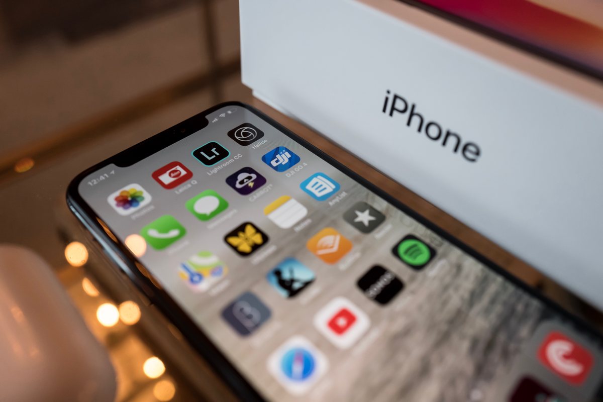
Of course, it’s impossible to talk about the iPhone X’s design without talking about the screen itself.
Beautiful new display
The screen of the iPhone X is all curves, and iOS 11 is more than ready to complement its looks.
The original iPhone was the first phone to popularize a face dominated by little more than a rectangular LED panel, and every phone that’s come after it has emulated that design closely.
The iPhone X changes the game, with a screen shape determinedly all its own.
The newly curved edges are a marked departure from the sharp rectangle that’s defined every iPhone since the first generation, and its rounded edges are an aesthetically pleasing departure, with the top edge cut out in the middle with what many refer to as “the notch.” That notch is where the iPhone X’s camera, phone speaker, and a bevy of other technological bits hide.
Some would argue that those features aren’t being hidden at all, with Apple choosing an iOS layout that unashamedly embraces the notch instead of choosing to conceal it in a strip of inky, OLED-powered blackness. To be frank, the notch is not a big deal. This is in part due to the fact that the iPhone’s screen is now massive, with the notch taking up only a small fraction of the overall screen’s length.
My experience has been that while browsing around the internet, reading tweets, or responding to a text message, the area in which the notch resides becomes a bit of a blur in your periphery, not something that constantly stands out.
Where it might stand out in an annoying way is in apps that predominately use a landscape view, or when watching a video and trying to utilize the bulk of the screen. When using apps like Netflix and YouTube, the default view stops the content just short of the notch, meaning that most videos will be pillarboxed with the right and left sides of the screen being unutilized. Double-tapping any 16:9 content will zoom it in (just like on other iPhones and iPads), allowing the video to utilize the full screen while also obscuring not only the top and bottom edges but also a bit of the left edge behind the notch.
Is it a bit weird that pieces of the video are hidden? Yes, but for some reason watching a video with rounded edges on a beautiful OLED screen just looks so cool.
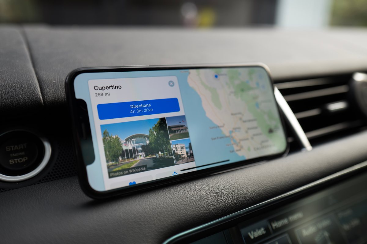
Apart from video, the only app that I use consistently in a landscape orientation is Apple Maps, which simply pushes any cards of information slightly to the right to make room for the notch. It’s unnoticeable there, and unless you have a habit of browsing Safari in this mode, you’ll likely agree that it’s a non-issue.
The OLED screen of the iPhone X alone would set it apart from every other iPhone that’s come before it in so many ways. The technology used in the panel means that blacks are truly black, with every color looking and feeling richer than before.
I expect that we’ll see quite a few apps start creating true “night mode” settings with a 100% black background. Apps like Reeder, Overcast, and Apollo have already done so. If you’ve found yourself having a hard time reading on a screen while you get ready for bed, this might be the phone to finally change your mind and keep you from reaching for your Kindle.
I imagine that there will be a major period of adjustment as iPhone developers learn to design for OLED. While the pure black backgrounds can be a major boon in situations where you want the screen to be as dark as possible, it can also be a bit of an eyesore, with the ultra-high-contrast of bright text on a black background providing just as much of a problem as a background that isn’t truly black. While Apple has no true system-wide dark mode to offer, there’s still room for the iPhone to grow when it comes to utilizing this aspect of OLED screens.
The iPhone X screen also makes use of Apple’s True Tone technology that appeared on iPads last year, a feature akin to an always-adjusting white balance that adapts to the environment.
If you aren’t a fan of Night Shift, you probably won’t be a fan of True Tone either. That said, if you’re finding yourself tiring of blue-tinted screens, chances are you’ll be embracing this feature; and once you turn it on, you’ll likely forget it exists in the first place.
Speaking of blue-tinted screens — herein lies one of the drawbacks of the iPhone X adopting OLED technology. When viewing the iPhone X screen from an angle, there is a noticeable shift in hue. This is most visible (and most annoying) when the background is mostly white — like a blank Safari page or in an app like Mail. I suspect that this won’t be a major annoyance in daily use, but it is a representation of the slight step backward that comes with this major step forward.
Another short-term annoyance: Apps that haven’t yet updated to take advantage of the new iPhone X screen appear in a letterbox presentation, with massive black gaps at both the top and bottom of the screen. You may remember the same problem from the upgrade from the iPhone 4S to the iPhone 5, and though it’s not a major annoyance it’s a reminder that one of the challenges of being an early adopter is that you’re likely earlier to the party than the developers of many apps you use on a daily basis. Having all that screen space and opening an app that doesn’t take advantage of it just feels unpleasant.
Apart from the screen, no change in the iPhone X is more major than the new home indicator.
Navigating without a physical Home button
Gone are the days of the home button, replaced by a long and (nearly) ever-present line at the bottom of the screen. Swiping up on the indicator takes you out of the app you’re in (or unlocks your phone), swiping to the right moves you to the previous app, and swiping diagonally (a skill that takes a minute to master, but then becomes a normal habit) brings up the App Switcher accompanied by an encouraging bit of haptic feedback.
As I showed my iPhone X to others (and friends began to get their own), it became clear that this new home indicator isn’t only a welcome change, but a new feature that for many people feels downright revelatory. It seems as if we didn’t know how much time we spent collectively double-clicking our old home buttons to switch between apps, a process that the new gestures make seem clunky and rudimentary in a very real way.
The home indicator feels remarkably easy to learn for a first generation of a major change, but there are some quirks that take getting used to. Many apps feature an awkward amount of space at the bottom of the screen to create room for the home indicator, wasting the screen real estate that can feel so precious. The keyboard itself is placed high above the button of the screen, with the dictation icon on the bottom right corner in what can feel like a frustratingly tappable area.
That being said, many of the home indicator’s details seem to center around delight. Tapping it while inside an app solicits a small bouncing animation, which seems to reveal the potential it holds, only a swipe away.
Exiting an app out to the home screen shrinks the screen down, turns it into an icon, and places it back in whatever row it’s located in. Other new interface decisions take a bit of adjusting to get used to, like the choice to move Control Center to the upper right corner of the screen. Though this can feel a bit strange at first, each of these decisions requires only a slight learning period before becoming second nature.
Face ID
Another feature that requires a similar learning period? Apple’s new method of securing the iPhone: Face ID. This new bit of tech has replaced the Touch ID sensor that previous models used, and much debate ensued over whether or not it would be able to provide the same level of quality of its predecessor.
The good news is that (in most cases) it absolutely does. Instead of touching your thumb to a sensor, the phone now actively looks for your face — and your attention — when the iPhone is opened.
A large padlock icon sits above the time on the lock screen, swinging open as soon as your face has been recognized. In practice, the camera is able to recognize you in no time flat, and is a serious step up from the fingerprint recognition that came before it.
With Touch ID, the steps were as follows: Open the phone, place your thumb on the sensor, and then unlock the phone. With Face ID? Open the phone, and swipe to unlock. Where with Touch ID there were middle steps, Face ID hides these steps from the user, requiring no time or mental space at all. Face ID just works, in most situations.
Of course, there are times when Face ID fails. In my experience, these are less Face ID failures and more times when I was unaware that my face was obscured by my hand. While the facial recognition software can deftly recognize my face regardless of how well-lit it is (thanks to the projection-mapping technology behind the lens that allegedly puts an invisible depth-map of tens of thousands of dots on top of your face), it can’t recognize me when my hand is covering my mouth or my face is halfway hidden behind a pillow. In these situations you’ll find yourself using a passcode.
Siri and Apple Pay changes
With the home indicator replacing the home button, a few things have found a new home in the iPhone X’s side button: Namely Siri and Apple Pay. Holding down the side button now activates Siri, and double-tapping it opens Apple Pay. When Apple Pay is activated it automatically looks for your face to authenticate a purchase, a feature I worried would fail in that awkward moment that you’re about to, say, check out at a grocery store. I use Apple Pay frequently, both at my local grocer and everywhere from gas stations to Best Buy, and I’ve never found the Face ID method to be anything but more convenient than Touch ID in practice.
The new method of Apple Pay lets you authenticate well before the transaction takes place, meaning that I usually have my method of payment ready to go before my last item has been bagged. Mercifully, if something does go wrong, Apple Pay offers you the ability to type in your passcode to make the purchase go through as well.
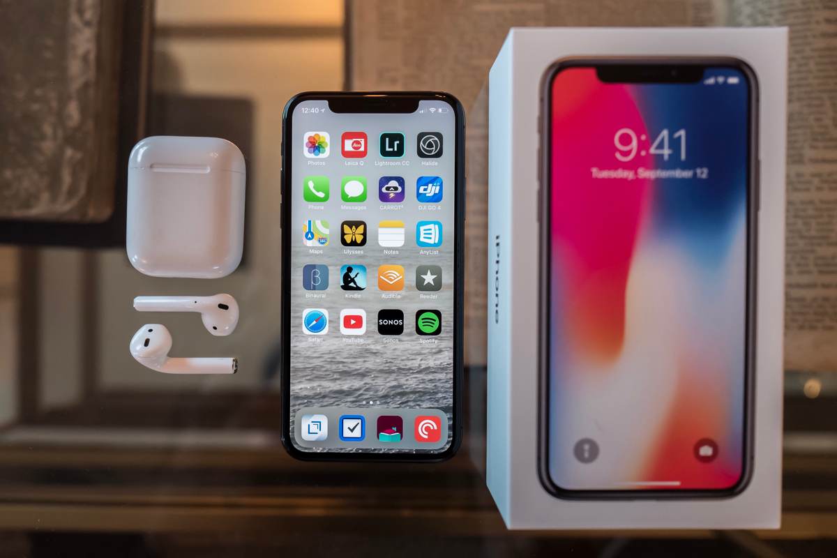
We’ve certainly reached the point where the “phone” we all keep in our pockets is no longer primarily a communication device at all (at least not when it comes to speaking into a receiver), but instead many things all rolled into one, including a primary method of capturing the world around us. We’ve gotten to the point where camera quality isn’t just a feature, it’s as important—if not more important—than many of the other features which the device provides.
The new camera
I have long been a fan of the iPhone’s camera and the voracious enhancements that it seems to undergo year after year. Without a doubt, the iPhone X’s camera is one of the greatest strides they’ve taken in years.

Like the 7 Plus model that came before it, the iPhone X’s rear camera system comes with a pair of two lenses: a traditional wide-angle accompanied by a newer telephoto. What camera you use at any moment is left up to Apple’s software to determine. Tick through the levels of zoom progression in the Camera app and you might notice a small pop of change between 1.9.x and 2x (though this might change under certain low light conditions).
That telephoto lens is used in tandem with the wide-angle to create Portrait mode shots, a feature that automatically attempts to create a depth map of what you’re shooting, putting the subject in focus and blurring the rest of the shot out in a beautiful and artful way. If you’ve used Portrait mode (or the telephoto lens) on a past iPhone model, you might be used to seeing a few of its flaws. The feature worked imperfectly in anything but the best of lighting situations, and the darkened shots that it produced in low-light situations were grainy and bleary at best.

The iPhone X has managed to knock the telephoto lens down to an aperture of f/2.4 (compared to the 7 Plus’ f/2.8) and provided the lens with optical image stabilization. The result is a camera that actually shocked me the first time I tried it out; providing a much crisper image with a huge amount of light in every shot. Gone are the days of subpar photos (and videos) in poorly lit conditions. The iPhone X camera is a masterful thing, able to produce incredible photos in a variety of situations that past Apple cameras would have choked on.

Portrait Mode has also managed to move to the front-facing camera, utilizing the same depth-mapping features that allow Face ID to exist. Both of these portrait modes now also offer Portrait Lighting, which dynamically allows different lighting options in real time: Natural Light, Studio Light, Contour Light, Stage Light, and Stage Light Mono.

From top-left to bottom-right: Natural Light, Studio Light, Contour Light, Stage Light, and Stage Light Mono.
In my experience it’s Studio Light that manages to hit the sweet spot of automated-editing and brightening up the subject’s face without making a photo look unnatural. Though I can’t imagine I’ll find myself using the “studio light” options on a regular basis, there’s something to be said about the fact that we’re all carrying around cameras in our pockets capable of taking a remarkable, professional portrait on a moment’s notice.

The introduction of Animoji
The front-facing camera and its “TrueDepth” sensor has one more trick up its sleeve that will either seem like a gimmick or a major innovation depending on the people that you chat with and your personality: Animoji. In any iMessage conversation, a new section tucked away under the string of installed apps allows you to map your face onto several three-dimensional emoji. You can send and record a 10-second message sent via a dozen digital emissaries such as a fox, pig, unicorn, monkey, alien, and yes, a smiling pile of poo.
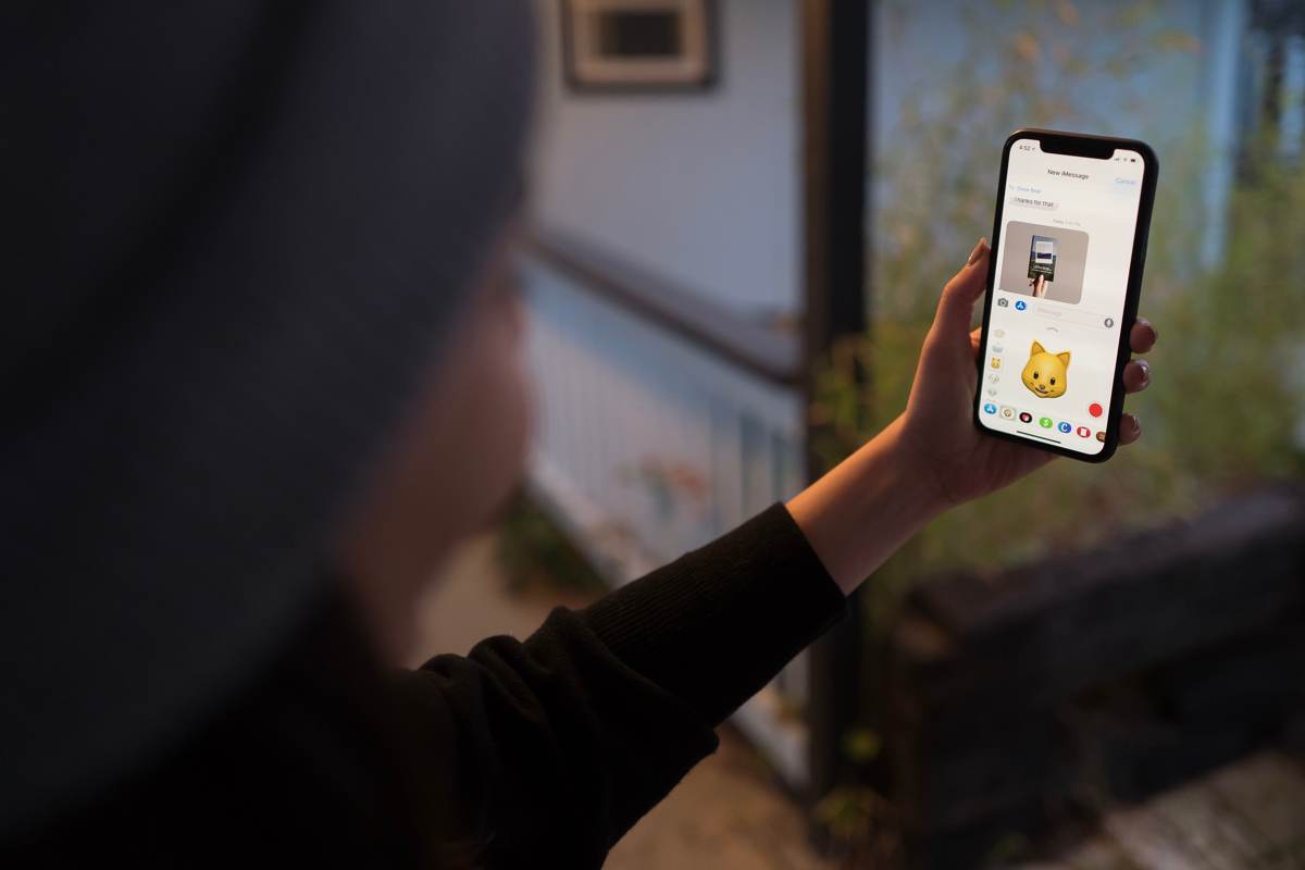
There’s a chance that we’ll remember these Animoji the same way that we remember the digital touch messages that the Apple Watch first touted as a major communication breakthrough, a fun gimmick that never took off.
However, there’s also a chance that these will be heavily and widely adopted, a fun way to send a quick message, and perhaps the first chance for us to grow accustomed to sending quick videos of our faces (though obscured behind a cartoon robot) via Apple’s own messaging platform.
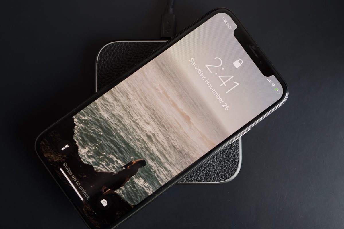
Wireless charging
It’s telling that so much ink can be spilled about the iPhone X without even mentioning some of the new features the device holds. One of my very favorite new features is wireless charging, a new feature (and part of the reason why the phone has a glass back in the first place) that utilizes the Qi wireless standard that other phones have been using for some time now.
Anyone who finds themselves with an iPhone X owes it to themselves to go out and buy a couple of wireless chargers to place around the house. Though, in theory, there is little difference between plugging a phone in with a Lightning cable and placing a phone down on a charging pad, in practice the difference is huge. Placing the phone down on one of these pads (purchased through third-party manufacturers like Belkin, Mophie, or dozens of generic brands on Amazon) automatically starts charging your phone, with the battery icon in the corner of the screen growing larger to verify a clean connection. If you, like me, often find yourself with a dying phone based on the pure laziness or absentmindedness that kept you from plugging it in at your desk, wireless charging might be your saving grace.
Wrapping up
A friend who recently got an iPhone X said that it felt less like a phone update and more like a “lifestyle upgrade.” I couldn’t agree more.
Many of the best features of the iPhone X are features that fade away from the spotlight just as quickly as they appear. Face ID works best when it “just gets out of the way,” and the same is true for just about every other new piece of hardware and software that the iPhone X brings to its users. The new method of switching between apps makes you wonder how you ever double-clicked to open the App Switcher, and the form factor (particularly coming from the ungainly Plus-sized phones) disappears into the hand and pocket more comfortably than before.
After a few updates that have felt intended to maintain a status quo, the iPhone X feels like a major positive shift in the ethos of what makes an iPhone an iPhone.
Wait. There’s a Bonus….
Custom Productivity Templates
We have a set of custom productivity templates that work well with the iPad app, GoodNotes. And if you want to try them out, we’ve put together a free guide that can help you.
We’ll show you…
- How to create and save custom page templates in GoodNotes.
- How to use those page templates to transform GoodNotes into your own productivity notebook (or any other type of notebook replacement).
Plus, we also have included a couple of our custom productivity templates for you to get started with. These templates are right out of our popular productivity course.
The custom templates and the guide are available for FREE to our email subscriber community. And you can get it right now. By joining the Sweet Setup community you’ll also get access to our other guides, early previews to big new reviews and workflow articles we are working on, weekly roundups of our best content, and more.