A Review of the New 2018 iPad Pro
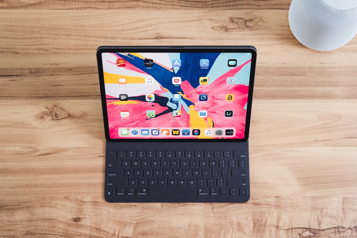
The new iPad Pro seems to have struck a touchy chord since its debut three weeks ago, and the reason is probably twofold. First, Apple’s marketing campaign comparing it against standard PCs invites unnecessary criticisms and unrelated comparisons. And second, there seems to be a wide range of unrealistic expectations.
I really like how Jason Snell put it:
No, the iPad Pro can’t do everything a PC can do—nor should we expect it to, because it’s not a PC. If you choose to use an iPad Pro rather than a MacBook or a Windows laptop, you are presumably doing so because some aspect of the iPad Pro makes it more appealing than those products. In other words, there’s something else it does better than those devices, making it worth the trade-off.
Better is to judge the iPad on what it is—and where its potential lies. While it’s misguided to consider the iPad’s path incomplete until it turns itself into a PC, it’s fair to ask if the spectacular hardware Apple’s developed here is being let down by its software.
The iPad Pro isn’t a PC, and shouldn’t be judged as such. It’s something new, and different. But being new and different doesn’t mean it gets a free pass. It’s still got to measure up.
You have to judge a product on what it is.
Here’s my analogy: We all know a contractor who makes their living building homes. Sure, they could drive a small car to get to the job site. In all likelihood though, the small car wouldn’t meet their needs. This is why they drive a pickup truck.
Some people drive cars. Some people drive trucks. Others use Macs and PCs. And others use iPads.
Get Our Best Photography Tips & Workflows
Transform your photos and edits from average to awesome with our in-depth, mobile photography course. It’s jam-packed with training, ideas, and lessons that can literally transform your photography overnight.
I’m sure Apple will find a way to make the 2019 iPad faster, longer-lasting, more pleasant to hold, and more beautiful to look at.
But it’s hard to imagine how when looking at the 2018 iPad Pro — from the components on the inside to the “edge-to-edge” display on the outside, this iPad could very well be the most beautiful piece of technology ever created.
I’ve owned almost every generation of iPad with hopes of the glowing slab of glass becoming my de facto computing option on a day-to-day basis. While it feels like every generation of iPad yearns for this usage test, hindsight suggests every rendition of iOS has a bigger impact on how the iPad is used than annual hardware upgrades.
In hindsight, it’s easy to see that we reached full iPad hardware capability a long time ago. Now, it’s all about how the software takes advantage of that hardware.
How I Use the iPad
Turns out, at least for me, the most impactful change to this year’s iPad Pro was actually the introduction of Shortcuts over the summer. Up until the end of October, I hadn’t taken the time to hash out a set of shortcuts that could make life easier on the iPad. Whether it was because I didn’t enjoy the smaller 10.5-inch display, or whether I wasn’t patient enough to take the time, I’m not sure.
But when the all-screen 12.9-inch came through the door, everything changed.
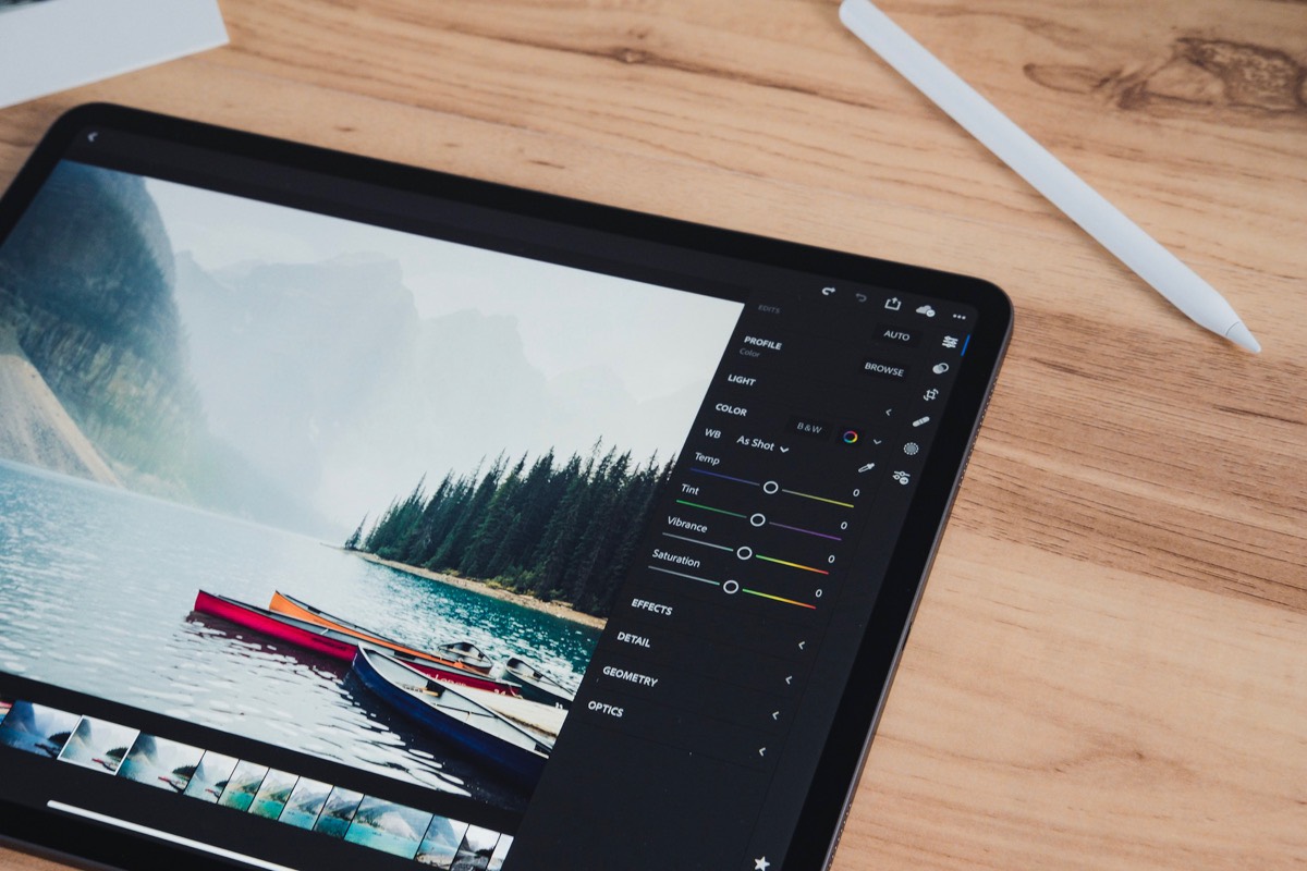
I’m an accountant by trade, so the most intensive tasks I perform on a computer are photo editing for the photos you see here on The Sweet Setup. I have some text snippets and semi-complicated clipboard processes set up on my Mac to complete the most repetitive HTML and URL tasks as well.
As per my analogy above, I’m no home-builder.
Even those text snippets and URL clipboard processes were hard to replicate on the iPad. There are a range of powerful clipboard managers on the iOS App Store, and TextExpander is baked into a range of powerful text editors for iOS. Unfortunately, none of these workflows ever stuck for me. They didn’t work one too many times, and I quickly returned to the Mac to complete the task.
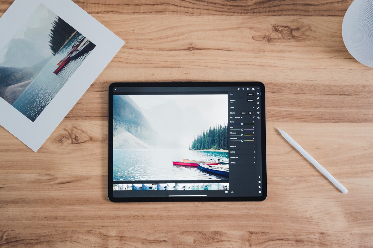
Shortcuts has fixed all these issues though. After some research and some guidance from The Sweet Setup contributor Matthew Cassinelli, I was able to mould some shortcuts together to change Amazon and iTunes affiliate URLs with apps like Associate and Blink.1 I created a bunch of shortcuts that emulate my most-used TextExpander snippets. And the incredible porting of features to Lightroom CC for iPad has shored up all my photo editing workflows.
In short, the last two or three months have been groundbreaking for my little computing workflow.
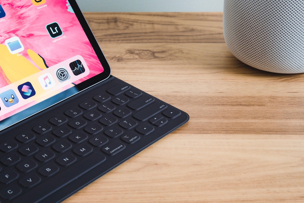
The iPad Pro has worked so seamlessly that I had to think back to when I last touched my MacBook Pro. The last time I fired up the MacBook was over two weeks ago, and that was to update some financial records inside Banktivity 7 (Banktivity’s iPad app needs some work before it can catch up to the Mac app’s capabilities.)
For me, that’s a long time to go without a Mac. And it’s been tons of fun to experiment along the way.
The iPad Pro’s New Display
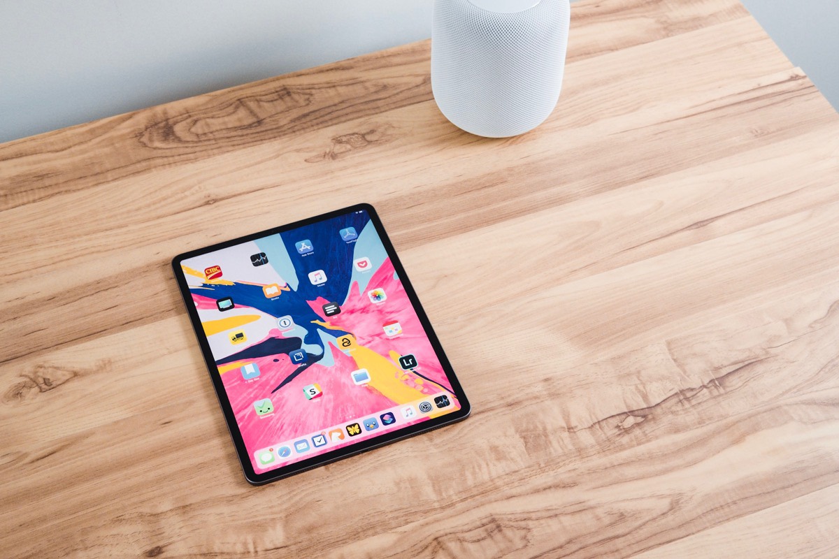
I may eat my words on this one, but I’m not sure I’d be able to appreciate a 12.9-inch OLED iPad display. Colors, blacks, and contrast would be dead accurate when viewed head on, but OLED’s poor handling of color when viewed at non-direct angles would leave lots to be desired. I think that I’d appreciate better color and viewing angles more than an OLED display.
OLED is the only thing I can think of that some folks would ask for after looking at the iPad Pro’s new display.
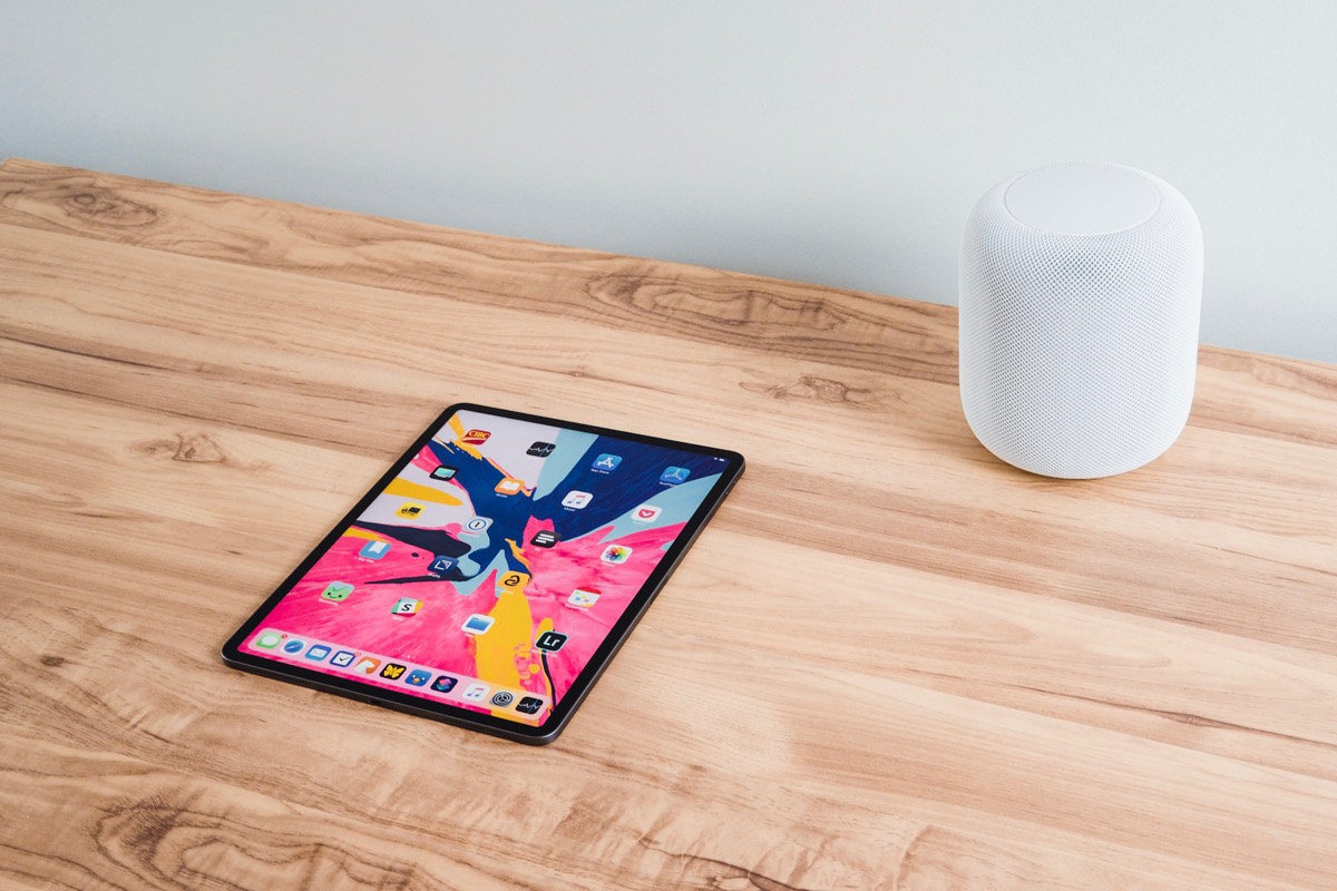
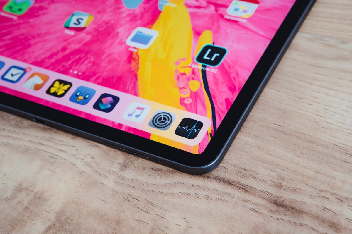
It’s amazing how Liquid Retina’s curved corners become the default, hip look for the iPad. Much like how the iPhone X’s curved corners made the iPhone 8’s square corners look archaic, the iPad Pro’s gentle corners provide a more inviting, more relaxed, more comfortable iPad experience.
The aesthetic nature of the iPad Pro’s display is actually surpassed by its technical nature. ProMotion technology, P3 wide color gamut support, 600 nits of brightness, and TrueTone technology make for the most feature complete display Apple has ever shipped.
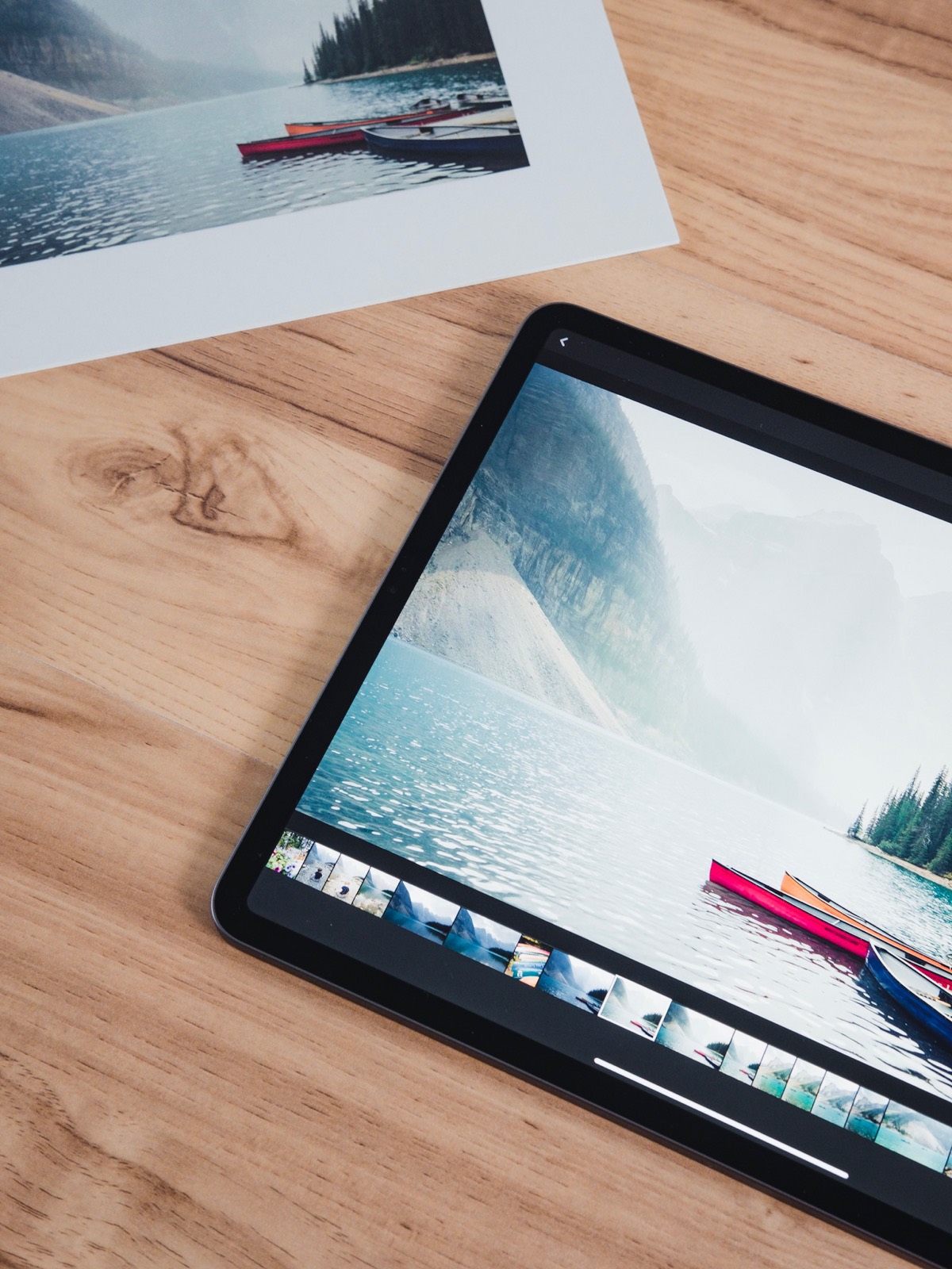
Editing photographs on this display must be the pinnacle of photo editing. The laminated display makes the pixels feel like they are right underneath your fingertips, while the new Apple Pencil makes selective edits more intuitive than any mouse or trackpad could ever achieve. The only complaint I have is that TrueTone can sometimes throw off your display’s color calibration — it’d be nice if you could disable TrueTone on an app-by-app basis.
Of course, the all-screen design and the elimination of the home button beckon for the iPhone X’s gestures. For those coming from a non-iPhone X, there will be a slight learning curve — my wife’s first look at the new iPad Pro yielded a look of confusion and uncertainty I haven’t seen with Apple products. Further, these gestures are obstructively hidden and not properly showcased in any onboarding session. As I see it, Matthew Cassinelli’s video highlighting six major gestures for the new iPad Pro is where brand new users should start.
Once mastered, the gestures are natural and give iOS a tactile experience. But I think Apple needs to shorten the gesture learning curve in a better way.
The iPad Pro’s Industrial Design
Very few designs share the same widespread love as the old iPhone 5 and 5S. That iPhone’s industrial look, feel, display, and Touch ID sensor is one of the most iconic Apple design of our time. To see the 2018 iPad Pro take many cues from the iPhone 5S is a great blast from the past.
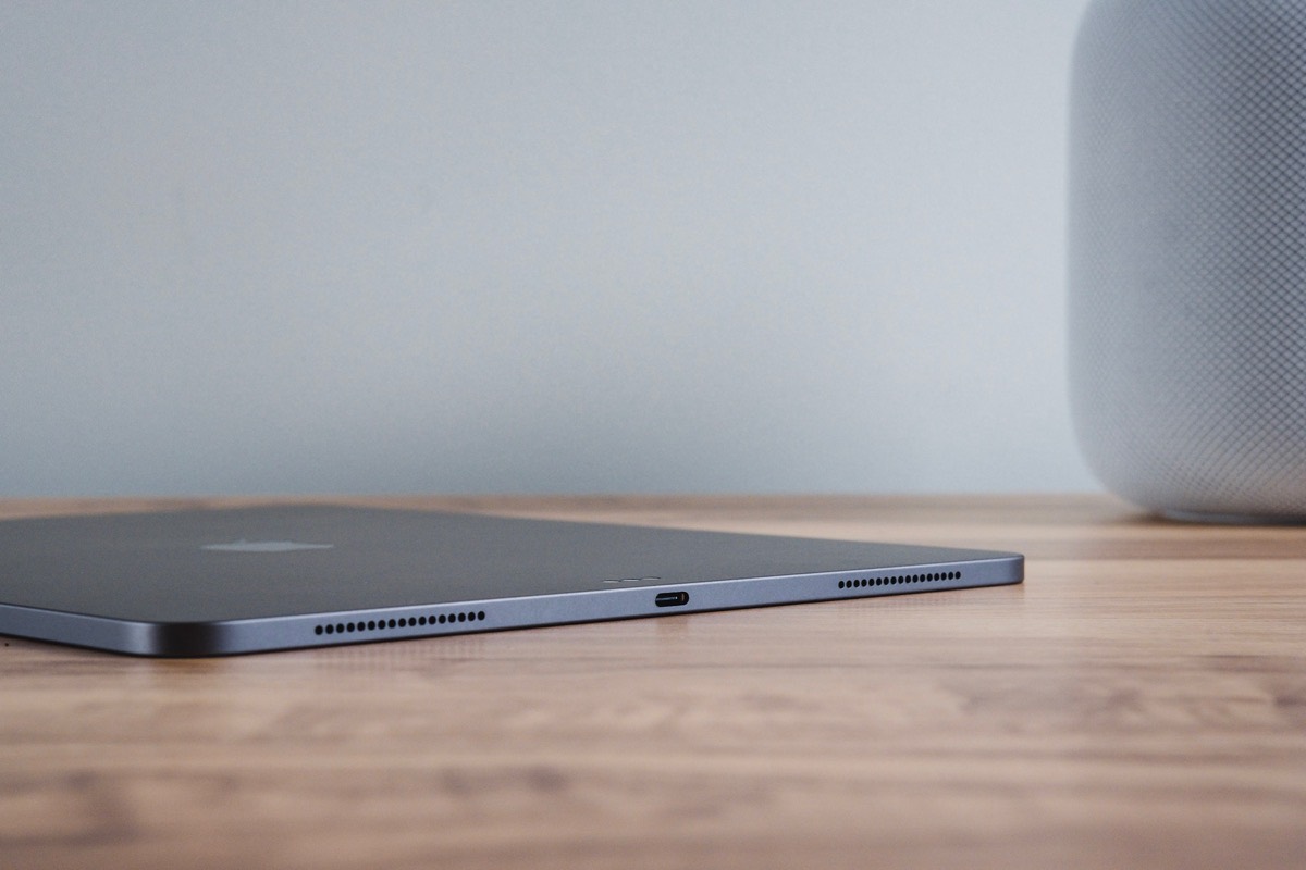
Rounded and chamfered edges have been traded for flat edges, with speaker holes, microphone holes, and the Pencil’s charging dock all drilled into the iPad’s sides.
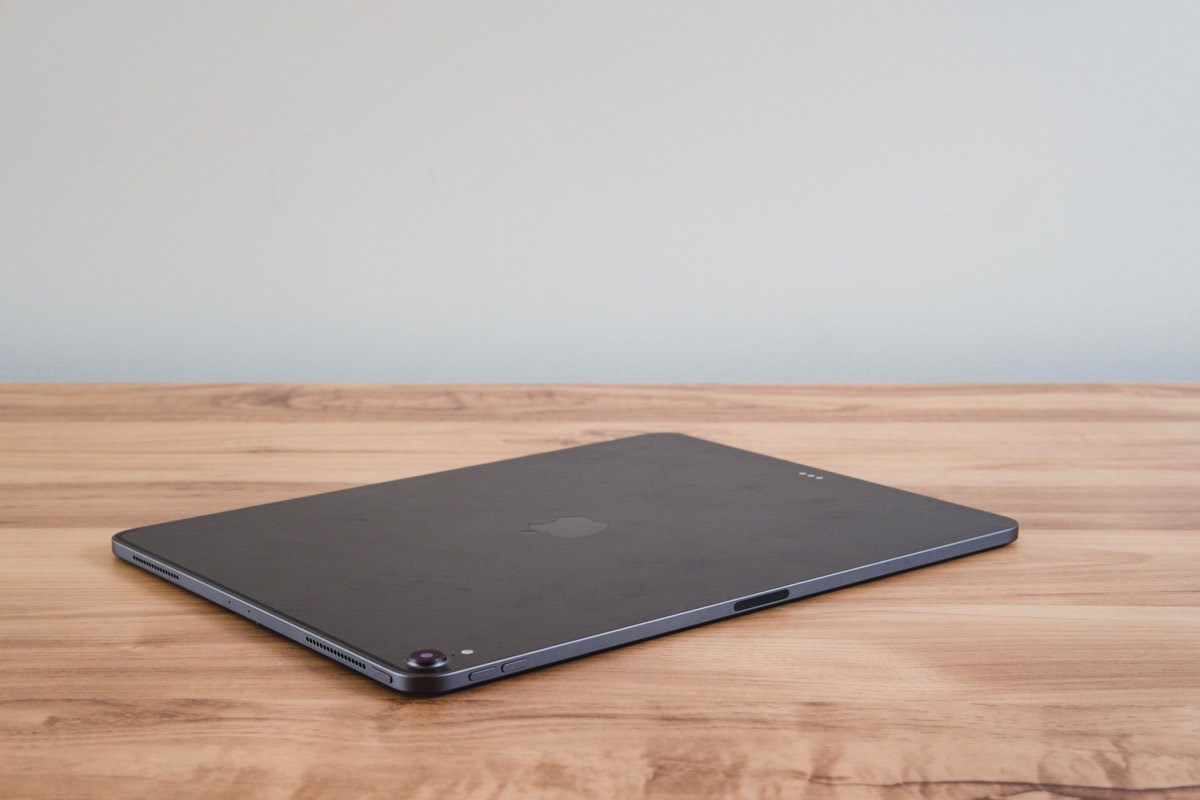
Squared off edges, you’d think, would have a sharper feeling in hand than rounded edges, and would be less comfortable to hold. I, for one, don’t think the chamfered edges of the iPhone 5S design would work with an iPad of this size.
Instead, Apple has subtly rounded off the square edges, providing a really soft feel to the iPad. The entire iPad’s aluminum has a soft feel as a whole, but the gentle squared off edges are where this feeling really stands out.
The result — especially on the larger 12.9-inch iPad Pro — is an iPad that feels incredibly thin and incredibly light. Almost impossibly light.
Borderline fragile light, even. Even before that viral video of the new iPad Pro’s bend test, I felt a need to be careful with this iPad more so than previous iPads. This iPad doesn’t have a major heft to it. It instills confidence, sure, but not in the same way prior iPads did. You have to be sure not to accidentally sit on this iPad if it’s laying on the couch.
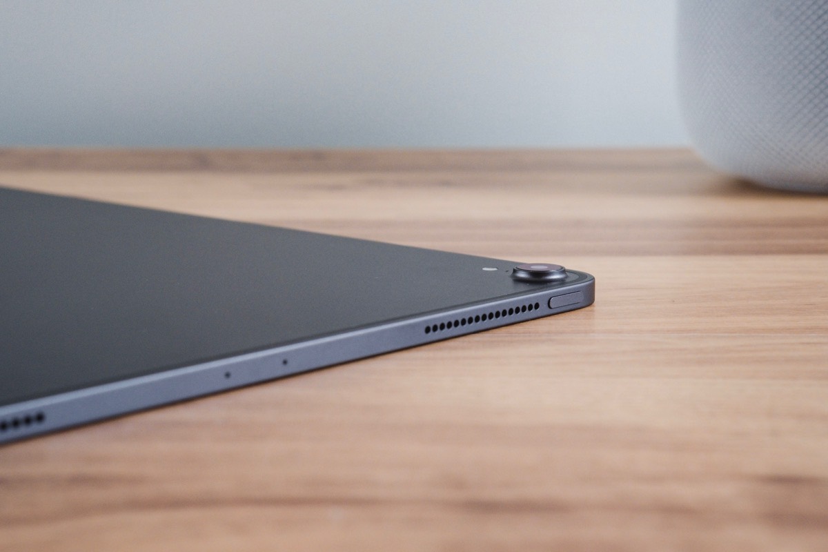
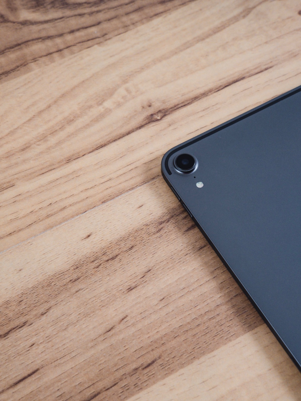
The gently rounded edges of the iPad Pro extend into its new camera housing. I adore the design of the new iPad’s camera. The elegance of the bulge is phenomenal and exudes minute tolerances and attention to detail. I will probably never shoot a photo with this camera (maybe I’ll scan a document or two), but I almost like having the camera there just to show off the machined aluminum details on the back side.
I hope this new industrial design will extend further into the iPad’s future than the design of the iPhone 4/4S and 5/5S. We had those utilitarian iPhones around for a fast four years, and I think many in the Apple community have yearned for that design ever since.
Face ID
I think I see that little Face ID authentication animation at least twice as often as I see it on the iPhone. This is probably because I use the iPad differently than the iPhone, but it also explains why Touch ID seems so inconvenient after only a few weeks with the new iPad.
If you have the iPad propped up in some fashion and are using an external keyboard, utilizing iOS 12’s Password Autofill features used to require a constant reach up, hold, and authenticate with Touch ID. Face ID makes reaching up to authenticate feel like a problem you never knew existed until you knew it existed.
The TrueDepth camera on the front of the iPad is gorgeously hidden behind the bezel, and even when you’re searching for the camera it’s hard to find. As a result, I’ve lost track of the camera more times than I can count and often find my hand covering the camera when trying to unlock the iPad.
Face ID works in portrait, landscape, or upside down, unlike the iPhone XS. It’s easy to point at this and state the iPad Pro’s Face ID system is superior to the iPhone XS’ — and it rightfully is in this regard — but my experience hasn’t been perfectly smooth either. I’ve found a lengthier delay when Face ID misfires on the iPad Pro. If authentication doesn’t take place the first time Face ID goes through the motions, I feel it takes longer for Face ID to give it a second try than the iPhone XS. More often than not, it’s faster for me to type my PIN on the Smart Keyboard Folio than it is to re-authenticate using Face ID.
Face ID on the iPad Pro seems to be even more forgiving than the iPhone XS on viewing angles, though.
Face ID on the iPad offers a glimpse into what Face ID on the Mac might feel like. We may not see Face ID on the Mac for a little while thanks to the thinness of Mac displays these days, but it’s certainly something to look forward to.
The A12X Bionic Chip
Aside from the brilliantly huge display, the iPad Pro’s new screaming speed has been its headline feature.
Back in late 2016, I bit the bullet and bought a built-to-order 15-inch MacBook Pro with Touch Bar, as it was the first mobile Mac that could power a 27-inch Retina Display. 16GB RAM and 512GB of speedy storage later, I felt like I was on top of the computing world.
For only a fleeting moment.
Two years later, and that same 15-inch MacBook Pro has been surpassed in performance by the 2018 iPad Pro. Both single core and multi-core Geekbench scores suggest the 2018 iPad Pro has become the most powerful computer in my home.
For our review of the MacBook Air on Tuesday, I completed the highly scientific experiment of exporting 3 full-size photos from Lightroom CC and timing how long it took for Lightroom to complete the export. The iPad Pro matched the 2016 MacBook Pro in that test, as it exported those 3 photos in 16 seconds flat. The MacBook Air came in at 22 seconds.
It’s not just in processing power either. The iPad Pro’s graphics prowess has grown faster than its processing prowess, and can now match console-level graphics. My Xbox One S is not brand-new by any means, but the fact a massive console is matched and surpassed by this wafer-thin iPad Pro would be unimaginable just a few years ago.
The A12X Bionic chip is reason to reconsider your computing kit, if your usage permits. For all intents and purposes, the iPad Pro relegates the Mac to “light usage” territory, at least for me. Where before I needed a 15-inch MacBook Pro to do the heavy lifting, today I have the iPad. This could, theoretically, either eliminate the Mac, or permit a more sensible case for the low-powered, ultra-portable 12-inch MacBook or new MacBook Air.
Again, everyone’s usage is different in this regard, but I wouldn’t be surprised if a range of people decide to switch up the roles of their devices in the coming years.
Bonus! One more thing…
The Complete Guide to Managing Tasks in Things (Video)
If you struggle to keep up with all your tasks, we can show you some organization tips that may help you.
We put together a video that shows you everything you need to know about a task in Things:
- The difference between start dates and due dates and how to use them effectively.
- How to set up reminders so you never forget an important task again.
- How to use checklists for tasks that require more than one step.
- How to configure daily, weekly, monthly, or even annual repeating tasks.
- And more…
You don’t have to use any of these things in your tasks if you don’t want to. But knowing what they are and how they all work will help you be more organized, save time, and ensure you are using Things in the way that suits you best.
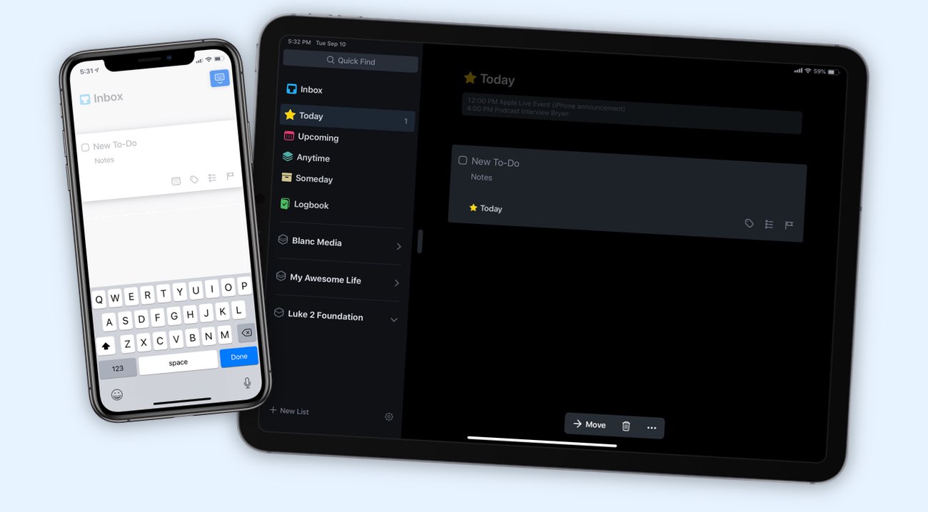
This video is something we have made available for free to our email subscriber community. You can get it right now. By joining the Sweet Setup community you’ll also get access to other guides, early previews to big new reviews and workflow articles we are working on, weekly roundups of our best content, and more.
The New Apple Pencil and Smart Keyboard Folio
Charging the first-generation Apple Pencil was an asinine practice, but one that I rarely completed. I took advantage of that tiny little Lightning adapter shipped in the box and generally charged the Pencil via a Lightning cable and wall adapter.
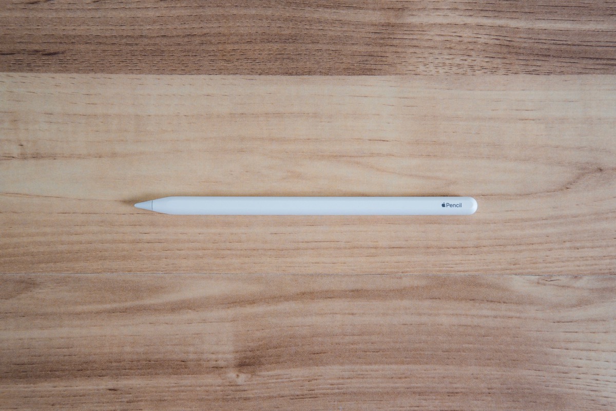
Yet, even that method was extremely un-Apple-like.
That was then. The second-generation Apple Pencil is now a perfected technology.
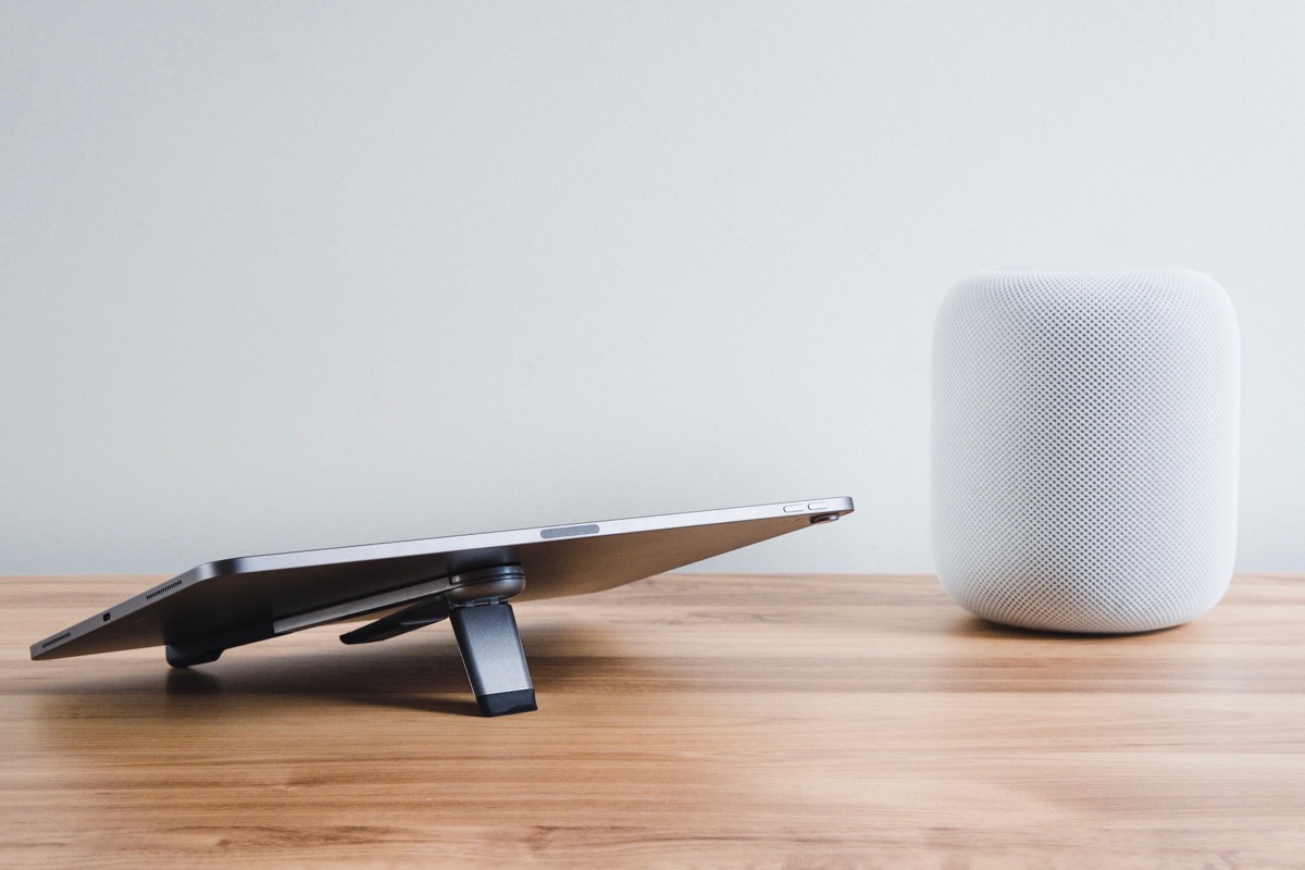
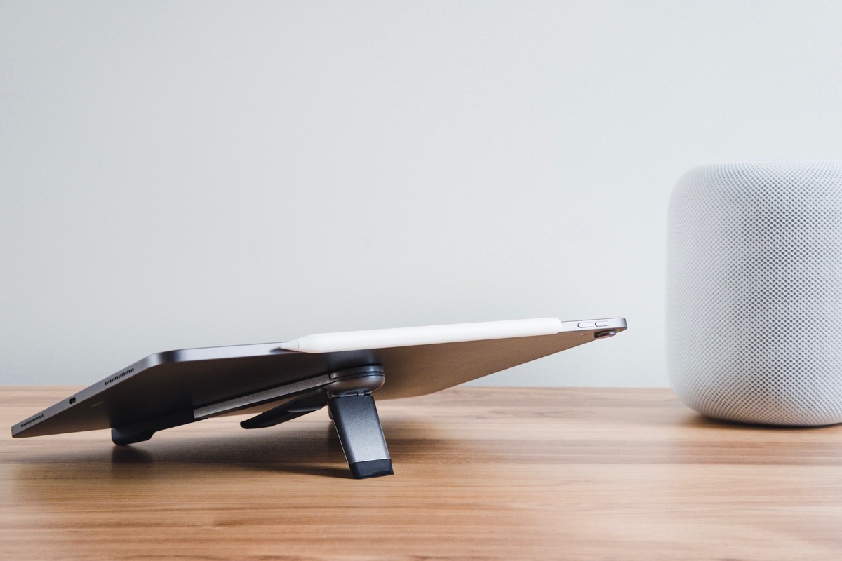
Magnetic and inductive charging takes care of that repulsive first-generation charging method. It also provides a place to store the Pencil when it’s not in use. The matte finish and singular flat side make holding the Pencil substantially more comfortable. And if that wasn’t enough, the flat side now has a touch-sensitive sensor to allow a quick double-tap gesture for changing tools inside apps.
To me, the most important change to the Apple Pencil is its length. The first Pencil resembled a brand new, unsharpened wooden pencil. It felt obscenely long to me. The second generation Pencil is considerably shorter, moving the weighting of the Pencil to a more comfortable position for taking notes and drawing.
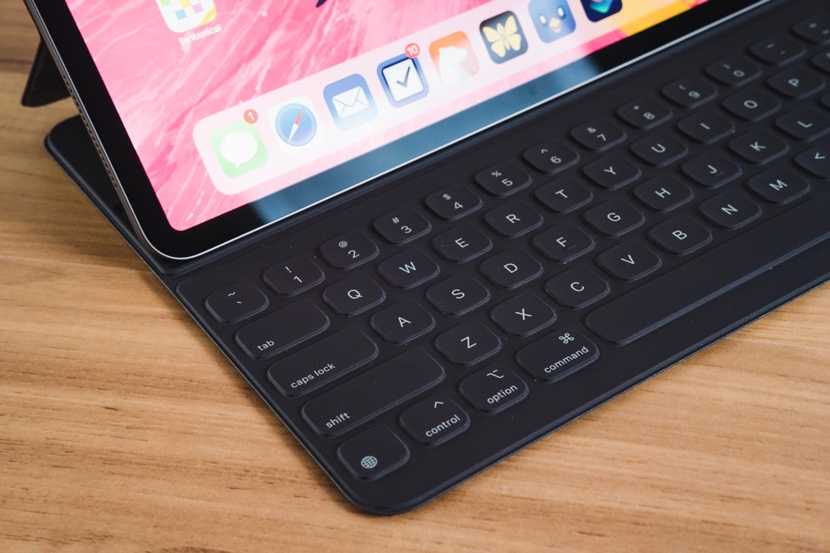
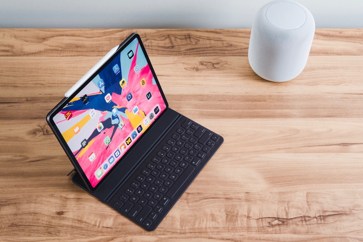
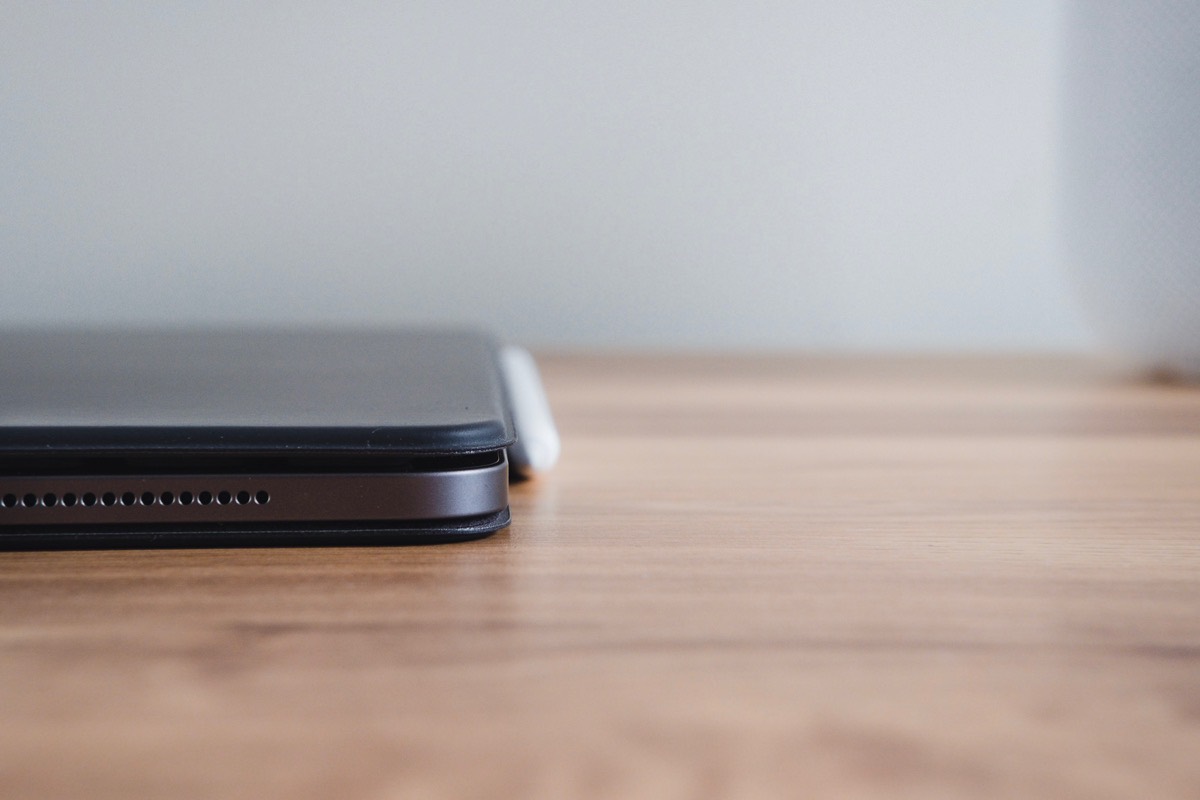
The Smart Keyboard Folio is substantially more polarizing. For one, it’s quite a bit thicker than the original Smart Keyboard, making the iPad Pro package equally thick or thicker than any MacBook Pro.
Two, the Keyboard Folio gets rid of the interior micro-fiber liner, which was one of my favorite features of the Smart Cover and Smart Keyboard. It’s still there, but placed against the backside of the iPad. Considering the amount of fingerprints this screen picks up, the micro-fiber liner should be put up against the screen.
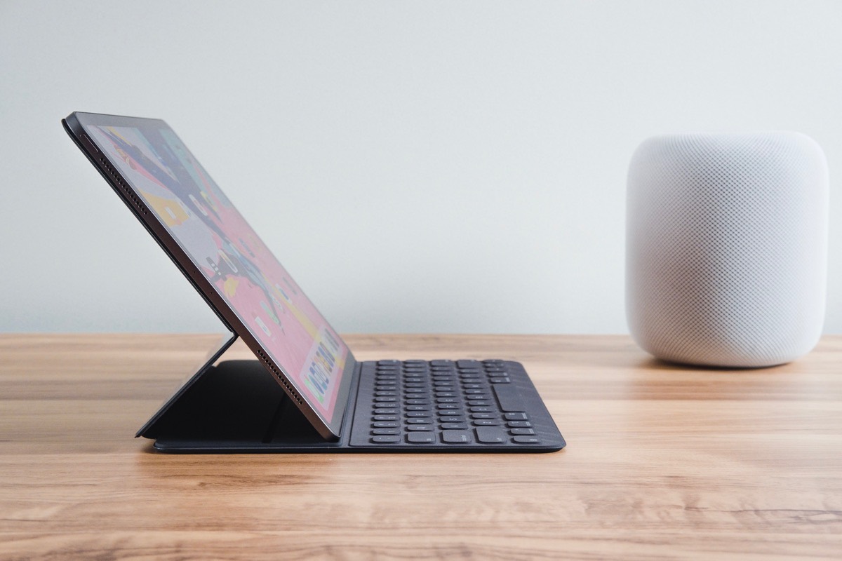
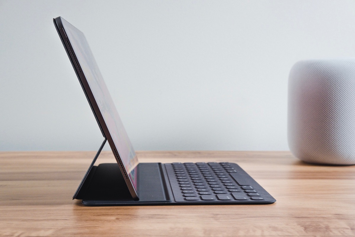
Also gone is the “media mode” viewing angle of the Smart Keyboard, replaced by a secondary viewing angle which is surprisingly steep. I find that secondary viewing angle equally as useful as any prior media mode, I just think Apple shouldn’t market the viewing angle as “desk mode.” If viewed as a media viewing angle of sorts, it works very well for placing on a coffee table and viewing a TV show from five feet away.
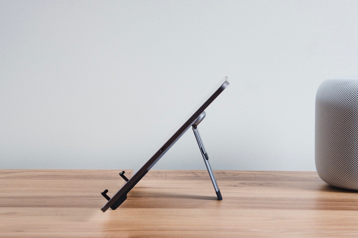
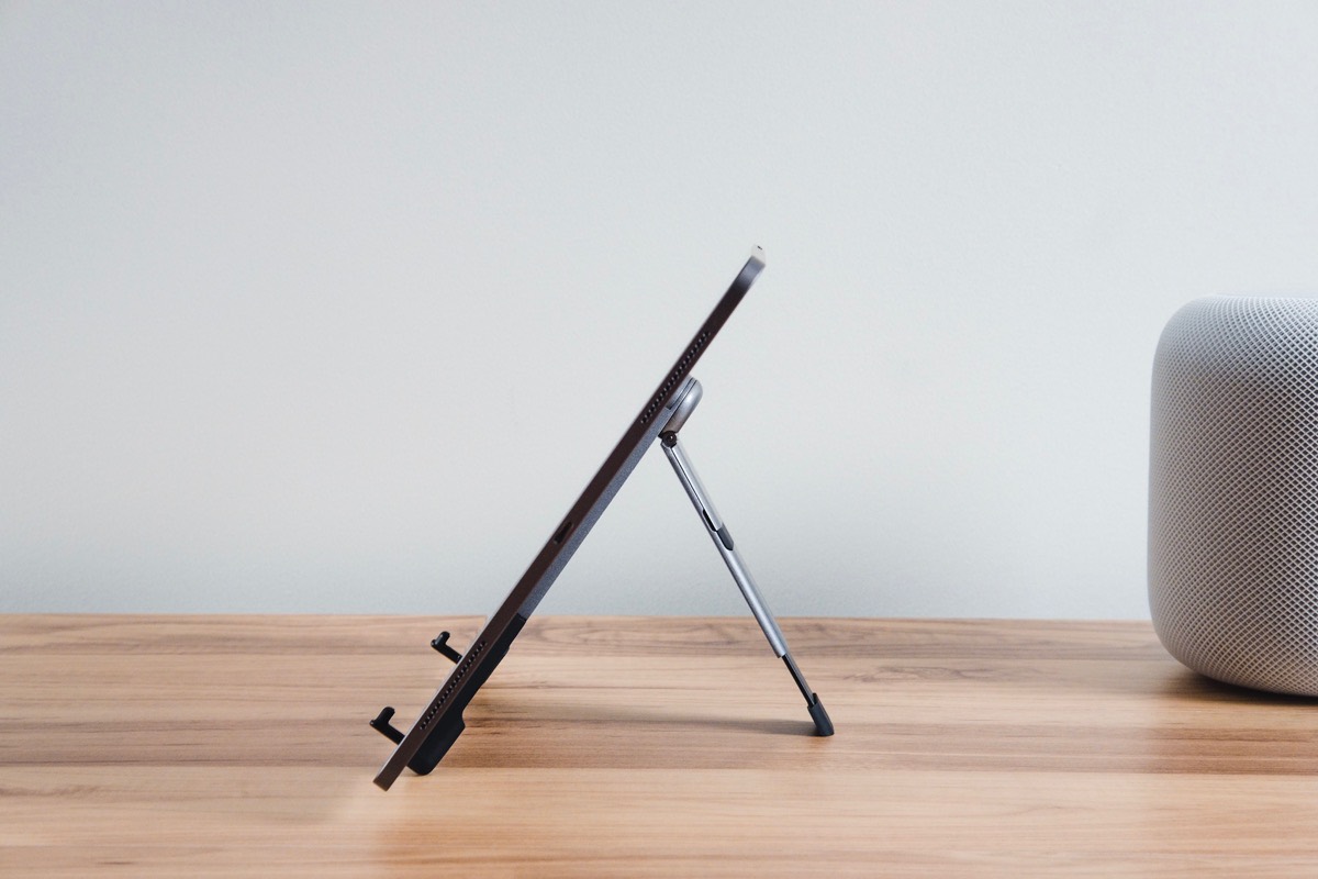
As it stands, the Smart Keyboard Folio has two very similar viewing angles to Twelve South’s new Compass Pro stand. When I’m out and about, I throw the Smart Keyboard Folio onto the iPad for convenience purposes. When I get home, I can have almost the same viewing experiences with the Compass Pro stand and an external keyboard with a proper function row and better key travel.
The Smart Keyboard Folio does have some neat features up its sleeve though. Adhering to the back of the iPad via magnets is the most elegant attachment method for an exterior case. Twelve South has made a SurfacePad that adheres to the back of an iPad or iPhone via an adhesive layer. It doesn’t leave any residue when removed, but it makes the case an effective one-off — once you remove the case, it’s hard to re-adhere a second time.
Not so with the Smart Keyboard Folio and Smart Folio.
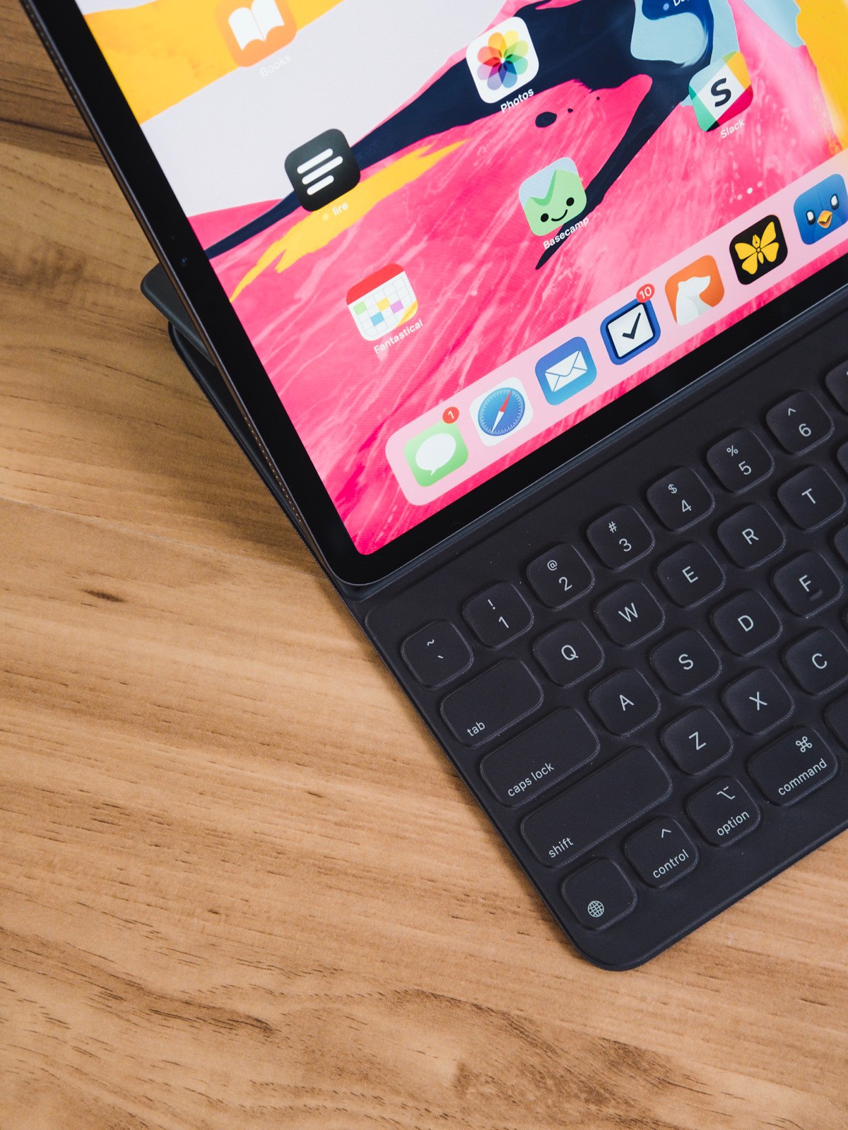
I still don’t like the keyboard’s typing experience though. Key travel is still pretty short and can cause some finger and thumb soreness when you really get going.
Overall, I feel the convenience factor of the Keyboard Folio outweighs the odd feeling of the keyboard and key travel. It’s so convenient to not have any batteries or Bluetooth connections or sticky adhesive or cords to lug around with the iPad. Just clean, unobtrusive magnets.
It’s not a perfect keyboard by any means — backlighting, more viewing angles, and a function key row are amongst my top wishes — but I think, even at its hefty price, it’s worth having. At least until the Brydge keyboard debuts in 2019.
USB-C
I want to get this out of the way: I can’t help but feel that Apple deceived us when introducing the iPad Pro’s new USB-C capabilities. Perhaps not intentionally, but maybe.
Apple specifically stated the iPad Pro is capable of driving a 5K external display when connected via the new USB-C port, and in the same breath, showed an image of an iPad connected to what appeared to be an LG UltraFine 5K Display. Many of the initial press videos from the hands-on area showcased the iPad Pro connected via USB-C to an unlabelled, but UltraFine-resembling, display.
Of course, shortly afterwards, it was discovered the iPad Pro cannot drive the LG UltraFine 5K Display, as the UltraFine runs through Thunderbolt 3, not USB-C. The UltraFine 4K Display works perfectly with the new iPad Pro, but not the 5K Display.
I hit the purchase button thinking I could use my 5K Display with this new iPad Pro. I figured it would be a great experiment and secondary use-case for my display.
Of course, the joke’s on me now.
It is what it is. This isn’t a dealbreaker. I just felt deceived initially.
Aside from this, USB-C on the iPad Pro is a nice jump up from the proprietary Lightning port, even if this USB-C port has been artificially handicapped. You can’t read or write to an external hard drive with this USB-C port, but you can do a lot of other stuff with it. Have a favorite USB keyboard you like to use? Provided it doesn’t need to be powered, it should work via an adapter. You can directly connect cameras to the iPad, hook up a wired Ethernet connection, run a 4K USB-C display, or even charge your iPhone with the iPad. There are a few USB-C-ready cameras that come to mind (the Sony a7III, Fuji X-T3, and Olympus OM-D E-M1 Mark II, for instance), so all it takes is a single USB-C cord to hook up and transfer photos directly to Camera Roll.2
While most of these things could be performed before via Lightning, the reality is that USB-C’s broader support means it’s much more convenient to use the iPad Pro’s USB-C port. Most of your prior MacBook adapters should work with the iPad Pro, so you won’t need to go buy a duplicate adapter.
There’s no more convenient factor here than being able to pull double duty with your MacBook’s USB-C charger. The iPad Pro ships with a new, quick-charging USB-C charger that we haven’t seen before. However, if you have a USB-C charger from your MacBook already, there’s no sense in carrying both chargers with you wherever you go. Plus, the MacBook’s USB-C cable is substantially longer than the iPad Pro’s out-of-the-box USB-C cable, making this my preferred method for charging.
The adoption of USB-C doesn’t have major new benefits now, but it houses an enormous amount of potential for the iPad Pro down the road. Whenever Apple unlocks the ability to read and write to an external hard drive (even just read would be great!), we’ll start to really see this iPad come into its own.
The Miscellaneous Section
Can’t have a section for everything.
-
The iPad Pro’s backside camera comes equipped with a 12MP sensor and the same Smart HDR features that debuted with the iPhone XS. I still think it’s hysterical to shoot photos with this camera, but I think a higher resolution sensor is more valuable on this camera than on the iPhone XS. Being able to scan documents with the iPad Pro is one of the device’s hallmark benefits over a regular PC, and greater resolution makes for greater document scans. There’ll be a threshold where greater resolution is no longer required, but this iPad simply can’t shoot as high quality a document scan as our dedicated Fujitsu scanner in the office.
-
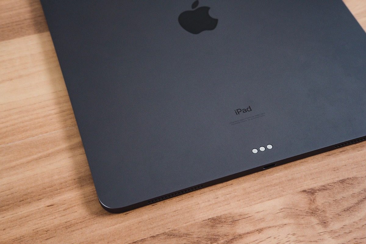
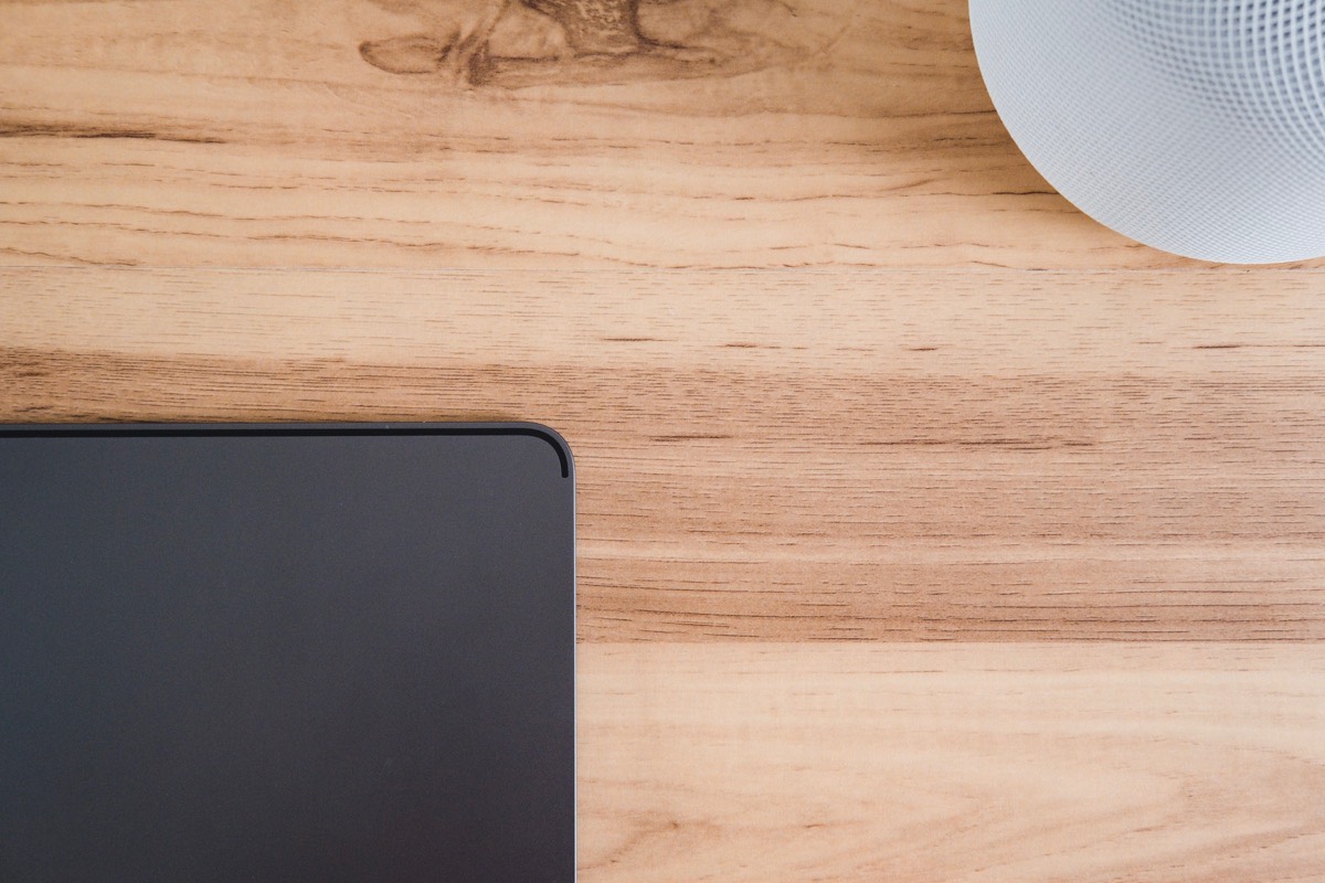
The Wi-Fi-only iPad Pro has antenna lines built into the back of the iPad’s aluminum backside. The only difference between the LTE-ready iPad Pro and the WiFi-only iPad Pro are two antenna lines on the top and bottom edges of the iPad. I could be wrong, but I think this is the first time we’ve seen antenna lines on the Wi-Fi-only iPad. I don’t mind the look, and it appears to allow simultaneous dual band (2.4GHz and 5GHz) Wi-Fi (the only wireless difference between last year’s iPad Pro and this year’s iPad Pro).
-
Snapping a screenshot on the iPhone XS with the volume-up and lock buttons has become second nature, but this action feels substantially better on the iPad Pro. Thanks to the volume and lock buttons being within an inch of one another, it’s easy to reach up and press both buttons (when attached to the Smart Keyboard Folio, it’s as simple as putting your middle finger on the lock button and your index finger on the volume up button).
-
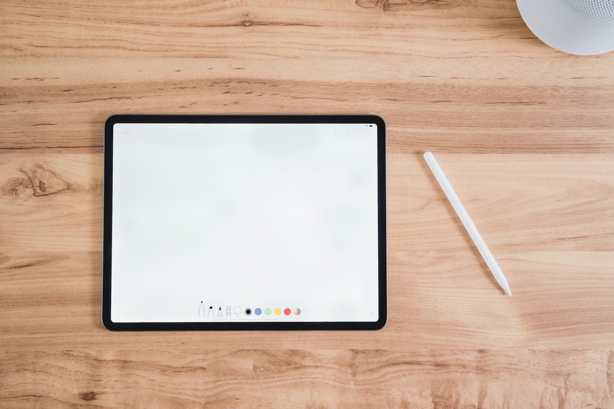
I’ve been very impressed with the Apple Pencil’s distinguishing between double-taps and general pen shifting. It takes an actual attempt to double-tap the side of the Pencil to switch to the eraser. Random switches to the eraser could cause unparalleled disaster. I’m thankful for the attention to detail.
- Non-updated apps look substantially worse on the 11-inch iPad Pro than they do on the 12.9-inch iPad Pro. I find it interesting that unoptimized apps have a black bar around the outside of the app on the 12.9-inch — it almost implies the 12.9-inch display of the 2018 iPad Pro is bigger than the 12.9-inch display of prior iPad Pros.
- I haven’t noticed faster speeds when importing photos with the USB-C to SD Card Reader, but it seems to be more reliable than the Lightning to SD Card Reader. On the 10.5-inch iPad Pro, compressed Fuji raw photos can’t be previewed and often can’t be looked at even after import. I’d have to import into Lightroom CC before I could look at the image. With the USB-C adapter, I can preview raw photos and see them before importing into Lightroom.
- iOS 12 is still iOS 12, and this seems to be the hang up for many individuals who hoped, somehow, that this iPad Pro could do more or play a larger role in their work than the prior iPad Pro. iOS 12 is the defining factor here, and if iOS has always been the impediment, it’ll continue to be the impediment. I genuinely think patience and diligence in re-creating workflows to work on the iPad is key to moving to the iPad more regularly, but there are still a wide range of workflows that simply can’t be completed on the iPad. That’s fine. The Mac still works great for those types of tasks.
Get Our Best Photography Tips & Workflows
Transform your photos and edits from average to awesome with our in-depth, mobile photography course. It’s jam-packed with training, ideas, and lessons that can literally transform your photography overnight.
Wrap Up
In the lead up to the iPad Pro introduction and in the subsequent weeks after the event, I’ve egged on Sweet Setup contributor Marius Masalar to update his first-generation 12.9-inch iPad Pro. Marius’ resilience to “upgrade fever” is impressive, as I don’t think I’ve been able to budge him at all.
His rational take is pretty accurate: The new iPad Pro enables iPad users to do almost nothing new that they couldn’t already perform with a prior iPad Pro. Sure, the new iPad Pro is blazing fast and may allow you to complete tasks quicker than before, but there are very few new capabilities here. Face ID is a new capability, but it replaces the acceptably-apt Touch ID. The 2017 iPad Pro had TrueTone, ProMotion, a future-proofed A10X chip, and the mostly-same Smart Keyboard.
Really, the only immediate evident new capability is the ability to bounce back and forth between a pen and an eraser with the new Apple Pencil.
So why bother upgrading, especially considering the now almost-inaccessible price tag? That’s a good question. Clearly I don’t have an answer — Marius hasn’t upgraded yet.
The latest iPad Pro does everything last year’s iPad did, but at increased speeds, with a beautiful new design, with a jaw-dropping new display, and with a new near-perfect Apple Pencil.
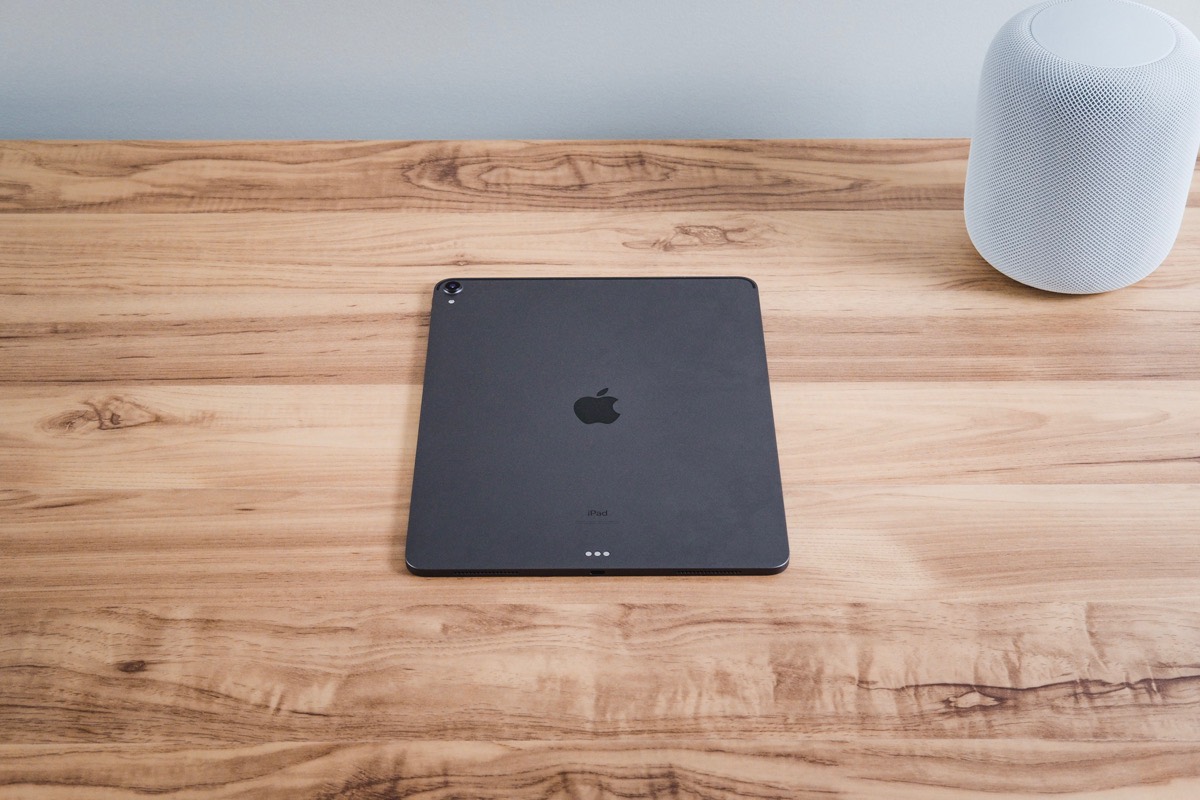
That we compare the 2018 iPad Pro not to other tablets on the market but to the Mac and to PCs is a strong measurement of the iPad’s impressive capabilities.
Whatever your needs, this new iPad Pro is a pleasure to use, incredible to look at, and the most impactful iPad I’ve experienced yet.
-
Unfortunately, Blink seems to have been discontinued on the iOS App Store. I hope the team brings it back soon. ↩
-
I really hope Apple unlocks the possibility of using the iPad as a live monitor for these cameras. Just imagine shooting in a studio with the iPad as your viewfinder. It would be incredible. ↩
