The Best RSS App for iPhone and iPad
Unread
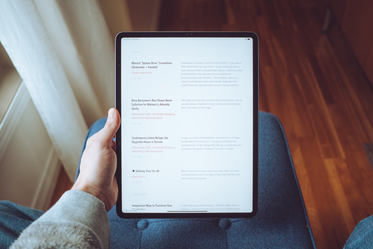
RSS arguably had its perfect device when the iPad was introduced in 2010. Suddenly, you could read the entire Internet comfortably on the couch. In a way, you could use RSS to bring the web to you.
RSS went through something of a lull in the early and mid 2010s due to the closure of Google Reader and the rise of social media. Instead of finding and producing news for a blog or site, many folks pushed content discovery and creation into the worlds of Facebook and Twitter. Social media today, however, is undergoing a sort of crisis, as users flock away from the privacy-destroying platforms. In the wake, RSS is seeing another revival of sorts.
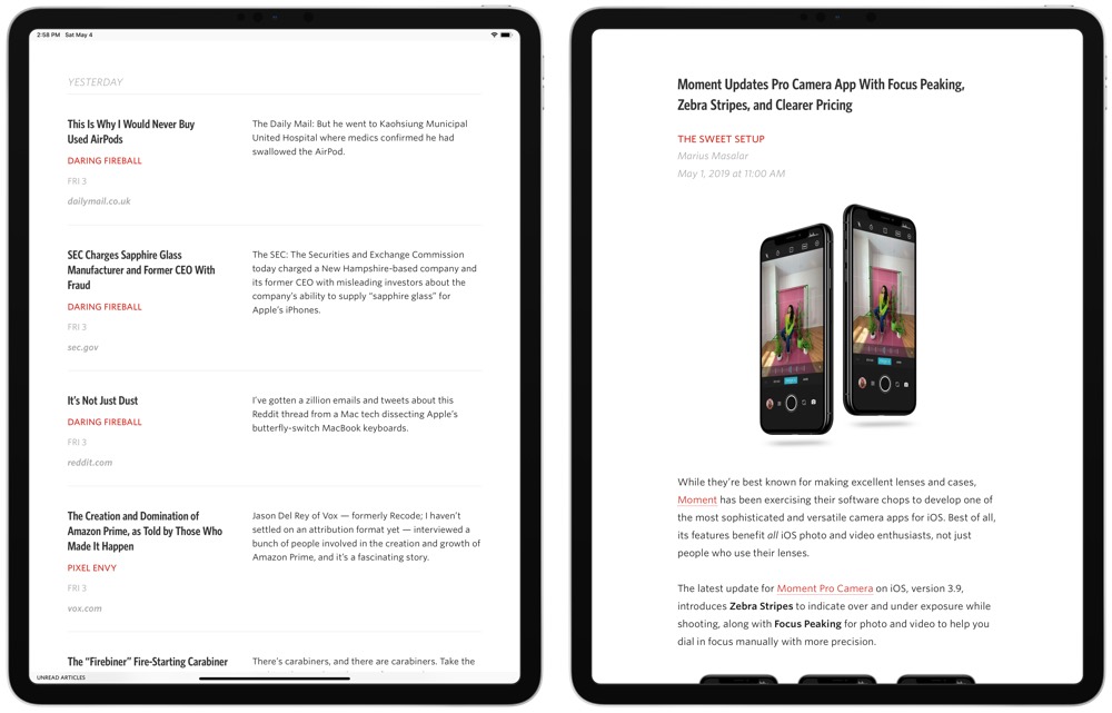
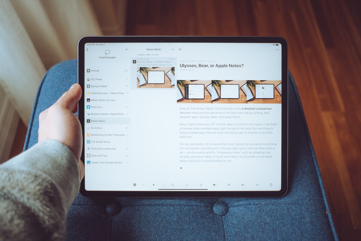
In the midst of this RSS revival — or perhaps “awakening” is a better term — we believe slowing down, being conscious of the news you’re consuming, and consuming high quality writing are key to a great reading experience. That’s why our pick for the best RSS reader for iOS is Unread, an app designed to help you slow down, lean back, and enjoy good writing.
This being said, RSS presents multiple opportunities for different types of news consumers, and Unread mainly excels in the reading department — if you’re looking for a fast way to process your RSS feeds, Unread quickly falls short. Classic RSS apps like Reeder have never gone away and Reeder still processes feeds faster than any other RSS app to date. Still, other RSS apps — like Fiery Feeds and lire — provide more pro-level features and greater support for the newest RSS services and features from services like Inoreader or Feedly.
In the world of RSS apps, it’s very difficult to choose the best. We believe curling up to your RSS feeds should be much like curling up to a good book, so Unread is our pick in this regard. But, we won’t sell Reeder, Fiery Feeds, or lire short — they all excel in their own regard and are worthy RSS apps for your iPhone or iPad.
Bonus! One more thing…
The Complete Guide to Managing Tasks in Things (Video)
If you struggle to keep up with all your tasks, we can show you some organization tips that may help you.
We put together a video that shows you everything you need to know about a task in Things:
- The difference between start dates and due dates and how to use them effectively.
- How to set up reminders so you never forget an important task again.
- How to use checklists for tasks that require more than one step.
- How to configure daily, weekly, monthly, or even annual repeating tasks.
- And more…
You don’t have to use any of these things in your tasks if you don’t want to. But knowing what they are and how they all work will help you be more organized, save time, and ensure you are using Things in the way that suits you best.
This video is something we have made available for free to our email subscriber community. You can get it right now. By joining the Sweet Setup community you’ll also get access to other guides, early previews to big new reviews and workflow articles we are working on, weekly roundups of our best content, and more.
RSS and the iPad
I found it depressing whenever anyone suggested that RSS was dying because I honestly think it is one of the greatest inventions in the history of reading. What’s not to love? You get to hand-pick a series of feeds that will then send you articles to read, and instead of piling up around you, like magazines and newspapers of yore, the articles magically disappear after you read them, replaced by a fresh batch. That’s the concept, anyway. The execution of that concept took a while to find its proper form.

It’s perhaps ironic that Google Reader helped popularize RSS, considering the sheer horror of its interface design. In retrospect, making RSS feeds look like email was a terrible idea. Email comes from work, creates obligation, and makes you feel guilty. I was working as a journalist when I first started using Google Reader, and I subscribed to a wide variety of feeds that I thought would make me more well-informed. Instead, every time I opened the app, I felt overwhelmed with the massive volume of my inadequacy.
RSS is an amazing service for finding new things to read, but it can also be overwhelming. If you’re not careful, you can be inundated by high volume feeds, and your RSS reader can become less of a tool for discovery and more of a method to hack through the ever-growing weeds. No matter how good the iPad may be for reading, or how good the iPhone is at processing long lists of feeds, having the right app makes moving through countless RSS items easy and efficient.
In testing apps for this review, we considered the following criteria:
- Support for a number of different RSS services, such as Feedly, Feed Wrangler, Inoreader, NewsBlur, and Feedbin.
- Support for a number of different sharing services, including Instapaper, Pocket, and Pinboard.
- A beautiful, intuitive design that made RSS feel like a tool for discovery.
- Support for the latest features from RSS services, like tagging, saved searches, automation, offline reading, full-text reading, and smart lists.
- Support for iOS’s latest features, like drag and drop, a modern design, and URL actions.
The Reader: Unread

When Jared Sinclair released his RSS app, Unread for the iPhone in February, 2014, he included a philosophy statement:
Most RSS apps are patterned after email. Noisy parades of dots, dates, and tags trample over their screens. Their source lists look like overflowing inboxes instead of stately tables of contents. Toolbars bristling with options obscure the text. Putting it bluntly, using these apps feels like work…I made Unread because I wanted to get back to a more deliberate style of reading. I designed it for times of quiet focus. With warm typography and a sparse interface, it invites me to return to the way I used to read before I fell into the bad habit of skimming and forgetting.
At the time, Unread quickly became the preferred iPhone RSS app for people like Federico Viticci, David Sparks, Stephen Hackett, and The Sweet Setup’s own Shawn Blanc.
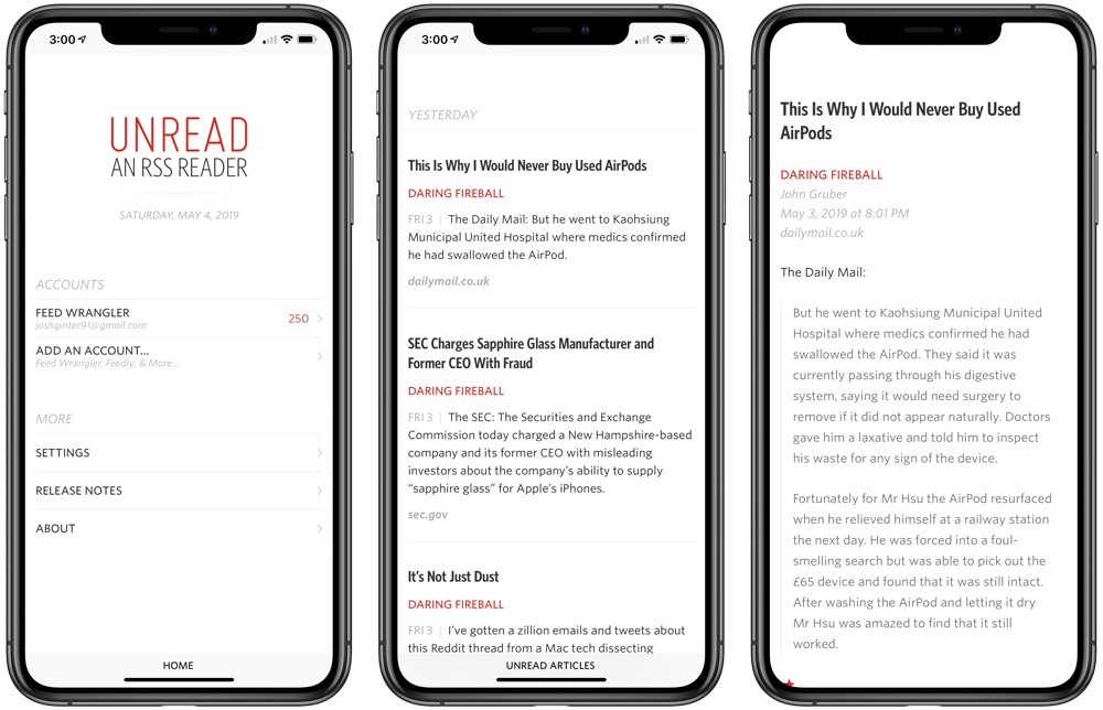
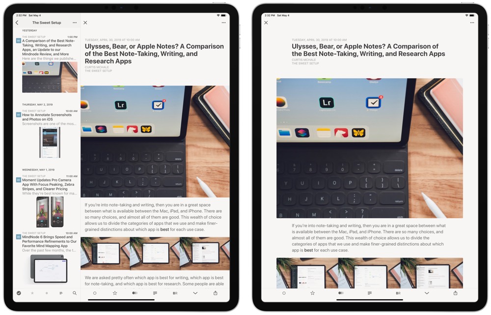
Unread’s sparse interface, serene reading environment, and excellent use of gestures makes it a phenomenal RSS app for the iPhone, where one-handed use is often required. But, as good as Unread is on the iPhone, I prefer reading on my tablet, and Unread shines on the bigger screen.
Note that Jared later sold Unread to Supertop, who thereafter sold the app to Golden Hill Software. Golden Hill Software is now actively developing Unread for iPhone and iPad.
Unread’s Focus on Reading
The app’s article view is perhaps the most obvious place to see how it makes the reading experience paramount.
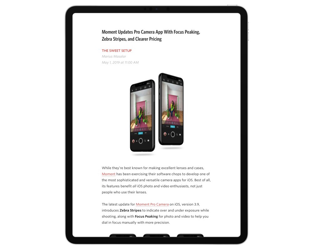
There are no buttons inviting you to mark the item, star the item, or send the item elsewhere, or even to move to the next item. Instead, you’re invited merely to read the item in the beautiful Whitney typeface. Going from Reeder to Unread, I felt as if I was getting slightly more oxygen through the clarity of the interface.
The app includes two settings that make this process even easier. First, there’s an option to mark items as read as you scroll past them. Then, if you want to read an item, you can tap on it. If you tap and hold an item, you have the option of going straight to the web to read it.
This is especially nice for feeds that only offer partial articles. The end result is that you can scroll through a relatively large number of items and consciously select those you actually want to read. Unread then gives you an ideal reading environment in which to do just that.
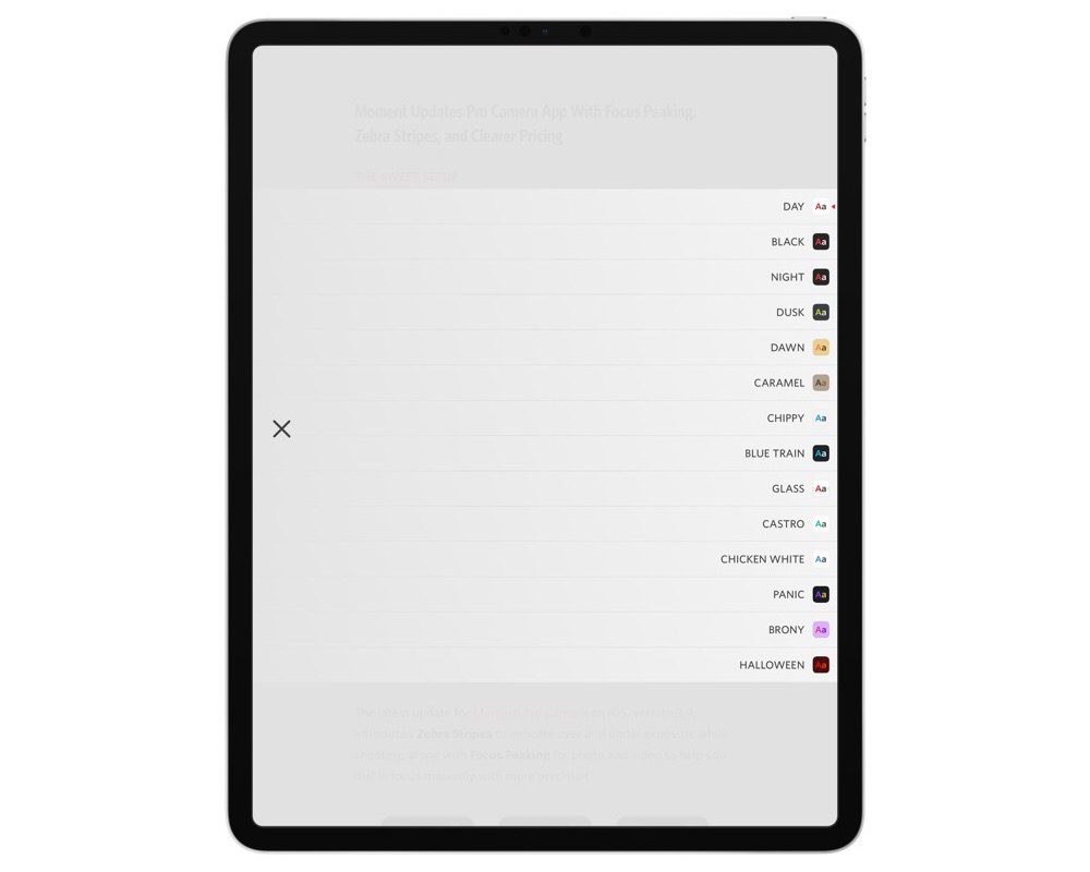
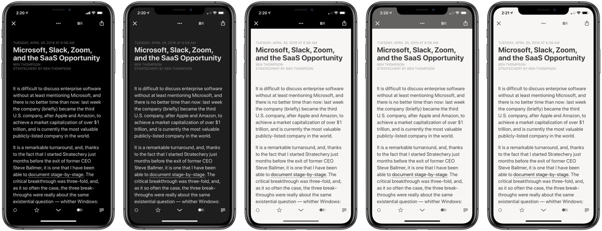
Unread has a plethora of themes if you don’t like the elegant, magazine-like “Day” theme. When you upgrade to the full-featured Unread app, you gain access to the full library of all 13 themes. I particularly love “Chippy”, and the “Night” theme erases the line of where your iPhone X display ends and where the glass curve begins. No matter where you find yourself wanting to read your RSS feeds, Unread has a theme that fits.
Unread’s Gestures
In order to avoid surrounding the interface with buttons, Unread relies on a number of gestures. Swiping left to right follows the now conventional action of returning you to your previous screen, but swiping right to left calls up a number of possible new actions, which are different based on the context.
In the list view, swiping right to left gives you options such as refreshing the feed or marking everything in the feed as read. Swiping right to left in the article view gives you options such as marking the item as read, viewing it on the web, or sharing it to one of any number of services. In the web view, you can also swipe to call up the option for sharing or using the Readability view, and since some webpages have unswipeable mobile webviews, Unread gives you two little swipeable areas at the bottom of the screen.
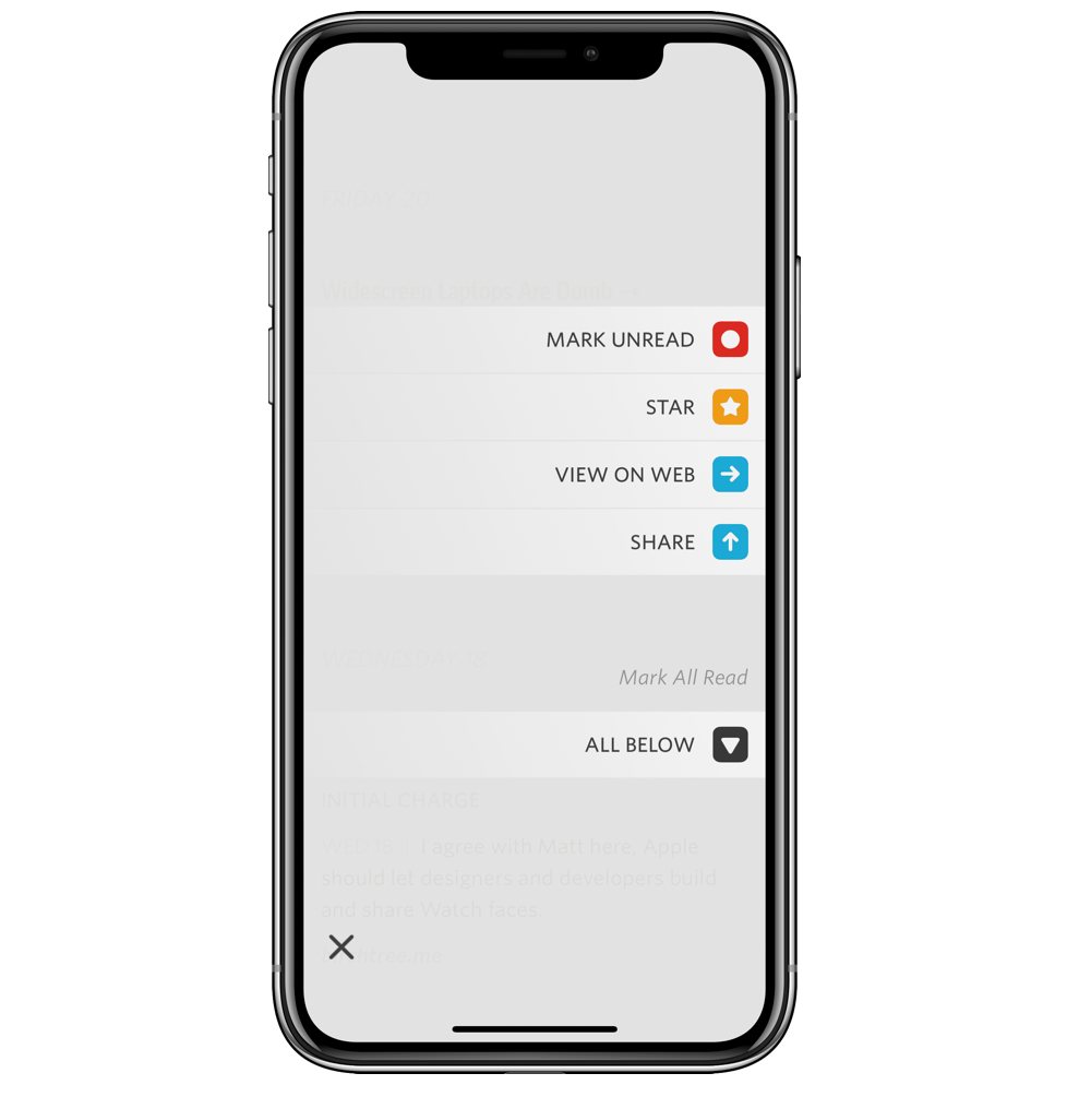
You also have the ability to call up certain actions with long taps. Long tapping an item in the list view brings up options to save it, share it, or mark it as read. Long tapping a link in an article brings up options to share it to the services you’ve enabled. Long tapping an image in an article gives you the option to view in fullscreen, share the image, save to camera roll, or copy the image URL. My favorite part of long tapping in Unread on iPhone is the haptic feedback you receive — you receive a subtle vibration as you jump into any one of Unread’s contextual screens. It’s a great design feature utilized across many apps today, and we love how Unread has utilized it.
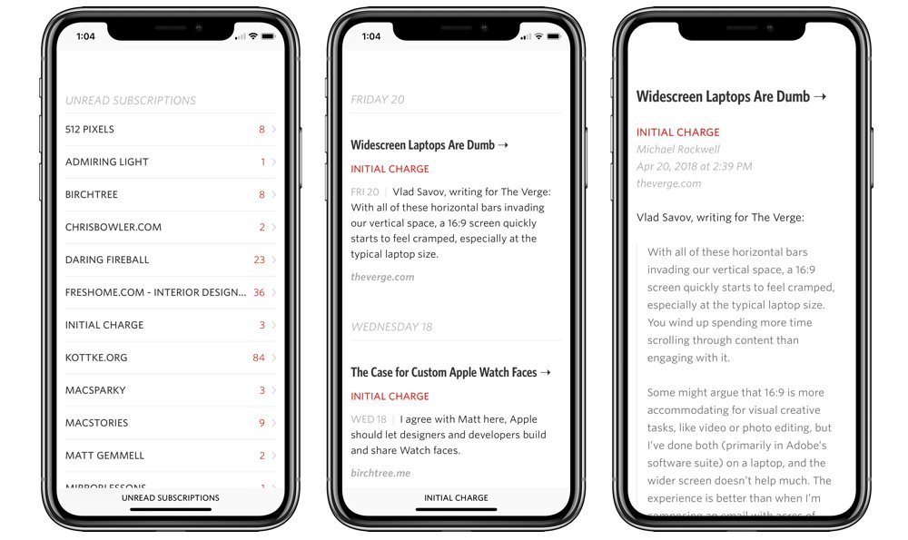
Relying on gestures might present a greater learning curve for inexperienced users, but the advantage is that you’re never shown a button when you don’t need it. Keeping the buttons out of sight also forces you to be slightly more intentional about using them. In Reeder, the ease with which I could send items to my Instapaper queue (simply by swiping or starring an item) resulted in an Instapaper queue of things I didn’t really want to read. By slow me down a bit, Unread helps me consider the real value of each item, and since it’s almost as nice to read as Instapaper, I only send items that way if I don’t have time to read them now.
What Unread Lacks
Perhaps the biggest feature missing from Unread is the ability to manage your feeds. In short, you can’t subscribe or unsubscribe from any feeds within the app.
This means users will need to visit their RSS service of choice on the web to add or change subscription information. While this is not a deal-breaker, it can be annoying on an iPad.
I also quibble with the text size in the app. Unread does not give you the option of changing the font, but you can change the size of the text in any of the different views. The settings screen gives options from “Epic” all the way down to “Tiny,” which seems like plenty of options. And yet, they all feel a little too big to me. “Tiny” feels downright medium-sized. I love the way the retina screen displays tiny text, so I want truly tiny. But maybe that’s just me.
Unread does support full-text RSS (where the service downloads a truncated RSS feed and presents it in a full text-only format in the app), but the text extraction can’t be managed on a category or per feed basis like Fiery Feeds or lire. Tagging, saved searches, and many of Inoreader’s great filtering options also aren’t supported in Unread. Processing and discovering great content for reading is still done in a more efficient manner in apps like Reeder and Fiery Feeds. For power users who want the latest RSS service features available, Unread likely won’t make the cut.
Unread is free with an in-app purchase of $9.99 that unlocks the full potential. For anyone who purchased the previous version of Unread, you can unlock the new version for free.
The Standard: Reeder
The app that set the standard on the iPad was Silvio Rizzi’s Reeder, which was one of the original RSS apps for iPhone and which debuted on the iPad in 2010. It was incredibly fast at the time, and with its trademark, slightly textured off-white paper-themed design, it made RSS feel like the rough-cut pages of an old hardback book. Many had enjoyed NetNewsWire on the Mac, and while there was a NetNewsWire app for iPad, Reeder was arguably the first iOS app to make RSS feeds beautiful.
Reeder’s Design
The design of Reeder has changed a bit over the years. The developer completely rewrote the app after the demise of Google Reader in the summer of 2013 and brought it in line with iOS 7 conventions. Then, after 5 years of nearly no major changes, Reeder 4 debuted with largely the same design, but new animations, a new code-base, and a range of reading customization features. The result is an app that doubles down on what made Reeder the de facto RSS app in the past and adds some of the personality lost in the 2013 update.
Among the features gained over the years are the ability to add RSS subscriptions and reorganize subscriptions from within the app. Gone are the speckled paper fiber textures. Instead, you can choose one of a few fairly neutral themes.
Despite the long timeframes between Reeder’s updates, Reeder has been quick to adopt support for the latest RSS service providers (Feed Wrangler support, for instance, was added pretty quickly when the service debuted) and Reeder has always received updates for new iPhone or iPad screens. The latest true black theme for the iPhone X, for instance, was introduced shortly after the iPhone X launched.
The Power of Gestures
One of the standout features of the app is what you can do with a swipe. From the main reading view, if you swipe from right to left, Reeder will immediately load the webpage in a browser. Swipe left to right and you return to the RSS version. It’s one of the most fluid transitions between RSS and web that I’ve seen on any app.
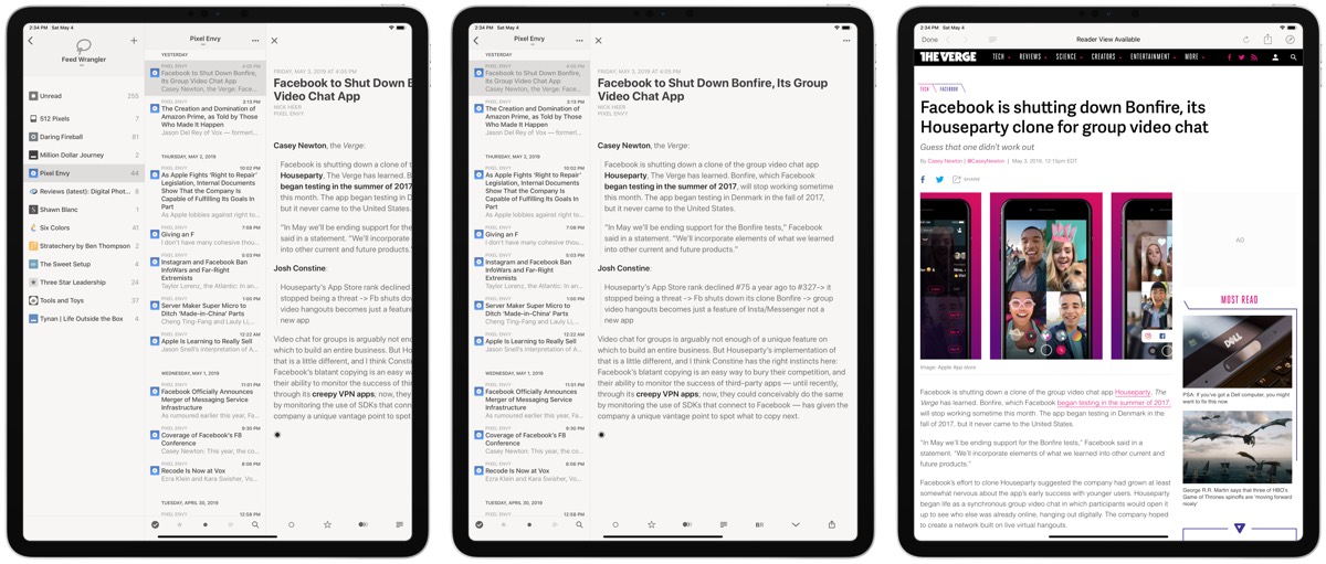
The swipe also has special powers in the list view. While scrolling through the list of items in your feed, you can swipe across an item to take action on it, and the actions you take are user-configurable. Sliding right or sliding left across an item can be configured to either mark the item as read, mark it as starred, or send it to a number of different services, (Instapaper, Pocket, Reading List, etc.). You can also take these actions upon the item itself from the article view, but doing so through the list view speeds up the process dramatically.
Reeder’s use of gestures is particularly great, but we feel the use of gestures is better handled in Unread. When Unread was originally developed, then-owner Jared Sinclair discussed how he wanted an RSS app for the iPhone that could be used top-to-bottom with one hand, as he often had to nurse a baby at night and wanted to catch up on news at that time of the day. As a result, Unread’s use of gestures mostly outclasses Reeder’s gestures, especially on the iPhone.
Reeder’s List View
Reeder’s list view is fairly standard for RSS apps on the iPhone — your feeds are listed in chronological order with dates, times, and a truncated preview line for quick perusing before tapping and reading the article. Reeder’s list view on the iPhone is tighter and more abbreviated than an app like Fiery Feeds (Fiery Feeds provides 3 lines of the article in the list view for previewing) and much more abbreviated than Unread, which has a clever hack to provide complete sentences in the list view for your previewing needs. On the iPhone, there isn’t much separating Reeder’s list view from other options, but its default previews make it more directed at those looking to quickly process feeds.
The latest Reeder update includes image previews right within the article list view, providing another option for perusing your articles. You can change the size of the image thumbnail, which thereby changes their position to below or to the right of the preview text in the list view. With the largest image thumbnails, there’s a little more content to separate each article in the list view.
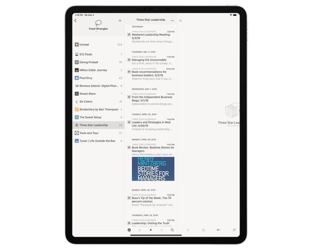
That said, I’m not a fan of how Reeder presents the list view in portrait mode on the iPad (my preferred reading orientation). All you get in the list pane is the feed’s icon, the title of the article, a truncated opening sentence, an image preview, and the date and time of publication. As nice as it is to act on these items with speed, it’s hardly possible to make that determination with so little to go on. With the iPad’s larger screen, I’d prefer to have more information provided in the list view to make a better determination of whether an article is worth reading.
The list view is confined to such a small space that none of the individual items have room to breathe, and if you select one of those items while remaining in the list view, the item itself gets cut off on the right hand side, which just feels cluttered. Ultimately, the only space in which I enjoy using Reeder on the iPad is the article view, which feels confining and seems like a wasted opportunity on the iPad.
Reeder’s New Layout Options
Reeder 4 debuted with a range of new layout options, specifically explorable on the iPad. Where Reeder effectively defined how to use lists to consume your RSS feeds over the years, Reeder 4 tweaks how it displays those lists and gives you options to customize to your liking.
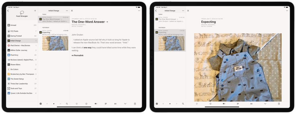
Reeder 4 provides five new layout options: single, compact, regular, full, and automatic.
The single layout option puts each list into its own view, encompassing the entire screen in the process. Prior versions of Reeder cramped a few of these lists into one view at once, but the new single option clears out all the crampedness and puts each list front and center. This layout feels a lot like Unread’s default view, to be honest.
The compact layout option puts your feeds and your selected feed’s article list side-by-side, and whisks the article view in separately when you tap on an article.
The regular layout option is the same layout we’ve come to know in Reeder: the article list is nestled on the left next to the article view on the right.
The full layout option is best used on a large iPad Pro and in landscape orientation — it puts all three lists side-by-side, providing a slightly more cramped article view but keeps the sliding in and out of lists and articles to a minimum. This full layout option acts the same as the regular layout option if the iPad is in portrait orientation.
Lastly, the automatic layout option feels like a combination of the regular and compact layouts, especially when the iPad is in portrait orientation.
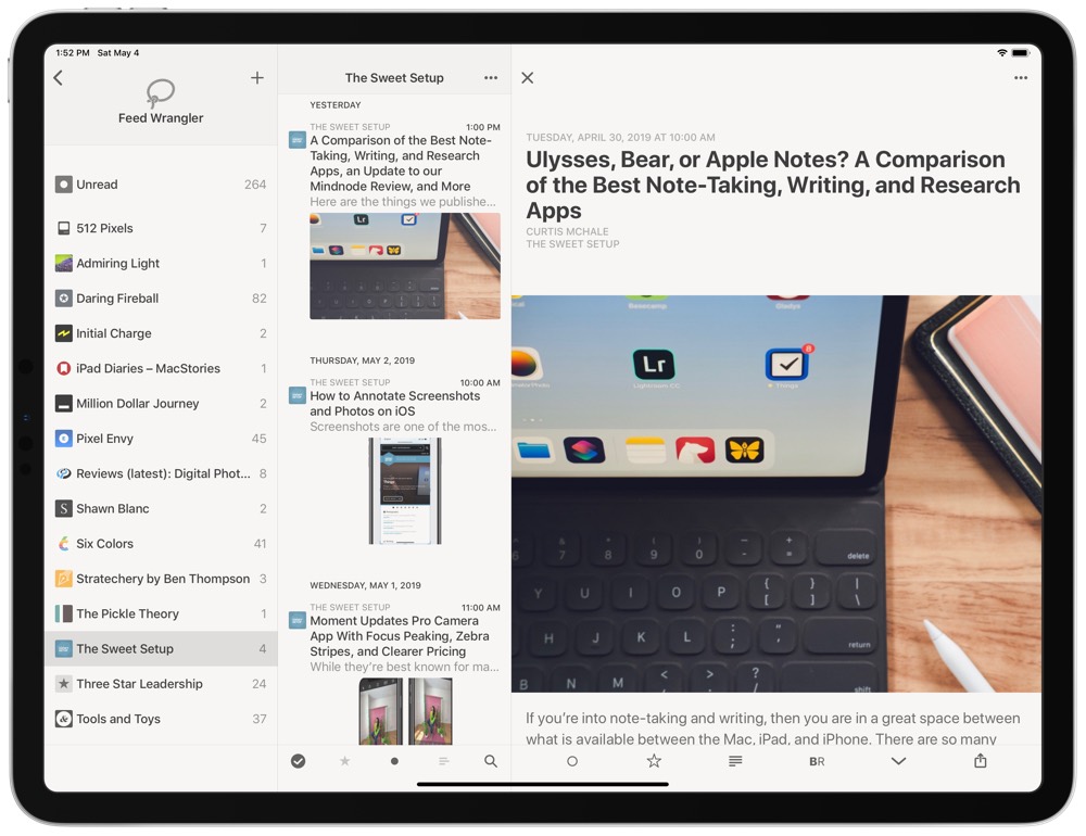
I tend to use the iPad Pro in landscape orientation, so the new full layout option is my layout of choice. This layout option allows you to navigate with both hands at the same time — you can scroll through your feeds on the left and quickly read through your article on the right, all without having to swipe left and right to return to prior menus.
Reeder’s Read Later Features
Reeder 4 debuted a built-in Read Later feature, allowing you to save articles within Reeder to read at a later time. Read Later allows you to save articles only within Reeder, however — the feature can’t be accessed outside the app, meaning you can’t treat Reeder’s Read Later feature like an Instapaper or Pocket queue.
Fortunately, Silvio Rizzi has already built-in direct support for the Instapaper read-it-later service right into the app, and an upcoming update is set to include full support for Pocket as well. These services, combined with Reeder’s own Read Later service, combine to ensure you can do all your reading — RSS, saved articles, and more — all within the same app.
Reeder’s Development Schedule
Aside from the sliding panes and somewhat cramped interface, the biggest area of concern we have for Reeder is its development schedule. Updates do come out to support the latest screen sizes and RSS service providers, but prior to the latest launch of Reeder 4, the last major update to Reeder for iPhone and iPad was version 3.0 all the way back in 2012. The latest update instills some confidence that the app will continue to be developed into the future, and the change over to a more consistent code-base between macOS and iOS hints at an easier rollout of consistent features in the future. We’ll have to keep our eyes peeled to this space over the coming years, but you could say this latest update to Reeder 4 was a long time coming.
While the development schedule has improved with the launch of Reeder 4, Reeder still feels like its falling behind the competition in its support for major RSS service features. Reeder continues to support the most major features of the most major RSS service providers — and does so with rock solid performance — but the app hasn’t been updated to take advantage of many of the latest RSS features from providers like Inoreader and Feedly, such as smart lists, tagging, and automation features. For power users, Reeder’s slow development schedule may not meet their needs.
Overall, I think Reeder is a great RSS app with all the basics you need, but it doesn’t stand out in any category, except perhaps the speed with which you can process your feeds. You can pick up Reeder 4 for iPhone and iPad for $4.99 on the App Store.
The Power RSS App: Fiery Feeds
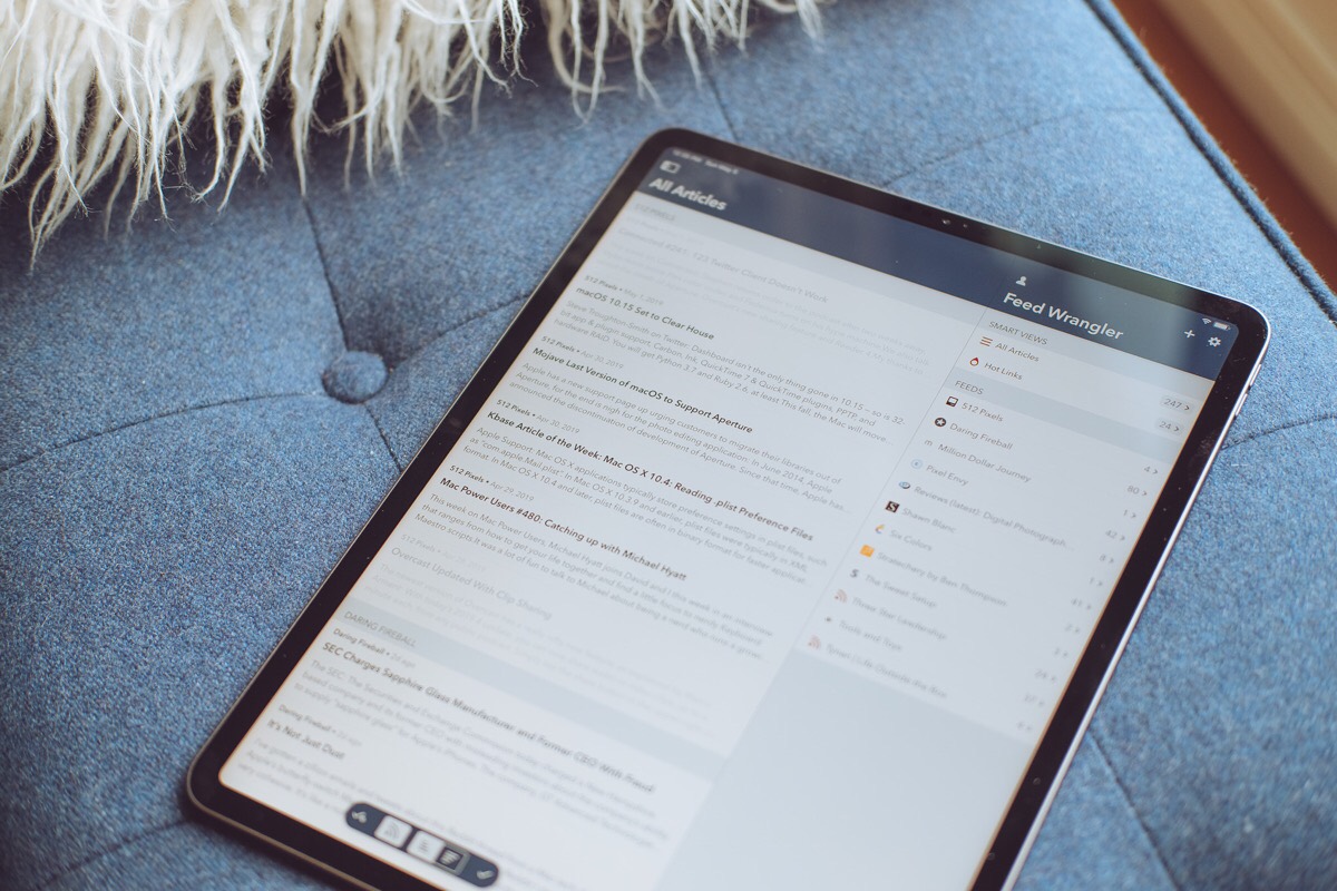
Fiery Feeds is a the heaviest hitting player on the RSS block that provides many of the latest features from RSS providers in a fast, well-designed app. Fiery Feeds has been used by power users for years thanks to its custom functionality to share articles with other apps. With the launch of Fiery Feeds 2, developer Lukas Burgstaller modernized the app to feel more at home on iOS 11, the iPhone X, and the iPad Pro, and also introduced a premium subscription service for users who want more from their RSS app.
Fiery Feeds is, first and foremost, a power user app, full of advanced and custom functionality for processing RSS feeds. A huge amount of the app’s functionality is available for free, but the premium subscription — which unlocks the custom URL actions that really set Fiery Feeds apart — will run you $9.99/year.
Fiery Feeds’ Design
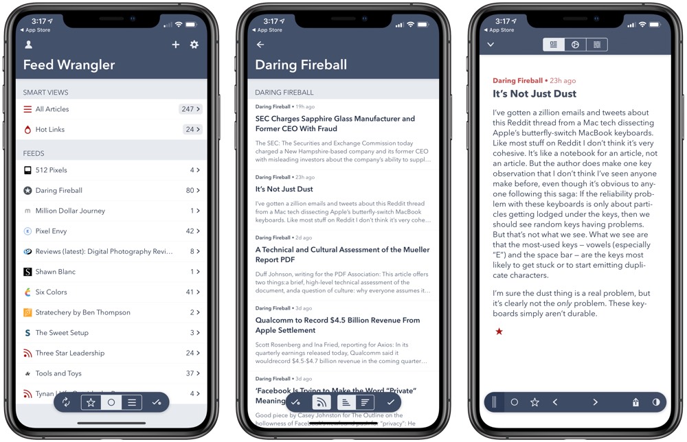
When Burgstaller updated the app to version 2.0 in early 2018, he introduced a range of new design features that brought the app into the world of iOS 11 without fully letting go of the prior design. The new design doesn’t fit iOS 11’s now prevalent design ethos, but Fiery Feeds doesn’t look out of place, either. Overall, it’s a nice design.
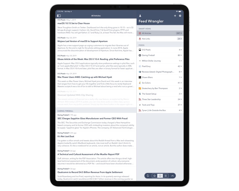
When I first discovered Fiery Feeds, I was surprised to find the main list view and navigational menus on the right side of the iPad screen. It completely caught me off guard and felt a bit odd, until I realized that I hold the iPad with my right hand most of the time and having the menu on the right side allowed for easier navigation through the app. Now, I actually prefer having the menu on the right side. However, you can always move the menu over to the left side if you want.
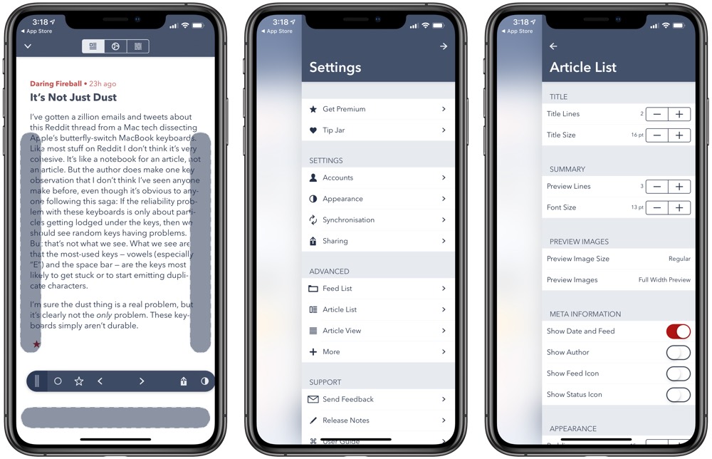
There are a multitude of buttons in Fiery Feeds, potentially introducing an overwhelming first impression. In the world of RSS, one button tap could result in an entire feed being marked read (or worse), so I am very hesitant to tap random buttons in an RSS app. If Unread’s sparse interface marks one end of the button spectrum, Fiery Feeds’ UI and button layout is sure to mark the other end of the spectrum.
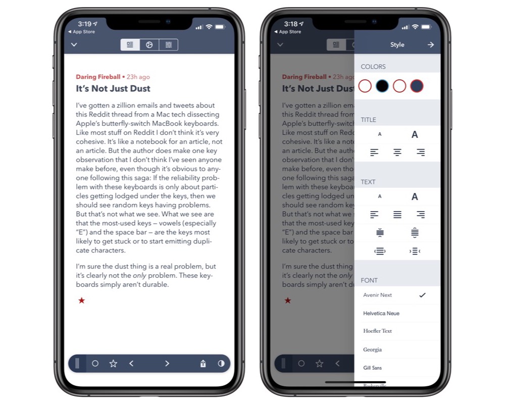
Fiery Feeds, by default, loads up Avenir Next as the font selection. Of course, you can change this to suit your preferences, but it conjures up a little nostalgia from the days of iOS 7 and earlier when Avenir Next took the world by storm. Avenir Next looks great, but I prefer Unread’s default Whitney typeface.
Using Fiery Feeds
Tapping on a feed in the right (or left) menu on iPad brings you to the article list view, which has the title bolded and a few lines of previewed text from the article. This view is far less cramped than in Reeder for iPhone and iPad, but there are also less articles immediately shown for your perusal. For power users, little details like this could matter.
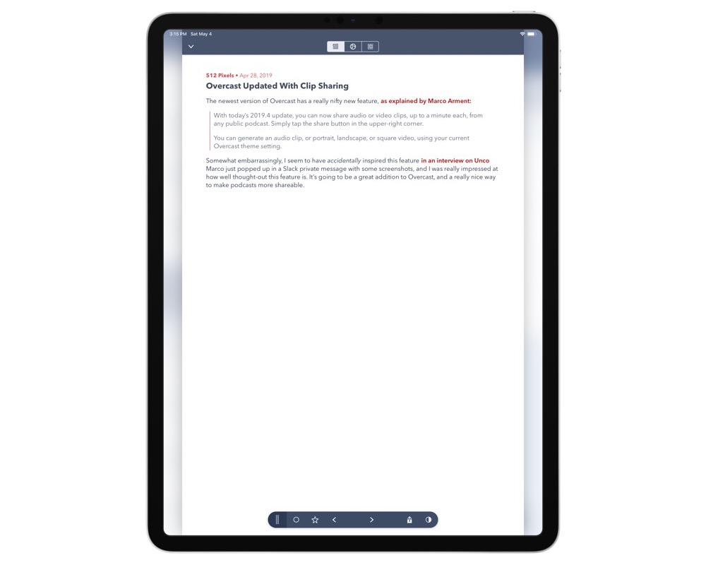
The only major design hiccup I’ve noticed is when you tap on an article in the list view. On both iPhone and iPad, instead of sliding the screen to the side to show you the article’s content (like Reeder), the article view slides up from the bottom of the screen in a somewhat lengthy animation. This animation — and the fact the article view takes up the entire screen by default — makes quickly skimming articles less efficient and substantially slower than other apps like Reeder.
Fiery Feeds has been updated to support the latest iPad Pros and the larger iPad Pro 12.9-inch display. Like Reeder 4, the latest Fiery Feeds update added a three-pane view which keeps your feeds, article list, and article all visible on the same screen — ideal for landscape 12.9-inch iPad Pros. This three-pane view stays put if you want to read in portrait as well — the article on the far right ends up looking somewhat narrow, but many people enjoy reading in this manner.
An increasingly popular feature amongst RSS apps is the ability to create your own RSS account that syncs via iCloud — the idea being, if you have simple RSS needs, you can use a free account right within either Reeder or Fiery Feeds and skip out on an annual subscription of one of the more powerful RSS services. Fiery Feeds 2.2 introduces this feature — you can create your own Fiery Feeds RSS account, which syncs across iCloud to Fiery Feeds on your other devices. The number of feeds you can subscribe to on the free tier is limited to 10 feeds, but you can subscribe to an unlimited number of feeds via the Fiery Feeds Premium subscription.
You can also create a Fiery Feeds Read Later account (almost identical to the Reeder Read Later account mentioned above) that syncs via iCloud.
The Fiery Feeds Subscription
I think the biggest point of contention — both positively and negatively, depending on your viewpoints — for Fiery Feeds 2.0 is the subscription revenue platform. Fiery Feeds as a free app offers great functionality, which keeps it in line with the feature set of Reeder and Unread, but Fiery Feeds Premium brings the “power” in “power RSS client.”
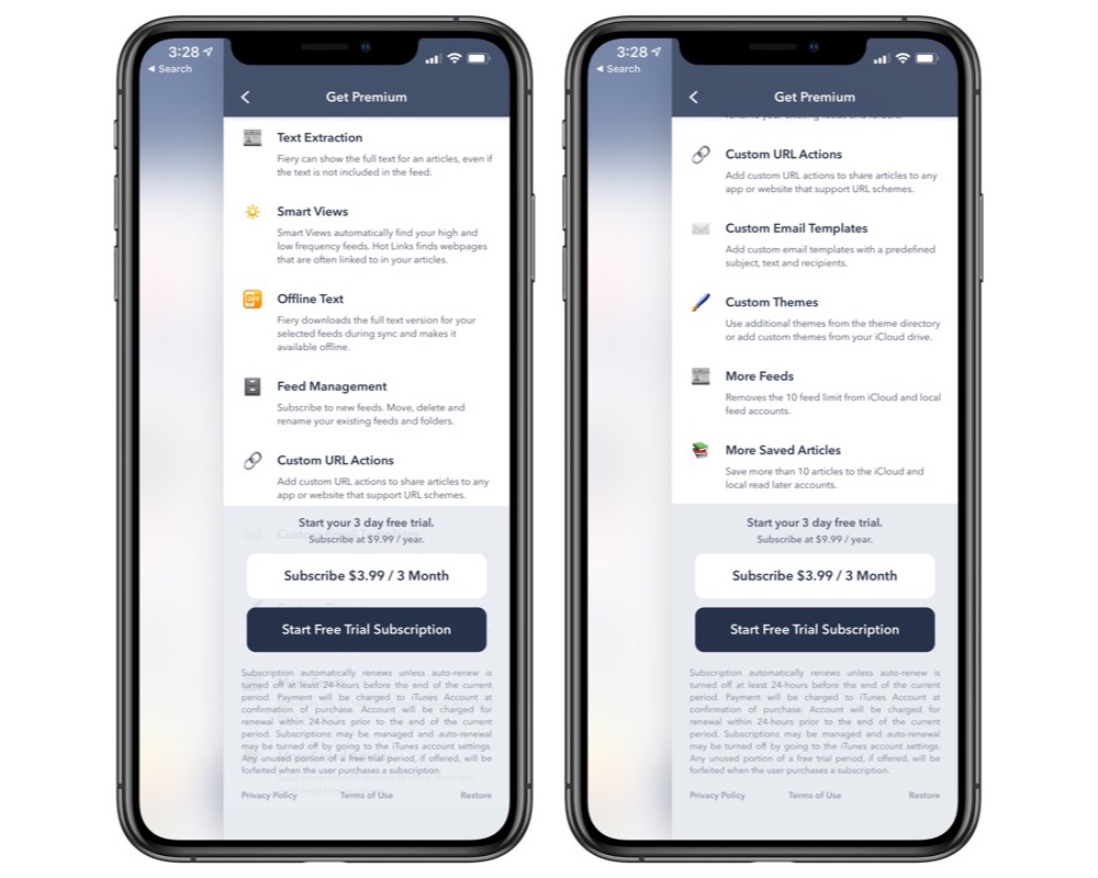
A Fiery Feeds Premium subscription unlocks a range of custom functionality, from URL actions to feed management to design management. Fiery Feeds Premium subscribers can create custom themes for the app’s design and change the app’s home screen icon. Fortunately, custom themes and font changes — like being able to change your font, font size, margins, line height, etc. — are all still part of the free Fiery Feeds app, ensuring you can change the app’s reading experience if you don’t like the default theme.
For the increasing number of RSS feeds today that truncate the content in the feed to encourage actual website visits, Fiery Feeds Premium includes text extraction for fully downloading the text of an article from the website and then presenting it in the app for easier reading. Fiery Feeds Premium also stores the downloaded text for offline reading — perfect for long flights or extended periods where you’re out of range of a cellular signal. There have been some reports of full-text extraction hitting some hiccups every now and then, so while the experience of this feature may not be as smooth as, say, lire’s full-text extraction, it’s still quite the handy tool.
A Fiery Feeds Premium subscription removes any limitations when you use a Fiery Feeds iCloud account for syncing your RSS Feeds, plus the Premium subscription removes a limit for saving articles in Fiery Feeds’s Read Later service.
To me, the most important functionality brought on with Fiery Feeds Premium are its Smart Views and custom actions. Smart Views automatically scans all your feeds to sort and separate your content based on publishing frequency. We all have RSS subscriptions that publish 5 to 10 articles a day and others who publish once a month. Smart Views scans each feed’s publishing schedule and separates your feeds into a “High Frequency” and a “Low Frequency” category, ensuring you never miss the rare article that hits your favorite blog.
Smart Views also scans your feeds and introduces “Hot Links,” which are webpages that are linked to more often by the publishers in your feed. If a range of publishers are talking about the latest Sweet Setup app review, for instance, that app review would show up as a “Hot Link” in Fiery Feeds Premium’s Smart Views. “Hot Links” and publishing frequency sorting are two great premium features that will help RSS power users find the content they’re looking for.
Lastly, Fiery Feeds Premium unlocks custom action functionality. Using the app’s sharing functionality — or Fiery Feeds’ Quick Share feature, which can configured in the app’s settings — you can process your RSS feeds using Fiery Feeds’ URL scheme. If you know how URL schemes work, you can create custom URL actions to share your articles to any app that supports a URL scheme — such as Things, Drafts, Ulysses, or Bear. If you’re a blogger, custom URL action functionality can make short work of sharing articles you discover in your RSS feed to your blog, or you can create custom email templates for sharing great articles with your friends or colleagues. Custom URL functionality, along with Smart Views, is at the heart of Fiery Feeds Premium and makes the app a worthy app for any RSS power user.
The inclusion of a premium subscription service does make Fiery Feeds the most expensive option on this list, however. At $9.99/year, Fiery Feeds Premium isn’t going to break the bank and helps to ensure long-time development on the app. However, other one-time purchases for apps like Unread, Reeder, and lire will end up being less expensive in the long run. If you’re an RSS power user and know you can save time (and money) with Smart Views and custom URL functionality, the $9.99/year subscription fee will be an afterthought.
The Rest of Fiery Feeds’ Exhaustive Feature List
The Fiery Feeds power user mentality ensures it has a wide range of features, especially at the Fiery Feeds Premium level:
- Fiery Feeds supports a multitude of RSS services, like Feedly, Feedbin, Feed Wrangler, Fever, Feedja, InoReader, NewsBlur, Bazqux, The Old Reader, FeedHQ, and Tiny Tiny RSS. Instapaper and Pocket support are also included for full two-way sync (read your Instapaper queue inside Fiery Feeds, for instance).
- Fiery Feeds supports feed management at the Premium level.
- Fiery Feeds has a range of external keyboard shortcuts for external keyboard or Smart Keyboard users.
- Quick Actions and the Today Widget make for quick processing inside or outside the app.
- Fiery Feeds supports multiple article view modes, such as article, web, and text view. In text view, Fiery Feeds loads the article’s text from the web, skipping over any truncated feeds.
As a whole, we believe Fiery Feeds is a phenomenal RSS app of choice if you are an RSS power user. If you have a large feed list and need to process those feeds or share articles quickly to other apps, Fiery Feeds’ subscription service quickly becomes a no-brainer. However, if you’re looking to simply read your feeds in a comfortable environment or process them by quickly skimming through a mid-sized list, either Unread or Reeder are likely to do the trick at less of a cost.
You can pick up Fiery Feeds for free on the App Store.
Another Great Contender: lire

If Unread is too sparse for you, Reeder too basic for you, and Fiery Feeds too powerful for you, our last major contender in the RSS app arena could very well have you covered. lire has been on the iOS App Store for a little while, but has recently gained a lot of favor and coverage thanks to it being named one of Federico Viticci’s must-have apps for 2017. For all intents and purposes, lire covers just about every base one could need in a great RSS app.
lire’s headline features are found in Fiery Feeds, but without the subscription cost. Its design is perfectly native to the new iOS 11 and iOS 12 design ethos. It supports all the major RSS service providers and a multitude of their latest RSS features. It has great iOS feature support, like drag and drop, and it even uses a few clever hacks to provide full-text RSS to get around truncated feeds.
lire and iOS
In many ways, lire feels the most at home in iOS 12 of any app in this guide. lire uses bold titles and different typography weightings to denote where you are in the app, much like Apple News, Messages.app, or Mail.app. It uses little bits of haptic feedback when you pull to refresh and the in-house sound effects give the app character other RSS apps don’t have.
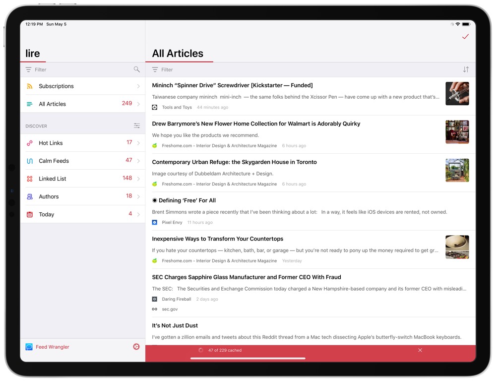
lire adheres to iOS 12’s design parameters almost to detriment, however. The app feels a little rudimentary and simple and doesn’t have the same fit and finish as apps like Unread or Reeder. As a whole, lire looks the part in iOS 12 but isn’t as clean as some may expect.
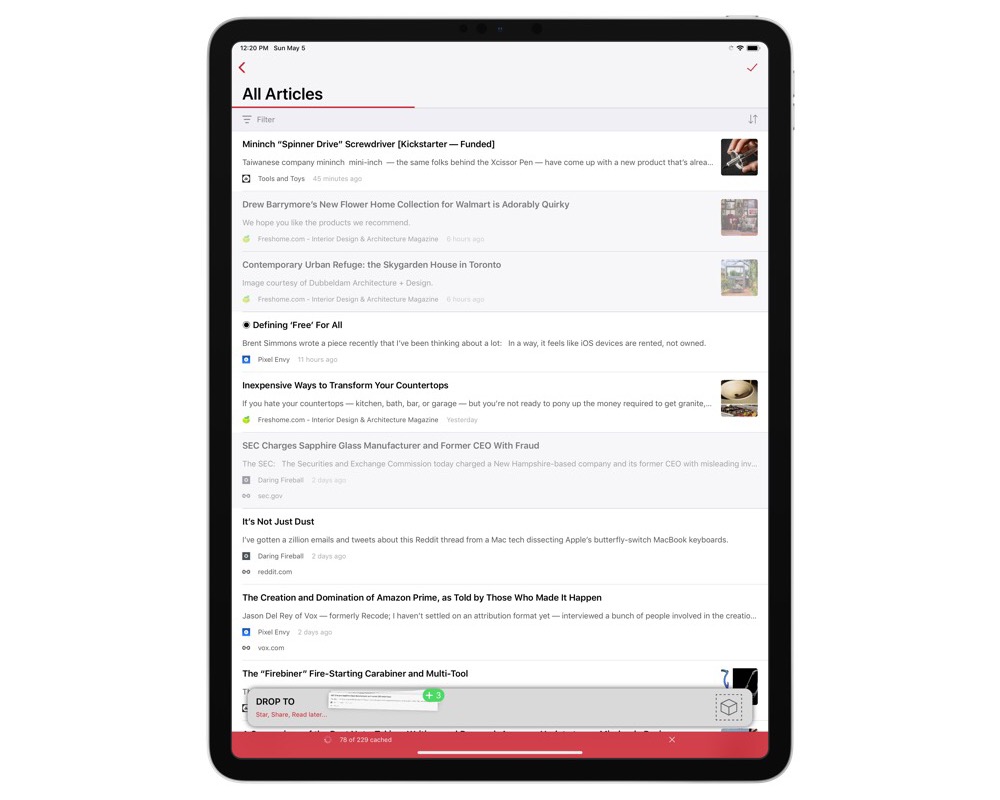
Beyond design though, lire utilizes the latest iOS 12 features in new and clever ways. This is most evident in lire’s adoption of drag and drop on iPad and iPhone. On the iPad, drag and drop works as it does across all of iOS — tap and slightly hold on an article or link and drag the content into a different app.
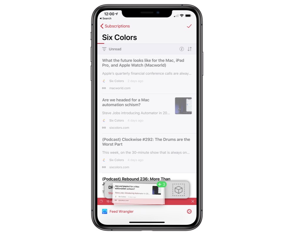
On iPhone, drag and drop works a lot like the neat implementation found in apps like Bear: tap and hold (but don’t tap too hard, otherwise you’ll get a 3D Touch peek at the article) and drag the article down to the floating article bar at the bottom of the screen. Drag as many articles as you’d like into the floating bar and then either star, share, or send the dropped articles to your read-it-later service of choice. lire’s implementation of drag and drop on both iPhone and iPad is the best we’ve found in the RSS app category.
Full-Text Extraction
Much like Fiery Feeds, lire has a full-text extraction feature that takes the text from the web and loads it in the article view to get around truncated feeds. Best of all, this feature can be applied on a per-feed basis — if you want to always load a feed like The New York Times in a full-text mode, lire will always do so. You can then set other sites to load the regular article view to speed up the reading process.
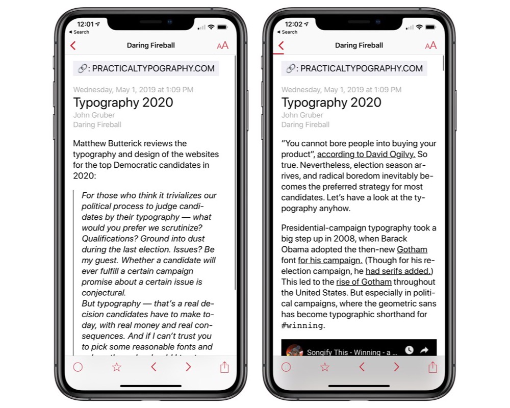
This feature can be difficult to understand, mind you. lire extracts the full text from the linked content in your RSS feed (for instance, a link blog like Daring Fireball) rather than the original content. As a result, if you load a linked post in full-text mode, you’ll get the linked content in your article view and not the original content from the linking site. There are handy buttons at the top of the article view to flip back and forth between the linked content and the original content, but there is some headspace required to understand how full-text extraction really works.
In addition to full-text extraction, lire also has the ability to complete a full-text search of your RSS feeds. So, if you’re looking to find articles with the word “HomePod,” a quick tap of the search icon and lire will find all articles in your feeds with “HomePod.”
Lire’s Discovery Features and Latest Updates
If there is one RSS client out of our list of favorites that continues to see an ever-increasing feature set, it’s lire. lire 3.1, for example, introduced a range of speed improvements, but most notably introduced new discovery features.
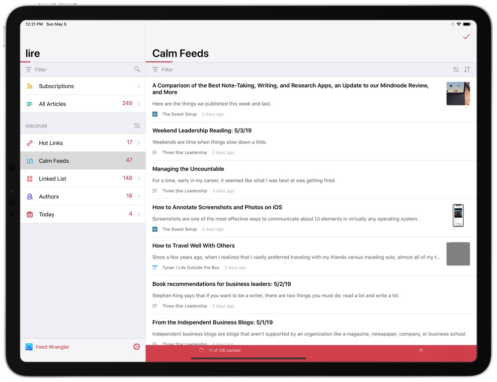
Off the top, it appears lire 3.1 took much inspiration from Fiery Feeds’s premium Smart Views features. lire 3.1 included:
- Hot Links: Shows web-pages that get linked to from multiple articles.
- Calm Feeds: Show articles from feeds with a low publishing frequency.
- Linked List: Shows articles that are determined to be linked-list style articles.
- Authors (introduced in lire 3.2): Shows articles from specific authors. The list of authors can get quite long, so it’s recommended to pin your favorite authors to the top of this discovery list.
- Today (introduced in lire 3.3): Shows articles published today only.
For users with loads of RSS feeds, or for users who are looking to stay on top of their favorite — but least often published — feeds, lire 3.1’s discovery features are sure to raise an eyebrow. We previously saw these features only in Fiery Feeds 2.0’s premium subscription, so it’s easy to say that lire provides great value for these types of discovery features with its one-time purchase option.
lire 3.2 continued this development train and introduced Siri Shortcuts to the RSS app. lire’s Siri Shortcuts can be managed inside Siri settings and allow you to ask Siri to sync lire, filter your lists for unread and starred articles, or jump directly to your entire article list.
And lire 3.3 introduced a multitude of enhancements and fixes, ensuring the app is as stable as can be on the latest version of iOS.
We’re very impressed with lire’s development and update schedule. Its feature list is also pretty exhaustive, sporting many of the same features as Fiery Feeds, but all for one upfront purchase.
You can grab lire for $6.99 on the App Store.
Other Apps in the Category
There are a wide range of other RSS apps we tried out for this review, some of which have a slightly different take on the layout of RSS feeds.
The Early Edition ($2.99) reimagines the RSS feed in a newspaper layout, which is fun to look at, but not especially easy to read. You can’t scroll from one item to the next without going back to the main newspaper. Plus, it hasn’t been updated in forever, so it appears to be abandoned permanently.
Newsify and Ziner (each free with $3 in-app purchase to turn off ads) use a more magazine-styled layout. In Newsify, the layout is a bit more jumbled, but you can scroll top to bottom and see everything. Ziner uses larger images and has you scroll horizontally between those pages. Of the two, I prefer Ziner’s less jumbled approach, but neither design really entices me to tap on anything. The design feels too haphazard and arbitrary. I prefer the choices of our favorite RSS apps to treat each item with equal respect.
Feedly, FeedWrangler, Inoreader, Digg, NewsBlur, and other first-party apps (free but each with their own paid subscriptions) all offer an RSS experience as thought out by each RSS service provider. Each have simple designs and make the most of the latest RSS features available in each service — like tagging, or custom filtering in Inoreader — but none of these apps have the fit and finish we’ve seen in apps like Unread, Reeder, or Fiery Feeds, and none of these apps have the pizazz of our favorite RSS clients either. The very best apps in the App Store offer a certain level of delight when in use and we think you will enjoy using any one of our three or four picks more than a first-party app.
Bonus! One more thing…
The Complete Guide to Managing Tasks in Things (Video)
If you struggle to keep up with all your tasks, we can show you some organization tips that may help you.
We put together a video that shows you everything you need to know about a task in Things:
- The difference between start dates and due dates and how to use them effectively.
- How to set up reminders so you never forget an important task again.
- How to use checklists for tasks that require more than one step.
- How to configure daily, weekly, monthly, or even annual repeating tasks.
- And more…
You don’t have to use any of these things in your tasks if you don’t want to. But knowing what they are and how they all work will help you be more organized, save time, and ensure you are using Things in the way that suits you best.

This video is something we have made available for free to our email subscriber community. You can get it right now. By joining the Sweet Setup community you’ll also get access to other guides, early previews to big new reviews and workflow articles we are working on, weekly roundups of our best content, and more.
Conclusion
The best RSS reader is the app that helps you take the best advantage of your RSS needs.
- Unread is designed for anyone who wants to take advantage of RSS to find and savor great writing.
- Reeder is designed for anyone who wants to quickly process their feeds, quickly share articles to a read-it-later service, and for those who want rock solid performance.
- Fiery Feeds (and Fiery Feeds Premium) is designed for the power user who wants to use custom URL actions to share articles to any app in iOS, or for users who want full-text extraction and a fully customizable app from top-to-bottom.
- For those who don’t feel any of the above three apps have the right fit, lire can jump in to plug all the holes.
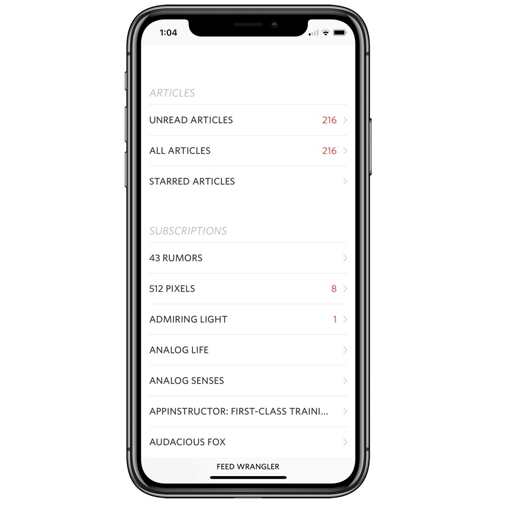
In the end, we think Unread is still the best RSS app for most RSS users, as it provides the best reading experience, the most satisfying RSS experience, and one of the best designs available for RSS readers today. We also really love Reeder thanks to its mainstay performance and quick processing workflows.
In his description for Unread, Jared Sinclair writes:
Let RSS be the place where great independent writing thrives. Choose your favorite writers and read them closely. If you’re also a writer, write as if you are writing directly to just such a reader, the way Kierkegaard always wrote for: “… that single individual whom I with joy and gratitude call my reader…”
It’s fitting that Sinclair ends this philosophy statement with a quote from Soren Kierkegaard. I often think of Kierkegaard when I think about the anxiety technology can produce — an anxiety brought on by the power to do so many different things that we’re never quite sure what to do at any given moment. Kierkegaard compared anxiety to dizziness: “the dizziness of freedom.”
Sometimes it feels like there’s too much, too many things to read, too many obligations, too many inboxes, and the endless stream of possibilities makes us dizzy. An app like Unread can help us slow down, stop the spinning, and focus on what’s here, now, on this screen, ready for us to read.

