The best flight tracker app for iPhone
App in the Air
Having a flight tracker app in your digital tool belt can save you from headaches and stress while traveling. Pilots, passengers, and pick-up people alike all stand to benefit from up-to-date, accurate flight information. After weeks of digitally following planes around the world, our favorite flight tracker app is App in the Air.
Do I really need one?
Some travelers may be okay with downloading an app for whichever airline they’re flying with at the time. But, a flight tracker’s purpose is to eliminate a folder full of apps and give you one consistently great resource to the right information — no matter what airline you fly — and provide additional features that can save you time.
Whether you are launching it twice per year or using it every few days, we think that a flight tracker app gives you the best overall experience compared to sorting through a combination of email confirmations, poorly designed mobile websites, crummy apps, and flaky SMS updates.
Finding the right tool
Before we started tapping download buttons, it was important for us to decide what we were looking for in a flight tracker. The following became our criteria:
-
Design and User Experience: A great flight tracker app should allow you to add and glance at flights in a quick and easy manner. In certain cases, you may want information about weather, your destination, and the airport. So that’s why design is key for this type of app’s success. The user experience should be intuitive and fluid for inputting flight information, and the app’s design both in looks and functionality should reflect today’s modern OS and navigation paradigms.
-
Features: Timely notifications, an easy way to organize your flights, and options for detailed trip data are just a few factors we considered when picking our top app, but feature saturation can become a problem — especially if it requires you to customize each option. Finding an app that had the right balance was paramount. Secondarily, additives like weather, checklists, and points of interest were also considered in deliberation.
-
International: While it’s nice to have certain apps cater to your country, a great flight tracker should follow you around the world and help you in situations like when you are abroad at an airport to which you’ve never been.
Our top pick
App in the Air (while its name does make us groan a little bit) stands out in all the best ways compared to its competition. Its design, navigation, and notifications made it easy for us to choose as our top pick. We tested many options from the App Store, and other apps failed in their clunky or outdated user interface, lack of features, or unstable software.
While it wasn’t a deal breaker when choosing one, App in the Air also features an Apple Watch app that adds another level of convenience and can come in handy if you are lugging multiple bags and suitcases through a crowded airport.
Interface
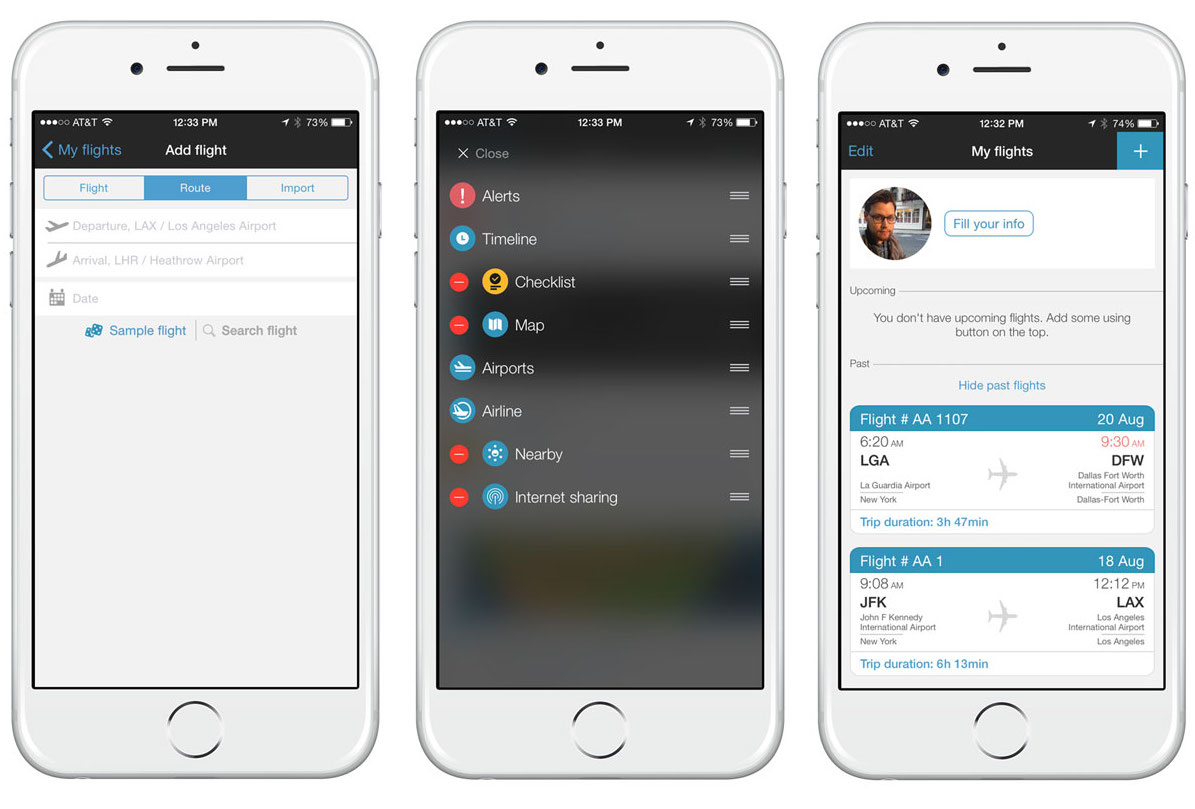
One of App in the Air’s strengths is its simple user interface. The “My flights” section shows you past, upcoming, and current flights and provides a plus button on the upper right corner for searching and adding new flights to that list.
If you tap on your profile photo in the “My flights” pane, you are taken to a screen that details how many miles and hours you’ve flown, badges that indicate different milestones that you can share to social media, and the settings menu.
But we wager you will be spending most of your time in the flight details page.
It’s all in the details
When you choose a particular flight to track, App in the Air has a beautifully designed section that provides you with a lot of data about your flight presented in a neat, organized way. This information is separated and listed in a cards-like interface somewhat resembling Google Now. These cards are customizable in their order and some of them can be hidden.
Alerts
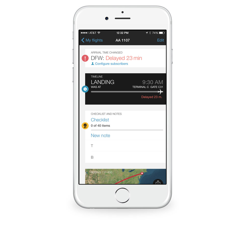
By default, Alerts is the first card you see when you tap on a flight in your list. It shows you the most recent alert, and you are given more options and information on past alerts when you tap into that card.
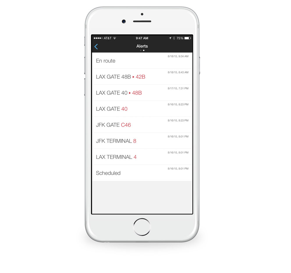
You also have the option to add subscribers to your alerts. Subscribers are given updates via SMS at the same time you receive them from the app. This works great if you want to keep your friends, family, or pick-up person updated on your flight status, or even to add a co-worker’s number you’re traveling with who doesn’t have the app. App in the Air knows that your subscribers may vary, so the app allows you to put subscribers into groups that narrow down the type of notifications a person receives.
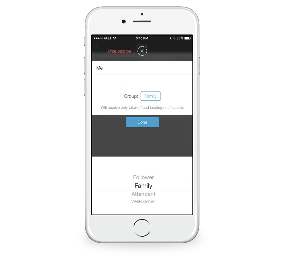
Once in the Alerts card, you can see past alerts. This can be helpful, especially if more than one comes in during a short period of time. These alerts can be anything from terminal and gate changes to letting one of your subscribers know that your flight will be landing early.
Timely alerts are key to a flight tracker’s success, and after testing App in the Air with multiple flights from around the world, its data and time stamps were accurate.
Editor’s note: The pricing for App in the Air changes frequently. For the most up-to-date pricing information, go to the Subscription Plans screen in the app.
Alerts can be viewed in-app at any time, but push notifications and SMS subscribers will come at a cost. There are three tiers of in-app purchases. It costs $4.99 for five flights, $9.99 for 12 months of alerts, and $29.99 for lifetime (or until the app no longer exists), which includes “Gifts & Surprises.” We think it’s tough to justify the lifetime pricing, but the first two tiers are very reasonable for what it provides.
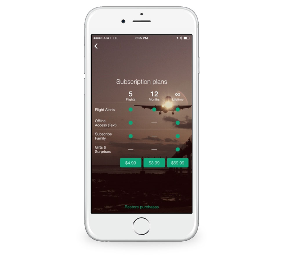
The 5-flight tier is for the traveler who doesn’t fly that often. The five flights that you are receiving push notifications for can be used at any time, so if you only fly once or twice a year, it’s worth it. The 12-month tier is for the frequent flyer, and with 12 months of unlimited flight tracking and app notifications, we feel that the price is more than fair.
Other apps that we tested did offer push notifications for free or included with the app’s price, but we found that none of them were as accurate and specific as App in the Air’s notifications.
Timeline
The Timeline card gives you a quick look at what your next steps will be to get to your destination. It displays time until check-in, boarding, take off, and landing and will adjust accordingly with any delays. After a particular task, (like boarding) is completed, it will mark the time that it was closed.
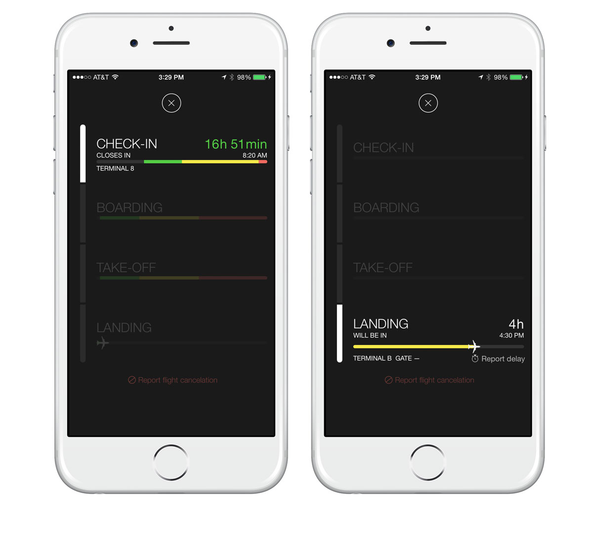
While in the air, a colored bar with a plane icon displays your progress with time left in the flight.
Checklist and Notes
The Checklist and Notes card does exactly what the title infers. One nice feature about notes is that you can attach a photo or document from iCloud Drive. This is nice for travelers who like to keep a scanned copy of their passport and other photo ID when out of the country just in case they misplace their physical copy. In a future update, it would be nice to have more options for importing, like Dropbox, Google Drive, or OneDrive. It was also strange to us that you couldn’t delete a note.
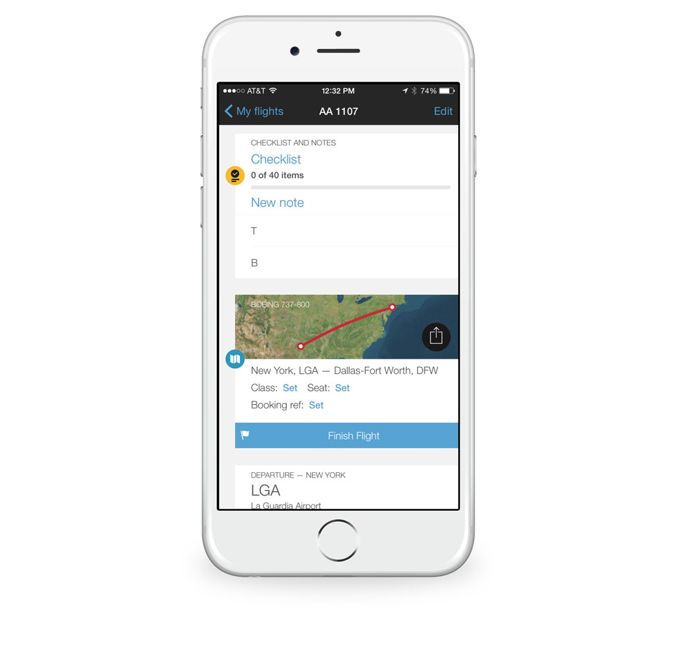
The Checklist and Notes card can be hidden if you’d rather use something else.
Map
The Map card is another section that can be hidden. It shows a current visual representation of where your flight is in-air and also gives you the ability to set your class, seat, and booking reference numbers.
Before, during, and after the flight, you can share via the Map card through social media about your trip. App in the Air creates a custom Instagram photo for you with how many miles and hours you’ve flown, what type of plane you were on, and your departure and arrival cities. The social aspect of the app isn’t front and center, which is something we like because not everyone wants their friends, family, and strangers to know where they are. For the millennials, though, it’s good to have.
Airports
The Airports card may look minimal at first, but once you tap into certain sections, there’s a wealth of knowledge and tips for you.
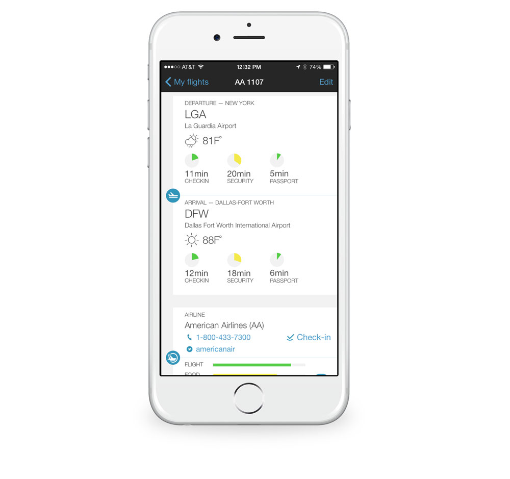
Without digging through any menus, the Airports card shows both departing and arrival airports, the current temperature at each location, and the average check-in, security, and passport waiting times reported by other users.
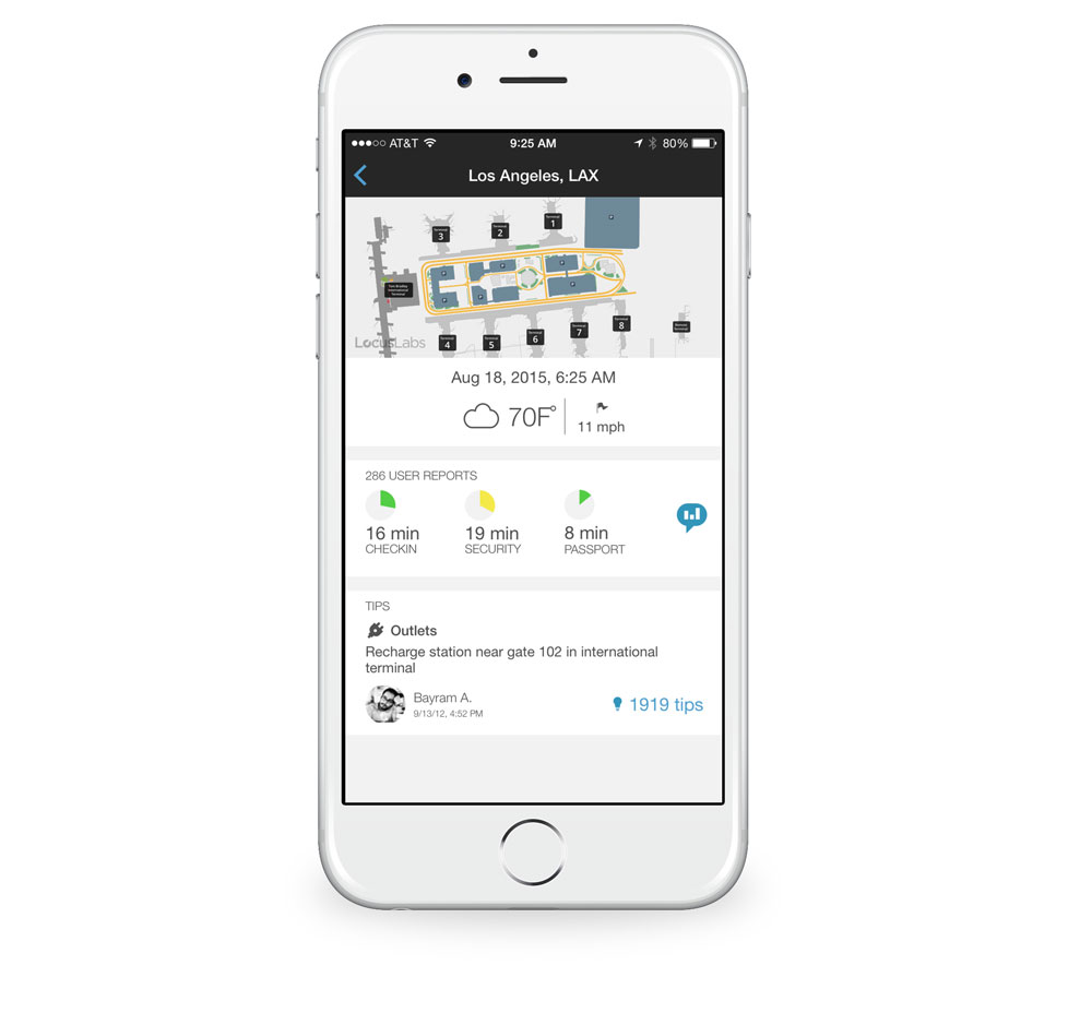
When you tap into a particular airport, you are brought into a section that displays additional information. Depending on the airport you choose, App in the Air will either show you a map of the airport location or an indoor map of the airport itself.
The indoor airport map, provided by Locus Labs, is extremely detailed. Each floor is mapped out meticulously and the search functionality is impressive. You can search for “toothpaste” and it will give you exactly where you can purchase it on what floors, vendors, etc. The indoor airport maps are considered in beta and are only for a handful of airports right now, but App in the Air has plans to bring it to more airports around the world.
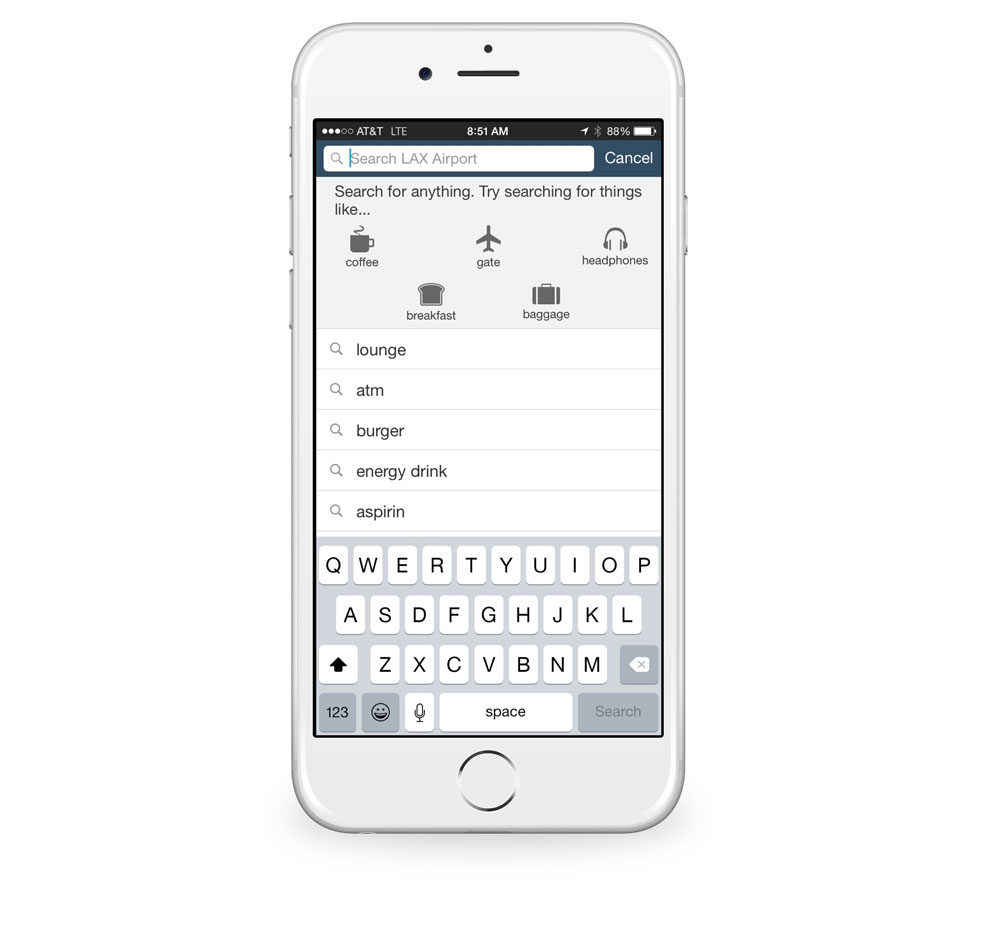
Below the airport map, the current date and time, temperature, and wind speed at that airport are displayed. Below that is the same check-in, security, and passport times that you saw in the main Airport card, but this also has a button for you to report your wait times in each section to help with the accuracy of the information.
Lastly, below the time estimates are user tips — and there are a lot of them. Each tip can be up- or down-voted and sorted by section (outlets, Wifi, shopping, etc.), which is really nice since some airports can have over five-thousand tips.
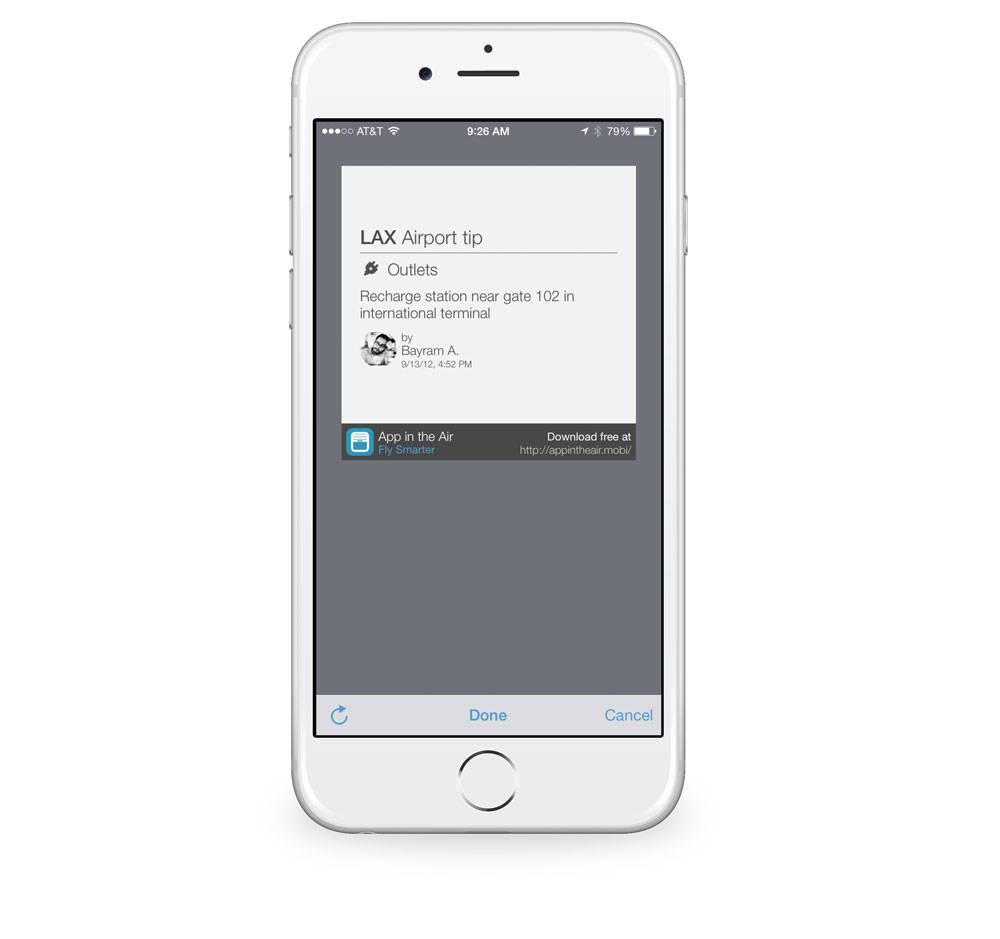
Within any forum, you are going to find some silly tips listed in there, but most of them seem very helpful — especially to tourists visiting a city for the first time. And if you are feeling generous, you can add your own tip to the list.
Airline
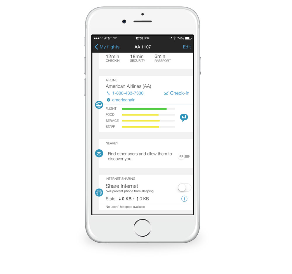
The Airline card is small, but packed with a lot of good resources. It provides links to the airline’s phone number, support Twitter account, and online check-in website. It shows user ratings about their experience with the airline that are separated in the categories of the flight, food, service, and staff. And just like with the airports card, you can provide your own rating based off of your most recent flying experience.
Nearby, Internet Sharing, and Accounts
The last two cards are Nearby and Internet sharing. You can hide them both, but they are more of a social tool within App in the Air that works with your account. Toggling Nearby on will show you other people on your flight using the app, while toggling Internet sharing on will create a hotspot for other App in the Air users.
If you are a Tripit user, App in the Air will sync with your account so that you don’t have to search for your next flight, and it will also import existing flight history. App in the Air supports iCloud and Facebook for account creation, but it’s not required to create an account to use the application unless you want to use features like Nearby.
Keep flying simple
With App in the Air, we think that users will gravitate toward certain features, but understand that they may not use them all. Our best advice for you is to try the app out. You can download it for free in the App Store and will have access to premium features for a limited time. We think you’ll really like it.
Worthy Mentions
We tested many flight tracker applications, and although App in the Air takes the top spot, there are some runners-up that we thought you should know about so that you can compare them with our pick.
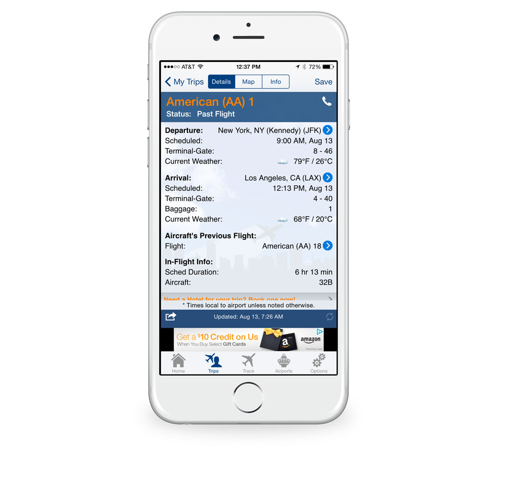
FlightView: a flight tracker that comes in three flavors: FlightView Free, FlightView for $0.99, and FlightView Elite for $3.99.
FlightAware: a free flight tracker with an in-app-purchase for $2.99 to remove Ads.
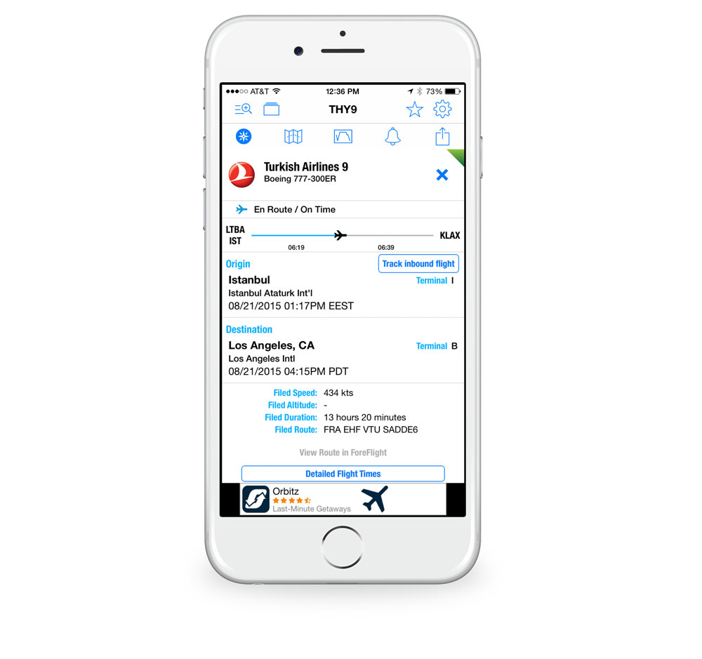
Where both of these applications fall short is in their user experience and interface. Both handle flight data pretty well, but navigating around each application felt like a chore.
FlightView has elements that look like they are from iOS 6, and FlightAware’s menu and tabs paradigm buries the data you need in too many layers.
If you can get past both app’s flaws, they serve well for flight data, but keeping your design up to date to match iOS and making it simple to find and input data weighs in big when choosing a great application.
Just pick me up
There was one particular app that we tested that had a singular focus — picking up people from the airport. Just Landed tells you when to leave to pick somebody up at the airport. To do this, it uses both flight and local traffic data. It’s worth noting that Just Landed only had select data for international flights.
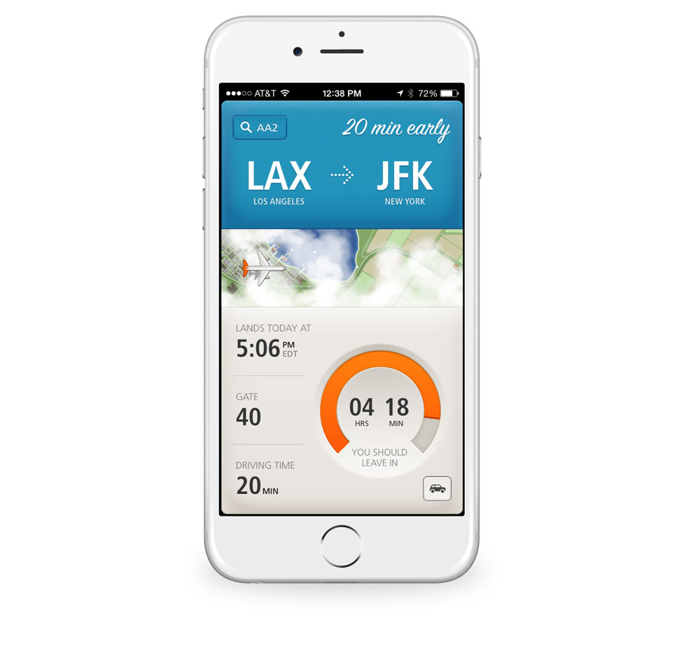
When comparing the time it told us to leave to other mapping and traffic services, the data was very accurate. If you find yourself picking people up from the airport often, it’s a nice app to have for notifications. Just Landed costs $2.99.
OS Integration
Currently, you can fire up OS X’s Dashboard app and use the flight tracker widget, but we wouldn’t recommend it. Aside from its lack of international data, the widget doesn’t provide much detail on times once you find the flight you are looking for.
Soon, you will be able to look up flight data within iOS 9 and OS X El Capitan. Reported by 9to5Mac, if the OS detects an airline name, pound symbol, and number, it will turn the text into a link where you can preview the flight information by long-pressing or right-clicking. For quick lookups, this tool can be convenient since it’s system-wide and presented in a pretty UI.
Conclusion
We think that your tolerance and taste for flight tracker apps will depend on how often you travel and what information is important to you. But there’s no denying that App in the Air’s design, user experience, timely notifications, and extra features make it stand out from the crowd, which is why it’s our favorite flight tracker.
