Apps We’re Trying: Tot
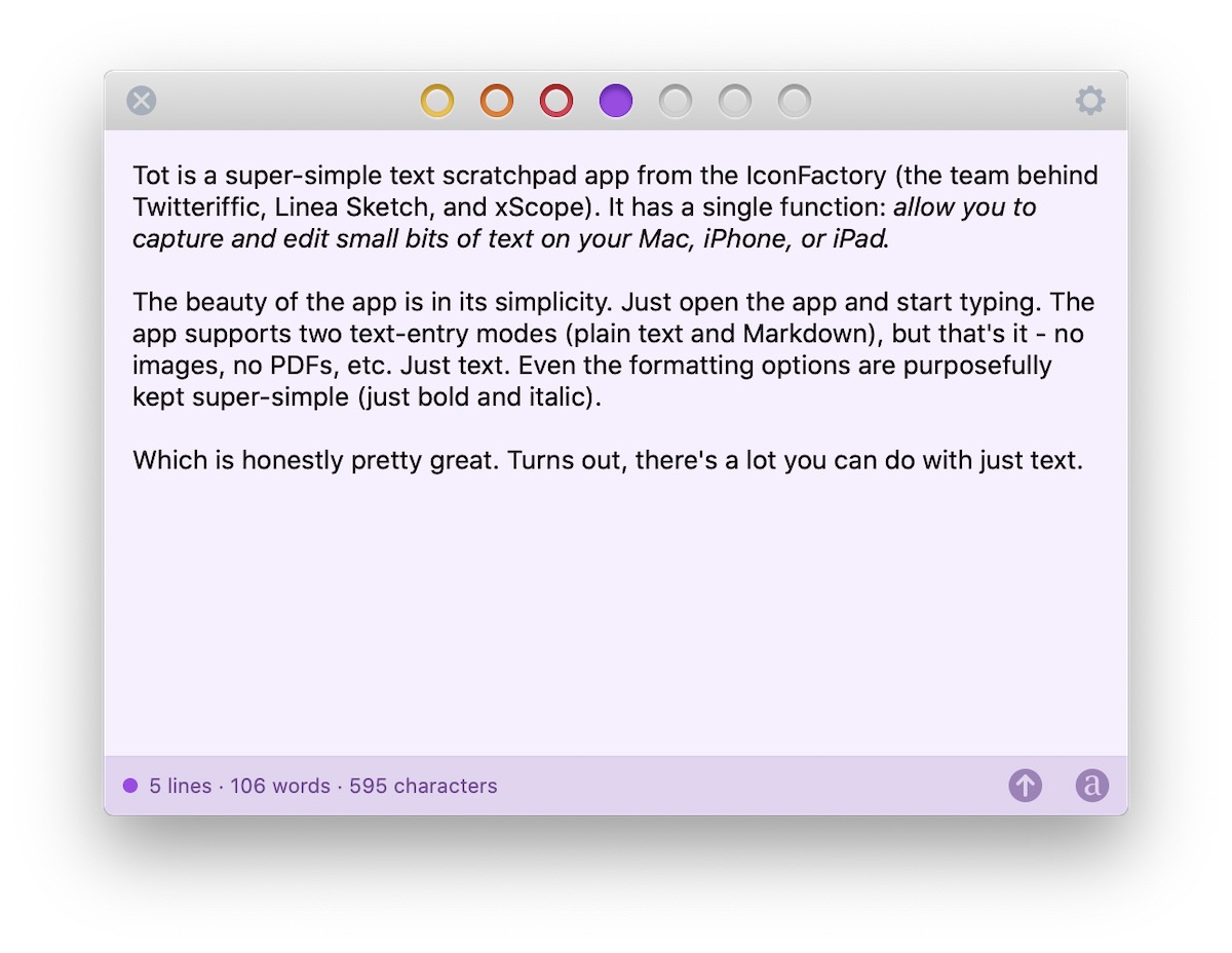
Tot is a super-simple text scratchpad app from the Iconfactory (the team behind Twitteriffic, Linea Sketch, and xScope). It has a single function: capture and edit small bits of text on your Mac, iPhone, or iPad.

The beauty of the app is in its simplicity. Just open the app and start typing. The app supports two text-entry modes (plain text and Markdown), but that’s it — no images, no PDFs, etc. — just text. Even the formatting options are purposefully simple (just bold and italic).
Which is honestly pretty great. Turns out, there’s a lot you can do with just text.
The Tot Interface
Tot supports seven individual text documents, represented by seven dots at the top of the window. Each txt document is a different color, making it easy to distinguish between them. Just select the colored dot for the document you want, then enter your text. There’s a simple status bar at the bottom of each document that shows the number of lines, words, and characters in the document, and two buttons to share the text or switch between rich and plain text.
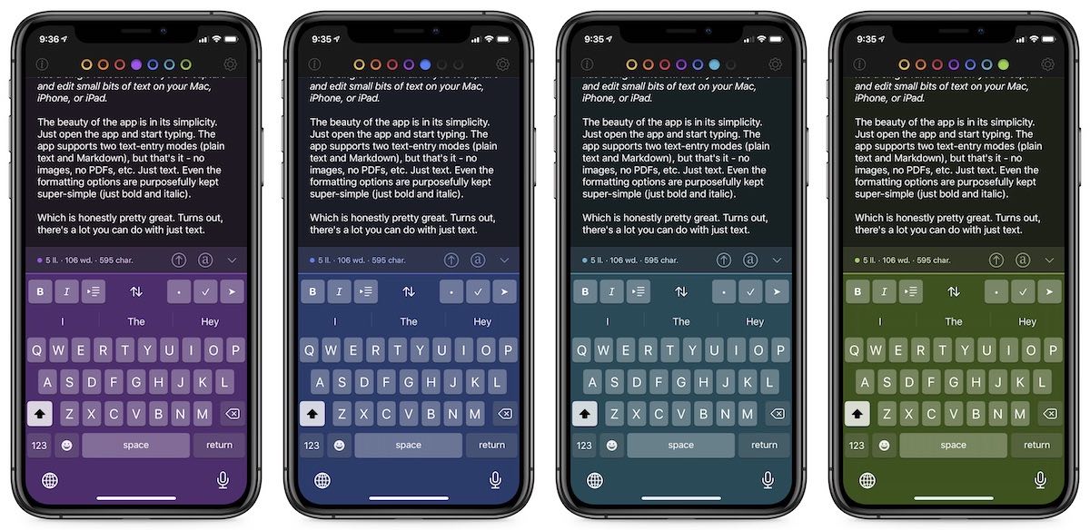
The design of the individual text documents is absolutely beautiful. Each text document features a unique UI theme, with no small detail left unnoticed. Each document even has its own keyboard design, which does a great job of combining translucency and vibrancy in all seven color schemes.

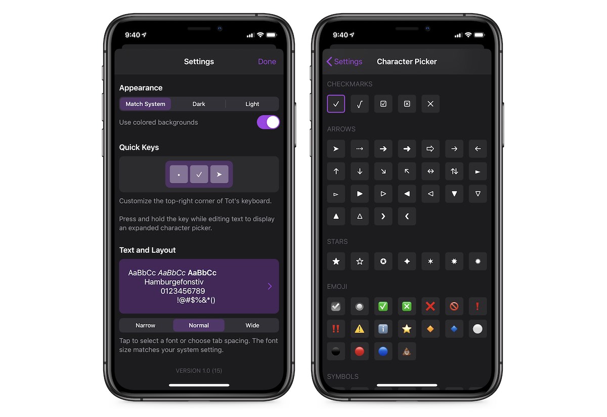
The app supports light and dark mode, and even has an option to toggle colored backgrounds for each text document.
The dots at the top of the window also serve as status indicators:
- A gray ring indicates a blank document
- A colored ring indicates a document with text
- A solid colored ring indicates the currently selected document
This makes it easy to locate and organize your text without requiring more complicated organization options.
Features
There aren’t many features in Tot, but the ones that are there are implemented well. For example, the app intentionally doesn’t support many text formatting options (only bold and italic are supported), but there are a large number of keyboard shortcuts. In addition to ⌘ B for bold and ⌘ I for italic, here’s a short list of useful keyboard shortcuts supported in the app:
- ⇧ ⌘ T – Switch from rich to plain text
- ⌘ / – Hide/unhide the status bar
- ⌥ ⌘ → or ⌥ ⌘ ← – Select the next/previous dot
- ⌘ 0 – Select the next blank dot
- ⌃ A or ⌃ E – Move to the start/end of the paragraph
Keyboard shortcuts are also supported in the iOS version, and you can customize the Quick Keys that appear in the top-right corner of the Tot keyboard.

Even simple commands like copy and paste have been carefully considered. For example, if you copy rich text from a webpage and paste it into a plain-text view in Tot, the text will be converted into plain text with appropriate Markdown formatting. The opposite is true when in rich-text mode, allowing you to copy Markdown-formatted plain text and paste it into Tot as properly formatted rich text.
Tot also is very smart about how it handles links. If you drag a link into Tot, it will automatically be formatted into either a clickable link in rich text mode or properly formatted Markdown in plain text mode. What’s really impressive though is the fact that Tot supports much more than simple web links. For example, if you drag an email message into Tot from the Mail app, you’ll get a formatted link that points directly to that specific message. The same is true for Ulysses sheets – drag the sheet you want to link to into Tot, and the link is created automatically.
Tot even has its own URL scheme that allows you to automate certain actions. This allows you to do things like append or prepend text to specific text documents in Tot, which opens up some unique possibilities for people who want to automate Tot using AppleScript or shell scripts.
Pricing
One of the most interesting things about Tot is the pricing structure. It’s available for free on the Mac, but the iOS version is a one-time cost of $20. iOS-only users may balk at the large upfront price, but I think that’s kind of the point. The average iOS user has gotten used to quality applications being ridiculously inexpensive, which has proven to be a major motivator for many developers in switching to a subscription-based pricing model in an effort to run a sustainable business. For an app as simple as Tot though, a subscription doesn’t really make sense. But I believe there are a large number of people (like me) who are willing to give Tot a try on the Mac first, then invest in a quality iOS companion app that syncs text documents seamlessly over iCloud.
Stop losing your ideas and notes to multiple apps…
An online course to help you save time, organize your notes, and master the best writing app for Mac and iOS: Ulysses.

