A Beginner’s Guide to PowerPoint on the iPad
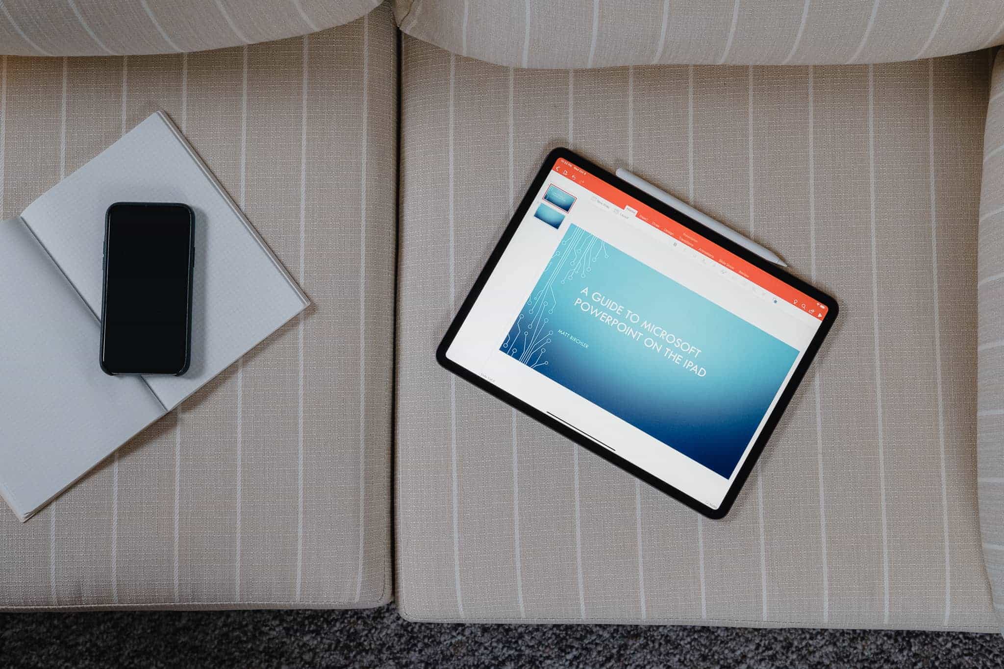
This is the third in our series of articles about Microsoft Office for the iPad, and the results so far have been decidedly mixed. We found Word to be surprisingly powerful and a good alternative to the desktop version for all but the most hardcore word processors out there. Excel was more of a let down with lots more functionality missing, including many elements that would be notable to even light spreadsheet users. We’re happy to report that PowerPoint is much closer to Word than Excel, and even more than either of those apps, you could use PowerPoint perfectly well on your iPad and never touch the desktop version. In fact, some of the design decisions Microsoft have made might even make you put together better presentations than if you had the complete desktop app at your disposal.
Our Must-Have, Most Used Productivity Apps
We spend an inordinate amount of time sorting through hundreds of apps to find the very best. We put together a short list of our must-have, most-used apps for increasing productivity.
Pricing
PowerPoint for iOS is free from the App Store and allows you to view PowerPoint files from anywhere. If you want to edit or create presentations from the iPad though, you’re going to need to subscribe to Office 365, which runs $6.99/month or $70/year for individuals on up to 5 devices. An Office 365 subscription comes with the full Microsoft Office suite of apps as well was 1TB of OneDrive storage, so there is quite a bit of value there.
Whether this is a fair price is a matter we can only leave to you, but the software package on offer, and especially the 1TB of cloud storage that works across iOS, Android, macOS, Windows, and Linux, makes this a pretty compelling subscription in our eyes.
Of note, Microsoft only requires iPads over 10.1” to pay up to get editing functionality. If you have a 9.7” iPad, iPad Mini, or even an iPhone, then you can use the full version of PowerPoint (and all other Office apps) without an Office 365 subscription. Apparently productivity starts at 10.1” in Microsoft’s world — not that we’re complaining.
Out of the Box Experience
If you start with PowerPoint on the iPad and want to begin building presentations from scratch, the iPad version gives you everything you need to start creating right away.
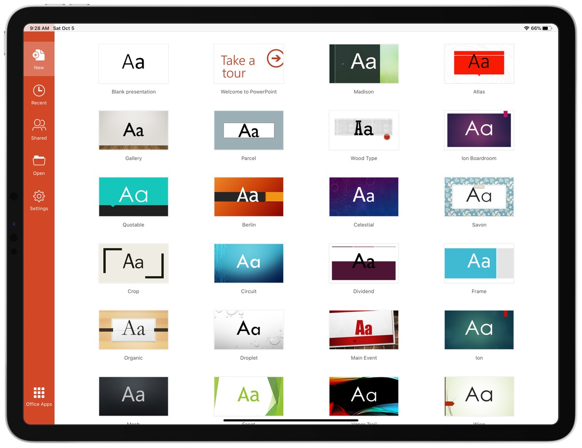
There are 25 built-in templates you can start with. While not all of them are great, ones like Parcel, Celestial, Ion, and Mesh are all really nice templates that you can use to create professional-looking presentations. Some of them are more fun and offer a more distinct look, but for many people, simplicity is king and the options here are more than capable of making you look good at your next speaking gig.
As you would expect, each of these 25 templates have an assortment of slide types so you can move between titles, lists, and giant images with a consistent experience for your audience.
And if you were worried about getting your content into these slides, fear not because PowerPoint for iPad has tons of tools around adding animations to elements on your slides, transitions between slides, drawing on and marking up content, and adding things like tables, images, icons, and videos into your slides.
Basically, if you work entirely from the iPad, you’ll have more than enough control over everything to put together a presentation that you can be proud of.
Adding Some Flair
PowerPoint has quite a few tools for customizing the feel of your presentations, and while I’d contend that adding too many effects and transitions to a slide deck can be detrimental, these can of course be used well and the fact that so much is here should allow most people to create exactly what they want.
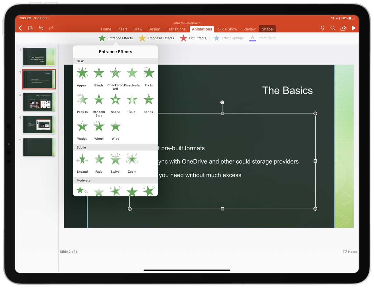
There are 35 ways you can have items on a slide appear or disappear and 17 different ways you can emphasize specific elements on a slide. And if you like transitions, there are a sweeping 49 options for how you move from one slide to another. Should you use all of these? God no. Does this level of flexibility enable a bunch of cool one-off effects? Oh yes!
And then there are a bunch of different drawing tools you can use to add a little panache. Similar to most markup apps you know and love, there are several drawing tools like pencils, markers, and highlighters, as well as a cool cosmic pen that is just fun. You can make this animate into the slide so you can have custom-looking animations that call out something specific on your slides.
Another thing I really like is a feature called Design Ideas. This is found under the Design tab and you can use it on any slide in your presentation. PowerPoint will look at the content of the slide and give you a few suggestions for alternative styling. For example, I had a basic bulleted list and it suggested this nicer layout for a short list:
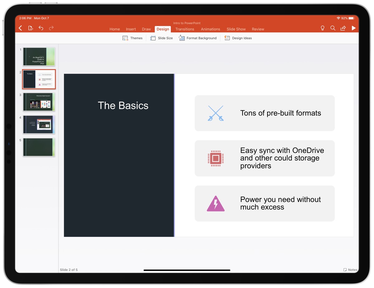
One of the things I love about how this is set up in the PowerPoint UI is that none of these effects are visible from the main tabs you’ll use when creating your slides. This breaks up the workflow between content and style. You’ll likely find yourself putting together all your content together across however many slides you need and then going back through it all to add whatever animations and transitions you think you need. Again, since the content of a slide deck is far more important than the flair on top of it, this behavioral encouragement is spot on.
Collaboration
As with Microsoft’s other Office apps, the collaboration features from the desktop and web versions are here and they work great. You can work in real time with anyone else whom you’ve shared the document. You can see their edits in real time and they’ll see yours, no matter the platform they are on.
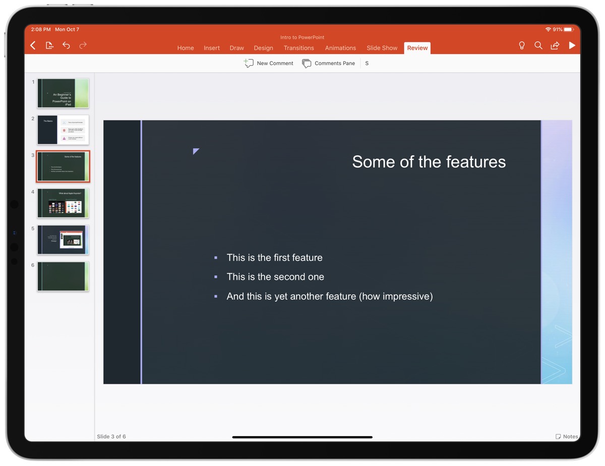
Comments are supported as well, and you or others can leave comments on certain points of the presentation, and there is even version control so you can go back to potentially dozens of versions of the presentation and restore them (or save them as a new copy).
Giving Your Presentation
The presentation itself is the whole reason for making a slide deck — that experience is rock solid — but might be limited compared to what you have on the desktop.
First off, you can present a presentation you created on the iPad on any device that runs PowerPoint, but if you want to present from an iPad, the easiest way to do so is to plug into the screen you are going to be using via a DisplayPort/HDMI/DVI cable that uses Lightning or USB-C (depending on your iPad). After you’re connected to an external display, you’ll see your slides in all their glory on the external display and the presenter view will appear on the iPad itself.
If you happen to be somewhere that has an AirPlay compatible screen (most likely through an Apple TV), then you can also mirror your screen to the AirPlay device and you’ll get the same effect where the slides show on the AirPlay receiver and the presenter view shows on the iPad.
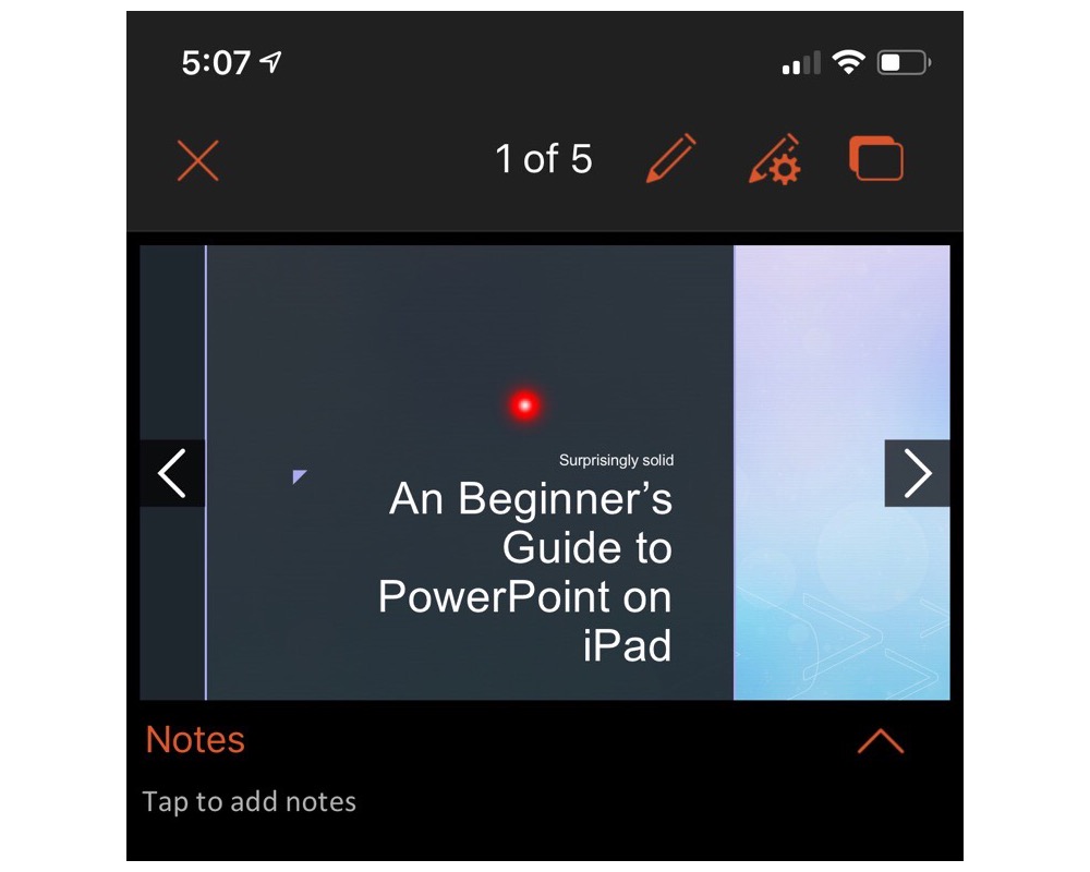
Whether using wired or wireless connections for the presentation, you can always tap and hold on your iPad screen to bring up a virtual laser pointer to point out whatever you want to highlight on a particular slide. It’s actually pretty slick and more useful than I expected it to be.
PowerPoint as a Good iOS Citizen
Unlike some other companies who take forever to support iOS’s latest and greatest features, Microsoft has done a pretty decent job of keeping up with the times. Using PowerPoint in late 2019 feels like using an app built to use most of iOS’s (and iPadOS’s) latest features.
Pretty much all the main contenders are here: drag and drop works well and lets you drag in your own media straight from things like Files, Photos, or even Safari and drop them into your slides with ease. The UI for this is rather limited, and you don’t quite know what will happen when you drop something like a photo onto a slide, but you can of course resize and reorient objects once they’re on the slide.
PowerPoint also supports split screen, which is very useful for this sort of app as it allows you to have your research on one side of the iPad and your presentation on the other. I constantly find myself bouncing back and forth when putting together a PowerPoint presentation, and this would be a near deal-breaker for me personally.
The one major iPadOS feature this doesn’t currently support is multi-window. iPadOS 13 enabled apps to have multiple documents open at once and PowerPoint does not support this at all. This is a less egregious omission since most people tend to work on one presentation at a time, but sometimes you might want to reference another presentation that you’ve created or are comparing your slides to ones someone else made.
Overall, PowerPoint strikes a good balance of being unmistakably Microsoft without feeling like a Windows app on the iPad.
Apple Keynote and Google Slides
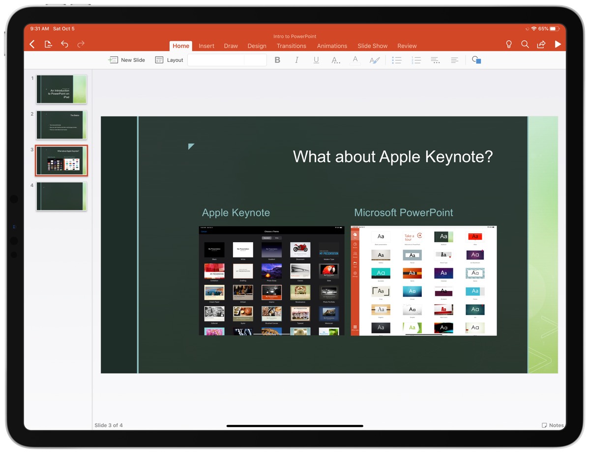
While PowerPoint is the undisputed standard for presentations, the options from Apple and Google are also compelling and have the distinct advantage of each being completely free. Without getting too much into the weeds here, the short overviews of each of these competitors are:
Apple Keynote lets you more easily create great-looking slides with modern, elegant templates. The app also feels more finely tuned to iPadOS’s UI is a very smooth experience from start to finish. Collaboration is a big issue though if you are not working with others on iPads or Macs. And even if you are, the collaborative editing capabilities are far less robust than what Microsoft has in PowerPoint.
Google Slides is a very minimal presentation tool, but it gets the job done. If your needs are very basic and you value a cloud-based solution with great real-time collaborate editing, then Slides can serve your needs very well. But if you want to have a little more style in your deck, then you’re going to be left wanting here. It’s not the end of the world, but it’s certainly not the best in class.
In short, if you value compatibility and collaboration, PowerPoint is the clear winner. If you value great design in your slides and a delightful iPadOS experience, Keynote is king. And if you just want what is on the web and included in your Google account, then Slides will be okay for you, but you’re probably not going to fall in love with it.
Conclusion
Ultimately, many of us don’t have a choice in the apps we use to give presentations. These usually happen at work and the company has some standard in place for creating presentations, so the choice has been made for you already. If you have any say at all in what presentation software to use, then we think PowerPoint is a great way to make them on the iPad.

With a rich set of tools to make everything from basic to wild and flashy presentations possible, it’s bolstered by a robust set of collaboration features as well as the simple fact that it’s the de-facto standard across most of the business world. You’ll probably have little-to-no friction in making this work for you and your business.
If you are working solo or there really isn’t any need to use one app or another, then Keynote is a very compelling alternative, and is the feather in iWork’s cap. it’s an excellent app that makes is dead simple to create professional-looking presentations with very little effort. Oh yeah, and it’s completely free! Not everyone will love this, but it’s definitely something to consider using if you’re not totally sold on PowerPoint.
Our Must-Have, Most Used Productivity Apps
We spend an inordinate amount of time sorting through hundreds of apps to find the very best. We put together a short list of our must-have, most-used apps for increasing productivity.
