A Thorough Beginner’s Guide to Roam Research

Roam Research is a new note-taking tool that’s re-imagining the way that we capture information, and it takes many of its cues from the pre-internet era. Doing away with the traditional file and folder structure that most note-taking tools have stuck with since the dawn of the PC, Roam has more in common with Wikipedia than it does with a traditional notes app. This is because Roam employs ‘bi-directional links’ which allow you to create new pages on the fly and move from thought to thought with ease. This linking structure is derived from the concept of hypertext (dating back to the 1960s) that inspired the ‘world wide web’ that we use every day — but where the internet uses hyperlinks to interconnect the world’s websites, Roam uses links to connect your thoughts, and there’s a particular power to collecting your ideas in this way.
An important note: Roam Research is still very much a beta product. As of today, the platform is in a state of constant change, and some features — like native apps – are nowhere to be found. Though Roam is currently relegated to being a tab within your browser (or an ‘app’ using a third-party tool like Flotato), other digital tools like Notion have proved that a solid web foundation can be the basis for something special. Roam is the rare tool that is so good it forced me to change the way that I worked, so that I could best take advantage of its features even in this nascent stage.
So, let’s dive in.
Writing in Roam
Bi-directional links are the first feature that any new Roam user should get acquainted with. Here’s a quick explanation: Roam lets you create a new page within a page by wrapping any word (or set of words) in a set of double square brackets. Let’s say you’re taking notes on a book about Leonardo Da Vinci and the author references Michelangelo. Wrapping the name [[Michelangelo]] in brackets means that a new page has immediately been created for the renowned 15th-century painter, and instead of this page being blank it will automatically reference the page about Da Vinci that is ‘linked’ to it.
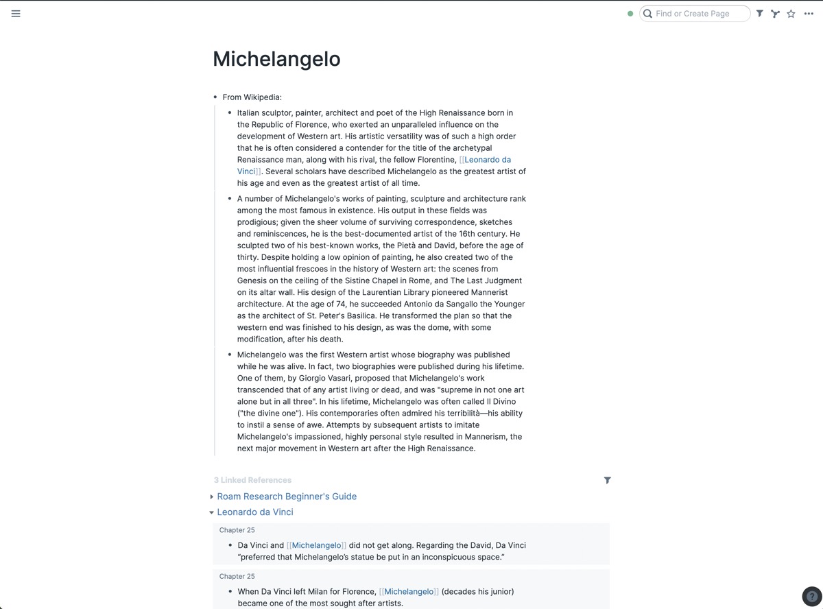
This small difference in the way that note-taking works completely changed the way that I take notes while reading a book. When the author comes across a quote that resonates with me, I write the quote down and put brackets around the person who the quote is attributed to, immediately giving them a page. In the few months that I’ve been using Roam, I’ve been shocked at the amount of times that I’ve done that only to find that I’ve already created a page for that person, which means that I immediately go out of my way to find more material by them.
What would have otherwise been two disparate quotes in separate notes instead becomes a clear connection. In this way, the notes you create in Roam should provide you with “compound interest” instead of falling away, forgotten — and because the links are bi-directional, they’re also highly modifiable. If you decide to change a page’s name later, any reference to it in the past will be changed instantly. Because of this, there’s no worrying about breaking past thoughts as they update right along with your thinking.
Each page in Roam takes the form of a bulleted list, with each line break creating a new block. This might seem odd at first — most note-taking tools since the era of Microsoft Word have made documents the default view and lists a secondary option, but this makes sense as soon as you realize that Roam prioritizes the connecting of thoughts and ideas from page to page. Because Roam caters to note-taking, documentation, and references, lists are an extremely useful way to think by default — but if you’d like to write an essay unimpeded by unsightly dots, right-clicking a title lets you choose a Document Mode that removes the bullets for that specific page.
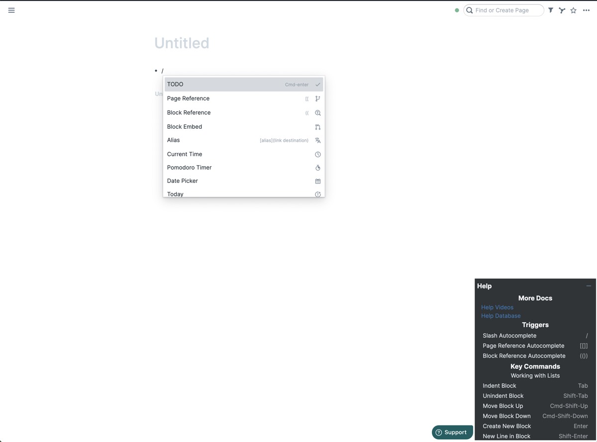
Roam supports Markdown, letting you not only emphasize your text, but highlight it, add code blocks, and include images. A helpful shortcut guide at the bottom right of every page lets you know all of the commands that are available to you while writing, and as this product is still in beta, new ones are still arriving with regularity. Hitting the slash (/) brings up a series of triggers, with a wide variety of functions: a Date Picker to tie a block to a date, a to-do checkbox (more on this later), a pomodoro timer, tables, kanban boards, and much, much more. A helpful list of shortcuts is also available in the bottom right corner of every page.
Our Must-Have, Most Used Productivity Apps
We spend an inordinate amount of time sorting through hundreds of apps to find the very best. We put together a short list of our must-have, most-used apps for increasing productivity.
Roam’s interface
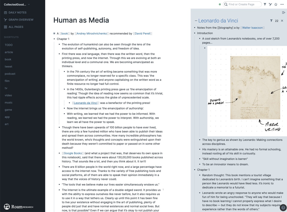
To the left of the text-editing space is a collapsible sidebar that gives you quick access to Roam’s three main spaces — Daily Notes, the Graph Overview, and All Pages. Below these three sections is a customizable shortcut section, allowing you to quickly access any page within your collection. In the top-right corner is a sync indicator letting you know that you’re connected to the server and that your thoughts our saving, a search bar (which you can type into directly by pressing CMD + U at any time), a filter function to pare down text, a graph depicting pages connected with bi-directional links, and a star that adds the page to a Shortcuts area in the aforementioned left-hand sidebar.
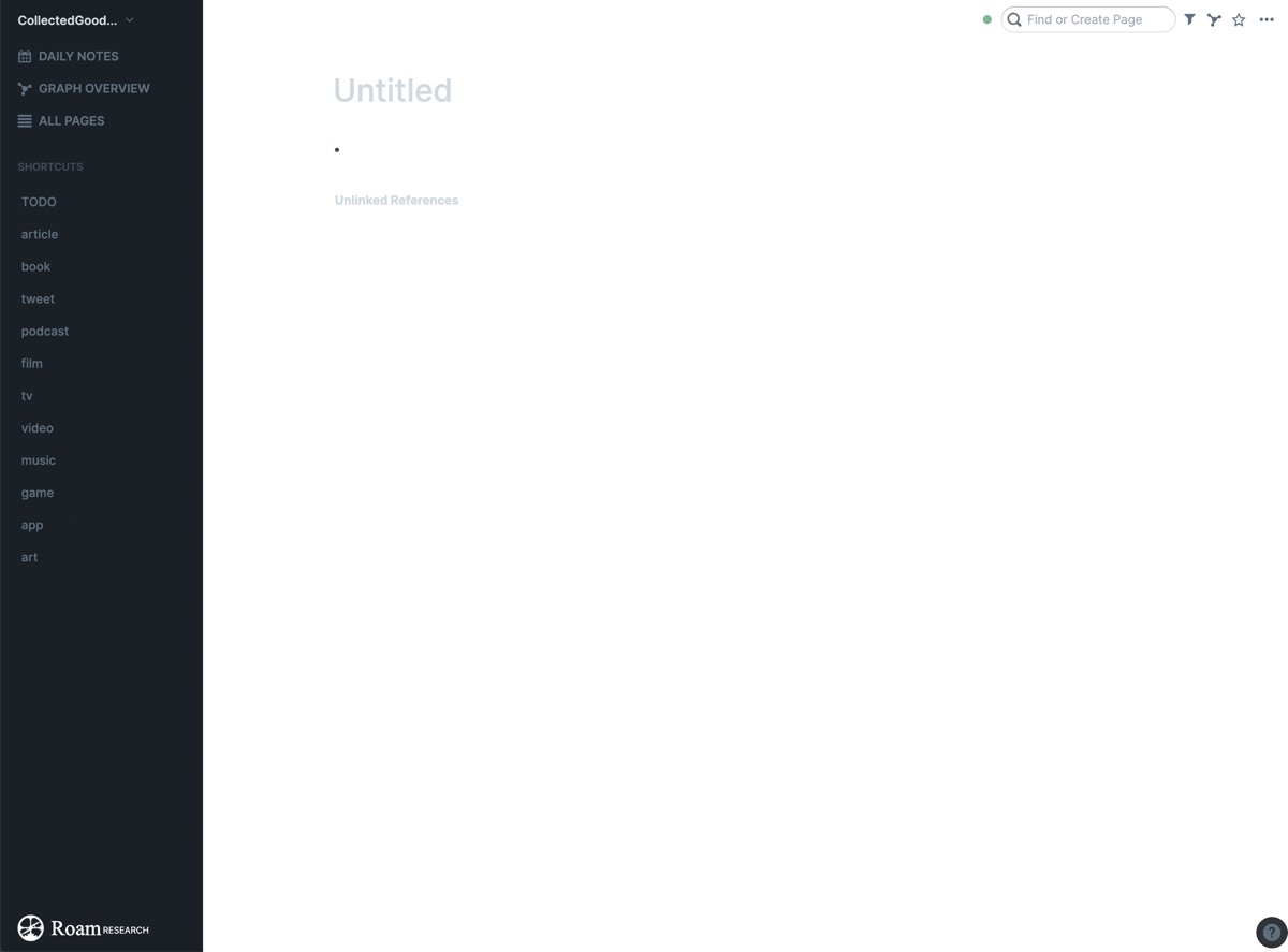
I personally use the Shortcuts section to keep tags so I can quickly come back to things I’ve recently captured. When I add something to Roam, I tag it as a book, a tweet, a podcast — whatever it might be — and because of this sidebar I am able to quickly scan through whatever I’ve been spending my time with to see if I want to go back and write more about it. This is just one use case, but you might want to use this space to store essays you’re working on, your favorite books that you reference often, or pages that function as evergreen living documents, constantly being added to. The choice is completely yours.
At the bottom of each page are two sections: Linked References and Unlinked References. This is where the interconnected nature of your collection of notes first begins to appear. This space reveals any time in which the page’s title has appeared on any other page within your note collection — and because it contains both linked and unlinked references, you’ll see the instances you’ve intentionally made as well as any that you might have missed.
Let’s say that you took notes on a book and you wrote down a quote from a source that the book referenced, but you chose not to make that author’s name a page. If you later create a page for that book and that author, Roam will instantly show you the author’s name under Unlinked References and give you a quick option to link it right there. One of my favorite essayists is Craig Mod, and I often find myself adding the things he writes into my Roam Graph. Sometimes as I’m writing, I forget to use a Page Reference to link the thought with his page. In Roam, that’s not a problem. At the bottom of Mod’s page is a list of unlinked references that I can quickly link if I so choose.
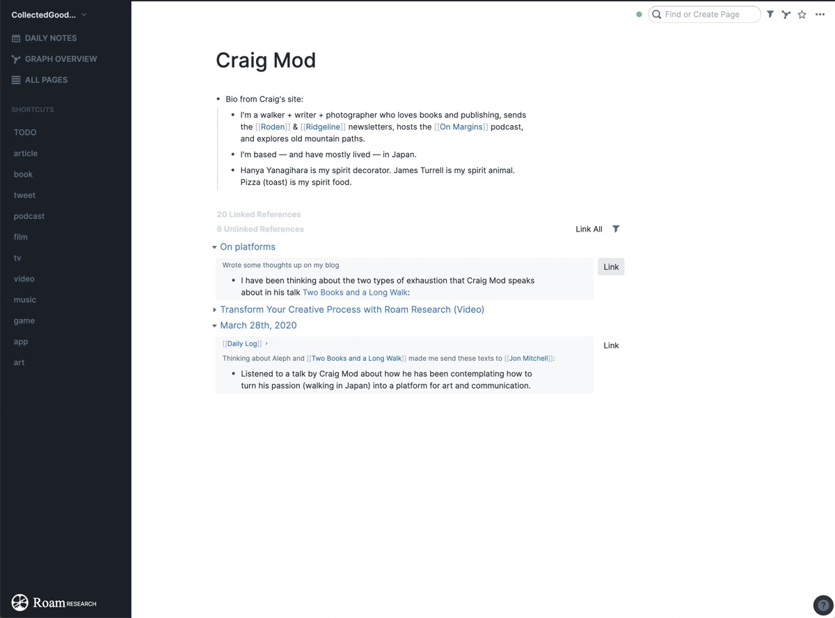
There are a wide variety of reasons that these linked and unlinked references might be helpful to you, including when you decide to create a page for an idea that you may have written about in the past. What if you decide to write about computers or meditation or speed-reading? If you’ve ever written about those subjects before, Roam will help you quickly connect the thoughts before you knew you actually wanted to.
Finally, because linking ideas is so core to Roam, there’s an incredibly easy way to pull up multiple pages side-by-side: Right-click any page title and it will appear in a right-hand sidebar. This is an amazing way to move between thoughts, build upon references, and connect ideas — and you can open as many pages as you want within this sidebar, then close it when you want to focus back on a primary thought.
Our Must-Have, Most Used Productivity Apps
We spend an inordinate amount of time sorting through hundreds of apps to find the very best. We put together a short list of our must-have, most-used apps for increasing productivity.
The Daily Note, The Graph, and All Pages
At first, the main page of Roam Research might seem a bit strange. Opening your note collection doesn’t present you with a blank page, but instead with what’s called the Daily Note. This is a note automatically pre-titled with today’s date, and that title cannot be changed. Unlike an untitled.txt file within TextEdit, this isn’t intended to be a temporary space that will be retitled later, but is instead a place for you to not only create thoughts on the fly but log them historically.
At first this might seem like a strange primary space for a note-taking system (my first instinct was to leave it blank and create new pages for each thought), but casual use of this page reveals how powerful adding a lightweight journaling function to your notes can be. I’ve begun using these Daily Notes to think out loud, moving from idea to idea, note to note, and task to task without overthinking it. Where my other pages are orderly and interconnected with intention, the Daily Notes are organized chaos with a surprising tendency to reveal ideas hidden deep within my subconscious, and I also use this space as a way to archive any media that I come across throughout the day.
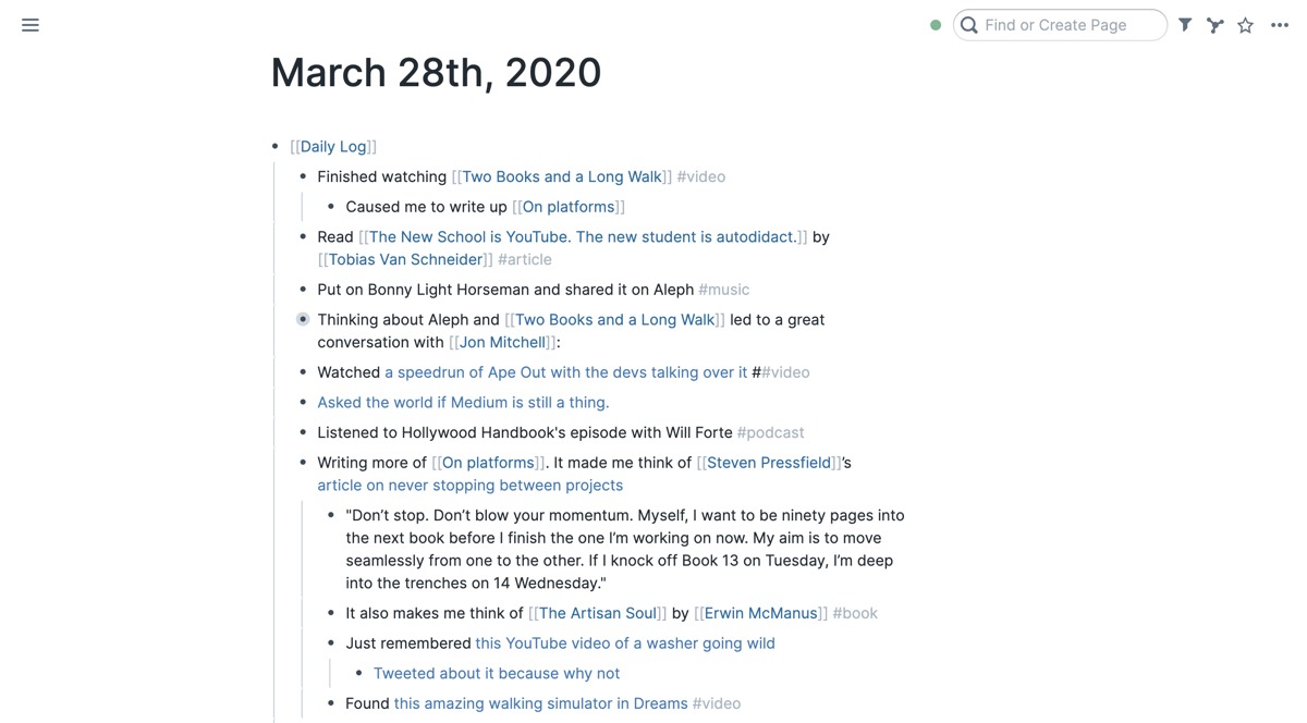
I often use the Daily Note space to implement my own version of Morning Pages (as does Roam’s founder), and I’ve found it to be the journal I’ve always wanted. Because it’s interconnected with the rest of my notes, I let half-baked ideas live in the Daily Note section until they’re ready to receive the full page treatment.
The proper nomenclature for your collection of notes within Roam Research is your Roam Graph, and it becomes apparent why it’s called that as soon as you click the Graph Overview page in the Roam sidebar. This is a 2-dimensional graph of all of your notes and the connections between each of them, with each note given a visual circle sized according to its word count. Clicking on any note highlights it in blue and shows the connection points it has to others. It’s fascinating to click each note and see connections light up that you may not have fully realized you were making. The graph icon in the top right corner of every note shows a similar, smaller graph of the pages directly connected to the one you’re currently looking at. Clicking any note will move you from graph to graph, allowing you to see the interconnected nature of your thoughts as one idea flows to another.
Right-clicking these graphs allows the user to access two different views — a linear layout that’s based on time or a layout that places all of the notes on a grid. You can also right-click and select remove log days to see the grid without each Daily Note page, allowing you to more clearly see the links between from idea to idea instead of connecting them through time.
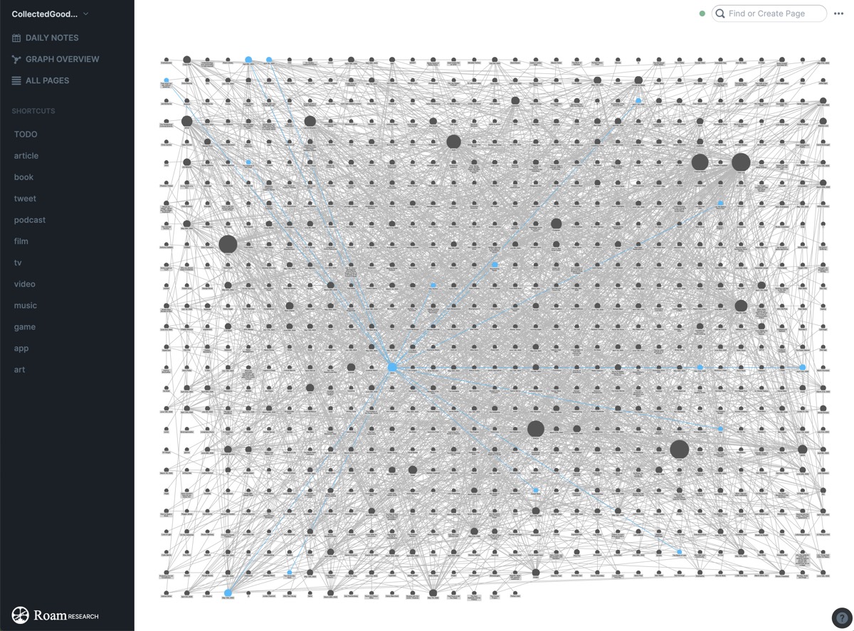
Here’s an honest truth — as of right now, the graph isn’t particularly helpful, at least in this current phase of Roam’s beta. The lack of filters means that as your graph grows it becomes more and more unwieldy — but I believe there’s a genuine benefit in the mental empowerment it provides you as a note-taker to see your notes not only grow, but connect. I personally found that watching the graph grow from its initial few dots was part of what initially kept me coming back to add more.
Beyond the graph overview, there’s another way to see the notes you’ve been collecting within Roam: All Pages. This is a list of every page you’ve ever created within roam, and it can be sorted by last updated, title (alphabetically), word count, mentions, or creation date. Each page’s Mentions are interactive, and clicking this will reveal the exact spaces in which the page is referenced within Roam’s left-hand sidebar. The All Pages area can also be filtered to make searching more convenient, hiding the Daily Notes (much like within the Graph Overview) or removing any of the sortable columns.
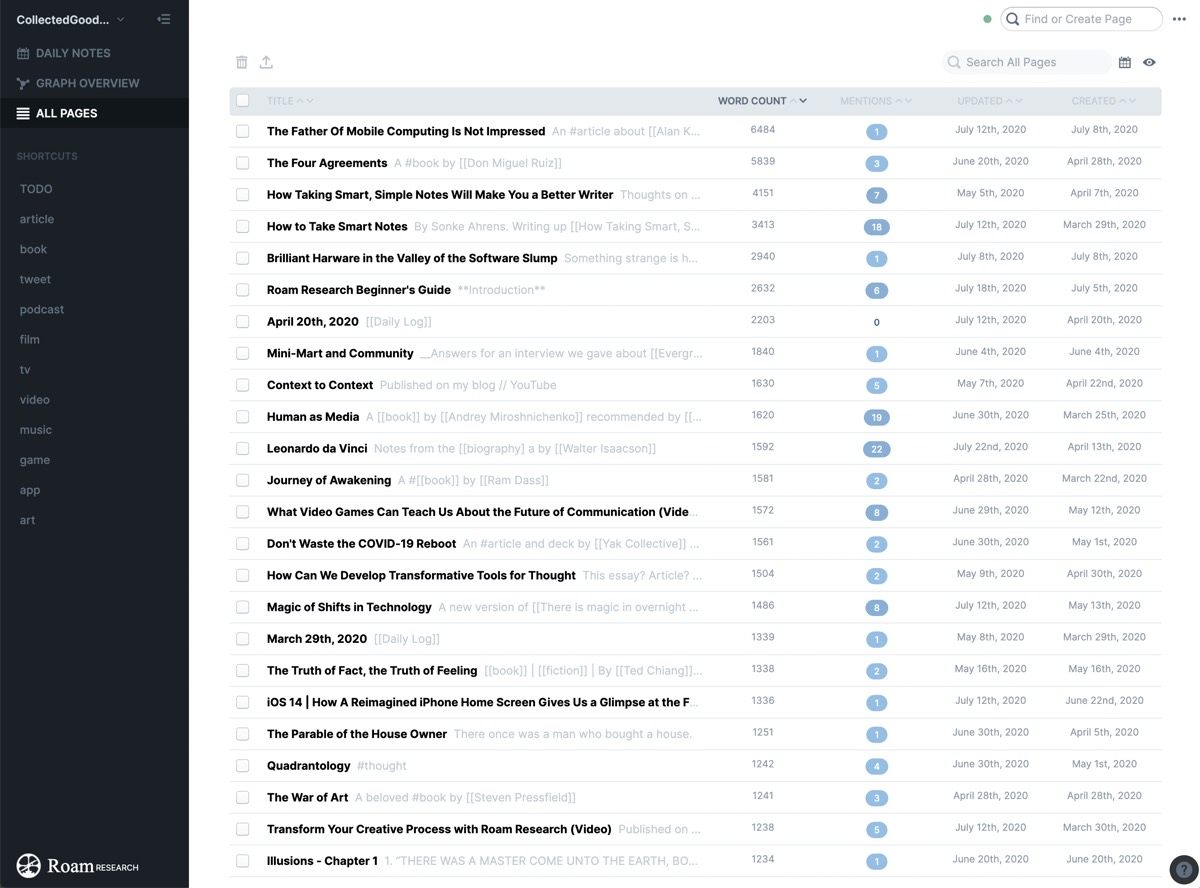
These three sections all provide the user with a remarkable variety of ways in which to look through your note collection — and as Roam continues to be fleshed out, I imagine there will only be more as time goes on. Furthermore, I have found as I’ve talked with other Roam users that spaces like the Graph and Daily Note can become deeply personalized, used in ways that uniquely fit your specific mental model. Though I know others who use the Daily Note minimally, I have begun using it not only to journal but to log my entire day, pasting in articles that I come across, writing what I’m reading or watching, and using it as a task manager.
Yes, a full-fledged task manager. About that…
Tasks
An impressively powerful feature of Roam Research is the way it can function as a task manager. While writing, at any point you can press CMD + Enter (or type / TODO) to turn that bullet point into a task. These tasks all live on a page called TODO (and completed tasks live on another page called DONE), and going to that page shows you not only the tasks you need to complete but the pages on which they live.
I have a confession to make: Though I’ve used almost every task manager under the sun, I am terrible at task management. I will diligently commit to a system for months, writing down each task, employing tags and due dates and notifications — but at some point that system will become a task graveyard. As I open the app less and less, tasks get missed, and I give up in total frustration. Part of the blame certainly lies with me, but a real issue I’ve always had is that tasks within a task manager end up feeling hidden. You have to add opening the manager up into your daily routine to ensure that nothing gets missed. That simply doesn’t work for me, and it’s why the task management system of Roam is so powerful.
Using Roam as a task manager, I am allowed to messily scatter tasks throughout my graph and on any note that I want. If I’m taking notes on a book and it references something else I want to read, I can add that to-do right there. If I’m logging my day in the Daily Note and realize there are things that need to get done, I can add them quickly. These tasks can be given tags and due dates easily within Roam, but I often find that I don’t need them, because a cursory scan of my tasks, broken up by page, makes the needs extremely clear. I have been using Roam as my sole task manager for three months, and I feel more organized than ever.

Block references
Roam’s bi-directional links let you connect high-level thoughts, but the block reference allows you to connect the more granular. Just as typing [[ immediately brings up a list of auto-completing page titles, typing (( brings up a list of every block that you’ve ever written within Roam. This is the power feature that I tell every new Roam user to use. Have you ever taken notes on a book or read an article and thought, “This reminds me of something else”? Instead of simply referencing that page’s title, Roam’s block references allow you to cite the specific idea in-line with what you’re writing.
Here’s an example: As I read the book Range I found that there were many concepts I was taking notes on that reminded me of other sources I had recently come across. One was an essay I had just begun writing about how Leonardo Da Vinci was constantly shifting between interests, so I linked that page. Next was a tweet that I came across about John Coltrane. Instead of having to re-dig the tweet back up, I was able to simply type “((Coltrane” and the block search automatically brought up the tweet that I was referencing, which I had recorded in a previous Daily Note. Further down the page this happened again, as a reference about decision-making reminded me of a great story in the book How to Take Smart Notes about how paramedics are able to make decisions based on experience which may seem wrong by instructors.
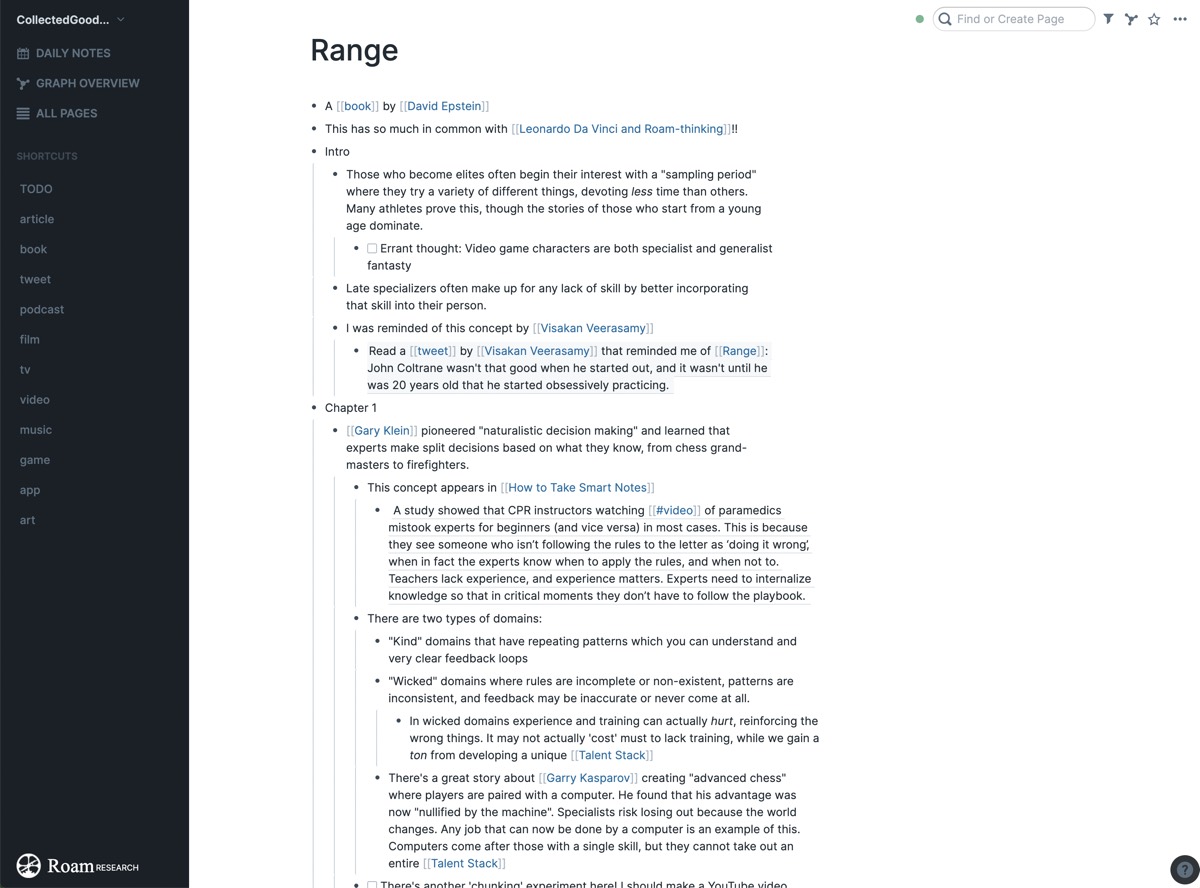
Block references allow for the remixing of your thoughts on a level that’s more detailed than if you were just referencing different pages, and this can be used in a variety of ways. When I’m taking notes on a book and it reminds me of something I’ve read previously, I reference that block instead of the book’s full page. This is often incredibly easy to do because I can type in the keyword that my brain was reminded of in the first place. Or, when I’m writing out an idea, I create new drafts that reference ideas from previous drafts using in-line blocks. This lets me build on ideas in a non-destructive way while still having everything on one page.
Customizing Roam
Though Roam Research is still in beta, a burgeoning community is forming behind the product, and with community comes customization. Since the tool’s inception, people have been hacking the user interface with Chrome plugins, but the team behind Roam has already worked to allow for a rudimentary version of custom theming.
To customize your graph’s theme, create a new page called [[roam/css]] and choose from a variety of themes that Roam’s founder keeps in a list on Twitter or on the Roamcult Themes collection. These themes are often hosted on Github, which means that as the themes are modified and enhanced, your own graph will benefit from these changes without you needing to make any updates.
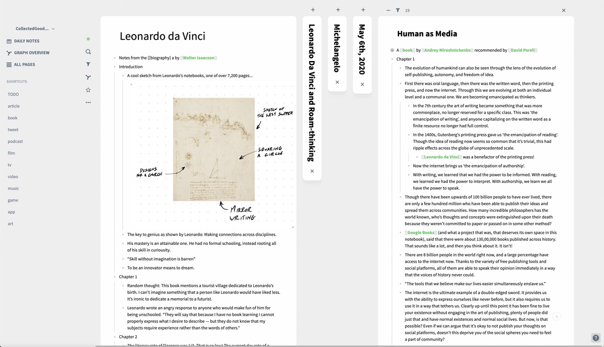
There are already dozens of themes available, ranging from simple re-skins that only modify the colors, to massive rethinks that change the way functions like the right-hand sidebar work. Because each person’s note collection is so unique, I think that choosing a theme that feels personal makes the experience that much better — and there’s more going on than just CSS changes. Users are building Chrome extensions that allow you to quickly make highlights as you read online, and the Roam team is implementing new methods of thinking like Mermaid diagrams at a rapid pace.
As mentioned, Roam Research is currently in beta, and the founder has been vocal about what’s coming down the pipeline as it matures — namely, an API. Though this will eventually change, Roam’s current iteration can be limiting for those who are accustomed to rich native experiences on iOS, and quickly accessing your notes on the go is cumbersome at best.
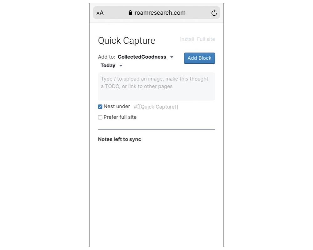
There is a stopgap solution for those who want to use Roam on their phones today: Quick Capture. Opening Roam’s website from a mobile device opens up a screen intended to grab information without requiring you to navigate to the required page, with any text by default being appended to the day’s page nested under the tag [[Quick Capture]]. What makes this page particularly powerful is the fact that page and block auto-complete still work, as do any of Roam’s / shortcuts. Although a full-featured mobile-first app would be preferred, this method of capturing information on the go will certainly hold me over until that’s ready.
Conclusion
Roam’s bi-directional links and innovative graph interface mean that your notes collection feels alive and accessible in a way that it may not within a traditional file-based application. As I have watched a community build around this tool, I have seen it being used in an incredible variety of ways.

An architect can link projects and products without feeling overwhelmed. Custom, collaborative wikis can be built on the fly. Authors can outline new ideas, referencing any information they’ve already put into Roam with ease. Entire CRM systems can be built. The list goes on and on, and it will only continue to grow larger as the tool continues to evolve.
I find it fascinating that this innovative experience is rooted in the dated principles of hypertext.
It feels very fitting that Roam’s logo is an astrolabe, a centuries old navigational tool that the founder says fits the product perfectly as Roam is for “building maps” (of thought) and “the value of knowledge.” Indeed, Roam is a tool centered on building out thoughts as opposed to simply capturing them, and because of that the experience will be different for everyone. At first glance, Roam can feel a bit daunting, as there are no tutorials, instructions, or templates, but in actuality it is remarkably simple to use. Start building your graph of knowledge today.
Our Must-Have, Most Used Productivity Apps
We spend an inordinate amount of time sorting through hundreds of apps to find the very best. We put together a short list of our must-have, most-used apps for increasing productivity.
