The best Wikipedia app for iPhone
Wikiwand
Wikipedia is thoroughly useable in a mobile browser. It’s quite easy to search, browse, and read this massive repository of information with mobile Safari or what-have-you. The use case for a dedicated app is in the fact that Wikipedia isn’t meant for casual reading. It’s a reference tool. To get the most out of it, you must look beyond a web browser.
People visit Wikipedia to retrieve information they intend to use elsewhere. Whether you’re working on an article, an academic paper, or just trying to settle a bar bet, you turn to a reference tool to get information that will be shared, compared or otherwise acted upon. Search, speed, and legibility are important — and in place without a dedicated app — but the purpose of a tool like Wikipedia is action. Which leads me to our criteria.
Our criteria
-
Search: Wikipedia, it goes without saying, contains a lot of data. As of this writing, English entries alone account for more than 4.9 million entries. Consider that Wikipedia officially supports more than 290 languages, and the important of effective, efficient search becomes clear.
-
Sharing: You’ll occasionally want to share your findings with others, but this category also includes the process of getting information out of Wikipedia for yourself.
-
Saving findings for later: Can I bookmark, favorite, or otherwise identify an article or bit of information for easy retrieval later?
-
Ease of use: This goes without saying, but the app must be pleasant to use. Not merely easy, but pleasant.
-
Design: I firmly believe that a tool can be useful, good-looking, and elegant. I considered all three when examining apps for this article.
-
Price: Another firm conviction of mine: people ought to get paid for their work, and that includes app developers. At the same time, I’m a frugal New Englander, so I like to spend my money carefully and wisely. Therefore, I’m after a price point that’s fair for both myself and the hard-working people behind these apps.
A quick question before I get to it: Why does any of this matter in a world of responsive websites? In this case, I’m not concerned with a responsive layout. As I described at the start of this article, I’m after function as well as form; the useful application of information stored in Wikipedia.
While a responsive site can look great on a mobile device, it doesn’t necessarily offer the functionality I’m after. That’s why I’m looking at dedicated apps.
Let’s get to it.
Our pick: Wikiwand
After testing several apps to research topic after topic, we’ve chosen Wikiwand. It looks great, it’s very fast, cleverly laid out, and full of thoughtful niceties that make it a pleasure to use. Plus, it satisfies all of our criteria nicely.

Search is the first criterion we’ve named, as it’s a mission-critical function for Wikipedia. When you first launch Wikiwand, you’re presented with the simplest of screens, unlike the other apps we tested. The prominent feature is a search field. Simply tap it to start typing. Options are presented as you type in the form of a list beneath the text entry field. To make a selection, simply tap to be taken to that entry. That’s great, but Wikiwand has another search trick up its sleeve.

You’ll notice a small “G” in the corner of the results list. Tap it to perform a full-text Google search for your chosen term using the app’s built-in browser. Additionally, Wikiwand remembers your most recent search term(s), and takes you back to that results list on subsequent taps on the search field.
In-article search is just as effective. For example, in my testing I searched for the term “cranberry.” Once browsing an article in Wikiwand, I could tap the spyglass icon in the toolbar to return to the list created by my initial query, or conduct a whole new search. Once that second search resolved, the first one remained a single tap away.

All along I never had to guess how to conduct a search, navigate the results, or explore an article. This app is as intuitive as it gets. Finally, Wikiwand is so responsive and fast (I conducted my testing on an iPhone 5c running iOS 9) that it’s a pure pleasure to use. There’s no waiting around for results. Just type, tap, and pop — you’re there. Let’s move on to sharing.

The blue share icon is ever-present and tapping it reveals several options:
- Message
- Other
The first four are self-explanatory, while “Other” opens the iOS share sheet and all of its possibilities, including AirDrop, copy, add to Reading List, and other options based on what you have installed. In other words, it’s quite easy to get information out of Wikipedia and into your destination of choice with this app.
While it is possible to save an article for later reading via one of those share options, there’s no in-app “favorite” or star feature. This would be nice, but its absence isn’t a deal-breaker.
As for ease of use and design, Wikiwand nails it. Most of the apps I tried simply present a mobile-friendly version of the Wikipedia we all know and love. For example, Wikipanion and Articles, which I discuss later in this article, pretty much present an optimized version of the website. That’s not the case here.
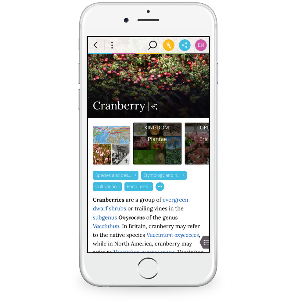
The article layout is a great example of this. The main image is clearly presented, and the subsequent topics and sub-topics appear below as swipe-able, labeled images of their own. Tap anything to jump right to it. If you tap a topic that would lead you to another article, a small text box rises up from the bottom of the screen with the first three lines of that article (you can pull this box up a bit to reveal about eight lines), an image, and the option to open that article in full, all without interrupting or leaving the article you’re currently reading. This is one of the thoughtful niceties I mentioned earlier.

The article itself is legible and easy to navigate. In the bottom left-hand corner is a small tab that presents the article’s table of contents. Swipe left to reveal it, and right to put it away. Finally, you can pick a preferred language (62 are offered) and view a gallery of an article’s images, complete with attribution and usage guidelines.
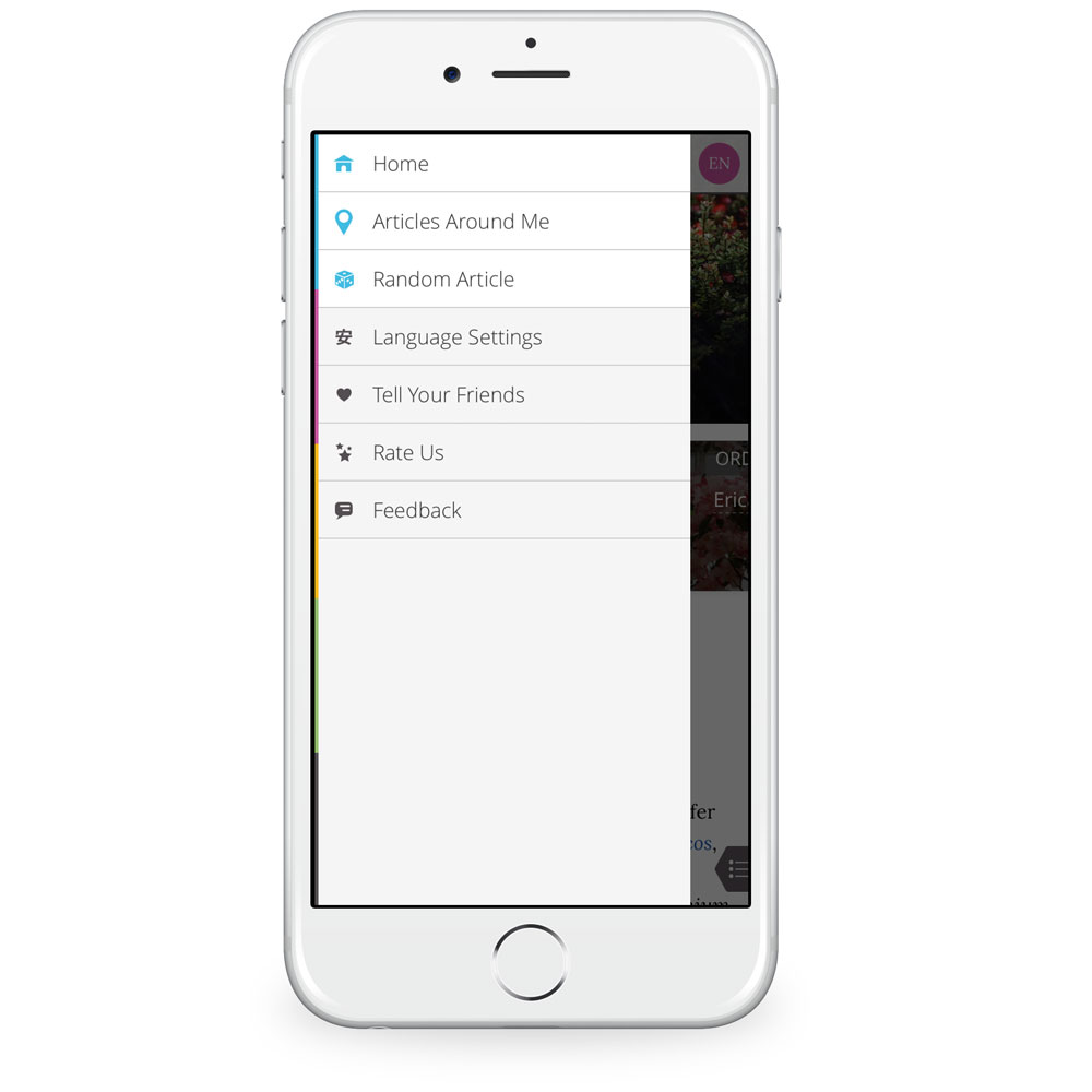
There are a few other goodies to play with here. For example, “Find articles around me” notes your physical location (with your permission) and drops pins for points of interest, etc. around you for which Wikipedia articles exist. I had fun poking around my neighborhood to see what I could find.

Additionally, there’s an option to “roll the dice” and view a randomly-selected article, and you can also designate three preferred languages to be used for search and reading. Finally, the app prominently displays when an article was last updated.
Now we come to price. It’s clear that a lot of thought and skill went into making Wikiwand. There’s even a Safari plugin to use on the desktop.
All of this makes me feel guilty that Wikiwand is completely free. I’d gladly hand over some cash for this great app, but the good folks behind it are not accepting any.
Runner-Up: Wikipedia
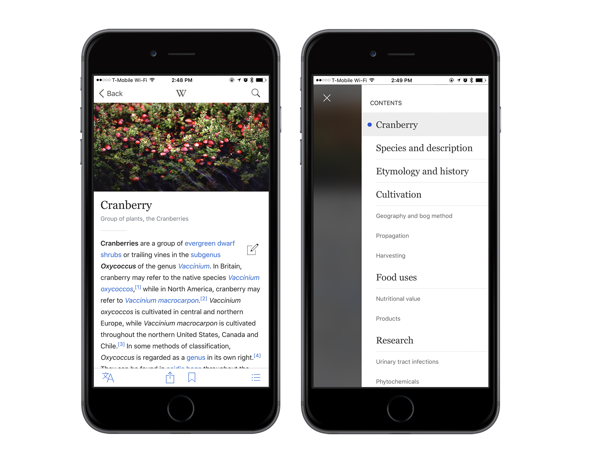
The free, official Wikipedia app for iPhone is quite nice. It’s very fast and provides an option to save pages, which Wikiwand does not. Additionally, it lets users edit Wikipedia entries right from the app. Again, this is a feature that Wikiwand does not offer.

Sharing is a bit odd. You can share a text link to an article via the iOS share sheet, or an image plus some text. dubbed “Share-a-Fact. The latter is nice but unnecessary; a simple link gets the job done.
While the official Wikipedia app is functional, it’s also uninspired. Yeah, it’s Wikipedia. On our phone. OK, cool. It’s basic, but it works if you don’t care for Wikiwand.
Other Contenders
There are several other Wikipedia clients we considered:
Wikiamo
This free offering hasn’t been updated in over two years, and it looks it. Out-of-date design elements abound as well as a very confusing first-use experience. You’re presented with a blank white screen with a tiny toolbar along the bottom. I stared at it for several seconds, expecting something to load, before I realized it was waiting for me to tap the spyglass.
After that, the experience didn’t improve, as slow load times and blocky text made for a forgettable experience.
Articles
This former darling is showing its age. Last updated on Sept. 25 2013, this former Apple Design Award winner could use a facelift.
Functionally, it’s still quite nice. Articles is responsive and snappy, with legible text and fast search. The share button elicits the iOS share sheet, and a tidy page function lets you open multiple pages at once and jump back and forth easily. You can also set up bookmarks and sort them by folder, which aids in research quite a bit. Lastly, the “nearby” and random article functions that I enjoyed in Wikiwand were a part of Articles before Wikiwand was a twinkle in its developers’ eyes.
Still, it suffers on design and some functionality. While the multi-page approach is nice, for example, it feels like an old version of mobile Safari.
Wikipanion
Wikipanion lets you adjust text size, which is helpful. It also feels more contemporary that some of its companions. Ultimately, it feels like a styled presentation of Wikipedia. Search is fast, but scrolling isn’t. Options are cleanly presented, but don’t do anything special.
Conclusion
Wikiwand is our favorite Wikipedia app for iPhone because it’s beautiful, functional, and lightning fast. It’s full of thoughtful features that make it a pleasure to use.

