Day One 3.0 for Mac Introduces Cleaner Design and Simplified UI
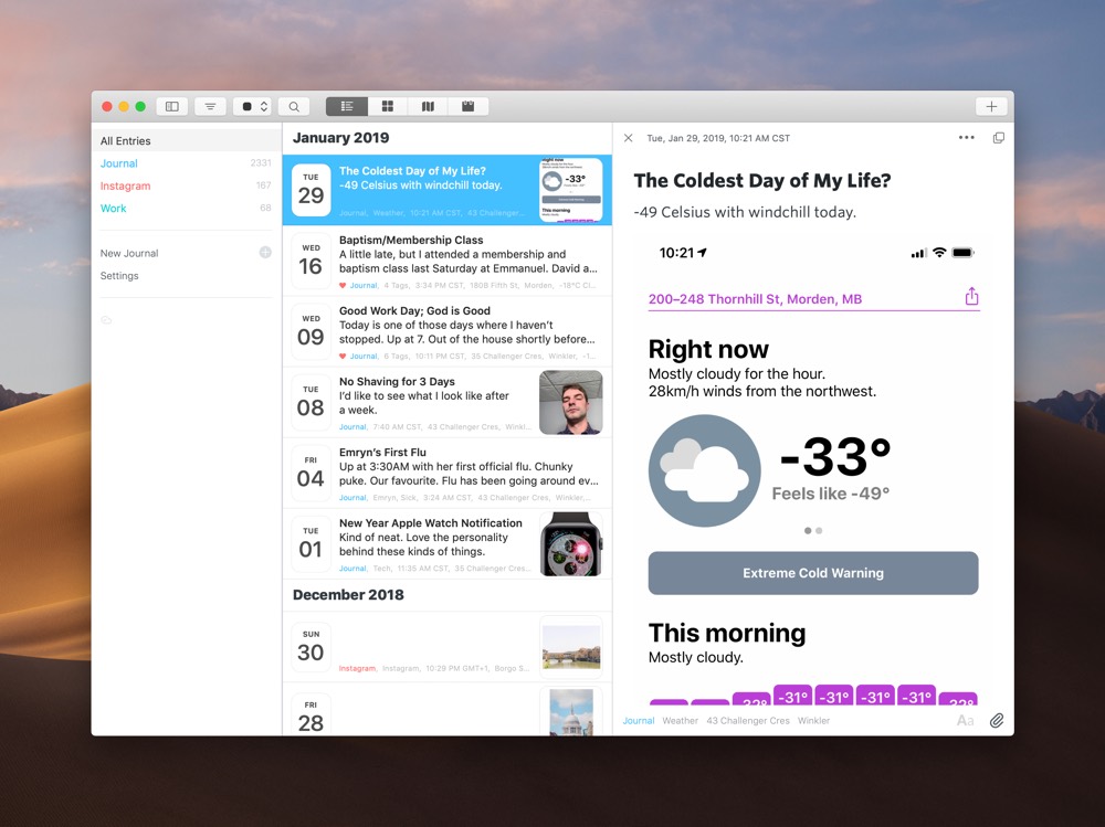
We love Day One here at The Sweet Setup and we’re not shy about it — it’s the best journaling app for iPhone, iPad, and the Mac for a reason. Each major update to both iOS and Mac apps brings new features, new entry types, and an increasing range of utility for keeping your memories safe and sound. The latest version of Day One for iOS included new audio snippets, a beautiful new dark mode, and more. Today, Day One for the Mac catches up to its iOS counterpart.
From a fresh design, to a new toolbar, improvement range management, and new pop out entries, Day One 3.0 for macOS continues to improve on what we love so much about Day One.
New Design and Toolbar
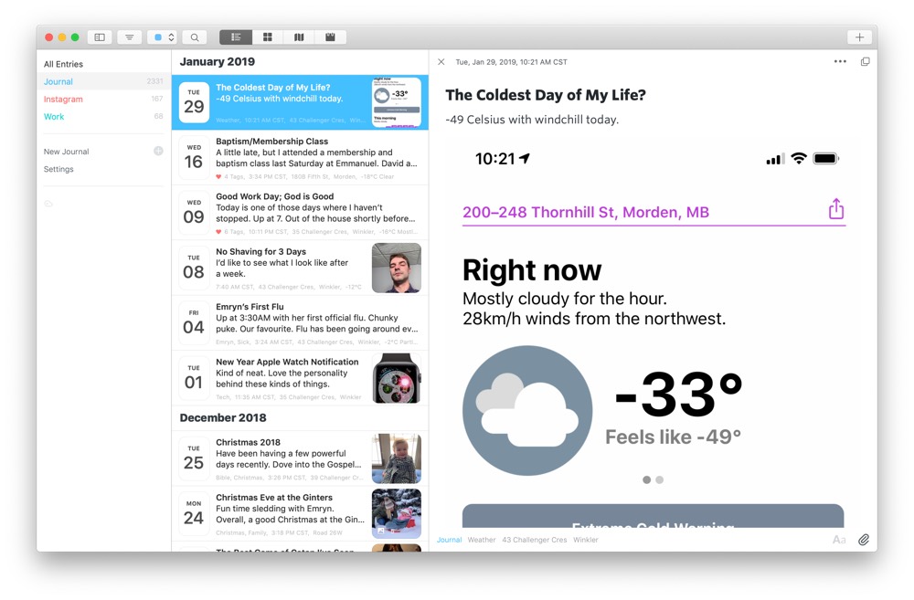
The latest update for Day One for Mac comes with a fresh facelift to bring the design of the app into the latest macOS playground. Text and font improvements range from improved use of bold fonts to the inclusion of custom fonts in the editor, like Whitney, Ideal Sans, Sentinel, and more. And although we’ve already seen a dark mode in prior versions of Day One, the latest dark mode is a continued improvement on the theme.
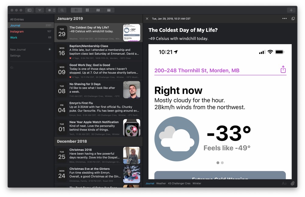
If you move through multiple journals quite often, the left sidebar is now a little more pronounced and, in our opinion, better suited for longer lists of multiple journals. It also auto-collapses if you drag the column size too far to the left.
Day One’s top toolbar has also seen an overhaul, providing button options for quick filtering of your entries, moving between journals, searching your entries, the photo view, map view, and calendar view. In many ways, Day One for Mac feels like it is reverting to a more classic Mac-app style, which we’re fond of and feel more comfortable using.
There are numerous other tweaks in Day One V3:
- The entry list now includes a single photo from the entry with other overlaid information for other types of media.
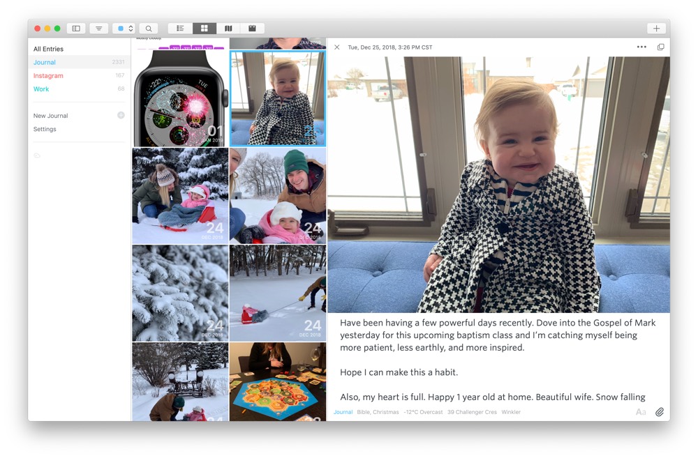
- The entry view now includes a date in the top bar and the ability to quickly open a pop-out entry. The bottom of the entry view now includes the journal, tags, location, and other metadata of the entry.
- The menu bar entry option now has a simpler design.
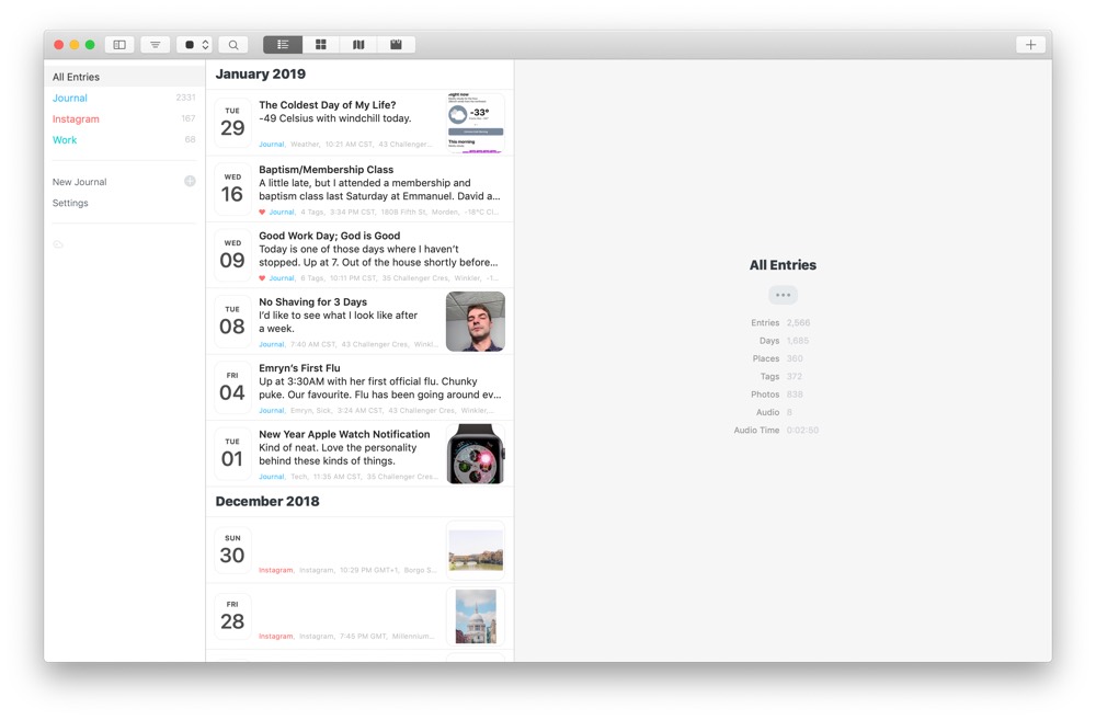
- When an entry is closed (say, after it’s been popped out), you can view the selected journal’s statistics, like number of entries, number of days, number of locations, and more.
In all, Day One 3.0 for Mac is a testament to simplifying and making the app easier to use. The new design feels right at home on the Mac and we’re glad to see the app feel less complex to use
New App Icon
![]()
Part of Day One’s latest design update is a fresh new icon. Day One went with the current aqua-blue icon as part of its first major design update. That icon was largely the same across the Mac, iPhone, and iPad — the flat icon with a white bookmark became ubiquitous, no matter which device you were on.
Now, a few years later, Day One for the Mac gets its own unique, 3D icon. It’s still the same icon by and large, but the 3D flavor gives it an extra pop when put up beside all the round icons found in macOS these days.
Pop Out Entries
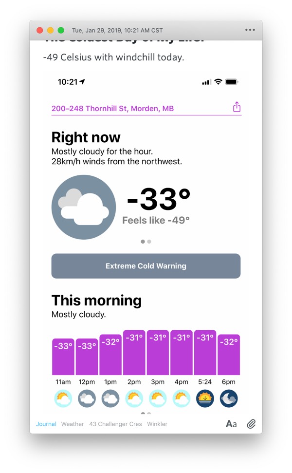
Double-clicking any entry in the entry list will immediately open the entry in a quick pop-out view. This feature is going to be perfect for people who use Day One as a notes repository or who need to reference something inside Day One while they work in a different app.
You can double-click on more than one entry in the entry list to open up multiple pop-out entry windows, making for side-by-side referencing a breeze. Each window can be resized on its own and each entry can be edited within its own window.
New entries can also be popped out to provide an open canvas for more relaxed writing. Day One as a text editor has never been lacking, so some users may opt to use Day One in this setting for creating Markdown and other types of text files.
Some Shortcomings
The latest iteration of Day One for Mac is still missing a few things that its iOS counterpart boasts, namely audio entries, drawings, and the Activity Feed. Any media to be added to a Day One entry on the Mac is done by hitting the paper clip icon in the bottom right corner of the entry, and the list is fairly limited at this point in time. We recognize there are no good drawing options or built-in audio capturing options for the Mac, but these types of features do put the iOS version ahead in our books.
Wrap-Up
Day One’s development has been a long haul and we’re excited to see continued attention to detail after nearly a decade on the App Store. The latest jump to version 3 continues this long haul development, effectively bringing Day One’s design back to the basics to simplify how the app is used.
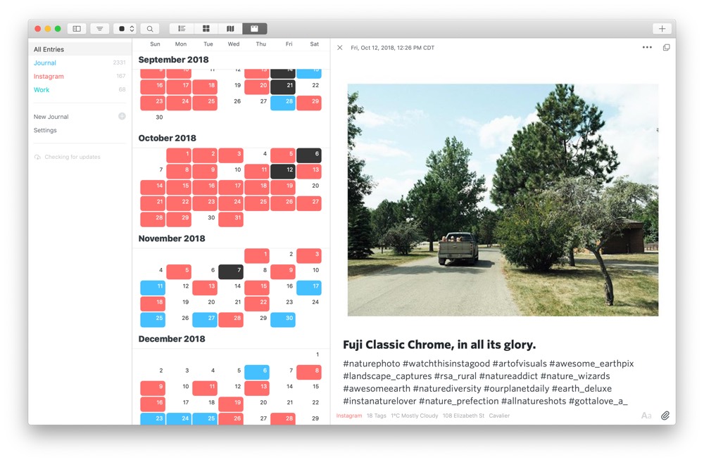
We greatly prefer the new design to the old, as the top toolbar makes jumping between views easier and better uses iconography to denote different areas of the app. Of course, for those who love Hoefler’s font options, Whitney, Sentinel, and Ideal Sans really shine in this new design.
I personally love pop-out entries and the ability to drag them anywhere in macOS for reference somewhere else. This type of feature reminds me a lot of how Bear Notes provides the option of opening a note in a standalone window, which I use a lot. If you use Day One for any sort of note-taking or if you need to reference a specific entry beside a different app, you’ll love pop-out entries.
Hopefully, we continue to see many of iOS’s most notable features move over to the Mac in the future. For now, Day One 3.0 for Mac is a great update for one of our most treasured apps and is a must-have update for any Day One user.
For more information on the best journaling app for iPhone, iPad, and the Mac, be sure to check out our review and our full-fledged course. You can download Day One for Mac for free from the Mac App Store and subscribe inside the app for a premium account.
Wait! There’s more….
How to Use Day One in Your Life
For a the best journaling app, you won’t do better than Day One. And if you want to discover how to use this app more regularly, and take full advantage of all its features, then we have some video screencasts that can help you.
In our course, Day One in Depth, you get 8 video screencasts that will take you line by line through every feature, setting, preference, and option found in Day One.
We’ll show you…
- Complete walkthrough of the Mac and iOS apps.
- How to create and customize your journal entries (from text, to photo, to audio)
- How to find, filter, export, and more.
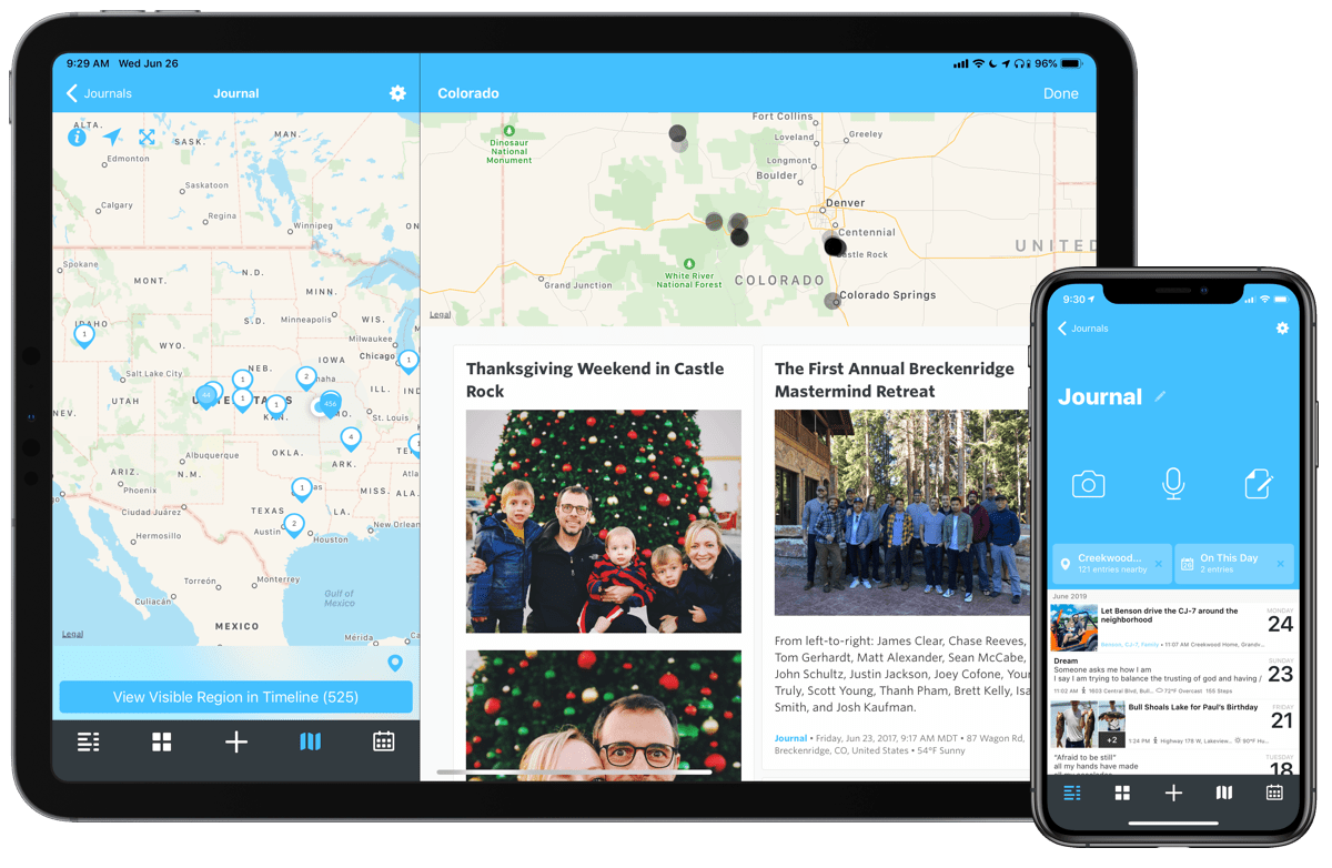
Plus! You will get bonus tips, workflows, and tutorials for how best to use Day One to suit your own needs: from a morning writing time to a photographic travel log, to weekly reviews and productivity journaling — Day One can do it all and we will show you how.
