Our first look at Shortcuts on iOS
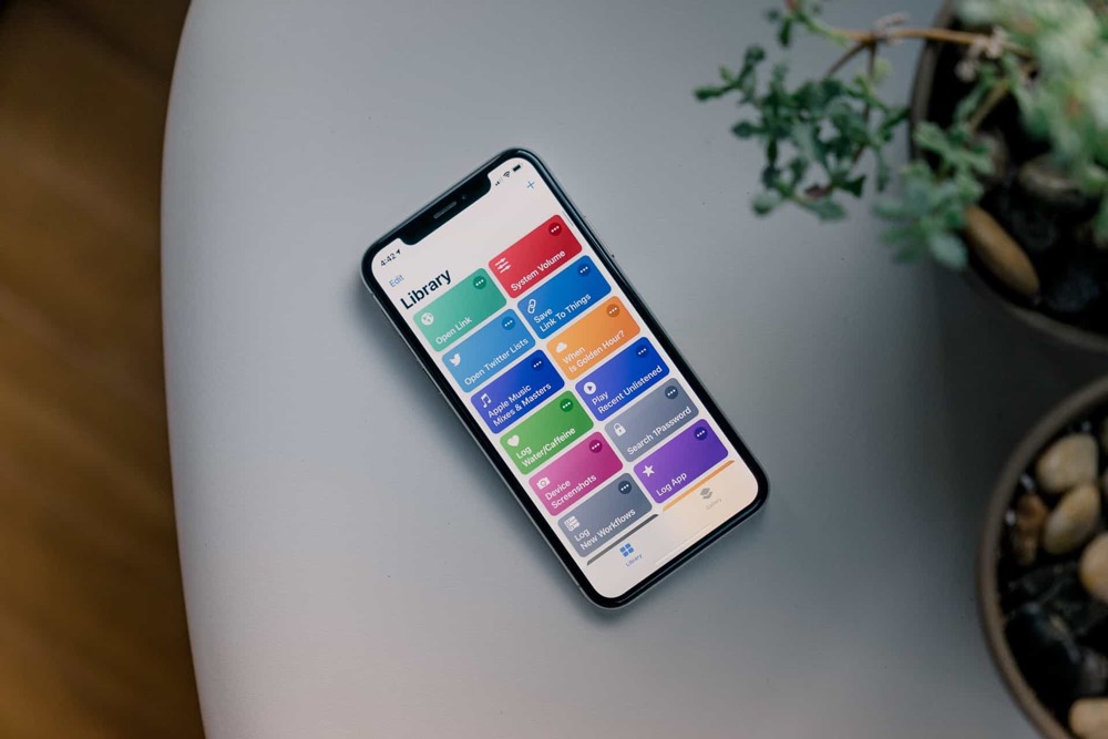
When Shortcuts was announced at WWDC, I became incredibly excited. Apple bought Workflow back in March 2017 and I was a little concerned about the future of the app. Workflow was created by a small team to enable automation on iOS — and Shortcuts has taken all of that, and added more. Much more.
For any developers who have applied to test the Shortcuts beta, it’s still in its earliest days. It’s important to keep in mind the reality of an early beta. In short, things will change!
So, what’s different between Shortcuts and Workflow? As per Shortcuts’ release notes (available on developer.apple.com) there are some actions missing (such as IFTTT triggers) and iCloud sync is not available yet.
Wait. There’s a Bonus….
Custom Productivity Templates
We have a set of custom productivity templates that work well with the iPad app, GoodNotes. And if you want to try them out, we’ve put together a free guide that can help you.
We’ll show you…
- How to create and save custom page templates in GoodNotes.
- How to use those page templates to transform GoodNotes into your own productivity notebook (or any other type of notebook replacement).
Plus, we also have included a couple of our custom productivity templates for you to get started with. These templates are right out of our popular productivity course.
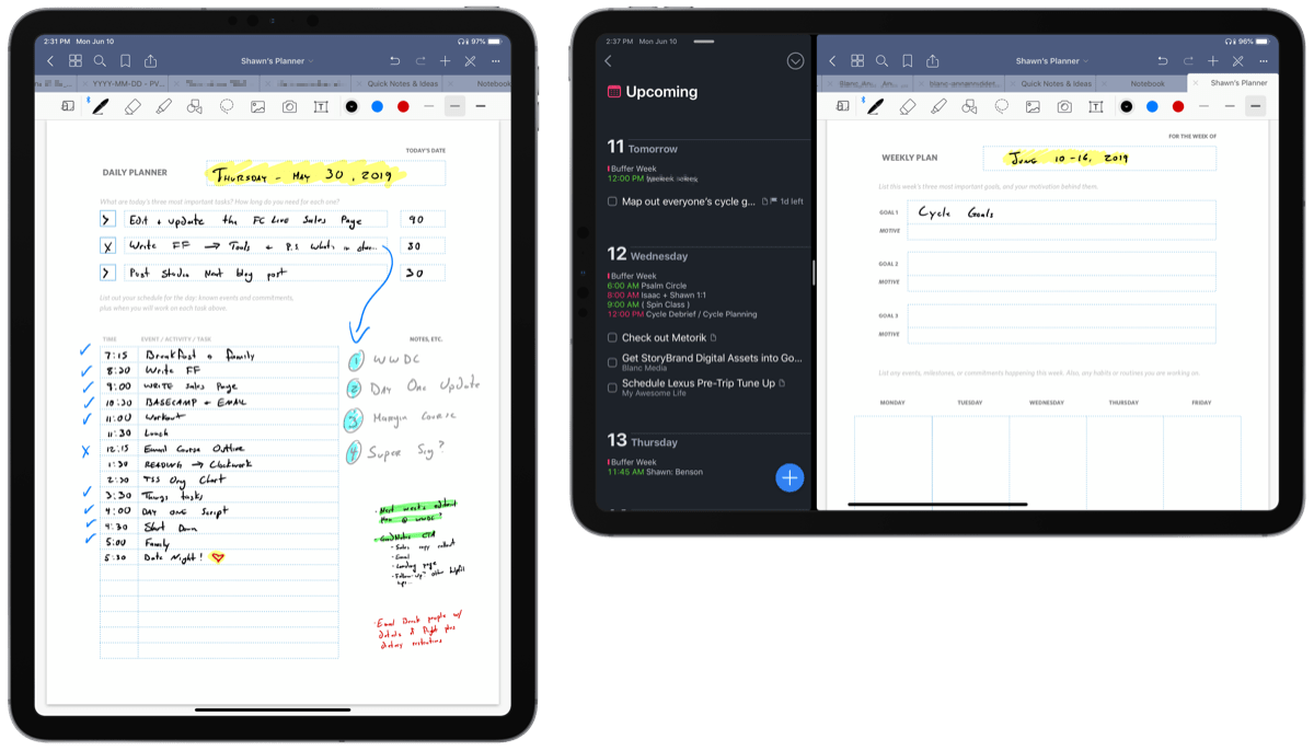
The custom templates and the guide are available for FREE to our email subscriber community. And you can get it right now. By joining the Sweet Setup community you’ll also get access to our other guides, early previews to big new reviews and workflow articles we are working on, weekly roundups of our best content, and more.
However, what’s most interesting is what we’ve gained. First, we have a variety of new system controls. This includes controls for:
- Airplane mode
- Bluetooth
- Cellular Data
- Do Not Disturb
- Low Power Mode
- Wi-Fi
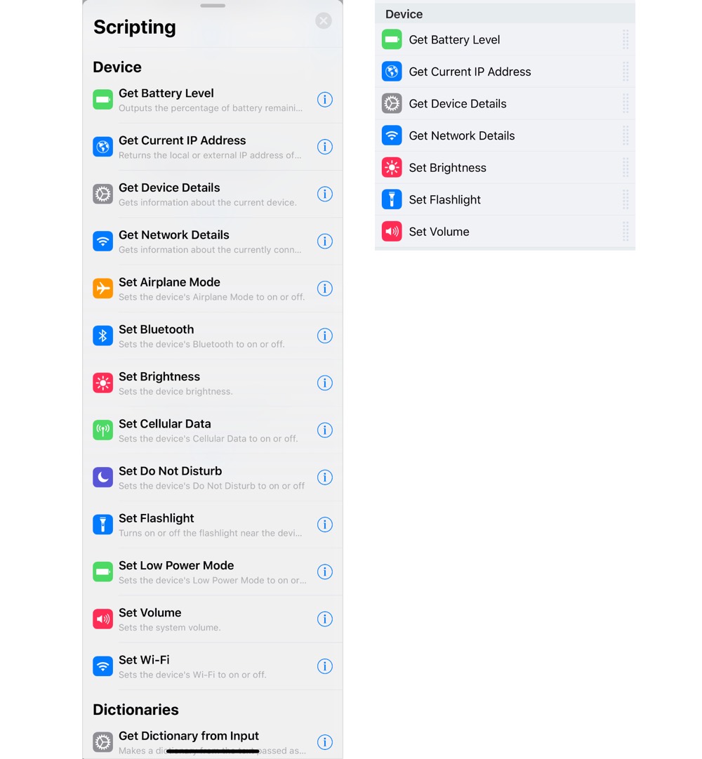
Editor’s note: Shortcuts is on the left, while Workflow is on the right.
These actions alone give us a lot of power.
Shortcuts looks different than Workflow too. Here are a few text and comment actions as an example:
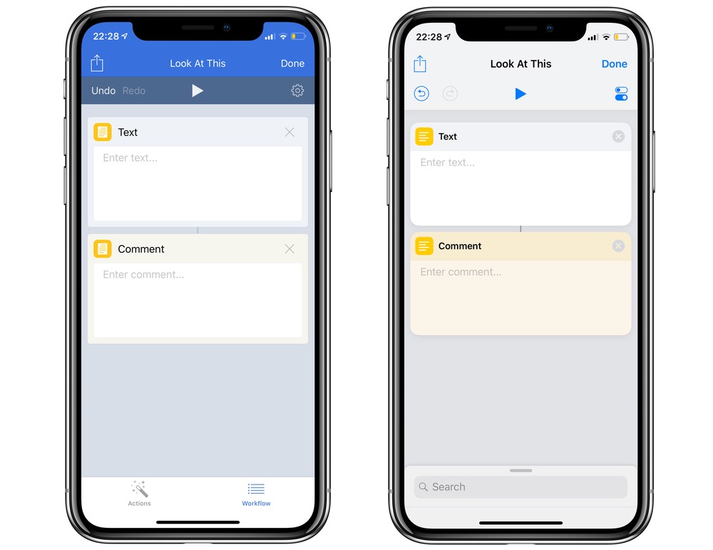
Editor’s note: Workflow is on the left, while Shortcuts is on the right.
In Workflow, these actions looked very similar and had squared corners. Shortcuts has some polish added, which makes it easier to differentiate actions, and it also feels more like an Apple app.
In Workflow on iPhone, you swipe left from the action Workflow to get to the lists of actions. In Shortcuts, there’s a search bar at the bottom that you can drag up to suggest a few actions. By tapping in the search box, you can see the typical groups and views we’re used to seeing in Workflow. While this change may take a little getting used to for those who are familiar with Workflow, I think it makes things much more accessible for those who are not yet power users, or who are just getting into the app.
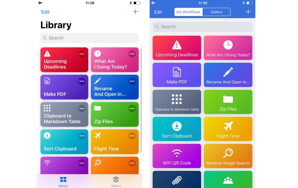
Editor’s note: Shortcuts is on the left, while Workflow is on the right.
We have a new group of actions available in Shortcuts too: Siri Suggestions. These are the same kinds of things available in Settings → Siri & Search, but by building them into a Shortcut, you can trigger multiple actions with just one command. These actions include anything Siri might suggest on its own, including HomeKit scenes, playing music, contacting people, map directions, and more. These suggested actions are not editable, but do make things easier to understand. For example, playing a particular song in an album is one small action if suggested by Siri, but you would need both the “Find Music” and “Play Music” actions to recreate this by yourself in Workflow.
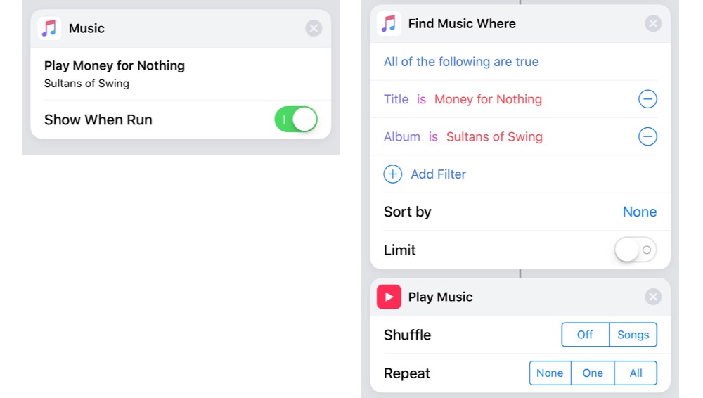
Editor’s note: Siri’s suggested action is on the left, while the Shortcuts action is on the right.
Triggering Shortcuts can be done from the main page of the app. Simply tap the icon of the Shortcut (in Workflow you had to double tap on the icon to run it immediately). This also doesn’t show the UI of the Shortcut unless it is needed. From editing the Shortcut (the ... part of the icon), you can choose to show it in the share sheet and/or the widget (which are options in Workflow too), or you can add it to Siri directly and specify your preferred command.
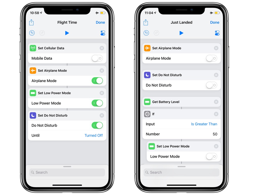
I’ve already been able to use some of these new actions to build and enhance my Workflows into powerful Shortcuts. One new shortcut is Flight Time, a very simple automation that I can now run when getting on a plane. It disables cellular data (because of potential roaming charges when landing) and enables airplane mode, low power mode, and do not disturb. This (naturally) has a companion shortcut called Just Landed, which disables airplane mode and Do Not Disturb, and if the battery level is over 50%, it disables low power mode, too. Of course, the latter probably can’t be triggered with Siri if you’re flying, but it fits nicely in the widget.
Shortcuts has a lot of potential — that’s very clear. I’m very much looking forward to seeing what ideas I and others create in the future. However, I’m most pleased to see that Shortcuts is becoming easier to use. The Siri integration is a no-brainer — as we can trigger these options from the HomePod, this has given Siri a lot of the power users have been asking for.
So, what might we want to see in the future? Currently, any Shortcuts that have an “ask for input” require you to use the keyboard. This is fine if you’re using “Type to Siri,” but it would improve the experience if Siri could say whatever phrase necessary for that input box, and allowed you to speak to fill the input box.
Similarly, the dictation action runs until you stop it. This isn’t ideal when driving.
Currently, there’s no way to submit to the gallery, and the only way to share a shortcut is via AirDrop or saving a file. Perhaps we’ll get a mini App Store like the Messages store? I would love the ability to submit shortcuts I’ve made for other people to use.
I’m extremely excited by Shortcuts, and I think everyone will be able to take advantage of Shortcuts’ power — even if it’s just a shortcut that plays rain audio and enables Do Not Disturb for an hour to help you take a quick cat nap!
