Window management for macOS in 2018
On a recent run, I was listening to one of my favorite podcasters, Drew Coffman, talk about how iOS is so much more pleasing than macOS when it comes to organizing your workspace.
It wasn’t the focus for the episode, but I couldn’t help but be surprised about how the two hosts described managing applications and windows on an Apple desktop computer. My surprise was not because of the issue itself (we’ve all pressed the green traffic light planning to expand the window and gone full screen, or accidentally minimized an app to the dock), but because Drew and Jon seemed unaware of some of the excellent options available to address this issue.
The Problem
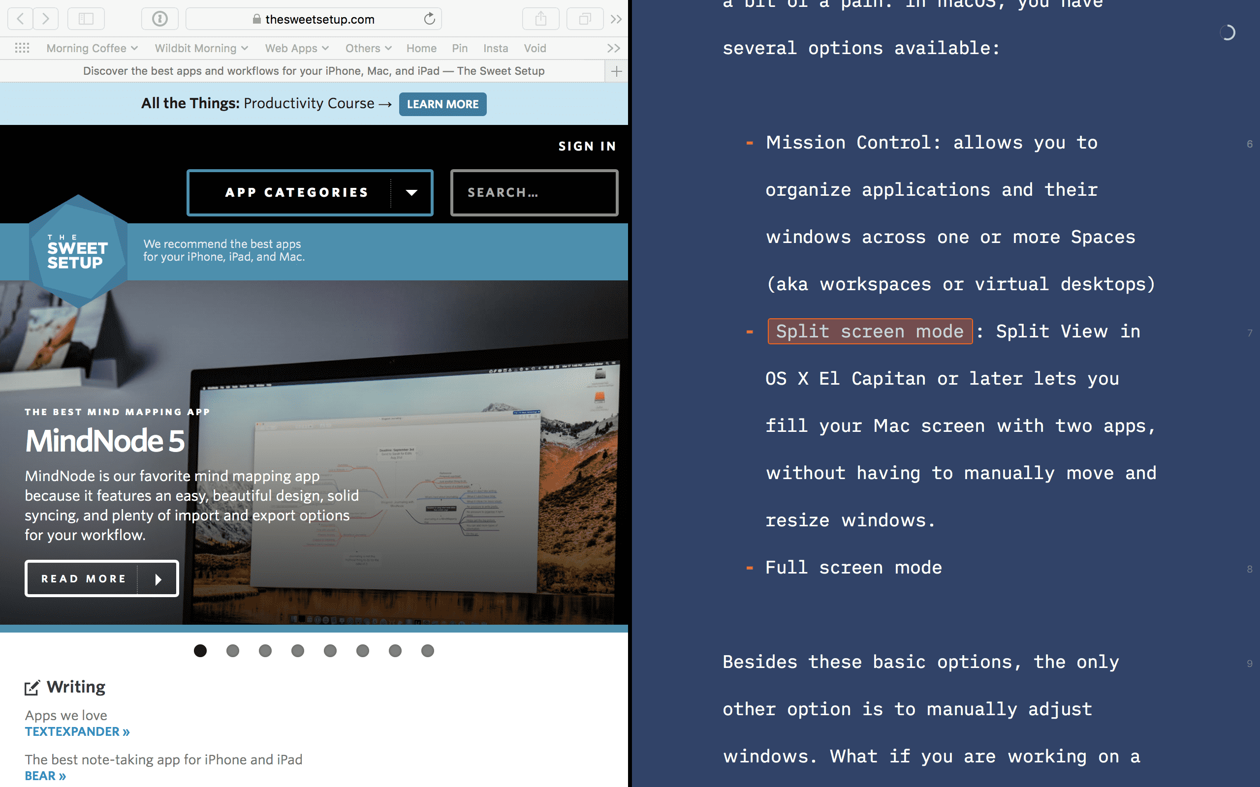
What’s the issue here? Well, managing your application windows on macOS can be a bit of a pain. In macOS, you have several options available:
- Full-screen mode allows you to focus on one app at a time. Clicking the green traffic light button on any window will open that application in a separate space and remove items like the Dock and menu bar from view.
- Split screen mode gives you the same functionality as full-screen mode, but with two apps. You can fill your Mac screen with two apps, but without having to move and resize windows manually.
- Mission Control allows you to organize applications and their windows across one or more Spaces (aka workspaces or virtual desktops)
Besides these basic options, the only other option is to adjust windows manually — like an animal. What if you are working on a large display and want your code editor on one side of the screen, and your Git client and a browser window on the other side? And what if you want to add a fourth application with one window across the bottom quarter of your screen? You have to set up this arrangement manually. Now, imagine you want to use this setup every day.
Maybe that sounds complex, but even just taking one window and making it fill the entire screen without going into full screen mode is annoyingly hard. It becomes easy to see why some people have recognized the lack of control in macOS and have filled in the gaps.
Solutions
In 2018, three primary applications come to mind as great solutions for this problem. They are:
- Moom from Many Tricks
- Divvy from Mizage
- Magnet from CrowdCafé
Of the three, Moom is my favorite. In fact, I’ve been singing its praises for five years now. Here’s what I love about it.
10 default options: Once running, Moom takes the green traffic light icon and adds functionality. Hover the mouse cursor over the green icon and another menu is shown. This menu includes five layouts that can be clicked to organize your windows in a precise sizing and layout.
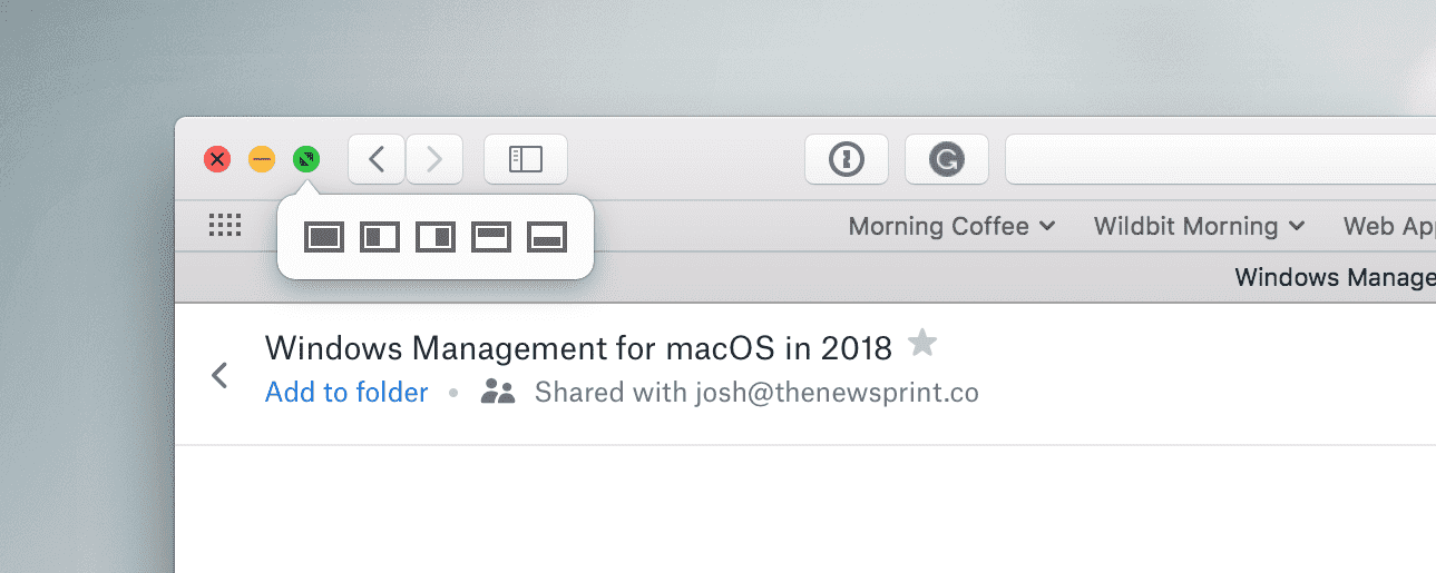
Hold the alt key down while hovering over the green icon and you’ll get five other layout options. Even if you never used any other features of Moom, these options alone make managing your application windows far easier.
Custom layouts: You can take it further and create custom layouts to craft the desktop that suits you best. Moom has an intuitive UI for breaking your screen into a grid, then lets you specify what part of that grid you want a window to take up.
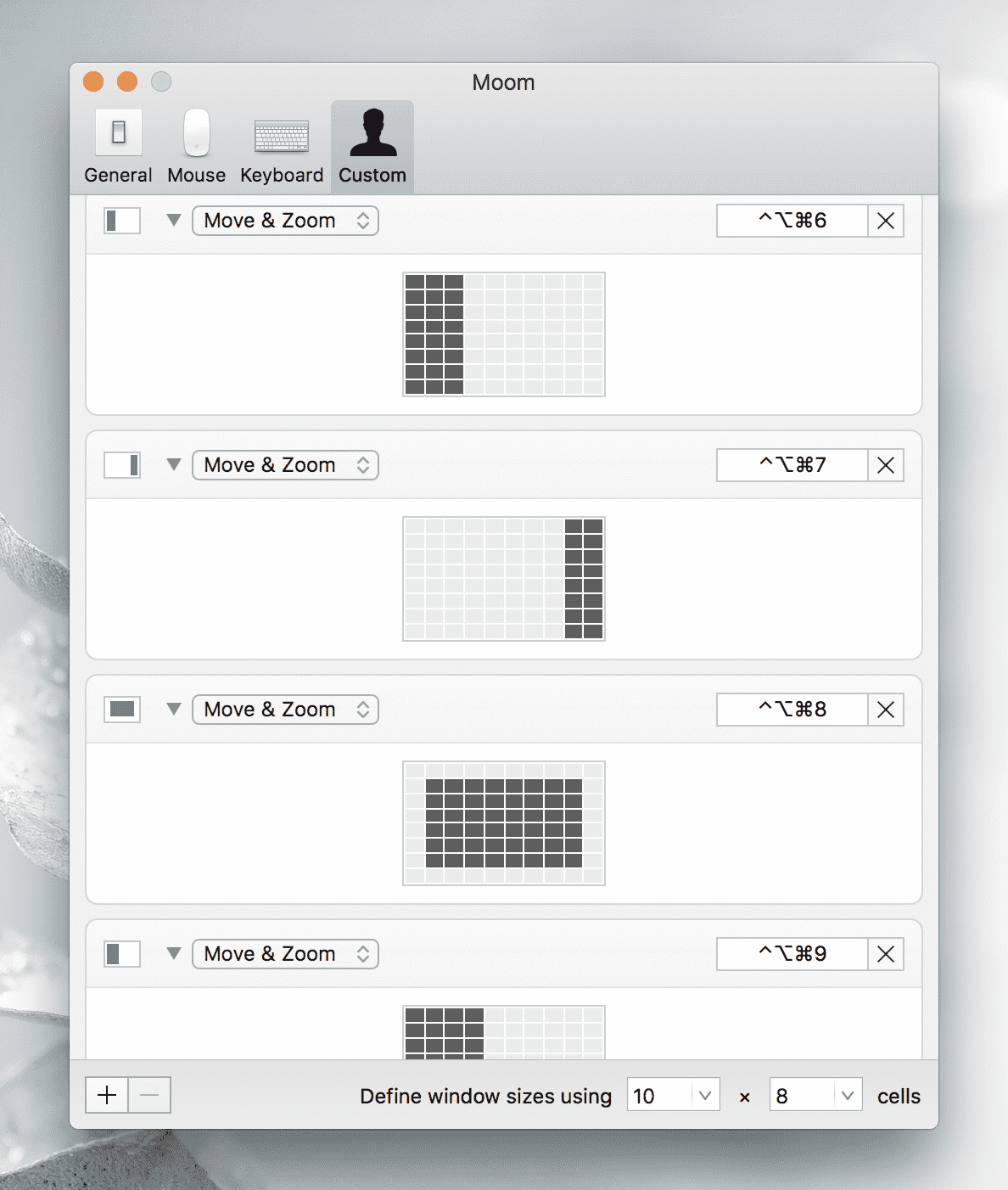
If the default grid is not good enough for you, you also have the option of breaking into smaller and smaller pieces.
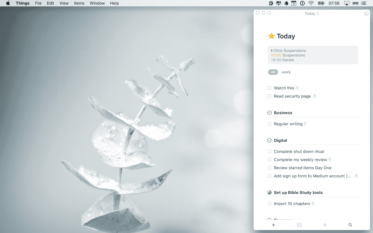
Last, the custom layouts can have an associated shortcut. Now, you can navigate to any open application, then trigger Moom with the associated shortcut. I use this option for Slack and Things every day.
For the power users: As well, Moom has a couple advanced options. One is for bundling sets of applications and/or windows into a custom layout. A perfect example use case for this is a web developer who requires multiple tools to do their work. They might need to open the command line (i.e., Terminal), their preferred text editor, a Git client, a SQL client, and a web browser.
With Moom, they could use the grid options to arrange all of these apps in a precise configuration, then save that as a custom layout. Every day when they’re ready to work, all they need to do is open the required apps, then use a keyboard shortcut to trigger that custom layout.
Last, Moom also recognizes external displays and allows you to save configurations for those as well. It has a lot more options not mentioned above, but these are a good start.
Issues
One thing to mention here is that these solutions work great with native macOS apps, but applications built on Electron can be less ideal.
Slack is probably the most used Electron app for Apple desktop users, and it’s a great example — it can ignore the layout from a Moom configuration, or only apply it partially. But with several clicks, it will eventually fall into place.
Perhaps people like Jon and Drew prefer iOS because of the feel or because the operating system has better options by default. Me? I don’t mind supporting third-party developers who recognize gaps and fill them in.
In fact, I love supporting these people — they are what drew me to using Apple products. This type of app has a lot of functionality for the power users. For the $10 price tag, it’s out-of-the-box options are worth it for the casual user who wants a little more control over their windows.
We have more useful workflow examples right here.
Wait. There’s a Bonus….
Custom Productivity Templates
We have a set of custom productivity templates that work well with the iPad app, GoodNotes. And if you want to try them out, we’ve put together a free guide that can help you.
We’ll show you…
- How to create and save custom page templates in GoodNotes.
- How to use those page templates to transform GoodNotes into your own productivity notebook (or any other type of notebook replacement).
Plus, we also have included a couple of our custom productivity templates for you to get started with. These templates are right out of our popular productivity course.
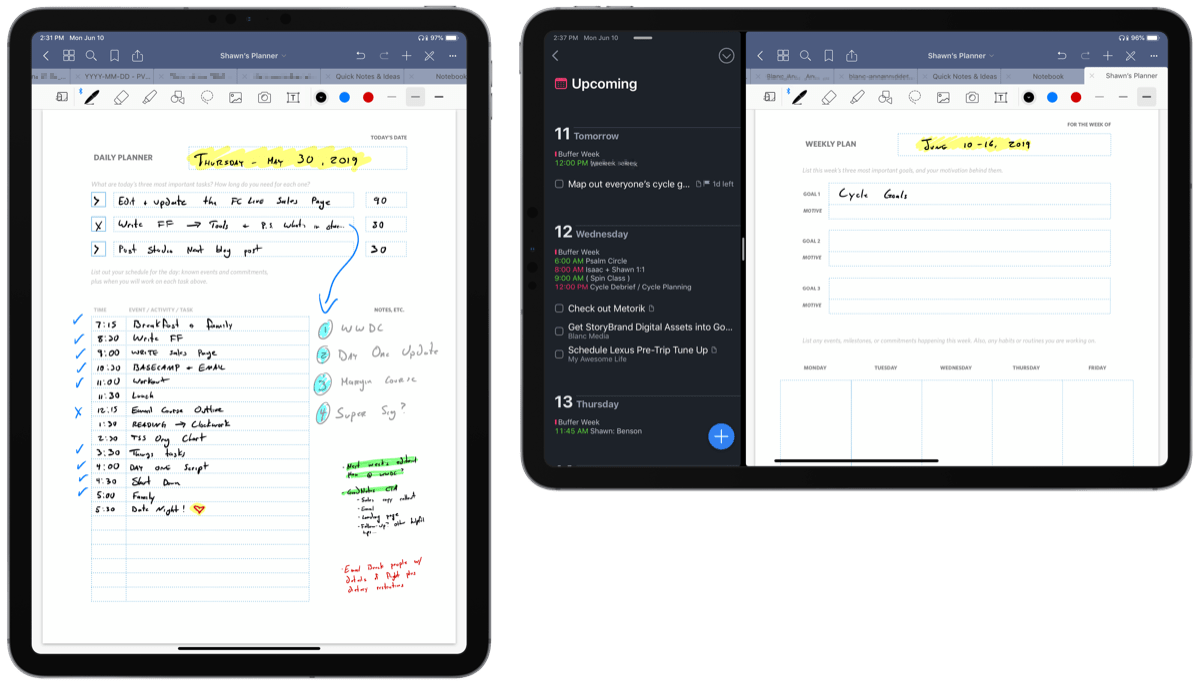
The custom templates and the guide are available for FREE to our email subscriber community. And you can get it right now. By joining the Sweet Setup community you’ll also get access to our other guides, early previews to big new reviews and workflow articles we are working on, weekly roundups of our best content, and more.
