How to use Responsive Design Mode in Safari
Anyone that works with websites knows how important it is that they scale correctly on all types of devices. While mobile is extremely important, desktop is still a primary way that a lot of people experience the internet.
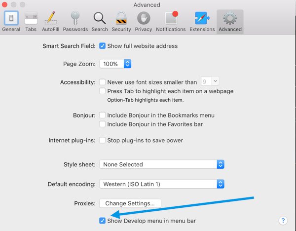
On the Mac, Safari makes it extremely easy to check websites across all types of devices and screen sizes. To do this, you need to enable the Developer menu. Click Safari → Preferences, and then click the Advanced tab. Enable the Show Develop menu in menu bar option in the Preferences dialog box.
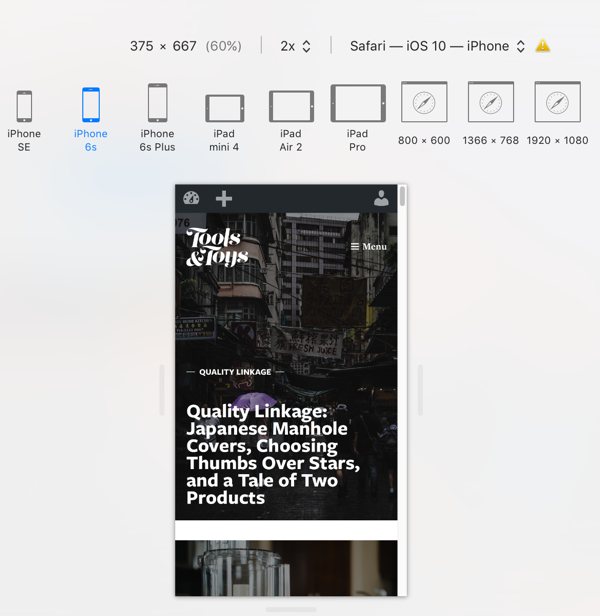
One that is enabled, go to the Develop menu on the Safari menu bar. Click Enter Responsive Design Mode.

You’ll now see options for various iPhones, iPads, and desktop screen resolutions. This will allow you to make sure your websites look good for everyone, regardless of device choice.
We have more helpful tips right here.
Curated List of Must-Have Apps
We spend an inordinate amount of time sorting through hundreds of apps to find the very best. Our team here at The Sweet Setup put together a short list of our must-have, most-used apps in 2022.
You will get…
- The current list of The Sweet Setup’s top 8, must-have apps.
- A special, pro tip for each app to help you save time and become more of a power user.
- A hidden feature of each app that you may not have known about.
The Sweet Setup Staff Picks for 2022
These apps work on iPad, iPhone, and Mac. And they range across several different categories but are mostly focused on productivity. They will help you get the most out of your devices and your day.