Ulysses 15 Introduces Split View Editor, New Image Export and Previewing Features, and Keyword Management Improvements
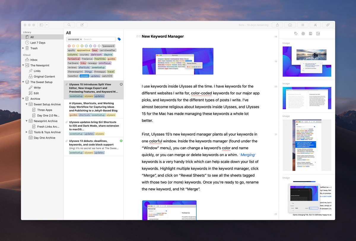
Ulysses has been our pick for the best pro writing app for iPhone, iPad, and Mac for quite some time. However, we’re often met with comments from folks who are unable to use Ulysses for their own writing needs, be it because of how Ulysses handles images, how the app handles Markdown, the need to view multiple sheets side-by-side, or a range of other nitpicks.
Every single one of these nitpicks is legitimate, and although I’ve been using Ulysses for writing exclusively for a few years now, I’ve had to adapt my writing workflow — and insert other apps into the process — just to make it work.
You could say I’m making compromises in my writing workflow just so I can use Ulysses.
It shouldn’t be that way — one app should be able to fulfill the majority of writing workflows.

Stop losing your ideas and notes to multiple apps…
An online course to help you save time, organize your notes, and master the best writing app for Mac and iOS: Ulysses.
My workflow, for example, requires an app like iA Writer for previewing and editing everything before I send it off for publishing. iA Writer has always had a significantly better preview window than Ulysses, and the inability to preview web images inside Ulysses has always been one of the biggest pitfalls of the app.
Other little things have annoyed me too — although you can wonderfully drag and drop any image from Finder into the sheet attachments bar and then into your writing, Ulysses has never properly inherited file names from the Finder. I can’t count the amount of image filenames I’d have to manually rename inside the Ulysses editor before exporting to iA Writer for preview.
Long story short, Ulysses has always had a few annoyances that require other apps or inefficient uses of time to overcome.

With Ulysses 15, almost every one of these annoyances is overcome. You could almost name Ulysses 15 the “blogger update,” but that’d be undermining the breadth of improvements in the latest version of the app.
Our pick for the best pro writing app gets better and better with age, and Ulysses 15 is one of the most significant updates in recent memory for smoothing out a multitude of minor annoyances.
The New Split View Editor
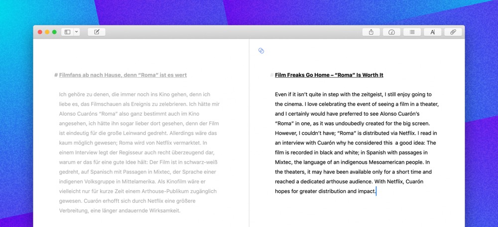
Ulysses was one of the first apps to tout feature-equivalency across the Mac, iPhone, and iPad. Ulysses 15 steps away from this idea, and introduces a native split view editor on the Mac that isn’t available on the iPhone or iPad.
Although you could largely replicate this feature before by opening multiple sheet windows, the new native split view editor is more comfortable and much easier to use. Whether you need to view your research while writing, or need to translate a document, the native split view editor will be a welcome addition.
We sort of have a sense of how not to do split view if we look at how Apple handles Split View on the iPad. On the iPad, there’s no keyboard shortcut for moving between apps in Split View and there’s no way to know which app is currently in use.
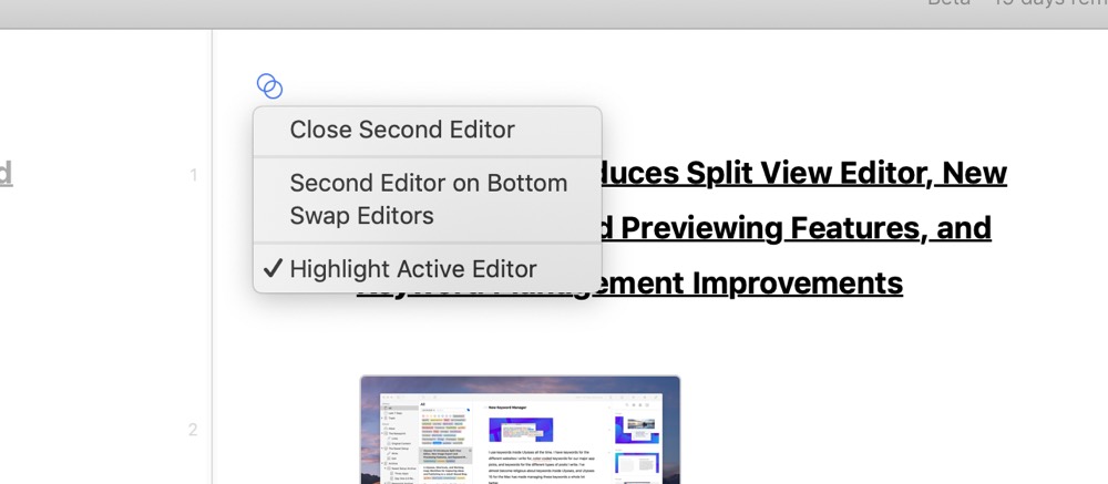
Ulysses’s development team has kept a close eye on this apparently, as navigating between split view sheets inside Ulysses 15 is a breeze. You can jump between the editors by using a Command + Option + Left/Right keyboard shortcut and you can even scroll both documents at a time if you hold down the Option key while scrolling. And, to ensure you always know which sheet you are editing, the active sheet is highlighted, while the inactive sheet is greyed out.
It’s interesting to see third-party developers learn from Apple’s miscues on other platforms in order to ensure a feature like this can be pulled off properly. While a native split view editor won’t be necessary for everyone, having the ability baked into the app is far better than having to manually resize individual sheet windows.
New Keyword Manager
I use keywords inside Ulysses all the time. I have keywords for the different websites I write for, color-coded keywords for our major app picks, and keywords for the different types of posts I write. I’ve almost become religious about keywords inside Ulysses, and Ulysses 15 for the Mac has made managing these keywords a whole lot better.
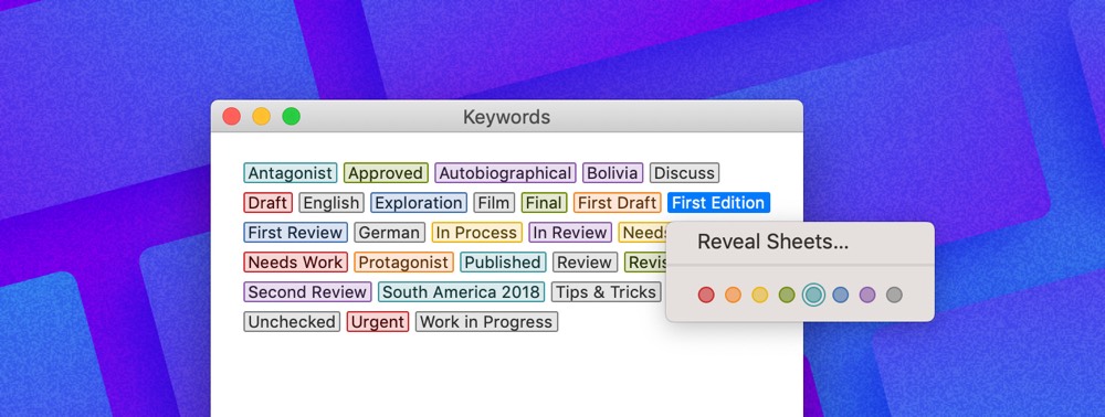
First, Ulysses 15’s new keyword manager plants all your keywords in one colorful window. Inside the keywords manager (found under the Window menu), you can change a keyword’s color and name quickly, or you can merge or delete keywords on a whim. Merging keywords is a very handy trick that can help scale down your list. Highlight multiple keywords in the keyword manager, click Merge, and then click Reveal Sheets to see all the sheets tagged with those two (or more) keywords. Once you’re ready to go, rename the new keyword, and hit Merge.
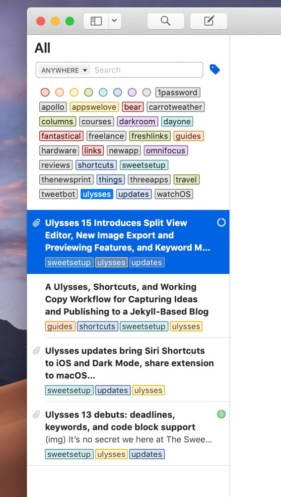
Second, Ulysses 15 for Mac now features better keyword searching. Where before, you’d click the Search button and search through all your sheets for your search query, you can now search just by keywords. When you click the Search button, you can now click on the tag icon to search through just your keywords, making it far faster to drill down to all the sheets with your required keyword.
This is a relatively small improvement that can have a monumental impact on how you use Ulysses. Merging keywords has really tidied up my keywords list and the ability to search strictly by keyword has made researching some of my old work far easier. For example, I searched everything with the ulysses tag (color-coded yellow, of course) for this article so I could see everything I’ve written strictly about Ulysses, rather than bringing up every single sheet with the word “Ulysses” written in it.
Dark Export Preview
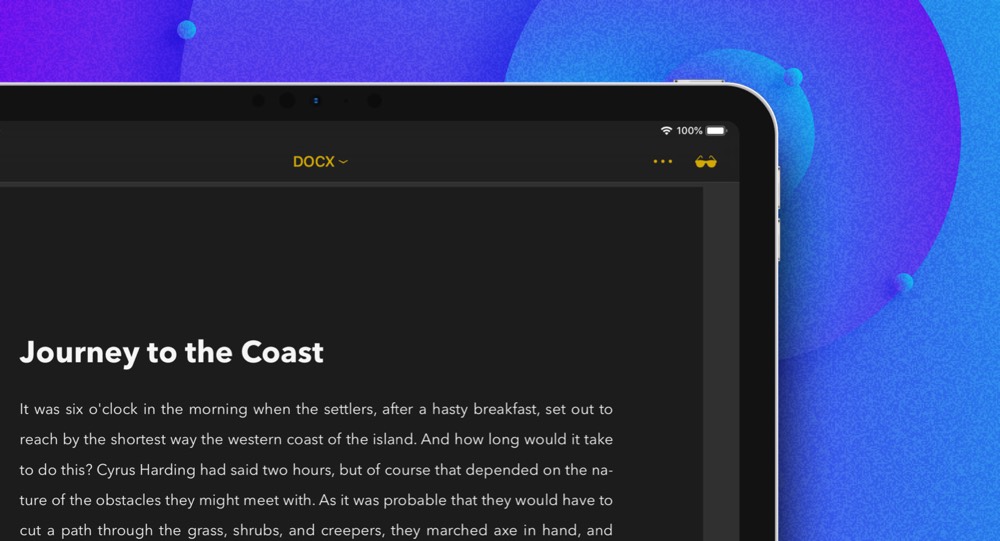
Ulysses’s preview mode has always baffled me — it’s why I use iA Writer for previewing all my work before sending it away — but the single-most baffling aspect of the preview window was the inability to preview your work in a dark mode, even if the rest of the app was set to a dark mode.
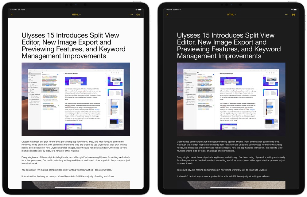
Whether this was an oversight is beyond me, but it’s fixed once and for all in Ulysses 15. When previewing your sheet, simply click or tap on the cool sunglasses icon to flip back and forth between a light and dark mode preview.
Game changing? No. But I’m definitely happy to see the Ulysses crew shoring up one of the oddest design choices in the app.
Resize Images on Export
The last two major new features for Ulysses 15 may not matter to all Ulysses users, but these two improvements have hit the nail on the head for me.
I mentioned earlier that I use keywords religiously inside Ulysses. Although you can tag your sheets in the sheet navigation pane, I find it easier to fill out keywords in the attachments bar in each sheet. While I’m tagging the sheet, I often set a goal for the length of the piece, and I quickly drop in the images I expect to use.
The old workflow involved the need to resize those images first before dropping them into the Ulysses attachment bar. I’ve always used ImageOptim for this on the Mac, but there’s never been a good way to resize images on the iPhone or iPad.
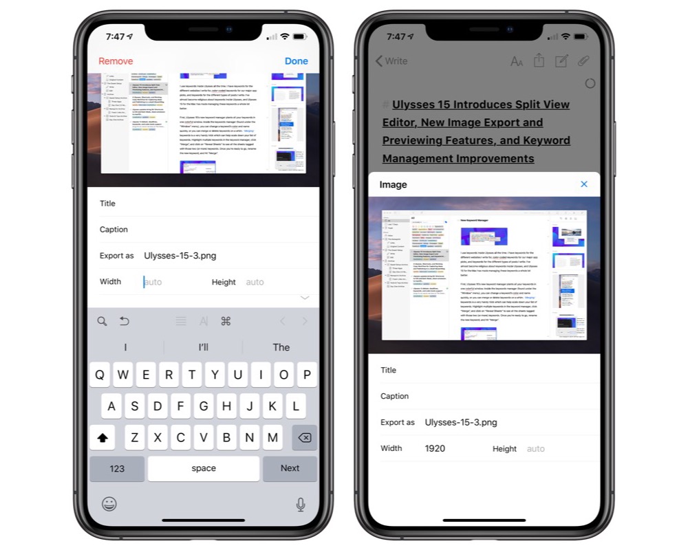
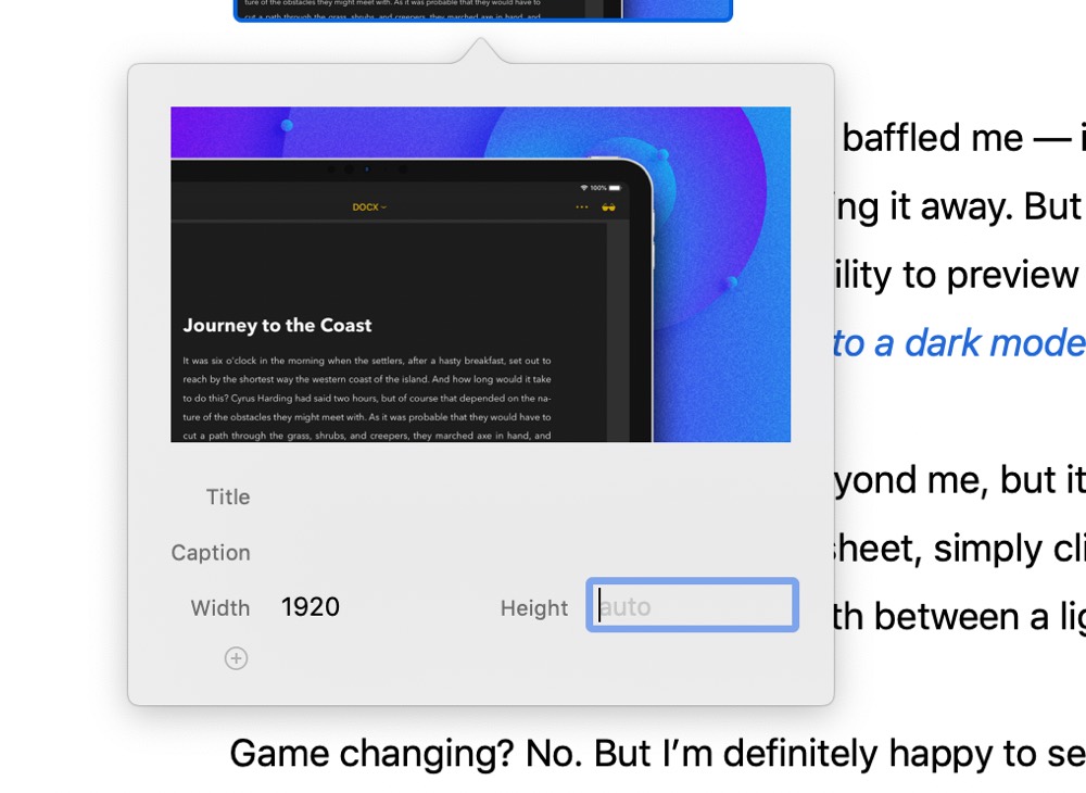
Ulysses 15 has replaced this workflow for me — an image resizer has been built right into the text editor, eliminating the need to resize images before placing them into your sheet. Simply drag an image into your sheet, tap/click on the image, and change the export size of the image.
A by-product of this new feature is the fact that Ulysses can now act as another photo backup location. If you drag and drop full-size images into the attachment bar of a sheet and you resize on export, those full images will be saved to those respective sheets for as long as you are a Ulysses user. If for some reason you can’t locate an image in your Lightroom library or Camera Roll, Ulysses now becomes a viable option for backing up photos and images you’ve used in your writing.
Web Image Previews
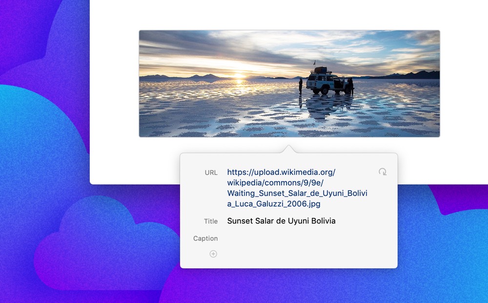
Lastly, Ulysses 15 introduces web image previews — another one of those features I always thought Ulysses should have had. Now, if you type (img) in a sheet, two options appear on the Mac: you can select a file from Finder or click URL to paste a web image URL into the image placeholder. On the iPhone and iPad, typing (img) will now bring up an entire image choosing view, allowing you to select from your photo library, Files.app, a URL, or shoot a photo directly with the camera. After you enter the URL, you’ll see a preview of the web image right in the editor.
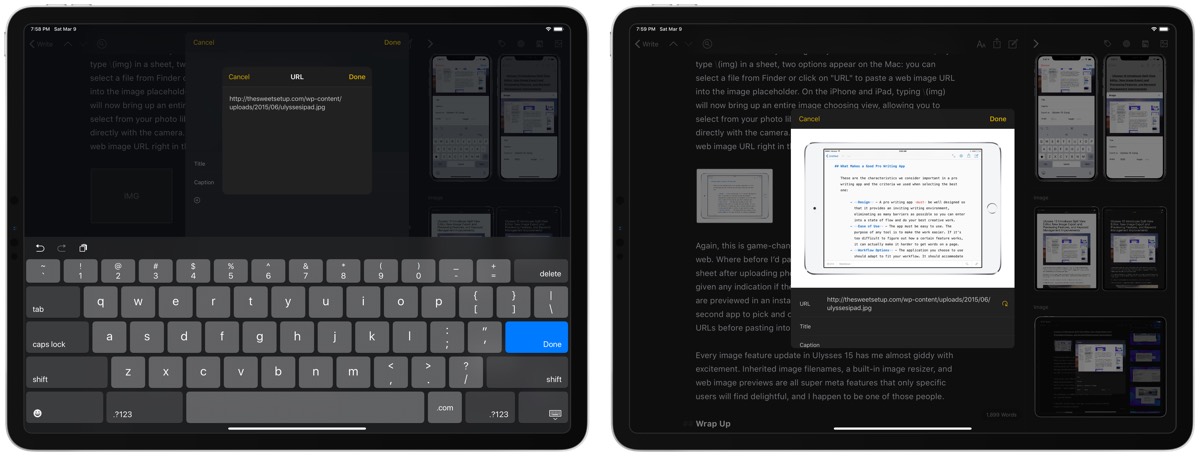
Again, this is game-changing for writers who store images on the web. Where before I’d paste a whole range of image URLs into a sheet after uploading photos to WordPress or Amazon S3 and not be given any indication if the URLs were working, now the image URLs are previewed in an instant. Not only that, I no longer need to use a second app to pick and choose photos based on their previews before pasting into Ulysses.
Every image feature update in Ulysses 15 has me almost giddy with excitement. Inherited image filenames, a built-in image resizer, and web image previews are all super meta features that only specific users will find delightful, and I happen to be one of those people.
Wrap Up
Don’t take the name “Ulysses 15” to mean that the app has seen 15 different major updates — the Ulysses development team uses these X.0 updates to introduce incremental changes and features, while still adhering to what the app does so well.
But 15.0 feels different to me. I always felt like I had to make concessions when committing to using Ulysses exclusively for writing. Ulysses has always succeeded at actual writing and for archiving and storing written text, but I’ve always been let down by its previewing and image features.

Version 15 changes all these annoyances and takes Ulysses to a new echelon, in my opinion. Gone are the days where you couldn’t use Ulysses for every step of the writing process. From initial idea capture in the Ulysses inbox, through to writing, image management, keywords and tags, goal measurement, and previewing and exporting, Ulysses 15 has every step covered.
I expect some writers will still avoid Ulysses because of how it treats Markdown, but the subset of users who can’t be served by Ulysses is shrinking by the update.
This is one of the most impactful app updates for me in the last year or two, and Ulysses is now, bar none, the single writing app I recommend to everyone.

We have a big update to our review of the best pro writing app for the Mac, iPhone, and iPad to accommodate this brand new release of Ulysses 15. If you need to wait until our review update tomorrow to take a fresh look at Ulysses, no problem and stay tuned.
But don’t kid yourself — these changes to Ulysses are a long time coming, and are sure to change how writers use Ulysses from here on out.
Stop losing your ideas and notes to multiple apps…
An online course to help you save time, organize your notes, and master the best writing app for Mac and iOS: Ulysses.

