Two Weeks with the iOS 14 and iPadOS 14 Public Betas
Each year, the tech experts advise all bleeding edge iPhone and iPad users to stay away from beta software. Developer betas — especially iOS 13 — were particularly buggy, and the iOS 13 public beta wasn’t notably better. Of all years to put a bad beta taste in your mouth, 2019 should have done the trick.
But 2020 being a wildcard year meant tech experts were seemingly recommending the iOS 14 and iPadOS 14 public betas for bleeding edge users. Developer Beta 1 and Developer Beta 2 have been surprisingly stable, they said, and so the public beta was much less risky than in years past.
Since I can’t stop myself even in bad years, these positive remarks had me installing the iOS 14 and iPadOS 14 public betas the moment the news hit Twitter.
And my experience so far has been at least as bad — if not worse — than iOS 13/iPadOS 13 in 2019.
My iPhone restarts four or five times a day right now, shutting off right in the middle of typing out a text message or in the middle of editing a photo. Maybe half my shortcuts work on iPad. The new widget features haven’t treated my iPad particularly well, with the built-in Weather widget being completely unusable.
In short, my experience with this particular set of public betas has been nothing to write home about.
But this doesn’t mean I’m not excited about iOS 14 and iPadOS 14’s potential coming this fall.
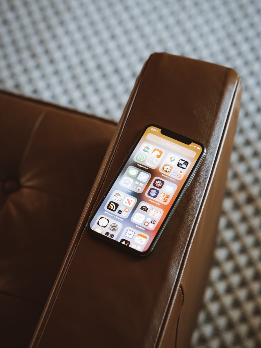
These public betas provide an in-depth look at the improvements coming in the fall, and they are sure to delight different groups of users. The new “Spotlight Search” on iPad is extraordinarily well done. Widgets on the home screen have the potential to change how one utilizes their home screen. App Library on the iPhone instantly cleans up less-used apps, and, perhaps above all else, the ability to change the default browser and email app have the chance is sure to usher in some delight.
No, despite the stability issues I’ve run into so far with the public betas, it’s very clear iOS 14 and iPadOS 14 represent evolutionary steps forward for Apple’s portable devices.
Spotlight Search on the iPad
When watching the well-executed keynote in late June, it hadn’t dawned on me that the new Spotlight Search on iPad would be more representative of an app like Alfred and less representative of Spotlight Search on the Mac. Spotlight Search on the Mac is somewhat underpowered, and bringing that to the iPad seemed natural, evolutionary, and sensical.
Apple clearly opted for a more powerful rendition of Spotlight Search for the iPad, however, and I couldn’t be more excited.
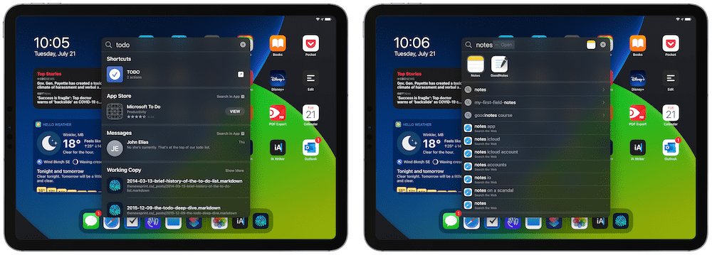
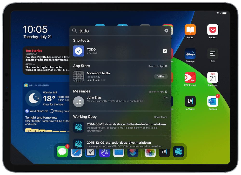
The ability to launch a shortcut directly from Spotlight Search is wonderfully powerful. Upon realization, I quickly created a “TODO” shortcut (named after the “/TODO” nomenclature inside Roam Research) that can be triggered via Spotlight Search on iPad. After typing a quick “TODO” in Spotlight Search and hitting enter, the TODO shortcut is quickly available and provides a text box hovering right over your home screen (or the app you’re working in) that can be inputted and sent off to your Things inbox instantly.
The potential for these types of Spotlight Search commands is endless.
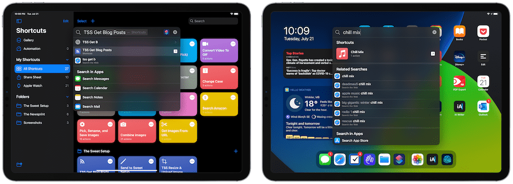
I have a shortcut titled “Chill Mix,” which is a simple one-tap shortcut for firing up my Apple Music Chill Mix on our HomePod. Now, with Spotlight Search on iPadOS 14, I can type “Chill” and the shortcut will execute. Building out that shortcut to dim the lights, turn on the TV, or bring up a new sheet in Ulysses for some writing would be a breeze.
And it’s all accessible via Spotlight Search on the iPad.
Spotlight Search is a little slow in my experience on public beta 1. The animation takes a quarter second to take place and the results for queries take an additional half second to load as well.
You also can’t initiate Spotlight Search when you’re working inside an app without an external keyboard. This is one of the weirdest limitations of iPadOS since its inception.
All said, Spotlight Search is perhaps the feature I’m most excited about in iOS 14 and iPadOS 14. This single feature has the potential to morph how folks use a keyboard with the iPad.
I’ll be on the hunt for handy automation workflows that work wonders from a simple Spotlight Search query right from the home screen.
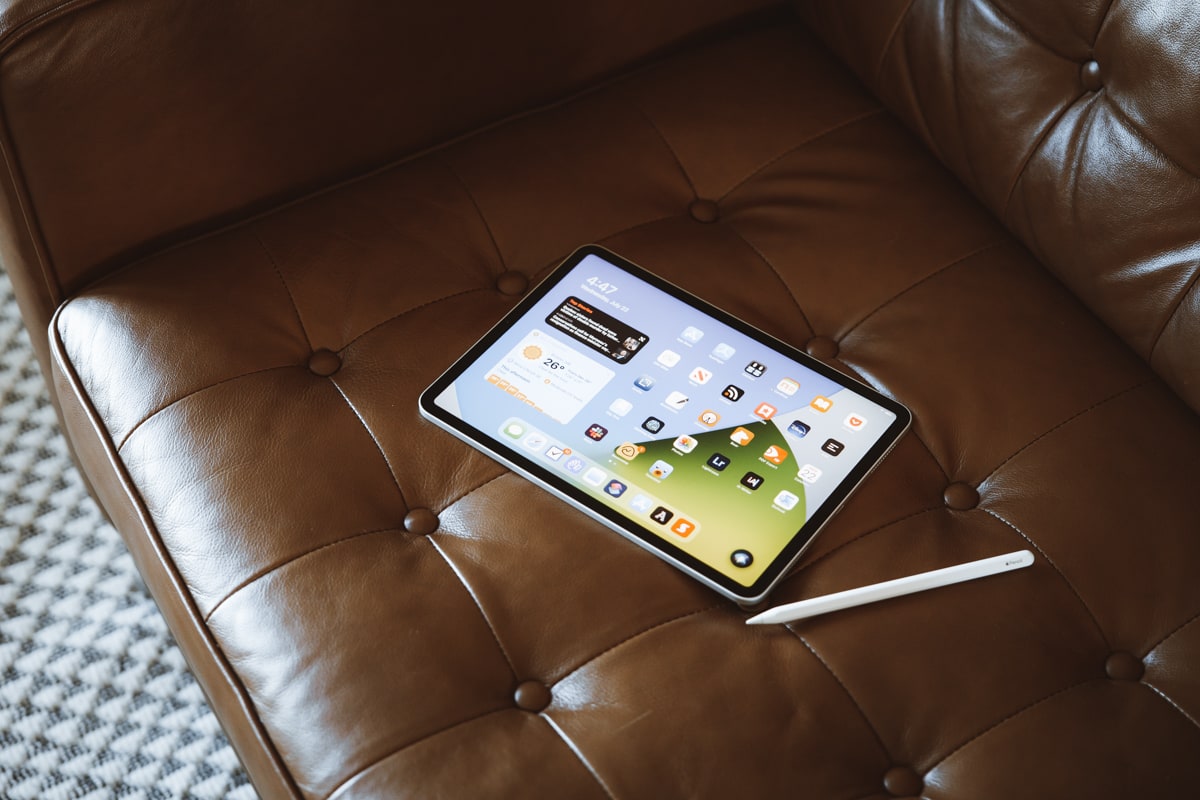
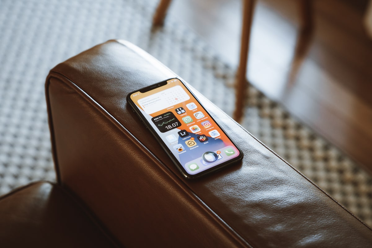
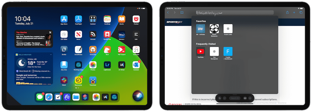
Widgets and Smart Stack
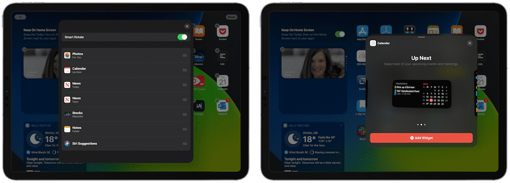
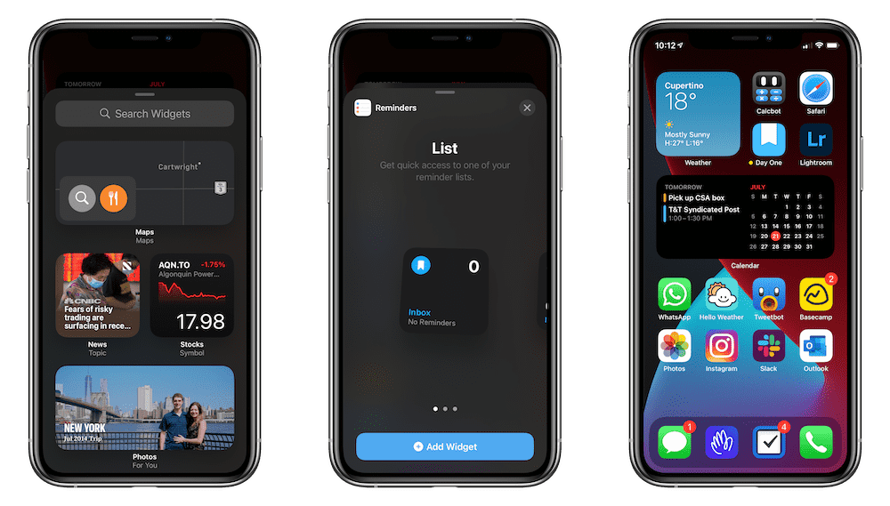
Widgets have been the most talked about feature in iOS 14 and iPadOS 14, at least in my circles. Whether it’s because this feature has been around since the earliest days on Android or because widgets signify an end to the clean app layout of the iPhone home screen, widgets have been the talk of the town.
We’ve had a taste of widgets on the home screen in iPadOS, but iOS 14/iPadOS 14 give these widgets more room to breathe and better designs for improved functionality. Where before, the Today Widget for an app like Hello Weather was kept to a translucent window with a minimized and maximized view setting, iOS 14/iPadOS 14 offer newly designed widgets that can take up half the space of the former minimized size or up to the full size of the former maximized size. How widgets look and their sizing is a much smaller change than the ability to have the widget on your iPhone home screen.
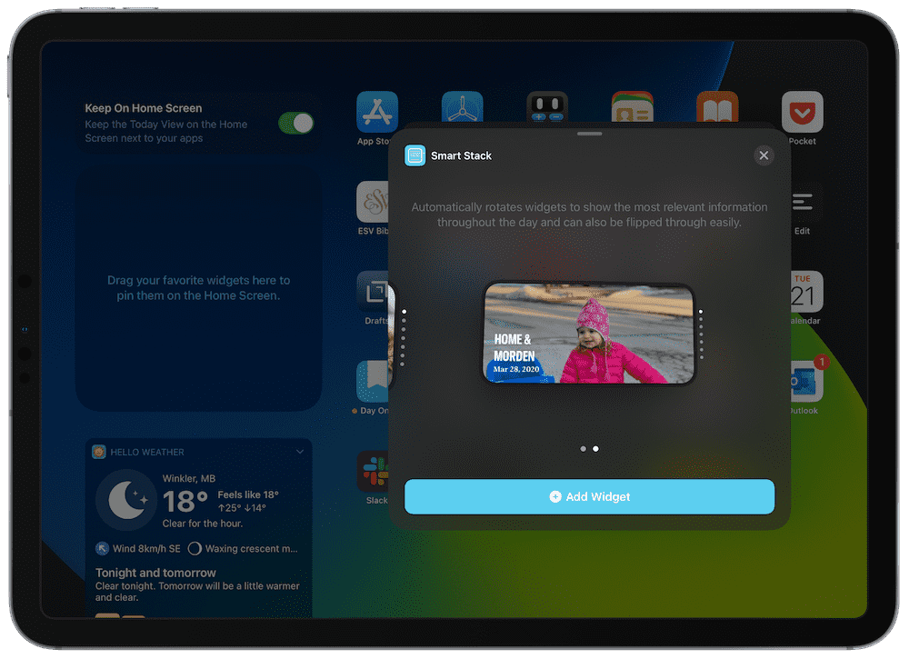
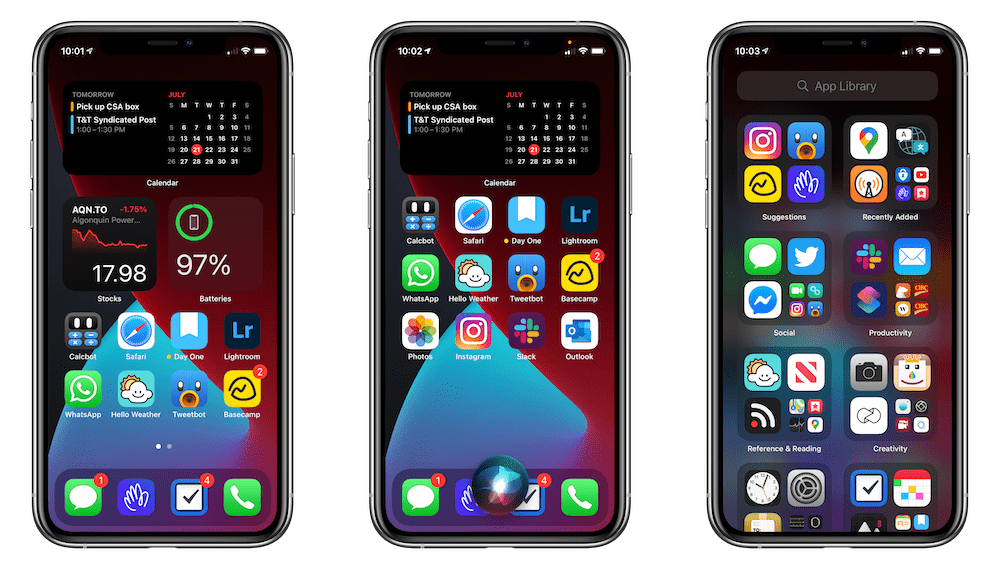
My favorite new widget, far and away, is Smart Stack. Creating a Smart Stack is easy — when you’re in Jiggle Mode (it took me a while to figure out how to add new widgets to the iPhone/iPad, so hopefully this saves you some time) and tap the “+” in the top left corner, you can scroll down and find “Smart Stack” as a widget option. You can choose a small tile or a larger horizontal tile (not the biggest card size tile you can with other widgets) and the default Smart Stack houses seven different widgets in one: News, Stocks, Top Stories, Calendar, Featured Photos, Notes, and Music. You can scroll through these different widgets by swiping top-to-bottom or bottom-to-top.
Smart Stack is the closest thing to context switching I have seen on the iPhone and iPad so far.
I currently have four main widgets in my Smart Stack: Stocks, Calendar, Featured Photos, and Top Stories. I scroll through Stocks, Calendar, and Top Stories throughout the working day, but find myself flicking to Featured Photos for the evening and leaving it there until I return to work the next morning.
In a fun world, I imagine having multiple small-tiled Smart Stacks strewn across my home screen, each with two different widgets: one for work and one for leisure. When I’m at the office, a quick two or three swipes to move the iPad into Work Mode, and when I return home, the same swipes can move the iPad into Relax Mode.
Smart Stack is just a glimpse at the new power housed inside iOS 14 and iPadOS 14’s new widget features, leaving me very excited to see what third-party developers have in store for us in the fall.
Scribble
Apple spent a lot of time — and likely spent a lot of development time as well — on showcasing the iPad’s new Scribble features for the iPad and Apple Pencil. In short, iPadOS can now be operated nearly top-to-bottom with an Apple Pencil — you can hand-write queries into text fields and search bars throughout iPadOS; you can edit, separate, and quickly erase text all with different Pencil strokes; and iPadOS can even OCR your handwritten text and make your handwriting tappable for loading URLs, calling phone numbers, or creating new emails.
The power behind Scribble is pretty evident and the feature itself is wonderfully thought out. For those who use their iPads in “Clipboard Mode” and don’t want to move back and forth between using their Pencil and using a keyboard to insert text, I imagine Scribble will solve a lot of problems.
But Scribble isn’t for me. I’m not sure if it’s because I have horrible handwriting, or if it’s because I have a hard time remembering the different Pencil-stroke syntax for putting spaces in text or separating words, or if it’s because I don’t use the Pencil that often, I don’t find myself using Scribble at all.
(Apple really needs to ensure proper and ongoing onboarding of Scribble’s new gesture systems. You can scratch out text to delete, circle text to select, or make in-line annotations to separate text. But because this is effectively a brand new input mechanism for the iPad, it’s imperative Apple does a better job explaining how to properly use Scribble than Apple ever did in explaining how to multi-task on the iPad with Split View and Slide Over.)
I do see some hope for myself though.
Notes has finally done away with the horrid skeuomorphic letterpress background, bringing the app back into the 21st Century along with the rest of its brethren. And for many design-picky nerds, this one feature change puts Notes into a new category of usability.
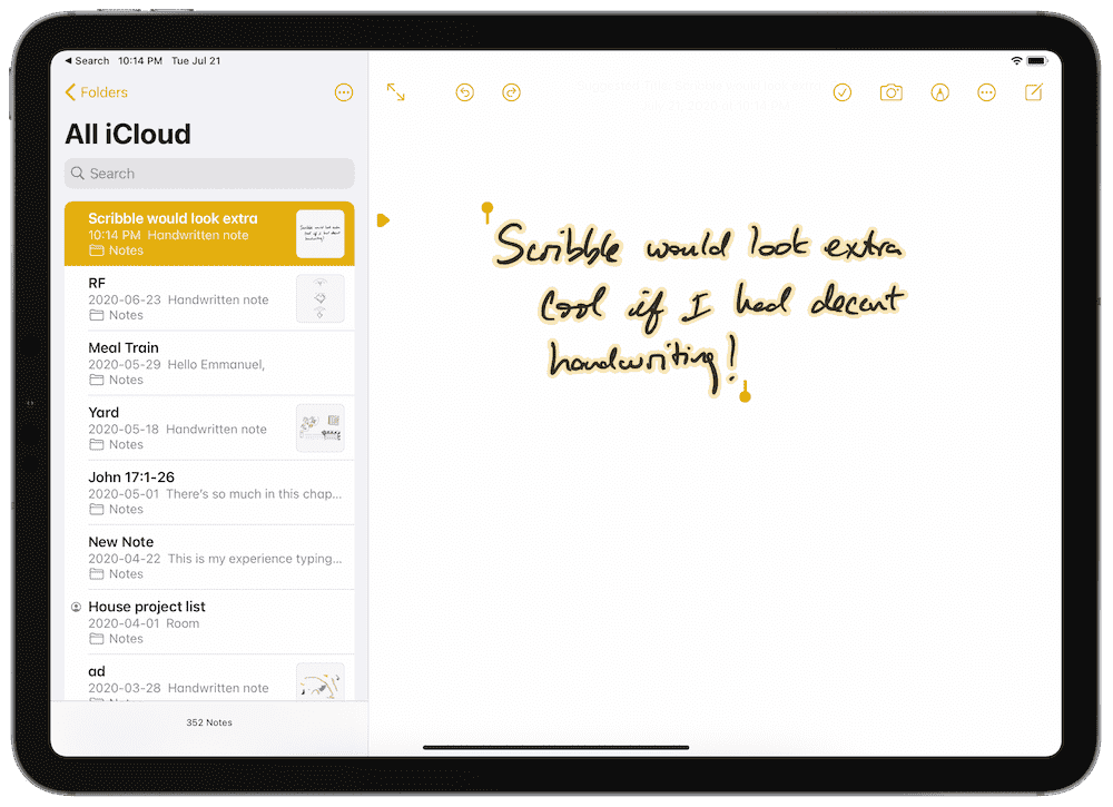
Being able to access Notes from the lock screen with the tap of a Pencil and now being able to tap on those handwritten notes to load a URL or make a phone call via Smart Selection is magnificent — and something no other notes app can touch. I’ve been happy to have this on multiple occasions in client meetings.
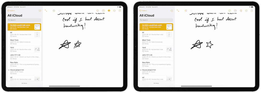
I also like the ability to pause at the end of a drawn shape to make an ideal shape form.
So while Scribble — specifically the part about handwriting text into text fields throughout iPadOS 14 — has gone relatively unused on my end, the reality of a live, searchable, and instantly accessible Notes app right on the lock screen really pushes the iPad ahead of a physical notepad.
Work From Home….
30% Off The WFH Course Bundle
Get our task and time management mini-course (All the Things (Analog)), plus with our Day One in Depth screencast course. This “WFH Bundle” is 30% off right now.
We’ll show you…
- How to schedule your day for maximum productivity in the least amount of time. This is especially helpful if you and your significant other are juggling responsibilities of kids and home life while also trying to do work.
- Weekly planning and reviewing. A great way to get ahead of your upcoming week so you can be prepared and have a priority of what needs to be done.
- Custom Productivity Templates: These are a few of the main PDF templates that you can print out or use on your iPad in order to follow along.
- How to use Day One, the best journaling app out there: which can help with reducing stress and anxiety, celebrating your wins each day, and keeping a log of what is happening in life right now.
Bundle Bonus: The WFH Bundle also includes three bonuses: The Calm Inbox Checklist, the Habit Tracking Quick-Start Guide, and Using Day One templates for the 5-Minute Journal.
Normal Price: $68
WFH Bundle Price: $47 (You save $21)
Group Messages
I find myself in an increasing number of group iMessage threads right now and the proposed improvements in iOS 14 and iPadOS 14 seemed sensational during the keynote.
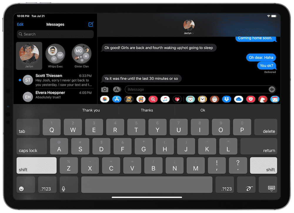
After some testing in the public betas, Apple has either completely swung and missed here or there are further improvements to come. I find group messages more confusing now, not less. Especially around the latest reply to a specific thread.
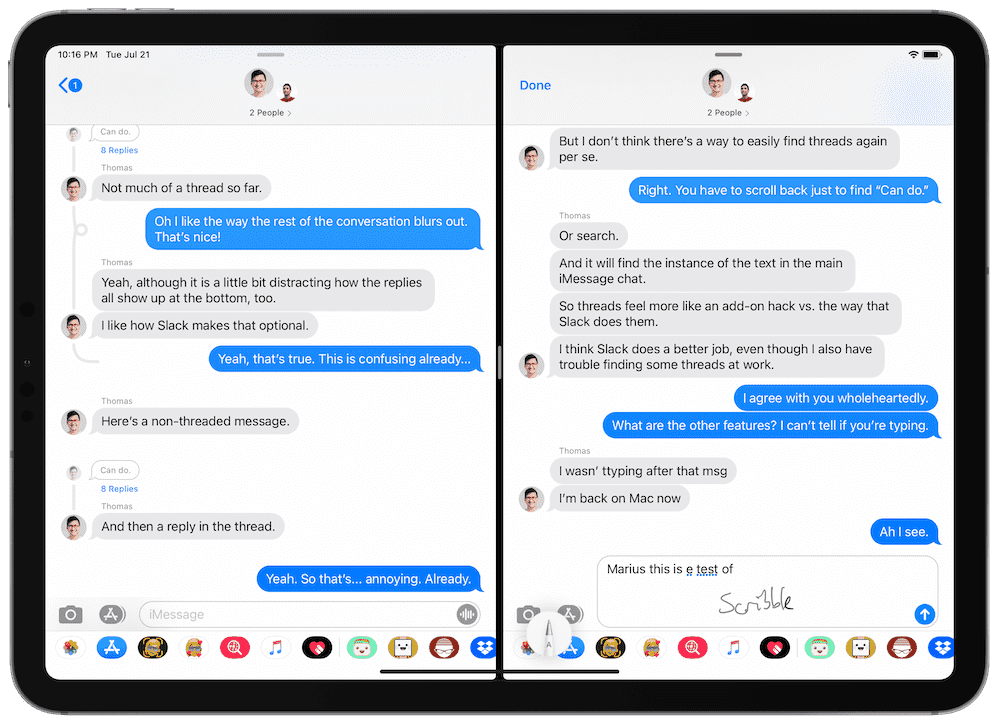
You can long press on a specific message in a group message and reply to that specific message, essentially creating a thread for that specific message. That new thread will be titled with the original message and all replies to that thread are hidden behind a tappable “X Replies” link that can be tapped to reveal the whole thread with the group message blurred out in the background. Design-wise, this is great. But usability-wise, I find myself scratching my head.
For instance, check out this screen shot of a group message with some of my friends:
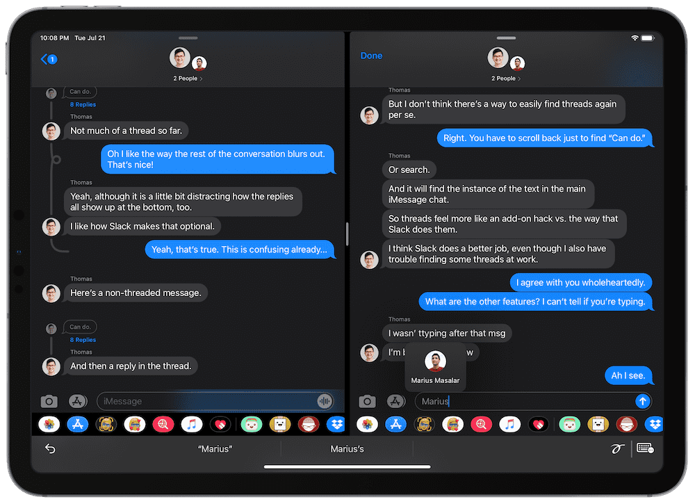
“Can do.” is the name of the thread, but what’s that odd grey noodle line curving around? What about the odd grey noodles further above, earlier in the conversation? Is the message “Extra annoying” part of the “Can do.” thread? Or is it it’s own message in the bigger group message?
This isn’t exactly maddening, but this isn’t any less confusing or annoying than group messages were in iOS 13 and iPadOS 13.
Mentions are also available in the new group messages in iOS 14 and iPadOS 14, but I expect the ability to use mentions are going to be lost on most users. If you type one of the recipient’s names directly, the name shimmers in silver and becomes a tappable link. You can then set the recipient as the mention, their name turns blue, and they’ll be notified of your mention.
I think the silver shimmering will throw-off some users — when typing someone’s name in a group message in the first few minutes of my iOS 14 use, their name shimmered silver and I had no idea what was happening. All of Apple’s marketing uses blue text to denote a mention, not silver shimmering text. It took a couple extra seconds to realize what was going on. And I don’t think less knowledgeable users will clue into what’s going on behind the group messaging scenes.
I had high hopes for the improvements in Messages in iOS 14 and iPadOS 14 and the only feature I’m positively excited to report is the ability to pin specific messaging recipients to the top of your list. As it stands right now, group messages need some work before the final version of iOS 14 drops in the fall.
Compact Calls and Compact Siri
What I’ve found most interesting about the new compact phone call notifier and on-screen Siri interface is not how inefficient the old full-screen views were, but instead how hard the new compact interfaces are to find on a big screen.
Siri, since forever, has taken up the entire screen when initiated. It was the easiest thing to know when you were dealing with Siri.
A phone call was no different — if a phone call came in, you had to deal with it through deferring, deferring with a message, ending a call, or what-have-you.
In both circumstances, you had one single on-screen task that dominated — also majorly disrupted, to be sure — your workflow and you had to conclude that workflow before getting back to what you were previously doing.
In iOS 14 and specifically in iPadOS 14, both the compact phone call notifier that drops down from the top of the screen and the small Siri icon in the bottom right corner provide an ambiguous and semi-confusing path forward. You can keep working on the email you’re drafting while your iPad rings away at the top of the display. And if you don’t realize that Siri has been initiated on the iPad, you may mistakenly believe your iPad has been bricked and stands completely frozen.
I like how the Siri icon on the iPad sits in the bottom right, unobtrusive and out of the way. But again, new users or less experienced users may miss Siri in the corner and not know what’s going on. On a bigger iPad, if you’re working in Split View with the app on the left side, it’s easy to not see the Siri icon as it appears in the bottom right. Seriously. I’ve had at least a few double takes before realizing Siri has been initiated properly.
It’s these two little quirks that surprised me in the transition to iOS 14 and iPadOS 14. Apple’s user base is increasingly knowledgeable with how these devices work, but I always think about my dad — who uses his iPad for everything — who has no idea Split View and Slide Over exist. I expect the change from full-screen phone calls and Siri to compact phone calls and Siri will be quite jarring for someone like my dad.
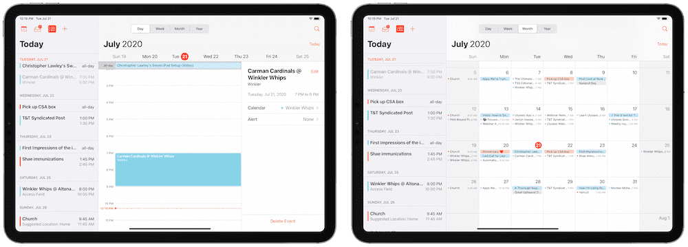
A Special Shoutout to the New Calendar App
It’s not like the Calendar app has seen a dramatic change year-over-year, but the fresh bits of design and the new date-picker make for a much-improved Calendar app.
I’ve stayed away from the stock Calendar app for a long time — mostly because of the power of Fantastical’s natural language parsing features, but also because of Calendar’s relatively bland design. Calendar has always been dominated by white space and an inefficient use of text and font size, especially on larger iPads.
Calendar in iPadOS 14 is different though. The new Month view is well spaced out with great drops of color. I especially like the list view beside the monthly calendar view.
And while I’m not sure if the Day view in Calendar on iPadOS 14 is new, it feels useful to me for the first time. The event details and a standard list view sandwich your daily agenda in between, providing everything you might need (except for, maybe, some note-taking capability, a la Agenda).
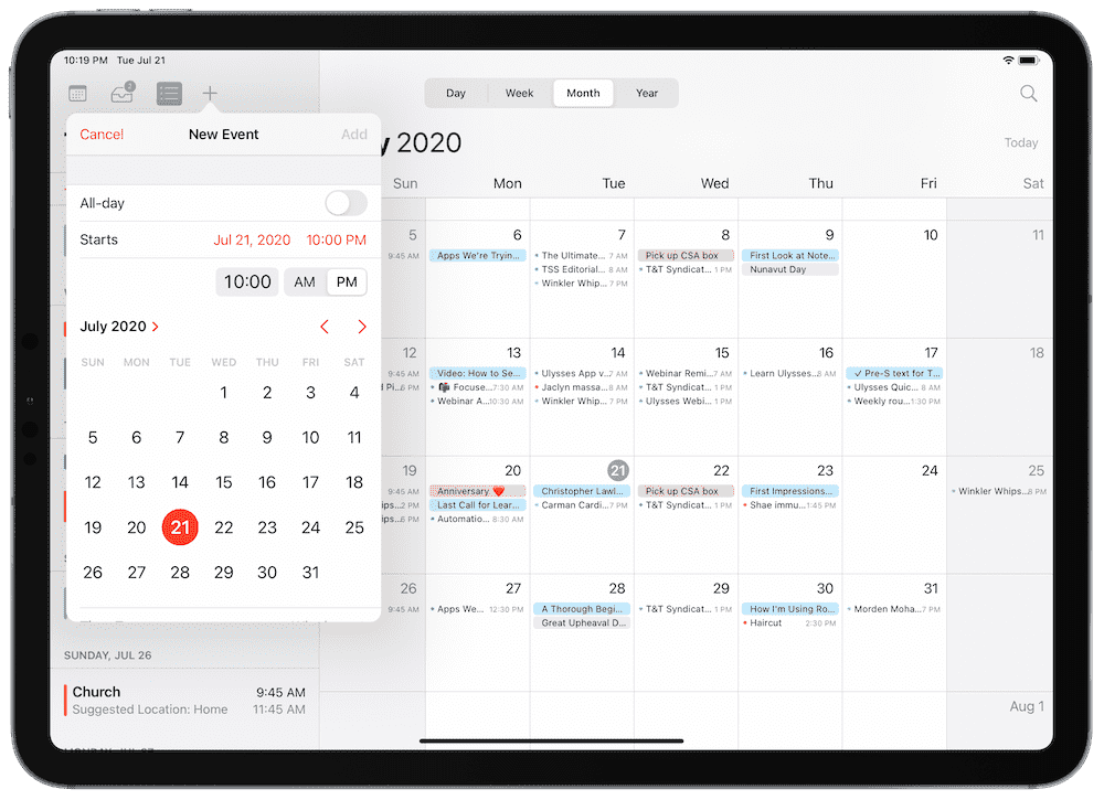
The new date picker (specifically — the time picker needs some work yet) is also well done in the new Calendar app. Instead of a dial format requiring you to spin the dial to the correct month and date, iPadOS 14’s date-picker provides a full month view. The new option works much, much better with a cursor and trackpad, and the touch targets are big enough to press with a fingertip to not be annoying.
Calendar in iPadOS 14 (and iOS 14, though it shines more on iPad in my opinion) is a huge step forward. It seems like Apple picks a different stock app to revitalize each year. With iOS 13 providing extra focus on the Reminders app, it feels like Calendar was this year’s recipient.
Other Miscellany
If I haven’t discussed a specific element in the iOS 14 and iPadOS 14 public betas above, it’s likely because they’ve had little to no impact on how I use my devices.
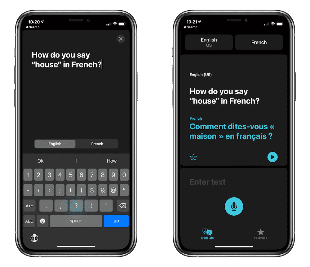
Take the new Translate app, for instance. This is Apple’s prowess in full flight, using technology to quickly bring people of all walks of life together.
But I only have use for a Translate app a few times a year, and usually there’s someone around who would be able to help me quicker than the Translate app could.
The new changes in Maps are equally impressive, especially for those who cycle to and from work each day and need more efficient cycling routes. Again, not something I’ll ever use, but something I imagine folks have been eager to try over the last few iOS cycles. I am excited to try the new Guides feature when we tour new cities, mind you.
AirPods have received substantially improved device switching, which will be met with high acclaim if executed properly. And though I have knowledgeable friends who look at the new spatial audio features skeptically, I imagine Apple’s team will have made strides in this audio feature as well.
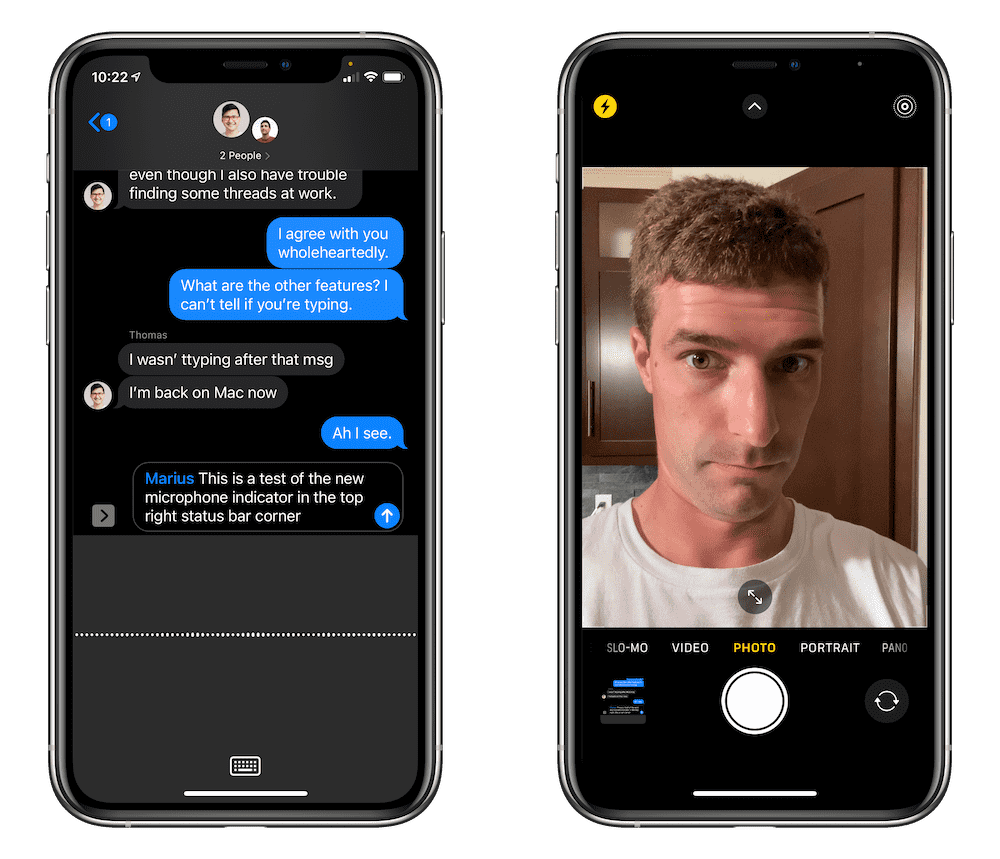
Perhaps the most underrated feature I’ve experienced across both iOS 14 and iPadOS 14 are the new camera and microphone indicators in the top right status bar area. I’ve had to try to convince people out of believing Instagram is listening to their conversations to serve them ads. That little microphone indicator may be the saving grace for eliminating these conversations.
And, of course, who could forget Apple giving in to the outspoken crowd and allowing you to change the default browser and email app in iOS 14 and iPadOS 14. To a degree, I was one of those outspoken folks — I have had an on-again, off-again relationship with the Mail app, but have always used Safari on iPad because of the limitations beset on other browsers. Though the capability to set a default browser or email app hasn’t yet been unlocked in the public betas, I anticipate many an applause for Apple’s leniency here.
Wrap Up
My introduction was harsh, especially around the stability of iOS 14 on my iPhone. iOS 14 has been somewhat annoying on my iPhone, for whatever reason (I just reached for it and found it turned off and restarting, again). But iPadOS 14 on the iPad has been impressively solid for me, providing little for me to complain about except for misfiring shortcuts.
The solid experience is most likely due to the relatively unchanged feature set in iPadOS 14. Even though widgets appear to be brand new, they really only receive a redesign in iPadOS 14 — you can’t put them anywhere on the home screen like you can on the iPhone.
You don’t get App Library on the iPad either, oddly enough.
But the rest of the smallest improvements are sure to be well-received. Even small details like the refined sidebar in apps like Photos and Files makes the iPadOS 14 experience feel more refined, consistent, and easy to use.
iPhone-wise, users are sure to be delighted with compact phone calls, compact Siri, the App Library, and widgets on the home screen. Though nothing dramatically different, these changes and improvements seem like evolutionary steps forward for the iPhone.
What I’m most curious about is how more advanced iPad users bend the new Spotlight Search to their will. I’m eagerly awaiting those sections on Shortcuts-dedicated websites that promote launcher-type shortcuts. This type of feature may not be game-changing immediately, but I feel like Spotlight Search will continue the progression of the iPad’s modularity, especially in the keyboard department.
All told, these are public betas. Things have changed quite dramatically between the time of public beta 1 and the golden master beta that ships in the fall in years past. Though this year feels different — there must be something in the water this year — it will be interesting to see how Apple refines iOS 14 and iPadOS 14 over the coming months.
You can enroll in Apple’s Beta Software Program right here. Simply click or tap the Sign Up button in the middle of the page, log in with your Apple ID, and follow the on-screen instructions to install the public beta profile and download the public beta software. As always, you do so at your own risk, so it’s best to make at least one backup of your device before undertaking the public beta sign-up process.
Work From Home….
30% Off The WFH Course Bundle
Get our task and time management mini-course (All the Things (Analog)), plus with our Day One in Depth screencast course. This “WFH Bundle” is 30% off right now.
We’ll show you…
- How to schedule your day for maximum productivity in the least amount of time. This is especially helpful if you and your significant other are juggling responsibilities of kids and home life while also trying to do work.
- Weekly planning and reviewing. A great way to get ahead of your upcoming week so you can be prepared and have a priority of what needs to be done.
- Custom Productivity Templates: These are a few of the main PDF templates that you can print out or use on your iPad in order to follow along.
- How to use Day One, the best journaling app out there: which can help with reducing stress and anxiety, celebrating your wins each day, and keeping a log of what is happening in life right now.
Bundle Bonus: The WFH Bundle also includes three bonuses: The Calm Inbox Checklist, the Habit Tracking Quick-Start Guide, and Using Day One templates for the 5-Minute Journal.
Normal Price: $68
WFH Bundle Price: $47 (You save $21)