Three Apps We’re Trying This Week: October 8, 2018
There are many apps that grace the Mac and iOS App Stores that simply don’t get enough attention or admiration. Sometimes an app is so good at what it does, it becomes the default app for the task and is rarely questioned. Sometimes a new app debuts in a given category and, while it shows promise, doesn’t quite live up to our pick for the best in that category.
There are millions of apps to try out on any given day, so here are three we’re trying this week.
Chirp for Twitter
One might not need a full-fledged Twitter client on the Apple Watch — and, admittedly, a Twitter client may not be best-suited for a small Watch screen — but there are times and places where it’s nice to have. Chirp and a Chirp Pro in-app purchase bring the entire social network to your wrist.
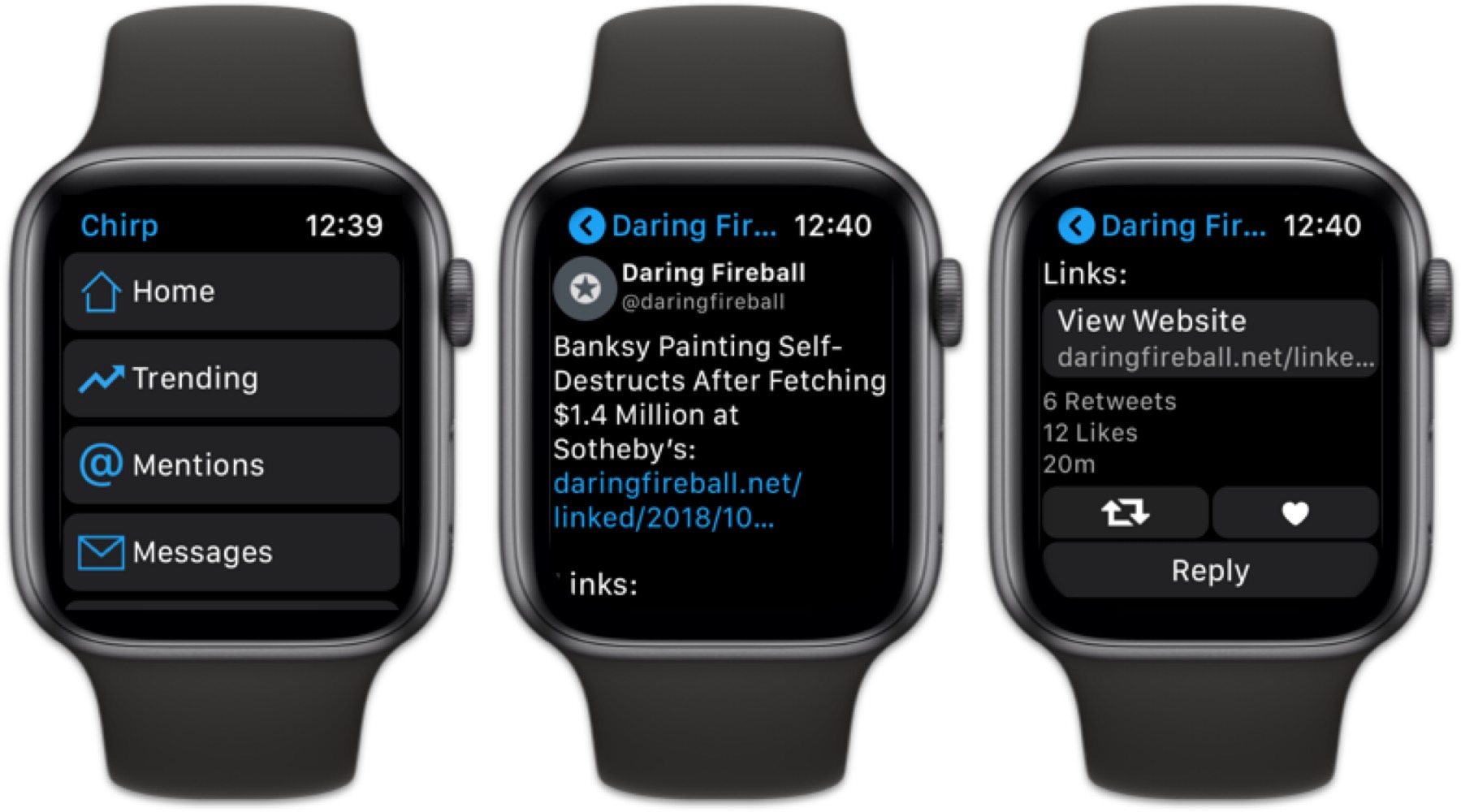
Chirp is downloaded on the iPhone, but has no iPhone UI to speak of. Once installed, the app prompts you to install Chirp on your Apple Watch, where the remainder of your interaction takes place.
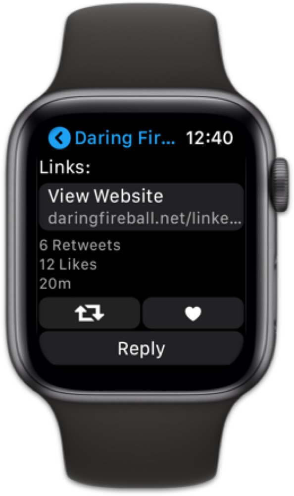
Inside Chirp, you can access everything Twitter has to offer. Your main timeline, trends, messages, settings, and more are all a few taps and a few Digital Crown revolutions away. There’s a particularly large amount of scrolling, but if you want to keep up on news or message someone in a pinch, Chirp works great. You can reply and retweet, like, and tap on a URL to view the URL in the new Apple Watch Safari view.
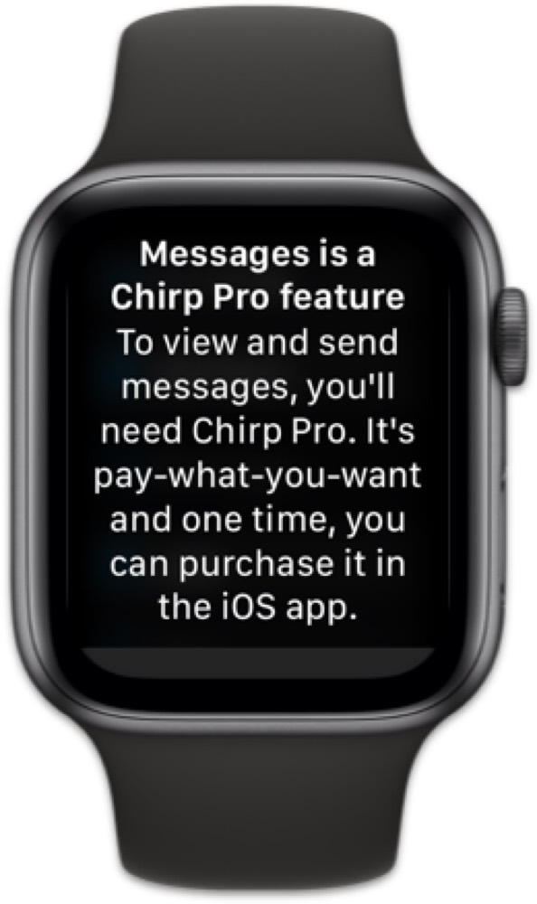
A Chirp Pro in-app purchase unlocks everything for access, including messages, trends, mentions, and more. The initial free purchase only includes access to your main Twitter timeline.
So far, I’m impressed with Chirp’s capabilities. It has crashed on me more times than expected, but it’s not unusable. And for the few times I’m without my phone and want to see the latest news on a particular topic, Chirp has worked great.
Chirp for Twitter is a free download on the App Store.
Better Day
Apple’s stock Apple Watch calendar complications leave a little to be desired. There are no customization options. You’re stuck with the default color, and you’re stuck with the default sub-dial layout. Better Day promises to bring more customization to your Apple Watch calendar complication.
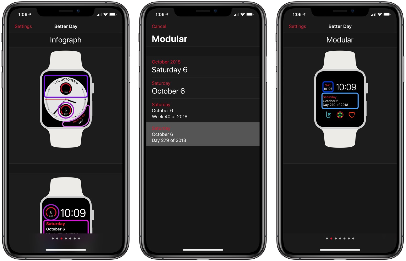
The iPhone side of the app is plain and simple, but full of customization power. You can customize any of Better Day’s complication layouts to better suit your needs. Options range from the day of the year, to the week of the year, to the date format, and more. You can also change Better Day’s color to better match the other complication colors on your Apple Watch.
The actual complication can be tapped on the Apple Watch to bring up a full month calendar for viewing. I found navigating this full month view somewhat confusing — you need to use a combination of swiping and scrolling to move between months. Scrolling moves you through the months, while swiping moves you to the end of the prior year or beginning of the upcoming year. You can’t drill into a specific date on the full month calendar either.
As apps continue to be updated for the latest Apple Watch, there are more and more options for calendar complications. For now though, Better Day’s Apple Watch calendar complication is a far cry better than Apple’s own stock calendar complication.
Better Day for iPhone and Apple Watch is $1.99 on the App Store.
Pantone Studio
If you’re obsessed with color, you’ve surely heard of Pantone. Pantone names “Colors of the Year” each year and provides color codes and other coding options to nail your color choices on the web. Pantone’s iOS app is equally impressive and surprisingly handy.
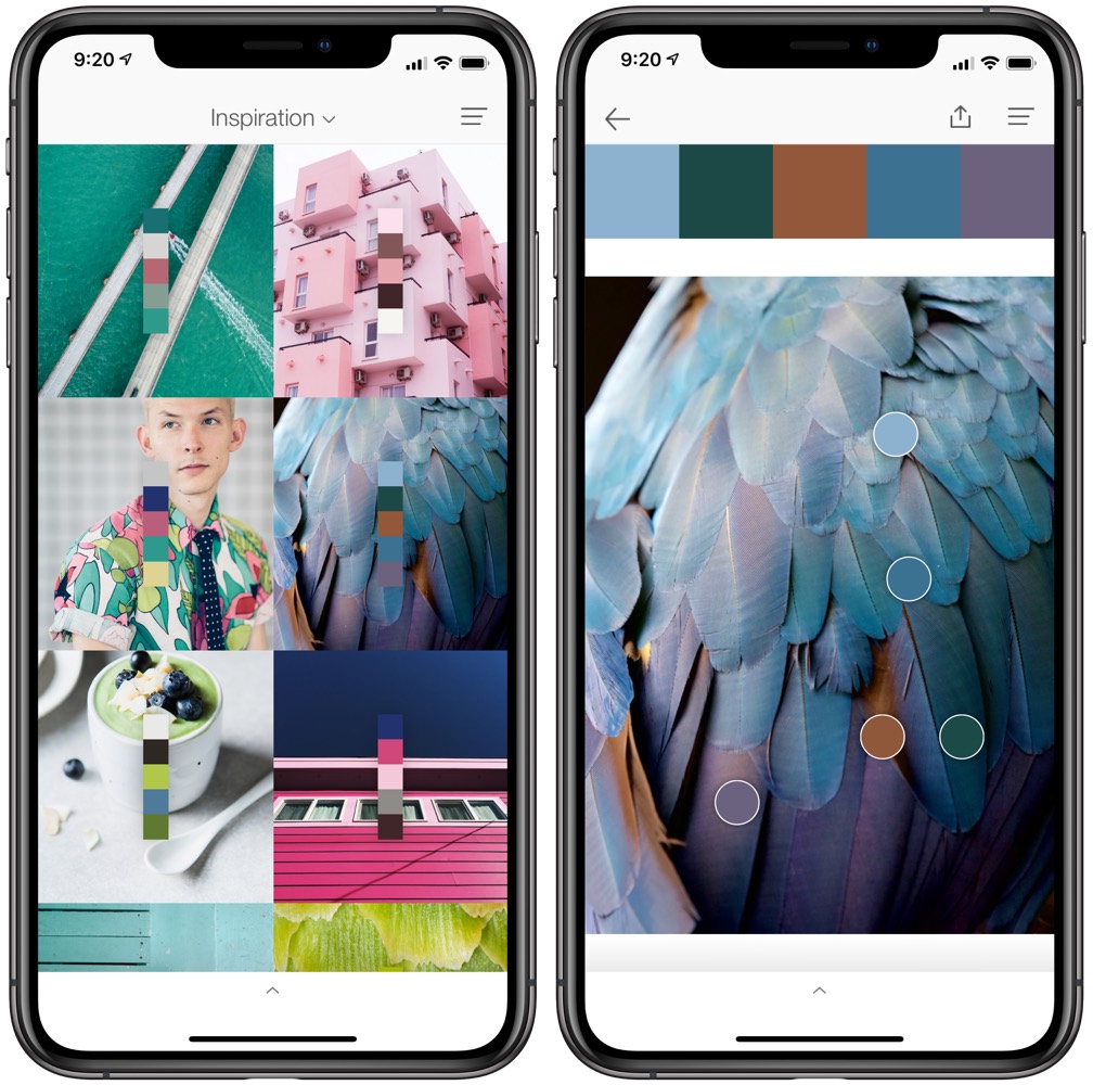
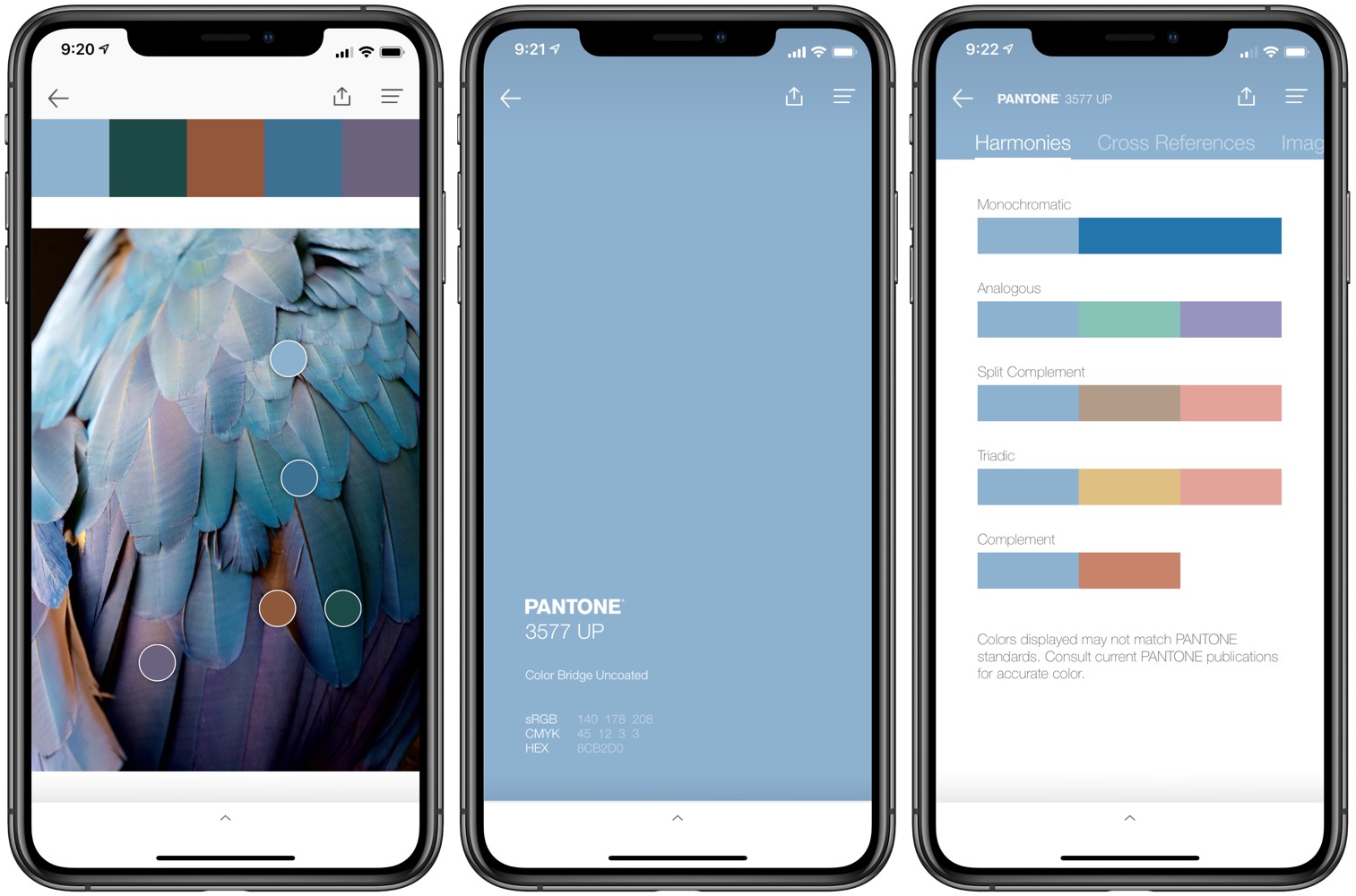
Pantone’s iPhone app has a range of features, but the main feature I’ve used so far is its ability to identify specific colors in photos in the Camera Roll. You can export a photo from Lightroom CC or have Pantone analyze any of your iPhone photos, and Pantone will provide a five-square color palette overlaid on top of your photo. Tapping the photo gives you the option to move the color pickers around and nail down every tone in your shot.
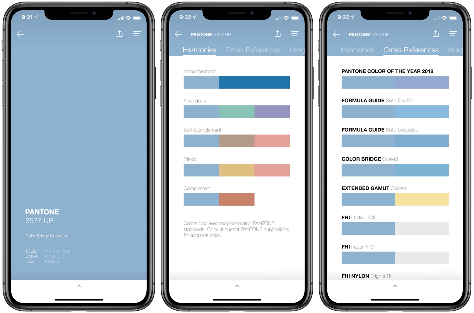
The real power of Pantone is in the color analytics when you tap on a specific color. Swipe up from the bottom and Pantone provides a range of contrasting harmonies, values, and cross references. Once you discover these analytics, you can grab any color codes necessary and use them inside Lightroom, on your blog, or wherever.
There are a range of other features available in Pantone’s iPhone app. You can mix and test colors on 3D materials inside the app before you design. You can subscribe and receive Pantone’s color guides. And you can share your color palettes with others.
The best hidden feature of all is Pantone Studio’s app icon. This icon has completely flown under my radar and I want to put the app on my home screen simply due to the icon’s burst of color.
Pantone Studio for iPhone is available for free on the App Store.
Get Our Best Photography Tips & Workflows
Transform your photos and edits from average to awesome with our in-depth, mobile photography course. It’s jam-packed with training, ideas, and lessons that can literally transform your photography overnight.