One Week With the New 2020 iPad: Moving Back to Small
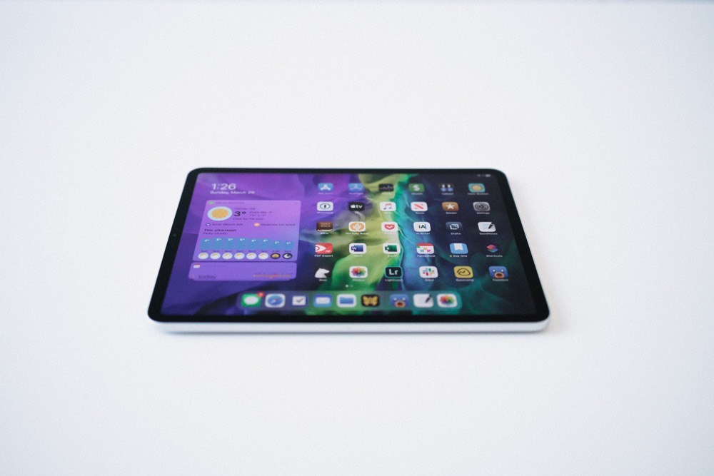
I think there’s a consensus about the 2020 iPad Pro: You probably shouldn’t buy it, especially if you have the 2018 iPad Pro. This is the single smallest spec bump in the history of the iPad and, likely, the history of Apple’s iOS devices. If the iPad wasn’t useful to you before, the 2020 iPad Pro certainly won’t change anything.
Disclaimer done. Full stop. Party crashed.
What may — I would almost say “will”, but that’s very concrete — change how you use the iPad are the places you take it, the tasks you complete with it, and the accessories you attach to it.
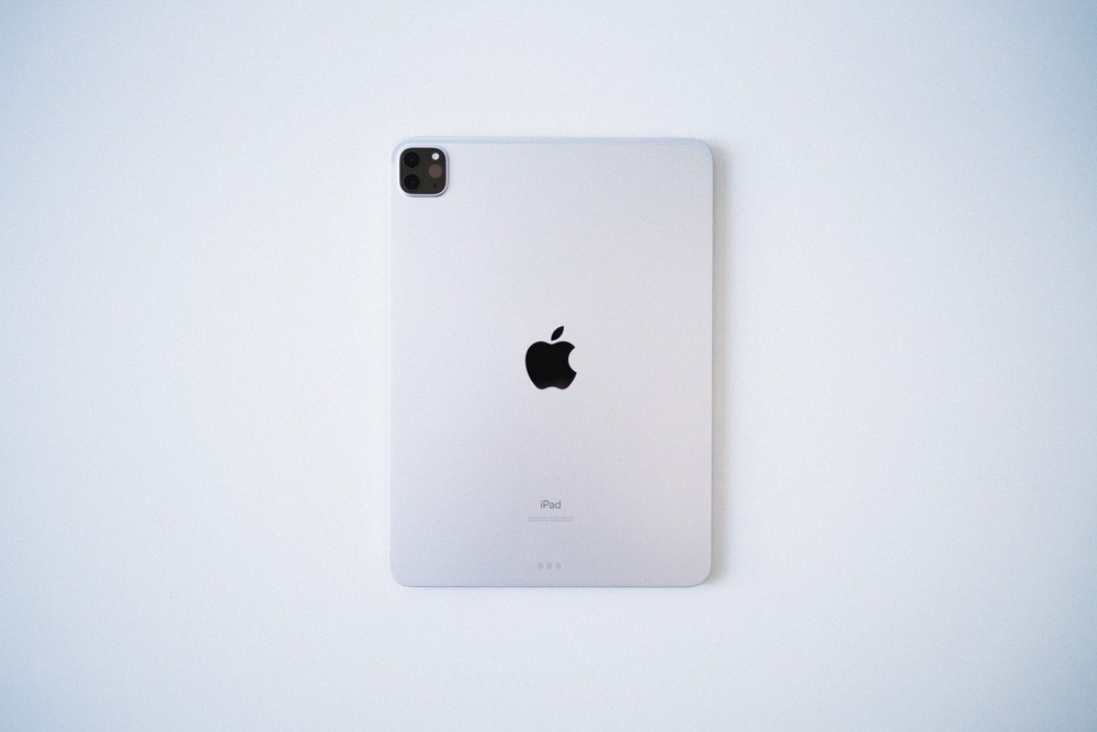
The 2020 iPad Pro marked the opportunity for me to try out the smaller of the two iPad Pros. I’ve been using the 12.9-inch iPad Pro since debut day in 2018, and I know how that shoe fits after a few years. Throw that large iPad into a dock on a desk, connect a Smart Keyboard Folio or external keyboard, and hammer away to your heart’s content. With iPadOS 13.4, an external mouse or trackpad make the 12.9-inch iPad Pro really feel like a MacBook replacement.
The 12.9-inch iPad Pro excels on my desk, but grinds to a halt everywhere else. I haven’t picked up or walked around with the big iPad Pro in about six months and haven’t read with it on the couch in even longer. I often use the big iPad Pro at the office to digitally sign PDFs, but even that feels like a rewrite of all those clipboard adventures from sixth grade science class.
The big iPad Pro has its place. Some swear by it. Some call it The One True iPad.
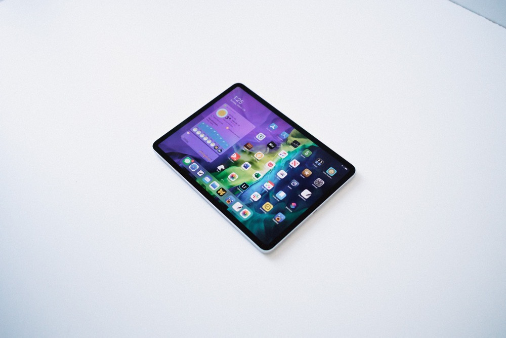
For me, it was time to give the small iPad Pro a fresh chance. I’ve been taken aback at how many new places I can take the iPad: the couch, the lounge chair, around the house while thumb-typing. Thumb-typing! I haven’t thumb-typed on an iPad in ages!
There’s always apprehension though. I haven’t yet tried the smaller Smart Keyboard Folio, nor am I excited about plopping over $350 CAD for the upcoming Magic Keyboard without knowing if the spacing of the keys and the size of the trackpad will be comfortable over long periods of use.
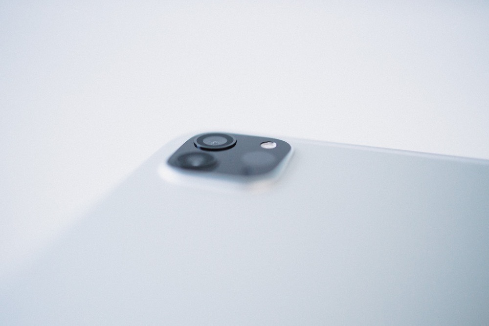
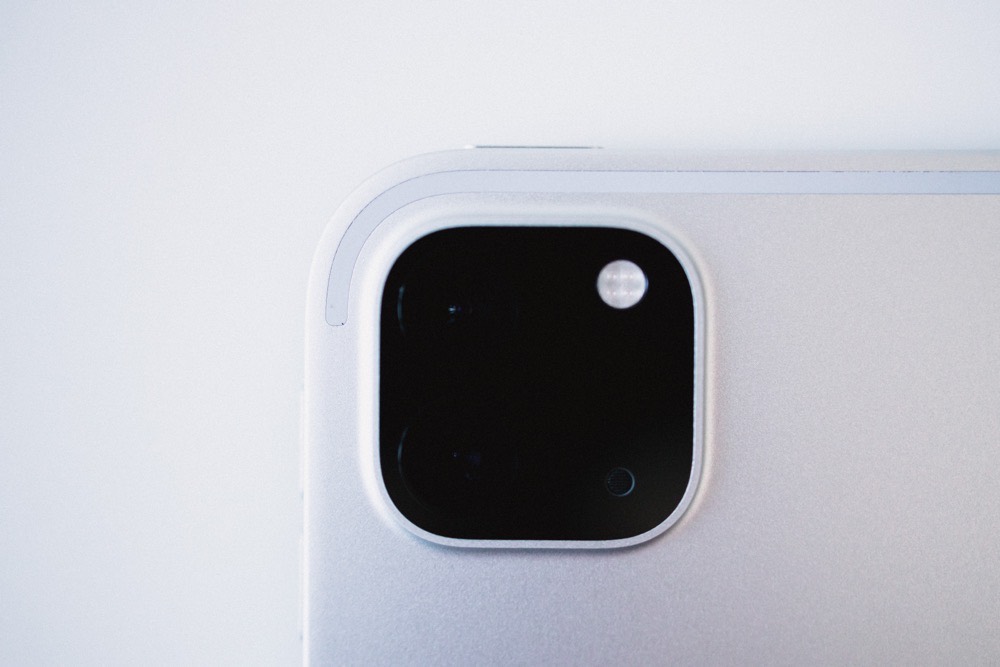
It’s been but a week, but so far, I feel all the new contexts this 11-inch iPad Pro invites have quickly outweighed the smaller screen and smaller apps. Honeymoon phase and all, I’m excited again to reach for the iPad Pro.
Go Small or Go Home
I almost never read books. Tax memorandums, financial relief measures, and CPA educational documents dominate my library. I’ve read one book in the last two years, and two if you count textbooks.
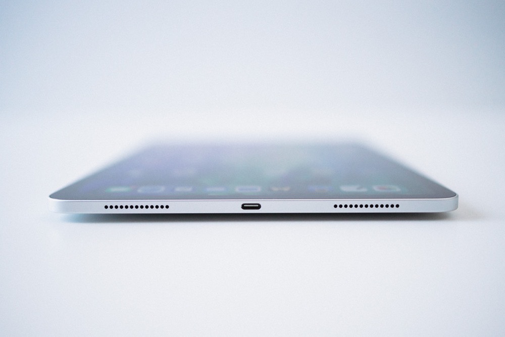
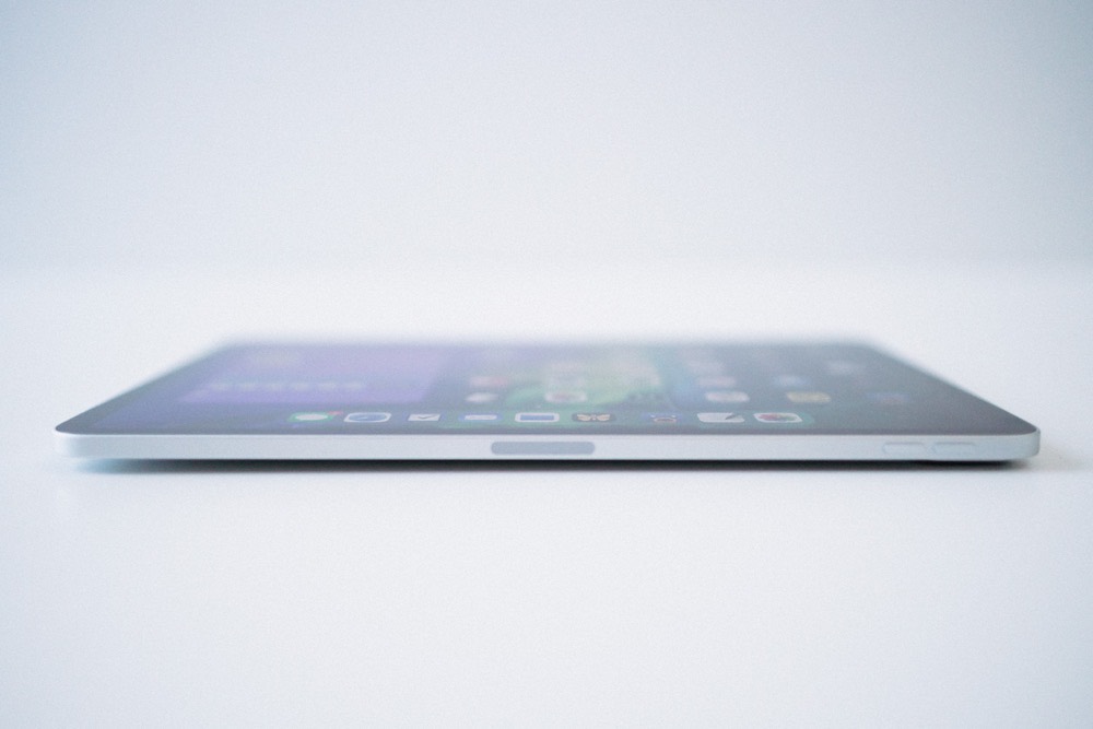
Earlier this week, I purchased a book on the Books app. I was zipping around the iPad on the couch, jumped into Books to see how the reading experience differed from the big iPad Pro — interestingly, the 2020 iPad Pro has a much warmer screen tone than the 2018 iPad Pro — and zipped through Ray Dalio’s Principles sample in half an hour. I moved Books to my home screen.
Apple made waves when they debuted their own sans-serif font, “San Francisco.” I knew, but hadn’t paid attention to, the fact that Apple also made their own serif font, coined “New York.” Late one night, I wanted to read an article in Safari and jumped into Reader View to have a more pleasant night-time reading experience. To my surprise, New York was a font option.
Instead of reading in my RSS app of choice, I’ve been reading in Reader View in Safari.
These are but two examples of how the small iPad Pro have changed my reading habits over the last seven days. This iPad is wonderfully designed for reading.
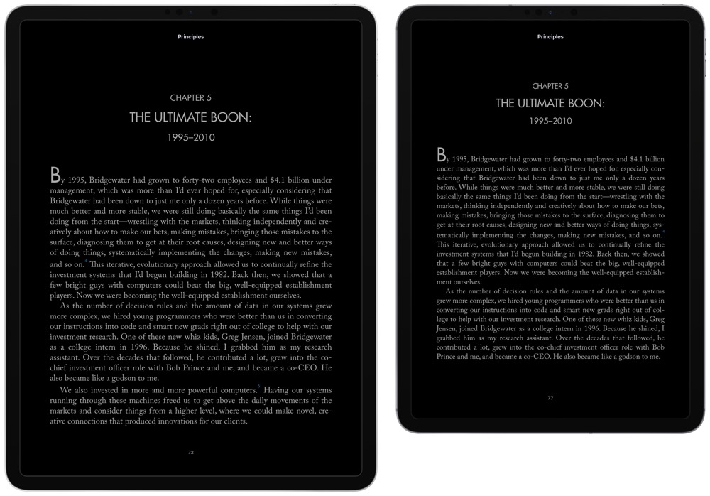
Take the above screenshots as an example. Both iPads have the same chapter of the same book in Books. Especially in portrait orientation, the big iPad Pro has too many words per line, making for a less comfortable reading experience. The small iPad Pro has a perfect margin and substantially improved line length. Boost the font size just a hair (this is the default font size) and you’re left with lines you can skim vertically as you head down the page. This is how I want to read, not reaching the end of a line and shifting my neck to the next line like on the big iPad Pro.
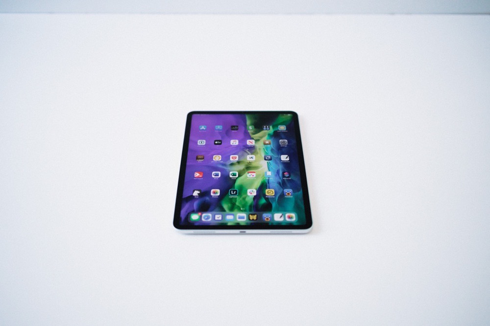
I thought I was an Apple Geek, but I admit to not realizing the differing aspect ratios between the small and big iPad Pros. The big and other regular iPads have always used a 1.33:1 aspect ratio, providing a wider-in-portrait and taller-in-landscape display. The 11-inch iPad Pro rocks a 1.43:1 aspect ratio with a 2,388 by 1,668 screen resolution, making for a narrower-in-portrait and wider-in-landscape display. I originally thought my brain was playing a trick on me, and never before have I been so happy to have not known about an iPad spec.
This is the aspect ratio to win them all.
It’s specifically noticeable when watching any sort of widescreen media. Smaller black bars above and below movies and TV shows make for a more pleasant viewing experience, and this aspect ratio looks much more natural when connected to an external display.
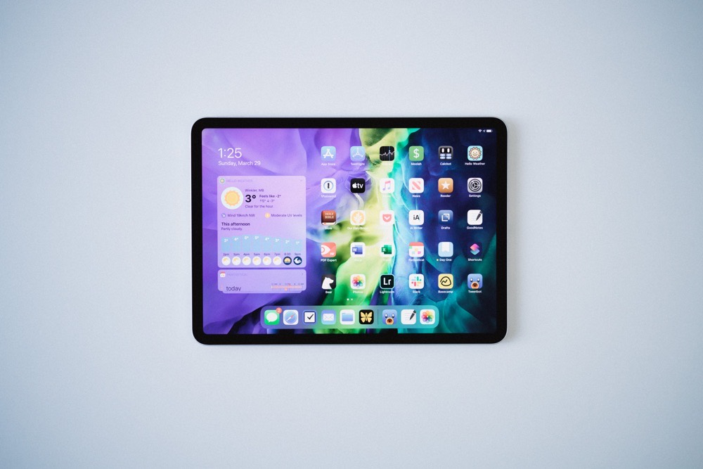
The aspect ratio also plays a subtle role when using the small iPad Pro in landscape orientation. Sure, the screen feels longer horizontally and spaces apps and widgets very slightly differently than on the big iPad Pro. But more importantly, I find the entire weight of the device feels different. When I hold the iPad in landscape, I generally do so with my left hand. I somewhat pinch the left side of the display, cupping the edge, and extend my fingers along the back of the iPad. Because of the longer and shorter aspect ratio, the balancing of the iPad applies more directly to my hand than on the big iPad Pro, where more weight rests above and below my fingers on the back side.
I get that the small iPad Pro is the small iPad Pro — it has a smaller screen, smaller chassis, and therefore, lesser size and weight. But the weight is distributed differently thanks to this unique aspect ratio, affecting my overall usage of the device — when walking around with the iPad, I now use the iPad almost exclusively in landscape orientation, something I never did before.
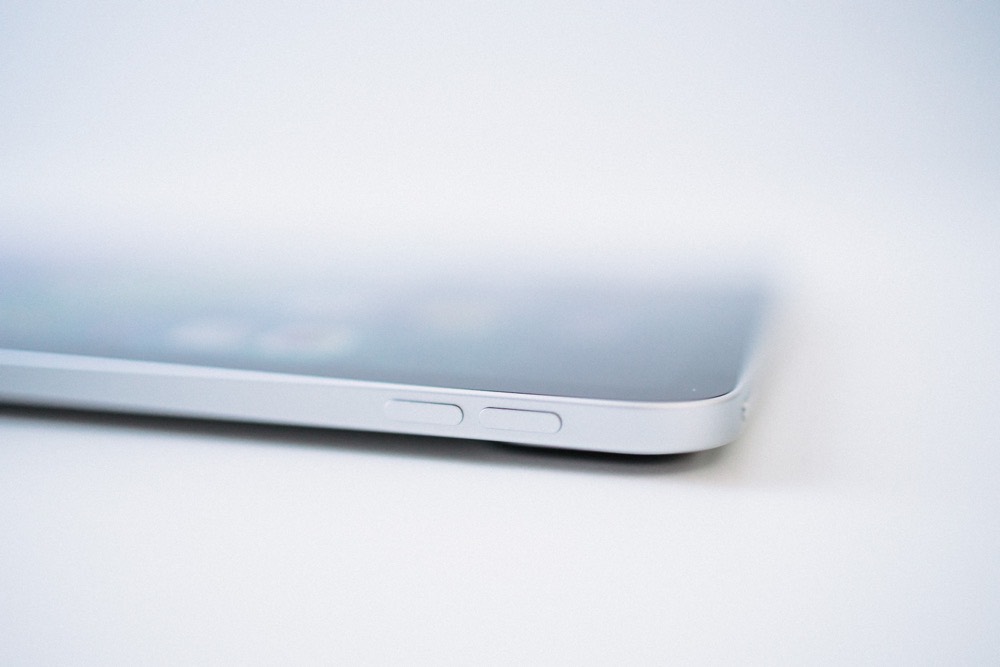
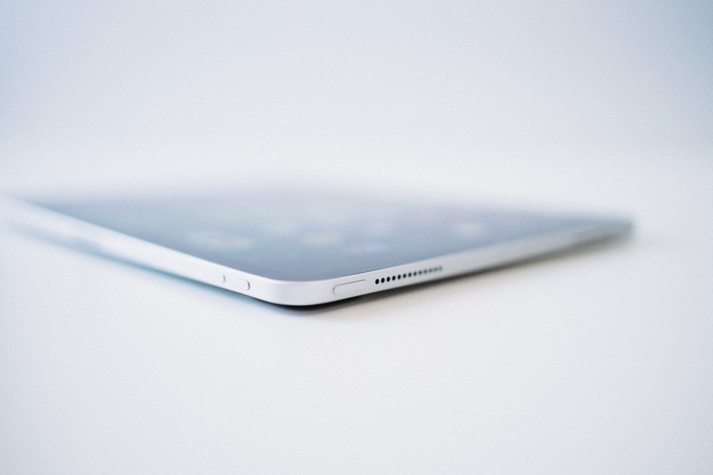
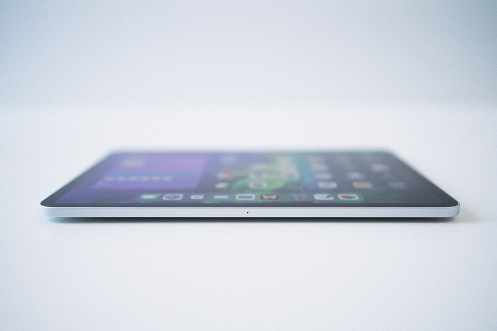
Apple’s 11-inch iPad Pro is, quite simply, a joy to pick up and hold. It’s wonderfully light and the edges are rounded off and soft, making for a great couch and lounge chair device. This, and the narrower aspect ratio, combine to make the 11-inch iPad Pro the ultimate device for watching movies, reading books, and browsing the web — all the tasks Mr. Jobs proudly pounded into our shimmering eyeballs back in 2010.
Somehow, I think this 11-inch iPad Pro is the exact device he envisioned all along.
Work From Home….
30% Off The WFH Course Bundle
Get our task and time management mini-course (All the Things (Analog)), plus with our Day One in Depth screencast course. This “WFH Bundle” is 30% off right now.
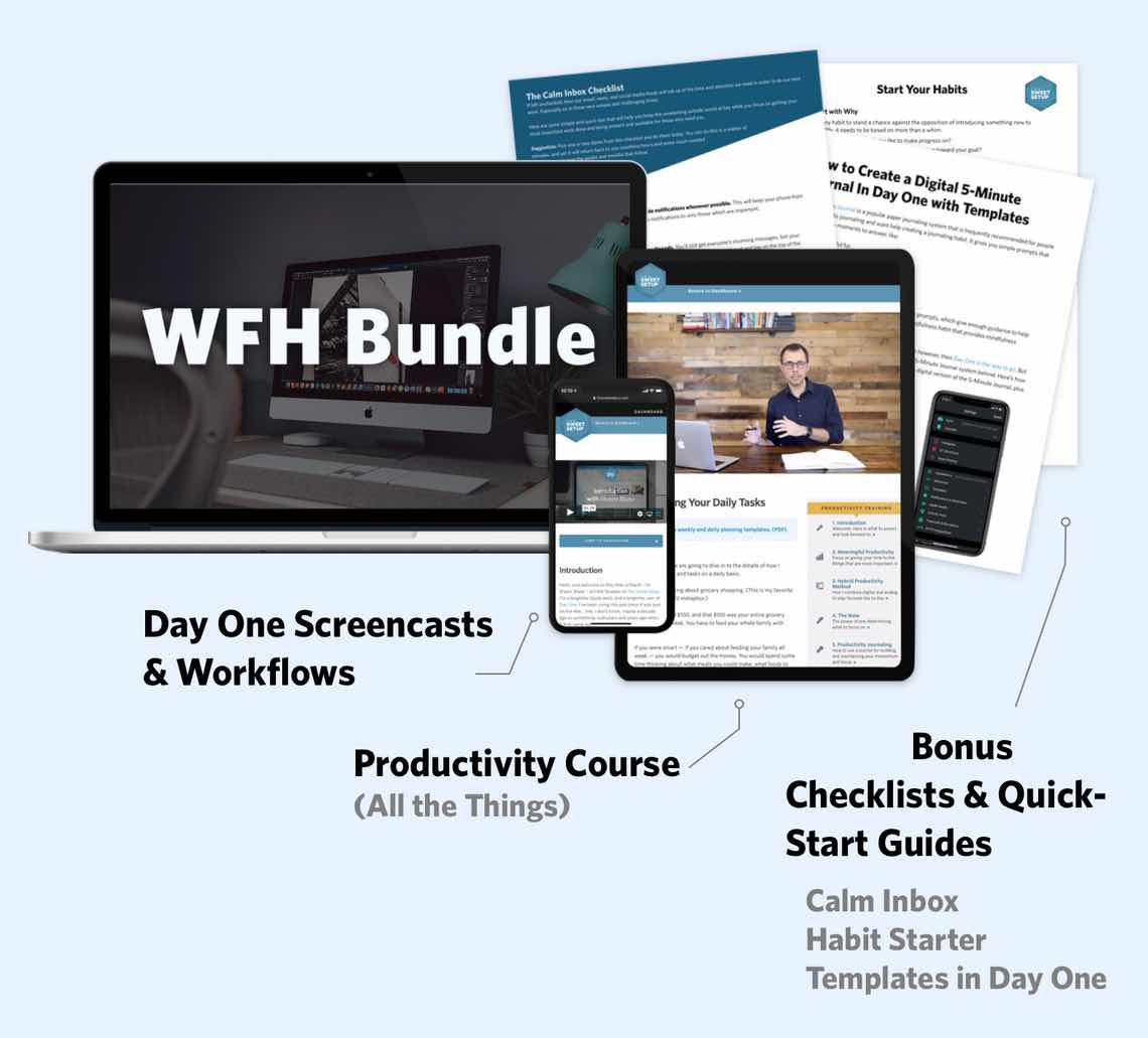
We’ll show you…
- How to schedule your day for maximum productivity in the least amount of time. This is especially helpful if you and your significant other are juggling responsibilities of kids and home life while also trying to do work.
- Weekly planning and reviewing. A great way to get ahead of your upcoming week so you can be prepared and have a priority of what needs to be done.
- Custom Productivity Templates: These are a few of the main PDF templates that you can print out or use on your iPad in order to follow along.
- How to use Day One, the best journaling app out there: which can help with reducing stress and anxiety, celebrating your wins each day, and keeping a log of what is happening in life right now.
Bundle Bonus: The WFH Bundle also includes three bonuses: The Calm Inbox Checklist, the Habit Tracking Quick-Start Guide, and Using Day One templates for the 5-Minute Journal.
Normal Price: $68
WFH Bundle Price: $47 (You save $21)
Getting Things Done
But Josh! We already knew the iPad was a great reading/browsing/consuming device. We all just want an iPad that you can do real work with, and the 12.9″ iPad Pro is much better for getting real work done.
I can hear you saying it now.
You’re not actually saying it. I know, but it’s what I imagine some journalist somewhere penning up when their editor made them try to replace their laptops with an iPad.
Of course, this is almost entirely related to software, not hardware — the new LiDAR scanner, the sort-of-new A12Z chip, and the new microphones aren’t going to change what you can and can’t do with an iPad Pro. (Though the new microphones might have an impact, depending on what you do.)
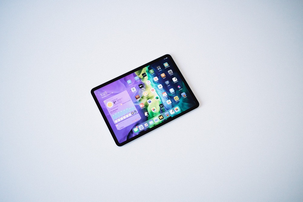
But, I haven’t found a single “work” task that hasn’t felt more comfortable on this smaller iPad Pro. I haven’t found the posture to be less comfortable than the big iPad Pro when working at a desk, nor have I found the smaller screen size impactful when researching and writing blog posts, letters, or memos at the office.
And, for me specifically, I haven’t found an impact on any photo editing. In fact, a byproduct of the smaller size has made this iPad better for photo editing.
Let me explain.
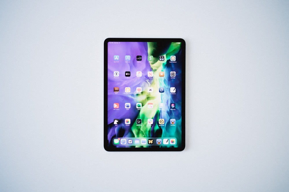
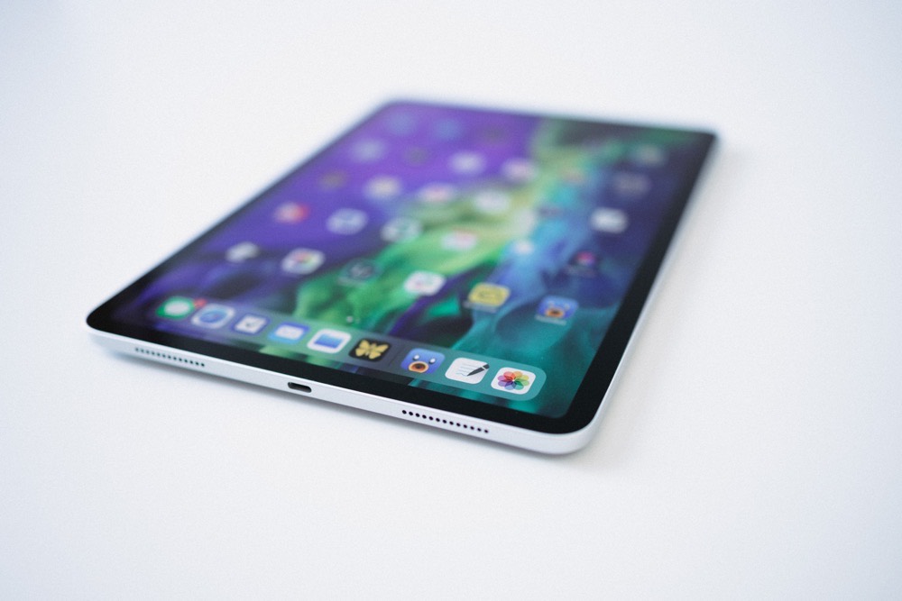
Because the small iPad Pro is easier to pick up and take around the house, I find it much easier to grab and edit photos while walking around the house with the Apple Pencil. Before, with the big iPad Pro, photo editing with the Apple Pencil was mostly a desk affair. I’d either awkwardly draw and edit on the iPad at an angle, or I’d have to clean off some extra desk space to lay the iPad flat for Pencil editing.
Now, it’s literally grab-edit-and-go.
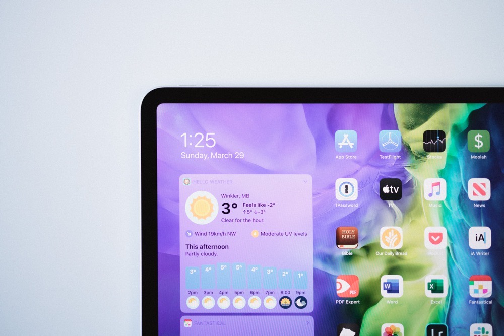
All photos for this review? Shot with an EOS R, imported into the iPad Pro, and Pencil-edited while walking around the house with the iPad Pro. I don’t think I’ve done that since I reviewed the big iPad Pro back in 2018.
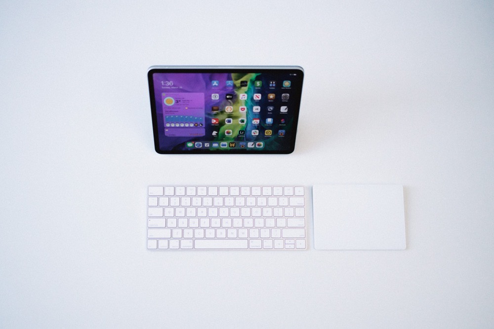
Also, cursor support. Between 7:30AM and 6:00PM, I live inside tax software, spreadsheets, and email. While the tax software is as proprietary as it gets — it looks like that classic 100100101 binary line-by-line text app from the ‘80s — spreadsheets, memos, letters, and email have all become substantially easier to attack thanks to iPadOS 13.4’s new cursor support.
Late last week, the internet crashed at the office — I can only assume it was overloaded because everyone was at home binging Netflix. I couldn’t get my work PC to connect to my iPhone’s personal hotspot, so I resorted to working on the 11-inch iPad Pro. I had to pump out Records of Employment (ROE) for a range of folks who were laid off due to COVID-19, and all their employment earnings and data was housed in an Excel spreadsheet. I opened the spreadsheet and the web submission tool in Split View and jumped between apps effortlessly with the keyboard and trackpad. Finally, I saved the PDF ROEs to our office’s shared OneDrive account.
All from an iPad.
Finally, after all these years, it’s possible to quickly highlight a column of cells and note the sum in the bottom right corner of Excel. Finally.
This doesn’t count the fact that I connected to my work PC from AnyDesk from the iPad Pro, dropped some files into OneDrive, and accessed them inside Microsoft Excel, all from the comfort of my home office.
I suspect certain tasks will always be more comfortable on certain devices — major 3D or VR productions on a Mac, and reading the newspaper on the iPad, for instance — but the lines are blurring and the grey areas are growing. More and more, it feels like the answer is “Yes, you can” when talking about the iPad Pro instead of “No, that’s not possible”.
On iPadOS Apps
Generally, less screen means less app. With a different aspect ratio and smaller screen size, one of my most sincere concerns was that of not experiencing the entire breadth of iPadOS apps, either in full screen or in Split View, on the small iPad Pro. I expected a wide, gaping distance in app experience between the big and small iPad Pros.
To my surprise though, I haven’t found myself wanting more screen space.
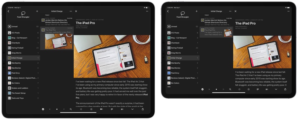
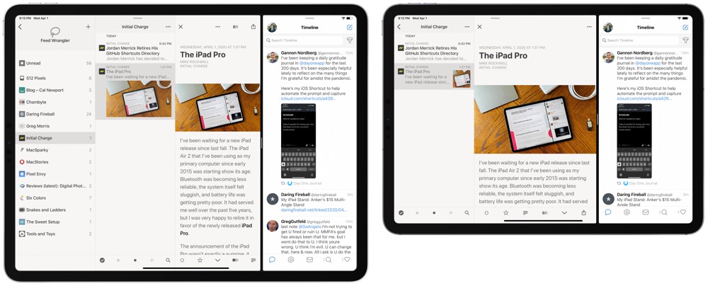
On the big iPad Pro, I became accustomed to using three-panel apps — in landscape, apps like Reeder, Ulysses, and Bear felt right at home with the three-panel layout. That same layout doesn’t work as well on the small iPad Pro. I’ve had to adjust some of my RSS reading habits as a result. I find myself most comfortable with the “Regular” layout in Reeder on the small iPad Pro, while I generally used “Full” on the big iPad Pro.
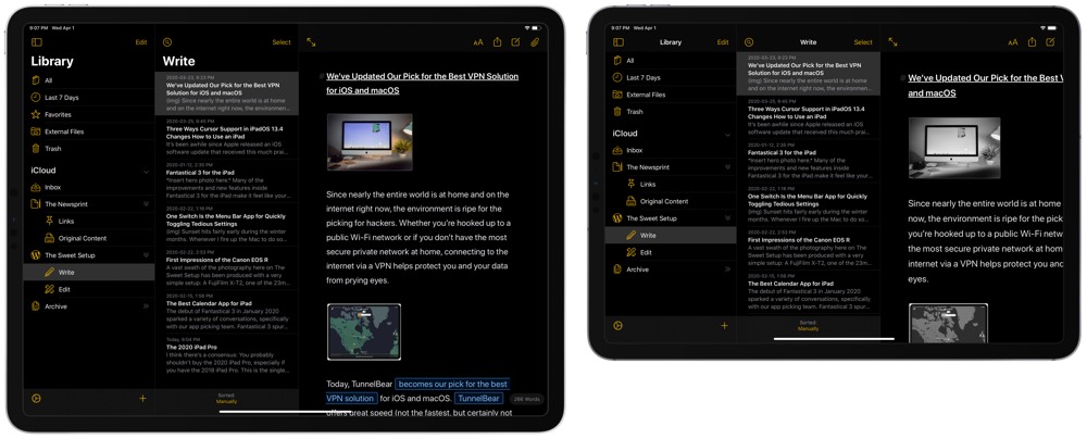
Or, in Ulysses as above, you can work full throttle in a three-pane view on the big iPad Pro. On the small iPad Pro, you have to swipe into your article. A dealbreaker? No. But a difference if you’re quite accustomed to the big screen size.
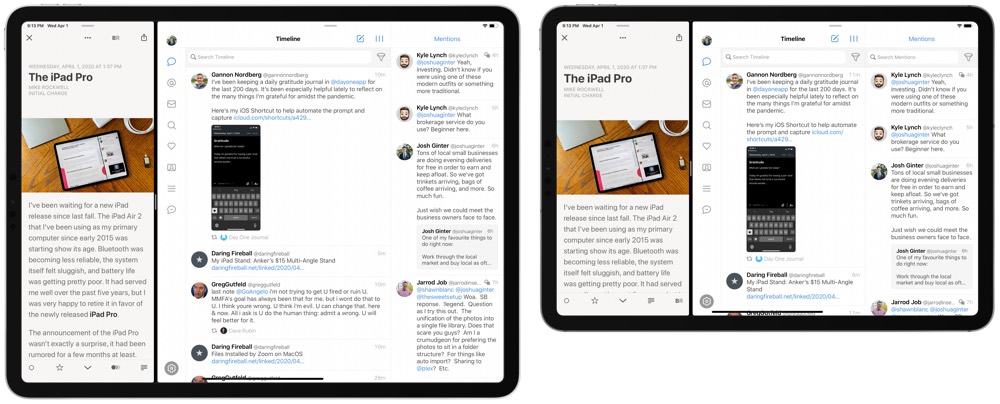
On the other hand, the smaller display makes for more natural Split View apps. While I’m not much of a fan of two 50/50 apps on the smaller display — especially coming from the big iPad Pro where two 50/50 apps meant essentially viewing two full-size iPad apps at once — a one-third/two-third Split View works extraordinarily well. It’s like having an iPhone app and a two-panel iPad app side-by-side.
Though, sometimes even 50/50 feels better on the small iPad Pro.
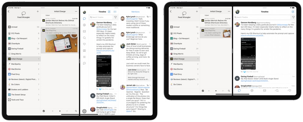
The above screenshot proves this wonderfully. Tweetbot on the right simply doesn’t know what it wants to be on the big iPad Pro, while the small iPad Pro pushes Tweetbot into more of an iPhone, single-column layout.
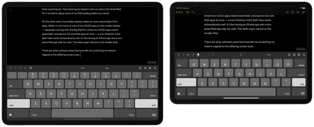
There are some other differences worth noting as well. I fully expected the keyboards to have different layouts. That said, I have been baffled with where keys are positioned on the small iPad Pro software keyboard. Perhaps my eyes are playing tricks on me, but I swear there is more space between the keys on the small iPad Pro keyboard. And because there’s so little space above the keyboard anyway, I don’t see why Apple can’t add that half-key number row to the small iPad Pro keyboard. Of all the things I miss due to the smaller screen size, it’s that number key row.
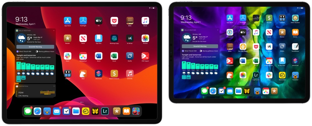
I’ve also noted a difference in how I’ve set up my home screen on the small iPad Pro. Dropping too many apps into the dock (you know, because the dock is the only good way to put apps into any multi-tasking mode) decreases the touch target size of the dock app icons very quickly. Having many apps in the dock is fine for landscape work, but because I find myself using this in portrait orientation a lot more, I’ve found myself leaning towards less apps in the dock on this new iPad. Less apps in the dock means a more cluttered first home screen — my perfectionist self needs time to adjust.
A Few Quick Thoughts on the Smart Folio
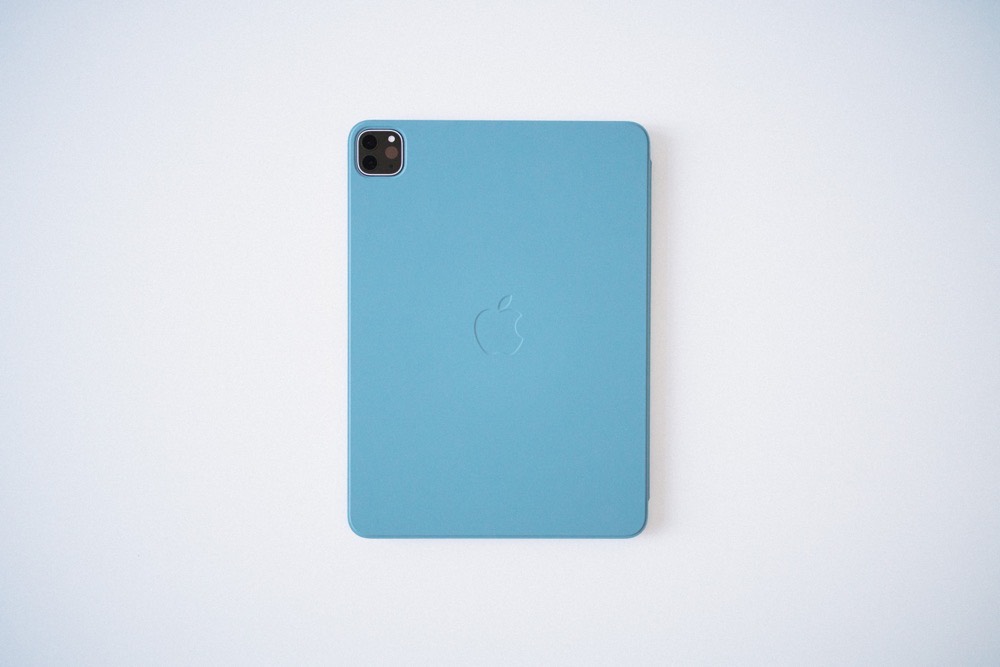
The 2018 12.9-inch iPad Pro in my kit is the first iPad I’ve purchased without a Smart Cover of some sort. The very original Smart Cover — the one with the metal attachments that scratched the iPad 2 into oblivion — was the most ingenious cover design of all time. Minus, of course, the metal attachments.
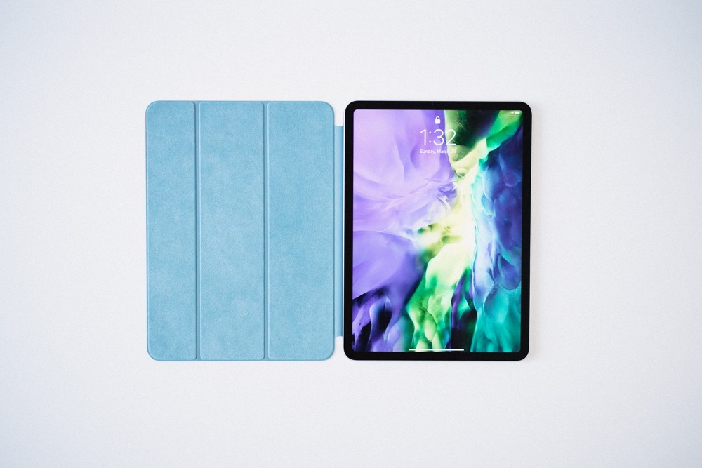
Over time, Apple has evolved that original Smart Cover design into what we now know as the Smart Folio. This latest design is, for the most part, a near perfected design. The three panel front cover, interior micro fiber cloth, and now a back-facing cover make the Smart Folio a must-buy in my opinion.
That being said, the back-facing cover leaves a little — or a lot — to be desired. It has the micro fiber cloth, attaches via magnets, protects the back — sure, I get it. But it feels like nothing more than a piece of cardboard covered in fabric. There’s nothing to the back side cover, which leaves me questioning its long-term durability.
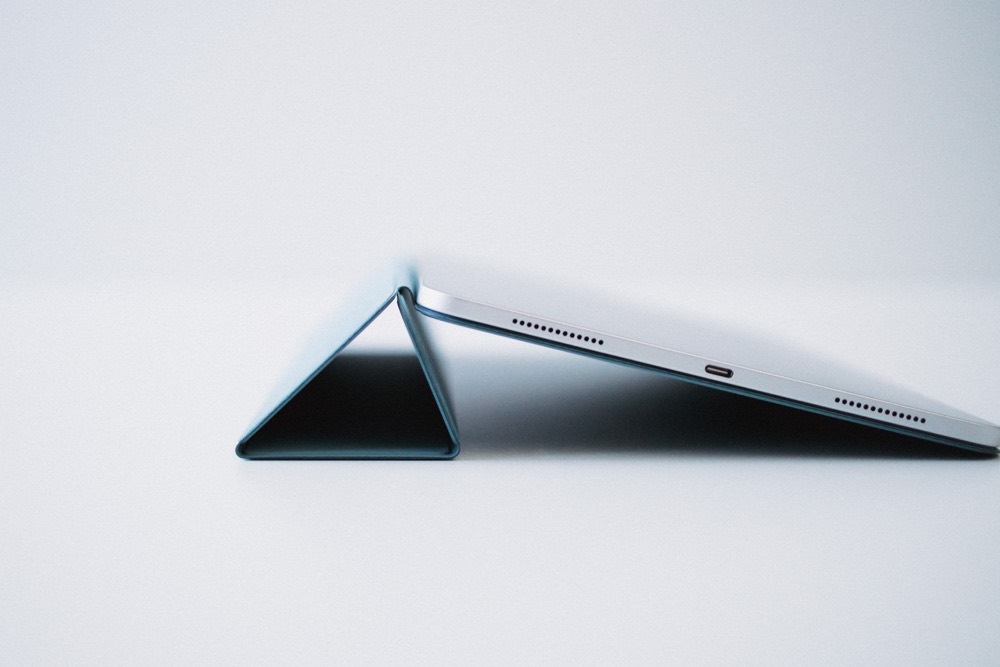
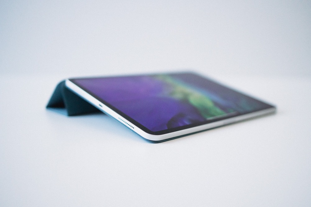
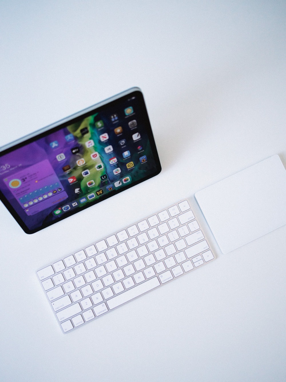
The three-panel front cover also doesn’t do the greatest job staying folded in the now-classic triangular shape for propping up the iPad to a more comfortable typing angle or more comfortable video-viewing angle. So far, I’ve carried this to the office alongside a Magic Keyboard and Magic Trackpad 2, and I’ve opted to leave the Twelve South Compass behind. However, the moment you pick up the iPad from its video-viewing angle, the triangular fold gives out and unfolds. If you have to shift the iPad at all, this is infuriating.
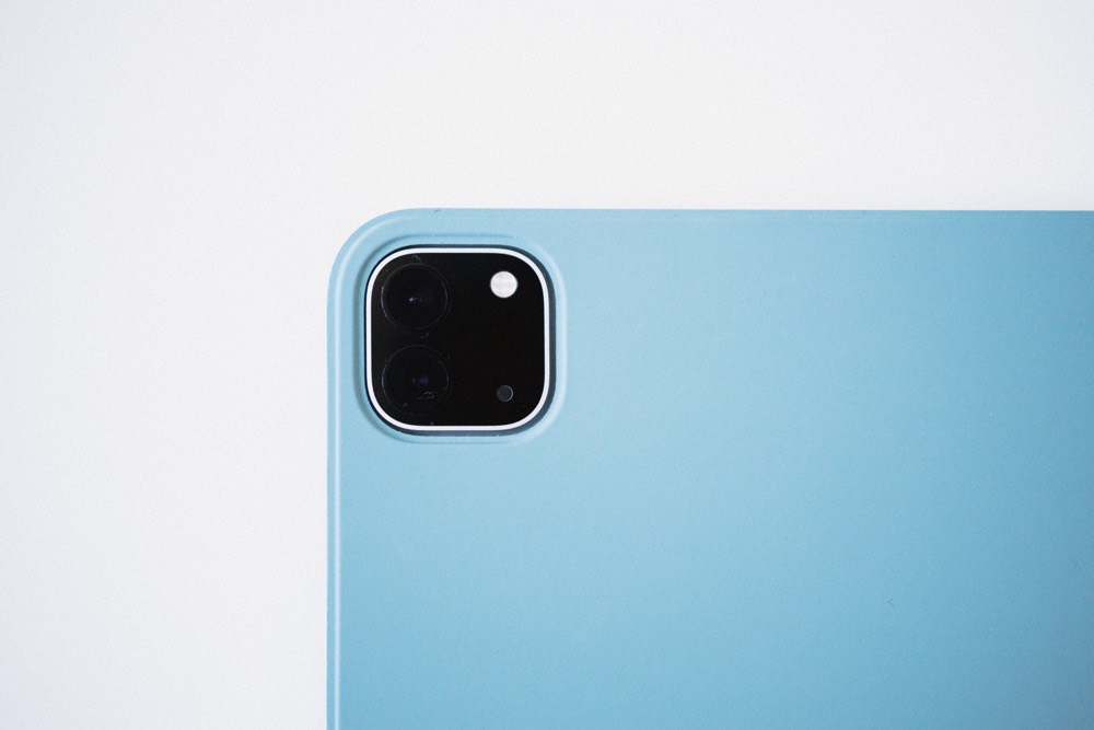
The old leather Smart Covers that could be bought alongside the original 10.5-inch iPad Pro was the very best Smart Cover I’d ever seen. This Smart Folio cover, though superior in the fact it covers the back of the iPad Pro, is a step backwards in terms of quality.
A major step backward.
My New Couch iPad
In the midst of finishing off this piece, I returned to my 12.9-inch iPad Pro to create some screenshots and do some direct comparisons. I sat at my dining room table, both iPads side-by-side in a desk-like setup, and marveled at the beauty of the gigantic iPad. The 12.9-inch screen sits dazzling on a desk, full of room for multiple apps, big canvases for photo editing, and with a full-size software keyboard ready for more serious typing.
This is, and likely always will be, where the 12.9-inch iPad Pro excels.
But when I reached the end of my writing for the night, I grabbed the 11-inch iPad Pro and sat down on the couch to read a chapter of a book. I didn’t have to lean the iPad against my knee. I didn’t have to use two hands. I didn’t have to crank my neck or change font sizes. I just sat down and read.
I think this little microcosm story is a perfect representation of my first week with the small iPad Pro. I had expectations — tons of expectations. Some of those expectations came true (awkward software keyboard size, for instance) while others surprised me (Split Screen apps and the aspect ratio, to name two).
Shawn Blanc, editor-in-chief of The Sweet Setup put it to me like this (I may be paraphrasing as I can’t find the exact message in Basecamp): “I didn’t think the trade-offs of not being able to use the iPad on the couch or with one hand was worth the wonderful desk experience of the larger iPad Pro.”
In a short period of time, this has been my experience as well.
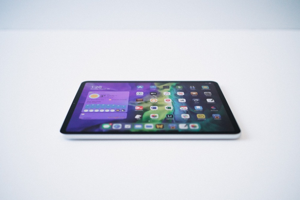
In the last six months, I’ve moved from the big iPad Pro and big iPhone to the small iPad Pro and small iPhone. I have yet to be clamoring for the larger screen sizes, in both cases.
Go small or go home.
