Some First Impressions of Apple’s Studio Display
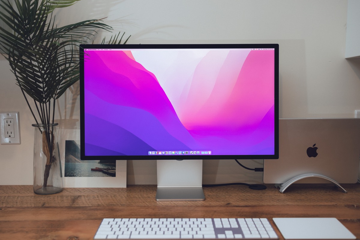
It’s been awhile since I’ve come across an Apple product that has me excited to use it. The iPad Magic Keyboard had me looking for any and all ways to use the iPad in my daily work (often leading to workflows that simply weren’t designed for the iPad). And the AirPods Max are within an excited arm’s reach all day (no, they are not good workout headphones, as I’ve discovered).
The Apple Studio Display finds itself in that category. I’m finding myself leaving the office early knowing I can — and even want to — work from home in the evening on the Studio Display.
Which is odd, to be sure. There’s nothing majorly new about the Studio Display. The panel is largely the same as the iMac before it. The size, scaling, and resolution are all the same as the other 5K displays on the market. The color accuracy is the same. The I/O isn’t exactly new (at least not when you compare it to the MacBook Pro).
Not that the Studio Display should be a letdown, given all the years Apple fans have been calling for a great and price-accessible external display. But for it to rank in my favorite three Apple products in many, many years? That seems like a high ranking.
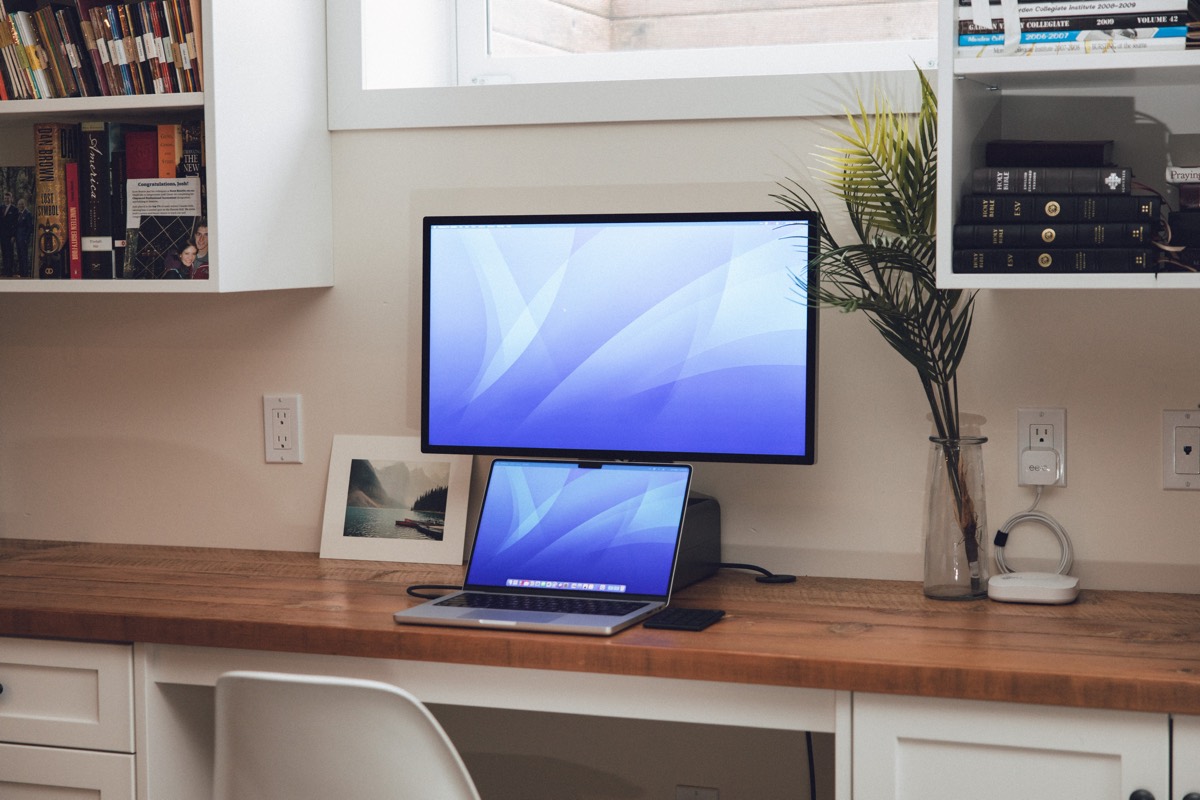
Nevertheless, the Studio Display is one of the most giddy-worthy Apple products I’ve played with in a long time. Its design is impeccable, speakers deep and thorough, display bright and crisp, I/O usable and manageable.
Price? Perhaps higher than some would like.
The Apple Studio Display is the quintessential Apple add-on accessory. One that I want to use in every office and everywhere I work.
Great First Impressions: Design, Speakers, Display, and I/O
I’m pretty in love with this Studio Display, so I’ll attempt to keep from rambling here.
Design and Build Quality
If I had to rank the best aesthetically designed Apple products halfway through 2022, the Apple Studio Display may rank at the top. Some may prefer the Mac Pro cheese-grater design (it is, indeed, beautiful, though a bit gaudy, in some ways). Some may point at the iPad Pro design or the latest iPhones Pro.
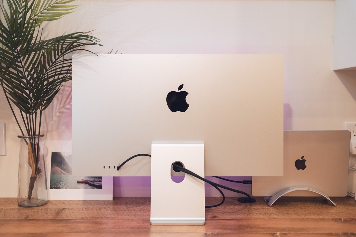
I prefer the Studio Display. The back aluminum body is unassuming and very elegant, while the speaker cut-outs on top and bottom stray away from the Pro Display XDR’s huge grater holes. The bezels could be thinner, sure, but they’re also vastly improved over the prior iMac and feel very balanced in use.
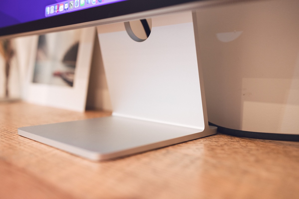
The build quality is equally impressive. The stand in particular is heavy duty and machine-precise, with the height-adjustable stand giving off a Pro Display XDR feel.
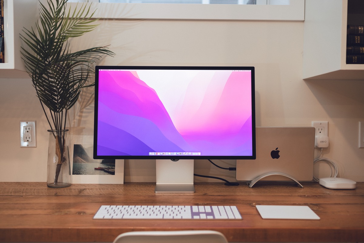
My only design or aesthetic complaint would be the positioning of the cable passthrough cut-out in the stand. When looking dead on, the bottom half of that hole is visible, with wires quite conspicuously running through. It’s even worse on the height-adjustable stand. A little higher and Apple hits a grand slam.
(Also, right after plugging in my Studio Display, I noticed this slight hum or buzz that comes through the top speaker grill. After the Display has been on for quite some time, the buzzing goes away. I wonder if it’s something to do with the heat sink or something on the inside?)
Speakers
When the latest M1 Pro/Max MacBook Pros debuted, much was said about the built-in speakers. The moment you opened the lid, that Apple chime sort of gripped the deepest part of your ear drums.
The Studio Display does the same thing. But it reaches even further into your ear sockets.
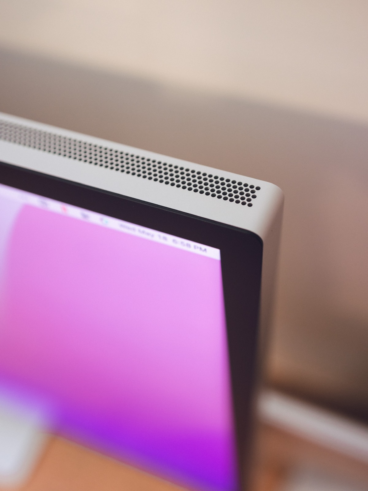
The same commentary applies here: The Studio Display’s speakers are deep, full, and as complete a speaker I’ve heard since I threw on the AirPods Max five minutes ago.
Instead, anecdotal: I find myself opting to watch my favorite TV shows on the Studio Display much more often than any iMac or external display before it. The combination of display quality, comfortable size, and excellent sound make for a truly enjoyable TV experience (especially if you have a comfortable chair). Those deep speakers are especially noticeable when streaming live sporting events — there is a deep roar in the crowd you could never hear on a set of external display speakers before the Apple Studio Display.
And honestly, the Studio Display’s speakers would get an A+ rating if all Apple did was improve the volume increments. Or am I the only guy who finds the LG UltraFines go from whisper-quiet to blaring-loud between three ticks and four ticks?
Nano Texture Display
I had to be reminded this week that the Studio Display’s panel is certainly upgraded over any prior 5K display from Apple. Improvements include a brighter display (600 nits vs. 500 nits prior) specifically. I always use to run the 27-inch iMac at full brightness all day long. The Studio Display is too bright for my eyeballs at full brightness.
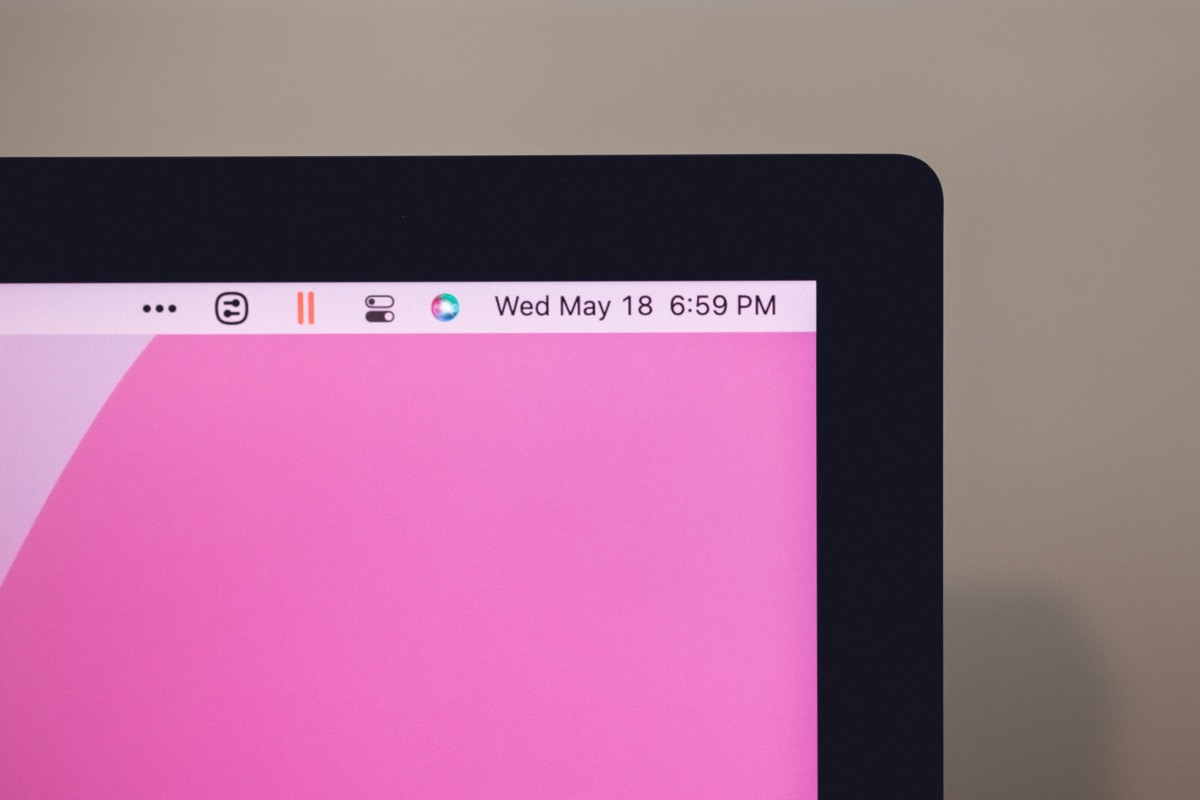
The new nano texture option has garnered a lot of conversation as well, as it hearkens back to some of the older matte Cinema Displays from the early-to-mid 2000s. Those old matte displays weren’t high resolution Retina displays by any means, but they felt a lot like this nano texture display feels. Text is sharp, but has an ever so slight fuzziness around the edge. Colors are slightly muted. The display feels quite different than the glossy displays Apple has been producing for the last decade.
These sound like negative connotations, of course. And some folks will find “fuzziness” and “muted” completely offensive to their eyeballs. But there is a place for the nano texture display, and it’s on a lot more desks than others have been led to believe.
I find the nano texture finish to be more soothing on the eyes than any ultra-sharp glossy display before it. It’s hard to put words to, exactly. I can work on this display longer and with less eye strain than the LG UltraFines and the iMac before it. I’m not sure if this is due to the softer text saving my retinas or the lesser contrast burning my eyeballs. Either way, I have quickly come to prefer this nano texture finish over any glossy display before it.
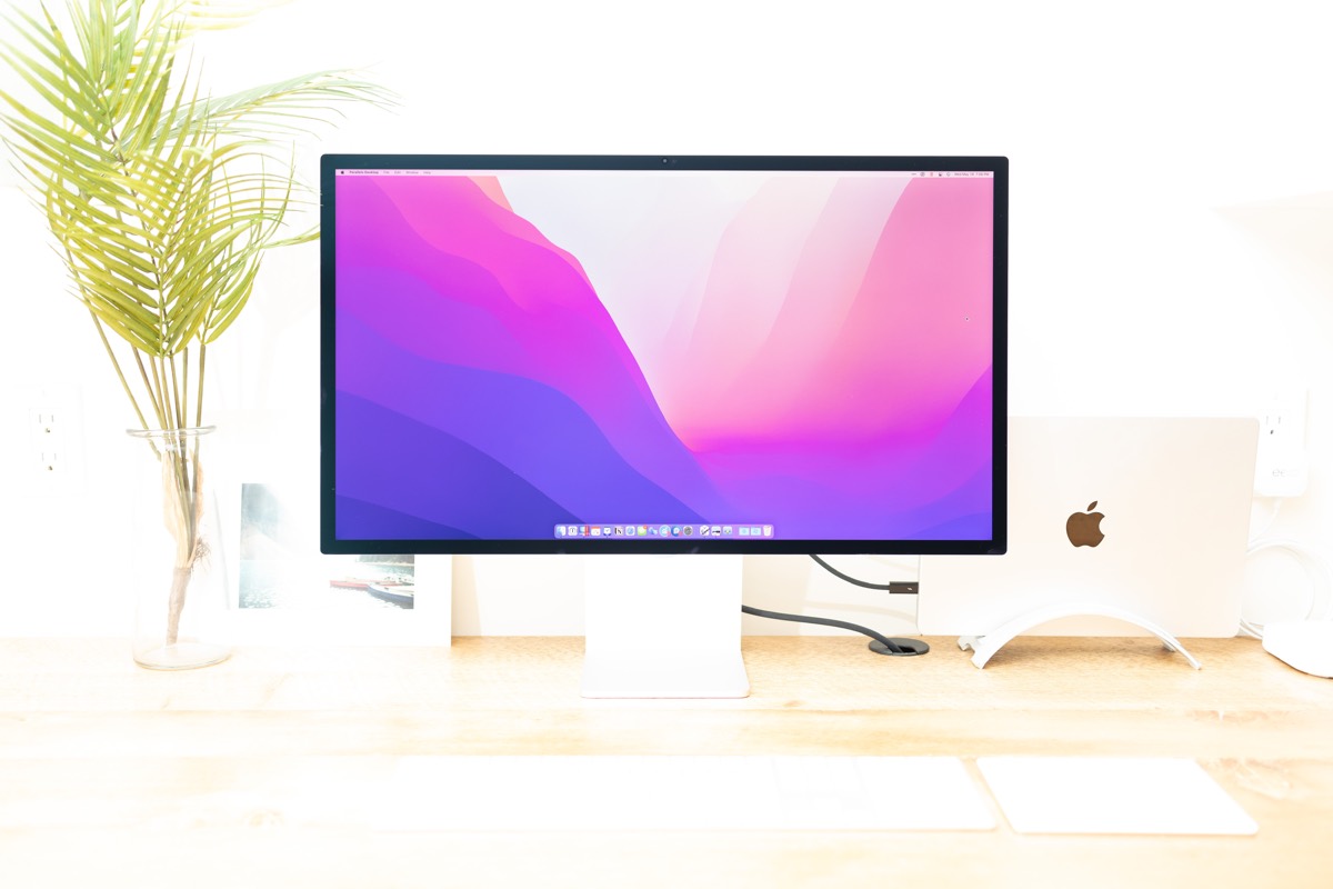
It’s also fantastic for photography. I used to use the same photographic angles and light placements when shooting any display on my desk.
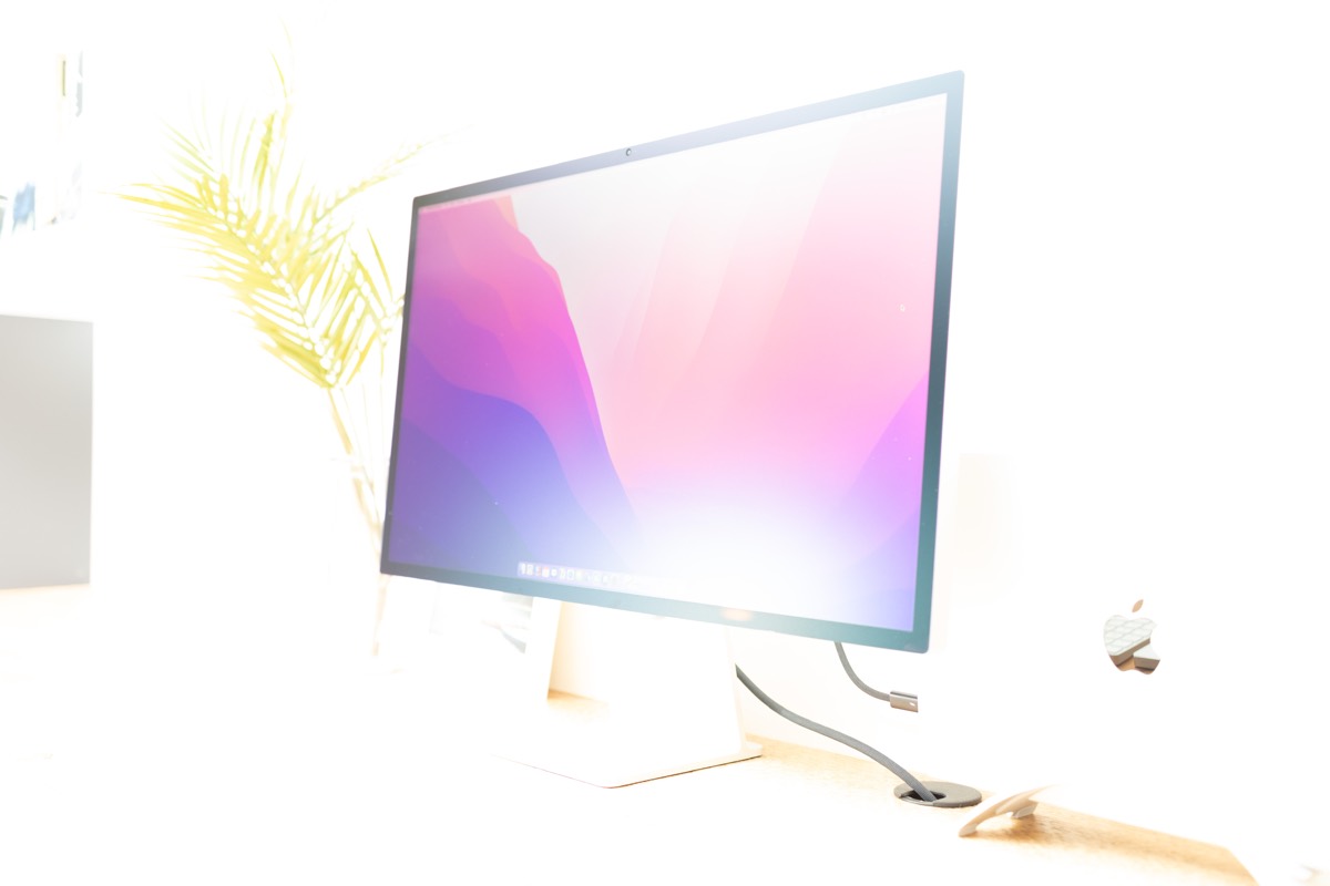
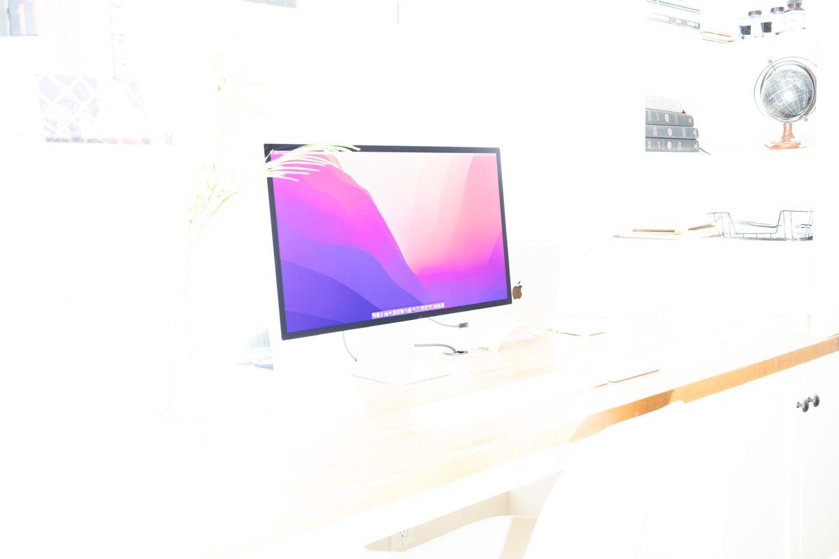
Now, I can fire a flash full steam at the Studio Display and text and color are almost perfect in the final photograph.
There are other awesome-to-haves here as well. P3 wide color and True Tone support are great — I really miss True Tone when working on my 24-inch LG UltraFine displays; so much so that I generally run Night Shift at a really low setting at the brightest times of the day. With built-in True Tone and that nano texture finish, the Studio Display has become my go-to display for long work sessions.
Other than that, ProMotion please? I imagine it’s technically difficult to pull off, but working on a Studio Display side-by-side with the latest MacBook Pros is very telling.
I/O
The super-thin 24-inch iMac hit the market with a glimpse of the Studio Display future — two USB 3 ports and two Thunderbolt 4 ports are all you get on Apple’s most accessible all-in-one. The Studio Display is a little different, but the I/O certainly isn’t as expansive as the Thunderbolt Display from the mid-2000s.
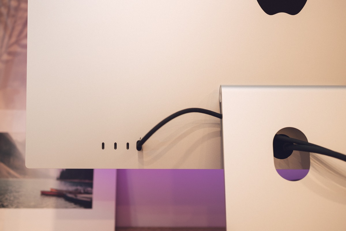
Apple trained everyone over the years with the USB-C-only MacBook Pros and MacBook Airs — most folks likely have oodles of extra dongles kicking around. The MacBook Pro certainly cut into dongle usage, but the Studio Display will require a few of them if you’re wanting permanent connections.
Think a hard-wired ethernet connection. Or an always-on Time Machine external drive. Or one of Logitech’s tiny Bluetooth USB dongles for improved peripheral functionality. Each of these accessories will need a dongle, and you’ll have to funnel them through that low-cut cable cut-out in the stand.
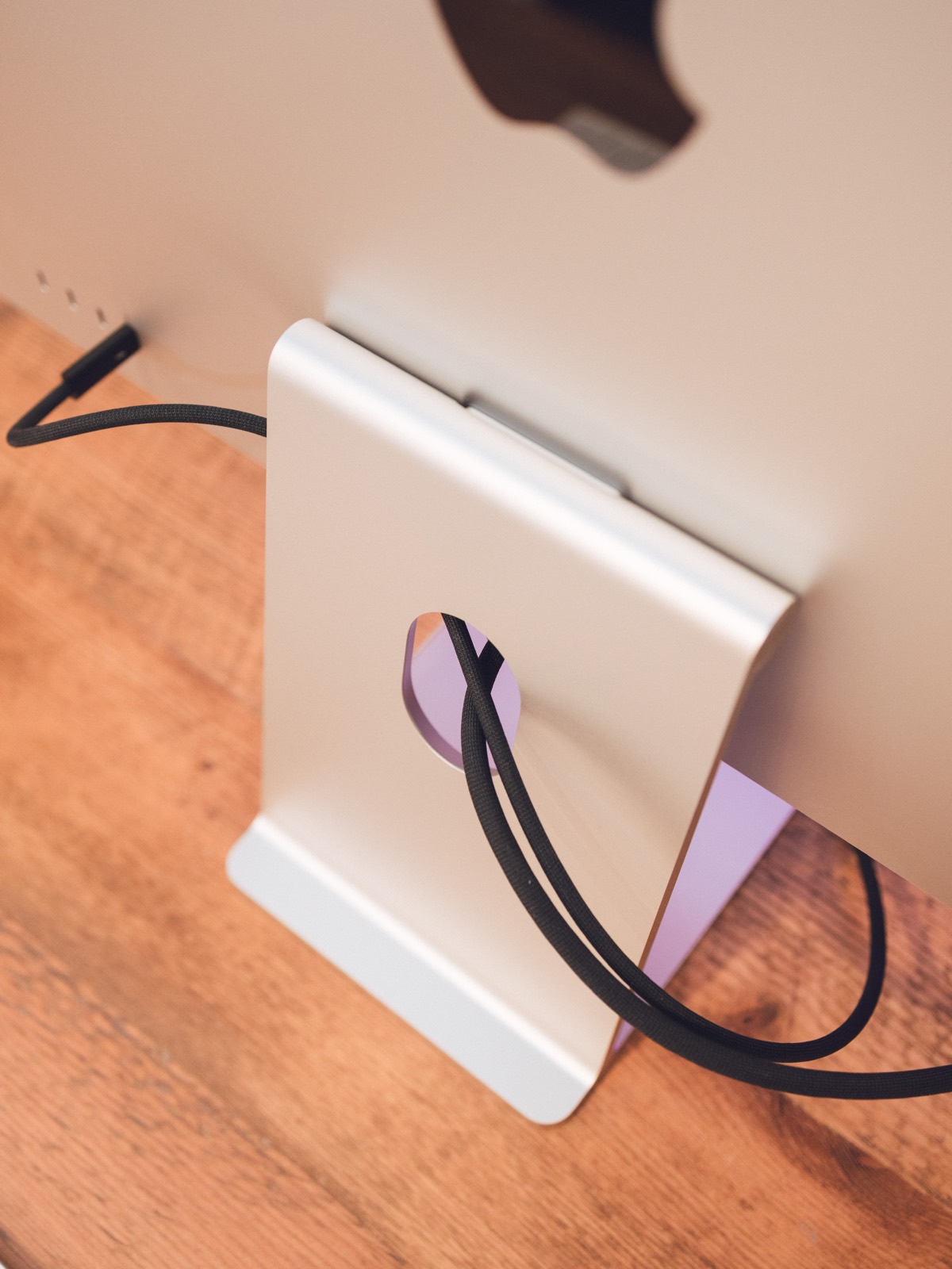
But in combination with the latest MacBook Pro and Mac Studio I/O, a few dongles and the Studio Display unlock an impressive amount of I/O functionality. I find myself plugging in permanent connections to the Studio Display with the hopes of maintaining that heralded single-connection cable to the MacBook Pro.
One last I/O anecdote: I was reading an early review that stated any Thunderbolt 3 or Thunderbolt 4 cable could be used to connect to a MacBook Pro or Mac Studio. Indeed, this is the case — and you may want to use a Thunderbolt 3 cable as they can get significantly longer and be significantly cheaper than any Thunderbolt 4 cable out there (Apple’s included Thunderbolt 4 cable is incredibly well made and incredibly short.)
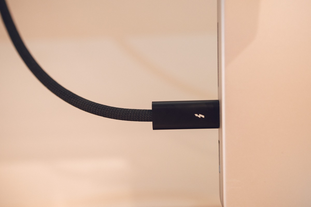
This said, the Thunderbolt 3 cable I tried (originally included in the LG UltraFine boxes and much longer than the Thunderbolt 4 cable) immediately led to some scaling differences. The Studio Display immediately started moving the scaling in my Parallels Windows VMs, making text much bigger than I’d prefer. On the other side, the LG UltraFines started showing different scaling options in the displays preferences window when I used the Thunderbolt 4 cable for connectivity. It was a weird day of trying to figure out scaling issues and I immediately brought the Thunderbolt 4 cable back for Studio Display use.
Long and short: You can use a Thunderbolt 3 cable to connect to the Studio Display, but my experience so far has been superior with the included Thunderbolt 4 cable.
Not-So-Great First Impressions: Camera and Price
One of these not-so-great impressions will be stated bluntly and with little to no room for Apple’s excuses. The other impression requires some additional discussion.
Camera
Sometimes I wonder what goes on in the boardroom at big companies like Apple. Do head executives place unreleased hardware under a black cloth and allow directors to demo the products after some fancy magic trick? Did John Ternus actually look at the Studio Display before he talked about the camera in the keynote?
Or did those decision makers truly think we wouldn’t notice the incredibly poor quality of the Studio Display’s camera? The keynote didn’t present any sort of cliched commentary, but Apple’s response to early reviewers complaints was that a software update would improve camera quality.
I don’t know if I can remember the last time Apple treated its customers like fools on a feature. The company has a long reputation of under-promising and over-delivering. The Studio Display’s camera completely, utterly missed the mark and has provided a moment of pause for Apple’s quality reputation.
Flip side though: I really like Center Stage on the Studio Display. The argument has been made that most folks will be situated in front of their displays and Center Stage isn’t as necessary in that sort of setting. Agreed, but I’m curious if those writers have 3-year-old children bounding around during FaceTime conversations with Grandma and Grandpa. Center Stage wonderfully keeps my kids centered in the frame so Grandma and Grandpa don’t miss any of the action.
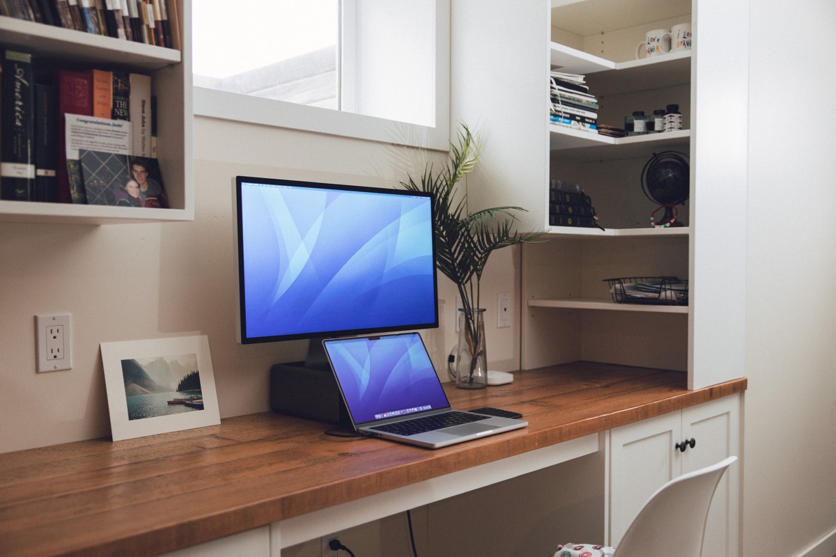
Center Stage for families is an absolutely amazing feature. It also happens to be the only good thing I can say about this pathetic Studio Display camera. Thank goodness you can easily use the MacBook Pro camera instead.
Price
This needs more discussion and requires a macro look at the economy at large.
The base price of the Studio Display is $1,600 USD ($2,000 CAD). The nano texture option is $300 USD ($400 CAD) and the height-adjustable stand is an additional $400 USD ($500 USD) for basically a one-time height adjustment. That’s $2,300 USD ($2,900 CAD) for a fully maxed out Studio Display — more than any prior base 27-inch iMac, for sure.
But a macro look at the global economy shows why prices on the Studio Display have reached where they are today. Let’s name a few factors:
- The braided Thunderbolt 4 cable is one of the most advanced cables ever shipped. The short Thunderbolt 4 cable is $129 USD on its own.
- Global supply chain issues and a tight labor market have caused large increases to input costs and shipping costs. Remember, Apple provides free shipping on nearly all their products. I know they’ll garner huge discounts due to shipping volumes, but their costs will have risen for sure.
- Apple has adopted Buy Now, Pay Later programs around the world, requiring a 3% to as high as 9% cut to go to the financing company. Again, I’m sure Apple has negotiated a great rate here, but these costs will be baked into the purchase price.
- These displays were likely designed and built during the pandemic, introducing an array of new costs to be recouped in the purchase price.
- The Studio Display is likely to be situated on desks for a much longer period of time than any iPhone, iPad, or Mac. With customer re-buys coming in lower than other Apple products, margins likely need to be higher to recuperate product life cycle costs.
I could add a few more to the list.
Apple’s a rich company, but they aren’t in business to lose money on a product. Margins are still going to be healthy on the Studio Display, but short of seeing the numbers myself, I’d bet the Studio Display has been positioned to achieve certain margins on higher input costs than ever before.
Apple is a big company and a huge player in the global economy. But even Apple is subject to the leaps and bounds of that global economy. The Studio Display’s pricing likely got caught right in the middle of all the economic tension in the world.
Ultimately, it’s an expensive display to purchase. But it’s the only display of its kind on the market.
Wrap Up
How did I ensure the two pitfalls of the Apple Studio Display didn’t overtake the product’s great features? How did the Studio Display end up at the top of my list of favorite Apple products of all-time?
I have a MacBook Pro with a great built-in camera. I rely on the built-in camera for most video calls. For calls with Grandma and Grandpa (who have an old iPad to boot), I switch to the Studio Display for Center Stage.
And the price? Well, this isn’t a personal finance blog, but I recommend looking into the benefits and drawbacks of Buy Now, Pay Later.
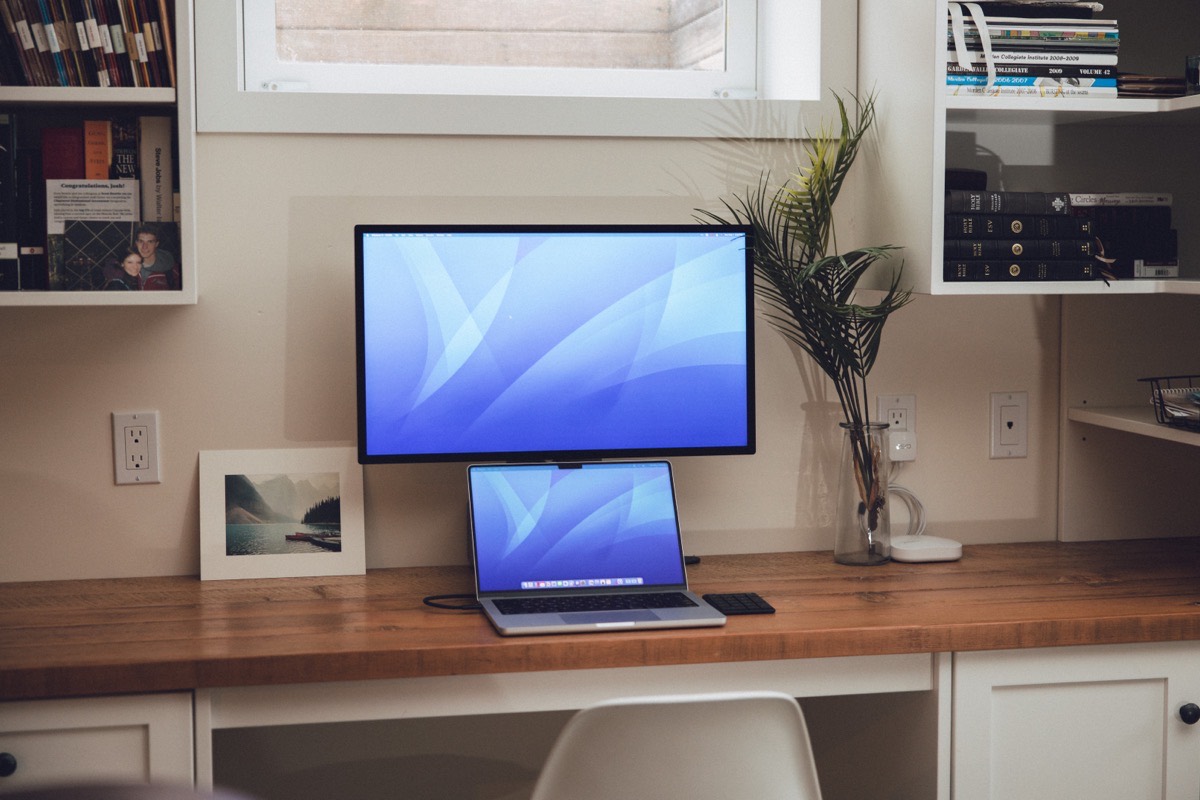
I especially love this Studio Display’s nano texture option. It’s a great contrast with the MacBook Pro’s XDR Display — the XDR Display can be used for fine-tuning photographs and watching any video in the absolute best quality, while the Studio Display’s nano texture finish is best for daily work all day long. I truly find an improvement in eye strain throughout the day.
And if you’re a photographer or videographer who shoots the Studio Display itself, I recommend a Studio Display consideration. People with bright offices don’t need to be the only people who should consider the nano texture finish.
The Apple Studio Display is likely to be situated on my desk for the next decade. It’s likely one of the longest investments you can make in Apple hardware right now. The display looks great. It sounds great. It’s built great.
There’s so much to love about the Apple Studio Display. Apple really, really outdid themselves here.
