Reeder 4 Debuts for Mac, iPhone, and iPad With Bionic Reading Mode, Read Later Feature, Design Improvements, and More
If you need proof that The Sweet Setup isn’t a just a list of a specific individual’s favorite apps for iPhone, iPad, and Mac, you don’t need to look any further than our RSS app review for iPhone and iPad. Unread is our pick for the best RSS app for iPhone and iPad, and has been since the very beginning. Unread’s minimal design and smooth swiping navigation features are great for just about all RSS users.
However, I’ve always preferred Reeder. Reeder is the first app I bought for the iPhone back in 2010, and is one of those apps I find myself buying before even reading a feature list.
So when Reeder 4 debuted a few weeks ago for iPhone, iPad, and the Mac, I only discovered the app’s new features after the apps had been installed.
Reeder 4 doesn’t rewrite the playbook that made it one of the premier RSS apps for every Apple platform, but it introduces a few niceties, like smoother and more friendly animations, a refreshed and more consistent code base across iOS and macOS, a new native Read Later feature, and Bionic Reading support. The app also debuted with a new icon, which may be the only hiccup I can come up with at this point.
Design Improvements
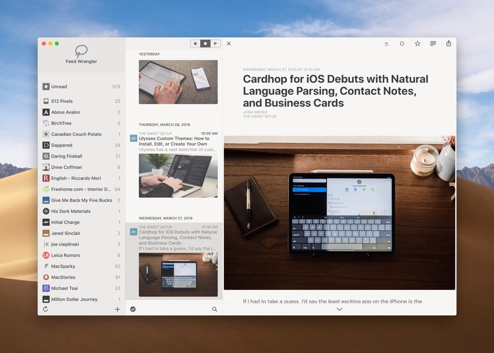
Looking at a screenshot of Reeder 4 reveals how discrete the design changes are from version 3 to version 4.
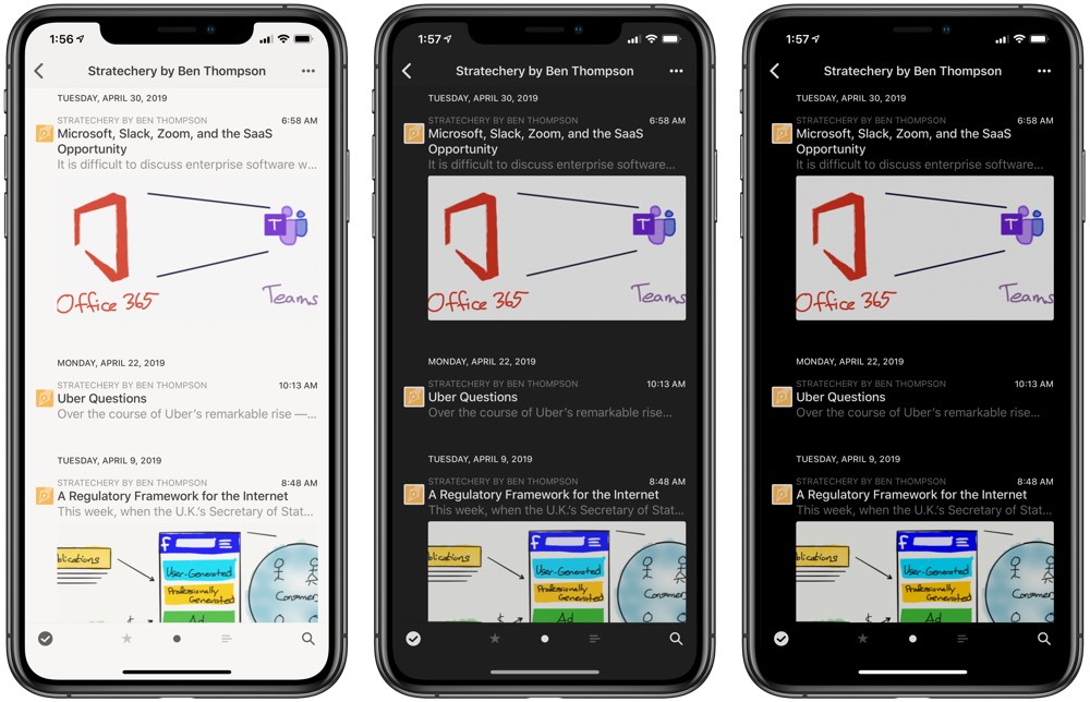
Where we had a light, sepia, dark, and black theme before, you can now set the theme to automatically change on the Mac. (Unfortunately, this feature doesn’t exist on the iPhone or iPad, which is particularly curious, as automatic theme changing is such a common feature across hundreds — maybe thousands — of other apps.) Lists can be pulled to refresh, while articles flow into and out of lists and menus by sliding in smoothly and gracefully.
The article viewer has been cleaned up as well, providing a better reading experience.
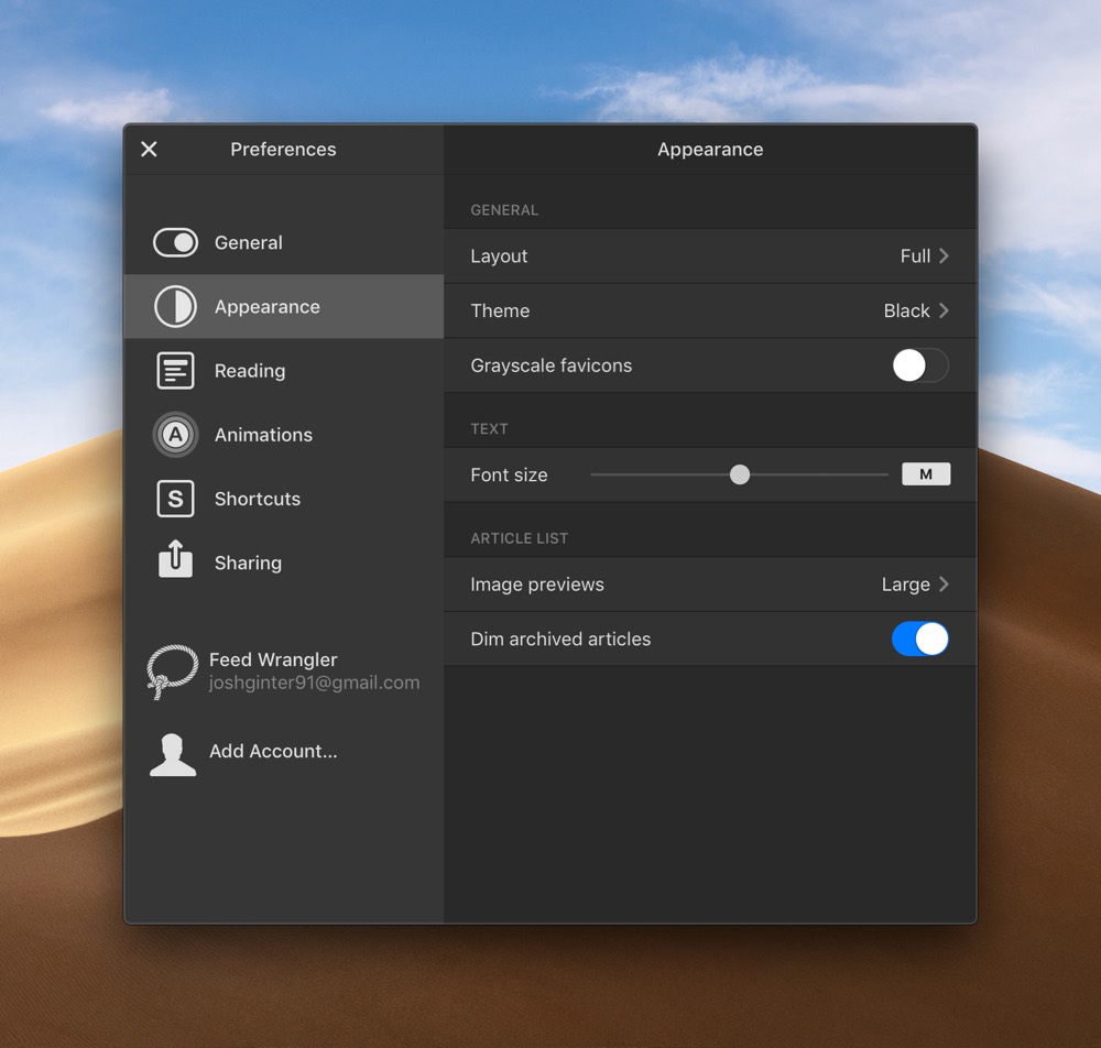
Back when Reeder 4’s public beta debuted for the Mac, I pointed out how much I liked Reeder’s new menu:
This new settings menu sets a new standard for how settings should be displayed, changed, and selected. A significant part of the improvements in this settings menu is the pared down approach — RSS apps are notorious for having a bazillion customization features and it’s so easy to get lost in the shuffle. Reeder 4 pares down the number of customization features and the settings menu makes it easy to customize the most important pieces.
Much of what I wrote in that article stands true today: I love Reeder’s new settings menu. The new animations are smooth and friendly, and the app feels like it was given an extra layer of polish, especially on the Mac.
But at that time, I hadn’t had a chance to test the forthcoming iOS version of Reeder 4.
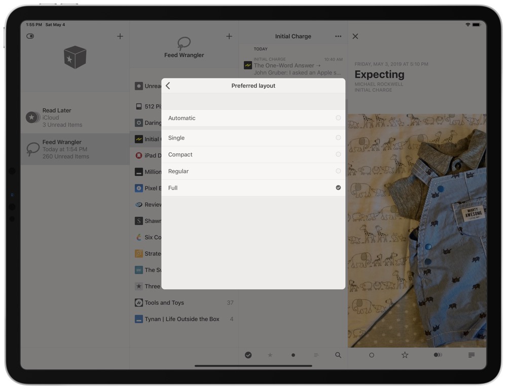
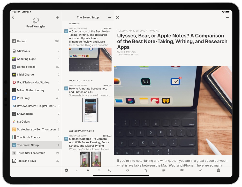
The single design feature that stands out to me, specifically on the iPad Pro, is the option to customize Reeder 4’s layout. There are four layout options: single, compact, regular, and full (you can choose to automatically change between them on the Mac as you enlarge the window).
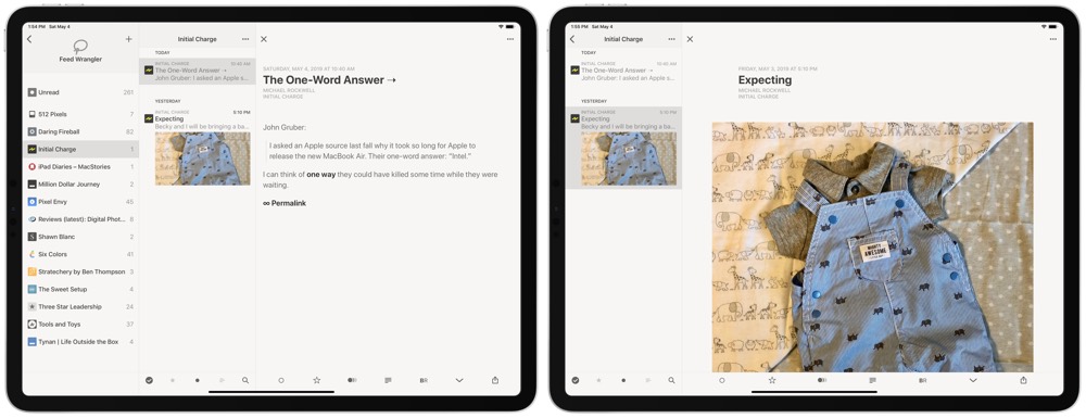
Caption: Full layout on the left, Automatic layout on the right.
The “full” layout option ensures a three-pane view when in landscape on your iPad Pro; a list of your feeds remains open on the left at all times, a list of the feed’s articles stays sandwiched in the middle, and the article can be read on the right side. Especially on the large 12.9-inch iPad Pro, having this full-layout option ensures you can navigate the app with two hands and whisk in and out of articles without the UI jumping all over the place.
I’ve called for more of these three-pane views for the largest iPad Pro, and word on Twitter is that the same three-pane view is coming to Fiery Feeds in the future as well.
Bionic Reading Mode
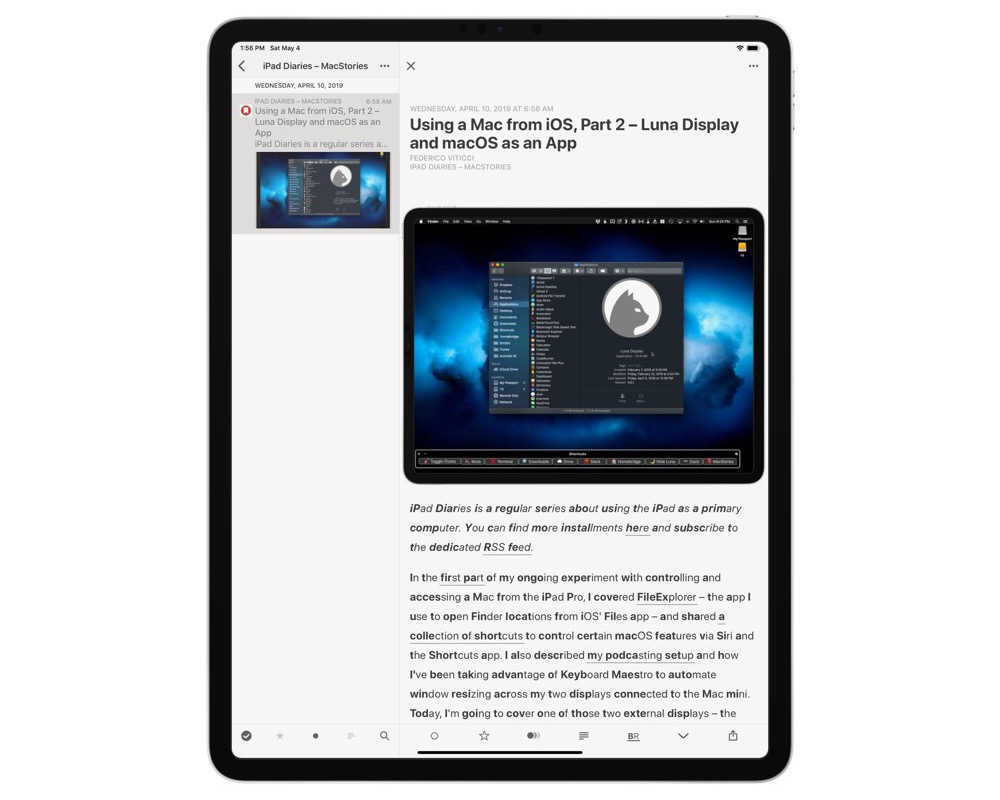
Bionic Reading is not a feature I was aware of before Reeder 4 launched, but a quick Google search reveals Bionic Reading helps your mind absorb what you’re reading in a more enhanced way by bolding specific parts of words in the article. From the Bionic Reading site:
Bionic Reading is a new method facilitating the reading process by guiding the eyes through text with artificial fixation points. As a result, the reader is only focusing on the highlighted initial letters and lets the brain center complete the word. In a digital world dominated by shallow forms of reading, Bionic Reading aims to encourage a more in-depth reading and understanding of written content.
My experience so far is that Bionic Reading is more distracting than helpful, but I’m willing to be convinced. I’m excited to test this out on longer pieces in the future.
Read Later
Instapaper and Pocket are the two best third-party read-it-later services (I use Pocket personally), but some folks may shy away from these services altogether. For those, Silvio Rizzi has added an internal Read Later feature inside Reeder 4, allowing you to save articles to read later right inside Reeder 4 and sync them across to your other devices.
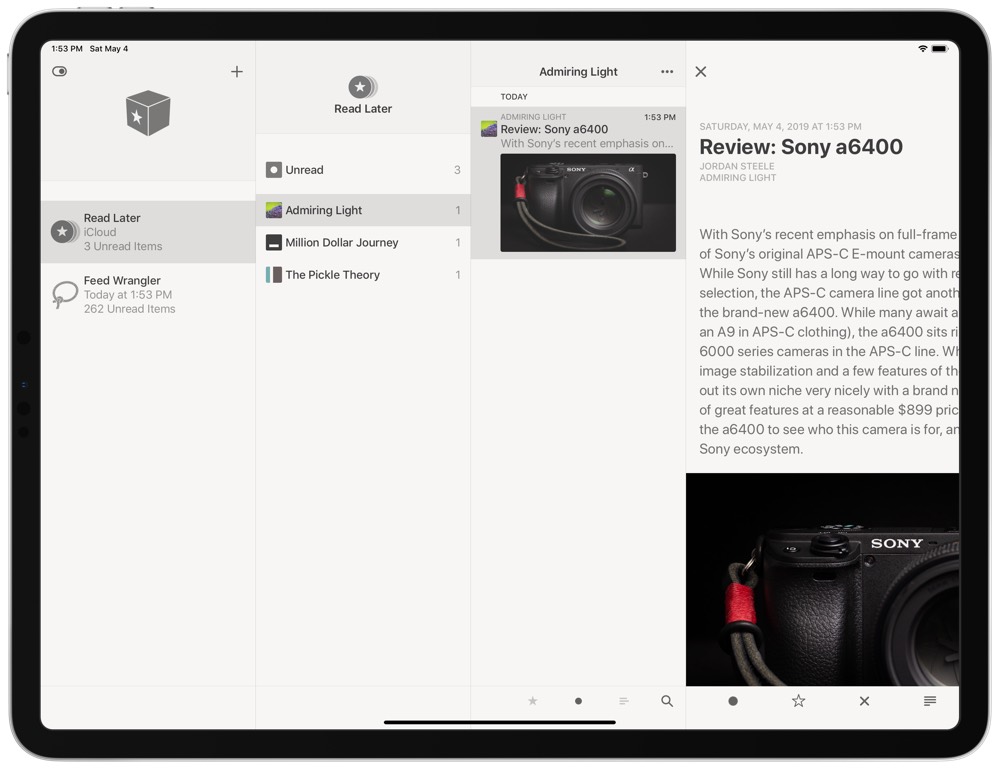
In the services menu (swipe to get to the left-most pane), tapping the “+” reveals a list of the services Reeder 4 supports, one of which is the new Read Later feature. The feature syncs via iCloud and is nearly instantaneous. I clicked the “Read Later” button in Reeder 4 on the Mac and the article was synced over to the iPhone in less than a second.
If you’re like me and your read-it-later service is already overloaded with a backlog of content to read, another read-it-later service might not be a solution. However, if you want to keep your RSS reading all within Reeder, you can now do that.
Other New Features
Reeder 4 is a brand new app for Mac and iOS, so there are a laundry list of new features to go through:
- The pull-to-refresh swipe forces a refresh of your subscriptions, but it now also moves you between articles in your article list when you swipe in the article view.
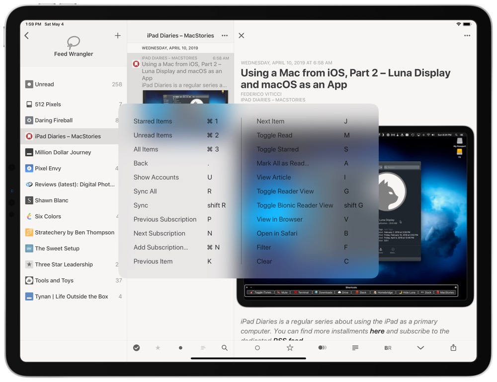
- New keyboard shortcuts on the iPad make for a consistent external keyboard experience when jumping between the Mac and the iPad. I wouldn’t peg Reeder 4’s new keyboard support as the same power as Things 3, but this is a huge improvement over Reeder 3’s keyboard support.
- Image previews in your article list allow you to skim through your articles visually, and you can change the size of the image thumbnails in the settings menu.
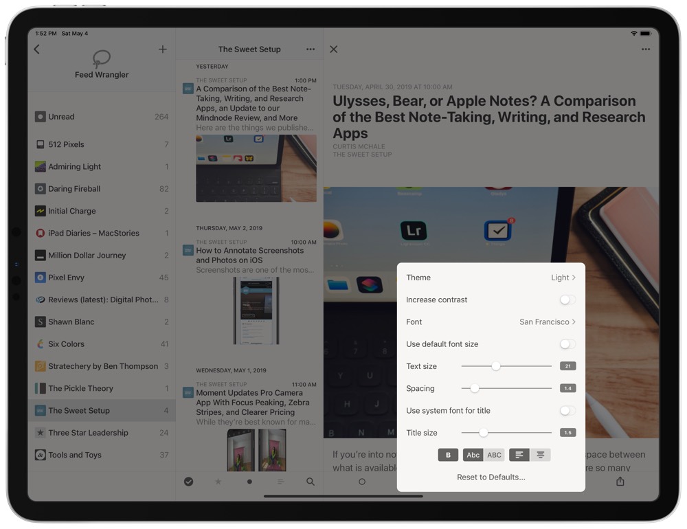
- A range of new customization options are available to better customize your reading experience.
- Reeder 4 has a new icon for iPhone and iPad, while the new Reeder 4 icon for Mac looks (to my eye) identical to Reeder 3.
- A new consistent code-base across both the Mac and iOS versions helps to ensure Rizzi can better implement changes in the future.
Wrap Up
One of our biggest complaints about Reeder 3 was its development schedule — Reeder 3’s last major update came all the way back in 2012, so this Reeder 4 update felt like a long time coming.
While I don’t think we’re going to go so far as to change our pick for the best RSS app for iPhone and iPad, we will be working on updating our reviews to showcase the new updates to Reeder. The new Bionic Reading mode, design improvements, and Read Later feature all ensure Reeder is going nowhere on our list of the best RSS apps available for iPhone and iPad.
For the Mac, Reeder 4 doubles down and further entrenches our pick for the best RSS app. The laundry list of built-in services and whimsical new animations put it heads and tails over the macOS competition.
For those looking for the best reading experience when consuming their RSS feeds, take a look at Unread. For those looking for a standard RSS reader, Reeder is still our pick. And for any RSS reading on the Mac, Reeder 4 is still the only great choice available on the Mac App Store today.
Bonus! One more thing…
The Complete Guide to Managing Tasks in Things (Video)
If you struggle to keep up with all your tasks, we can show you some organization tips that may help you.
We put together a video that shows you everything you need to know about a task in Things:
- The difference between start dates and due dates and how to use them effectively.
- How to set up reminders so you never forget an important task again.
- How to use checklists for tasks that require more than one step.
- How to configure daily, weekly, monthly, or even annual repeating tasks.
- And more…
You don’t have to use any of these things in your tasks if you don’t want to. But knowing what they are and how they all work will help you be more organized, save time, and ensure you are using Things in the way that suits you best.
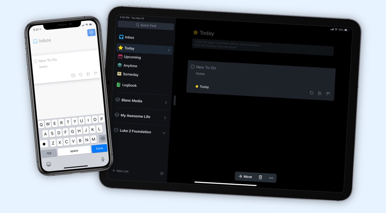
This video is something we have made available for free to our email subscriber community. You can get it right now. By joining the Sweet Setup community you’ll also get access to other guides, early previews to big new reviews and workflow articles we are working on, weekly roundups of our best content, and more.
