Moving Back to Apple’s Stock Apps
It’s probably too early to say — and the betas have probably been too buggy to proclaim — but Apple’s June 2019 WWDC felt momentous. Apple unveiled the new Mac Pro and Pro Display XDR, macOS Catalina, watchOS 6, tvOS 13, and a whole bunch more. Of course, iOS 13 and iPadOS likely topped the list.
With every new iteration of iOS, I’ve had a pull to return to Apple’s own first-party apps. With iOS 13, that pull is stronger than ever: Reminders is set to see its biggest update in years, Notes continues to be improved and has the ultra-luxury of being accessible right from the lock screen on the iPad Pro, Mail has that sleek iOS design that can’t be matched by any third-party email client, and Calendar’s iOS 13 improvements — especially the improved navigation — really pushes up against hallmark features in third-party apps.
I wouldn’t say Apple has “sherlocked” any of these app categories, but the company’s stock app development team has been on fire.
This year, I’m giving in to temptation. I’ve spent the last week or so switching things back to Apple’s stock apps from the best third-party apps in the industry, and I’m going to give them a shot for as long as I can.
Here are a range of initial impressions and frustrations in making the switch.
Notes
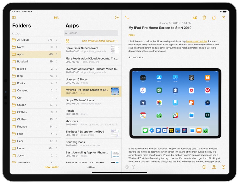
Notes hasn’t seen a major feature boost in iPadOS/iOS 13 this year, but there are a variety of reasons to make Apple’s Notes app your default note-taking app.
Why Switch Back?
First Party/System-Wide Integration: This is likely to be the hallmark reason to make the switch back to all of Apple’s stock apps, but it’s likely most important in the Notes app. Like any app, Notes is accessible as a share sheet extension, but it’s the ability to tap on a locked home screen with the Apple Pencil to create a new note that puts Notes ahead of any other note-taking app available. This is the epitome of first-party luxury with Apple’s stock apps.
Rich URL Previews: One of my favorite parts of dropping a link into Apple’s own apps are rich URL previews. Use the share sheet extension to share a URL from Safari and you’ll get a little bubble with a preview of the hero image from that link. These bubbles are easy to tap, easy to look at, and an overall far better approach than standard URLs.
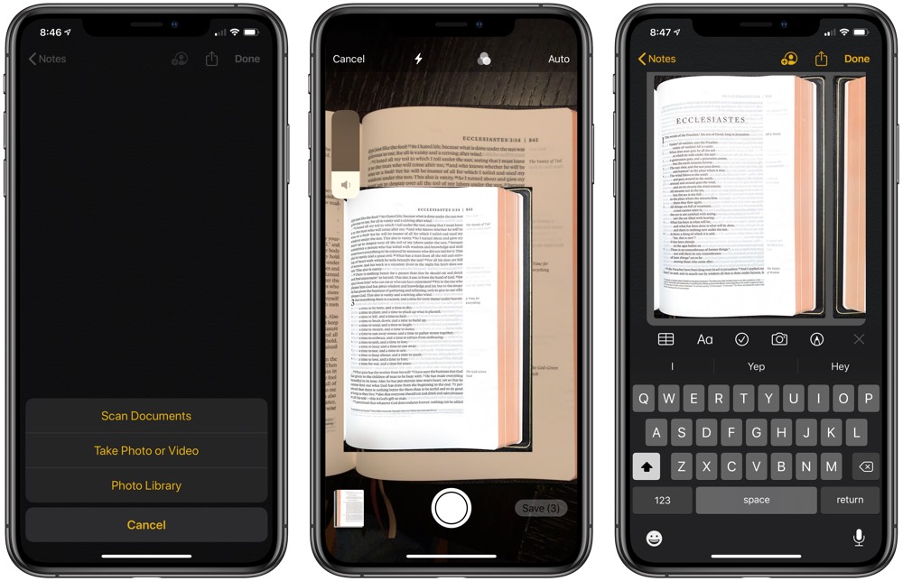
Direct Scanner Support: It may be an odd place to keep the document scanner, but Apple’s Notes app has its own camera-scanner built in. Create a new scan by hitting the + button and take pictures of your documents until your PDF is complete. No other widely-used note-taking app has this feature, and it saves an extra step were you to have to share that scan into a different app on your iPhone or iPad.
Initial Impressions and Frustrations
Moving to the stock Notes app has probably been the most tedious move of the four stock apps discussed in this column. That said, there are a range of great experiences so far.
Importing and Exporting Pains: Apple and third-party developers are keen to keep your notes locked into their own app, so there aren’t overly good importing and exporting out of third-party apps and into Apple’s Notes app. So far, I’ve exported all my notes from Bear as RTFs and imported everything into one giant folder in Notes. This, oddly, has to be done on a Mac, as I can’t find a way to complete this task on an iPhone or iPad. From there, I’ve had to create folders for all my previous Bear tags. Moving the appropriate notes into their respective tag folders has required a search for the tag and a move into the correct folder. It’s not a terrible process, but it’s not exactly smooth either.
Lack of Markdown Support: For (probably) most users, a lack of Markdown support in the Notes app is going to go unnoticed. But since nearly all the best third-party writing and note-taking apps support Markdown, it’s a pain to change habits to write with tap-and-click or keyboard-shortcut formatting instead of using inline syntax.
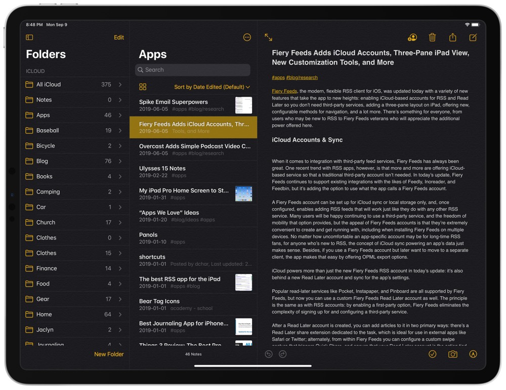
Poor Design: It’s vain, I know. But Apple really needs to get rid of that skeuomorphic note background. Just a clear, white canvas will do the trick 100% of the time.
Reminders
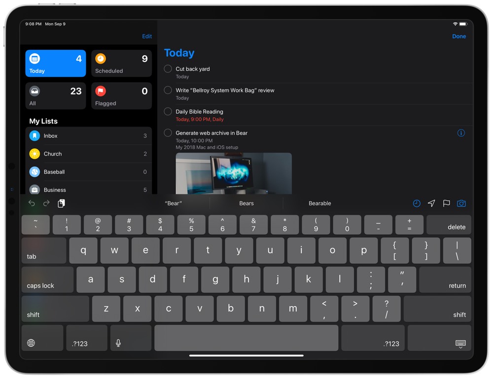
I mentioned it above, but I’ll say it again: Reminders is the biggest stock app transformation we’ve seen in, well, ever. From the old list-first mentality to a nearly full-fledged GTD app in the span of one iOS release, Reminders is finally going to be taken seriously for those looking to boost their productivity.
Why Switch Back?
There are such a wide variety of reasons to move to the new Reminders, it’s almost hard to pinpoint the best reasons.
Better Siri Integration: My entire day’s to-do list floods through my head as I drive to the office in the morning. I’ve always despised third-party Siri support, as “In Things, remind me to buy milk,” doesn’t feel natural at all. Not having to stipulate in my spoken phrase which app to use has made all the difference for me.
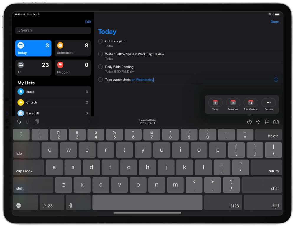
Natural Language Parsing and Keyboard Date Row: Getting to-dos into an app like Things has always been easy (and remains easier than Reminders, especially on macOS), but scheduling them continues to be a pain. In Reminders on iOS 13, we now have natural language parsing that automatically schedules a task based on what you type, and a convenient keyboard shortcut row at the top of your on-screen keyboard provides a one-tap solution for scheduling tasks.
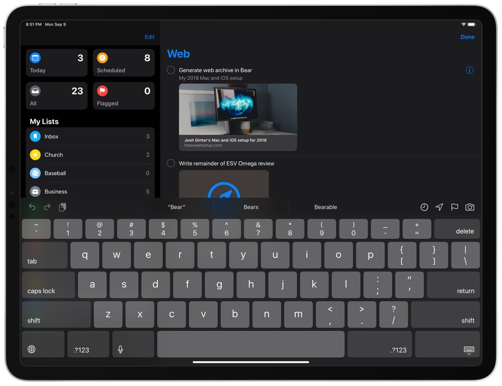
Rich Task Attachments: You know those rich URL previews I mentioned earlier? Well, they also make their way into Reminders, providing an easy to view method of what is in your task’s URL field. This is super useful, especially if you use Safari or inter-app URL schemes to create tasks.
Messaging Reminders and Location-Based Reminders: If you want proper location-aware reminders, you won’t get it in an app like Things. iOS 13 provides options to notify you of a task when you’re entering or leaving a location. Plus, if set up in your task’s metadata, iOS will provide you a reminder when you begin a message in Messages with a specific contact. This has been unbelievably helpful so far in my early testing.
Initial Impressions and Frustrations
Despite all the great reasons to move over to Reminders, I don’t expect Reminders to stick for me beyond the one-month trial period.
No Project Management Tools: At my office job, I often have to run through the same long checklist of tasks for each individual client.
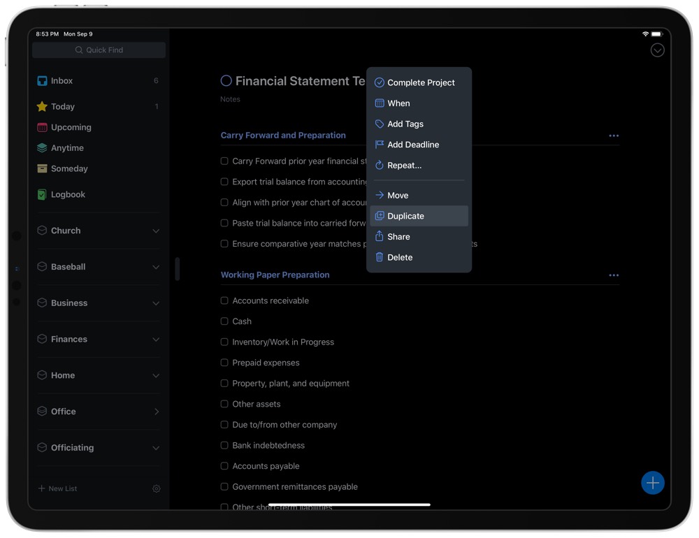
In Things, I have a template project that I duplicate and rename every time I begin new client work. In Reminders, I haven’t found anything suitable to replace this workflow. I figured there’d be something in Shortcuts that I can pull off, but I haven’t had any luck so far.
No GTD Methodology: Although we’re inching closer to a GTD methodology in Reminders, actual support for the workflow isn’t supported.
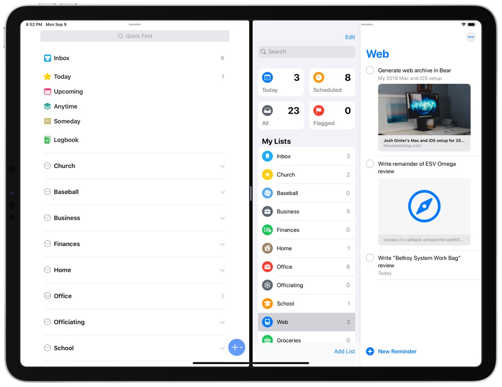
My fix so far has been to create a list that acts as my brain-dump inbox, and then all tasks float out of that list when it’s time to process. This fix has worked alright, but I like to let certain tasks stew for a little before processing them, and Reminders’s list-style inbox doesn’t replicate proper GTD-ing like in Things.
This only accounts for two reasons, but to me, these are dealbreakers. I almost can’t work without some level of project management (“subtasks” are great, but that’s only one level of depth when users often need three more levels). I’m also surprised by Reminders’s relatively poor support for Shortcuts — there just aren’t many actions available in shortcuts to automate the productivity process each day.
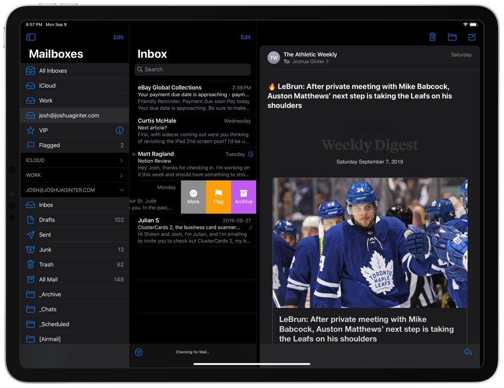
I’ve had an on-again off-again relationship with Mail over the years, and since Mail doesn’t have too many changes in iOS 13, I don’t expect this relationship to change.
Why Switch Back?
Design: I have a deep and sincere love for the classic Mail design. Typography dominates every screen, threads are nicely placed into expandable bubbles, and the new iOS 13 dark mode theme looks great (I also really like the new color selections for “Archive” in the iOS 13 Mail app). Perhaps it’s mostly typography for me — I’m just not a fan of the typography used in an app like Spark.
System-wide Integration: Here’s this little caveat again. Say you want to email someone and you have an email address that is tappable and ready to go for a new draft. Tapping on that link brings up Mail, not Spark or any other third-party mail client. Until Apple makes default app choices an actual feature, this first-party luxury will remain a major boon for Apple’s stock apps.
Security: It seems like every month we run into a story about email app privacy issues. Email clients like Newton and Spark have had privacy concerns from the onset, making these third-party apps absolute dealbreakers for anyone in need of the most secure email. Mail is a far superior email client choice if your main needs are security.
Initial Impressions and Frustrations
Where Notes had setup frustrations and where Reminders has project management limitations, Mail’s frustrations and limitations are a little more extensive.
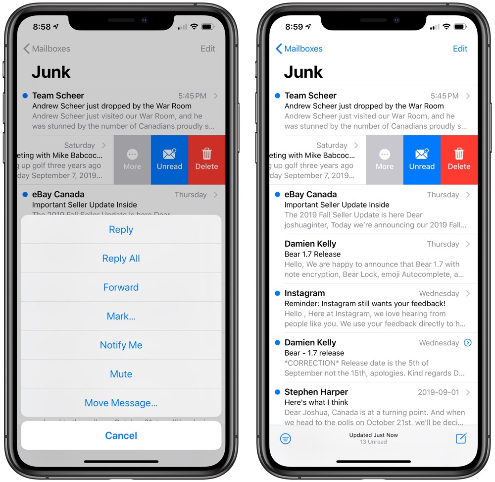
Inability to Share Emails: I can’t believe this is still a thing: You still cannot share an email out of Mail using the system share sheet. If there’s a way to get an email out of Mail without forwarding it, I beg someone to enlighten me.
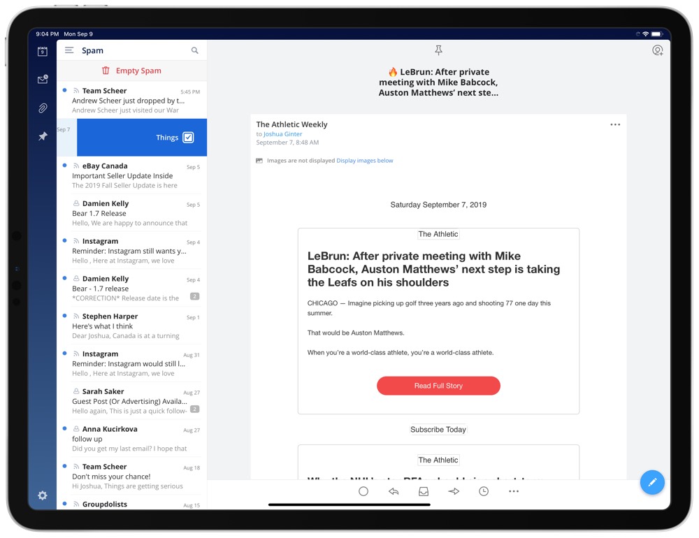
Apps like Spark make sharing emails super simple (I have my left swipe in the email list to send the email directly to Things, for instance) and this is a major limitation of the stock mail app.
No Power User and Team Features: While I don’t use these features per se, I expect many, many users do. The ability to collaborate on emails, delegate emails, or even something as simple as snoozing an email are completely unavailable in Mail. Still other features like delayed sending are unavailable as well. In essence, Mail is quite a barebones email client that sends and receives email but does little more.
Poor Inter-App Integrations: This goes hand-in-hand with the inability to share emails, but I’m surprised how poorly Apple’s Mail app works in conjunction with Apple’s other apps. Not only can you not share emails from Mail, you also can’t share anything to Reminders or Notes. My email inbox and task list are effectively siblings and they are almost required to work together. Spark and Things (Spark and any GTD app, really) work very well together. Mail and Reminders do not.
Calendar
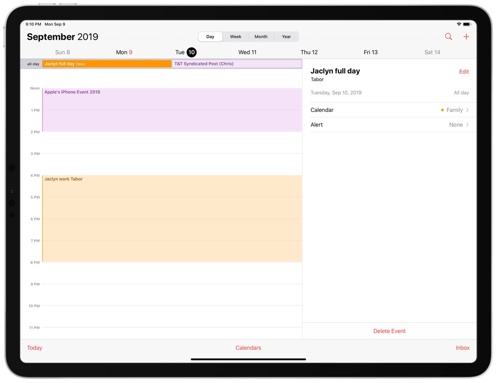
Last but not least, the stock Calendar app. If you can get past judging Calendar by its simple cover (its app icon), then Calendar is likely to be a great option.
Why Switch Back?
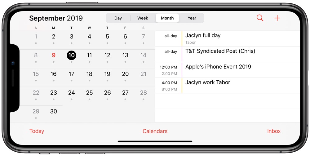
Great Design: Apple’s Calendar app has four great views for Day, Week, Month, and Year. Calendar has been tweaked for iOS 13 as well, providing better navigation and design to the iPad Pro as well as to a landscape iPhone. On an iPhone XS Max, for instance, scrolling through Day, Week, and Month views provides an exceptional taste of the best in iOS 13 design.
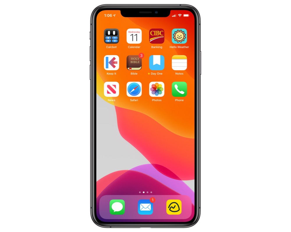
Live App Icon: This is a super simple, yet expected first-party luxury feature of the stock Calendar app. What date is it? Just look at the app icon on your home screen. No other calendar app has access to a live icon like the stock Calendar.
System-Wide Integration: You knew this one was coming. Let’s say you receive a message from a friend who wants to schedule lunch with you. In their message, they provide a date and time for your meeting. iOS and Siri automatically make that date and time a tappable link, which provides an easy-to-use window to create a new event in your calendar. Which app do you use to create said event? Calendar. This is yet another first-party app luxury that puts a major checkmark in the plus column for the stock Calendar app.
Initial Impressions and Frustrations
I expect Notes to stick after my month-long trial, but I also expect Calendar to remain on my home screen for months to come. My first impressions have been pretty good.
Creating Events: One of the hallmark features of the best third-party calendar app for the iPhone and iPad is Fantastical’s natural-language parsing. Simply type the entirety of your event in the field and Fantastical grabs the data to schedule your event. It’s incredibly easy. This, however, is not possible in the stock Calendar app, which I expected to be a major disappointment.
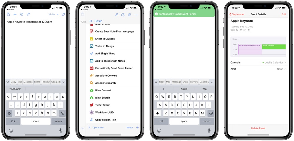
Instead, I’ve learned to use the Fantastically Good Event Parser via a Drafts action and Shortcuts to create events. Or, more often than not, I create most events from tappable links in emails or messages. It’s rare that I need full-on natural-language parsing in my calendar app.
The App Icon: I am no fan of the stock Calendar app icon; it’s super boring, hasn’t changed in years, and doesn’t provide any glimpse into the surprisingly nice design inside the app. However, the fact the app icon is live has been surprisingly helpful. Muscle memory has me authenticating Face ID and swiping without thinking about looking at the date on the home screen. By the time I’ve clued in and I’m ready to look for a date, I’m often staring at my home screen. Having the date right on the app icon is a tremendously useful tidbit that I thought was severely overrated before this switch.
Wrap Up
In about a month’s time or so, I hope to return to this topic to see which apps have stuck and which stock apps have been retired. If I had to make a prediction, though:
- I expect to return to Things 3, simply due to the ability to use project templates. The Things 3 design is still one of the very best on iOS (and the new Reminders app really does look great as well), and it’s just too well-made to not use each day.
- I expect to stick with Notes over other note-taking apps. After importing everything and getting used to all the different ways to create notes inside of Notes, I think it will be hard to go back to not having access to Notes right from the lock screen on the iPad.
- I expect to return to Spark for email, despite my personal disdain for the app’s design. I like Mail’s design quite a lot, but the inability to share emails out of the app leaves me shaking my head and scratching my chin (in unison, no less).
- I expect to stick with the Calendar app over an app like Fantastical. I’m a fairly busy guy with a busy schedule, but I don’t have dozens of meetings each day that I need to stay on top of. As a result, the few events I need to create can come via tappable links rather than complete clauses in Fantastical’s natural-language parser, and I really, really like that live app icon.
Apple’s stock apps have come a long way in recent years and I’m grateful the company takes its stock apps so seriously for two main reasons.
First: good stock apps ensure third-party developers remain on their toes and ahead of the curve. To convince people to spend money on a third-party app, developers will have to continue to create new and helpful features.
Second, good stock apps ensure an overall great default experience for those users who have no interest in third-party apps. The more stable, the more pleasurable, the more secure the default experience on the iPhone and iPad, the greater the customer satisfaction on the devices, the larger the market, and the greater opportunity there is for Apple and third-party developers to continue great app development.
A healthy core of Apple apps means a healthy environment for the entire ecosystem. It’s hard not to be excited about that.
(Pardon the pun.)
Bonus! One more thing…
The Complete Guide to Managing Tasks in Things (Video)
If you struggle to keep up with all your tasks, we can show you some organization tips that may help you.
We put together a video that shows you everything you need to know about a task in Things:
- The difference between start dates and due dates and how to use them effectively.
- How to set up reminders so you never forget an important task again.
- How to use checklists for tasks that require more than one step.
- How to configure daily, weekly, monthly, or even annual repeating tasks.
- And more…
You don’t have to use any of these things in your tasks if you don’t want to. But knowing what they are and how they all work will help you be more organized, save time, and ensure you are using Things in the way that suits you best.
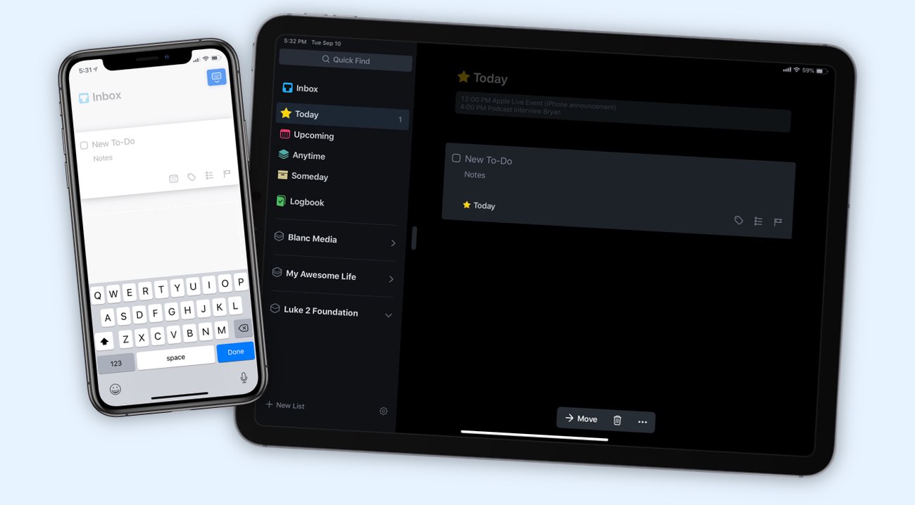
This video is something we have made available for free to our email subscriber community. You can get it right now. By joining the Sweet Setup community you’ll also get access to other guides, early previews to big new reviews and workflow articles we are working on, weekly roundups of our best content, and more.
