How to make journaling in Day One even better with automation
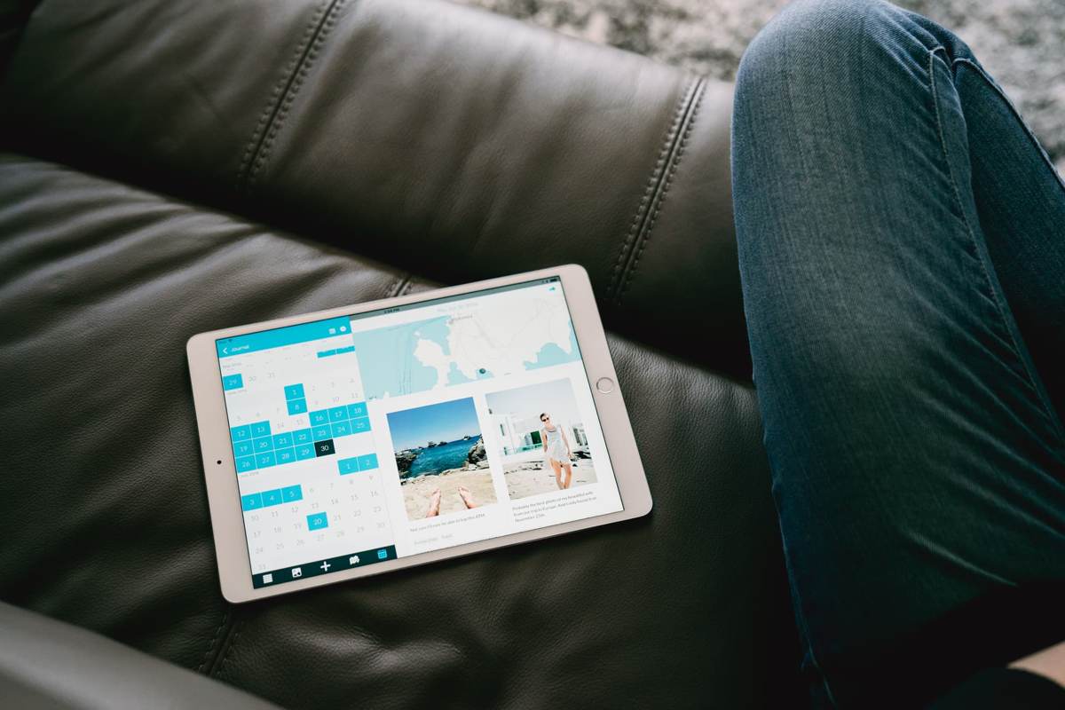
One of the things I love about Day One is using it as a fully digital journal, but it can be hard to use it to its full potential on a mobile device.
By nature, any journaling app is just one of many applications on your phone. Compared to a physical notebook that you might keep with you and remember to write in, something like Day One can go under-utilized if you just don’t think to use it enough.
Plus, if you’re not at a Mac often or don’t use an iPad with a keyboard, you might not find yourself getting the full use out of having a digital journal.
You could type longer posts with headers and sections when you have a keyboard attached. You could create unique images with different apps and dive in to create your memories. And you could also type out Markdown tables and peck in information with your thumbs.
Wait! There’s more….
How to Use Day One in Your Life
For a the best journaling app, you won’t do better than Day One. And if you want to discover how to use this app more regularly, and take full advantage of all its features, then we have some video screencasts that can help you.
In our course, Day One in Depth, you get 8 video screencasts that will take you line by line through every feature, setting, preference, and option found in Day One.
We’ll show you…
- Complete walkthrough of the Mac and iOS apps.
- How to create and customize your journal entries (from text, to photo, to audio)
- How to find, filter, export, and more.
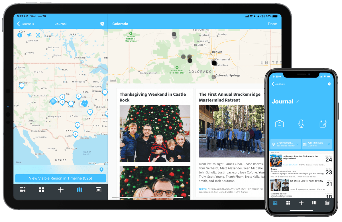
Plus! You will get bonus tips, workflows, and tutorials for how best to use Day One to suit your own needs: from a morning writing time to a photographic travel log, to weekly reviews and productivity journaling — Day One can do it all and we will show you how.
But doing this all takes just enough time and effort that many might choose not to take advantage of it when they’re on a phone or tablet.
I found that to be the case for myself over time after creating over 1,400 entries in Day One since 2012. As my life changed and habits shifted, I realized I didn’t write as many entries on a regular basis, I would batch all my photo entries and enter them later instead of closer to the moment, and there started to be more gaps in between the blue marks on the calendar view.
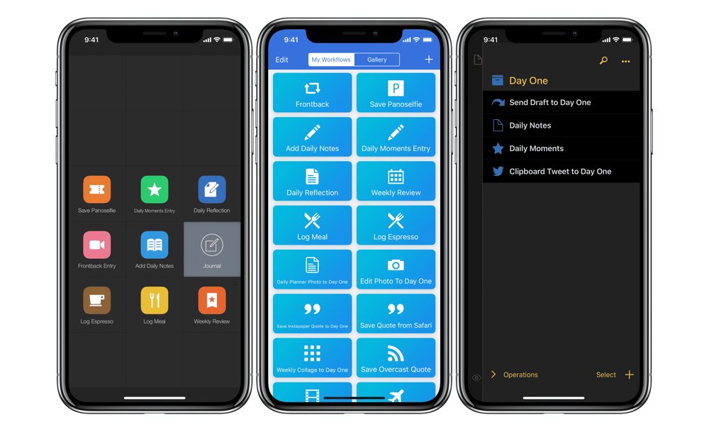
So, I started setting up automations for Day One in Workflow, Drafts, and Launch Center Pro, aiming to give myself more ways to add entries while making them better to enjoy and easier to create1.
While other apps are better suited for notes or writing, I realized I preferred Day One for a few things:
- Reflecting on thoughts and memories
- Keeping track of work progress
- Clipping quotes I found elsewhere
- Saving personal photos
- Documenting travel
Here’s how I’m making all those things better with automation and Day One.
Reflecting on work and life
My main methods for speeding up entries in Day One revolve around adding titles and tags, inserting entry templates using headers, adding markdown tables, and automating a question/answer process for quick reviews.
On the most basic level, there are a few entries I make on a regular basis that I just want to have a pre-filled title that inserts into the right journal with the right tags.
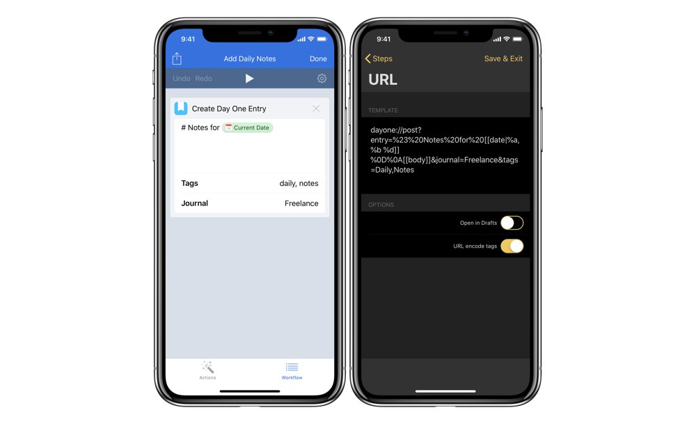
Each day, I keep a simple running list of things that happened in my work journal so I can keep a sense of when I had these thoughts over time. To add this entry quickly each day, I built a Drafts action that automatically applies today’s date into the work journal around the body of a draft – I also built a workflow template that I launch from Launch Center Pro.
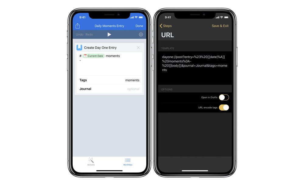
Personally, I’ve also been trying to keep track of little moments throughout the day so I’ll actually remember them later. For that, I use a launcher in Launch Center Pro to kick off a workflow each day and add the entry, but it’s also possible to kick off from something I’ve written with Drafts too2.
For more structured posts, I’ve laid out templates for all the Markdown headers, and built a few workflows, actions, and launchers that help me enter in the information automatically as I go.
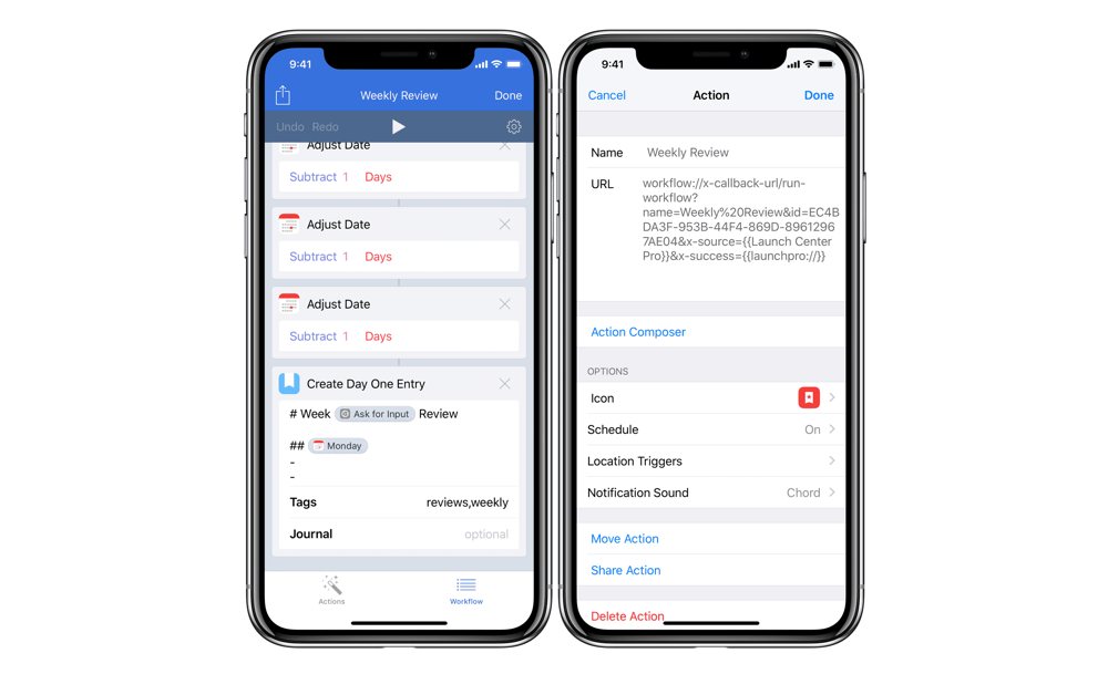
I try to keep up with the weekly review systems from the GTD protocols and look back on my week, but never want to spend time formatting my entries for it. Instead, I launch a workflow to add the different days for me, all aligned against a date I choose – plus, it’s scheduled to go off every Sunday.
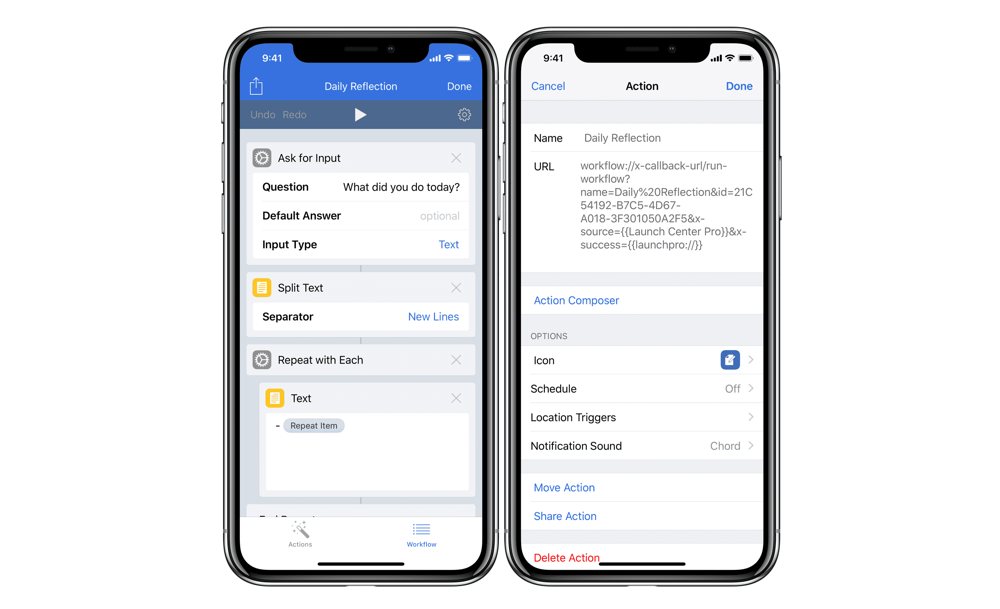
For my daily review process, I have a more guided experience where a launcher in Launch Center Pro reminds me each night to use a workflow that asks me each of the questions so I can fill them out one-by-one.
Using Day One’s support for Multimarkdown tables has captured my imagination from the start 3, giving me a way to dynamically structure my posts in a way that pairs perfectly with iOS automation.
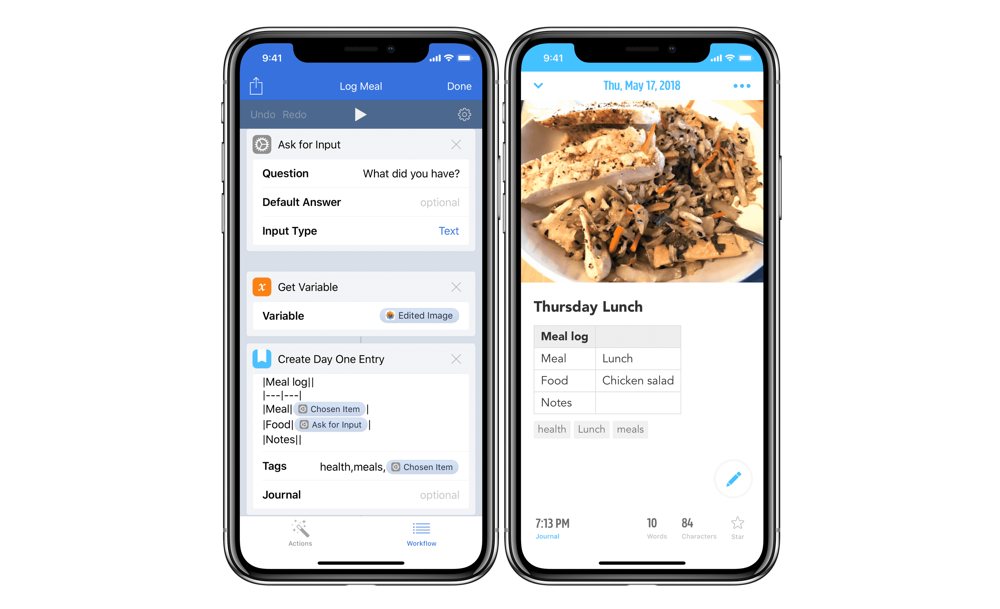
I’ve always heard that keeping track of meals helps you maintain an awareness of your diet, so a few times a day I launch a workflow that lets me take a picture of my meal and enter information about what I ate, how it tasted, and posts it into a nicely formatted table.
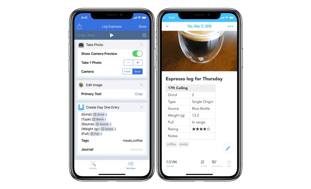
I got an espresso machine for Christmas and have been using a workflow to add markdown tables in Day One to note the grinds, weights, beans, and pressure levels each time I pull a shot. Not only is it helping me keep track of something I wouldnt’ve bothered with otherwise, doing so has helped me engage in the new subject I’m learning over time without getting bogged down in the process.
Saving quotes correctly
I’ve also found that Day One is great as a repository for quotes I want to remember from podcasts, selections I want to grab from Instapaper or Safari, and good tweets I come across. But all of these apps share their information from the share sheet differently, so I try to keep the formatting consistent with some automation.
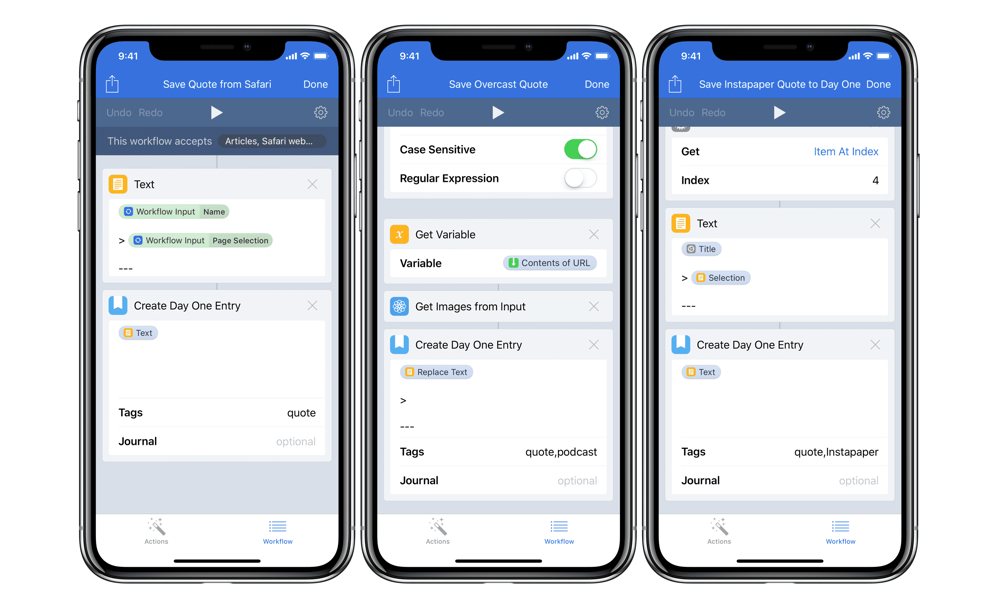
When I’m reading something in Safari and want to share a quote, I highlight the text, go to Safari’s share button, and run a workflow to extract the quoted text and format it nicely in Day One, then add my own blurb as a title.
I use a workflow to format the show title and permalink when I want to write down a quote from a show on Overcast, downloading the title of the podcast page and artwork for my entry automatically as the episode link is passed from the share sheet.
When I’m sharing from Instapaper, I use their highlight and comment feature, then use a workflow to extract the information based on how Instapaper’s share sheet passes the data and format it to my preferred style.
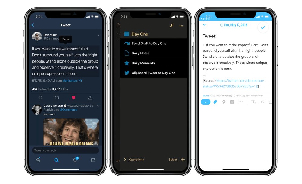
For Twitter, I copy the text of the tweet to my clipboard, then share the tweet permalink to Drafts. Then, using a custom action, I can format my entry for Day One and have the clipboard added as the quote inline.
Doing more with Photos
Adding photos to your entries is a huge part of Day One, and I love to go back through my Photos, favorite the best, and add them all to Day One on a regular basis. However, that disconnects the entry from the moment and could lead to a less interesting journal over time. In an effort to build better memories for later, I set up a few Day One automations for photography.
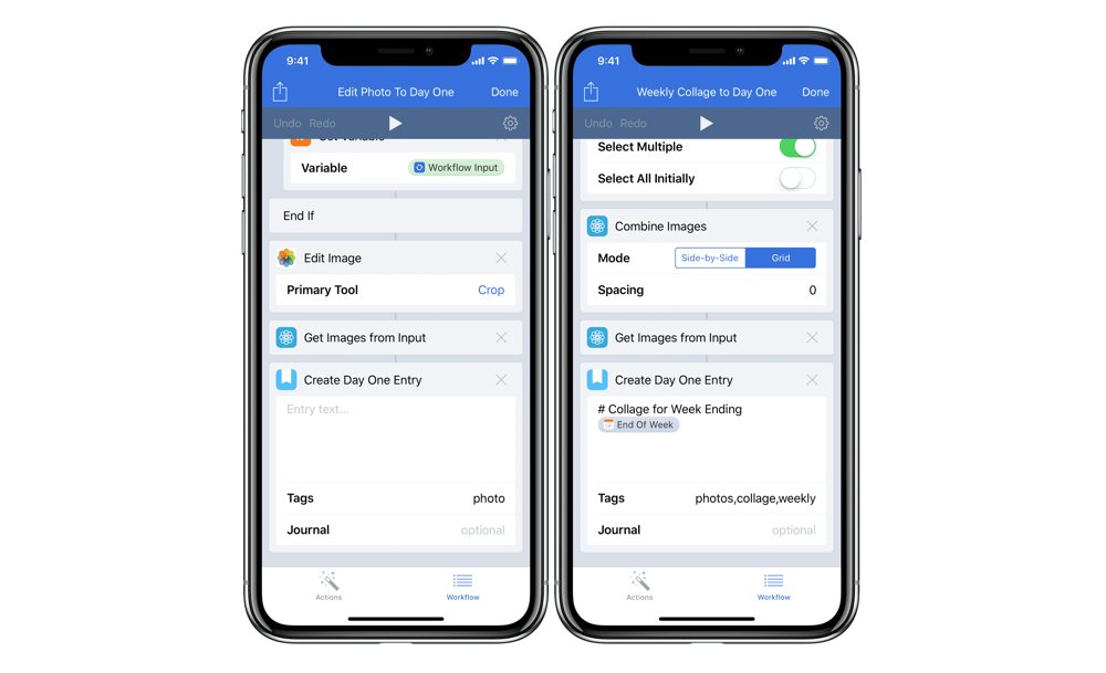
Day One doesn’t have any photo editing features, so I would often find that I’d want to crop a photo slightly before inserting it into my entries. With a workflow that uses the Edit action, I can quickly pick an image and use the built-in Aviary tool to crop the image (or make any other edits) before inserting the photo into a new entry.
I also wanted to find new unique ways to get myself to take more photos and create more memories specifically for Day One, so I created a Weekly Collage workflow that lets me pick from 9 or 16 photos from the week and stitch them together to get a nice recap of the week without filling up an entry with images.
I also have a few photo workflows that are specifically designed with travel in mind. I either run these and add to Day One in the moment, or instead just use the Apple Watch app to quickly save my location without getting distracted, take my photos normally, and then run these shortly after to actually create the entry that same day.
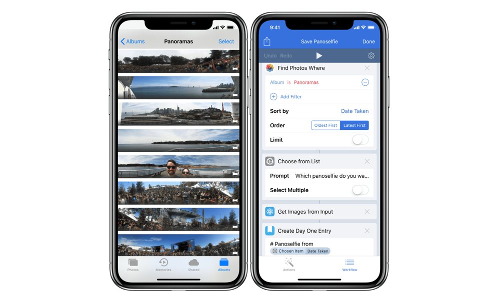
The first method involves taking a Panoselfie – that is, panorama shot but with your back to the scene and the camera facing you so you’re directly in the center. Once I’ve taken the shot, I use a workflow that I kick off from Launch Center Pro so I can quickly choose photos from my panorama album and add them to Day One with a photo, panoselfie, and travel tag applied automatically.
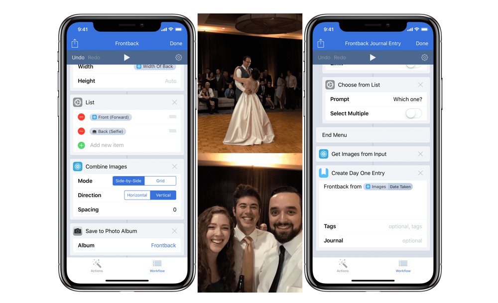
The second method involves capturing and adding a “frontback” photo, a format inspired by a now mostly-defunct startup that stitches together a normal shot and a selfie on top of one another to make a front and back scene. I don’t use the actual app anymore, but I realized I could recreate the effect using a workflow that shoots with both cameras, resizes them to fit each other, and combines them vertically. I find these give a very cool full-screen effect, plus they encourage sharing both where I went but also myself/who I was with, which is often left out of my photography4.
I can either kick off that standalone Frontback workflow to take one separately and just save it to Photos, and I can use my Day One Frontback workflow to choose one I’ve already taken or when I want to take a new one now and add my entry.
Pushing it where it’s worth it
With these automations, I’ve given new life to my journal. My number of entries is way up, they look nice and consistent, and I’m creating for Day One a lot more.
While a system like this takes consideration and time, and adds a layer of complexity, the result is speed and a better end product. Multiple points of entry gives me more room to build muscle memory, and the quality of entries improves my own experience with the app.
Having a better space to write and reflect will be worth it in the long run. The setup is over, and my future self will only benefit. I can quickly add richer entries and enjoy them all more when I look back through Day One later.
Wait! There’s more….
How to Use Day One in Your Life
For a the best journaling app, you won’t do better than Day One. And if you want to discover how to use this app more regularly, and take full advantage of all its features, then we have some video screencasts that can help you.
In our course, Day One in Depth, you get 8 video screencasts that will take you line by line through every feature, setting, preference, and option found in Day One.
We’ll show you…
- Complete walkthrough of the Mac and iOS apps.
- How to create and customize your journal entries (from text, to photo, to audio)
- How to find, filter, export, and more.

Plus! You will get bonus tips, workflows, and tutorials for how best to use Day One to suit your own needs: from a morning writing time to a photographic travel log, to weekly reviews and productivity journaling — Day One can do it all and we will show you how.
-
I’ll admit this article helped me clean these up and give them a more consistent style and flexibility, plus I cleared out a ton of old tags. ↩
-
I’ve thought about trying to copy the entry ID and build workflows to jump back into them later, but since Day One doesn’t have x-callback-url support it’s not as seamless and feels laborious to manually add every day or even if I did it weekly. ↩
-
These Markdown tables are inspired by some of the O.G. blog posts of iOS automation, back when things got very deep in the x-callback-url automation world. ↩
-
If this style got added to Stories, I think it’d be very popular. ↩
