Magic Keyboard: Turning the iPad Into Something New

Our accounting office is right next to a Telus store full of Android and Windows fanatics. I haven’t been able to get any person in the store to even consider an iPhone or Mac for themselves, let alone convince them the iPad is a great business device.
The Magic Keyboard is the first accessory that caught the Telus business owner’s eye when I pulled it out on my desk midway through last week. He grabbed it, marvelled at its weight, opened up the package, and began fooling around with the keyboard. After a minute or two, he exclaimed,
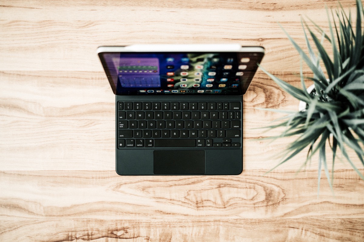
“Well, it’d be a good computer if you could plug a USB stick into it. Or if you could use Microsoft Office on it. Or if you could run a proper VPN on it.”
Of course, I rolled my eyes. And me being me, I had to get the last word in.
“Well,” I said, “You can, and you can, and you can.”
“Since when?” he replied.
This is the corner Apple has backed itself into over the last 10 years, especially with the business world and the iPad. The locked-down nature of iOS, the lack of proper keyboard and trackpad support, and the ultra-slow rollout of enterprise software for the iPad has pushed the iPad into the realm of business novelty, not business necessity.
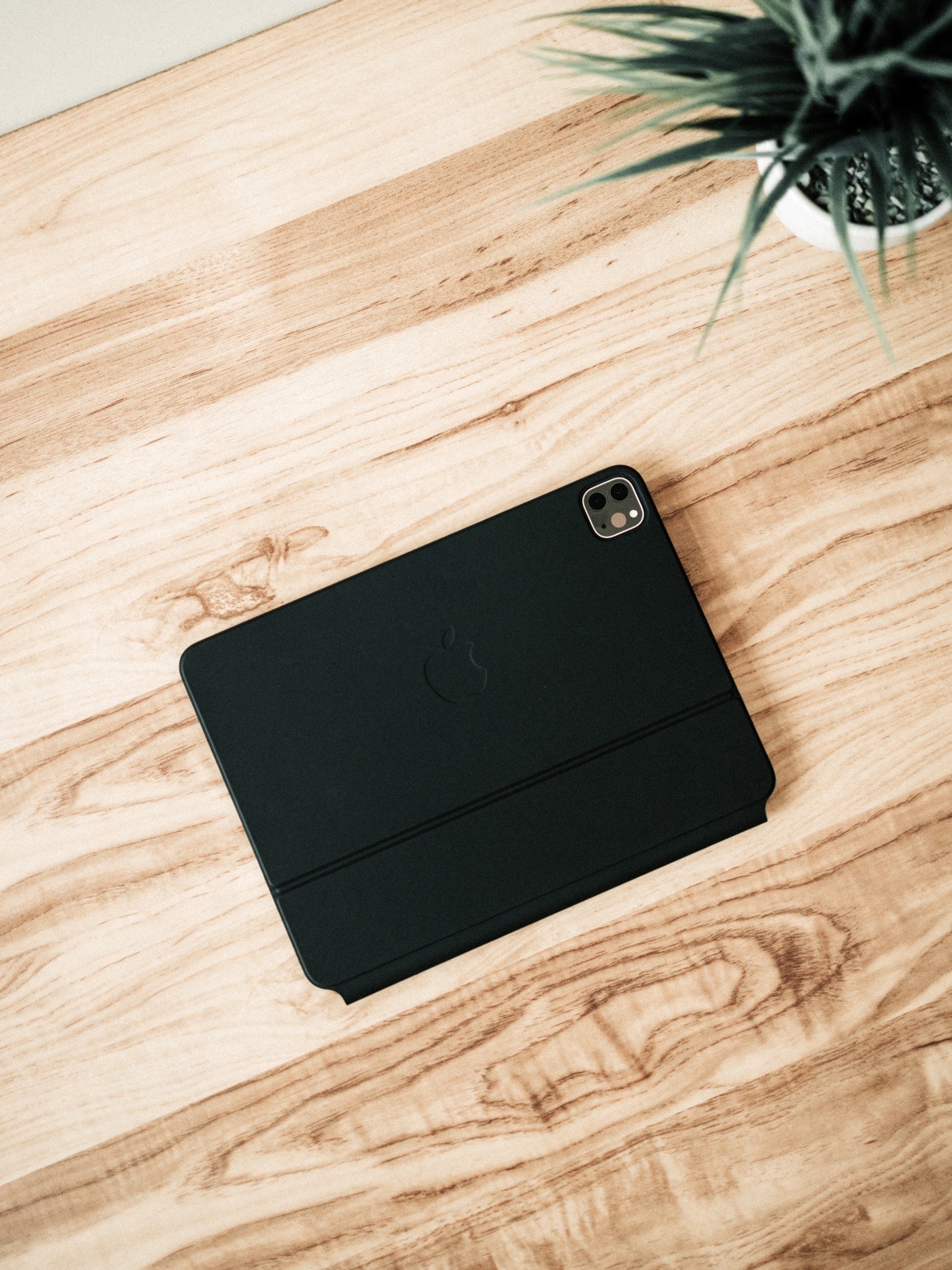
Apple is working on iPadOS and improving accessibility with every release, this much is clear.
But if ever there was a sign that Apple was working on the iPad’s perceived shortcomings, it’s this: The Magic Keyboard dramatically improves — I’d venture to say “flips on its head” — the notion that the iPad has poor keyboard and trackpad support.1
Much has been written already about this new Magic Keyboard for iPad. It’s very clearly a transformative accessory, one that promises new ways of working on an iPad for more types of people. In general, feedback seems positive as wide as the web stretches.
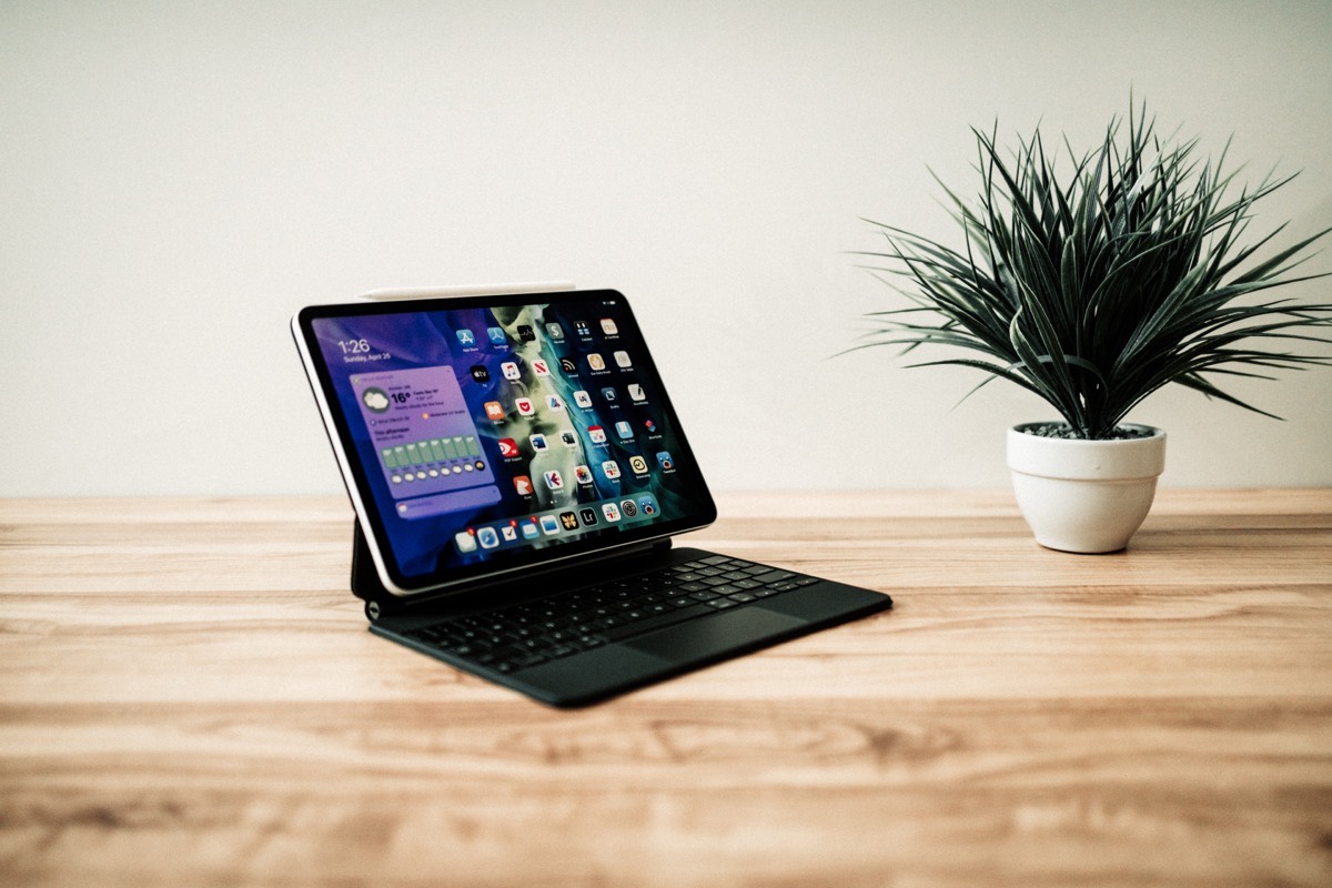
But even more in general, the Magic Keyboard is going to mean different things to different people. For some, the Magic Keyboard offers a truer laptop experience for the iPad than we’ve ever seen before, allowing them to compute in more comfortable and traditional ways. For others, the Magic Keyboard offers a multi-contextual array of computing by easing the ability to move from laptop mode to tablet mode. And yet for others, the Magic Keyboard may not change a single thing about their iPad experience.
With all this subjectivity in mind, I think it’s best to avoid general statements, best to avoid diving into technicalities, and best to avoid recommending this accessory to all iPad users. Here’s what I’ve noticed about the Magic Keyboard so far, in relation to how other products fit into my work life and how the iPad has evolved in my work life.
The Smart Connector Advantage
The Magic Keyboard’s direct, hardware connection is the single greatest benefit it presents over a Bluetooth keyboard and trackpad setup. Since iPadOS 13.4 debuted, I’ve enjoyed the iPad’s new cursor support, but found there to be noticeable lag issues with the Magic Trackpad 2. I’d push to click and the trackpad would click a half-second later. I’d swipe my finger only to have the cursor jump inadvertently to the edge of the screen.
Bluetooth sucks. It always has. Perhaps it always will.
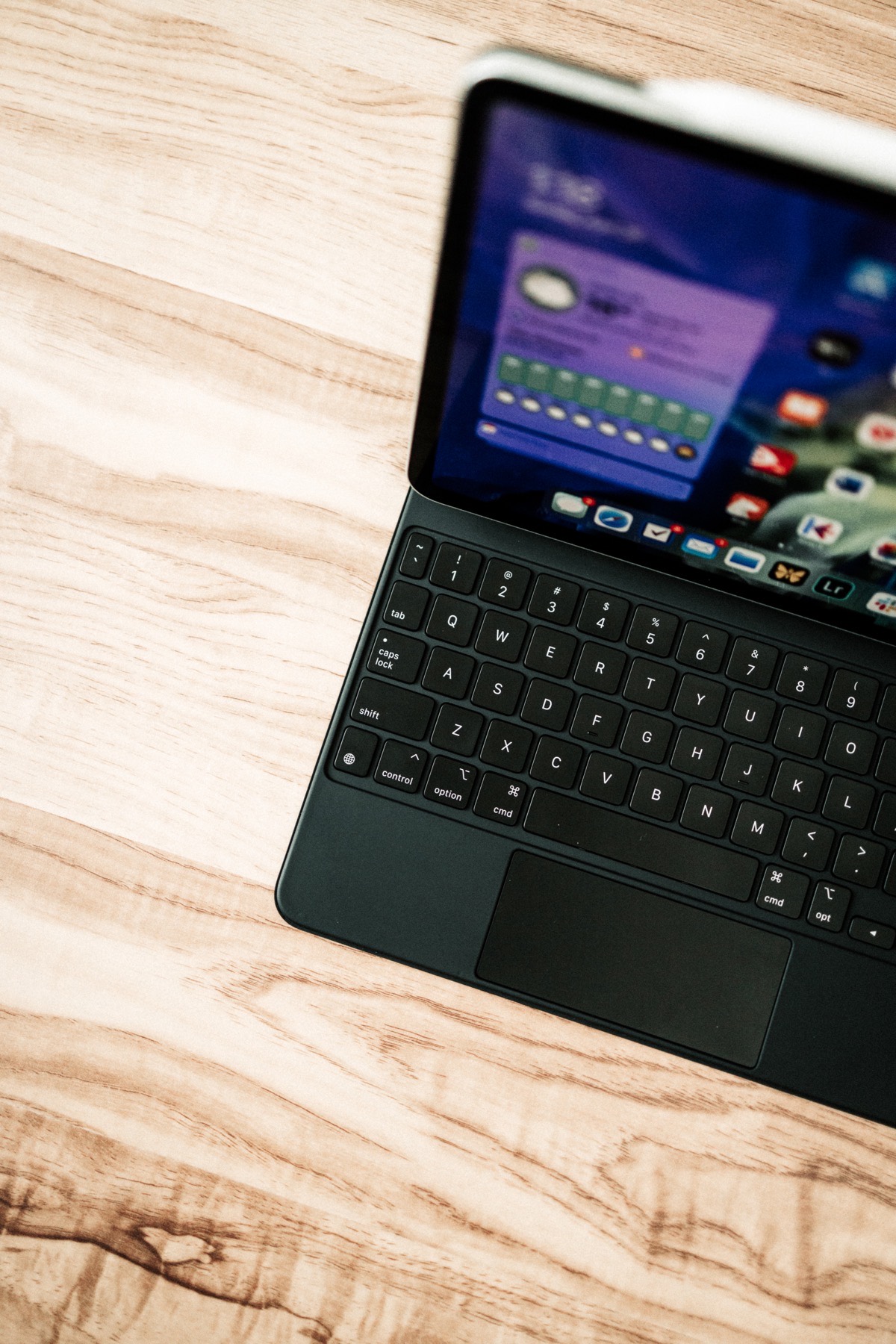
The Magic Keyboard’s hardware connection through the Smart Connector eliminates any and all lag, hiccups, and frustrations with a keyboard and trackpad. There’s no longer an extra swipe needed to wake up the trackpad or an extra key press to wake up the keyboard. Just tap the space bar, authenticate with Face ID, and tap the space bar again to jump into the iPad.
This is equally noticeable when you want to pull the iPad off the Magic Keyboard. Peeling away the iPad requires two hands — one on the corner of the iPad and the other on the opposite corner of the keyboard to keep the Magic Keyboard from moving. As soon as you remove the iPad from its magnetic perch on the Magic Keyboard, the software keyboard jumps onto the screen and the cursor disappears. Slide the iPad anywhere near the magnets on the Magic Keyboard to initiate the connection and the software keyboard disappears in an instant.
So easy.
This has big implications for the Apple Pencil, at least for me. In general, I find the Apple Pencil to be more of an annoyance than a useful tool. I may use the Pencil once every other day or so, and I’m not convinced it’s worth toting the Pencil along all the time for those one-off circumstances.
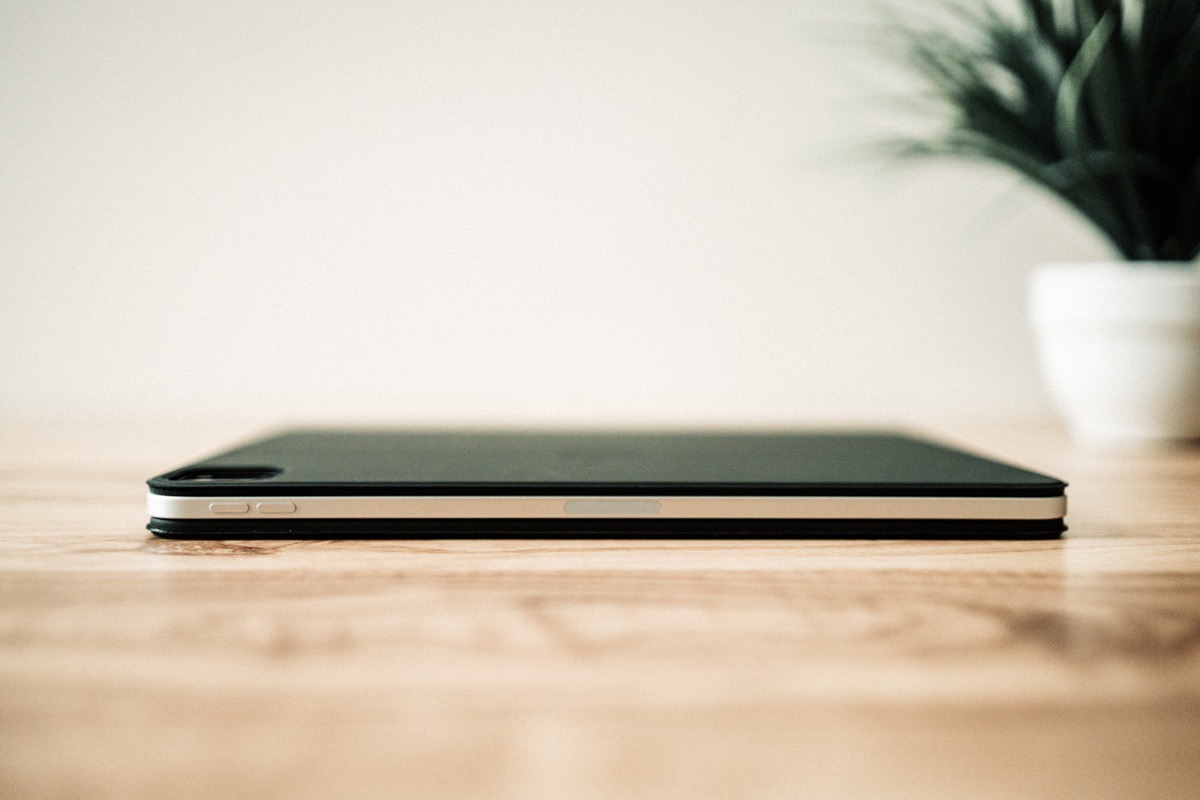
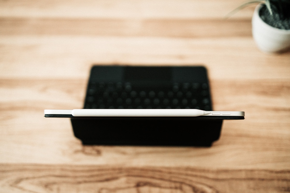
But! The instantaneous effect of the Magic Keyboard’s Smart Connector connection means there’s no extra overhead to grabbing the iPad and writing something on the screen with the Pencil. There’s no need to unplug if you’re on power. There’s no need to disconnect the Bluetooth keyboard. Just pull away, write or draw, and put back.
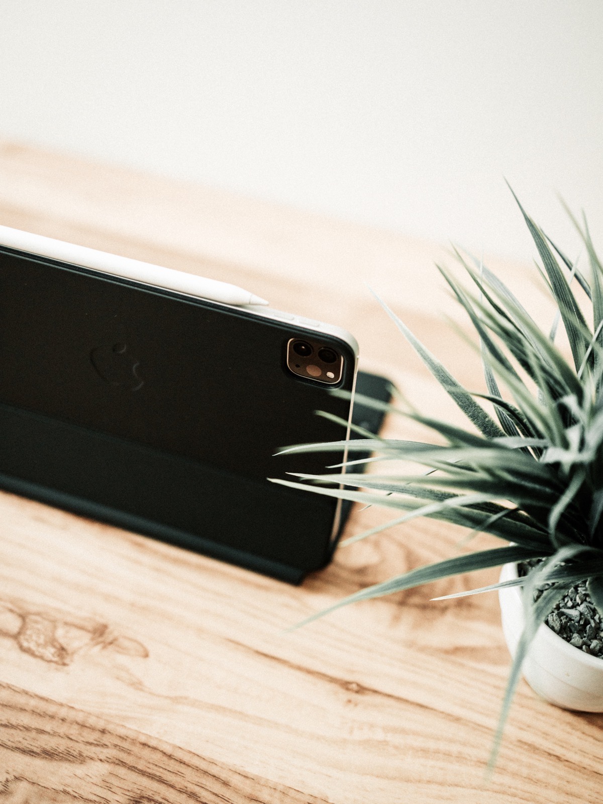
This context-switching is really the hallmark feature of the Magic Keyboard for iPad. You can move from typing mode to Pencil mode to tablet mode to laptop mode to entertainment mode faster than ever before, and it’s all thanks to that Smart Connector connection. I now choose to view PDFs at the office on my iPad, because there’s no longer a headache in having to properly connect and disconnect my Bluetooth keyboard should I want to type out a quick message. I now grab the iPad and read the news each morning as though I’m reading a newspaper, leaned back in my office chair with a cup of coffee in one hand. I now access spreadsheets in Excel for iPad because its finally possible to move through cells without having to use a finger.
The iPad has always been a very modular computer, but it’s the Magic Keyboard’s Smart Connector that has really unlocked that modularity.
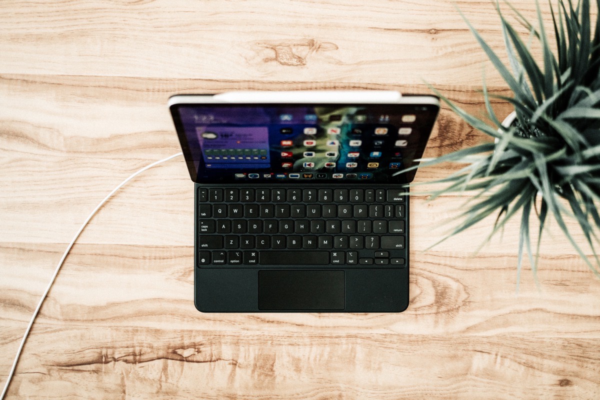
Could you imagine if the Smart Connector could handle data pass-through as well as power?
An Unmatched (Yet Hinged) Typing Experience
Apple’s keyboards have sucked the last few years. Butterfly switches were a complete and utter failure (that includes the butterfly switches in the Mac’s Magic Keyboards as well). The iPad’s Smart Keyboard/Smart Keyboard Folio’s thunk-thunk-thunking typing feel was muddy at best, and something I learned to put up with due to the typing benefits it provided when on-the-go.
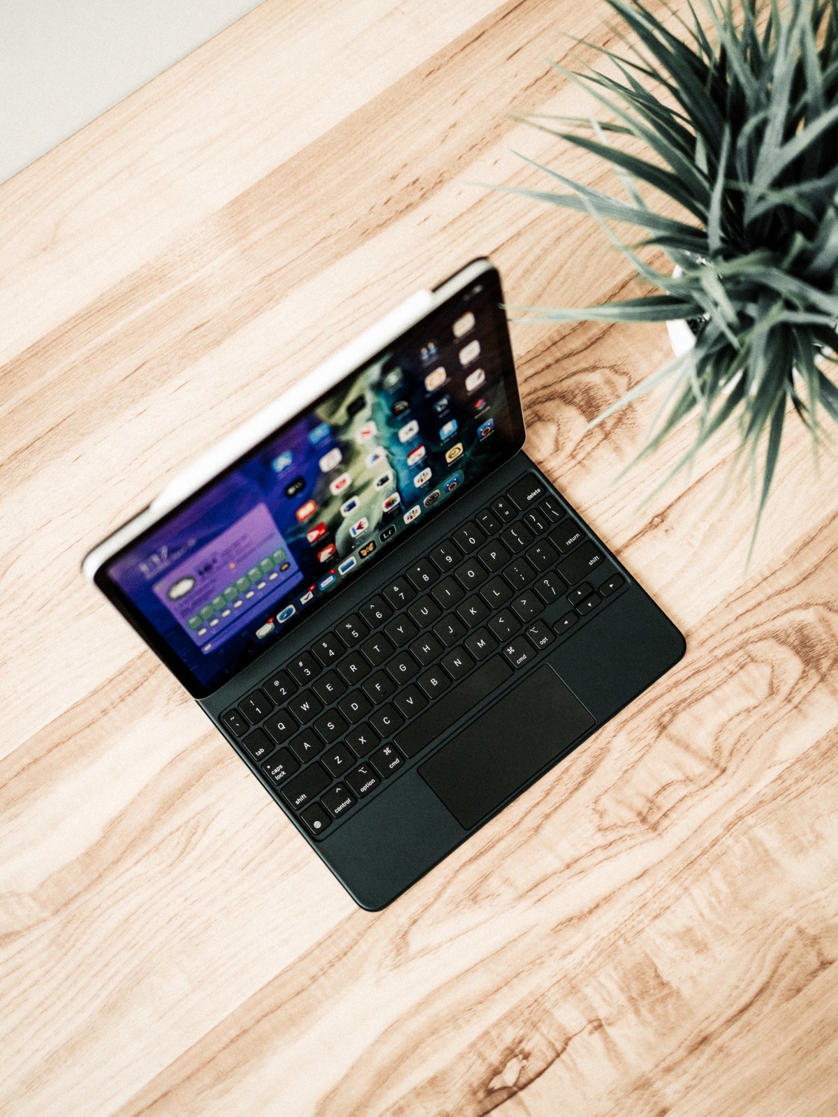
I quite liked the 16-inch MacBook Pro’s Magic Keyboard when I tested it a few months back. The keyboard felt good, albeit a bit more wobbly than I expected. Key travel and key sound were vastly improved as well. But I do admit, the MacBook Pro’s Magic Keyboard didn’t have me casting aside the Surface Ergonomic or Apple Wired Keyboards in my life. The Magic Keyboard on that MacBook Pro was good, but not that good.
My fingers find the iPad’s Magic Keyboard even more enjoyable than the 16-inch MacBook Pro’s Magic Keyboard. These keys feel more stable to me, specifically in the wobble of the space bar. And while I applauded Apple’s focus on improving bottom-out strain in the 16-inch MacBook Pro, I have to re-applaud Apple’s work here — it could be the soft, rubbery externals of the iPad Magic Keyboard, but something softens the blow of bottoming out when typing, and my fingers have yet to find any discomfort whatsoever from this keyboard.
The Number Row
The new cantilevered design of the Magic Keyboard does present the accessory’s biggest faux-pas though: the number row. Perhaps the angles on the 12.9-inch iPad Pro Magic Keyboard are different from this 11-inch Magic Keyboard, but typing numbers on the smaller Magic Keyboard is a lesson in patience.
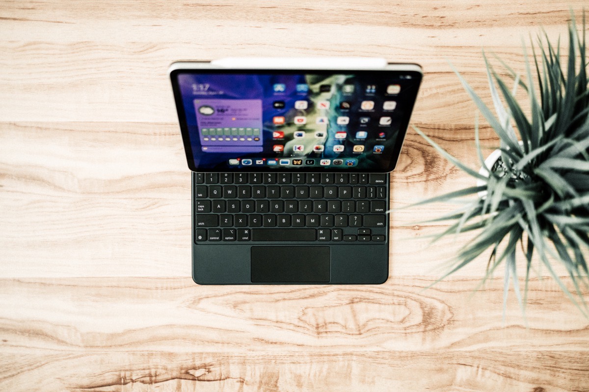
I type numbers all day, every day at the office, and I’ve bumped my fingernails into the bottom of the iPad Pro more times than I can count over the last week. Hitting the delete key without touching the iPad at the same time is almost impossible.
And to think of the concern about the lack of a function key row? There’s hardly enough room on this keyboard for a number row let alone a function row.
It could be a product of my daily work, but typing numbers on this new Magic Keyboard is a definite con in the Venn Diagram.
The Keyboard Layout
I talked at length about my switch from the larger 12.9-inch iPad Pro to the 11-inch iPad Pro just a few weeks ago. On the whole, I think I made the right choice.
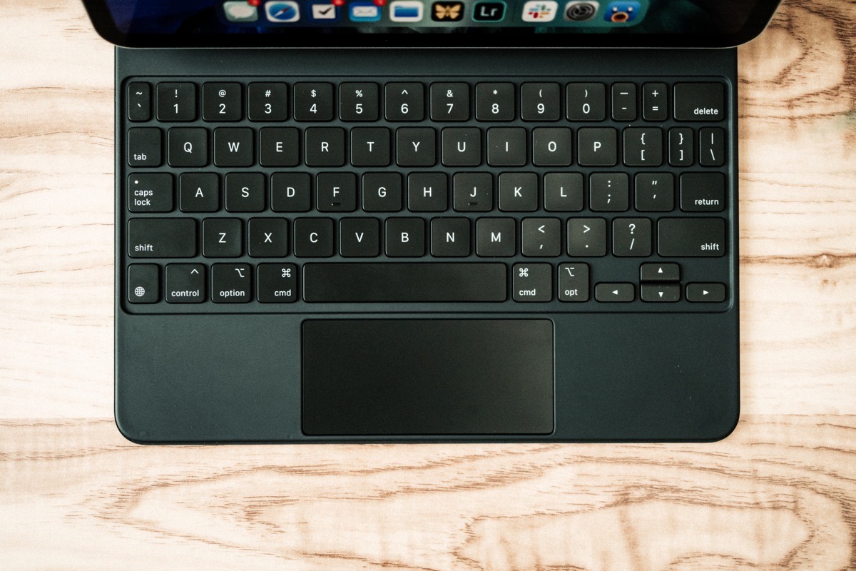
However, I’ve spent my entire time with the 11-inch iPad Pro with a full-size Bluetooth Magic Keyboard, ensuring any typing I’ve done over the last few weeks was essentially unchanged from any prior experience.

One of the major fears I had when moving from the larger iPad to the smaller iPad was the smaller external keyboard layout. I had attempted typing on the smaller Smart Folio Keyboard more than once at an Apple Store and always came away disappointed in the number of errors I made. The keys were too small and the layout of the function keys around the QWERTY keyboard was just different enough to cause ripe frustration.
I believe Apple has made a range of great compromising decisions when building out the smaller 11-inch iPad Magic Keyboard layout. Looking from left to right:
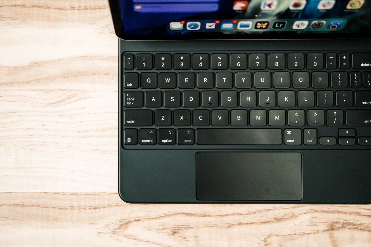
- The Tab key and
~key have been shrunk to about half the size on the 11-inch Magic Keyboard, alongside major shrinkings of the Caps Lock and left Shift keys. - The Globe key in the bottom left is about two-thirds the size of the larger key, while the left-side Control/Option/Command keys are all full-size keys (the left Command keys is slightly smaller than the 12.9-inch left Command key).
- The Space Bar has been shortened horizontally.
- The right side Command key is also a regular sized key rather than a larger key as found on the 12.9-inch keyboard layout. The right side Option key appears to be a half or two-thirds key.
- And, in no particular order, the
-,=,],\, Return, and right Shift key have all been shrunk down considerably. Most shrinkings have cut the keys in half.
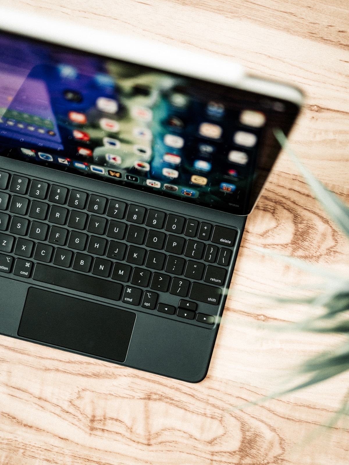
The result of these key sizing decisions is a shift of the typing experience on the 11-inch Magic Keyboard slightly to the left from center. Where the 12.9-inch layout puts the QWERTY keys somewhat more in the middle of the layout by stretching out the Tab, Caps Lock, Shift, and Return keys, sizing decisions on the 11-inch keyboard push the QWERTY keys slightly off to the side.
To be clear though: Apple has maintained a full-size QWERTY layout in the 11-inch Magic Keyboard. This may not even be a change from the prior Smart Folio Keyboard, but it’s been very noticeable to me. I always felt the 11-inch Smart Folio Keyboard required that awkward three-finger-and-thumb typing technique we’ve developed to type on the smaller software keyboard. The 11-inch Magic Keyboard has no such feeling, at least in regards to the QWERTY section of the keyboard.
Where I find the most mistakes made in my week of typing is in the - (dash) key being shrunk down to half its normal size, in the Delete key being shrunk down slightly (though this may have more to do with the iPad’s overhang on the Magic Keyboard), and in the substantially smaller Return and right side Shift keys. I have typed more \>? errors than at any point in my life in the last week.
As a whole, my worries about the smaller keyboard layout have been unfounded. I do find myself making mistakes I wouldn’t otherwise make on a larger layout, but the learning curve has been fairly short. Apple has made a plethora of great decisions in the layout department and should be applauded for their ability to nail the full-keyboard experience in such a small package.
Other Keyboard Anecdotes
Reviewers have likely all touched on these additional anecdotes at length, but here are a few other notable factors that have hit me in the last week:
Keyboard Backlighting: It just seems too good to be true that this Magic Keyboard somehow manages keyboard backlighting without an internal battery and without majorly hampering the iPad’s battery life. Keys are perfectly lit with very little edge bleeding. Accessing keyboard backlighting controls through a myriad of Settings menus is a pain, but I do admit I haven’t actually ventured into those Settings menus yet. The default settings suit my eyes just fine and I haven’t noticed an unusable hit on the iPad’s battery. I’ve left everything as is.
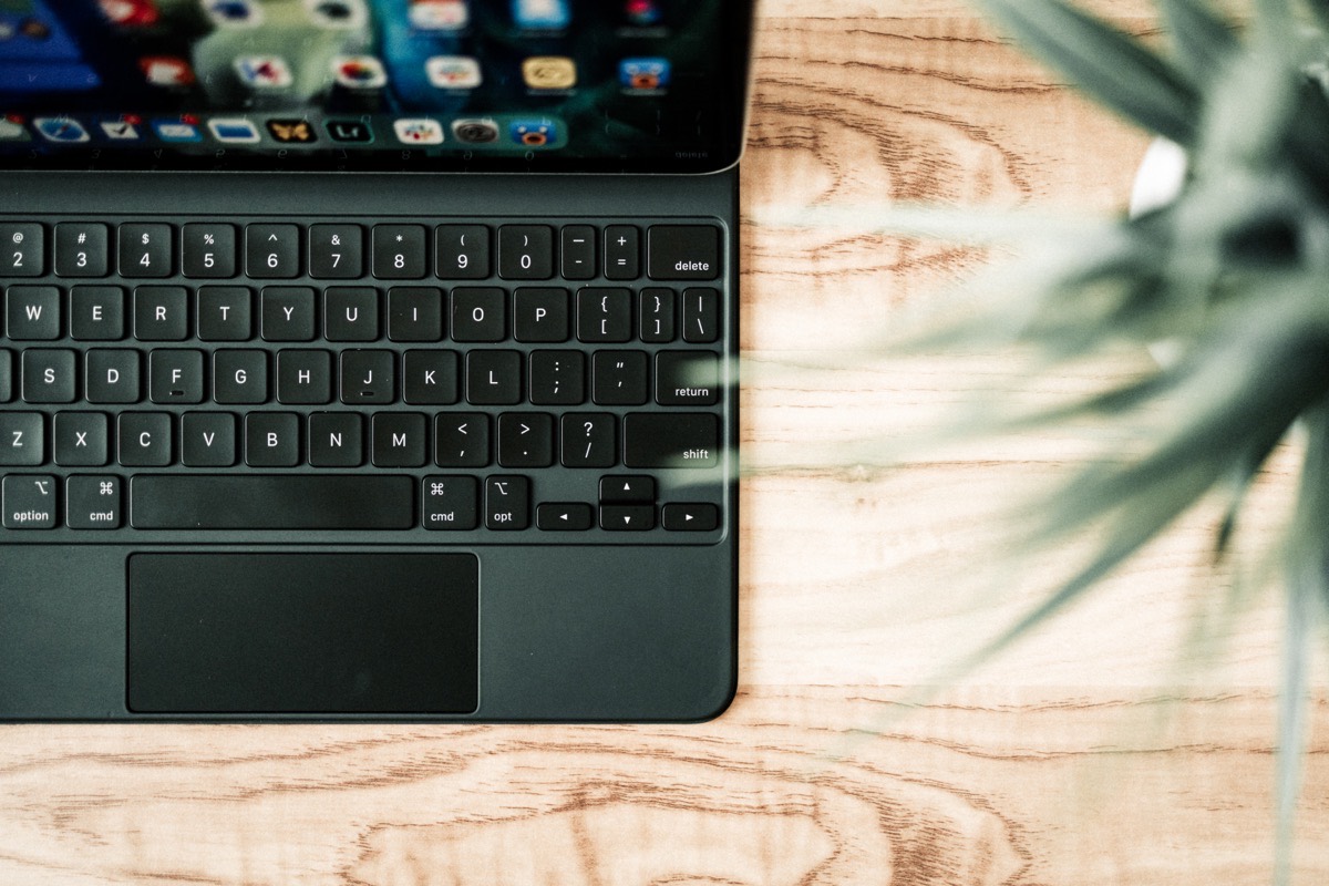
The Inverted T Arrow Keys: Alright, alright, everyone loves the inverted T arrow keys. They are nice, but I really like full size left/right keys. Count me as one of those folks missing the Smart Folio Keyboard’s arrow key layout.
The Globe Key: The Bluetooth Magic Keyboard for Mac has no such key, completely baffling me on how to find the emoji keyboard in Messages when connected to an iPad. I’ve found the Globe key to be surprisingly helpful.
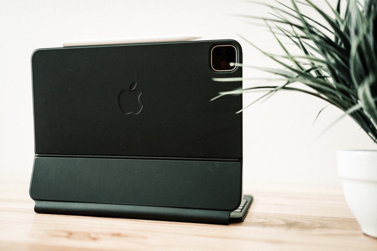
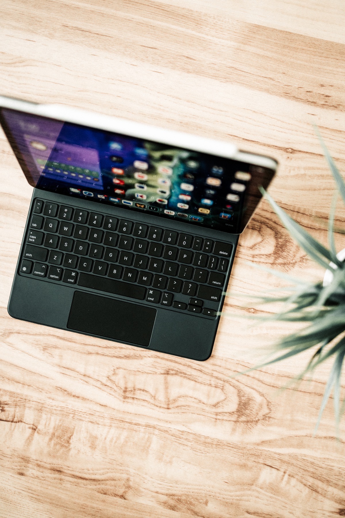
The Keyboard Palm Rests: The Smart Keyboard Folio had no palm rests whatsoever below the keyboard, ensuring the meat of your hands would rest on the desk below. The 11-inch Magic Keyboard has some space below the keyboard — just enough for the keyboard to fall off in the middle of the meat on my hands. In essence, the sweatiest part of my hands rests very specifically on the palm rest areas, ensuring this keyboard is going to look grimy and greasy in no time.
The Fully-Clickable Trackpad
It’s incredible how Apple’s smallest and most portable trackpad still outpaces every other trackpad in the PC world. The trackpad on the Magic Keyboard is exceptional, even if its vertical height is lacking.
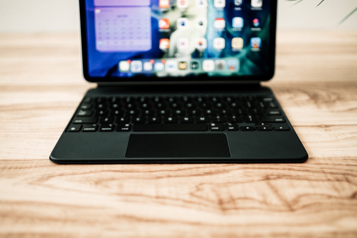
As a whole though, I haven’t found much need for the trackpad to be taller. Tracking and scrolling sensitivity is set very well by default, and two-finger scrolling isn’t impeded in any sort of way by the shorter height of the trackpad.
Left-to-write swiping and tracking has plenty of space to spread out — two-finger swipes to move between Slide Over apps and three-finger swipes to move between spaces and apps all have more than enough room to spare.
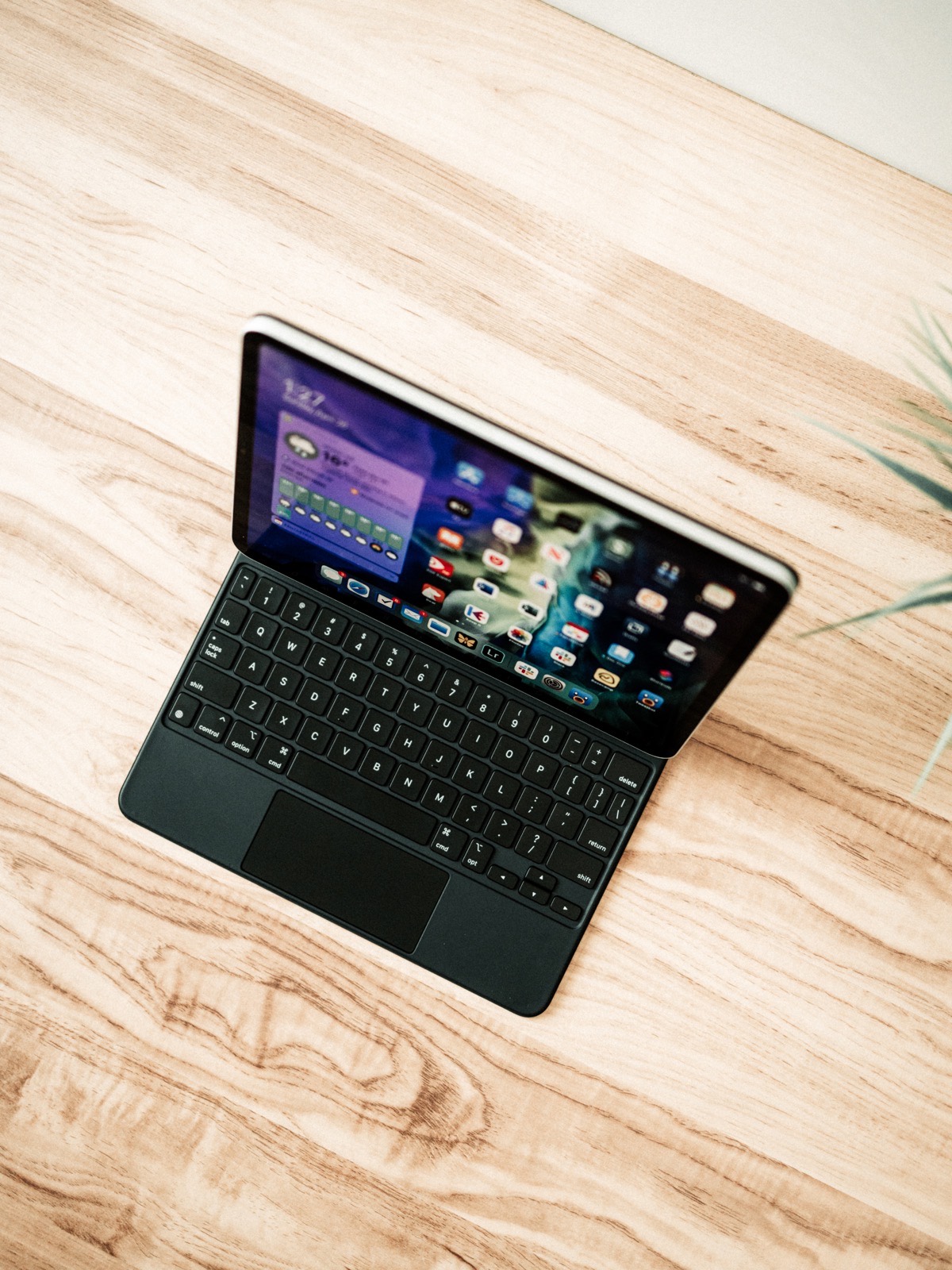
The only gesture that’s really impeded by the smaller Magic Keyboard trackpad is the pinch-to-zoom gesture. My pinch-to-zoom gesture is more vertical than it is horizontal or diagonal, and certainly runs into the upper edge of the trackpad. I’ve found reaching up to pinch the iPad’s screen instead has worked better for this sort of thing.
From 5,000 feet, it’s surprising how little surface area you need for a trackpad to work well. In reality, I bet 80% of gestures on the largest Magic Trackpad 2 are handled by 20% of the trackpad’s surface area. The smaller Magic Keyboard trackpad just ensures you use more of the surface area, more of the time. There are no real limitations here.
Other Anecdotes
This is the best section of every review. Very often, this is the section I jump down to in all other reviews (if it’s available).


USB-C Passthrough Charging: I mentioned above how powerful this Magic Keyboard would be if the additional USB-C port could handle data as well as power. That’ll have to wait for another generation. As it stands, there is something exceptionally liberating about plugging in the Magic Keyboard and not having to unplug the iPad when you want to grab it and walk away. Just peel away and go.


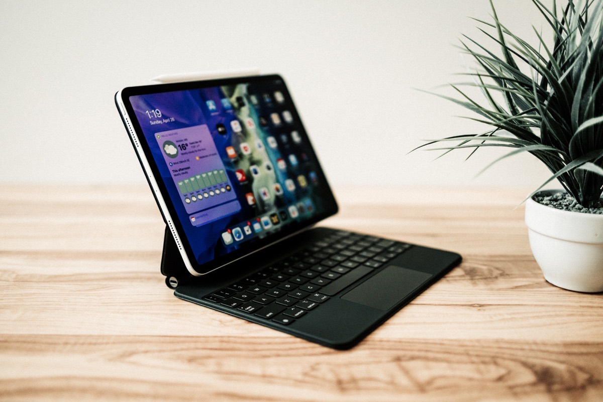
The Cantilever Angles: As a whole, I’m disappointed with the viewing angles provided by the cantilevered design. Tilting the screen down to ensure proper exposure to the number key row makes the angle nearly unusable, while I can’t seem to push the angle far enough back for proper long-term periods of work at a desk. I’ve resorted to lowering my chair slightly to accommodate the viewing angle.
Ergonomics: Which leads me into ergonomics — I’d say this cantilevered design has worse overall ergonomics when it comes to neck and shoulder pain than a laptop provides, but the positioning of the iPad dramatically improves touchscreen ergonomics when working on a desk.
To my first point: I’m nearing completion of this review after two hours of work and my shoulders and neck are killing me. I’m sitting on a Herman Miller Aeron with as best ergonomic posture as I can pull off, yet the viewing angle of the screen has me looking down more than I’m comfortable doing. I don’t remember feeling this uncomfortable when reviewing any prior MacBook Air or MacBook Pro, and I use a laptop at the office all day, every day without this kind of discomfort.
But to the second point, by pushing the iPad up and out closer to your face, the Magic Keyboard substantially improves the ergonomics when touching the iPad’s display. A laptop’s touchscreen experience generally requires greater extension of the arm, putting more stress on your shoulder and less stress on your elbow and bicep. The Magic Keyboard’s cantilevered design puts more of the weight of your arm on your elbow and bicep. I can feel the difference in weight on my shoulder when tapping and scrolling via the touchscreen with the Magic Keyboard attached. This is a phenomenal improvement in touchscreen laptop ergonomics.

Lap Typing: The Magic Keyboard’s stiff and heavy base provides ample amounts of stability for typing on your lap. I’ve almost never had success in working on an iPad or a laptop on my lap for extended periods of time, but my testing for this review resulted in a reasonable experience. That said, the smaller 11-inch Magic Keyboard has a narrower profile, ensuring you need to squish your legs together a little more firmly if you want a flat base to work off of.
Apple’s First Honest Punch at the Surface
My day work is defined by enterprise, Windows-specific software. Intuit’s ProFile tax software is archaic and Windows-only, Sage 50’s Simply Accounting is equally archaic and equally Windows-only, and quite frankly, even Microsoft Office is in its baby-step days on the Mac and iPad. The only reason to use a Mac in my business world is if you like the aesthetic design — you’ll be met with more headaches than niceties if you elect the path.
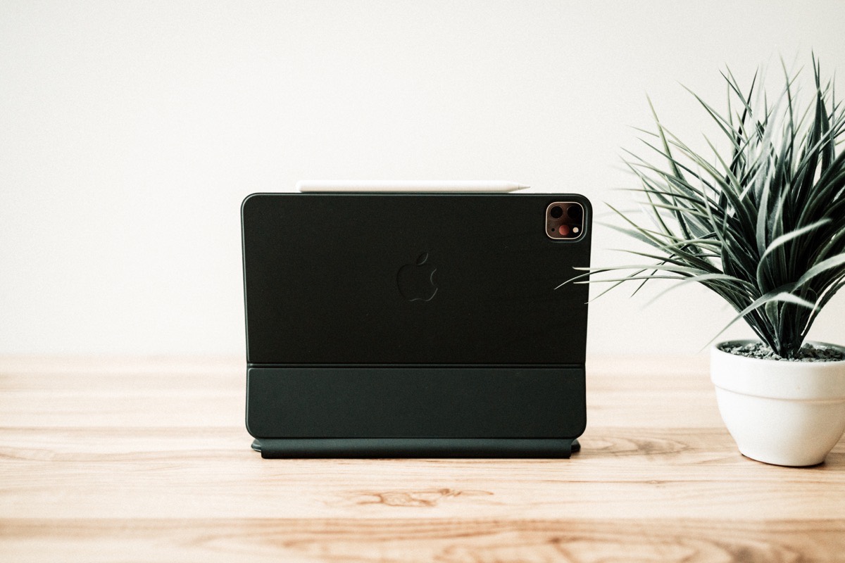
This is even more so the case with enterprise tablets. COVID-19 has caused many businesses to transition their employees to a work-from-home environment, and many local businesses around here have opted to purchase a mind-bending number of Surface tablets.2 The iPad doesn’t even venture into the conversation, let alone be weighed as a potential option.
It feels like it’s been a long, long time since we’ve had a small Apple notebook that feels designed for this kind of use. The 11.6-inch MacBook Air from 2010 comes to mind, with its diminutive size and instant-on SSD speed allowing for work in just about any circumstance.
I suspect Apple’s expectations of the enterprise world optimizing around the iPad weren’t being met. And I think the transition and fixing-up period began well over a year or two ago.
First came a dedicated Files app. Second came USB-C and read/write capabilities for external storage. Third came a desktop-class browser. Now, we see honest-to-goodness keyboard and trackpad support. In the future, I bet we see proper external display support, continued improvement in I/O (specifically around the Magic Keyboard’s USB-C port), and a keen eye ensuring software continues to improve for the enterprise-arena.
Which isn’t to say the Magic Keyboard isn’t meant for non-enterprise users.
But to me, the Magic Keyboard is the very embodiment of Apple’s focus on business, enterprise, and power iPad users. Apple has done a phenomenal job in recent memory in adapting to and implementing what its customer base is calling for. For every opinionated design choice, it seems Apple is implementing a customer-choice feature.
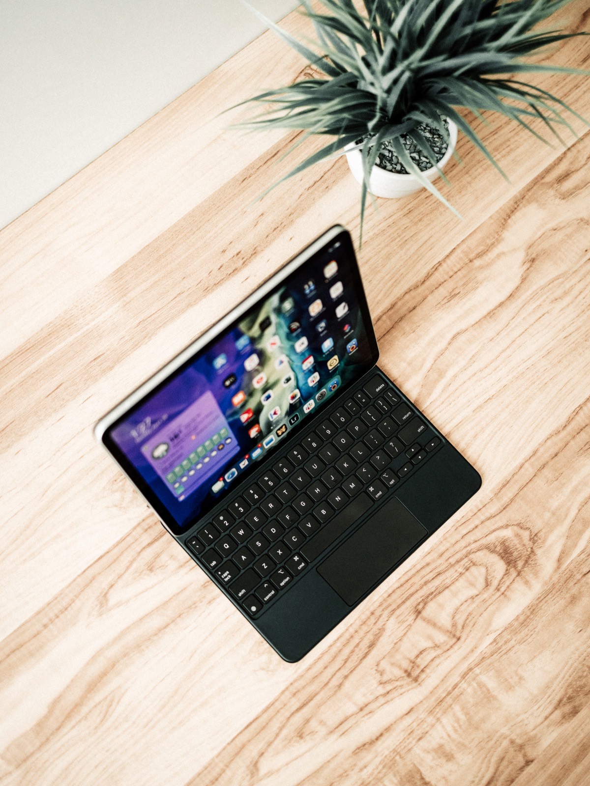
I love this new approach to iPad hardware and software design. Every year, we seem to be getting more and more features that unlock more and more of what the iPad is capable of.
The iPad Magic Keyboard feels like a doubling down of Apple’s focus to giving its customers what they want and what they need to get their jobs done each day.
The Magic Keyboard feels less opinionated and more utilitarian than any Apple accessory I’ve ever tried before.
Oh, and that Telus business owner? He said himself that this new iPad Pro and Magic Keyboard package might be the first Apple product he’d be able to pitch to his business clientele. First, ever.
-
Office-related software is also improving and becoming more prevalent by the year, though you won’t catch me doing important word in Microsoft Word on the iPad just yet. I wrote a 10-page paper for an assignment at one point and, due to the nature of saving inside Microsoft Office apps in iOS, a syncing glitch resulted in that 10-page paper being permanently lost with no way to recover it. ↩
-
The biggest credit union in our rural region purchased a few hundred Surface tablets on the spot. ↩
