iPhone 12 Pro First Impressions
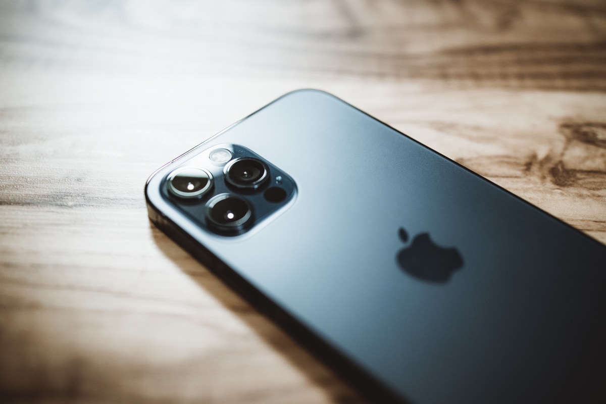
We’re marking it on our calendars: This is the first year I haven’t purchased the newest iPhone for myself on launch day since the iPhone 6 in 2014.
I’m holding out this time. I promise.
This year, my wife gets first crack at the latest iPhone.
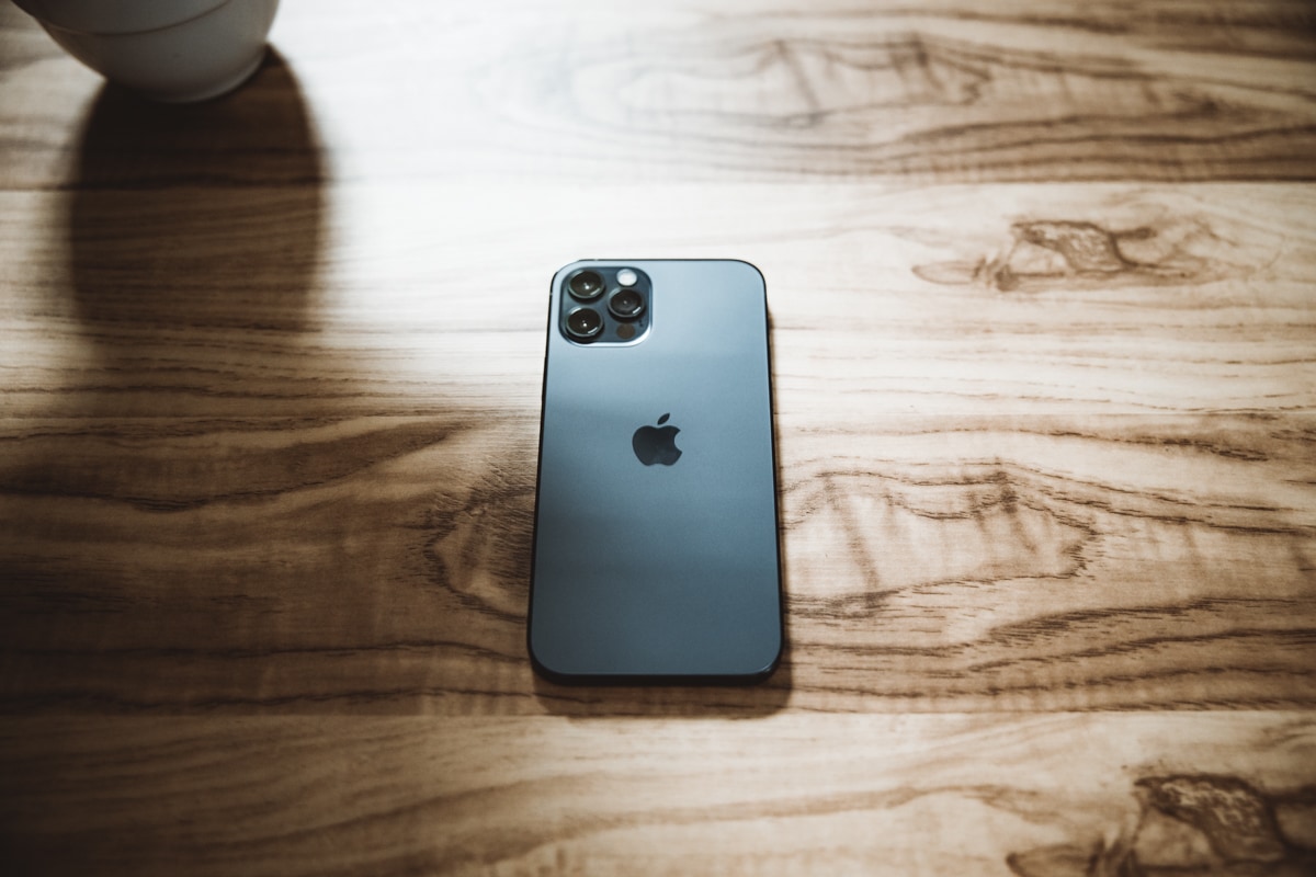
Were anyone to be concerned about my well-being, well, I’m holding out for the iPhone 12 mini.
It was kind of neat, watching my wife unbox the latest and greatest iPhone on her own. She held it carefully, dialing in quickly on the premium stainless steel band, the frosted glass back, and the third camera she’s been pining for over the last year.

And then she threw it in her back pocket like any other iPhone, screen facing outwards and toward the metal/brass button sewn into her jeans. My jaw slightly dropped, a tinge of apprehension and a rush of horror rushing over me.
“Had I made a mistake by purchasing this for my wife?”, I thought.
That was a fleeting thought. Because of course I hadn’t made a mistake — I was building the largest amount of brownie points in the past six years. I fully intend on cashing those brownie points in at some point in the near future.
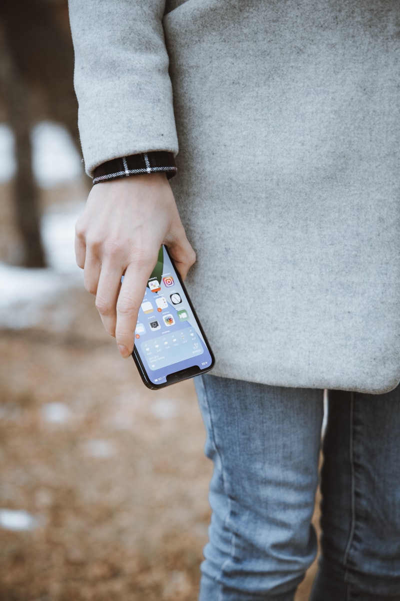
But this is how most people use their iPhones. They don’t rush out to test the latest HDR video standards from Dolby Vision. Most folks won’t understand how the difference in aperture sizes affects for their photos. Most won’t realize the durability benefits of the new Ceramic Shield.
Until they play a video for their friends. Until they catch that baby’s smile in the latest hours of the night. Until they drop their iPhone on the cement.
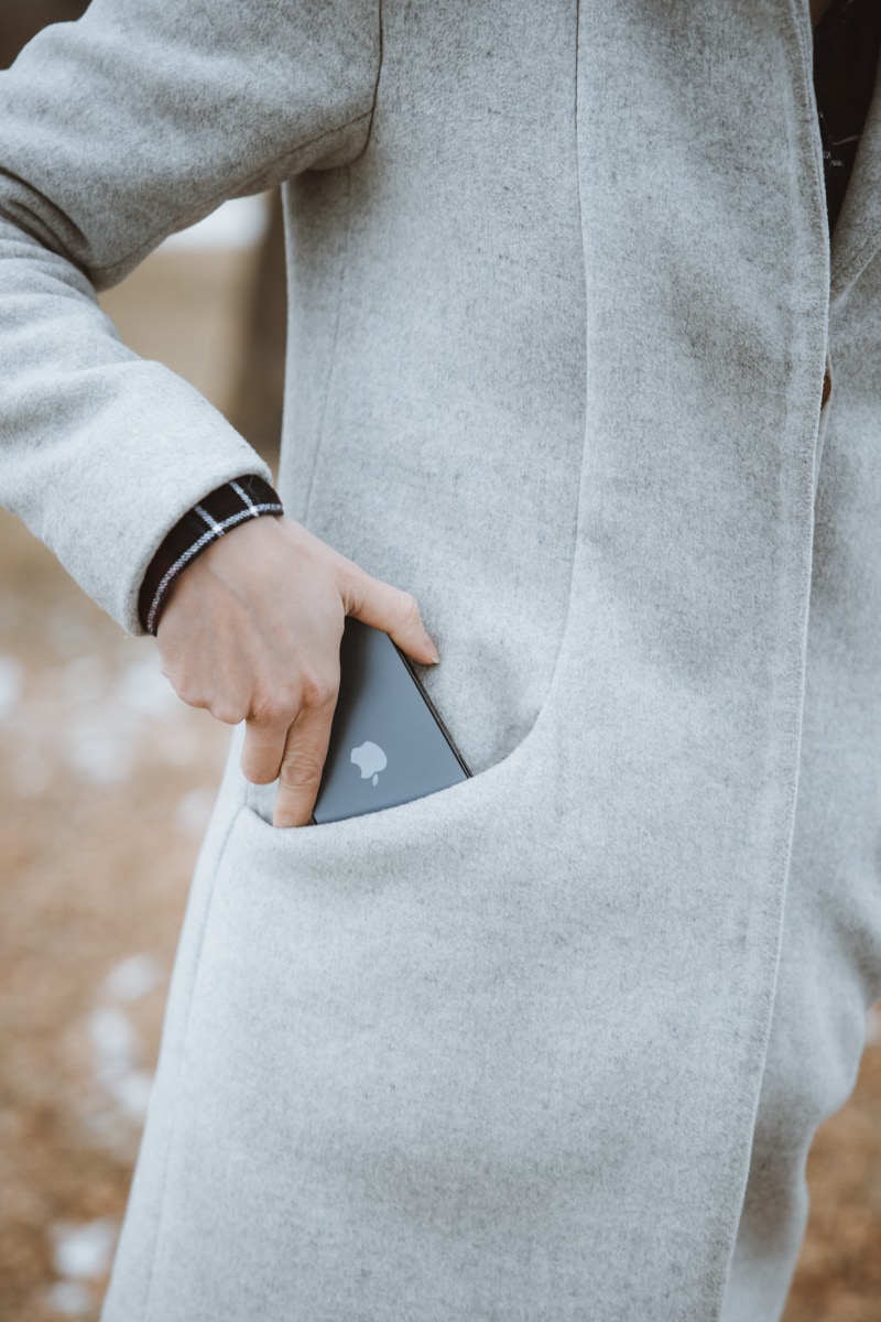
Though the iPhone 12 Pro is the most premium iPhone I’ve ever held, it’s also clear this iPhone is meant to be used.
It’s been a fun weekend watching my wife discover new ways to use her iPhone.
Design and Materials
The iPhone 12 Pro is the most premium iPhone ever made. This phone exudes confidence and drips quality, and you feel it the moment you pick it up.
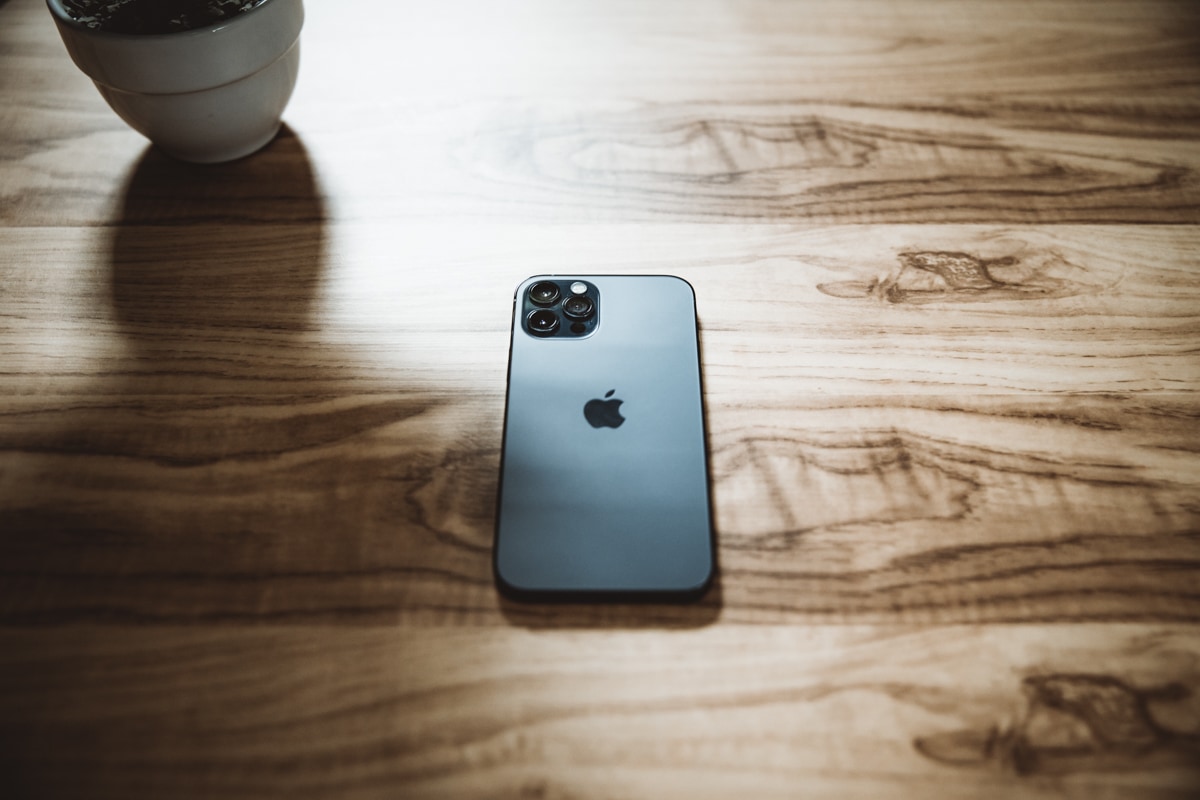
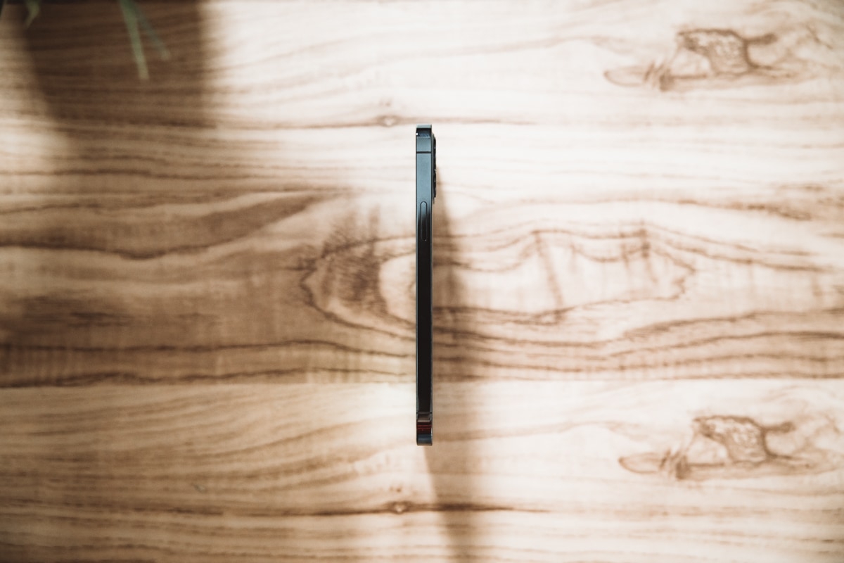
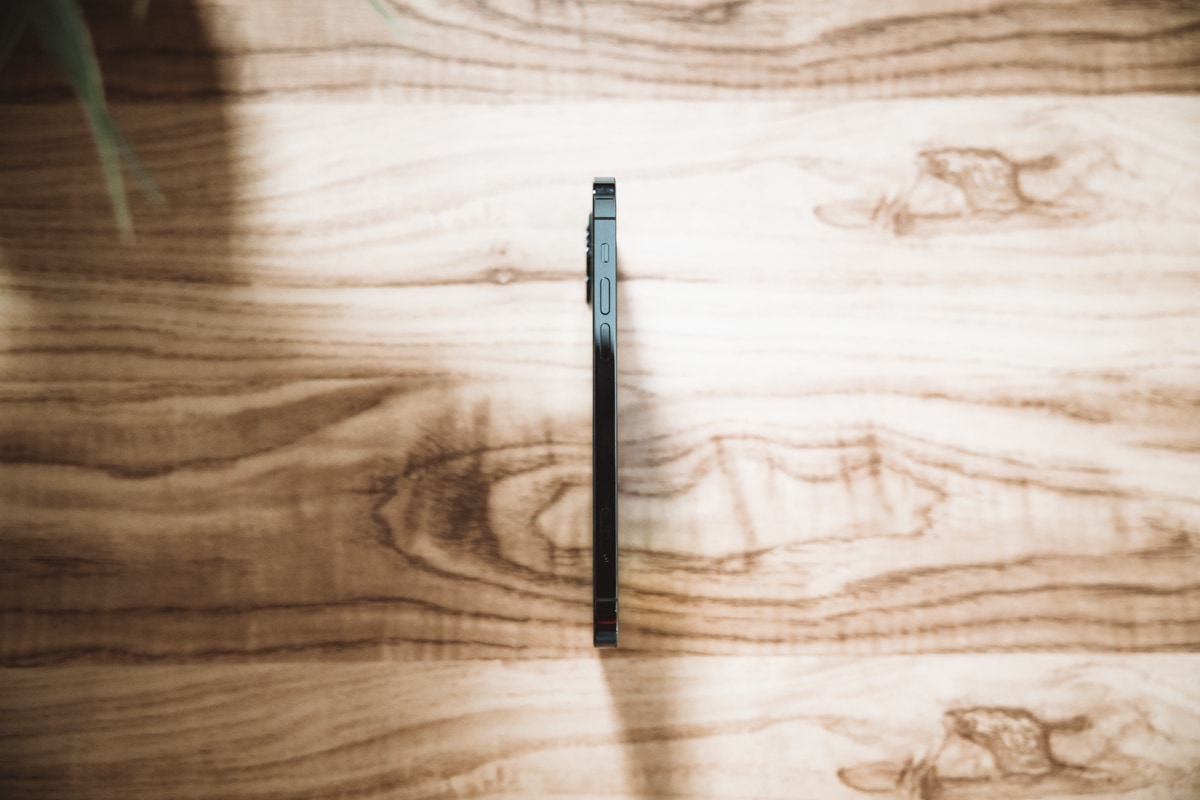
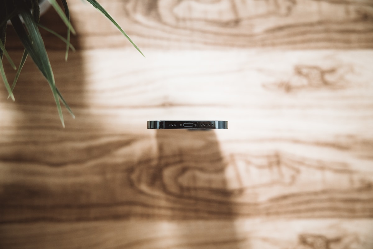
The iPhone 12 Pro is just a smidge larger than its 11 Pro predecessor. Technical measurements aside, the 12 Pro may be a hair wider and a coin thickness taller than the 11 Pro. How the device feels is a far cry from how they directly compare to one another visually — the iPhone 12 Pro feels substantially bigger, even though it’s really not.
I attribute this to two things:
- The decreased bezel thickness and flat screen make room for a beautiful 6.1-inch display in the iPhone 12 Pro. Measured next to the 5.8-inch display in the iPhone 11 Pro, the 0.3-inch inches of extra diagonal screen real estate has a huge impact in how the phone feels.
- The squared off edges.
The iPhone 12 Pro’s flat edges are a calling from the past, but with a modern utilitarian twinge to them. They’re visually brilliant in the 12 Pro — the flat stainless steel band wraps around the display in a high fashion, high glossy way, and the lack of chamfered edges (as we saw in iPhones of yesteryear) really drive home the “slab of glass” persona. It’s stainless-steel-band-meets-Ceramic-Shield-display with nothing getting in between (save for a few pieces of dust I can’t remove too easily).
The flat edges also have an optical element to them — they provide the illusion of a juicier, beefier iPhone 12 Pro, one that feels sturdier, more dense, and firmer when gripped in your hand. Make no mistake though, the iPhone 12 Pro is thinner than the iPhone 11 Pro and only one single gram heavier. In reality, because of the added body size, the 12 Pro actually feels lighter than the 11 Pro, though it feels the exact opposite.
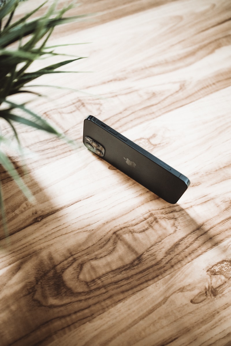
This is Apple design at its very best. I’ve truly missed the flat edges of the iPhone 5 and 5s (specifically for the ability to stand the iPhone on its edge and shoot it as a portrait subject rather than as yet another flat lay object). Utilitarian, simple, premium, dense, and high fashion, and all in the sense of making last year’s iPhone look five years old.
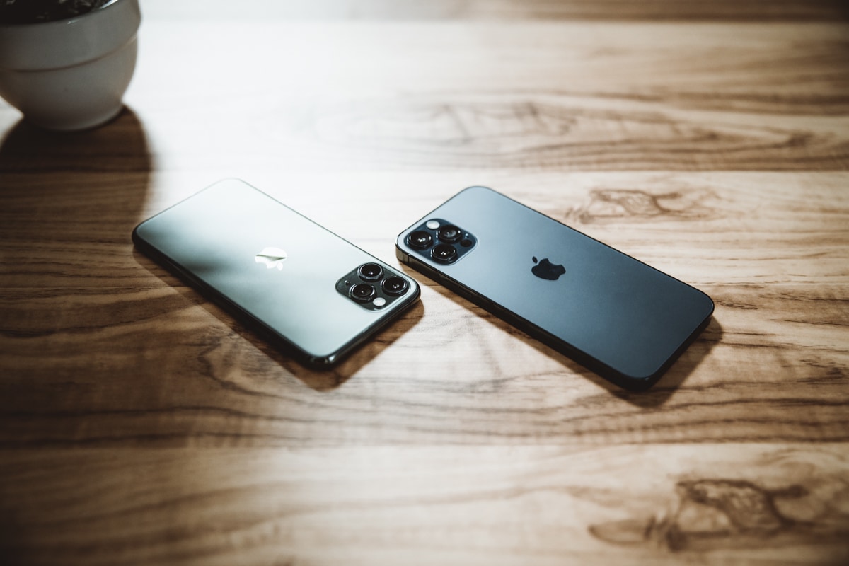
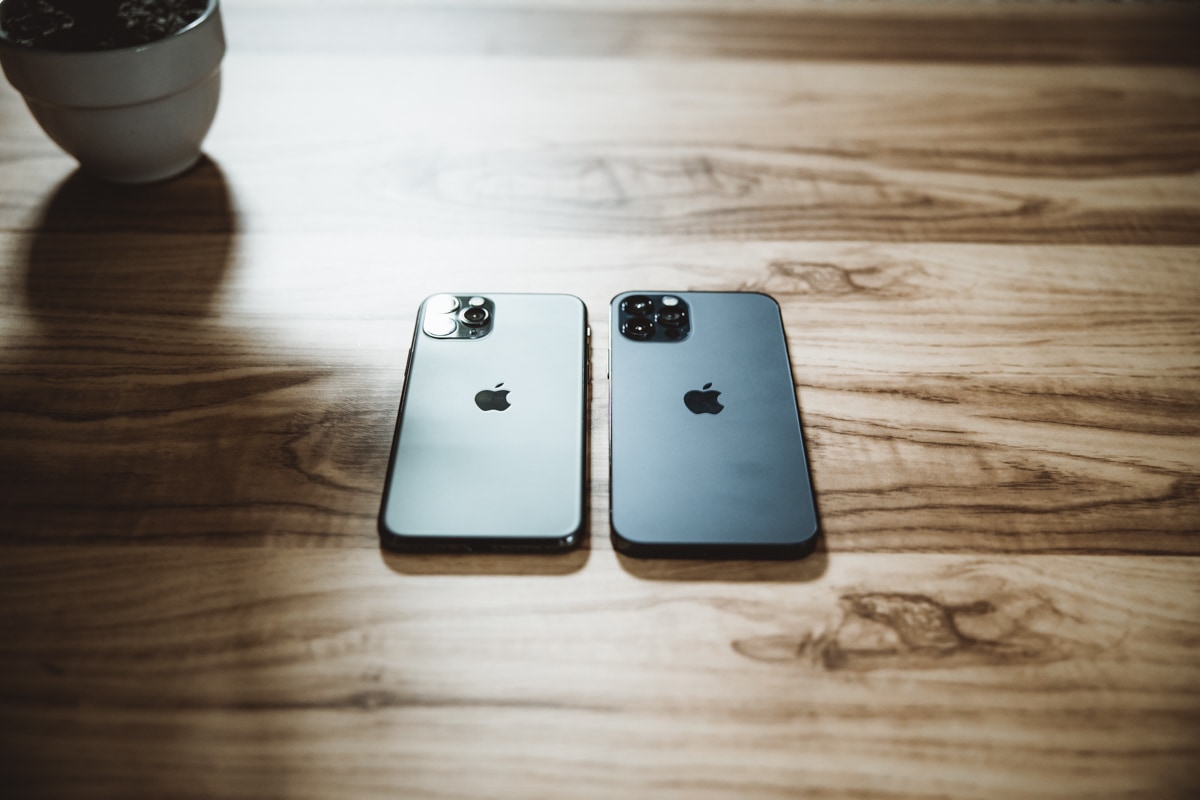
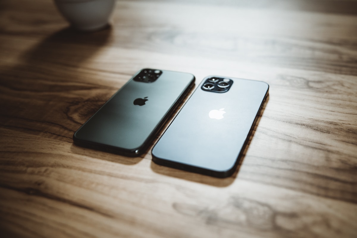
Pacific Blue is more subdued than I expected, but very much in line with the even-more-subdued Midnight Green in the iPhone 11 Pro. The frosted back keeps away fingerprints quite well, though the Apple logo itself is shiny and provides an imperfect element to an otherwise imperfection-free back.
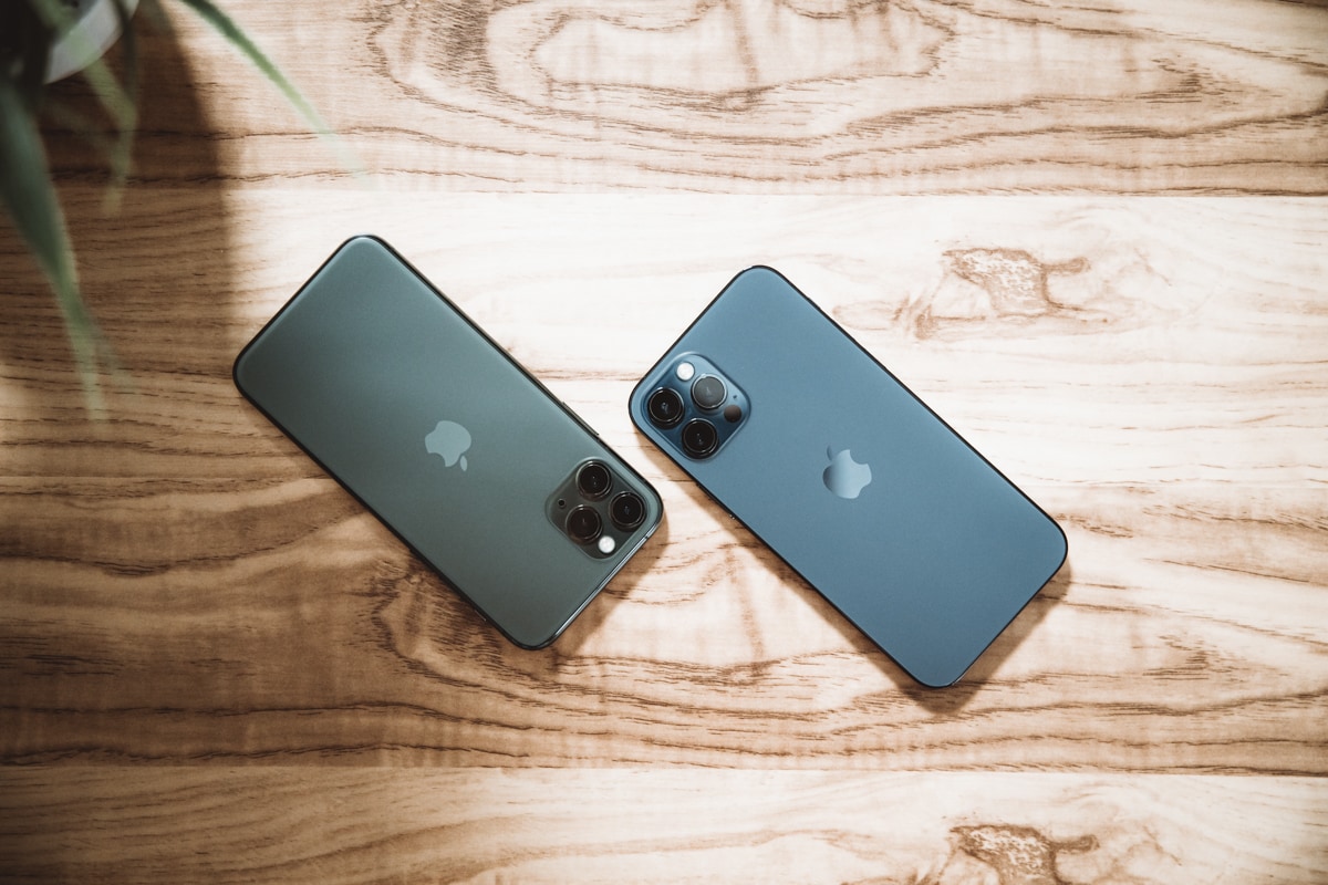
Apple’s over-arching goal here appears to be that these subdued, grey-scaled colors are a sign of luxury and premium quality, while louder and poppier colors are saved for the aluminum-edged iPhone 12.
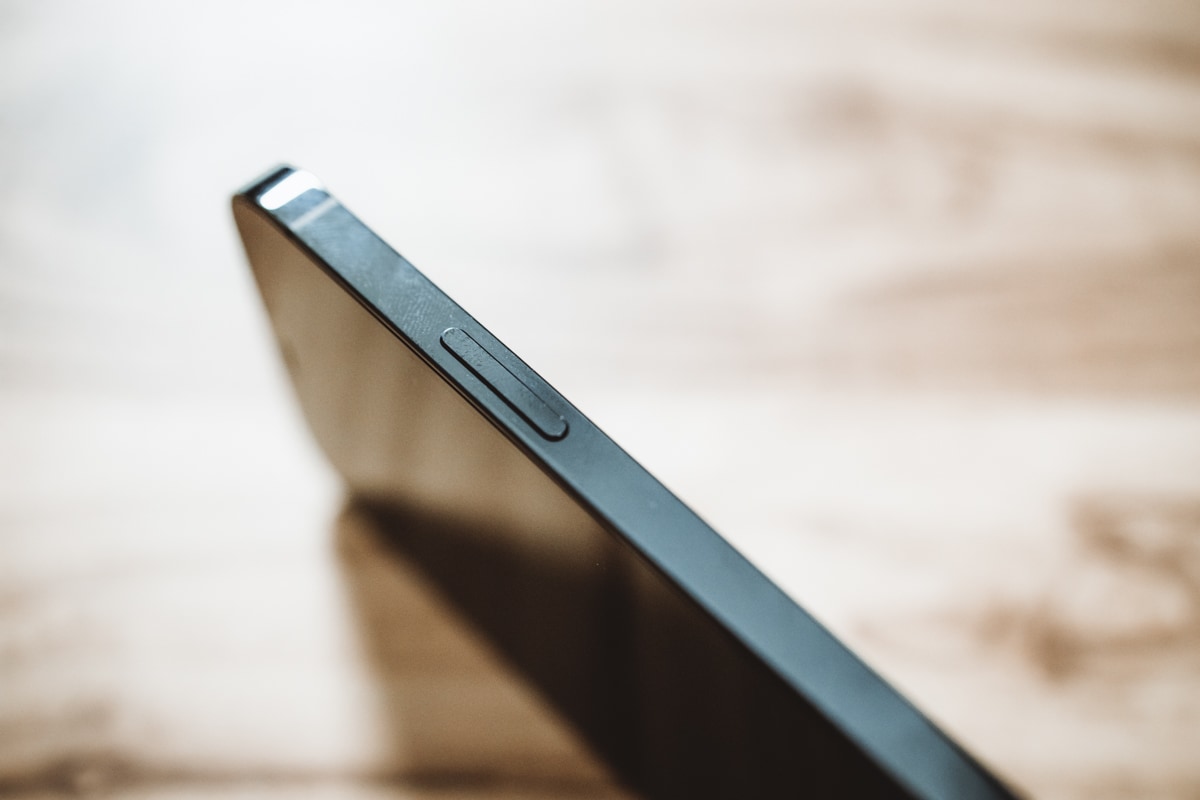
Though I don’t disagree with this color approach, I do oppose the stainless steel band — not only does the stainless steel band look gaudy, it proves to be a fingerprint magnet and shows abrasions like never before. It’s flipped around on the iPhone 12 of course — glossy, fingerprint-brazen back and aluminum band — but it actually works in the iPhone 12’s favor. When resting on its backside, all you see of the iPhone are its edges and its display. On the iPhone 12, those edges are matte aluminum and fingerprint-free. On the 12 Pro, those edges are riddled with fingerprints and micro-abrasions.
You be the judge of which provides a better first impression.
Perhaps the squared off edges will provide a better grip for sweaty hands, but the stainless steel band in the 11 Pro has proven to be a prototypical soap bar. I expect the squared edge will improve this experience in the 12 Pro, but time will tell.
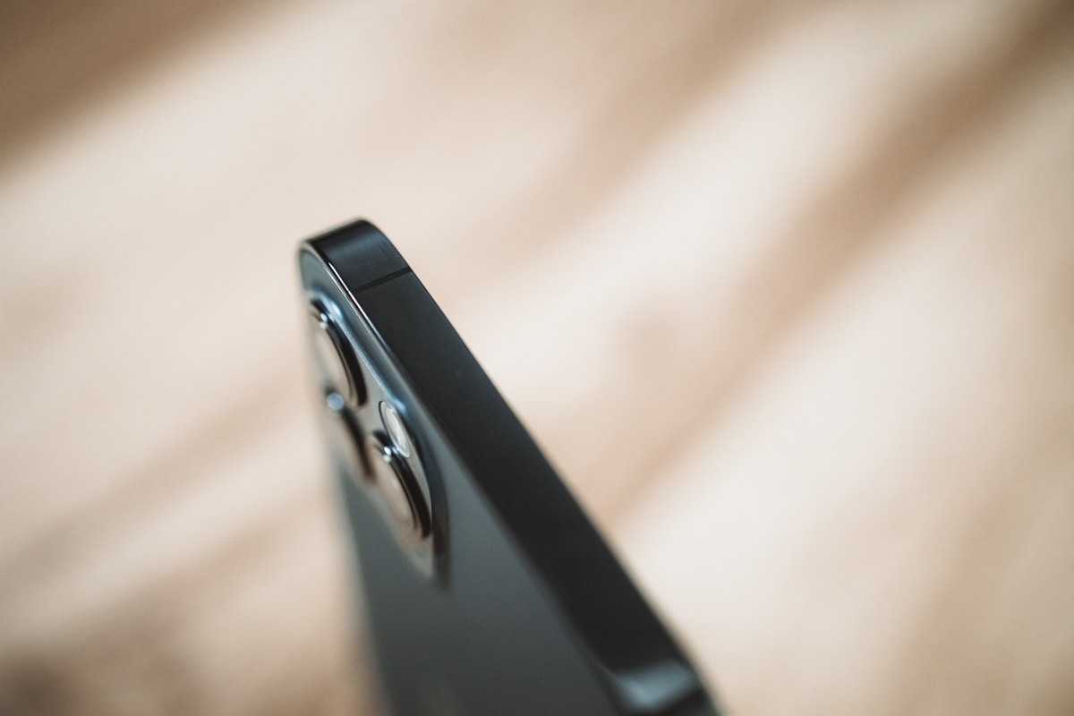
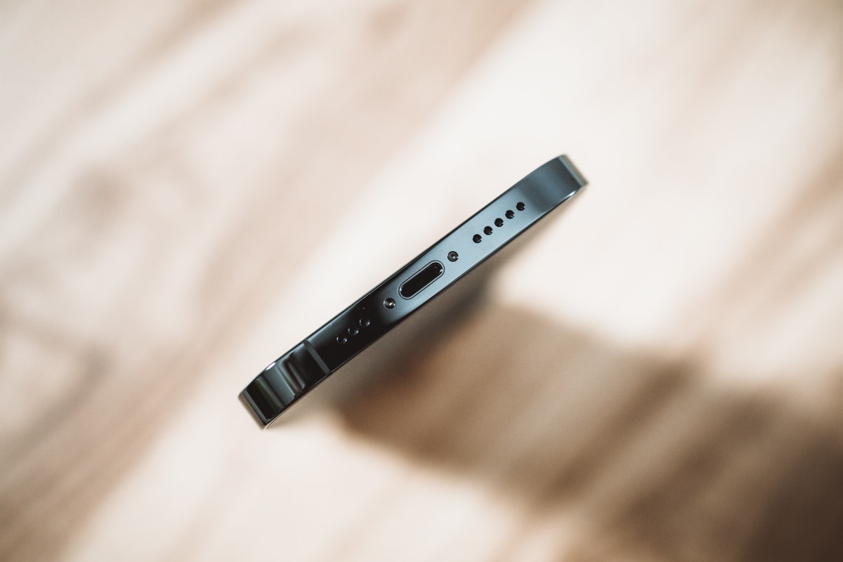
Like the iPhone 11 Pro before it, the 12 Pro rocks antenna lines throughout the stainless steel band. No iPhone has yet come close to the perfectly symmetrical top edge of the iPhone 7 Plus from 2016.
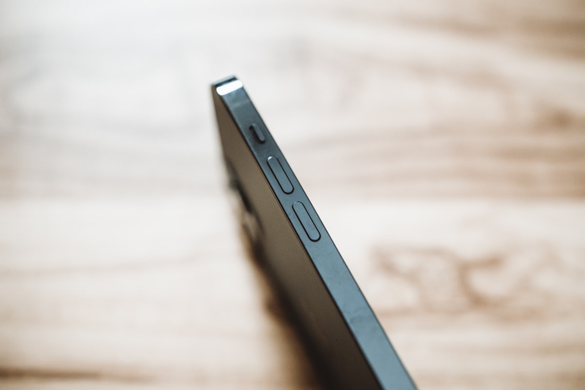
The 12 Pro’s buttons also seem to be adjusted, though it’s hard to tell if this is due to the squared-off stainless steel band or for another reason. The iPhone 11 Pro’s volume buttons, in particular, have a much lower, deeper sound when clicked. The buttons are also noticeably easier to feel, and to my fingers, they provide more feedback when pressed. The 12 Pro’s volume buttons have a higher-pitched click, and due to the squared band, the amount of feedback has considerably diminished. Though I don’t think you won’t feel a button click with a bare thumb, it’s going to be much harder to feel a volume button click with a pair of gloves on your hands.
From a material and design perspective, there are significantly more pros than there are cons. For every three squared off improvements, there’s a visual con that plants a fingerprint. The benefits outweigh the cons here, to the point of saying this may very well be the most beautiful iPhone Apple has ever created. We’ll have to pull the iPhone 5s from the archive and have a battle royale.
The Display and the Bezel Illusion
The 6.1-inch display plays that optical illusion with your hands, where you’re using a smaller phone than it actually feels. I suspect there are other elements at play here as well.
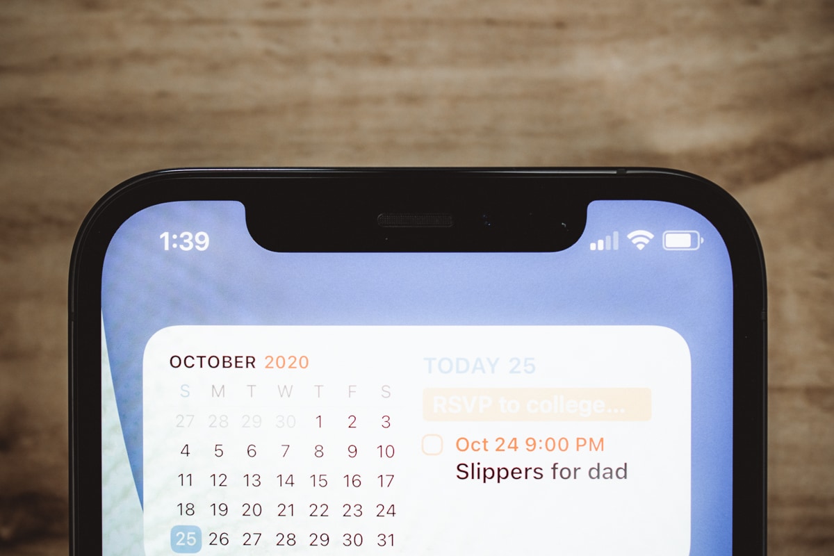
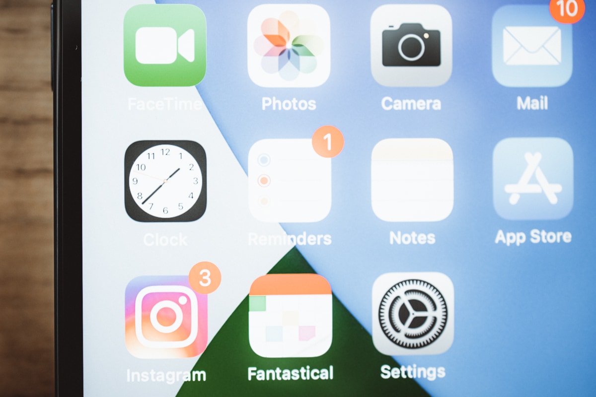
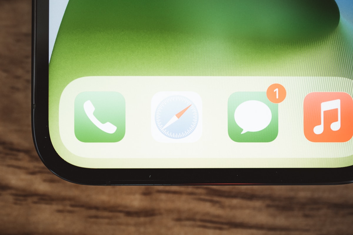
One is the decreased bezel size — or, perhaps, the illusion of a decreased bezel size. The rounded edges of the 11 Pro float into your field of view when using the 11 Pro head on — the bezels float off into the rounded edge of phone, making for what feels like a chunky bezel that never ends.
The 12 Pro plays the exact opposite game. The squared edges cut the bezel by what feels like half — the black line runs and stops on a dime. Nowhere is this more noticeable than in the bottom right or left corner of the 12 Pro. The curved edges and rounded corner in the 11 Pro is roughly 1/4-inch to my eye, while the 12 Pro’s bezel is a fraction of the size. The 12 Pro kindly reminded me the wonders of iOS’s rounded corners, made known by the full-screen iPad Pro of the last few years.
Whether this bezel knockdown is technically there or whether it’s all an optical illusion is irrelevant to me — the iPhone 12 Pro both looks and feels slimmer as a result of the bezel decrease, and the phone feels extra-modern as a result.
The first question I ask of any new phone size these days is whether the on-screen keyboard is comfortable and fast to use. There was a time when I swore I would only ever use a Plus/Max-sized iPhone, thanks only to the keyboard. I’ve since changed my tune on this, but I know that keyboard is near to the heart of many others.
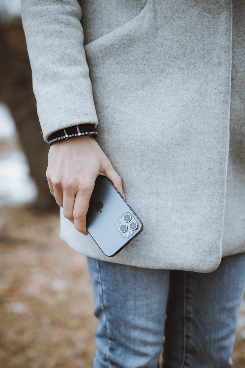
My wife’s report is simple: The on-screen keyboard is smaller than the Max-sized keyboard she’s used to, but it hasn’t caused an extra shot of errors in her typing. Her words were “comfortable” and “just right.” For 11 Pro users, this will mean an increased keyboard size. And for Max users, the drop-off in keyboard size shouldn’t be too noticeable.
There doesn’t appear to be any sort of difference in the feel of the new Ceramic Shield front glass. Tactility feels the same. Skin oils adhere the same. Dust is picked up the same. As far as I can tell, there’s no discernible visual difference between last year’s front glass and this year’s Ceramic Shield front glass. And I’m not willing to test it any further at this point.
Must-Have, Most-Used Photography Apps
We spend an inordinate amount of time sorting through hundreds of apps to find the very best. Our team here at The Sweet Setup put together a short list of our must-have, most-used apps for taking and editing photos on iPhone and iPad.
The A14 Bionic and Extra RAM
I’m not sure if this deserves its own section, as I tend to agree with all the other major reviewers in this camp: Apple’s processors are so good these days, there’s less benefit to having these processors now than the benefit you’ll have down the road when the iPhone is two or three years old. For years now, we’ve commented about how Apple’s chips are far from being fully utilized by third-party apps (specifically in the iPad Pro), and this year’s iPhone is no different.
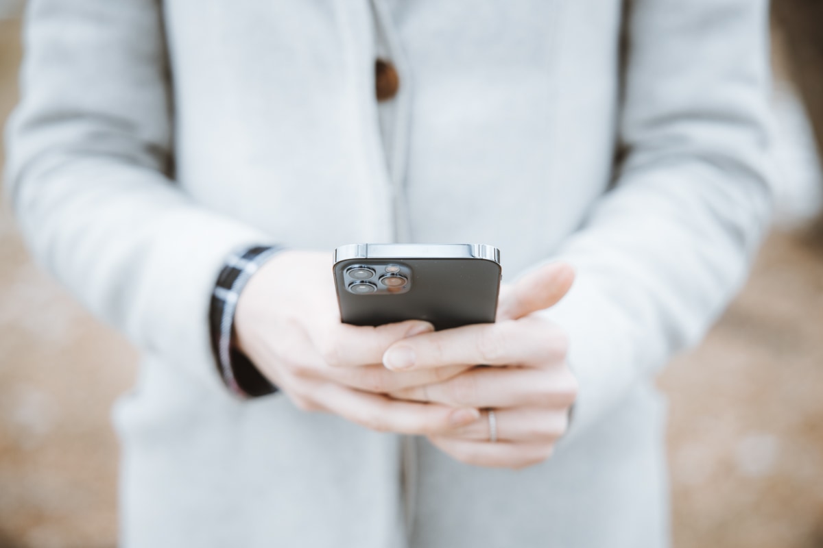
That said, there are a few differences I noticed in using my wife’s new iPhone 12 Pro. Whether these should be chalked up to this being a brand new iPhone with no gunk or extra apps, or if there is an internal hardware difference will have to be decided. But a few quick anecdotes here:
- I’ve noticed slow keyboard input on my 11 Pro recently. I am on the iOS 14 public beta, yes, but this has been going on for the entire summer and hasn’t changed. In short, I tap on a text field to type out a message and the iPhone stutters for a good two seconds before inputting half the word I typed. The 12 Pro has none of this happening and it’s a breath of fresh air.
- As a purely scientific test, I launched Instagram on the 11 Pro and the 12 Pro simultaneously. The 12 Pro opened Instagram noticeably quicker — I’d say about a half second.
- The 12 Pro’s camera opens faster and is ready to go quicker than the 11 Pro’s camera. This is more noticeable when I’m doing something else on the iPhone (say, browsing in Safari) and see a photo I want to take of my little girls. On the 11 Pro, launching the camera from Control Center often results in a delay in the viewfinder firing up. The 12 Pro seems to decrease the time from button-tap through to viewfinder-ready.
Again, many of these experiences may be the result of a year’s worth of use in the 11 Pro (or public beta issues). But the differences are there, and the 12 Pro is clearly swinging the axe at a faster clip.
The Camera System
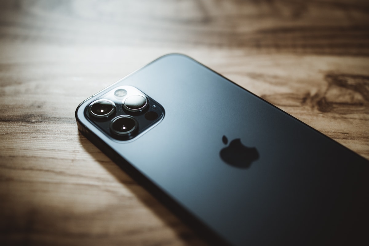
The three-camera system in the iPhone 12 Pro and 12 Pro Max are worthy of their own review — the improvements, specifically in the Pro Max, appear to be off the charts and in need of a deep-dive. This also gets me off the hook for having to come to perfect conclusions after only three days of observation.
At best, I have a few anecdotes thus far:

-
The improvements in the ultra-wide camera appear to be less impactful than I expected, specifically around image quality. I can find no discernible increase in sharpness in the middle of a photo or in the corners. The most noticeable improvement is in corner fringing — the iPhone 12 Pro nearly eliminates purple fringing in the corners. The 12 Pro’s ultra-wide camera also tends towards a cooler white balance than the 11 Pro, and appears to have an improved dynamic range in bright skies.
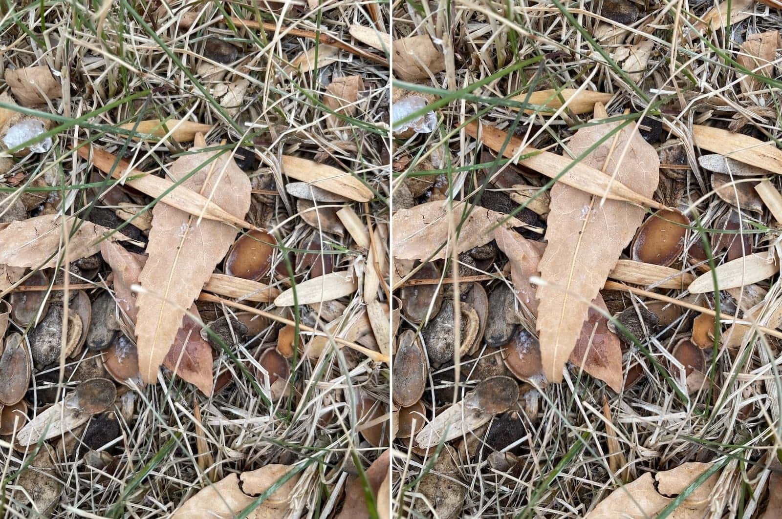
iPhone 12 Pro (wide) on the left and iPhone 11 Pro (wide) on the right. There’s very little difference here — so much so that I may even prefer the 11 Pro image thanks to the increased contrast. -
Though I believe this will be more appropriate for the 12 Pro Max review, I compared non-Portrait-Mode bokeh of the wide and telephoto lenses in the 12 Pro and 11 Pro. You can achieve a fair amount of background blur just by focusing on a subject close to the camera. And even though we’re not dealing with any change in aperture or sensor sizes in the wide and telephoto cameras on these particular iPhones, the background blur of the telephoto lens on the 12 Pro looks, to my eye, more pleasing. The blurriness around these branches is just a tad better in the 12 Pro. Also note the increase in detail of the 12 Pro’s telephoto shot — there’s quite the improvement in the detail in my wife’s hair in the 12 Pro shot.
- Night Mode coming to the ultra-wide camera on the 12 Pro (and the standard iPhone 12) might be my favorite new camera feature. I use the ultra-wide camera a ton and having that camera be able to see in the dark is going to be tremendous during long winter nights.
- Night Mode image quality in the 12 Pro’s wide camera appears unchanged, save for a slight shift in white balance. I expected an improved image in Night Mode on the 12 Pro, as the 12 Pro’s wide camera has a faster f/1.6 camera (vs. the 11 Pro’s f/1.8 camera).
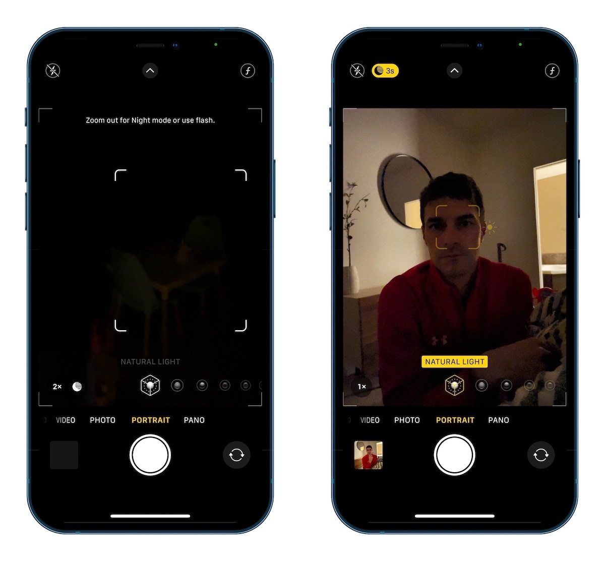
- Night Mode Portraits on the 12 Pro are pretty cool, and the on-screen notifications to properly implement the feature are very user friendly. Night Mode Portraits are pretty muddy at this point in time, but to have the technology available is a testament unto itself.
- As a whole, the 12 Pro’s camera system appears to be more heavily adjusting whites in Smart HDR photos. The whitest parts of the overcast skies in my test photos seem to have whites and highlights dialed down significantly compared to the 11 Pro.
- The 12 Pro’s camera system as a whole seems to be honing in white balance slightly cooler than the iPhone 11 Pro. This is much to my chagrin.
- I haven’t had a chance to test ProRAW in any way. Honestly, I don’t expect this to be a meaningful thing for most iPhone 12 Pro buyers. For professional photographers, sure. But for most folks, I think this ranks up there with having Dolby Vision HDR recording on an iPhone — a bragging rights feature that is only used by the most inquisitive creators. Keep in mind: RAW photos shot in a third-party app skip the Live Photo element of iPhone photography. To me, Live Photos > RAW photos on iPhone.
I haven’t had enough time to extensively compare the 11 Pro and 12 Pro camera systems, and I suspect this isn’t the comparison people want to see. I believe the much more important comparison will be between the iPhone 11 Pro/12 Pro’s camera system and the iPhone 12 Pro Max’s camera system. The Pro Max is where the majority of this year’s upgrades are focused, and I can’t wait to have one of the best iPhone photographers in the world give us her thoughts on the cameras.
For the iPhone 12 Pro? Well, I don’t know if there’s much of a difference between the 12 Pro and last year’s 11 Pro, save for Night Mode on the ultra-wide camera and Night-Mode Portraits on the wide camera.
Other Miscellaneous Thoughts (And Things I Can’t Speak To Yet)
iPhones are becoming more and more nuanced and it’s impossible to come to grips with the entirety of these new devices in three days.
- I don’t have possession of any MagSafe accessories at this point. No comment.
- The closest 5G network is about 1,357 KMs (843.2 miles) away from me. And given the state of travel, I have been unable to test any 5G specifics. (I do think this speaks to the bleeding-edgeness of 5G support, mind you. It’s rare for iPhones to be this bleeding edge.)
- The LiDAR scanner finally brings the iPhone to the iPad’s level when it comes to augmented reality. And since so few of us use augmented reality, the area where I notice this improvement most is in the Measure app. I use the Measure app pretty frequently (actually!) and the improvement there with LiDAR is immediately noticeable — both in speed and accuracy. Of course, more folks will use this for Night Mode Portraits.
- The tiny gap between the screen and the flat edge of the chassis presents an opportunity for visible dust particles and crumbs to congregate. A standard thumb wipe didn’t remove the particle and a standard puff of air didn’t remove the particle. It took an actual huff-and-puff to remove the issue. I’m not concerned, but this is something we haven’t dealt with for a few years.
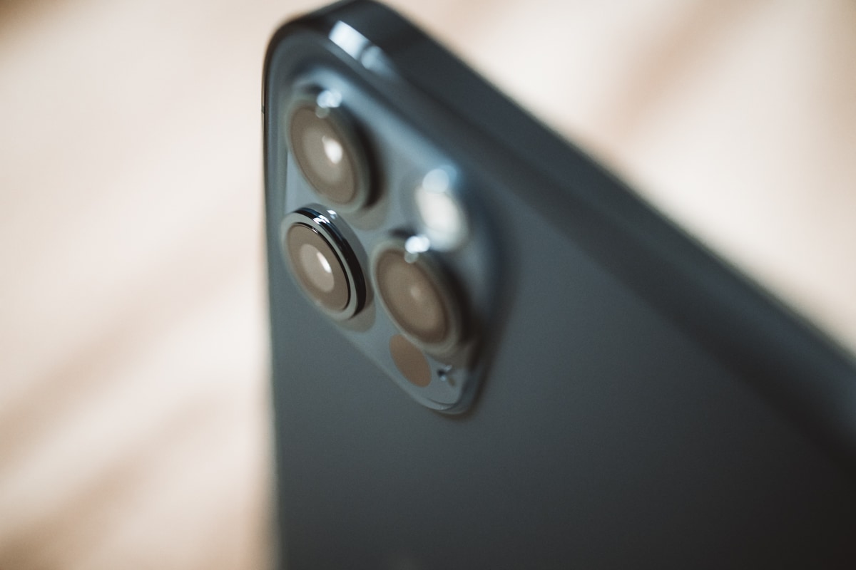
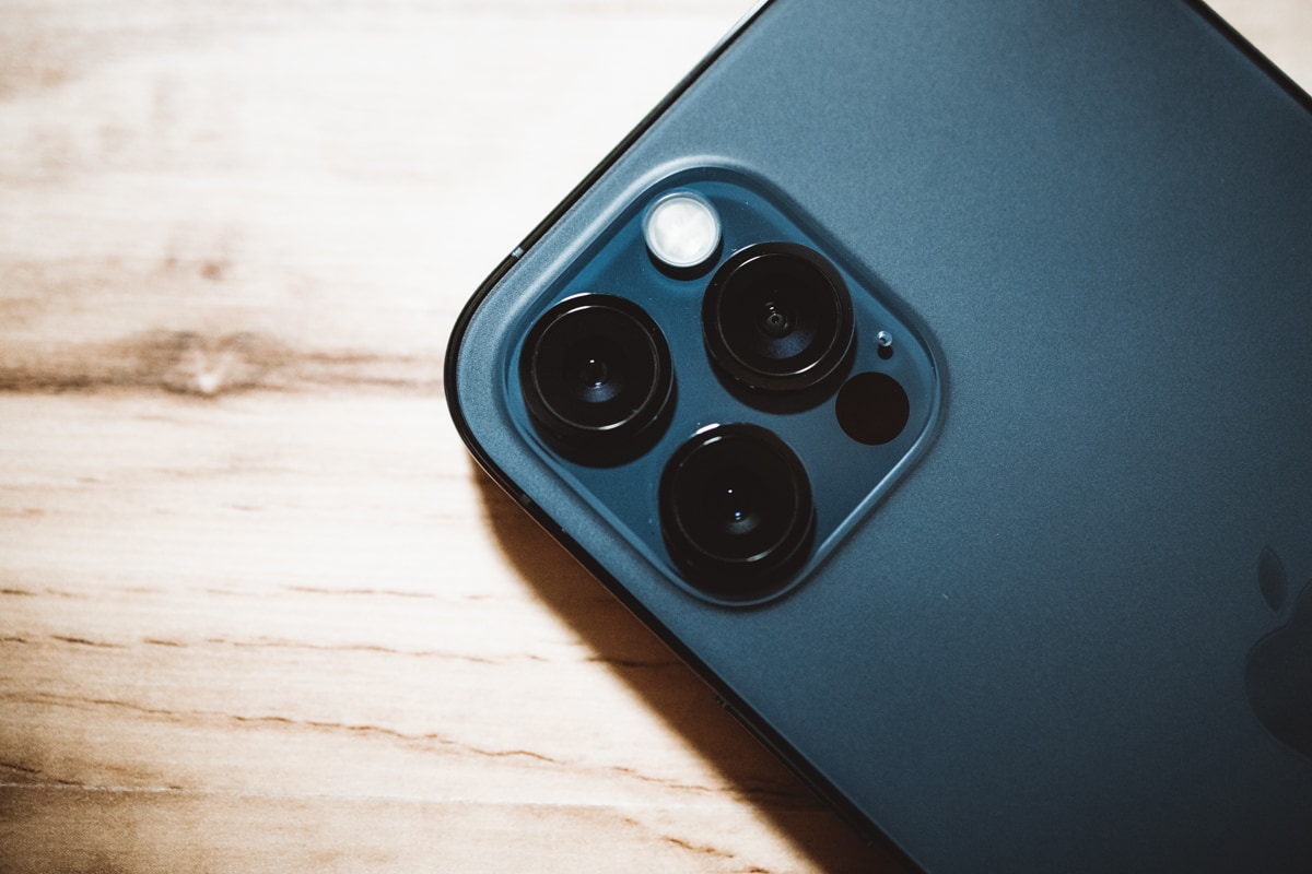
- The camera module on the back of the 12 Pro appears to be ever-so-slightly larger than the 11 Pro camera module. It’s the smallest difference, but it’s noticeable if you compare the space between the top left camera and the edge of the module.
- It is crazy to think the smaller iPhone box leads to more iPhones being shipped per pallet, which leads to less airplane routes required to transport these things from China, which leads to less fuel being burned, which leads to 450,000 vehicles being taken off the road.
I can’t wait to discover more of this iPhone as the weeks and months go by, especially through the lens of my wife. I’m excited to have her discover many of these new features for the first time and to see how they alter her iPhone usage.
Wrap Up
Over the weekend, a few of my favorite writers spoke about their dislike of the iPhone’s new squared-off edges. Though I disagree, I find the difference in opinion fascinating — Apple’s user base is so big and so diverse, it’s simply impossible to drum up unanimous love. Combine this with the diminishing returns reality of smartphone technology improvements and you’re left with an unnecessary year-over-year upgrade.
Of course, this has been the case for a few years. I just think there’s an unspoken group of us keeping our fingers crossed to once again experience a must-have year-over-year upgrade.
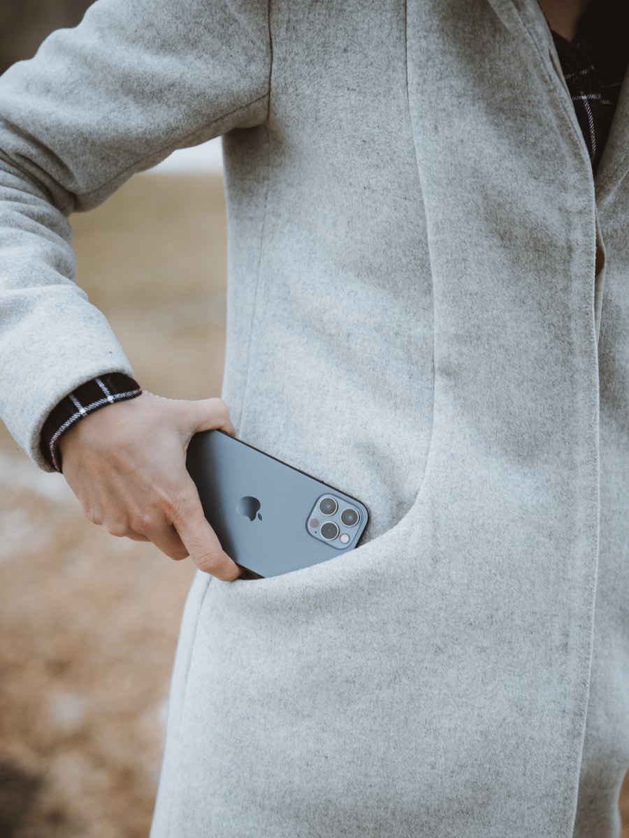
This isn’t even my iPhone! But it’s very clear there’s little to dislike in Apple’s 15th-odd attempt at the iPhone. The iPhone 12 Pro is an upgrade over the iPhone 11 Pro and in some pretty meaningful ways. Any buyer will be more than happy with it.
But perhaps the most significant reality of the year: The number of these features finding their way into Apple’s less expensive iPhone 12 and 12 mini lineup. If you cut out the LiDAR scanner, the telephoto camera, the stainless steel band, and some arbitrary software-only features like Apple ProRAW, you have the iPhone 12 and 12 mini. For a fair bit less money, too.
Even though it feels like the growth of the top-end iPhone feature-list is slowing, the speed at which these high-end features are coming to more accessibly-priced iPhones is speeding up.
The 5 Best Productivity Apps (Sweet Setup Favorites)
Download: We spend an inordinate amount of time sorting through hundreds of apps to find the very best. This list of must-have productivity apps includes app links, quick-start info, and pro-tip workflow recommendations for each app.
