How I Designed My New Office for Focus and Less Distraction
I can’t imagine too many folks have too many opportunities to design their own office from top to bottom. The fit, the finishes, and everything in between.
I had the chance to do so over the summer and, though stressful at times, it was a pile of fun.
Our small accounting office worked out of a workspace designed for architects and land surveyors. It was far from conducive for focused work or client meetings.
We had three main goals when redesigning the office:
- Increase productivity by decreasing distractions and decreasing foot traffic into our personal offices.
- Improve ergonomics and create a healthier workplace.
- Provide better organization opportunities to increase desk space and decrease desk clutter.
Here’s a quick schematic of the office floorplan before the renovation:
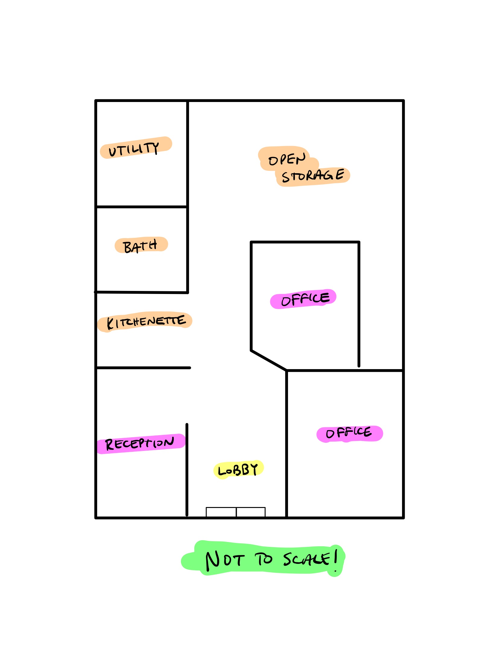
It’s a small office, to be sure. There’s about 1,000 square feet of available working space for our small team, so utilizing space efficiently was a priority.
You can quickly see how foot traffic would make its way directly into our two private offices, causing distraction and creating opportunities to breach confidentiality. This setup also undermined our administrative colleagues, as it was too easy for clients to sidestep their welcoming faces.
Here’s the new floorplan:
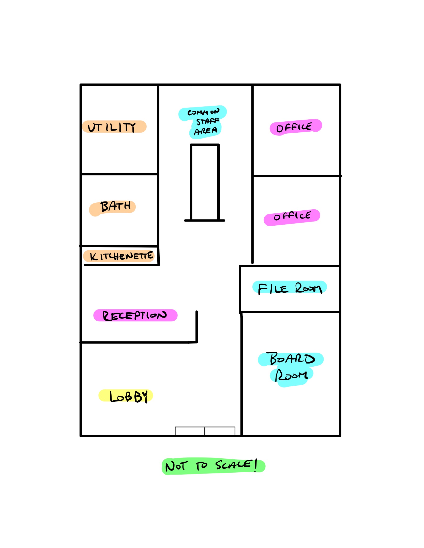
In nearly every way, our workplace has improved. My old office is now the conference room, providing a singular space for client meetings. This eliminates the need to clean up our private offices before each meeting and keeps foot traffic to the front of the office.
This floorplan provides a reinforced positioning of our administrative colleagues — no longer do clients immediately jump past them. This gives them the opportunity to provide that welcoming greeting.
This floorplan provides a variety of locations across the office to get work done. If foot traffic is at a minimum (which is usually the case for the back half of the year), we can work on the couch in the lobby up front. If we want to collaborate on a work project, we can work at the common area table in the back. If we want to work in the conference room all day, we can do so.
Finally, this floorplan provides a singular space for all our confidential file work in the file room. We can assemble, store, print, scan, shred, and bind any file right in one spot, freeing this work from our personal desks.
All in all, our three major priorities for the office at large were accomplished inside this new floor plan.
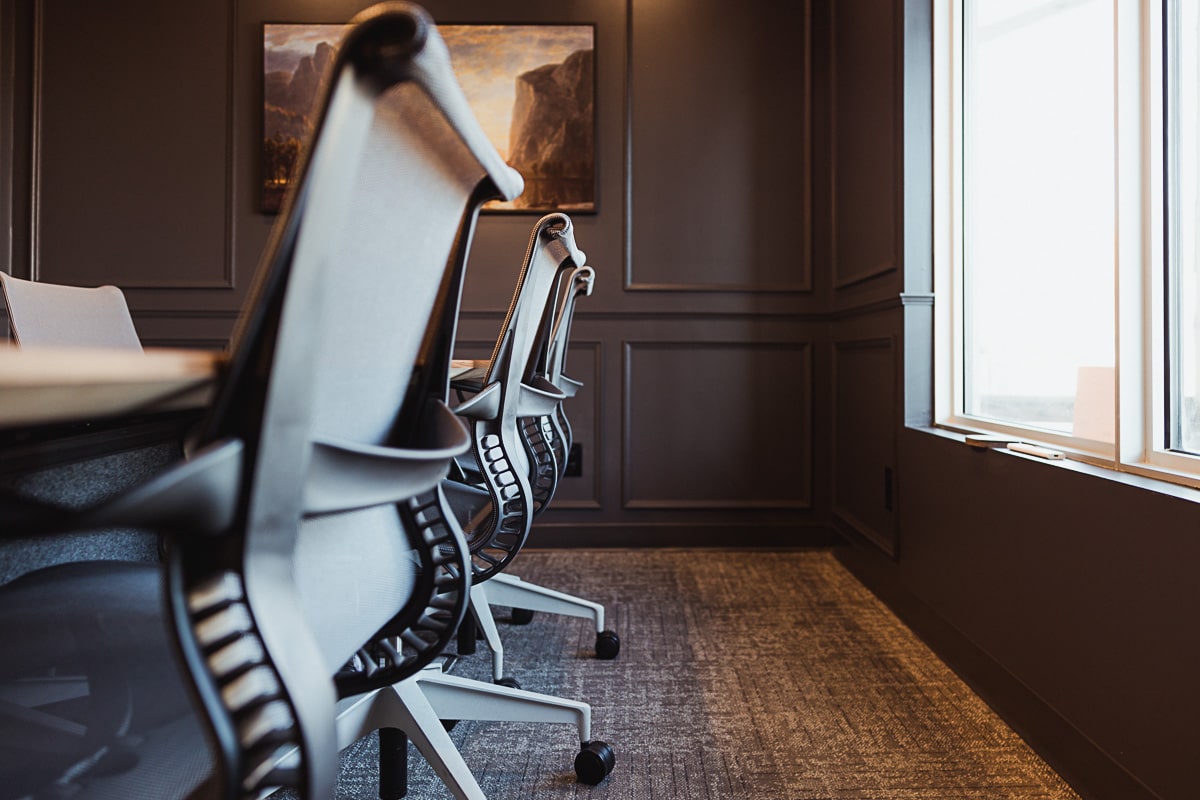
Fortunately, we also had the opportunity to make some decisions inside our personal offices. This is where the healthier workplace environment comes into action.
Private Office Design Priority #1: Eliminate Distractions
I used to have an L-shaped desk. L-shaped desks are great for spreading out and for meeting with clients. However, they are also inviting — with one wing of the desk visibly free of computers, it was much too easy for folks to walk in and quickly make themselves at home.
L-shaped desks are also notoriously wasteful — the giant corner of most L-shaped desks goes unused, creating wasted and inefficient use of space.
I wanted a private office that could hold a client meeting if I wanted to, but generally would provide the privacy I needed to get focused work done each day. This was achieved through the Herman Miller Canvas Private Office — a pre-built office layout complete with storage to put away clutter, a large adjustable standing desk, and excellent cable management systems to keep the space visibly ready for focused work.
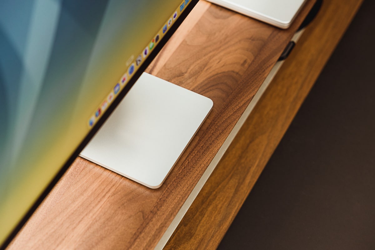
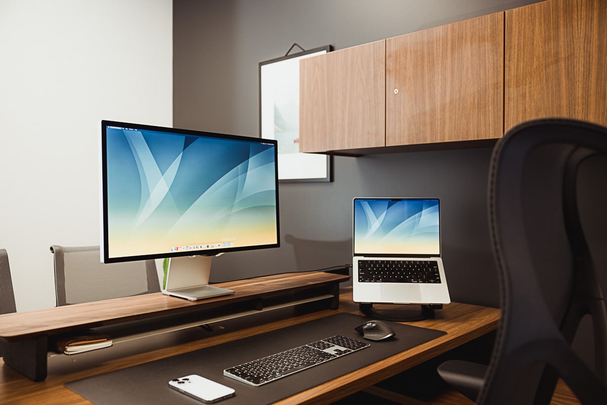
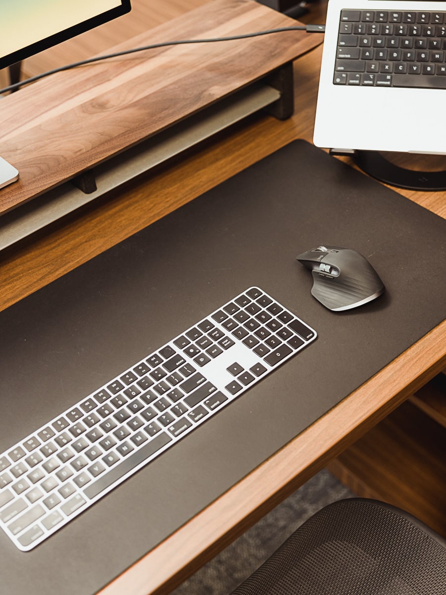
On the desk itself, I have a walnut Grovemade Desk Stand for raising my display up to a more ergonomic height. Moving the display upwards has been fantastic — not only is it more ergonomic, it also eliminates the ability to see over top the display. This means I can’t see past the display when working and others can’t catch my eyes while I’m working.
This may be the single biggest improvement I’ve experienced in my attempt to eliminate distractions. By positioning my desk such that I face the doorway when working, a passerby’s first impression is that my desk is “full.” They can’t see my eyes. They can’t see what I’m working on. And by and large, they can’t see what’s on my desk. By eliminating someone’s ability to catch a glimpse of my workspace, I’ve eliminated a variety of extra foot traffic into my focus spot.
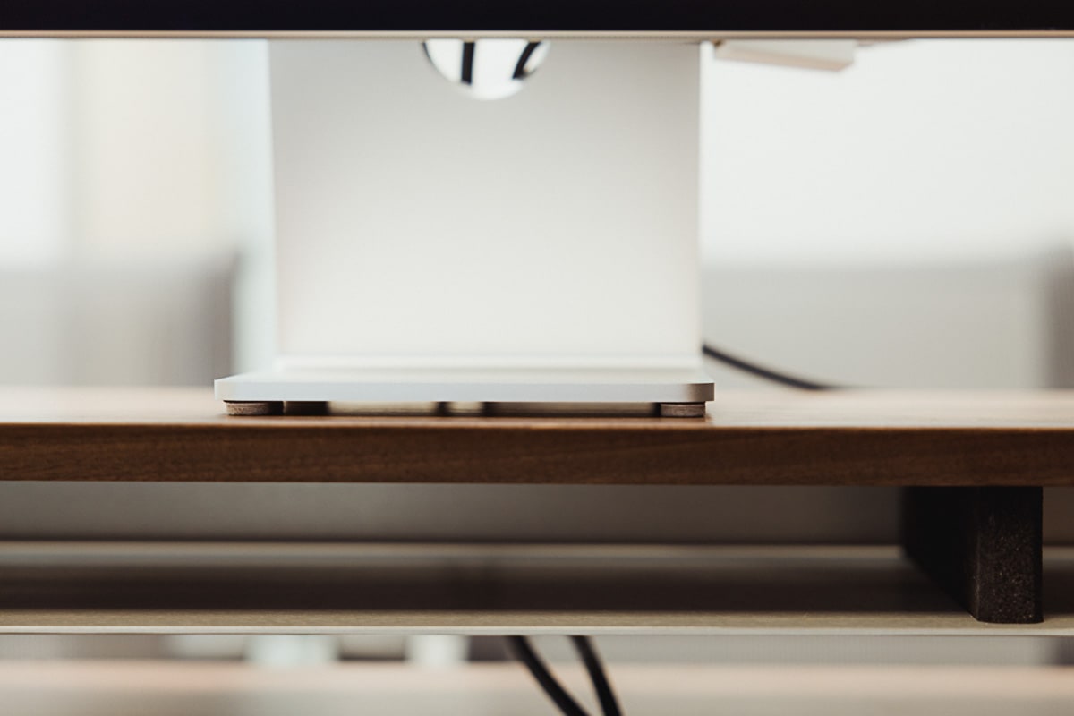
The downside to this type of desk positioning is, indeed, the difficulty in hosting client meetings. To combat this, I have put felt feet on the bottom of my Studio Display, allowing it to slide and turn swiftly on the Grovemade Desk Stand. If need be, I can turn the display, showcase what I’m working on, and move the display back into center position.
Is your productivity busted?
If you feel like you could use a tuneup for how you manage your tasks and your time, get access to our Productivity Workshop.
Shawn Blanc (founder of The Sweet Setup) covers:
1. The four most common symptoms of a busted productivity workflow
2. What you can do to overcome them
3. How to improve your approach to managing and organizing your tasks.
You’ll also get the downloadable templates and cheatsheets.
Private Office Design Priority #2: Improve Workplace Ergonomics
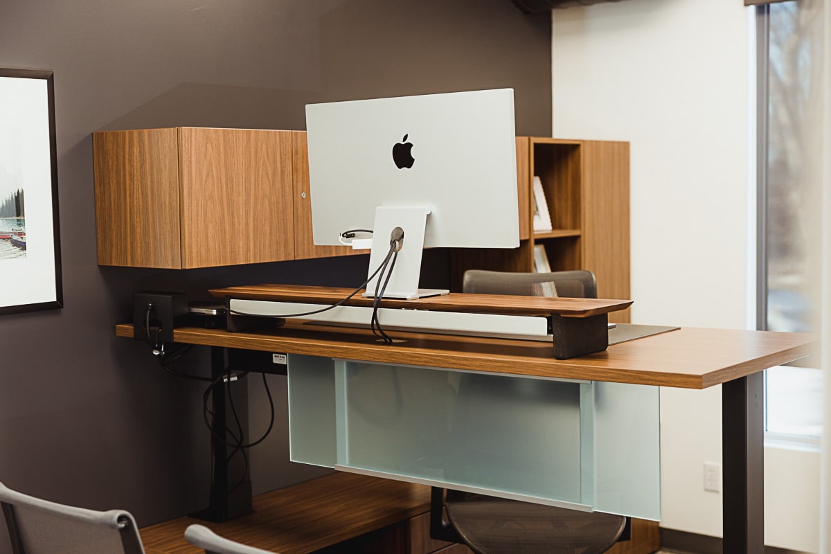
It’s such a treat to work standing up for a few hours each day. The standing desk is built right into the credenza, which still provides ample space for spreading out physical documentation for reference when working. The desk raises and lowers smoothly and quietly, ensuring the computer hardware up top isn’t in danger of falling.
The standing desk ensures we addressed our priority of improving workplace ergonomics.
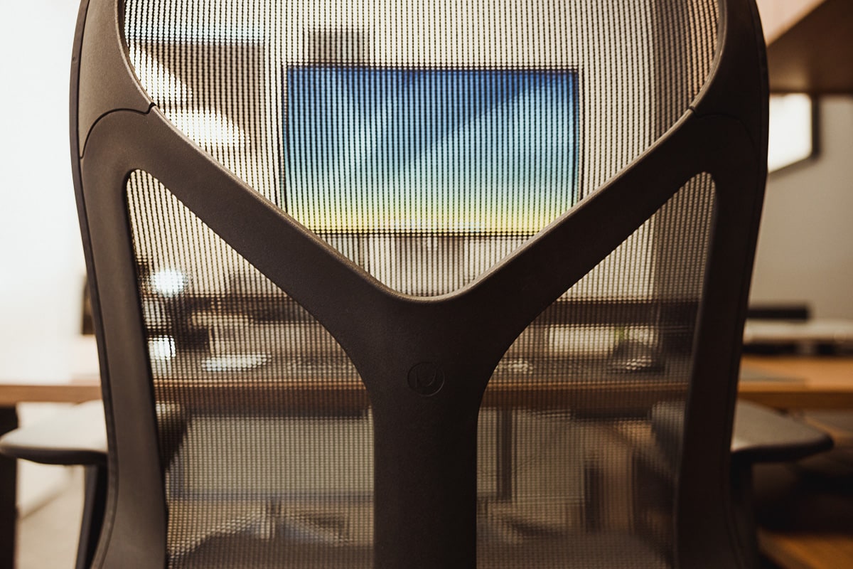
There’s more to workplace ergonomics than just a standing desk, though. We’re using Herman Miller’s new Cosm chair — which seems like the successor to the wildly popular Aeron — to ensure better lumbar support and blood flow to the legs. The Cosm’s seat is shorter than many other chairs I’ve tried, providing more space at the knee and a slight fall-off at the edge of the seat. The result is a unique feeling and more active legs when it’s time to stand up.
We tried out the Ollin monitor arm to better position external displays at the optimal height for ergonomic work. The Ollin arm is a bit rigid, though — we were hoping for it to easily swing to the side if we needed to meet with clients in our private offices. After some experimentation, we ultimately swapped the Ollin arms for Flo monitor arms, which are more flexible and easy to maneuver.
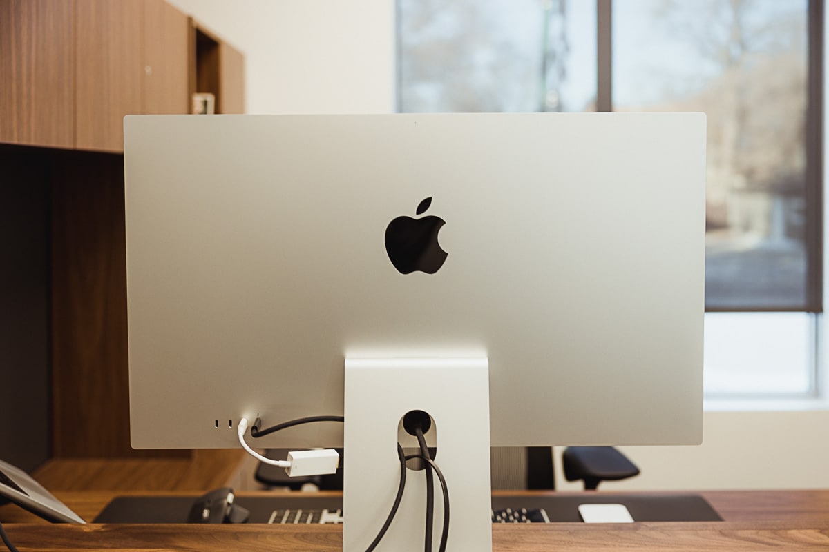
In my case, I quickly learned that monitor arms are not always meant for everyone. Every time I would move one of my displays, I would find myself tweaking the displays endlessly when I put them back. Personality drawback? Perhaps. But I couldn’t sit there for an hour each day trying to get my setup to line up perfect. (I have a few more ideas yet — one which includes a laptop mount for the Flo monitor arm — to see if I can make this work. But for now, it’s still an experiment.)
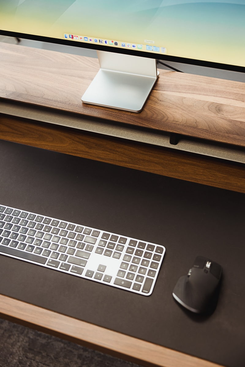
Ultimately, I opted to replace the monitor arms with the Grovemade Desk Stand and I positioned my Apple Studio Display (my own Studio Display from home) right front and center on the desk. This is ergonomically sound, for sure — there’s no neck craning right or left like you’d see in a dual monitor system split down the middle. I work in spreadsheets a lot each day, so the single monitor workflow is a little less efficient than a lengthy horizontal set of two displays. But overall, I like this setup.
The Twelve South Curve Flex Unlocks the Full Ergonomics of This Setup
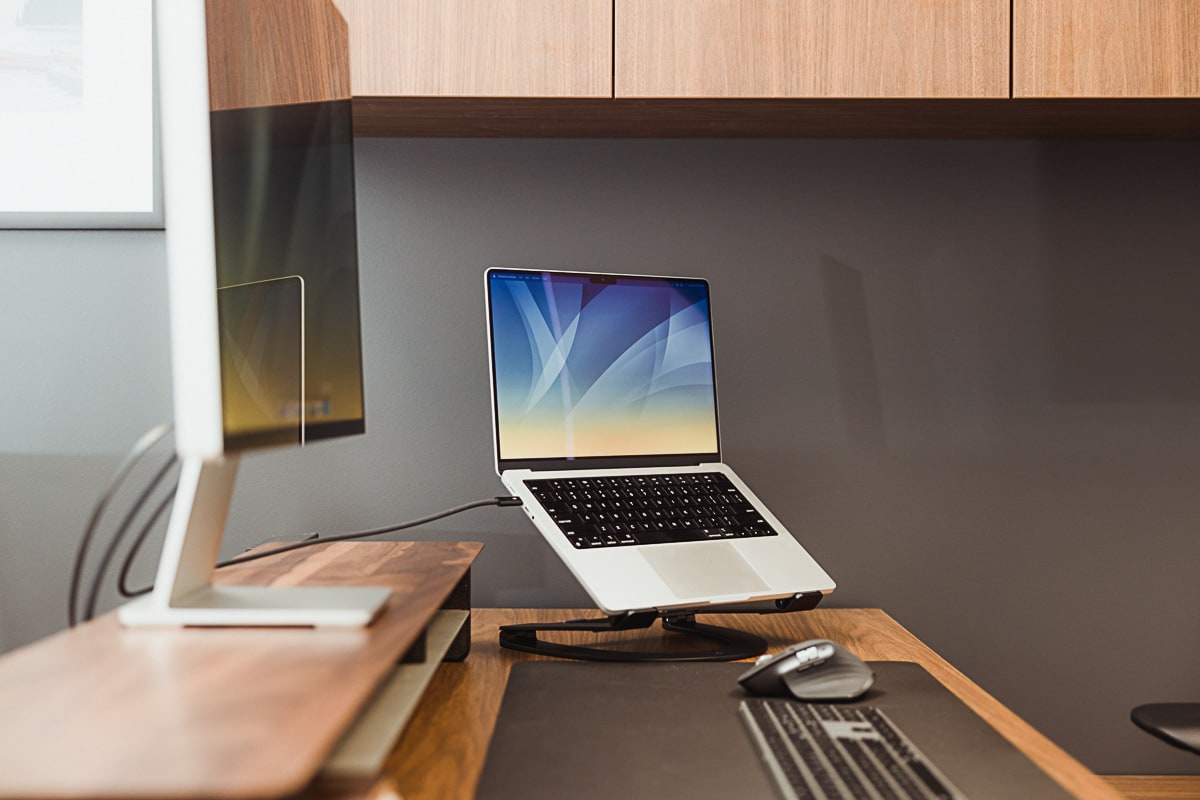
Again, it’s a very small office. Fitting in a full L-shaped desk with ample storage space was going to be tricky, especially if I wanted that sit-and-stand functionality. Having the desk built right into the credenza saves space, but does require some tweaking to ensure the desk rises without anything hitting the bottom side of the overhead hutch.
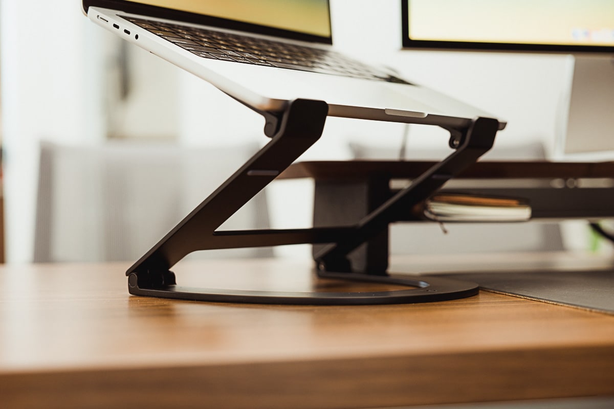
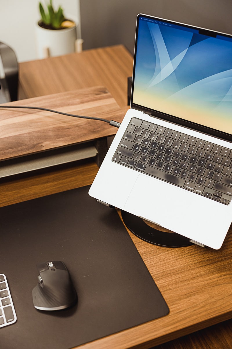
Enter the new Twelve South Curve Flex laptop stand. The Curve Flex is an evolution of Twelve South’s original Curve laptop stand. The Flex can expand to new heights and can contract into a portable, take-anywhere laptop display. Though I don’t ever see myself taking this stand on-the-go, I appreciate its ability to raise to an ergonomic height when sitting and fold away when it’s time to raise the desk to standing height.
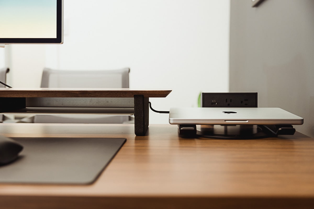
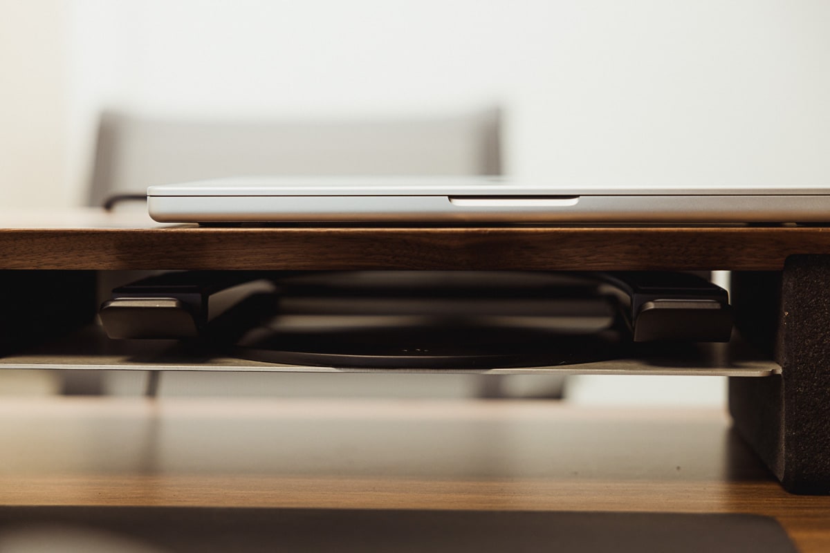
I have the Flex positioned right below the hutch, ensuring I can close the MacBook Pro and fold the Curve Flex down and out of the way when standing at the desk. If I need the extra screen real estate, I can move it to the other side of the Grovemade stand. And if I want to use the MacBook Pro below the Studio Display, the Curve Flex can be tucked neatly into the Grovemade Stand.
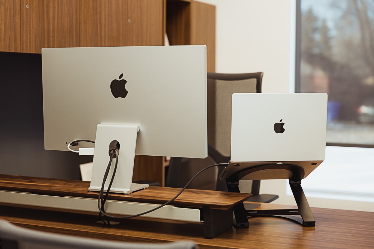
All in all, the Curve Flex unlocks the best ergonomics of this setup. It raises the MacBook Pro up to the best heights for ergonomic work, can be positioned anywhere on the desk, and can be tucked away in the smallest of spaces when I want to work on a single display. The only hiccup is the need to keep the screws tightened with the included Allen wrench. If you can get around this, or if you don’t need to constantly change the height of your laptop stand, the Curve Flex may well be a perfect laptop stand.
Private Office Design Priority #3: Increase Storage Space and Decrease Clutter
There’s more to decreasing clutter than just visual serenity — there’s a very real threat to confidentiality and there’s a straight jolt to productivity if you’re constantly looking for documentation. More than anything, I wanted our private offices to provide storage functionality and give off a strong professional impression that we are on top of our stuff.
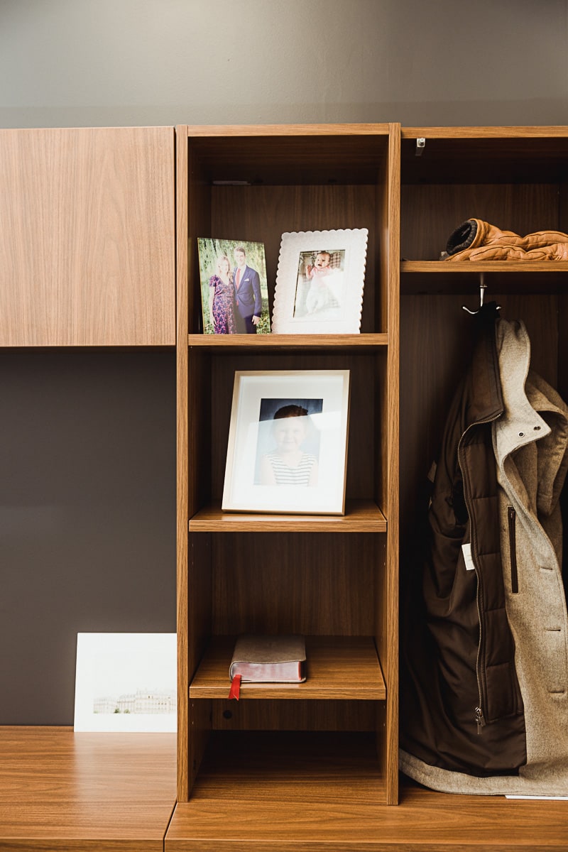
First, decluttering — we increased the number of “places” for “things” by about 200% across the office. There’s been quite a learning curve in figuring out the best place to put each particular thing, but once discovered, it’s been great to have a spot for everything.
Second, confidentiality — by having a place for everything to go, we tend now to have only what’s needed on our desks at any given time. That means one client’s documentation doesn’t leak into another client’s documentation. And if someone does indeed stroll into our office while we’re working on something, there’s a lot less to put away on short notice.
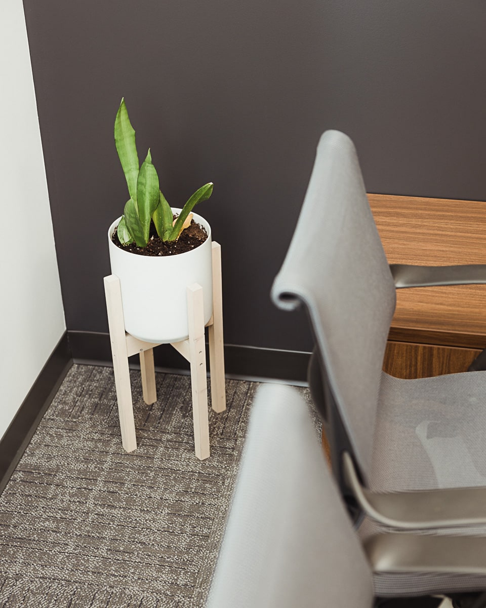
More storage space has resulted in a cleaner, tidier work environment; one that is more conducive to focused work for longer periods of time.
A Sweet Setup Dream Come True
We all tend to do our own photography here on The Sweet Setup, but I had a fourth underlying goal when designing this new sweet setup at the office: I wanted this new office to be fun and conducive to photograph from as many angles as possible.
We cut in very large windows for our private offices, both of which pour in light and eliminate most of the need to turn on the lights for most of the year. The walls are white with a contrasting Wrought Iron deep grey, providing nice reflective surfaces with subdued elements to provide depth to a photograph. The interior designer’s recommendation to go with warm walnuts and oaks is as trendy as it is photogenic.
It’s really a dream come true to photograph.
You’re sure to see more unique backdrops like this on The Sweet Setup over the coming months.
Wrap Up
I greatly appreciate the freedom — and I recognize the privilege — to create a focused workspace from top to bottom. I’ve worked in the same old office for 10 years now, and this happened to be one of the rewards at the end of the game. I don’t take the opportunity for granted.
I’m an accountant. It’s generally considered a boring profession. But I love my work. I get to help people make better financial and business decisions each day. It’s so fulfilling.
But to do that, I have to focus. I have to eliminate distractions and let my brain do the focused work.
The chance to design an office to eliminate distractions and increase focused work time was a dream come true. I’m excited to see the payoff in the years to come.
Is your productivity busted?
If you feel like you could use a tuneup for how you manage your tasks and your time, get access to our Productivity Workshop.
Shawn Blanc (founder of The Sweet Setup) covers:
1. The four most common symptoms of a busted productivity workflow
2. What you can do to overcome them
3. How to improve your approach to managing and organizing your tasks.
You’ll also get the downloadable templates and cheatsheets.
