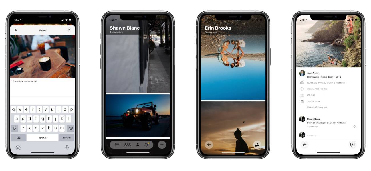
First Impressions of Glass, the New Photo Sharing App

Yesterday, a brand-new photo app came out. It’s called Glass.
Glass immediately strikes me as the best possible crossover between Flickr and Instagram.
It’s like Flickr in that it has a strong emphasis on community and quality and a little bit of photog nerdery. And it’s like Instagram in that it’s an easy-to-use, photo sharing iPhone app.
The app is very fast, very smooth, and very clean. You can tell that Tom and Stefan care about sweating the details, and it shows.
A few notable omissions that make Glass great:
- No ads: If you want to use the app it’s a subscription (with a 14-day free trial).
- No algorithm: You see things as they are posted, and when you return to the app the photos you’ve seen are still there.
- No filters: When you upload a photo, there are no in-app editing tools.
- No “likes” or “reactions”: If you want to tell someone you like their photo, then you literally leave a comment about the photo.
I love the lack of ads and algorithms. It makes the app feel clean and honest. And I don’t mind the lack of filters. But I’m 50/50 on the lack of an easy “like” or “reaction” button. On one hand, as a user of the app, I would love a way to easily tell someone that their photo is awesome. On the other hand, I like how it forces more thoughtful interaction within the community. I’ve already gotten into some friendly and casual conversations with folks that most certainly would have otherwise not have happened if we could have just doubled-tapped to like.
After a day using the app, one thing I would love to see is some take on the famous Flickr Explore gallery. This daily collection of the best of Flickr was always an amazing way to discover some of the best photos and photographers in the community. And I know that the few times my photos were chosen to be in Explore, I felt like a million bucks.
I asked Josh and Erin about their first impressions so far.
Erin Brooks:
I love how clean it is. I love that the photographs are the entire screen. I love that it shares which camera you used (now I won’t get asked 1 million times LOL). And I LOVE that it feels like it’s meant for people who just want to share their art.
Josh Ginter:
I like the focus on photography in the feed — it’s JUST photos — and how you can find out who the photographer is by peeking at the information with a swipe. I like how the metadata is shown when you tap on a photo. The comments and discussions seem to be simple and easy to follow. And all the buttons are easy to understand.
I also like that it is a for-pay service, and don’t get any ads. The only thing I don’t like is when you tap a photo to see more, it “zooms in” on the photo and you have to zoom it out by pinching it to see the whole thing.
You can find me, Josh, and Erin over on Glass: we are @shawnblanc, @josh-ginter, and @erinbrooks respectively. When you jump in to the app you can search for us if you like.
