First Look: Arc Browser

Web browsers have felt pretty stable for quite a while now. Most people use Chrome or Safari these days, and with good reason! After decades of competing web browsers, a lot of the interactions and design elements have normalized around basically the same thing everywhere.
That’s why we were so intrigued by Vivaldi recently, and it’s why Arc grabbed our attention as well; these browsers are doing something a bit outside the norm, and that’s exciting! While Vivaldi targets people who want absolute control over everything and who always want more functionality, while Arc is more focused on appealing to Mac enthusiasts who want a reliable browser that looks great and sports all the keyboard shortcuts and advanced features if they want them. Oh, and a couple surprises you probably didn’t see coming on top of that.
Arc is still in beta, but it’s so interesting that we had to talk about what makes this a special browser.
The Sidebar is Everything

The sun is to heat as the sidebar is to Arc. Or something like that.
Literally everything you do starts inside Arc’s left-hand sidebar. The sidebar houses regular tabs, pinned tabs, folders, spaces, favorite tabs, Spaces, the Library, Notes, Easels, screen captures, and more. If it exists in Arc, it exists in the sidebar.
The sidebar will take new users a little while to adjust to. Browser apps have used top navigation and tab organization since the invention of the Internet, so there are more than a few years of muscle memory to overcome. But with Arc’s vast keyboard shortcut support and the power of the left sidebar, a little practice inside Arc will pay dividends in short order.

Arc’s sidebar features require a quick bullet point breakdown:
- Today Tabs — These are essentially regular ol’ tabs. You can create as many as you want and they will pile up in the left sidebar. You can also have Arc auto-close these tabs after a predetermined amount of time.
- Pinned Tabs — These tabs move up the ladder of tab importance. You can drag any today tab into the area above the line in the sidebar and they will be pinned to that particular space. You can quickly jump into these pinned tabs at any time later on — Arc won’t auto-close these tabs.
- Folders — These are groups of tabs, plain and simple.
- Spaces — Long and short, each Space is its own sidebar, complete with its own set of folders, pinned tabs, and today tabs (more on this later).
- Favorites — The pinnacle of tab importance, favorite tabs sit at the very top of the left sidebar and transcend spaces. Favorite tabs are available anywhere across Arc and are quickly accessible by keyboard shortcuts like
Command + 1andCommand + 2.
You’ll also note you can pin Easels and Notes to any place in the sidebar. In many ways, this helps place your notes on equal footing with the web itself, ensuring you have immediate access to your applicable notes in the same window.
Arc has a built-in Split View, just like iPadOS on iPad. You can open two tabs side-by-side (these can be tabs, Easels, Notes, you pick) and work in one tab while referencing the other. You’ll quickly note tabs shown in Split View sit side-by-side in the sidebar and close out or enter into Split View right from the sidebar. It’s handy when you need it and isn’t required to get the most out of Arc if you don’t want.
Lastly, you can always hide the sidebar if you want to go full-screen. Arc does a great job of getting completely out of the way if you’d prefer. The top navigation bar is hidden by default and requires a hover to reveal window controls, and the sidebar can be quickly hidden with a Command + S shortcut.
The left sidebar could be potentially polarizing, but the sidebar’s power should quickly outweigh any muscle memory hiccups. Having everything in one spot, all navigable by keyboard shortcut, and completely customizable to your needs is a huge step forward over the clunkiness of tab management in Safari or Chrome.
Organize Your Workspace with Spaces
Arc’s left sidebar will likely alter how you think and work inside a browser. On the face of it, that sidebar looks simple as can be — tabs, tabs, and more tabs. But when you start unlocking that sidebar’s true power, you’ll start to bend the web to your needs. First and foremost, you’ll want to explore the sidebar’s separate spaces for organizing the different areas of your life.
To create a new space, you can hit the + button in the bottom right of the sidebar. Each space can be titled, given its own unique icon, and even given its own themed color to provide a visual cue of which space you’re working in. You’ll also quickly note the space is given its own little icon at the very bottom of the sidebar, allowing you to quickly click and jump to any space right away.
Each space houses its own set of pinned tabs (which can include pinned Notes and pinned Easels as well) as well as any other open tabs you’ve opened while working in the space. It took me a bit to wrap my head around the hierarchy of how tabs work inside and across spaces. Tabs that you’ve dragged right to the top of the sidebar will transcend each space and be available to you no matter which space you’re working in. If you drag a tab below the name of the space, these tabs will be pinned inside that space and only that space. And all other tabs you open while working in that space will be placed below the dividing line and can be closed off in one click with no fuss.
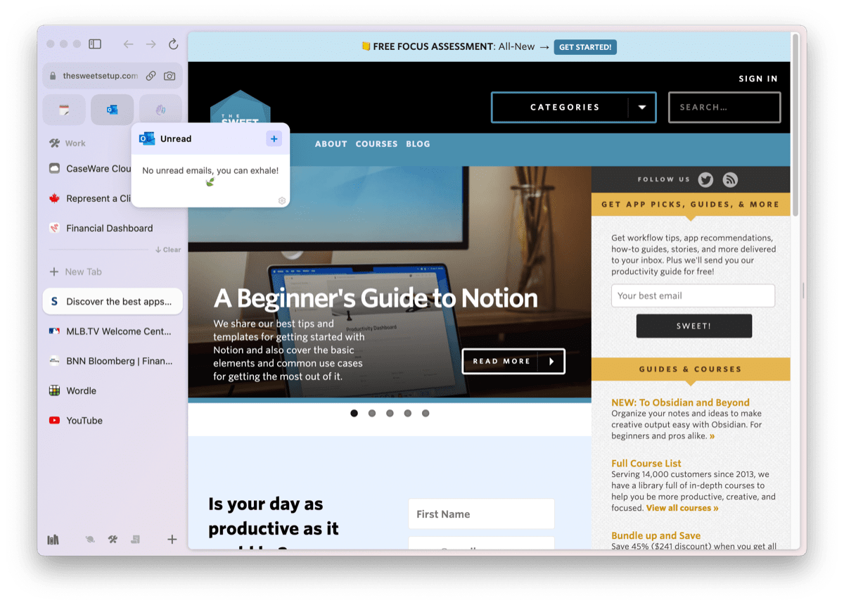
Lastly, the tabs you’ve picked to be pinned across spaces have a few special features depending on the site. For instance, if you’ve pinned Notion to the top of your Arc sidebar, you can actually preview what’s inside that tab just by hovering over the tab. This is especially cool for a tab like Outlook, where you can preview whether you have new email just by hovering over the tab. Arc even has a simple + button shortcut for creating a new page in Notion or a new email in Outlook right from the sidebar — you don’t have to open the tab and navigate to a new page or a new email!
The Sweet Setup Staff Picks for 2022
We spend an inordinate amount of time sorting through hundreds of apps to find the very best. Our team here at The Sweet Setup put together a short list of our must-have, most-used apps in 2022.
The Library
Inspiration and Personal Dashboard with Easels
No matter where you find yourself on the spectrum of preferring web apps to native apps, Arc makes using web apps a breeze. Arc is built with Google Chromium, ensuring web apps you’re used to working with inside Google Chrome behave the same way inside Arc.
Because web apps behave so well inside Arc, it’s easier and easier every day to justify working with web apps instead of the native option. If you use Hey for email, it tends to perform better inside Arc than it does inside the standalone app. Twitter? Better in Arc. Slack? Better in Arc. Arc has a way of eliminating extra apps on your computer unlike any other app we’ve tested in recent memory.
Consolidating work inside one app like this has interesting implications, especially for note-taking. In ways, you can build features on top of the web that enable you to transcend the native app. Think a meta layer for note-taking, like Jacob Jolibois pointed out here. Arc’s Notes and Easels are these web-transcendent features and become all the easier to use the more you use Arc.
Easels are a vast canvas where you can drop images, links, text, arrows, and more to build out your ideas in a visual way. You can share Easels and even collaborate with others on an Easel, making it a unique way to collaborate inside the web. And perhaps the most impressive of all, Easels can be active and live, giving you the ability to create completely customized dashboards to suit your needs.

To create an Easel in Arc, hit the + in the sidebar’s bottom right corner or press ⌃ + ⇧ + E. You’re provided a blank canvas for adding anything you want.

As an example, I’ve created a “Financial Dashboard” to help track my investments and skip out on having to visit multiple websites multiple times a day. Live screenshots are created by clicking on the camera icon in the URL bar and hovering over an area of the website. Arc will provide you an area it thinks makes sense for snipping. Once you’re satisfied with the captured area, you can add the captured area right to your newly created Easel and size the captured area however you’d like. To make the dashboard live, all it takes is a click of the Play button over each screen capture to update the little screenshot.

You can make Easels much simpler than a dashboard, to be sure. I also created an Easel with a variety of screenshots from a men’s clothing store that helped me build out a formal look for an upcoming event I’m attending. I provided that Easel link to one of the salesmen at the store and he helped me put everything together.
Easels may not be a groundbreaking new feature that will change how you work — you’l likely already have live dashboards for tracking important metrics in your life and work and many folks will have interactive ways of tracking inspiring tidbits from the web. But to have this all built into your browser is a new way of thinking about this sort of thing. Having this built on top of the web may ultimately change the paradigm for how some folks work.
Theming Arc
Arc looks great out of the box, but you can tweak it to your own liking as well with a simple and fun theming tool built into the app. Just right-click in the sidebar, go to your space options, and click the theme item.
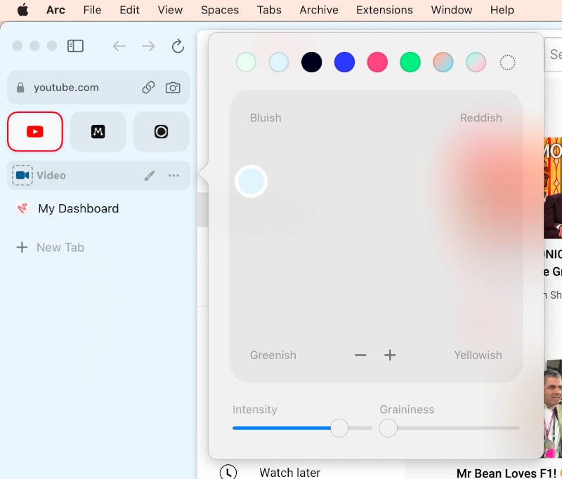
This brings up a unique color picker that you can use to select an accent color either from the suggestions at the top or by dragging the dot around the grid in the middle and finding a hue that you like. You can adjust the intensity (saturation) of the color, as well as adding some grain, which actually can look really nice.
But it doesn’t stop at solid colors. You can add up to three complimentary colors to the grid and create a gradient for the app’s UI. This could go completely off the rails, but since the app forces you to select complimentary colors, it’s pretty easy to make something that looks pretty great.
Themes are tied to your spaces, so if you’re using more than one space, you can theme each space separately. If you have one space for work and another for fun, then you could make the work space pretty neutral, but then use some big, bold colors on the fun space just for, well, fun!
The Sweet Setup Staff Picks for 2022
We spend an inordinate amount of time sorting through hundreds of apps to find the very best. Our team here at The Sweet Setup put together a short list of our must-have, most-used apps in 2022.
The Command Bar
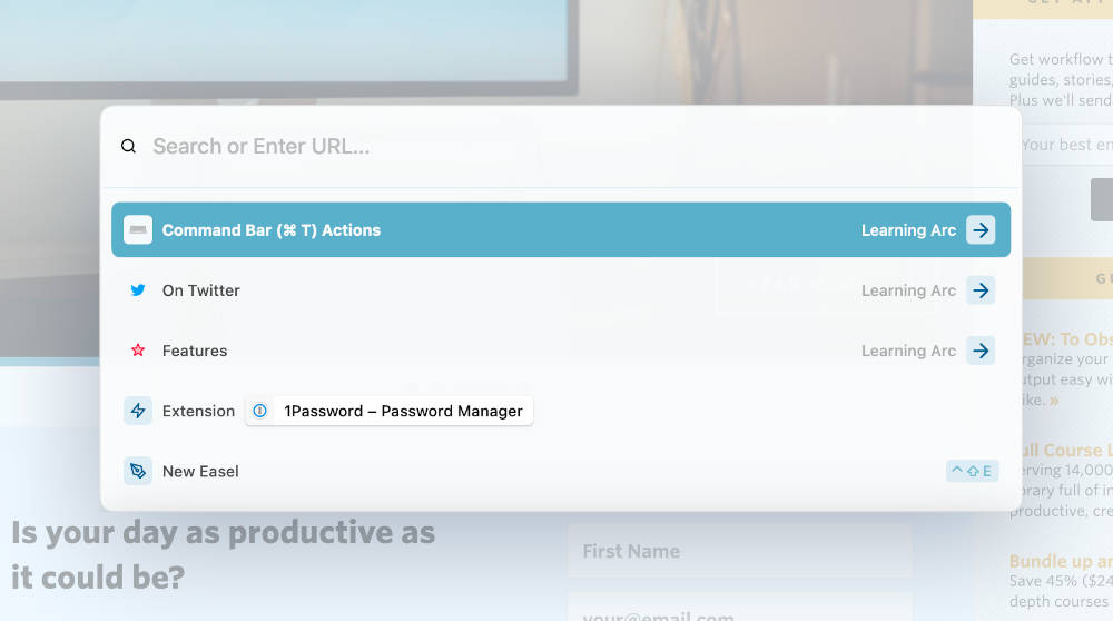
When it comes to trendy, enthusiast apps in 2022, it’s almost a given at this point that you’ll see a command bar brought up with a keyboard shortcut like Command + K, and Arc fits right in here with an awesome command bar tool. Instead of adding a new shortcut for you to memorize, Arc wisely uses the same Command + T shortcut you’d naturally use in a browser already to bring up their command bar.
Of course, you can just type a URL or a search term, but the entire app’s functionality is there as well. Want to launch an extension or open a new split view? Go for it! As of writing, there are nearly 100 actions you can perform from the command bar, and they’re all documented here.
If you’d prefer to do these things with your mouse, that’s fine too! There’s nothing in here that’s exclusive to the command bar interface, so you can choose to use it as much or as little as you’d like. As with most things, Arc manages to achieve a good balance of catering to casual and power users at the same time.
Modify Your Experience With Boosts
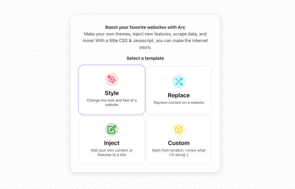
Boosts are a clever little feature that brings back an early 2000s vibe to the web that we really enjoy. The idea behind boosts is that you have control over what happens in your web browser. There are of course browser extensions that can help with this too, but it’s great to have a tool built into the browser that lets you take back a little control.
You can start creating a boost from the command bar or the plus button at the bottom of the sidebar, and then you can choose one of four things to do:
- Change the style (CSS) of the page.
- Replace content on the page with something else (JavaScript).
- Inject your own code (JavaScript) onto the site.
- Do something completely custom (CSS & JavaScript).
Boosts can be applied to specific website domains, or to every page you visit. So you may want to change the style of one website, but you may want to inject a little JavaScript on every site you visit.
As a very basic example, if you didn’t particularly like the colors on a website you visit all the time, you could create a simple boost that changes the color of specific elements on the page. Let’s say you enjoy a website, but their text is hard to read sometimes since they use a light gray font. You could create a boost for that page that’s as simple as:
body {
    color: black;
}
You may have to inspect the code to figure out what element you need to use to specifically change the text you want, but it’s that easy, and it just works perfectly. And of course, if you are familiar with CSS, you can go crazy and change everything from padding to text size to anything else you can achieve with CSS. And if there’s something on a website you just never want to see (looking at you, Twitter trending topics), you can throw a simple display: none; on that element’s ID to never see it again in Arc!
The JavaScript boosts are a bit more challenging to create, but again, if you know enough to be dangerous, this can be really useful. This is full-on code injection, so you can potentially break things. The example they give is the simple task of replacing any mention of the phrase web3 with my butt, which simultaneously achieves being an effective tutorial, as well as making reading some think-pieces much more entertaining.
Powerful Screenshots Built Right In
We spoke earlier about live screenshots when building out an Easel, but there’s so much more to screenshots in Arc.
First, to take a screenshot, hover over the address/URL bar and click the little camera icon. You can also use Command + Shift + 2 as a keyboard shortcut (which is very, very close to the same shortcuts for system-wide screenshot shortcuts in macOS). You can also simply hold down Command + Shift and drag your cursor over the area you want to capture.
Once you’ve captured a portion of the webpage, Arc provides you a sub-menu to save the screenshot, send it with iMessage, copy it to your clipboard, mark up the screenshot, send it to an Easel, and more.
Sending the screenshot to an Easel makes sense if you’re compiling ideas and inspiration in one visual canvas. But you can also send screenshots to Arc’s built-in Library, which we also spoke about earlier. The Library houses your downloaded files, screen captures, Notes and Easels in one spot, keeping everything in one easily accessible area. If you’re like me, then normally you capture a portion of your screen with Cleanshot X and save the screenshot to your desktop before ultimately trashing the screenshot at some point in the future. With Arc, this can happen all inside the browser, eliminating a messy desktop and a heaping full trash bin.
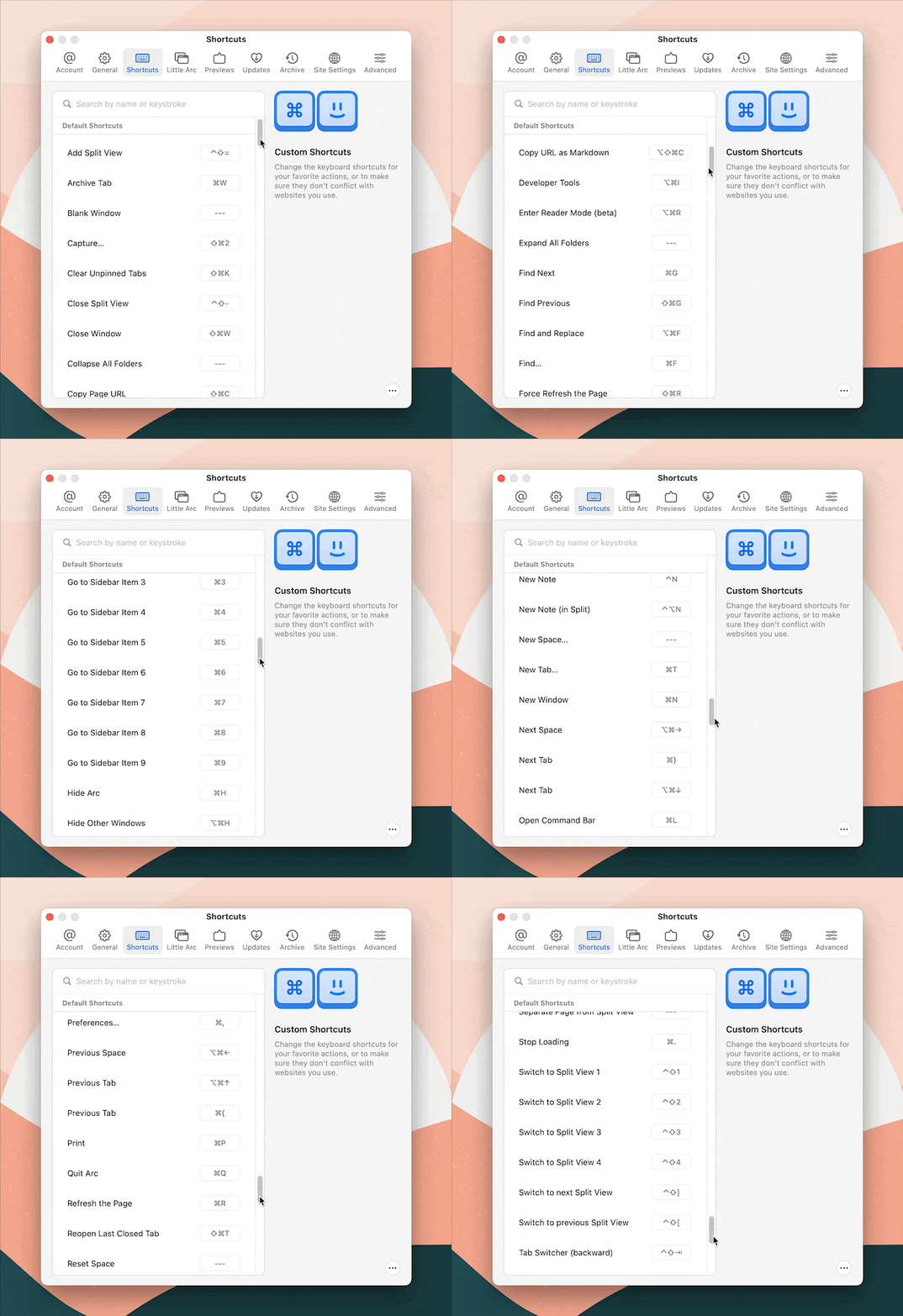
Keyboard Shortcuts for Everything
One of the things that you get hooked on very quickly in Arc is its keyboard shortcuts. All the standard stuff is here, but it’s the little extras that elevate the app in our estimation.
Command + Shift + Cis my favorite, as it instantly copies the current page’s URL to your clipboard. It even removes any trackers that may be tacked onto the end, so you’re always sharing clean links. P.S. If you are used this bringing up dev tools in other browsers, you can remap this or any other shortcut to your liking.Command + Sshows or hides the sidebar.Command + Option + Nfrom anywhere on your Mac opens “Little Arc” which is a small, minimal browser window you can use to quickly visit a site without actually switching to Arc or bringing up the whole browser. This didn’t seem useful at first, but I use it more than expected.Command + Shift + +opens a split view you can use to view two pages side-by-side.
There are a ton more shortcuts in Arc, and they can all be completely customized to your liking.
Final Thoughts
Arc is not going to make everyone happy. It’s an opinionated browser the likes of which we don’t see that often these days. The browsers from the big platform holders have really fine-tuned interfaces designed to make most people happy, and as a result, they’ve claimed upwards of 88% of the worldwide browser market. But part of being an enthusiast is looking for software that’s a bit more adventurous — things that try to push their categories forward in a way the mainstream options don’t since they need to serve billions of people. We think Arc exemplifies this attitude perfectly, and while it’s not The Best Web Browser for Everyone, it might surprise you if you give it a chance.
The Sweet Setup Staff Picks for 2022
We spend an inordinate amount of time sorting through hundreds of apps to find the very best. Our team here at The Sweet Setup put together a short list of our must-have, most-used apps in 2022.
