The iPhone XS and XS Max Review
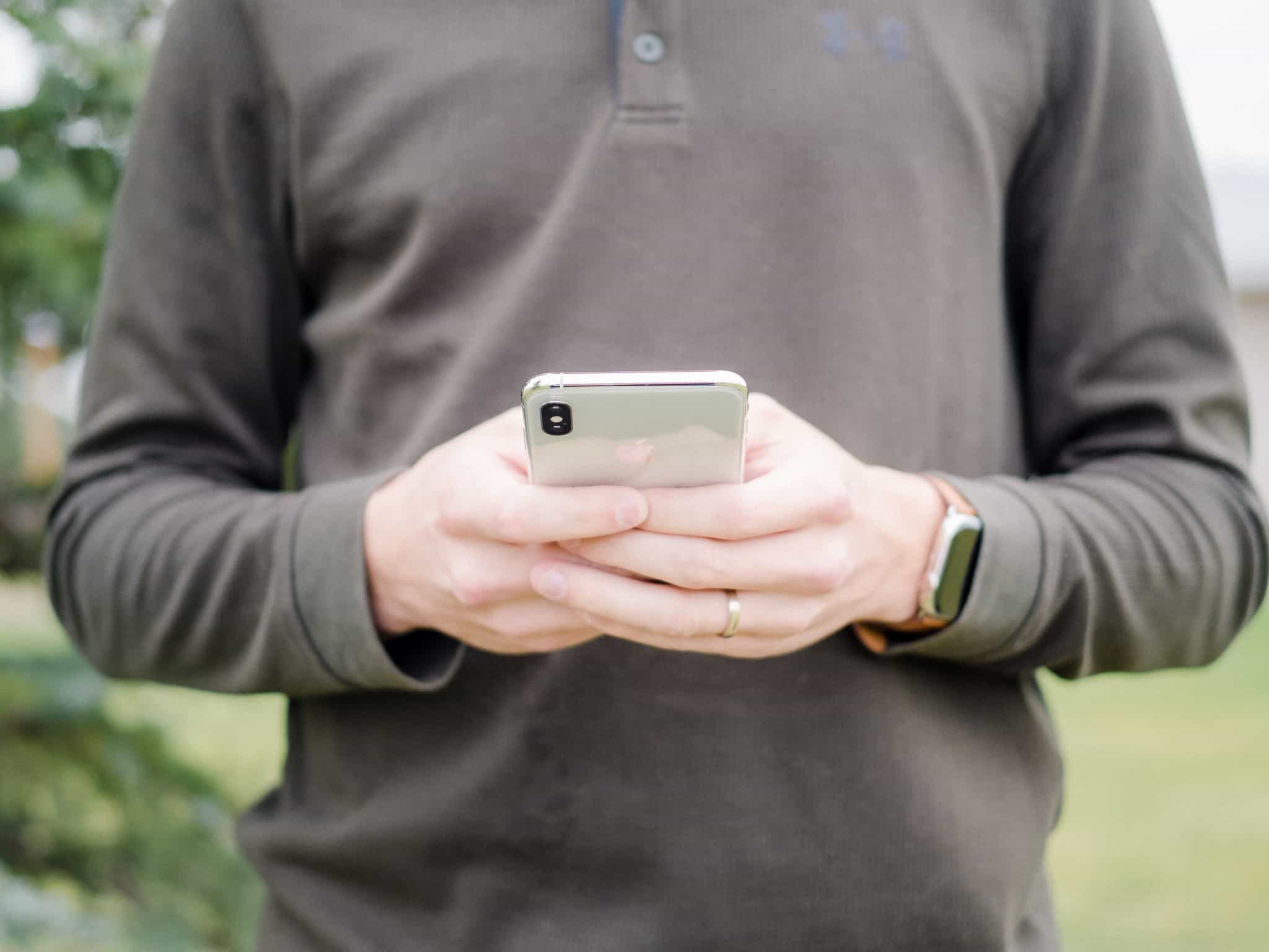
There’s very little to change in last year’s iPhone X. The X was easy to use one-handed, yet had the biggest screen ever shipped in an iPhone. Its OLED display showed near perfect color, while its cameras were able to shoot photos that took advantage of that perfect color. The A11 Bionic chip never held anyone back.
Off the top of my head, I can barely rattle off three issues with the iPhone X:
- The screen scratches very easily.
- The notch looks unsightly, despite being replicated by competitors.
- The price puts the phone in a new price territory.
For all intents and purposes, the iPhone X was an Apple experiment. (They skipped the iPhone 9 just to show off the tech, after all.) Judging from this year’s iPhone lineup, it’s logical to think it was a successful experiment.
I bet Apple learned more from the iPhone X than they had in many previous iPhone generations. For one, Apple surely gained insight into the iPhone’s price elasticity (how much demand changed given the increase in price). The market’s appetite for Face ID, the front camera notch, and the all-screen design were likely next on the school list.
So how do you make the iPhone better while checking off to-dos on the very short complaint list? How do you take what the iPhone X taught you and ensure you learn from your past compromises?
If Apple’s September keynote is any indication, you don’t do it by improving — or fixing, in more clear terms — anyone’s complaints.
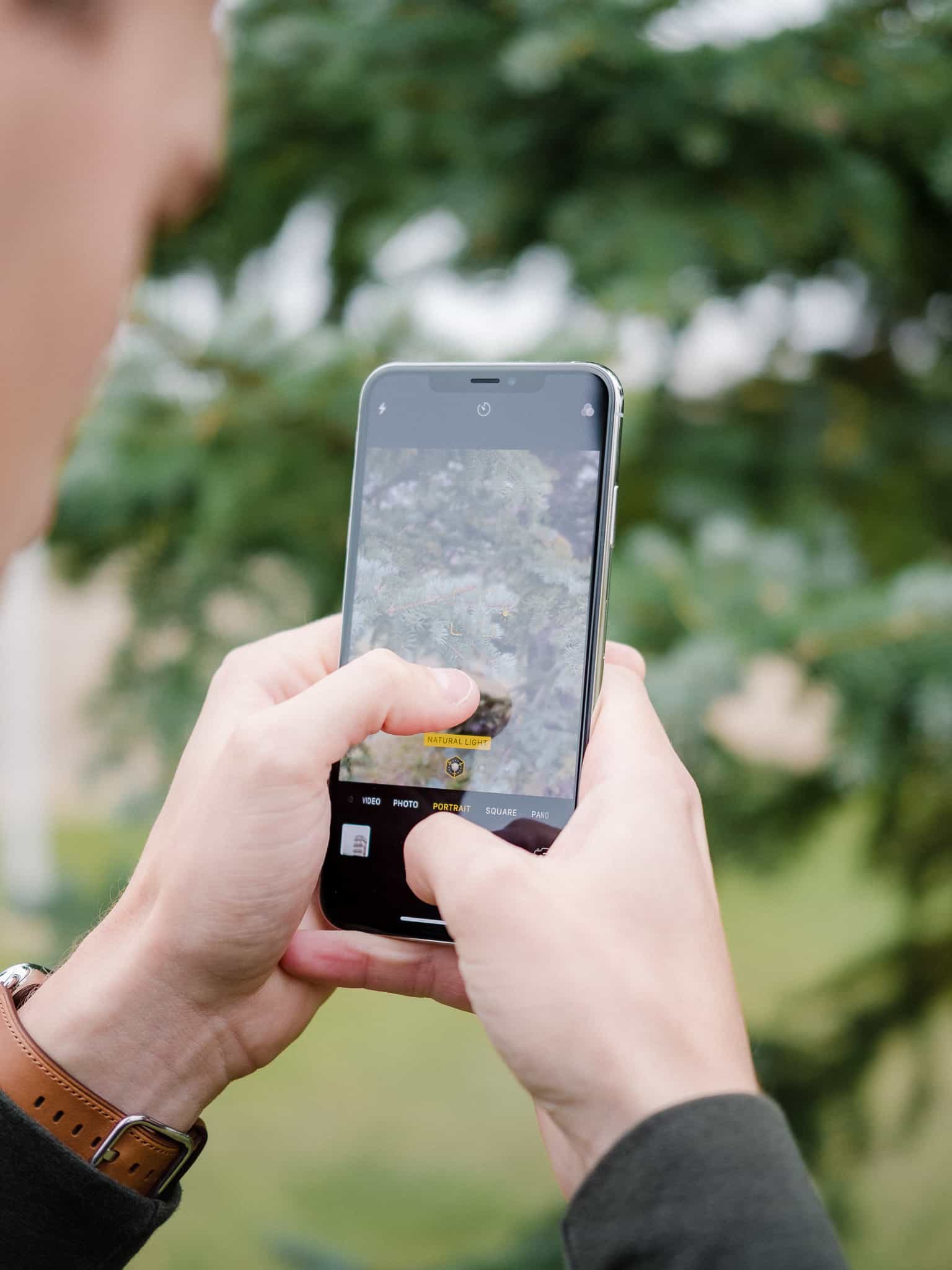
No, you improve the most popular camera in the world and you lay the groundwork for the future. And you double down on the notch and the price.
In a nut, that’s the iPhone XS and XS Max.
Editor’s Note: This review will highlight the iPhone XS Max specifically, as the author opted for the larger iPhone XS variant. As the iPhone XS and XS Max have effectively identical specifications — notwithstanding a slightly longer battery life and a larger 6.5-inch display in the iPhone XS Max — this review should be applicable to both the iPhone XS and XS Max.
The iPhone XS Max’s Large Display
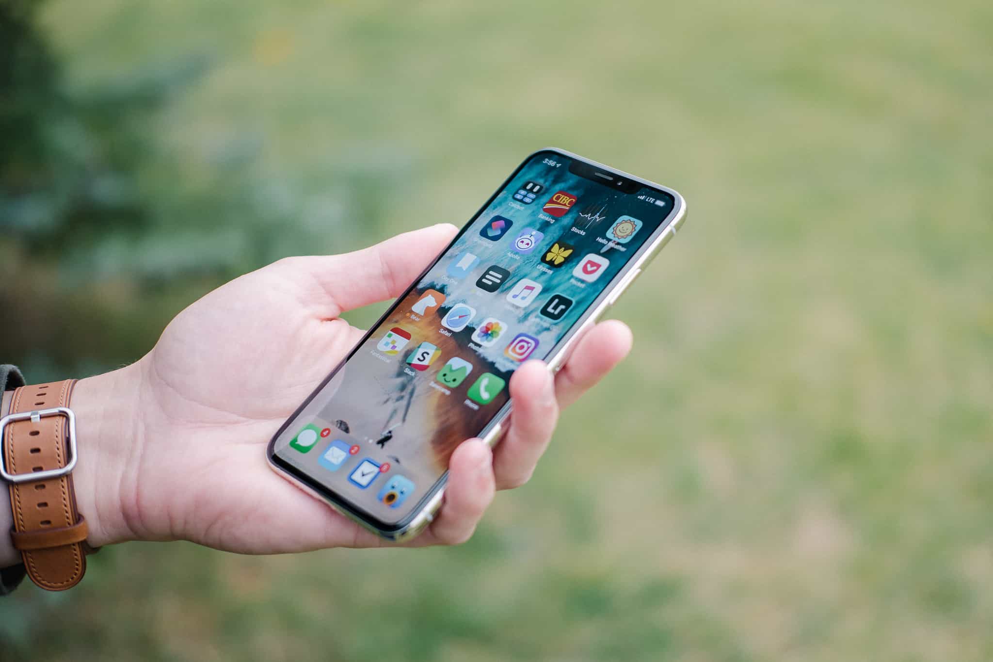
There’s effectively no difference between Plus-sized and Max-sized iPhones when it comes to body size. The Max is 0.9mm shorter, 0.7mm narrower, 0.2mm thicker, and 6 grams heavier than the previous generation iPhone 8 Plus. I’m assuming the negligibly smaller body is thanks to OLED’s ability to shrink bezels around the display, but I have no confirmation of that.
If you liked the iPhone 8 Plus’ size — or the iPhone 7 Plus or 6 Plus — you’ll like the size of the iPhone XS Max.
There does seem to be some added grippiness in the XS and XS Max generation, though. As noted by Shawn Blanc — and a few others — you’ll notice a grippier naked iPhone XS body right out-of-the-box. Again, this seems like an area where nobody was complaining, yet is a welcome improvement, especially in the larger XS Max.
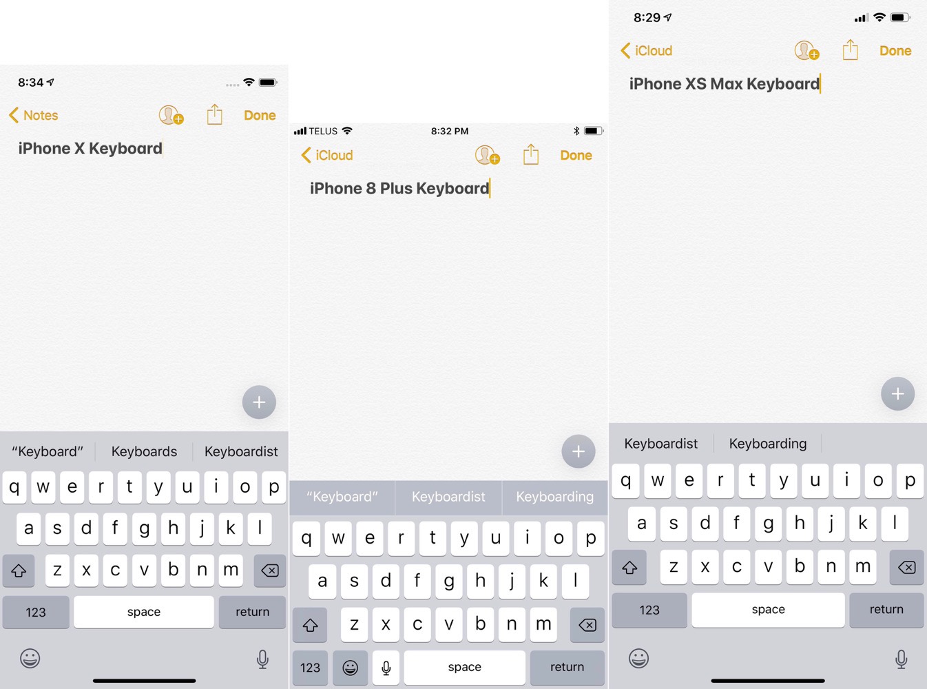
The other immediate impact of the larger XS Max screen is the software keyboard. There are a few notes in comparison to the iPhone X and iPhone 8 Plus that I’ve noticed in my short usage:
- The iPhone 8 Plus keyboard looks ever so slightly narrower than the XS Max when compared side-by-side.
- Like the iPhone X, the “123” secondary keyboard button is significantly larger on the XS Max, with the emoji and dictation buttons moving to the bottom of the display.
- The iPhone XS Max keyboard reserves the same amount of space at the bottom of the display for the emoji and dictation buttons as the iPhone X.
- Despite the emoji/dictation row being the same distance from the bottom of the display, every single key is both wider and taller on the iPhone XS Max, resulting in a keyboard that takes up more vertical space than on the iPhone X. The iMessages app tray at the top of the keyboard is also taller on the iPhone XS Max.
- The top of the keyboard area lines up almost perfectly1 with the iPhone 8 Plus keyboard on the vertical.
- Landscape keyboards are identical between the iPhone X and XS Max. The XS Max just has more grey space between the edge of the display and the edge of the keyboard.
These last three points are significant, at least to me. Apple has effectively combined all the best elements in its iPhone keyboards to date in the iPhone XS Max. They’ve made no change on the location of the iPhone XS Max’s keyboard — it’s still the same distance from the top and bottom of the iPhone’s body — ensuring the device isn’t top-heavy and unbalanced when you’re typing. They’ve included the extra large “123” keyboard function button in the bottom left for quickly jumping to secondary characters and figures. And they’ve maintained the sizing of the emoji/dictation bar from the iPhone X.
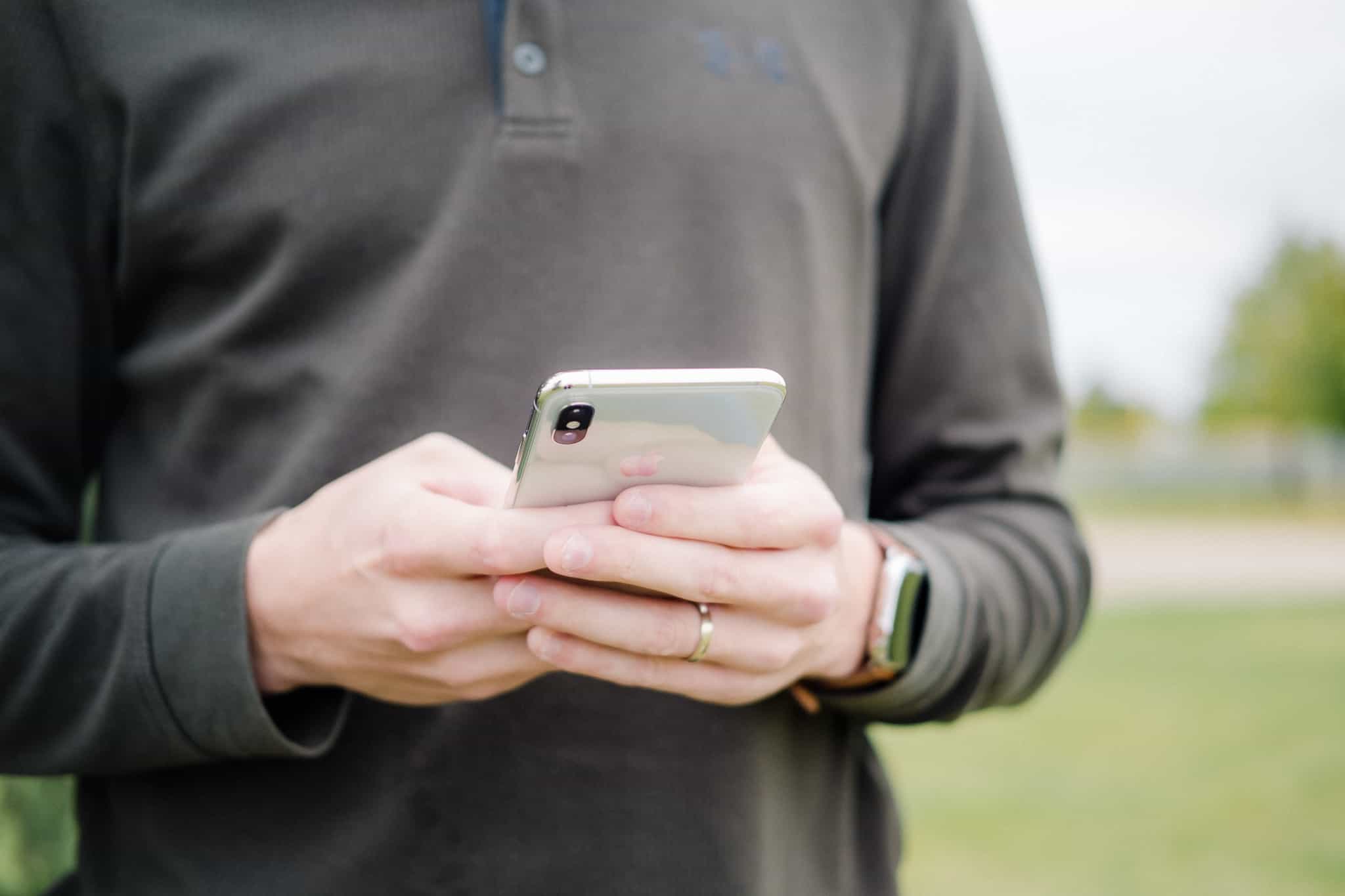
This tells me a few things. First, Apple feels it nailed the placement of the keyboard not only on the Plus-sized iPhones (which makes sense — they’ve had four generations of Plus-sized keyboard experience to fall back on) but also on the experimental keyboard on the iPhone X. That emoji/dictation bar that some folks discussed in the early iPhone X launch days changed only in relation to the changes of the Plus-sized keyboards. Apple knows it nailed the all-screen software keyboard — both portrait and landscape — and it’s sticking to its guns.
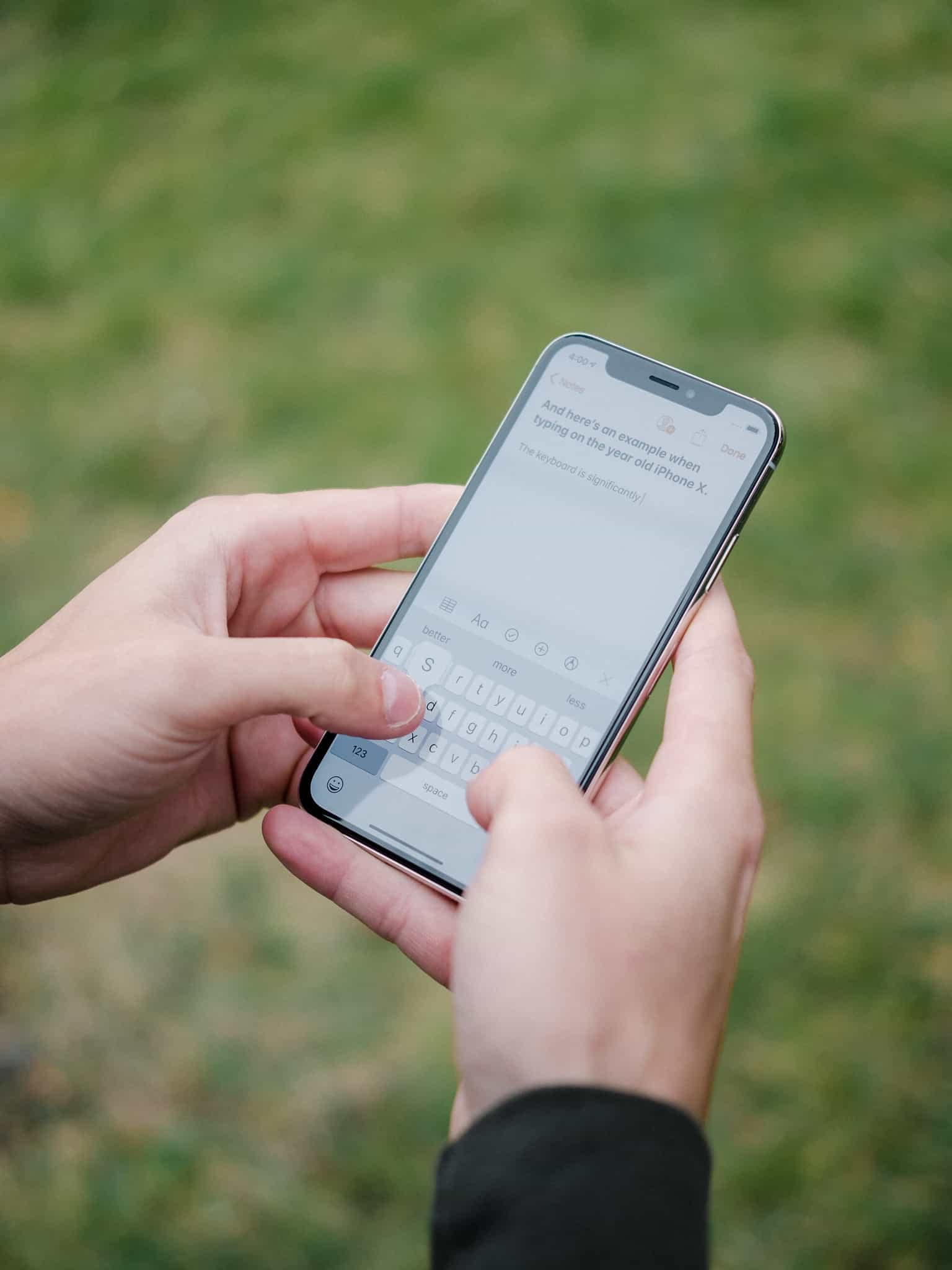
Typing on the smaller iPhone X.
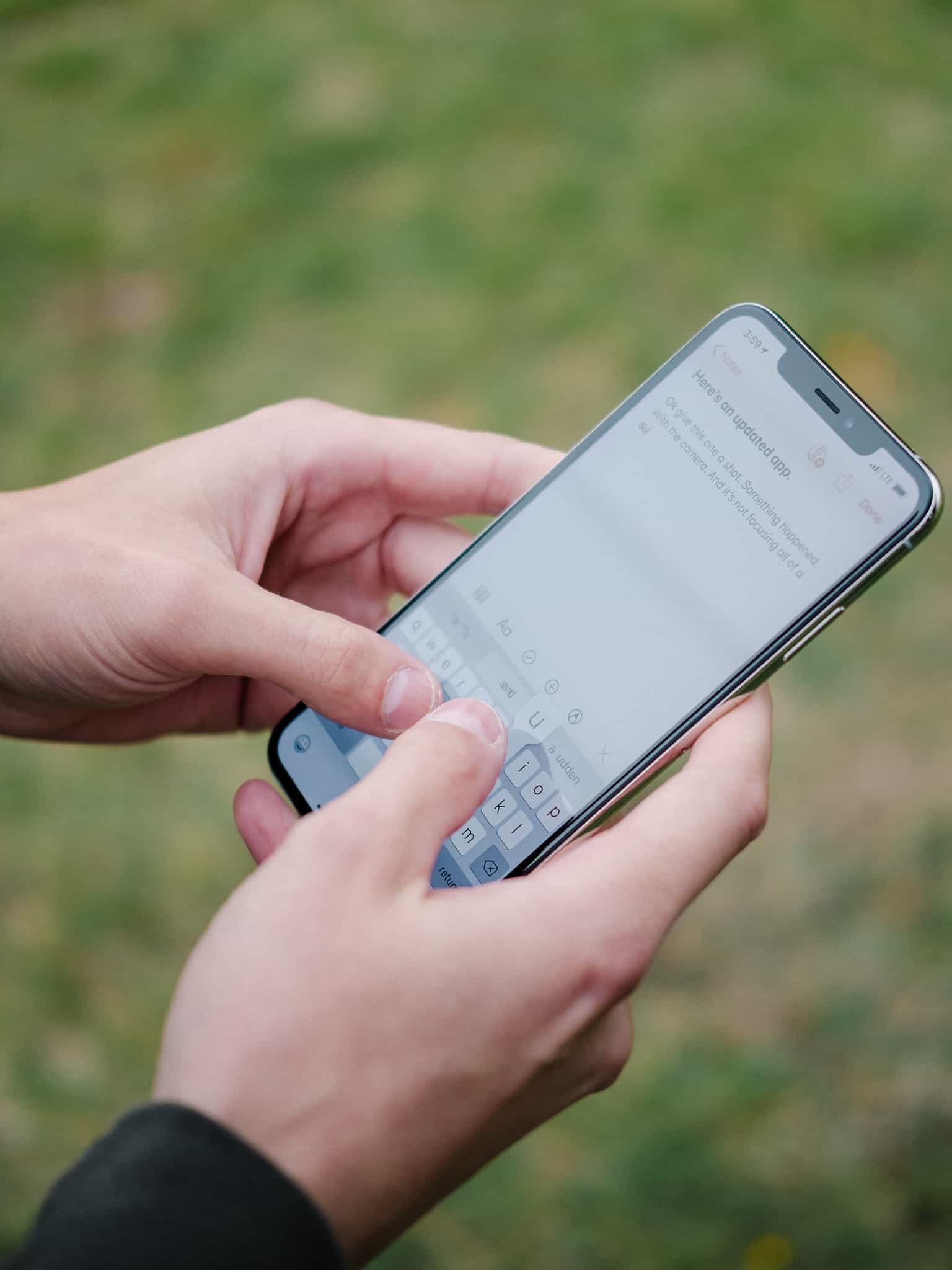
Typing on the larger iPhone XS Max.
The resulting experience is everything you’d expect it to be. The XS Max’s keyboard is easily the best iPhone keyboard ever created. It’s fast, expansive, and, insofar as QuickType and Autocorrect don’t get in the way, is the most accurate iPhone keyboard to date. I’m willing to bet, for many users, the size and feel of this keyboard is going to be the most underrated feature of the XS Max over the next year.
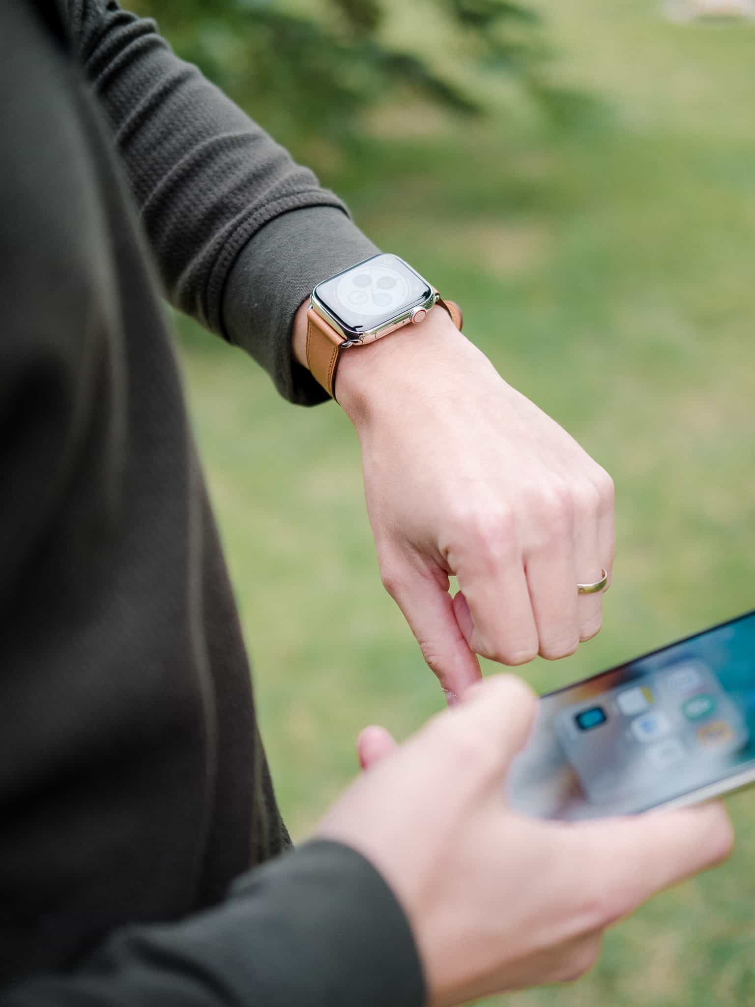
The iPhone XS Max, more than any previous iPhone, feels like it was made with the expectation of Apple Watch ownership. By that, I mean that this phone does not feel like the kind of phone you want to whisk out of your pocket every other minute of every day. I’ve owned Plus-sized iPhones in the past and never felt this way. Perhaps it’s the extra large screen. Perhaps it’s the pending repair bill if you drop the big, beautiful display. Perhaps it’s the enticing new Apple Watch Series 4. Whatever the case, the iPhone XS Max feels like it was built with no regard for size and the expectation that you have an Apple Watch on your wrist.
I haven’t noticed too many other significant changes in my short time with the XS Max.
- The lock screen number pad is a touch larger, for when Face ID misfires.
- There is no extra row for extra icons on the XS Max home screen, despite the greater vertical screen space.
- The notch is identically sized, meaning the screen “horns” (upper right/left corners) are larger.
- The sleep/wake, volume, and mute switch are all the same distance from the top of the phone body in both the iPhone X and iPhone XS Max.
The amount of space wasted in the “horns” isn’t comical, but does look out of place. I’d like to see Apple modify this area in some capacity to better use the extra screen width.
And unfortunately, we’ll all still shoot an extra thousand inadvertent screenshots this year when trying to lock or unlock our iPhones.
The iPhone XS Antenna Lines
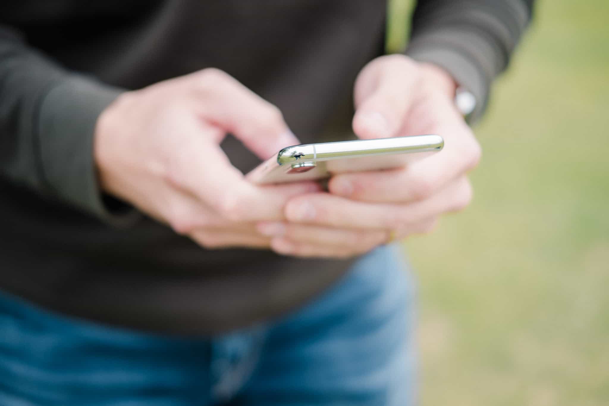
I’m sure the placement and asymmetry of the iPhone XS antenna lines will give Jony Ive nightmares. I share the sentiment many others have stated: The faster LTE speeds are worth the compromise of oddly placed antenna lines.
But that doesn’t mean these antennas look good. They ruin an otherwise elegantly designed phone.
The New A12 Bionic and Neural Engine
This feels like one of the smallest year-over-year speed boosts we’ve seen in iPhone history, especially considering it’s an “S” year.
But my experience with the iPhone XS Max over the weekend hasn’t been marred by an inconsequential speed increase. I’ve seen speed boosts all over iOS 12, from snappier execution in the share sheet, to faster jumping between apps, to quicker exports out of Lightroom CC. Heck, when I grabbed my wife’s iPhone 8 Plus and sent myself a message through the share sheet, it moved so slow that I thought something was wrong with the phone. I think it’s a stretch to say there’s no noticeable speed increases in the iPhone XS generation.
Apple spent a ton of time talking about the Neural Engine’s ability to run 5 trillion operations per second and the impact it has on machine learning throughout the iPhone experience. I don’t doubt the Neural Engine’s capability — especially in relation to augmented reality experiences and the new iPhone XS camera (more on that in a bit) — but this, to me, appears to be the hallmark ground laying feature for the future.
Apple has fought this “planned obsolescence” argument for at least a few years now, and there’s no bigger right hook than iOS 12. iOS 12’s impact on five year old phones is nothing short of jaw-dropping, as the company has now released an entire mobile OS that boosts performance more for Apple’s least-desirable customers (read as customers who upgrade less often) than for its most loyal annual upgraders.
The iPhone XS generation continues this trend, and it comes in the form of this Neural Engine and A12 Bionic chip. Sure, Apple touts 15% gains, 50% lower power usage, and 50% faster graphics in the latest Bionic chip. But this, combined with the Neural Engine’s machine learning capabilities, provide more than ample headroom for future iOS releases to take advantage of.
The iPhone XS Camera System
The Neural Engine churns out 5 trillion operations per second and Apple effectively decided to put this to best use in the iPhone XS camera system. I’m sure the Neural Engine is used throughout the iPhone in ways we hardly understand, but the single biggest selling feature of the Neural Engine is in this new camera system.
There is only one major hardware improvement in the new iPhone XS camera system. We’ve got the same 12MP sensors on the back and the same 7MP sensor on the front, and all lenses have the same apertures as in the iPhone X camera system. Apple flew a “deeper pixels” feature under the radar, which as John Gruber discovered, is the same as increasing the wide-angle back camera’s sensor by 30%. This is tremendous news and will give any photographer pause and gives the iPhone XS substantially better low light performance.
Apple used the term “computational photography” multiple times on stage in early September. My understanding of computational photography is basic, but in effect, Apple is using the smarts around the camera system to improve images rather than using the actual camera system to improve imagery.
One is governed by physics. The other is governed by… something. But it’s not light physics, that much I’m sure of.
Really, this is Apple’s only real foot forward. The iPhone can’t get thicker (think inches thicker) to accommodate a larger lens. And larger sensors require larger lenses, so this pushes Apple into another physical boundary.
No, the best foot forward is to improve the computer around the camera system and use machine learning to almost “create” images rather than “shoot” images.
There’s a lot to digest here.
Smart HDR
As per Apple, the A12 Bionic Neural Engine gives the iPhone camera system the power to constantly shoot frames, even when you’re not firing the shutter. So, as you’re composing your image in the camera viewfinder, the iPhone XS is actually snapping a gazillion photos.
In the split second that you fire the shutter — which is now instantaneous, as the camera has already captured the image you’ve fired the shutter for — Apple’s Neural Engine kicks in and analyzes the four photos captured at that very instant. It grabs the best aspects from each of those four images and combines the results into a single Live Photograph, complete with accompanying video and sound. (For Portrait Mode photos, it’s shooting far more photos and analyzing much more data.)
Despite an overall underwhelming improvement in hardware (if you disregard the 30% larger sensor we learned about after the fact), the difference in results between the iPhone X and XS are jarring.
Note: All photos in this section were shot on the iPhone X or iPhone XS Max (as noted) and are unedited, straight-out-of-camera photos.

iPhone X photo on the left. iPhone XS Max photo on the right.
Of all the photos my wife and I shot over the weekend to test out the new cameras, the above photo really brought out the color improvements in the iPhone XS. Perhaps this is just a misfiring of the auto white balance of the iPhone X on the left, but the iPhone XS Smart HDR features allow the iPhone to capture wider dynamic range, and thus brings out far truer-to-life colors. Notice not only the improved colors of the leaves and the reeds in the foreground, but also the enhanced detail and color in the fence and the house behind the trees.
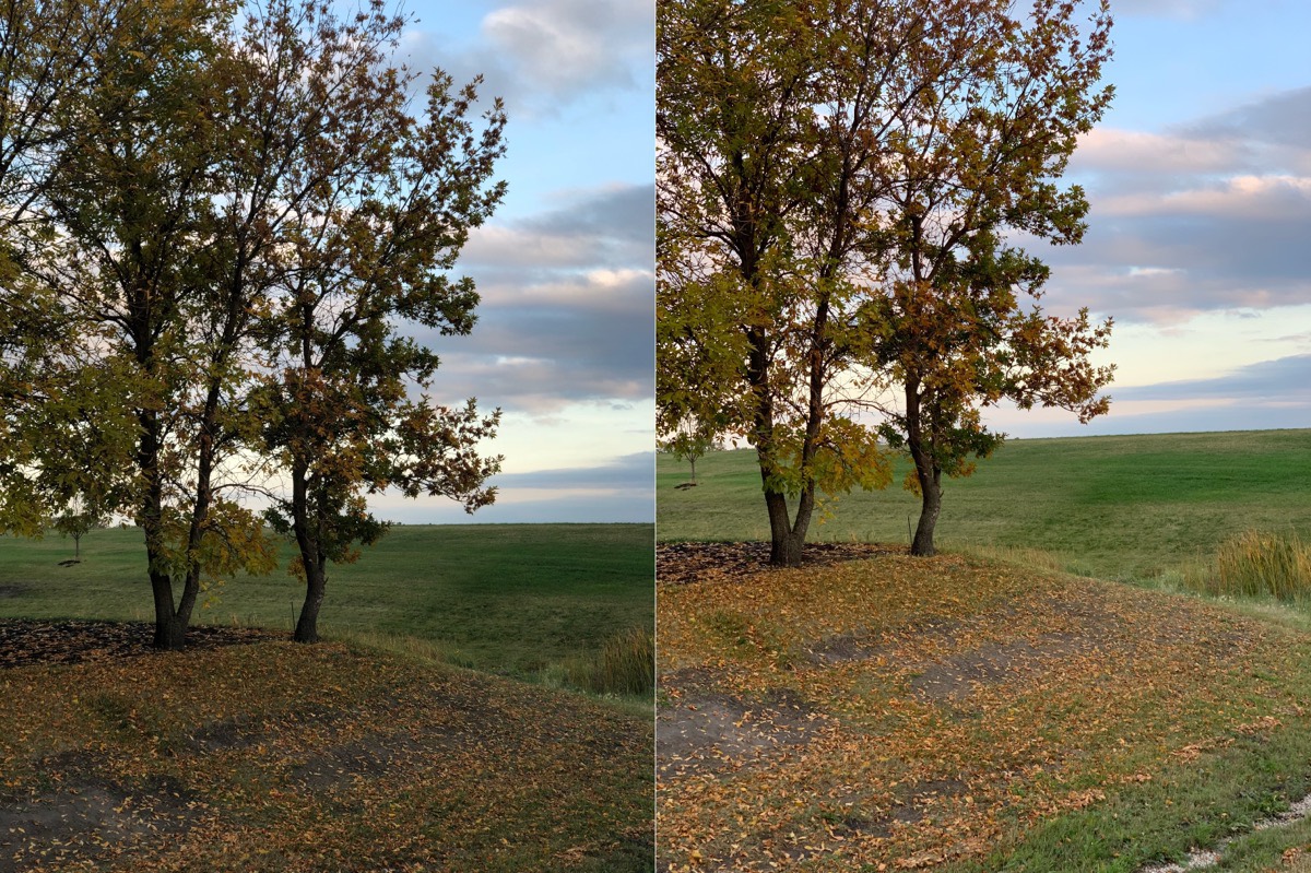
iPhone X photo on the left. iPhone XS Max photo on the right.
Another photo where the iPhone XS color simply blows away the iPhone X. These aren’t perfect compositional replications, but the improvements in the iPhone XS color are on full display here. Of more importance, at least to me, are the details in the highlights and shadows in the clouds. The iPhone X’s clouds are more polarizing, as they jump from white puffs to deeper grey colors faster. The iPhone XS’s clouds maintain their colors through larger ranges and appear softer and more vibrant. Amazing.

iPhone XS Max photo on the left. iPhone X photo on the right.
Finally, we have another where the softer clouds take immediate effect in the iPhone XS shot on the left. More dramatic are the oranges in the clouds just above the horizon, while the iPhone X’s oranges fade in and out of a peach color and don’t have the same impact.
If we jump in and do some pixel peeping, there’s a tremendous improvement in detail as well (which isn’t always the case, as we’ll see). Thanks to the Smart HDR features, the iPhone XS is able to use overexposed — or at least more exposed — photos to bring out details in the reeds and the pine trees in the shelterbelt. If you can take these images and throw them onto a 27-inch Retina display, you’ll be able to quickly see how much more detail there is in the farthest off points of the image.
And just to bring home the argument about vastly improved detail in the iPhone XS camera system, check out these sunflower shots compared side-to-side. I don’t even need to tell you which is the iPhone XS and which is the iPhone X.

iPhone XS Max photo on the left. iPhone X photo on the right.
Between the vastly improved detail and color on the left, I’d be happy with the year-over-year improvements in the iPhone XS camera system.
But there’s more.
Wider Field of View
Again, as some keen eyed reviewers have already pointed out, there’s a not-insignificant difference between the iPhone XS and iPhone X field of view. Generally speaking, the iPhone X has housed a full-frame equivalent focal length of 28mm for as long as I can remember. The actual focal length is minuscule, but the full-frame equivalency brings it on par with popular cameras like the Leica Q.
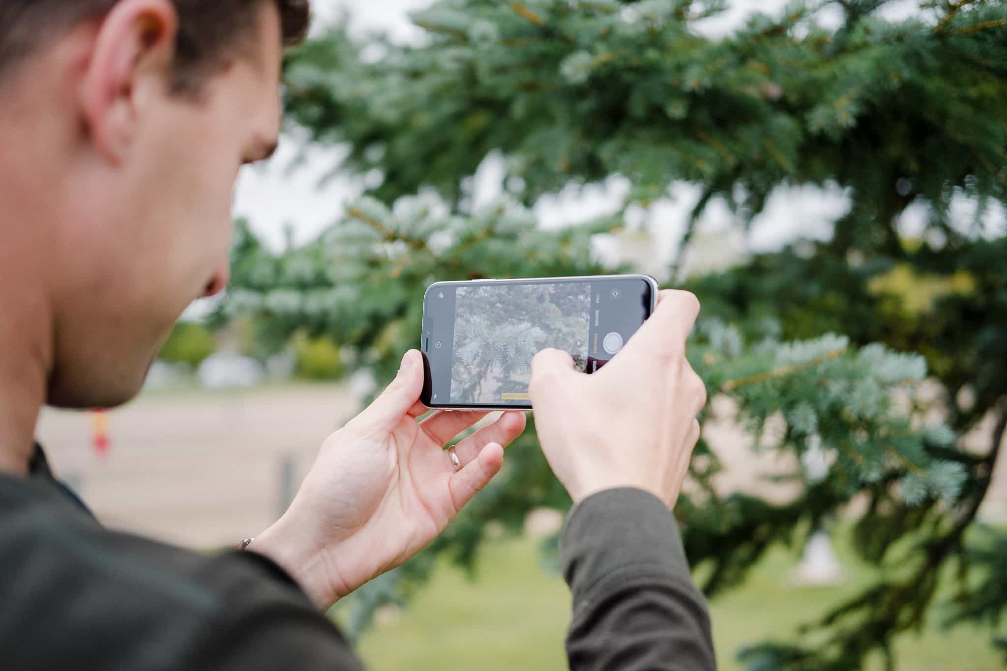
The iPhone XS field of view is slightly wider at 26mm. You can find this information either in the Photos app or in the Technical Readout page in the latest build of Halide manual camera app.
My work in all of these images was handheld and not with a tripod with dual iPhones, so the results aren’t perfectly scientific. That said, I worked hard in this comparison to take the photo from the exact same position.
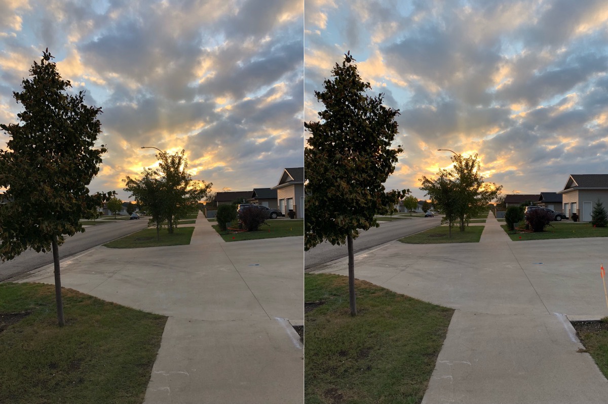
iPhone X photo on the left. iPhone XS Max photo on the right.
It may not be immediately noticeable, but look at the amount of extra detail in the chalk lines on the concrete in the immediate foreground. There’s an extra foot or two of real life real estate there.
And again, this doesn’t mention the improved color in the backlit trees and the golden clouds.
Portrait Mode
What started as a gimmick and a hit-but-mostly-miss feature, Portrait Mode has improved exponentially since its debut. The iPhone XS promises the best Portrait Mode yet, again thanks to its Neural Engine.
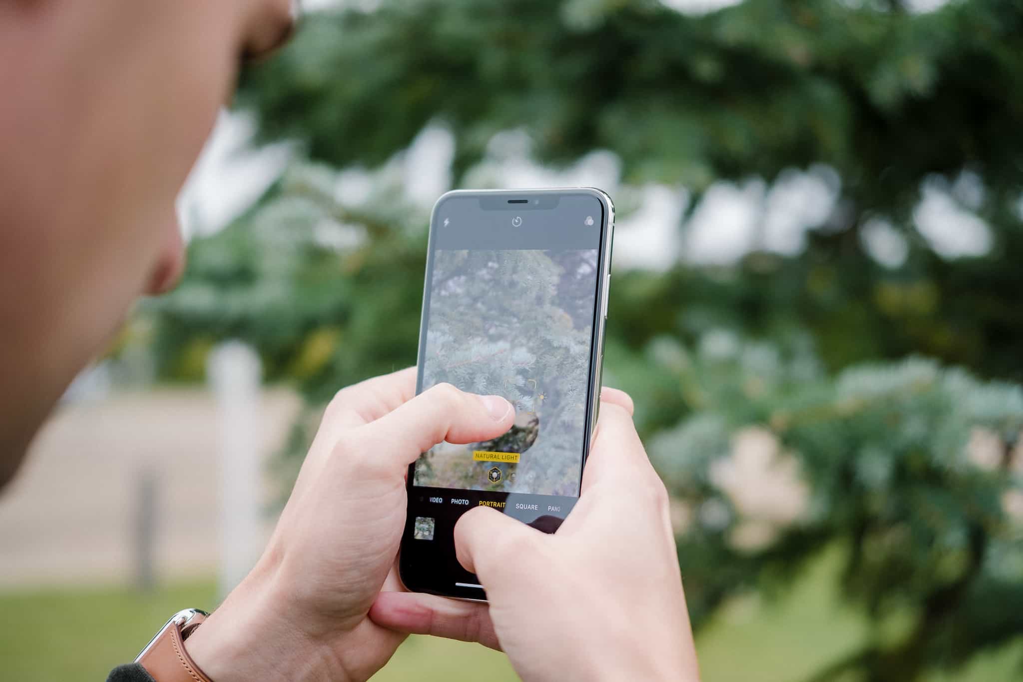
So much of Portrait Mode depends on lighting, on the busyness of the subject and the subject’s background, and on your timing when you fire the shutter. It’s still best suited for photos of people rather than objects, and it really struggles with free space, say, between a person’s bent arm and their body.
Here’s a comparison of Portrait Mode on the iPhone XS (left) and the iPhone X (right), both of which have a few notable differences.

iPhone XS Max photo on the left. iPhone X photo on the right.
- As already discussed, the iPhone XS handles color in the sky’s highlights vastly better than the iPhone X.
- The iPhone XS has a warmer white balance, bringing out a fuller skin tone than the iPhone X.
- If you pixel peep, the iPhone XS has a much improved focus fall off away from my wife’s head. The iPhone X’s focus fall off is still far better than previous Portrait Mode iterations, but the fall off is more abrupt and less pleasing.
- Portrait Mode on the iPhone XS handles stray hairs significantly better than I remember.
But here’s the one glaring observation I have for this set of comparison portraits: The iPhone X portrait appears to have more detail in my wife’s face, while the iPhone XS really shows off its processing work on her skin.
Sure, her skin is more sterile and less fulsome in the iPhone X shot, but there are lost details in the iPhone XS portrait. The smallest blemishes on my wife’s left cheek have seemingly been whisked away, while the tip of her nose is dramatically smoothed out. Same goes for her forehead.
There is a tremendous loss of detail in my wife’s face in the iPhone XS portrait.
I looked at the photo and almost couldn’t believe what I was seeing. So I snapped a photo of my daughter. The smoothing was the same. I snapped a few comparison photos of a wilting hydrangea in our front yard, and the comparison was more in line with what you’d expect.

iPhone XS Max photo on the left. iPhone X photo on the right.
The iPhone XS photo on the left has significantly more detail than the iPhone X shot on the right, seen most prominently in the detail on each petal and on the stems at the heart of the flower.
Clearly, Apple is doing some major processing on skin tones and blemishes to make faces look more true to life. If my tests are any indication, Apple is sacrificing detail for improved contrast and color, and they seem to bank on users viewing these images on smaller iPhone and iPad screens, not on large 27-inch Retina Displays like the one I’m writing this review on.
Depth Control
The term “computational photography” comes to life in Apple’s newest Depth Control feature. In short, Portrait Mode photos can now have their background blur changed after the fact and the resulting background blur (bokeh) now has characteristics in line with the characteristics of high end camera lenses.
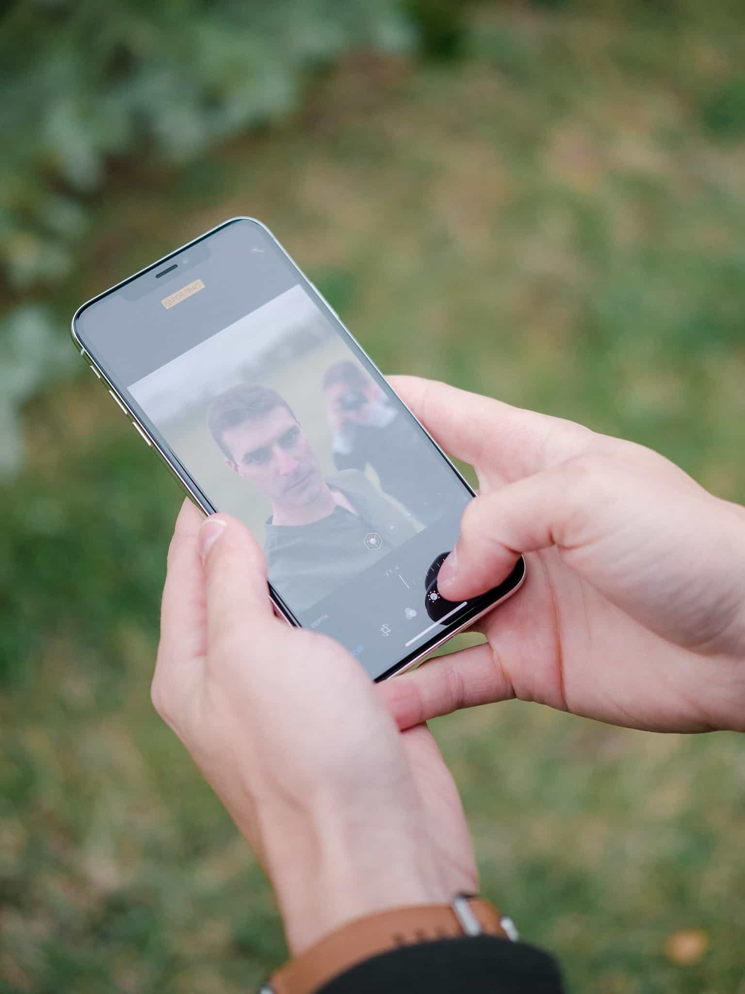
I’d be more impressed with this feature if it hadn’t already been available. Focos has had this feature available for quite some time, and apps like Darkroom and Halide have allowed photographers to apply edits to the foreground and background in different capacities. Focos even allows you to shape your bokeh based on characteristics of specific lenses, like the heralded Leica Noctilux, Leitz Elmar, or older Olympus Zuiko lenses. For me, personally, I’d rather have control over the shape, highlights, and color of my bokeh rather than Apple computationally adding in what it thinks is best.
Depth Control can be accessed on any Portrait Mode photo as soon as you hit the “Edit” button and you can move anywhere between f/1.4 and f/16.
Apple could have really impressed me if they created sun stars on backlit subjects as you moved towards f/16. As it stands, the current capability just sherlocks what was already available on the App Store.
Photography Wrap-Up
It’s clear Apple has made monumental leaps forward in the iPhone XS camera system. Color, in particular, is far and away improved thanks to Smart HDR, while finer details can be picked up in your subjects thanks to new access to higher exposed photos in the Smart HDR system.
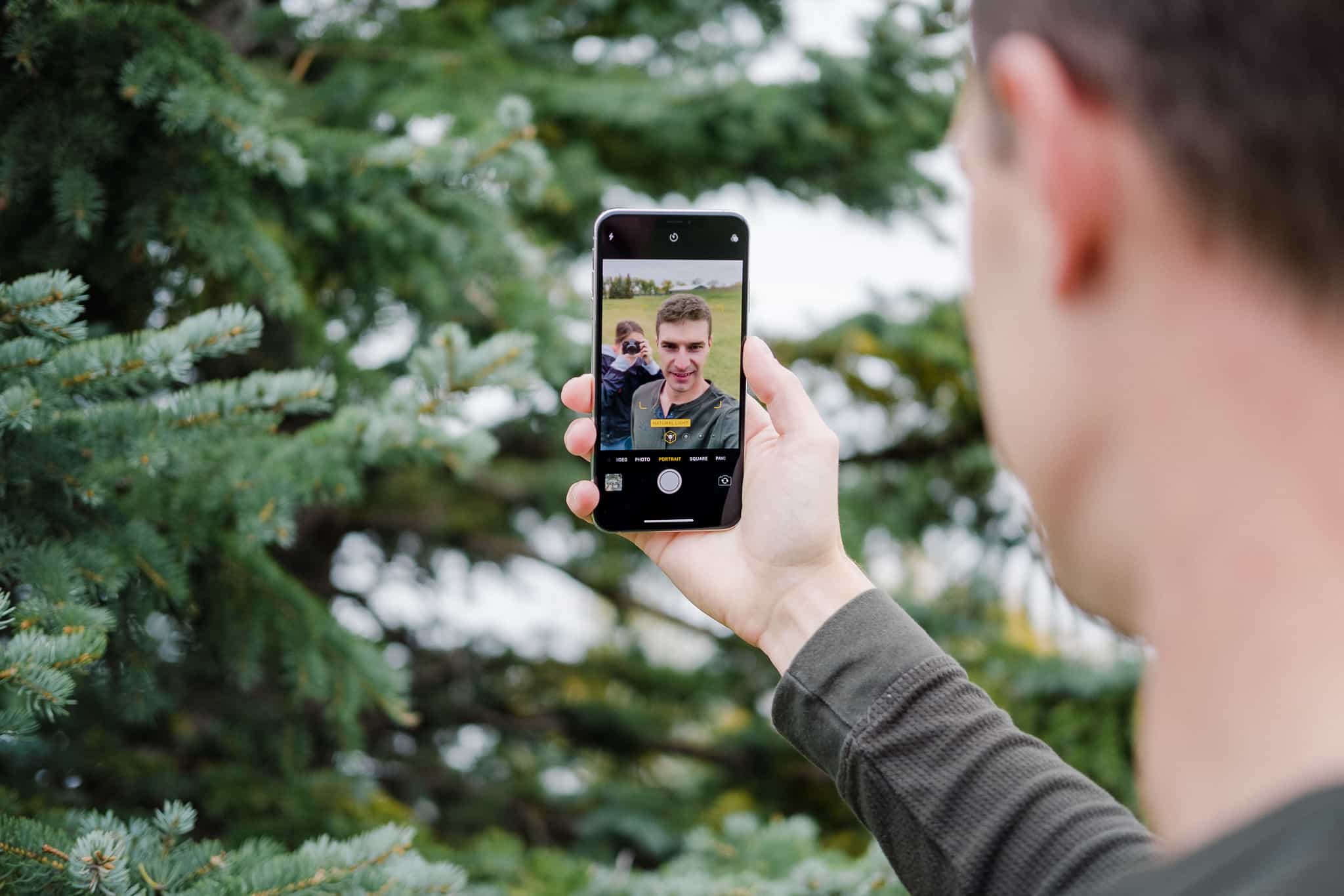
Apple has made some opinionated decisions in how the Neural Engine processes faces in the new Portrait Mode. Color, again, is improved, as are how Portrait Mode handles details around your subject’s face. Depth Control is neat — even though it was already available on the App Store — and likely can be taken further to include more forms of photography. But the overall loss in detail on Apple’s Portrait photos could push portrait photographers to their dedicated cameras if they don’t like the final result.
Some Final Notes and Observations
It’s hard to garner an opinion on every aspect of a brand new iPhone in three or four days, but here are a few final observations from my short time with the phone:
- The iPhone XS water resistance has been pushed to IP68, allowing you to dunk it (or lose it) in water up to 2 meters for 30 minutes. Of course, further tests have shown iPhones can survive longer than this, but Apple is playing it conservative like always.
- Videographers will be pleased with the new improvements in the camera system as well. Videographers can capture stereo sound. At 4K@30 fps and lower, videographers gain access to Smart HDR processing for video. Extended dynamic range features are being wrapped into the video camera as well, allowing you to shoot all sorts of environments that the computer can process.
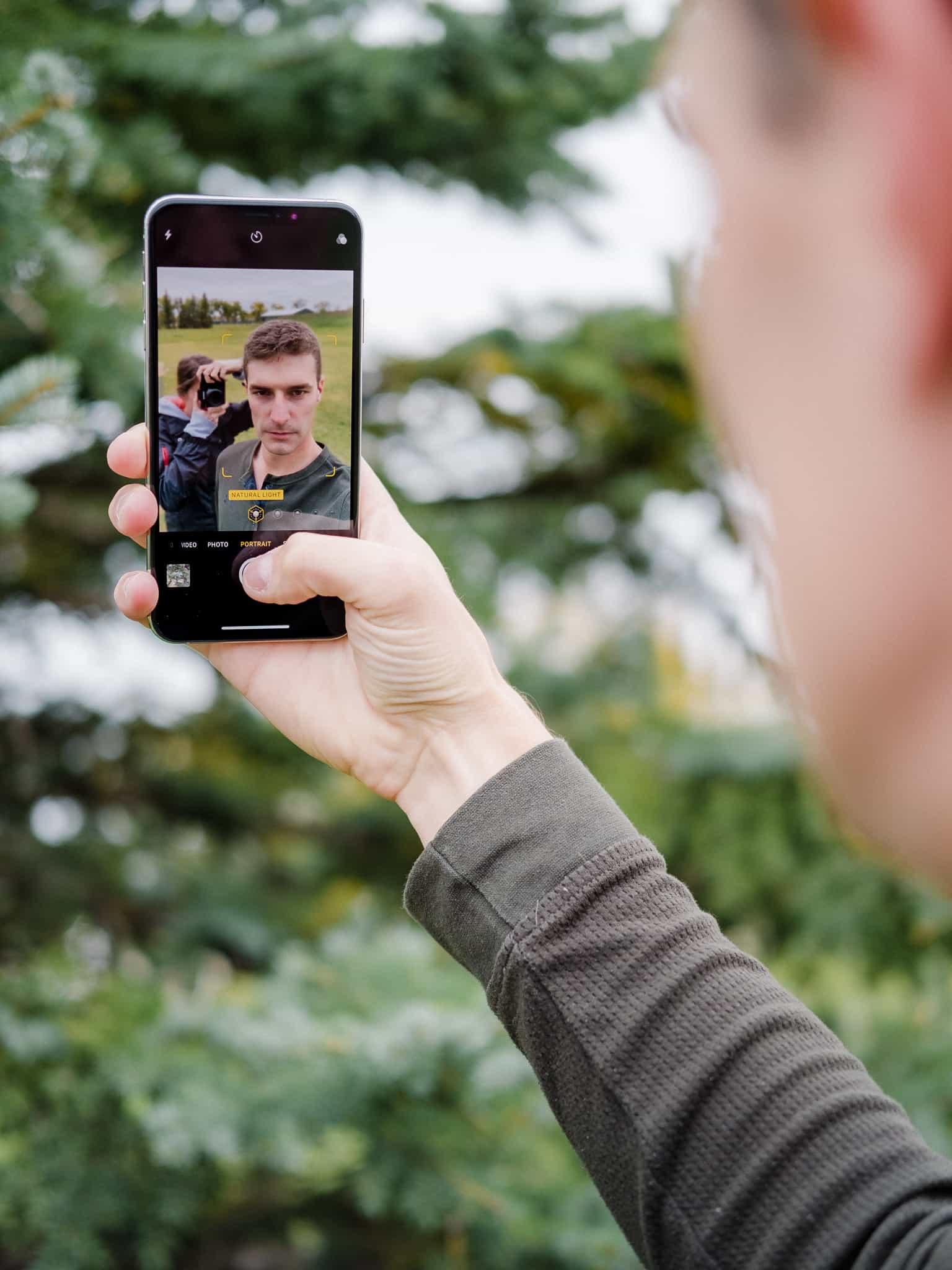
- All the same Portrait Mode features (including Depth Control) are making their way to the front-facing TrueDepth camera as well.
- Face ID is indeed quicker on the iPhone XS, but it’s not by much. Rather, the more significant improvement is in the angles that the iPhone XS camera can pick up your face. I’ve found I can be at all new angles to the iPhone and it’ll unlock for me. This improves how much you need to lean over the iPhone when it’s sitting on a desk. Also, the introduction of Password Autofill in iOS 12 means I’ve been using Face ID much more than in iOS 11. It could be that Face ID feels faster because I’m seeing it in action that much more often.
- The stereo speakers, especially on the iPhone XS Max, are loud. We’re now to the point where I never see myself needing to blare the iPhone’s speakers at full blast. For any of those types of situations, the HomePod will do.
- I’m not sure if the extra 1.5 hours of battery life in the iPhone XS Max is noticeable, especially when comparing a year-old iPhone X battery to a brand new iPhone XS Max battery. That said, the Max is indeed lasting longer through the day, and is especially noticeable when the A12 chip is under load. I can almost see the battery indicator drop in real time when editing photos in Adobe Lightroom CC on the iPhone X, and this certainly isn’t the case with the iPhone XS Max.
- The iPhone XS and XS Max ship with dual SIM capabilities. I have no reason or any way to test these new capabilities, but it’s worth a mention for those who have a home and work smartphone, or for those who travel a lot.
- The iPhone XS does not ship with a Lightning to Headphone Jack Adapter or a larger battery charger, both of which have sent some people into a frenzy. As an Apple customer, you can choose to feel nickel and dimed, or you can realize that Apple’s not in the business of holding up old technology on a pedestal (especially in regards to the headphone jack adapter; the battery charger I have no answer for). As an Apple shareholder, I expect this will continue to push the sale of more AirPods.
A Touch of Revolution
I live in a small community, where everyone seems to know everyone. By this iPhone generation, my photo has been on the local carrier’s Facebook page often enough for most people to know I buy a new iPhone on launch day every year.
The resulting question is always the same: “Josh, is that super expensive iPhone worth it?”
Let’s be honest: the answer is no almost 100% of the time. The iPhone XS and XS Max are designed for Apple’s most loyal customers and most fringe users who need more camera, need more speed, or who want the iPhone X form factor in the larger Plus-sized body.
And of course, the big asterisk at play here is the iPhone XR. You’re getting almost the same phone for a fraction of the cost, so long as you’re happy with an LCD screen (I’m sure most people won’t care one iota).
But unlike global politics, the latest iPhones aren’t as polarizing as a simple “yes” or “no” answer. Users jumping from an iPhone 7 are going to experience massive performance improvements, massive display improvements, and even more massive camera improvements. And as we’ve shown above, iPhone X users are also going to see significant camera improvements if they make the upgrade.
My actual answer to that question is this: Apple has done such a great job in designing its iPhones in the past, they’ve learned that an iPhone has a lifespan far greater than the regular two or three year upgrade. Apple even highlighted this lesson on stage. The company has developed extensive recycling programs to move old iPhone parts back into the system, and they debuted this recycling program with a bevy of iPhone 5s graphics.
The iPhone 5s. Thanks to iOS 12, it’s still a viable iPhone. If you’ve gone the extra mile to install a new battery, it’s clear Apple expects a now 5-year-old iPhone to operate for at least a few more years.
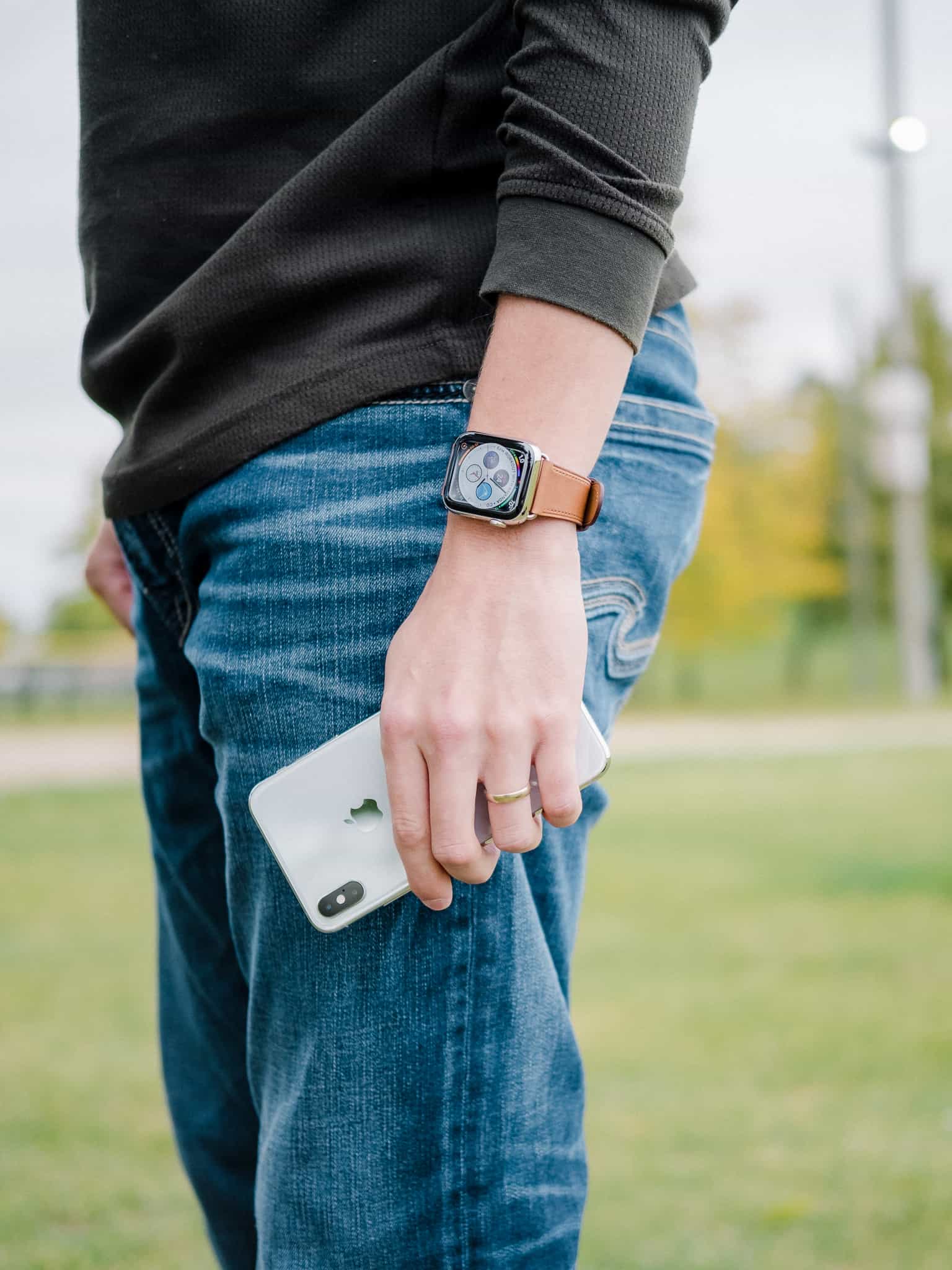
That’s the light that needs to be shone on the iPhone XS and XS Max. This is an iPhone generation that is going to be around for years to come — maybe even a decade to come. Inside are current-day expensive features that will become cheaper to produce over time, and which will continue to operate efficiently over time thanks to the latest improvements in iOS 12. This iPhone XS generation has been designed not just for today, but for the next 10 or more years of use.
So, as much as the iPhone X was tomorrow’s iPhone yesterday, the iPhone XS is now next week’s iPhone today. Or next year’s iPhone today.
Whatever the case, “planned obsolescence” and “Apple” should never be used in the same sentence again.
-
“Almost” because I don’t have a caliper to measure precisely. ↩
