The iPhone 8 Plus Review
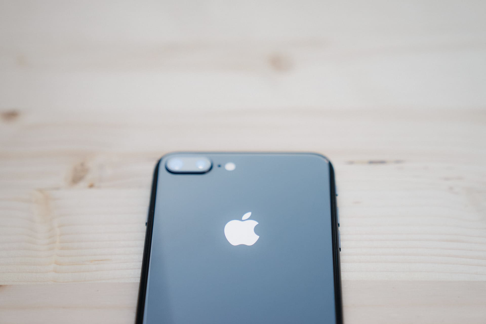
I’m not convinced waiting for the iPhone X is the best bang for your buck. The iPhone 8 Plus is too tried, too tested, and too trusted to be written off as last year’s technology.
This is the first time we’ve seen Apple release two flagship iPhones on the same day. Instead of the normal big screen vs. small screen choice, would-be buyers are faced with a more complicated matrix: buy now/buy less expensive/buy traditional design vs. buy later/buy more expensve/buy tomorrow’s design. It’s just not as simple as it once was.
At the heart of the iPhone 8 Plus vs. iPhone X decision is one’s taste in design. The iPhone 8 Plus design is now four years old, including its curved aluminum edges and large bezels. In many ways, the 8 Plus jams today’s technology into yesterday’s body.
But let’s pause for a second — maybe I’m getting old, but the now four year old design has never been an issue until now. The backside materials may have been more slippery than a bar of soap, but the year-over-year improvements from the iPhone 6 Plus to iPhone 8 Plus have never once let me down. The body chassis is easy to hold, the materials are sturdy and durable, and the extra size of the Plus-sized screen has done wonders for (my) productivity.
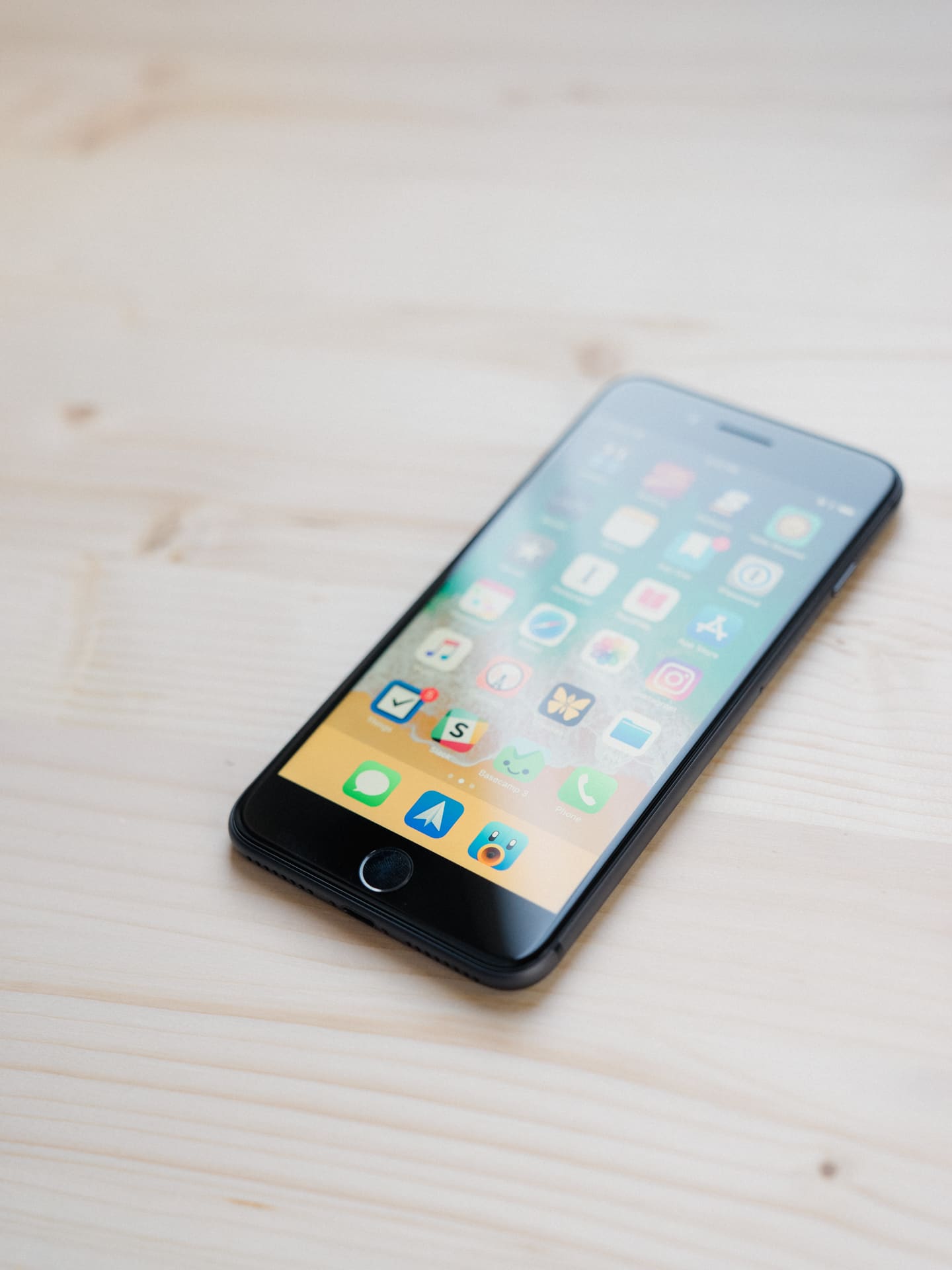
From the iPhone 8 Plus’ trusted design, to its faster-than-MacBook-Pro processor, to its groundbreaking dual-camera system and perfected Touch ID, the iPhone 8 Plus has been undeservedly overlooked more times than I can count.
This is the iPhone most people should get this year, whether they want to admit it or not.
Wait. There’s a Bonus….
Custom Productivity Templates
We have a set of custom productivity templates that work well with the iPad app, GoodNotes. And if you want to try them out, we’ve put together a free guide that can help you.
We’ll show you…
- How to create and save custom page templates in GoodNotes.
- How to use those page templates to transform GoodNotes into your own productivity notebook (or any other type of notebook replacement).
Plus, we also have included a couple of our custom productivity templates for you to get started with. These templates are right out of our popular productivity course.
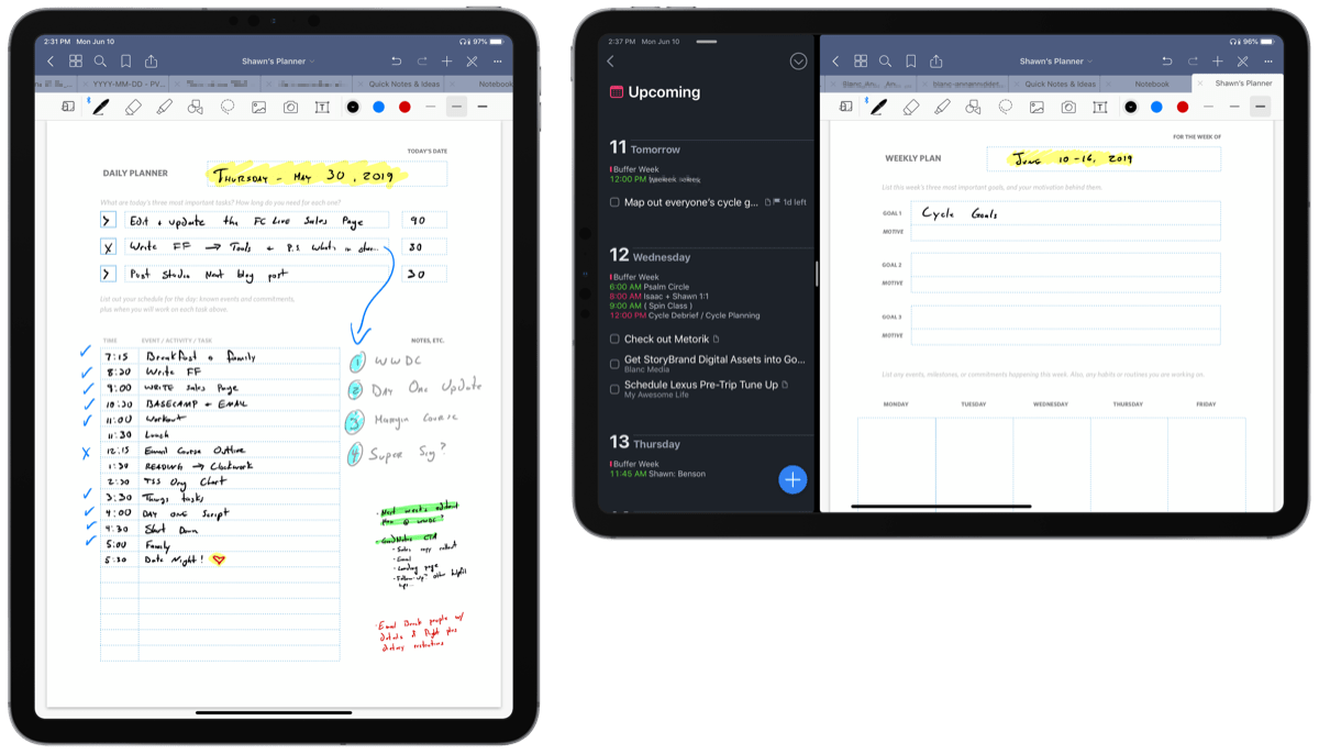
The custom templates and the guide are available for FREE to our email subscriber community. And you can get it right now. By joining the Sweet Setup community you’ll also get access to our other guides, early previews to big new reviews and workflow articles we are working on, weekly roundups of our best content, and more.
Design
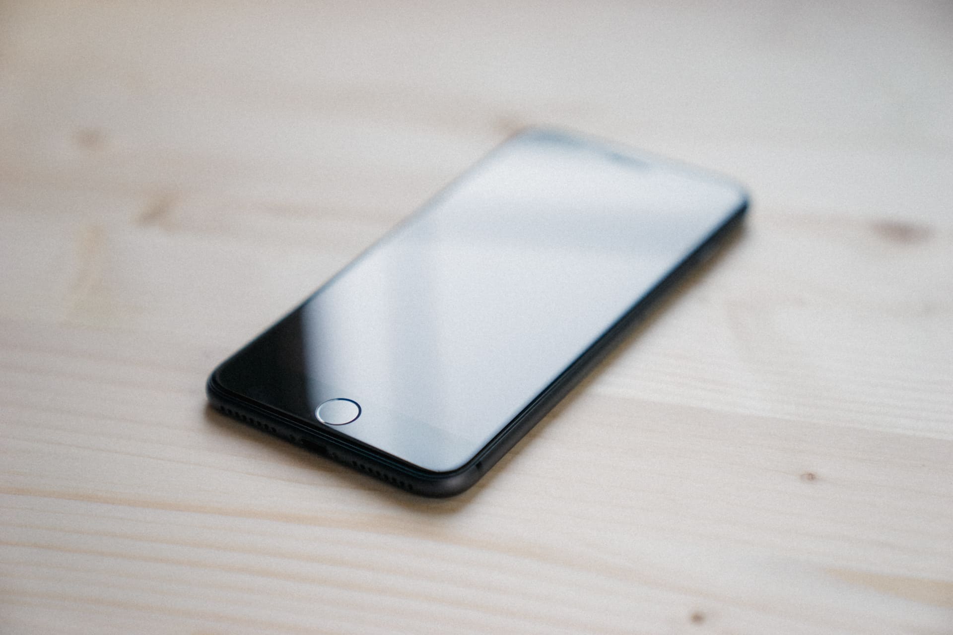
There’s no denying the iPhone 8 Plus’ design is anything but new — I could almost copy and paste last year’s design section of the iPhone 7 Plus review. From the debut of this body design in 2014, we’ve seen small iterations to the rounded edges and backside materials, but we haven’t seen much change in terms of its in-hand feel or its front-facing persona. The iPhone 8 Plus, in nearly all ways, feels comfortable.
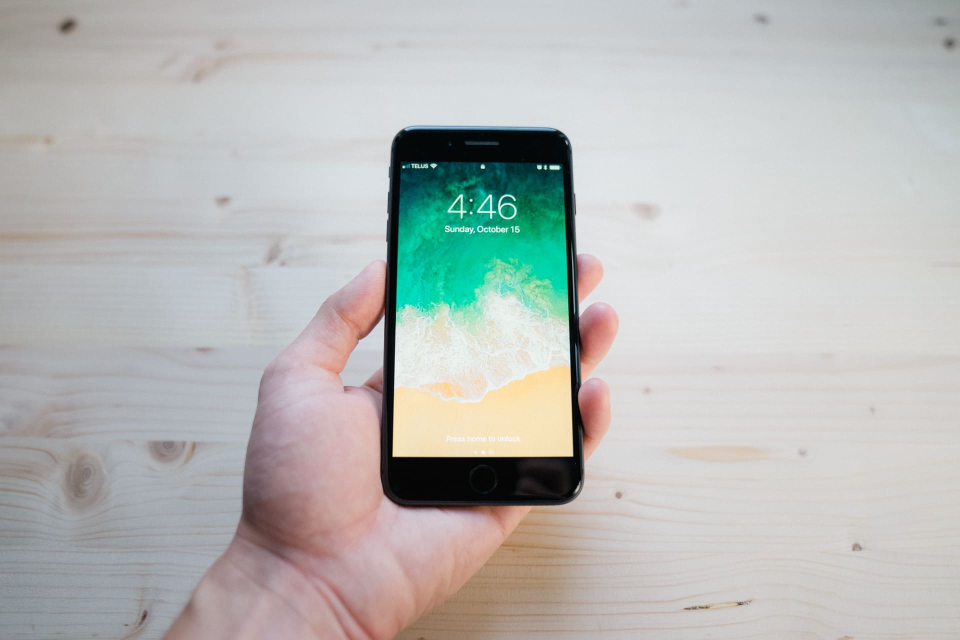
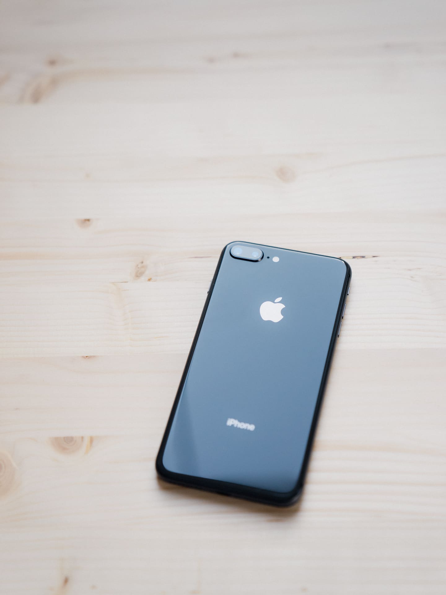
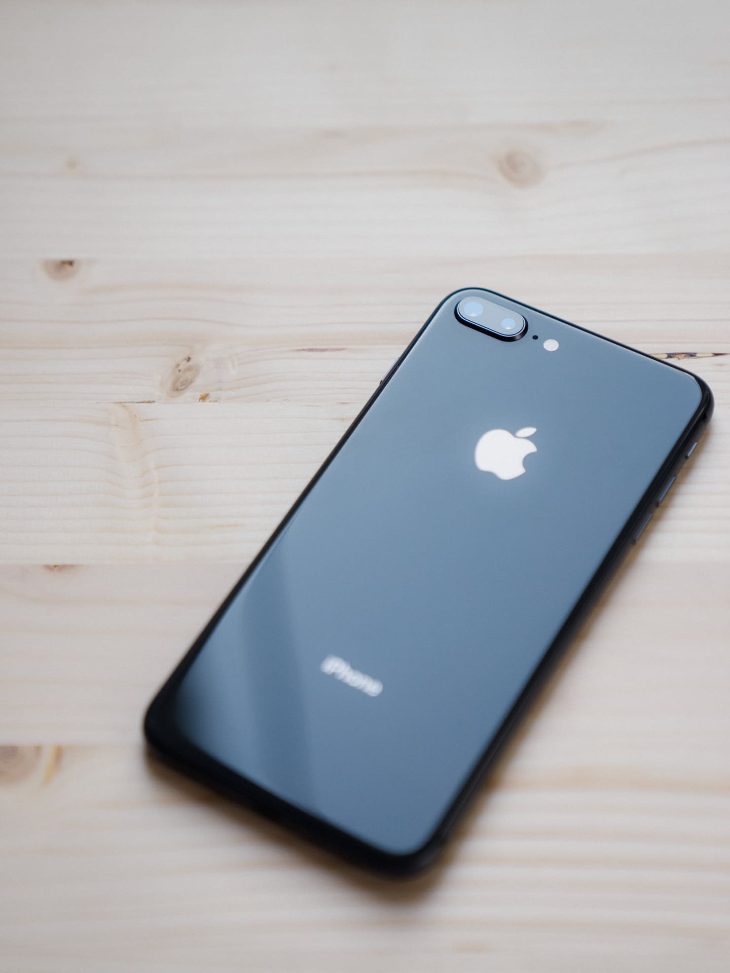
I believe the iPhone 8 Plus is an example of a perfected design. The aluminum backside of the iPhone 6 Plus was notoriously slippery, and each iteration has worked to improve the iPhone’s tactility. The glass backside of the iPhone 8 Plus provides more grippiness under most circumstances than prior aluminum-backed iPhones, while also being softer. There’s something about this glass backside that feels soft, smooth, and gentle in your hand. Glass makes a wonderful — albeit shatterable — backside and is certainly my material of choice.
Apple has dropped the Rose Gold color option this year, preferring to go with a Space Gray, Silver, and Gold scheme instead. The Gold iPhone is significantly creamier than prior Gold iPhones, the Space Gray option is more Gray than Space, and the Silver iPhone’s backside is more withdrawn and less contrasts than white iPhones of prior years. I think the Silver iPhone is the second best looking iPhone Apple has ever made, ranking only behind the Space Gray iPhone 5s.
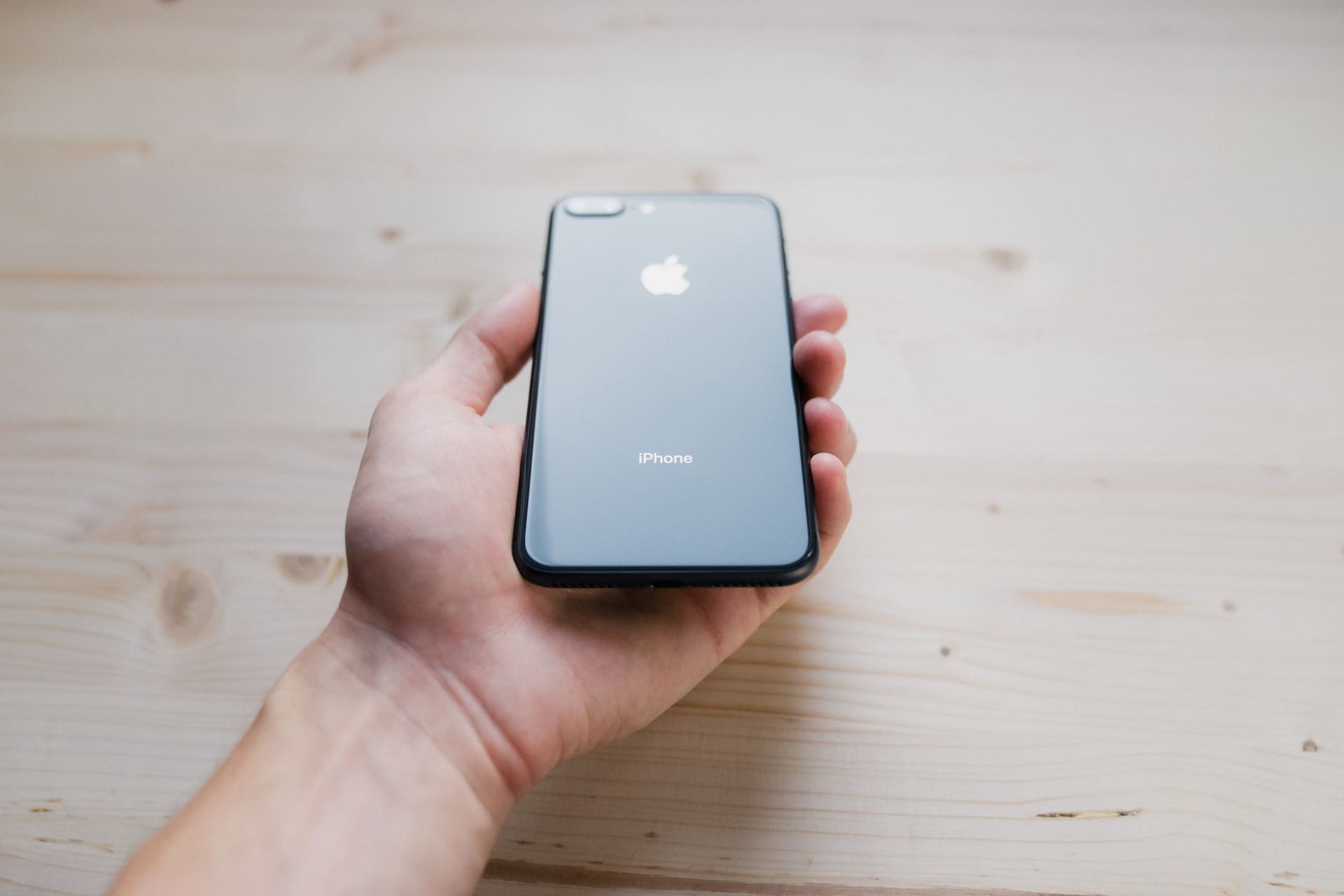
But overall, the point of the newest design is that it is tried, true, and tested. You already know this design will work with this year’s and last year’s accessories. You know how it fits in your pocket or bag. And you already know how it feels to type on the larger Plus-sized display.
In my opinion, the Plus-sized display is the most overlooked feature of the iPhone 8 Plus. Sure, real estate would dictate the smaller chassis iPhone X has more screen to touch and manipulate. But the iPhone 8 Plus’ display is wider, making for a wider, more comfortable keyboard. I can’t be the only person who feels his thumbs cramping up after long-winded iMessages. On the iPhone 8 Plus, the cramping is alleviated. The width of the display is a huge selling feature and should be cause for skepticism over the actual usability of the all-screen iPhone X.
Wireless Charging
There’s been a lot of underwriting of the wireless — or, rather, inductive — charging. Many have complained about how slowly the iPhone 8 and 8 Plus charge via Qi wireless charging apps, stating the convenience of wireless charging is limited by how long the iPhone has to charge. Worse, I’ve read stories of iPhones vibrating off their wireless charging pads overnight, leaving less than a quarter of the iPhone’s battery for the next work day.
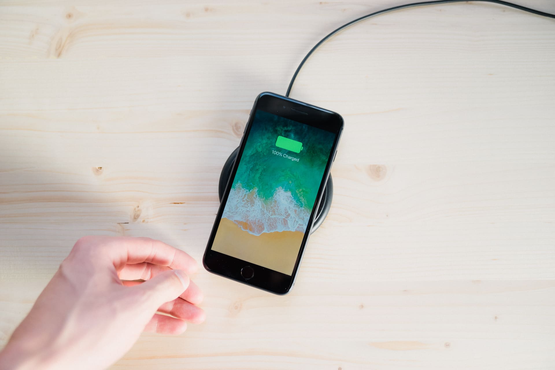
I simply cannot relate to these stories; the introduction of wireless charging to the iPhone feels like a whole new world.
The battery remains unchanged in day-to-day use, ensuring I head to bed each night with between 30% and 40% of its remaining charge. I clearly don’t use my iPhone throughout the day as heavily as others, but I’m impressed with the Plus-sized iPhone’s consistency year to year.
At night, my iPhone automatically switches into Do Not Disturb mode. Notifications don’t light up the screen and nothing wakes me up unless someone calls twice within three minutes (I’ve instructed all my family members to call twice within three minutes in case of emergency).
Wireless charging fits wonderfully within this set of parameters. So long as the iPhone’s interior charging hardware is relatively aligned with the charging pad, I’m sure to wake up with a full charge. And between the rubberized ring on most wireless chargers and an activated Do Not Disturb mode, there’s no chance of the iPhone vibrating off the charger.
I’ll quickly throw in my vote for the Mophie Wireless Charging Base. It’s definitely not as well designed as the Belkin option, but it’s heavier and more tactile. Plus, there’s a nice green indicator that lights up when the iPhone is charging — perfect for ensuring you laid it down properly at night. Neither option appears to live up to what Apple’s AirPower will bring in 2018, so neither may be a good buy right now.
Unless, of course, you need chargers lying in every nook and cranny like I do.
Cameras
When people discuss why they want the iPhone X over the iPhone 8 Plus, the conversation is usually led with the difference in the two camera systems. Justifiably so, I’d argue — there are a wide number of technical differences between the two.
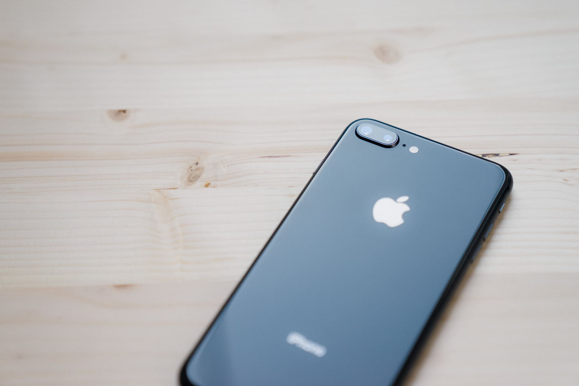
The iPhone X’s telephoto lens, for instance, sports optical image stabilization and an f/2.4 aperture, while the iPhone 8 Plus’ telephoto lens sticks with an non-stabilized lens and the smaller f/2.8 aperture.
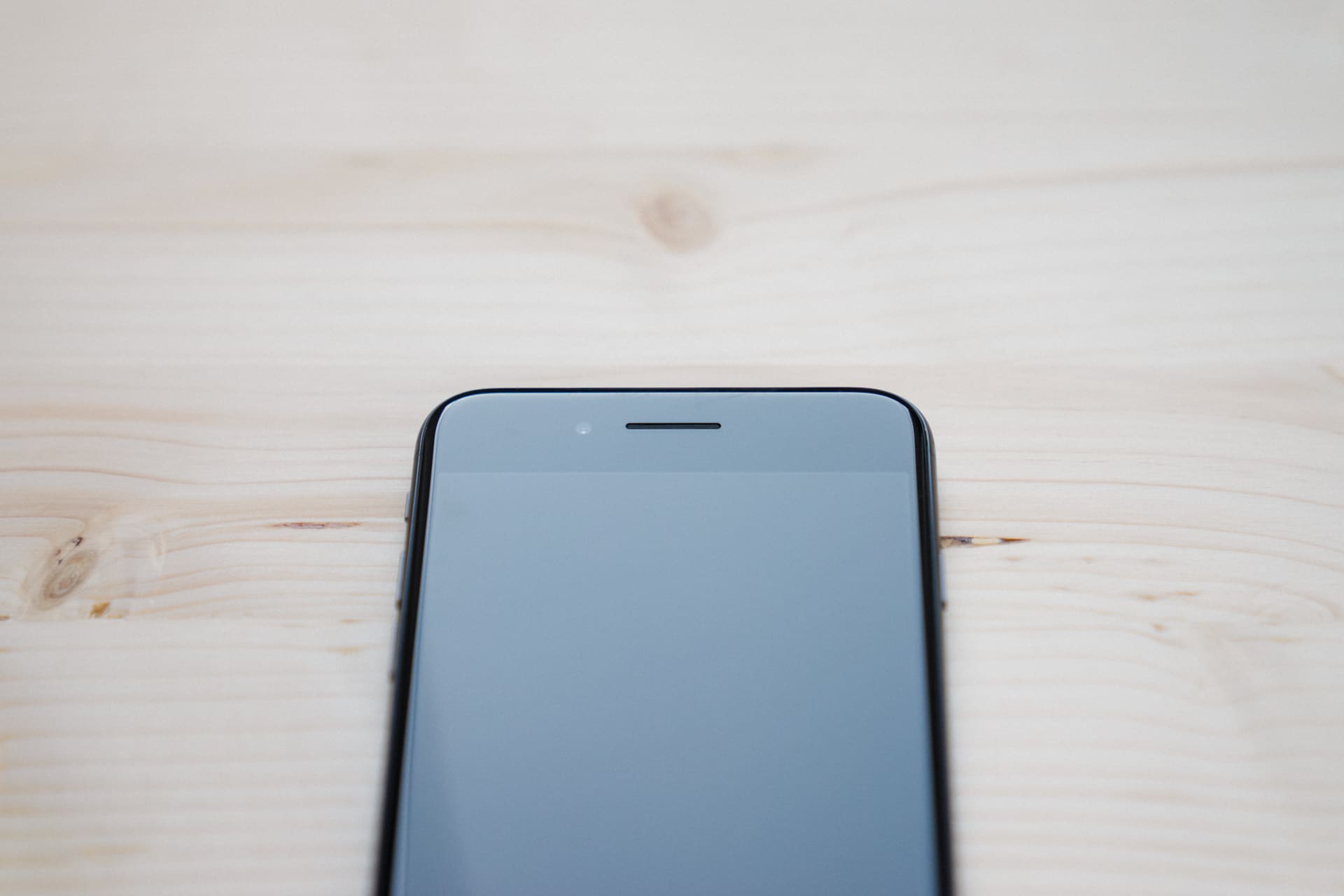
The iPhone X’s TrueDepth front-facing camera is significantly better than the front-facing iPhone 8 Plus camera. That TrueDepth camera is responsible for Portrait Mode and Portrait lighting from both front and backside cameras, Face ID availability, and the new Animoji features.
Simply put, it’d be folly to state the camera systems in both flagship iPhones are the same.
I think the better argument for the iPhone 8 Plus lies in value. The same new sensor found in the iPhone X is included with the 8 Plus. The same Portrait and Portrait Lighting modes are included with the 8 Plus. And the wide range of improved video features (4K at 60 FPS anyone?) are also all found in the 8 Plus.
All, I might add, for $300 or $400 less than the iPhone X.
Moreover, I’m willing to bet the general person will have a hard time recognizing the difference between iPhone X and iPhone 8 Plus photos. If people can’t recognize the difference between an f/1.4 lens and an f/1.2 lens, I doubt people will be able to easily spot the difference between the two iPhones. In actuality, there is a significant difference between the two (OIS plus the increased aperture will result in at least a full stop of light more than the iPhone 8 Plus can capture), but I doubt it’ll be noticeable for most people.
Portrait Mode/Portrait Lighting
Apple’s website suggests Portrait Mode has exited the beta stage and entered full-fledged status. Had I not noticed the lack of “beta” tag on Portrait Mode, my claim that Portrait Mode has improved immensely would be merely anecdotal. Instead, I think it’s safe to assume a significant number of improvements have made their way into Portrait Mode.
Portrait Mode is significantly faster on the iPhone 8 Plus; subjects are locked onto quicker and live application of artificial bokeh can be seen nearly instantly. I’ve noticed a large improvement in how Portrait Mode locks on to and understand inanimate objects as well — so much so that I shot a hero image for The Sweet Setup a few weeks ago and you can hardly tell it was shot with an iPhone instead of a Sony a7II.
I’ve also been pleasantly surprised with the utility and impact of Portrait Lighting. When being debuted, Portrait Lighting came across as a gimmick. After playing with Portrait Lighting, the impact of improved lighting on your subject’s face is dramatic.

Normal Lighting

Studio Light

Contour Lighting

Stage Light

Stage Light Mono
My undoubted favorite is Contour Light — it provides a dash of drama, contrast, and punch. Studio Light dials back contrast a bit, while Stage Light and Stage Light Mono bring absolute focus by eliminating the background entirely. I’ve found little to no use for Stage Light or Stage Light Mono, but it’s clear the results can be stunning.
Slow Sync
One of the most noticeable camera differences between last year’s iPhone 7 Plus and this year’s 8 Plus is the addition of Slow Sync to the camera’s flash system. Slow Sync combines a slower shutter speed and a pulse of strobe light to more evenly light backgrounds, provide better tones, and provide more light for your subject. Just look at the improvement Slow Sync makes:

Shot on front-facing iPhone 7 Plus camera.

Shot on front-facing iPhone 8 Plus camera.
The difference here is considerable, especially in the highlights on my nose and forehead and the tones of my shirt and sweater.
The obvious application of Slow Sync will be in greatly improved late night, bar-scene photos. But the impact on poorly lit selfies in all contexts will be immediately noticeable on all photo-sharing platforms.
True Tone Display
I’m not sure if True Tone on the iPad is less noticeable because of the size of the display or if the iPad’s True Tone is less effective, but the new True Tone display in the iPhone 8 Plus is immediately noticeable, even without comparing directly to an iPhone 7 Plus.
In fact, I’ve been disappointed with True Tone on the 10.5-inch iPad Pro. I expected great things after glowing reviews of prior iPad Pros. However, my first experience with True Tone resulted in an iPad constantly fighting the ambient light in my home. It reverts between cool and warm every 10 seconds during mid-day light. I hated it so much, I turned off True Tone to stop the constant shifting.
This soured my expectations and created disappointment when True Tone was announced for the iPhone 8 and 8 Plus. Barring my iPad being faulty, I expected the same experience on the new iPhone.
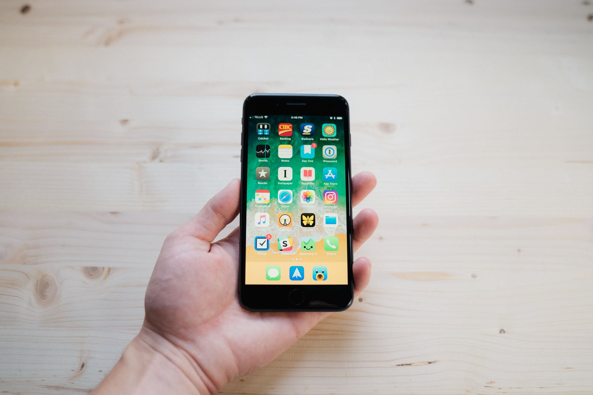
The iPhone 8 Plus True Tone display is anything but frustrating. It makes the 7 Plus screen feel cool, desaturated, and completely inferior. I find the warmer display to be easier on the eyes throughout the day and especially in the late hours of the evening.
I can only imagine the impact of True Tone on the iPhone X. Quite frankly, if there’s one area where the iPhone X appears to greatly outpace the iPhone 8 Plus, it’s in the quality of its display. Combine OLED technology, HDR color, and True Tone and you’re sure to be blown away. If you’re set on the iPhone X and you begin your justification with a reference to the X’s superior display, there’s little argument to be had.
A Few Other Anecdotes
It’d be easy to go through each major feature as you scroll through Apple’s iPhone 8 page, but everyone uses their iPhone differently. Here are a couple further thoughts:
- The impact of augmented reality is eminent and provides yet another feature-equal aspect between the iPhone 8 Plus and iPhone X. The 8 Plus cameras and on-board processors provide the hardware needed for groundbreaking AR apps. I’ve spent some time with The Machines (the game debuted on-stage at the Apple Keynote) and it has served to showcase the true power of the iPhone 8 Plus.
- The iPhone’s A11 Bionic chip is brilliantly powerful, but I’ve only noticed the power of the chip when playing AR games. Screen-to-screen and app-to-app, it doesn’t feel like there’s much difference between the 8 Plus and last year’s 7 Plus. Any hiccups on the 7 Plus have been eliminated with the 8 Plus, but I feel like the difference between the iPhone 6 Plus and 6s Plus was a more significant improvement across the OS.
- Each year, Apple seems to defy audio physics. The 8 Plus sports louder and crisper stereo speakers than the 7 Plus, which continue to satisfy quick needs in the kitchen when my wife and I need to play some tunes. I rarely push the speakers to the max — they’re simply too loud and turn your conversations into shouting matches.
- I touched on it earlier, but the videography improvements in the iPhone 8 Plus are nothing to shake a stick at. The 8 Plus can shoot in 4K 60 FPS and slow motion video at 1080p 240 FPS, further eliminating more and more need for dedicated video cameras. If I were to travel, I’d skip on the GoPro HERO 6 and take the iPhone instead — especially since the iPhone’s water-proofing is good enough to dunk under the surface for some cool underwater shooting.
Wrap Up
Perhaps I’m being too bold. Or maybe I’m overthinking it. It’s often easier to assume there are some complex, ideological idiosyncrasies underlying the release of the iPhone 8 Plus “alongside” the iPhone X.
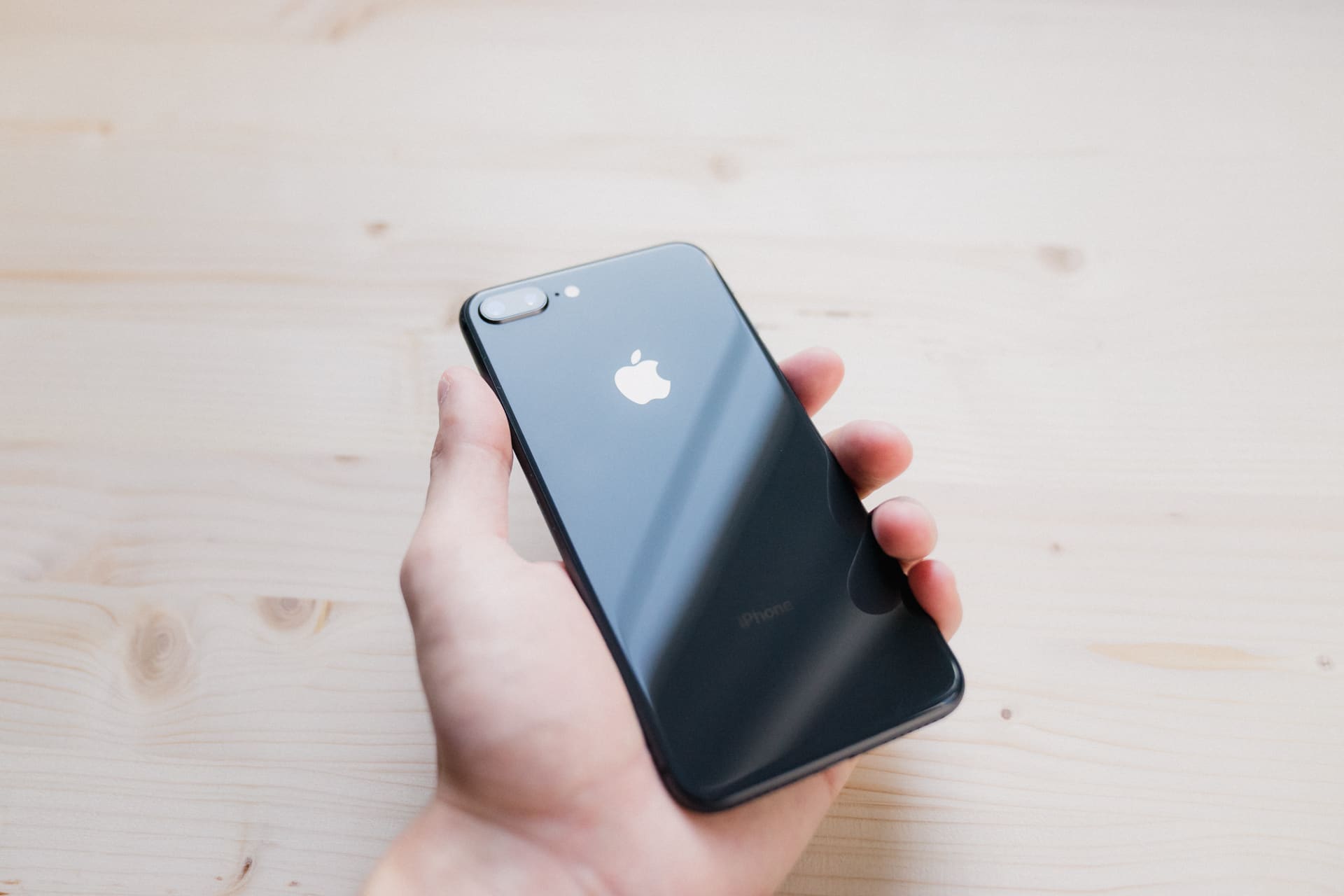
Or maybe Apple simply wants to show us tomorrow’s iPhone today. Done. End of story.
If so, today’s iPhone will symbolize the peak of the iPhone 6 design. It perfects a near perfect chassis. It introduces a wide range of tomorrow’s technologies. Touch ID feels like a perfected art form, and the continuance of Apple’s silicon dominance can be seen in the fluidity of augmented reality apps, a speedy OS, and an ever-improving Portrait Mode.
Simply put, the iPhone 8 Plus holds fast to what has worked so well for the last 4 years: well-designed hardware integrated seamlessly with great software.
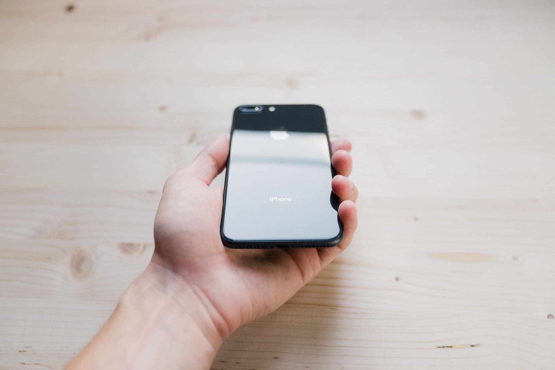
Today, it just happens to be available for far less money and happens to provide the best value of any new iPhone available right now.
Maybe ever.
Wait. There’s a Bonus….
Custom Productivity Templates
We have a set of custom productivity templates that work well with the iPad app, GoodNotes. And if you want to try them out, we’ve put together a free guide that can help you.
We’ll show you…
- How to create and save custom page templates in GoodNotes.
- How to use those page templates to transform GoodNotes into your own productivity notebook (or any other type of notebook replacement).
Plus, we also have included a couple of our custom productivity templates for you to get started with. These templates are right out of our popular productivity course.

The custom templates and the guide are available for FREE to our email subscriber community. And you can get it right now. By joining the Sweet Setup community you’ll also get access to our other guides, early previews to big new reviews and workflow articles we are working on, weekly roundups of our best content, and more.
