A Review of the Apple Watch Series 4
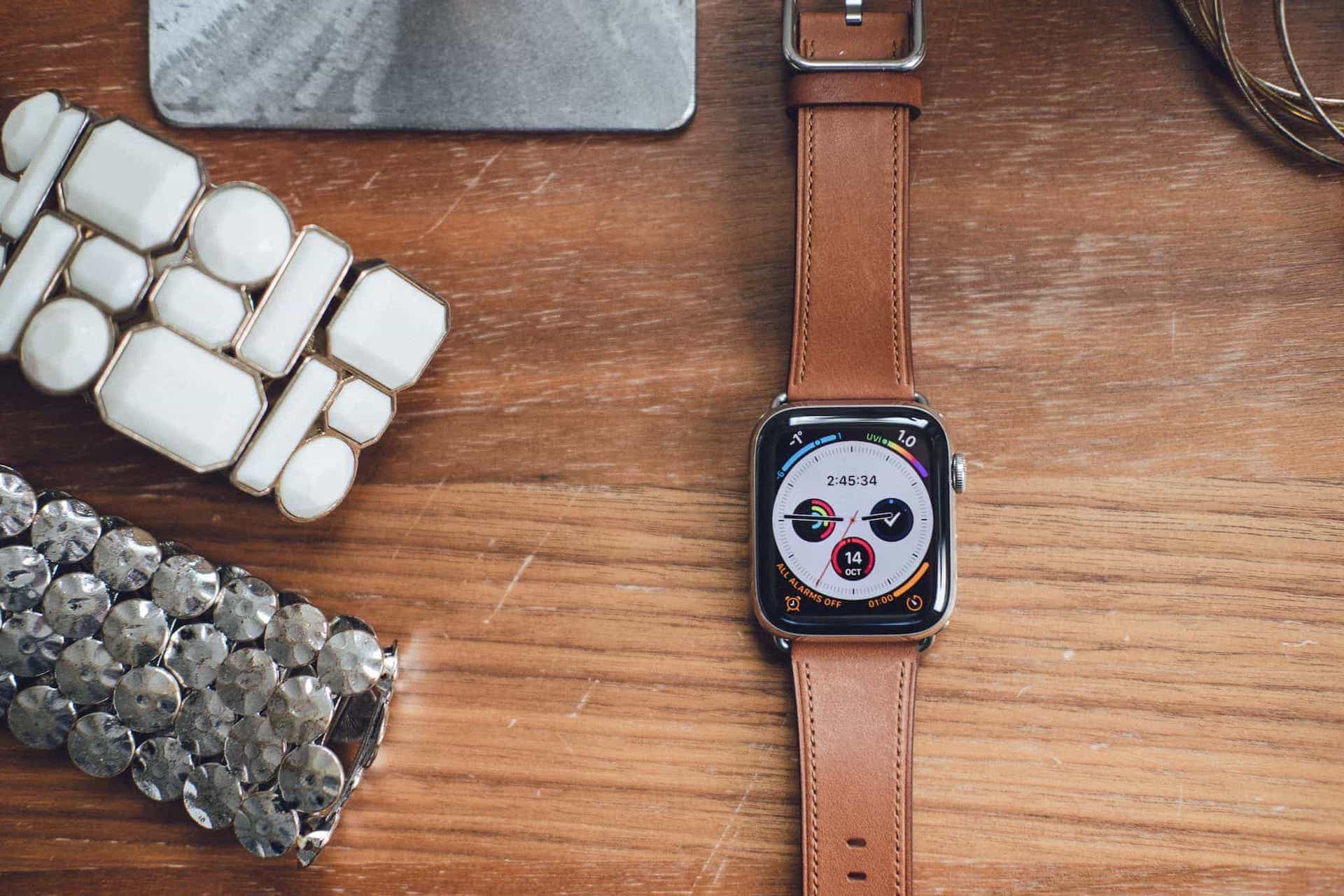
John Gruber’s review of the Apple Watch Series 4 began with a general look at “nice” watches — the idea of traditional watch purchasers looking for a “nice” watch rather than its timekeeping functionality:
The luxury watch market is in large part about niceness. No one buys a Rolex or Omega or Panerai or Patek Philippe because of its timekeeping accuracy. They buy them because of how nice they are. Jony Ive is a watch guy. He knows this. Phil Schiller is a watch guy. Apple is full of people who love traditional watches, because they appreciate craftsmanship, attention to detail, typography. Nice watches are all about design down to the smallest detail.
I believe Gruber intended the term “nice” to have a large scope. “Nice” materials and construction. “Nice” design. “Nice” band. “Nice” watch face. And “nice” from both a physical, concrete perspective as well as from a subjective standard.
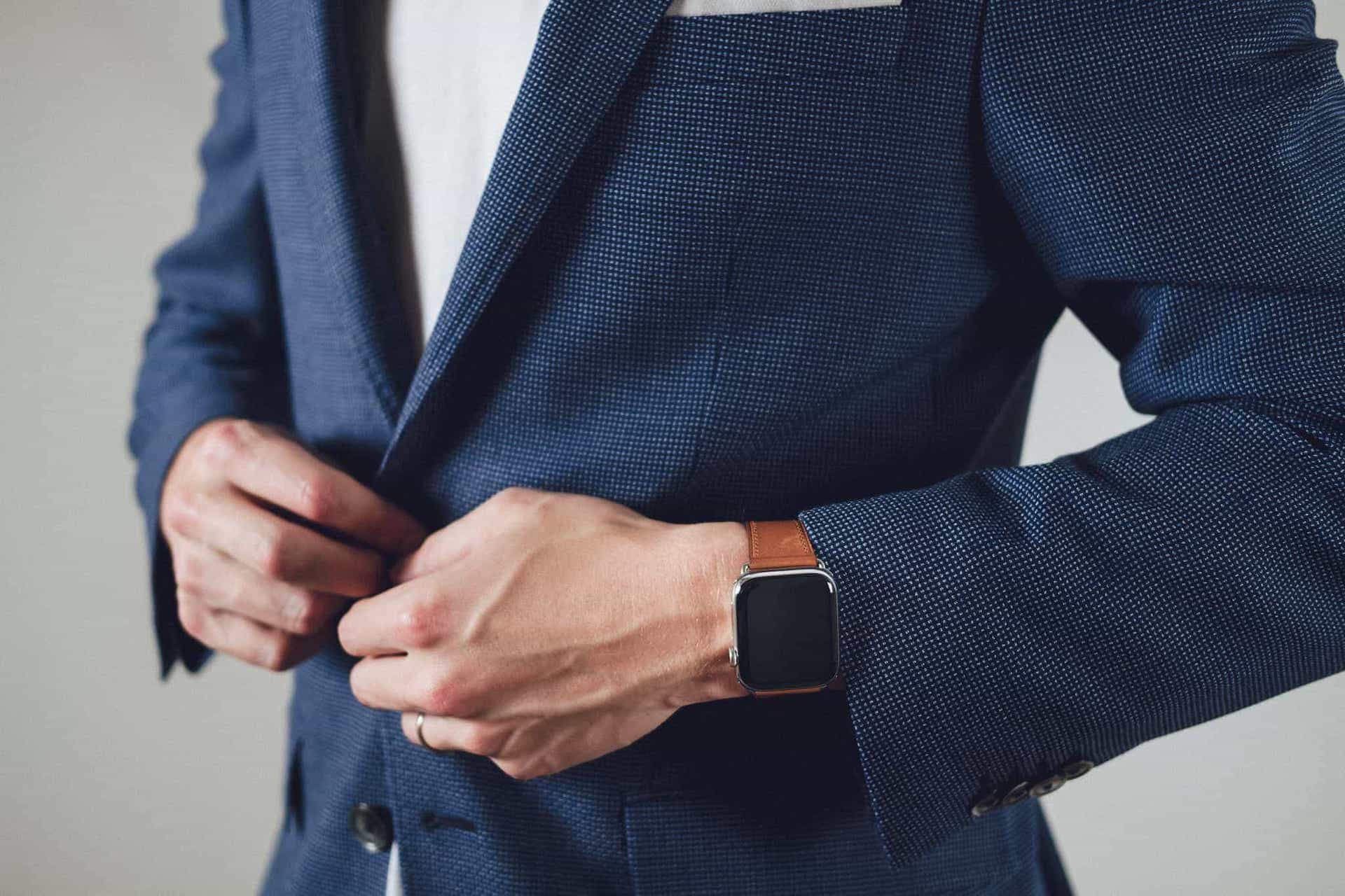
Whether he intended this or not, I took this idea as a confirmation of something I had been looking for from the Apple Watch since inception: style. People wear watches to say something about themselves, to stand out from the rest of the crowd, just as much as they wear a watch to tell the time. Haje Jan Kamps said this — somewhat presciently — back in 2015:
Apple Watch: Watches are jewellery, and jewellery is personal expression. They may well sell a billion of ‘em. And that’s part of the problem.
In the same way a pair of glasses tells someone about you, a watch paints your personal picture.
Another point, which I’m going to hone in on further:
But at the price points they’ve chosen, they’re going to really struggle not to be compared with a timepiece, and therefore, a statement of self-expression, more than just a device to measure out hours and minutes.
No matter how hard Apple tries to steer clear of being related to timepieces, it’s inevitable. Humans have two wrists and are very unlikely to wear a watch on each, so the conscious decision to wear an Apple Watch or a traditional watch is made each day. The two are intertwined and, therefore, competitors.
Look at this graphic from Apple’s site:

Which of these looks like a watch and which of these looks like a computer? I think there are two watches, one fitness tracker, and one computer. I’d wear the two watches with a sport coat or a suit. The fitness tracker and the computer? Not a chance.
I’m arguing subjectives here. More than one person has said how many people they see in suits and sport coats wearing an aluminum Series 3 Apple Watch. It can be done, to be sure. But I wouldn’t be caught dead with a computer strapped to my wrist and a Canali sport coat over my shoulders.
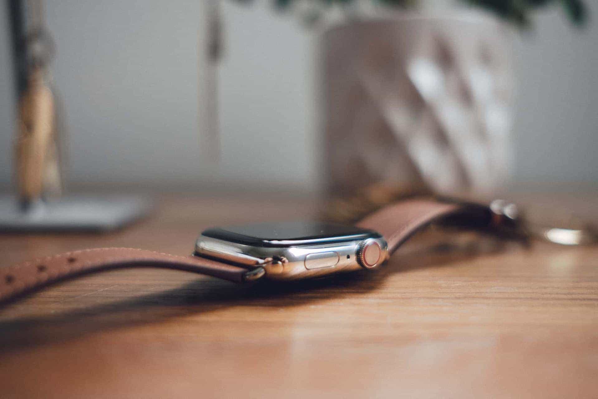
To me, the Series 4 Apple Watch is an inflection point. The gentler corners, classier (when customized) Infograph watch face, less bombastic LTE indicator, smoothed dock button, and gold stainless steel materials have pushed the Apple Watch into a new jewelry echelon, for both men and women.
For the first time, I’d wear an Apple Watch with a sport coat. For the first time, the Apple Watch has become a “timepiece,” with every bit of snobbery assumed in that title.
Style
It’s from this angle that I’m approaching the latest Apple Watch. Should the iPhone team opt to enhance the iPhone’s physical design while cutting out features, we’d rightly complain about lost functionality. But since the Apple Watch comes from the ashes with one single core functionality requirement (timekeeping), I think it’s completely fair to view the Series 4 through the lens of its design.
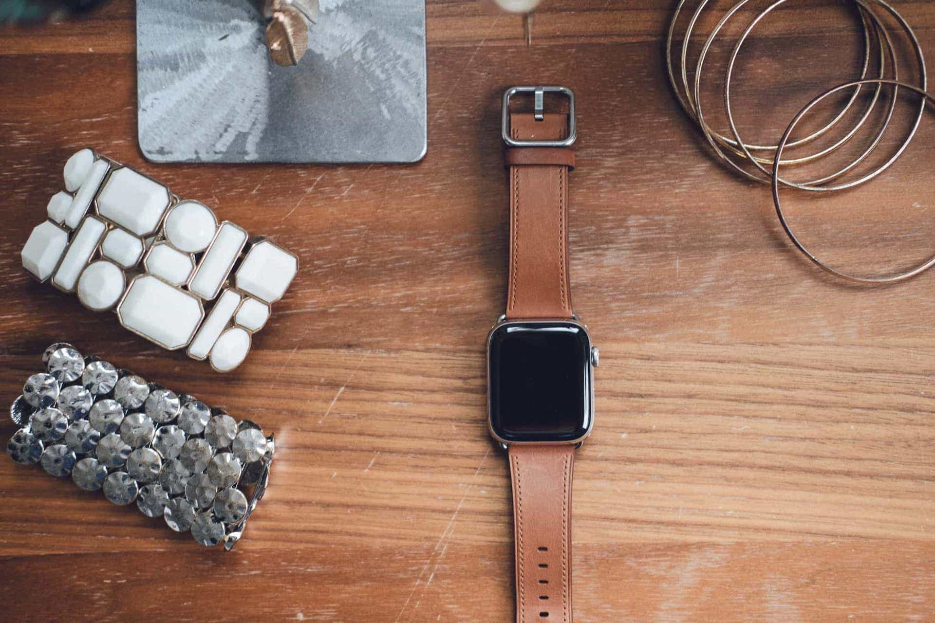
The Apple Watch Series 4 isn’t just a beautiful smartwatch, it’s a beautiful piece of jewelry. It’s a beautiful timepiece.
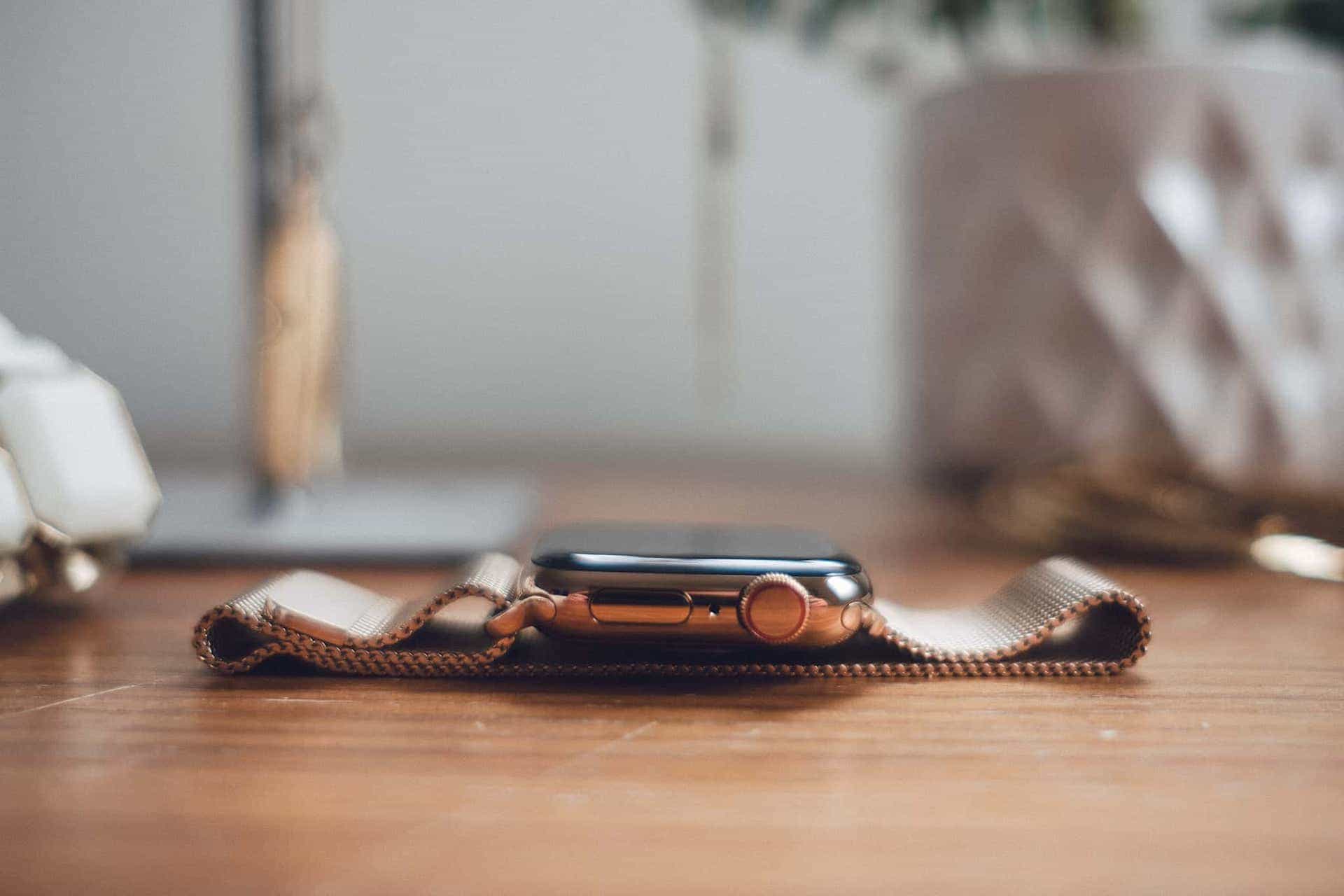
The smallest tolerances in the Digital Crown remind me of my bucket list mechanical watch, the Nomos Tangente Neomatik 41. The crown is large and spins with the right tensions, and the new red LTE ring’s understated appearance adds a dash of character. In past years, that dash of red character was overdone.
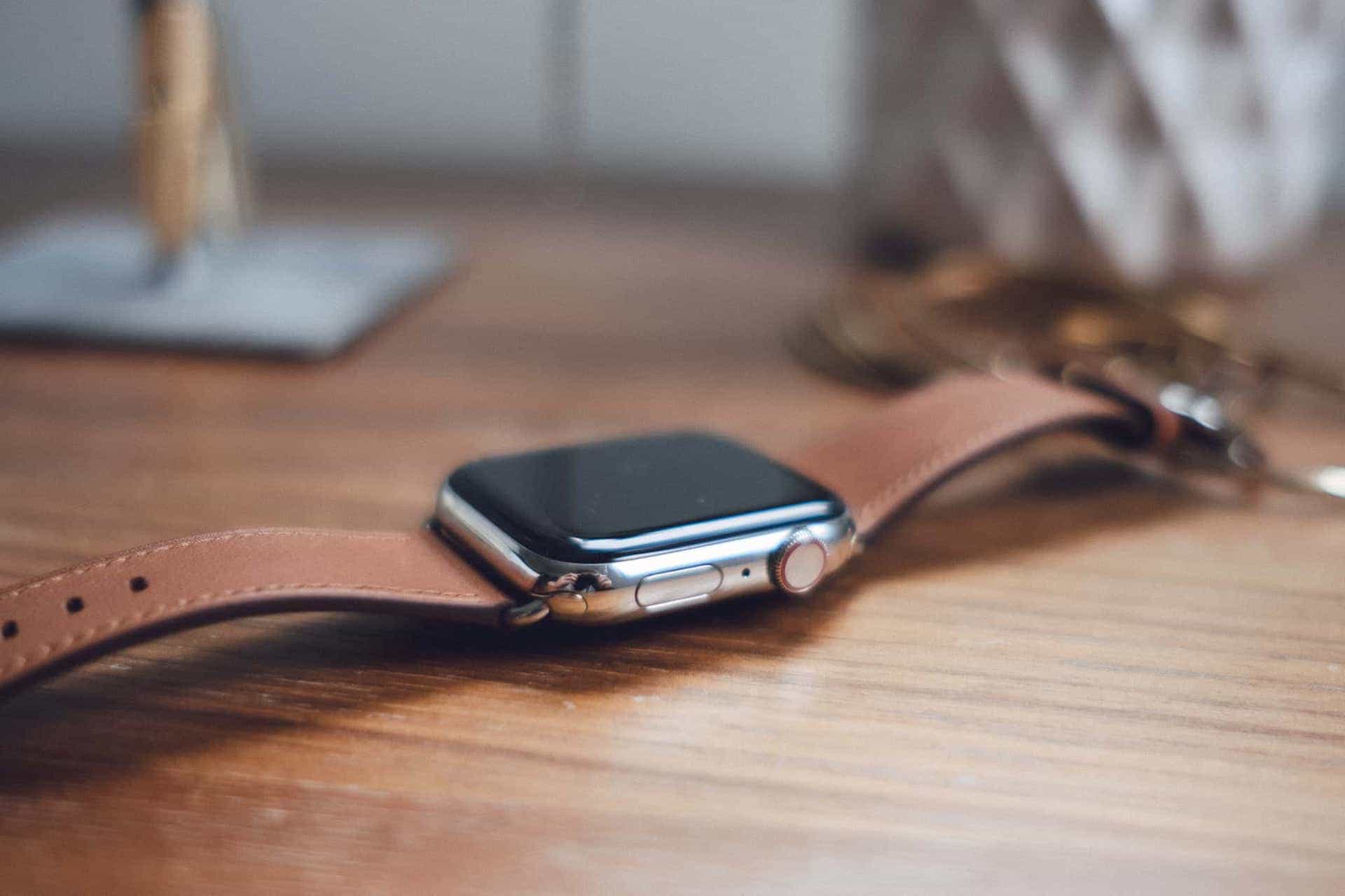
The dock button has been recessed to lay evenly with the rest of the Series 4’s body. Initially, this didn’t seem to be a big deal. In hindsight though, the protruding dock button in Series 3 watches and prior looked like a button. I don’t think watches should have buttons, at least not computer-styled buttons.1 That Series 3 dock button was unrefined and non-watch-like. The Series 4 tidies up this oversight quite nicely.
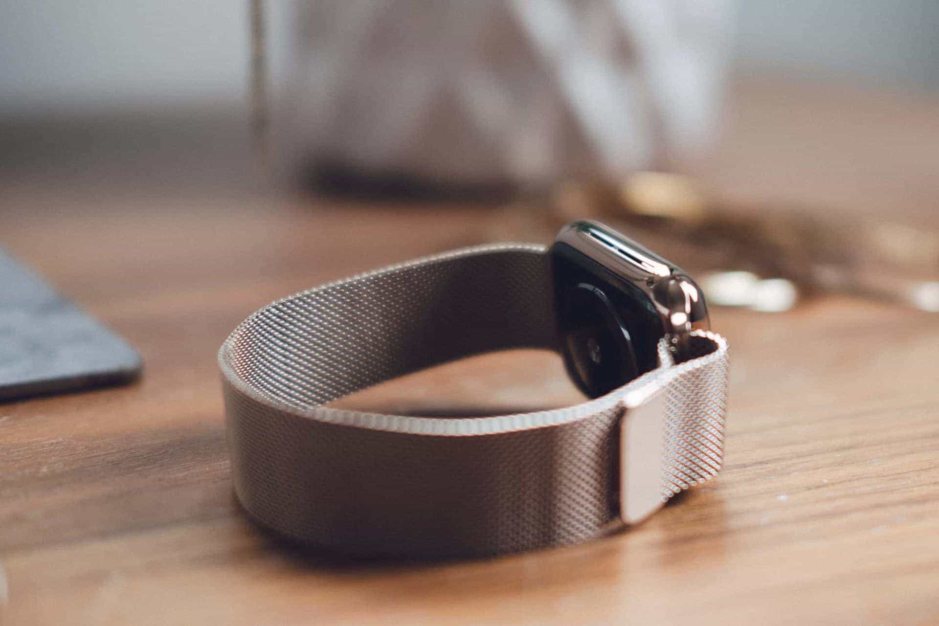
Same goes for the Series 4’s body shape. The watch’s corners are more rounded, providing a more amicable, more approachable feel. Apple found a way to move back to a thinner body despite increasing both screen sizes to 40mm and 44mm, helping the watch lay flatter on your wrist. Where before we had a chunky computer to wear, the Series 4 is more approachable and more comfortable, both to wear and to look at.
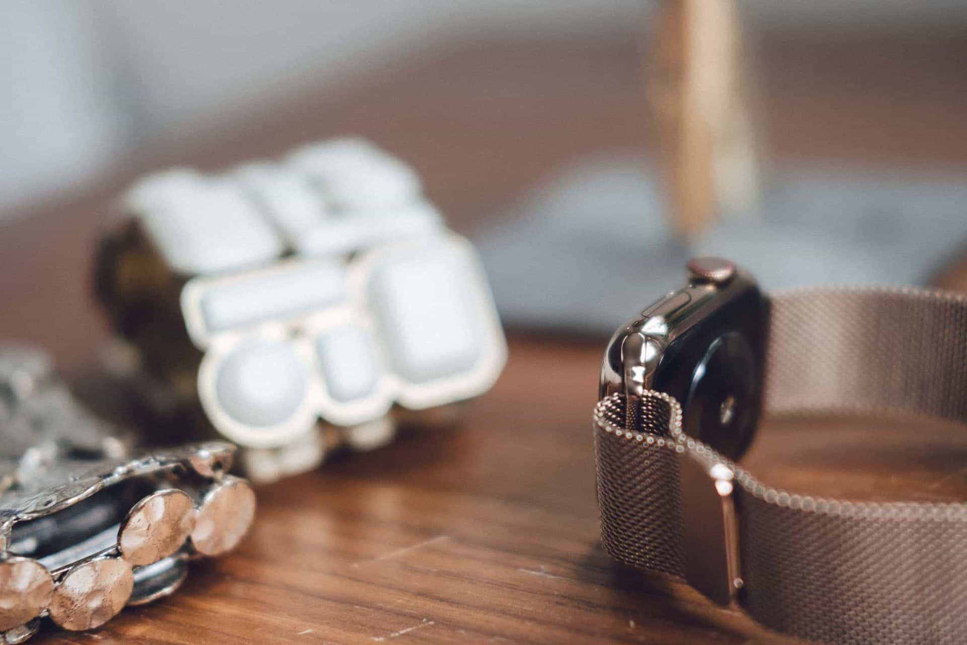
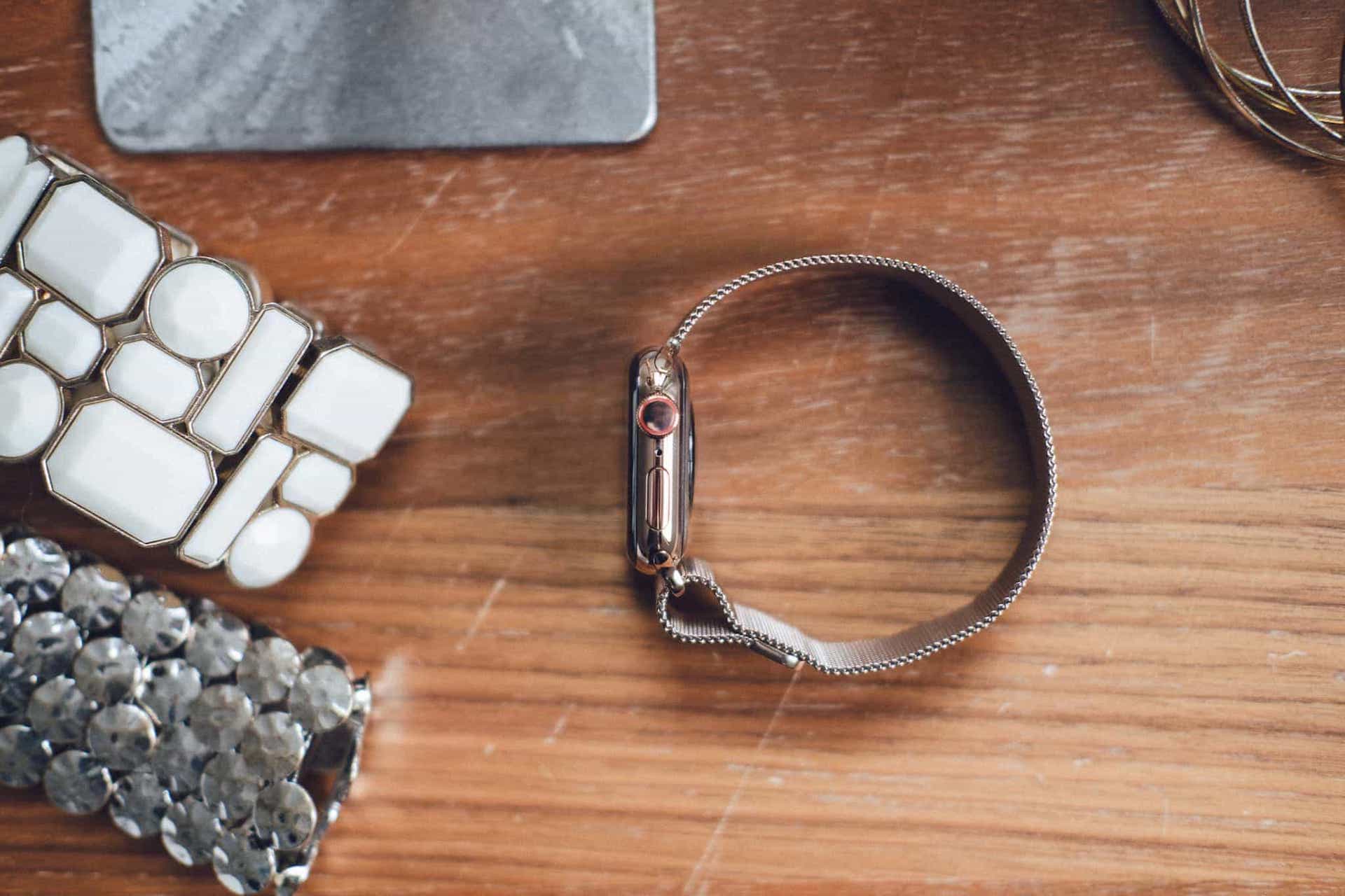
All prior Apple Watch bands can be used with Series 4, however very close inspection reveals an imperfect fit. The Series 4 sport band that shipped with my watch has perfect tolerances — you can rub your finger along the edge of the watch and not feel where the sport band meets the watch’s body (save for change in materials). Same goes for my wife’s Series 4 milanese loop — the band lugs fit seamlessly with the new Apple Watch Series 4 body and contour perfectly to the rounded shape of the Apple Watch.
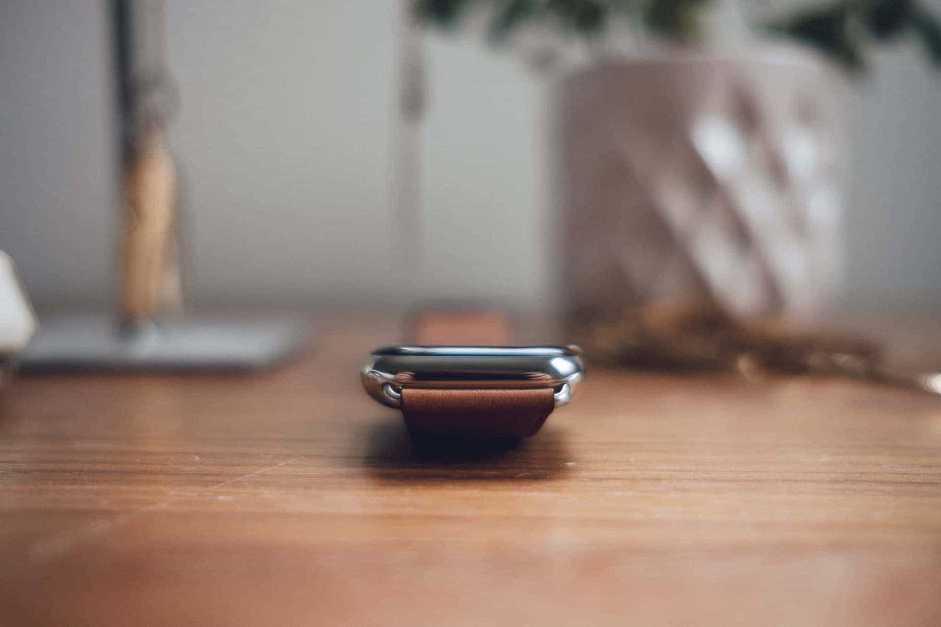
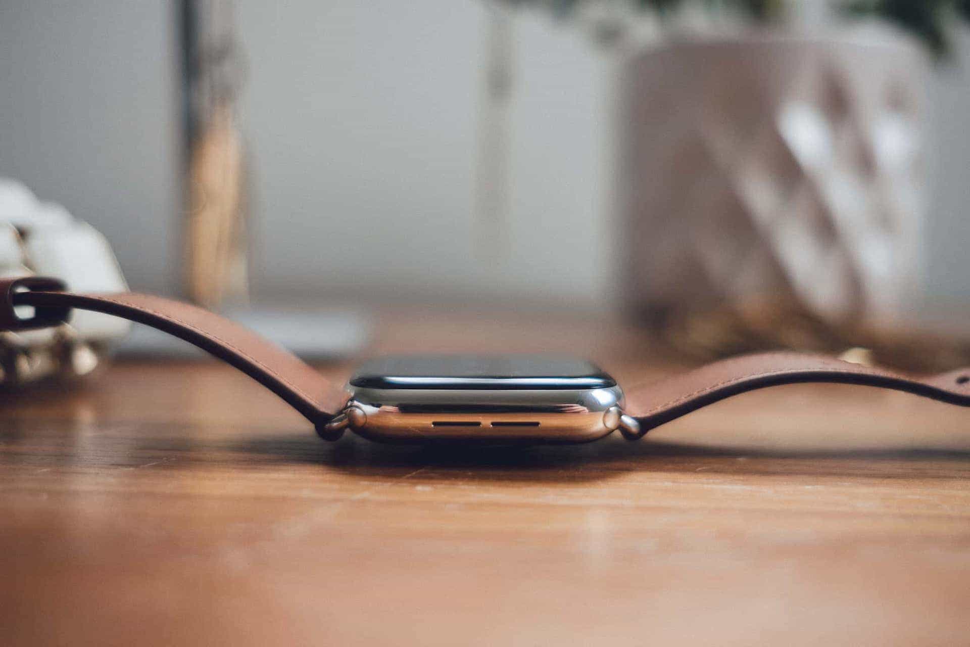
I purchased a Saddle Brown Classic Buckle band on eBay as soon as I learned Apple had discontinued the band. However, when attached to the Series 4, the band lugs don’t line up perfectly. Will you notice it in everyday use? Probably not. (I subconsciously noticed this after two or three days, but it took a friend to explicitly show a photo of the imperfection to consciously notice. Plus, I couldn’t even photograph the issue properly. Which goes to show how minute the imperfections are.) Apple correctly states prior watch bands will work with Series 4, but they aren’t perfect. I imagine the latest watch bands also won’t be perfect with old Apple Watches.
There are a few other small changes as well:
- The microphone has been moved from the watch’s left side to the right side, while the speaker grills on the left have been enlarged. There’s no symmetry here or anything, but I think this design looks cleaner.
- The underside of the Series 4 has been redesigned. It now looks sleeker and sexier, with a more blacked-out design. It’s also made from consistent materials, no matter the type of watch you purchase. All Series 4 watches now come with a ceramic casing on the underside. Older Apple Watches kept the higher quality sapphire crystal underside for more expensive lines.
- The four evident sensors on the underside of prior Apple Watches have now been replaced with a single optical heart sensor in the middle.

All of these changes amount to an Apple Watch that looks better, feels better, and is more easily wearable in a variety of styles. Throw on a leather classic buckle band and you can wear the Apple Watch to the office, with a suit or sport coat, or for a casual night out with friends. Throw on a sport band for moseying around the house on the weekend or for working out. While you could do this before, there was still an element of nerdiness to it. Between the Apple Watch’s growing popularity and classy new design, it feels far less nerdy to wear whenever, wherever.
Stainless Steel Gold
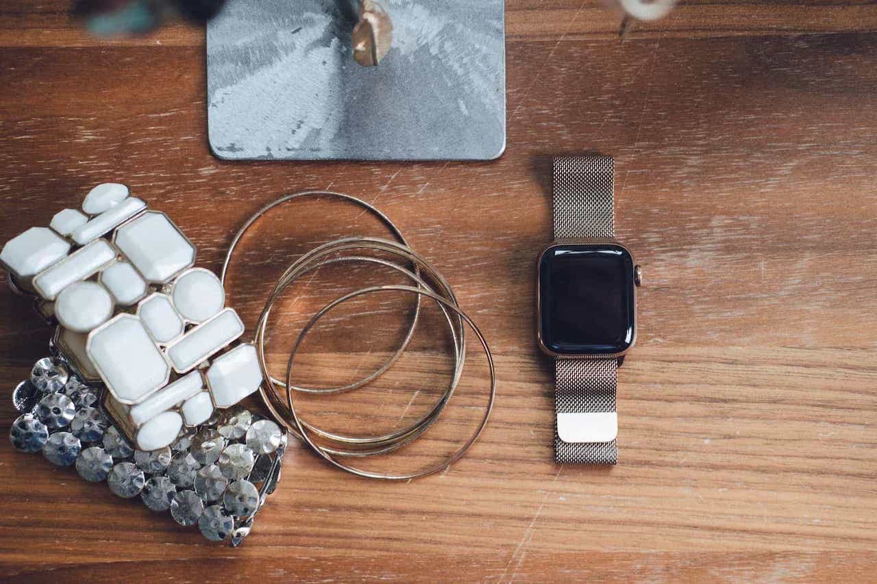
There’s nothing that drives home this jewelry idea more than the new gold stainless steel model. Apple probably uses the new model in all its promotional materials because it’s new. But it shouldn’t be a surprise that the gold stainless steel model is also the most beautiful Apple Watch ever created.
This is the first “gold” Apple Watch that has been accessible to the public. The first gold iteration was of actual gold in the first Apple Watch, and cost a cool $15,000+. For gold lovers who didn’t have that kind of money to burn, this is the first chance at a gold Apple Watch.
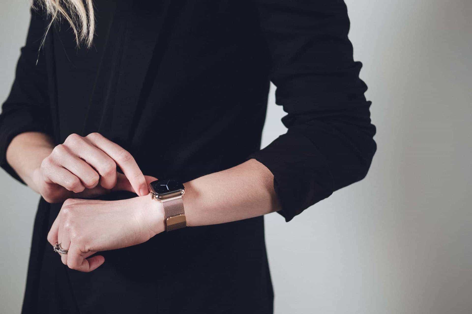
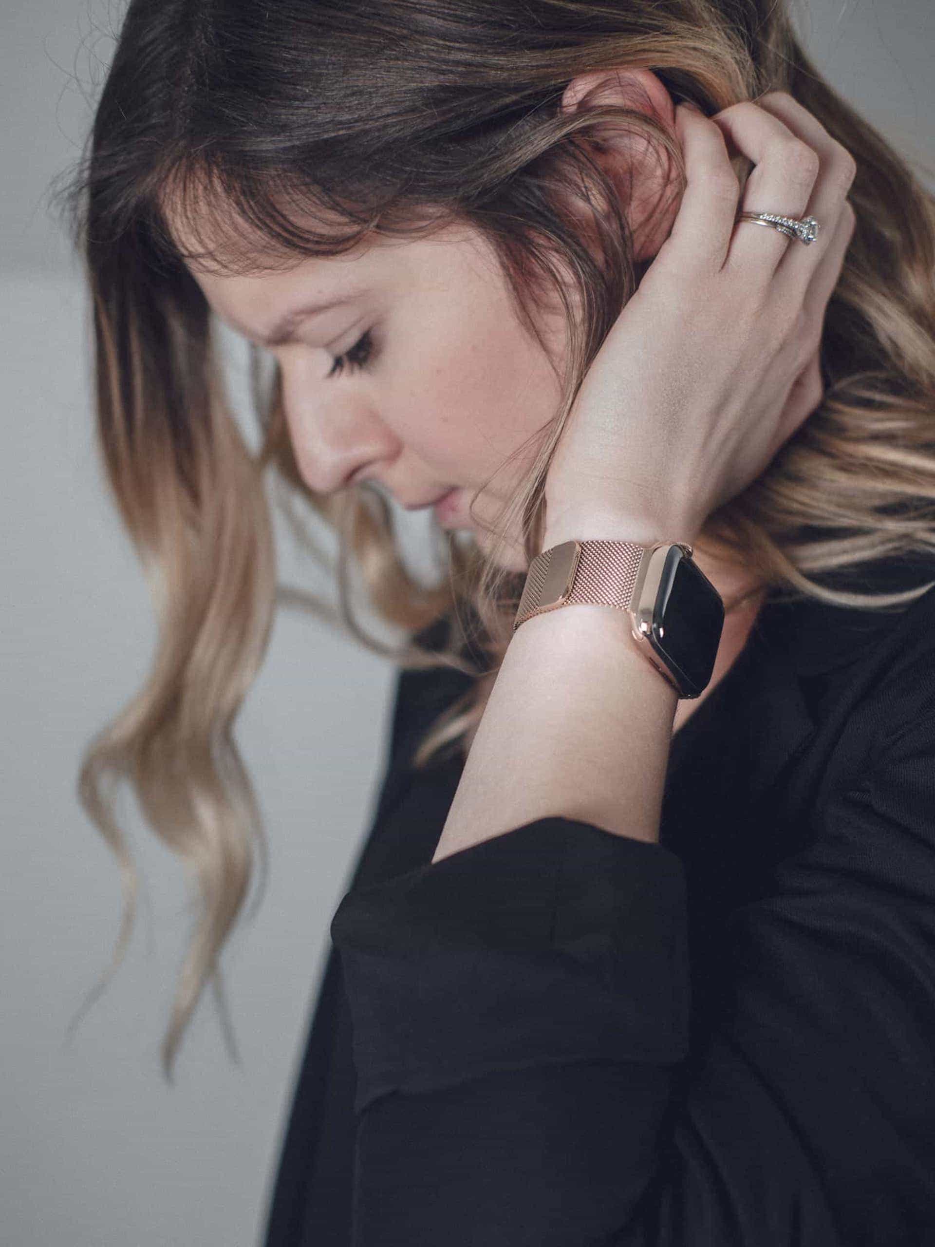
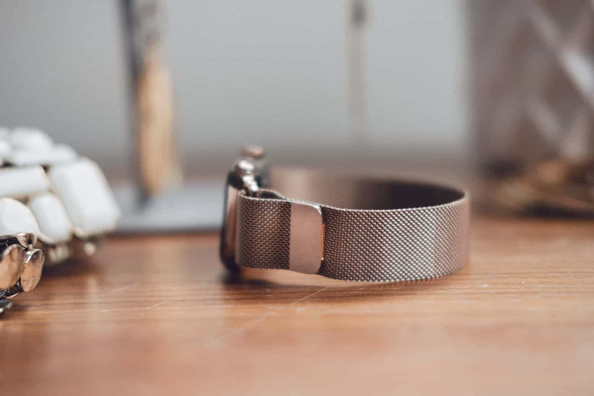
The Series 4 gold is more understated than I anticipated, but it’s even more elegant than expected as well. Paired with a gold milanese loop band, the stainless gold Series 4 can be worn in a range of styles, from casual to business casual and even, in some circumstances, in a formal setting. My wife has worn hers with a blazer and dress pants to church and it has fit in perfectly.
The gold stainless watch does give off a bit of a pink or rose gold coloring, but only in certain lights. The red LTE ring on the Digital Crown is somewhat hidden thanks to the rose gold coloring, and the LTE ring’s understatedness really drives home the gold stainless watch’s elegance.
If you opt for the gold stainless Series 4 watch, you’ll likely need to pickup a sport band for any workouts. Apple’s marketing images showcase the gold stainless watch with a “Stone” sport band and this combination is even prettier in real life. I don’t think my wife would wear the sport band to a business or more formal setting, but it’s far (far) less geeky than the white sport band the regular stainless watch ships with.
Infograph, Complications, and Launching Apps
It’s almost like Apple dialed up the new Infograph watch face to 11. You can fit up to 8 different complications on the new Infograph watch face and some of the dial color combinations can make the watch look very busy.
I’m a brand new Apple Watch owner, so I’ve had a learning curve to overcome in the first few weeks. If I’m counting correctly, there are four different ways to launch an app on the Apple Watch:
- Ask Siri to open an app.
- Click the dock button and open an app from the dock.
- Click the Digital Crown and select an app from a list or from a crazed beehive of apps.
- Tap a complication to open an app.
I admit to being utterly confused on which way is best to open an app. However, I think I see a dividing line between complications and the dock.
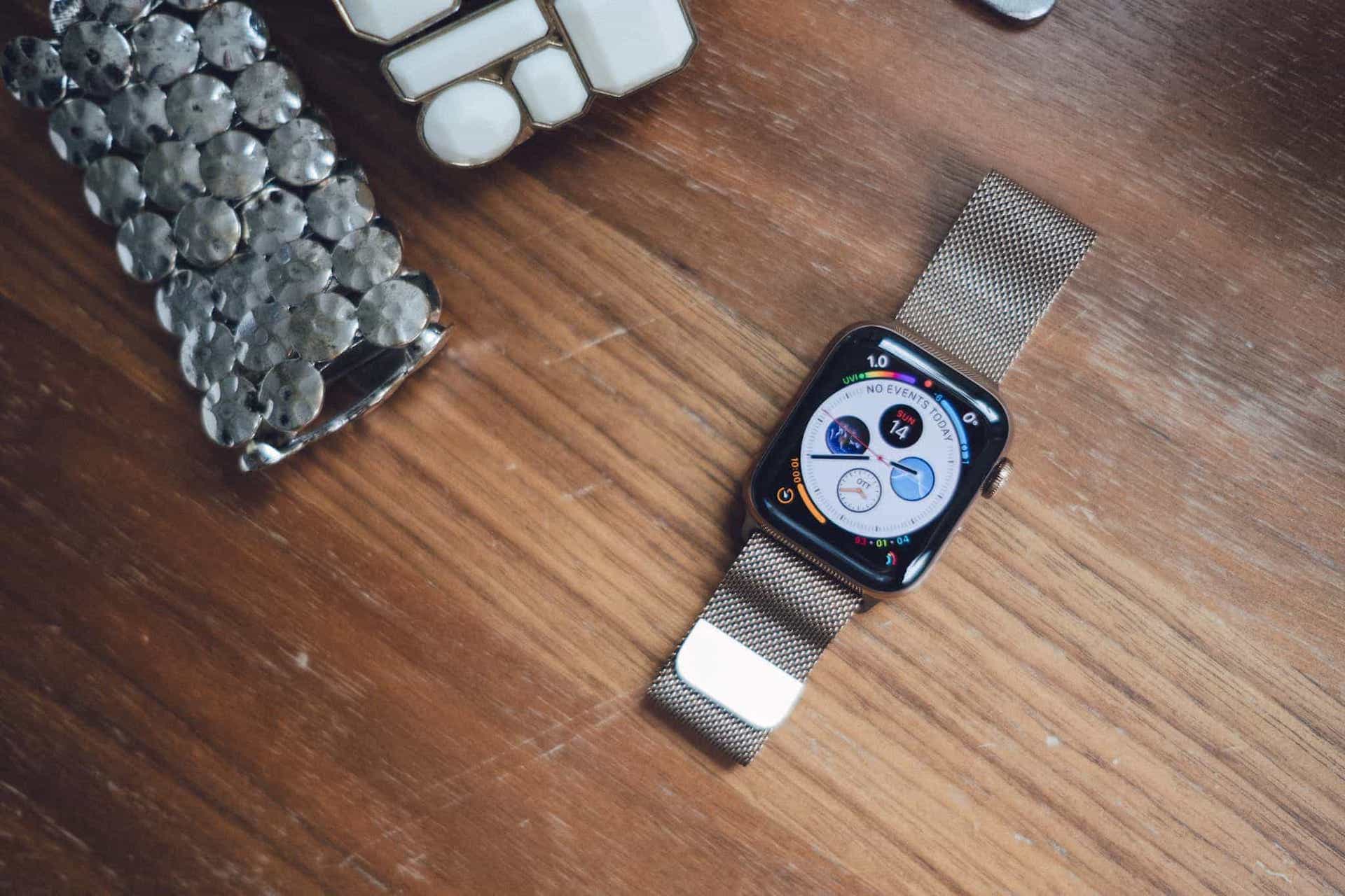
To me, complications are best suited for glanceable information — bits of UI that update automatically and provide information with no interaction. These work great on the outside of the Infograph dial, and look specifically good when the complication wraps around the dial. Complications like Weather, UI, Battery etc. add a touch of elegance, color, and utility to the Infograph face.
I simply don’t understand why you would put an app complication like Overcast or Walkie-Talkie on the outside of the Infograph dial. These seem better suited either for inside the dial or, even better, in the dock. Any complication that doesn’t wrap around the dial shouldn’t be placed on the outside of the dial.
As a whole, complications that wrap around the dial on the outside of the Infograph face work really well and look even better. I think the rounded complications drive home the rounded corners, making the whole device feel more personal and approachable. But that’s subjective.
Inside the Infograph face is a whole different story.

For one, the default white dial color provides poor contrast for reading the time. Having information wrap around the top of the dial (say, your next event in a calendar complication) eliminates numerals and ticks for telling the time, increasing the busyness of the face. And at specific times, the hands of the watch face get in the way of deciphering information from the four complications inside the dial (this is particularly bad if you have a digital readout of the time in the top sub-dial complication).
From the default perspective, Infograph is a giant mess. But in my mind, Infograph can be vastly improved if you better understand the best way to launch apps. Complications should be reserved for glanceable UIs only. Rounded complications should go on the outside of the dial. Apps that don’t have glanceable complications or helpful glanceable information should be launched from the dock, the Digital Crown home screen, or Siri. And anything leftover should be eliminated from the Infograph screen.
Infograph is easily the best new watch face to ship with the Series 4. Its only downfall is that it provides too much of a good thing. If you dial back what it shows, Infograph is a perfect watch face that even improves the physical appearance of the Apple Watch. In many ways, it’s almost like software. When honed correctly, it becomes tangible and amplifies the persona of the Series 4 Apple Watch.
Walkie-Talkie
I wrote off Walkie-Talkie as a gimmick initially, but it’s one of the most used communication methods on my watch so far. Once it was described to me as an “asynchronous phone call,” the entire feature clicked. Now, my wife and I send messages back and forth at the beginning or end of the work day, or when one of us is out getting groceries and needs some help on what to grab.
We’ve certainly run into connection issues when trying to use Walkie-Talkie, though. If you try to contact someone who isn’t available, the watch just spins and spins before telling you the other person is unavailable. I’d like to see the other person receive a quick notification telling them someone would like to speak with them. They can either accept or reject at that time, just like a phone call.
Cellular Connectivity
Apple Watch Series 3 debuted LTE connectivity, allowing you to leave your iPhone behind and take phone calls, send messages, and stream music directly to the Apple Watch. Series 4 improves upon the Apple Watch’s LTE connectivity and all the communication methods (like Walkie-Talkie) that go along with it.
In fact, this cellular connectivity is so good that I’ve looked at the iPhone differently over the last few weeks. In many ways, it’s the iPhone that’s the most superfluous device I have with me each day. With an LTE Apple Watch, it’s not all that hard to arrive at the office in the morning, open the MacBook or pull out the iPad, and work for an entire day without the need for an iPhone. Throw in a set of AirPods and all phone calls can be answered, all messages can be sent, and all work can get done, all with just an Apple Watch.
I’ll be interested to see how a connected Apple Watch changes my habits over the long term.
A Word on Health Features That Are Hard to Test
Two major feature releases from Apple headlined the Series 4 launch, both of which are either very difficult or impossible to test.
Fall Detection is a great feature that appears to be designed specifically for the elderly. Apple Watch can detect if you’ve fallen. If you aren’t responsive after the fall, Apple Watch will call emergency services. For those with parents or grandparents with potential health concerns, this can be potentially lifesaving.
Oddly, Fall Detection is turned off by default. I’ve turned mine on now that we’re headed into the icy and slippery season.
The other headline feature I simply cannot test is the Series 4 electrocardiogram app. In short, the Series 4 Apple Watch can generate an ECG/EKG and save the report to be provided to your doctor. This feature hasn’t yet launched and will only be available in the United States at launch. Of course, this will provide a tremendous amount of data for physicians and their patients and is sure to save numerous lives in the future. I wouldn’t be surprised, though, if it also caused a spike in the number of ER visits due to misplaced concerns generated by the ECG/EKG app.
Series 4 introduces more heart health features as well, such as irregular heart rhythm notifications and notifications for unusually high or low heart rates. Thankfully, my wife and I haven’t had any notification or any chance to test these features,but it’s great to be assured there’s always a device keeping track of your vitals.
Miscellaneous Anecdotes
Here are a few anecdotes from the last few weeks, most of which are likely specific to my experience:
- Automatic workout detection in watchOS 5 is a great feature, but I haven’t been all that impressed with its accuracy. I’ve gone on walks in the middle of the day and purposely not set a workout, only to finish the walk and not having received a notification to start the workout.
- In a few instances where I started an outdoor hike workout, a 10-second stop to shoot a photo resulted in a notification to pause the workout. This suggests incredibly accurate performance, but it was annoying to receive notifications every time I stopped to take a photo during the hike.
- Siri on the Apple Watch has worked about 50% of the time for me. I’ll hold in the Digital Crown and ask Siri to send a message to someone, only to be met with a “Hold on…” and “I’ll tap you when I’m ready.” notification. Each time this happens, I’ve waited multiple minutes for Siri to tap me. It’s often better to just start over and dictate the entire command once more.
- Battery life has been stellar. I’ve only had one day where the Apple Watch has had less than 50% of its battery when I’ve gone to bed, and it was a day where I went on a multi-hour outdoor hike without my iPhone. I know Apple can’t say “multi-day battery life,” but I wonder if extra promotion of the Apple Watch’s incredible battery would incentivize more sleep tracking software to be developed.
- Haptic feedback from the Digital Crown is a surreal experience. If you were brand new to the Apple Watch, it’d be hard to know that the Digital Crown itself isn’t clicking as you spin it.
- Touch targets on the larger 44mm Apple Watch make it the de facto purchase option, in my opinion. Even something as simple as entering a passcode on the smaller 40mm Apple Watch is noticeably more difficult. That the 40mm Series 4 actually has a larger screen than the prior 42mm Series 3 is reminiscent of the move from the small iPhone 5 keyboard to the larger iPhone 6 and 6 Plus keyboard.
- I have small wrists in comparison to most other men I’ve met, and the 40mm Series 4 still looks awkwardly small on my wrist. My wife, who has smaller wrists than most women she’s met, looks comical with a 44mm Apple Watch on her wrist. There’s no gender line between the two sizes, but I bet the 44mm Apple Watch won’t look out of place for the majority of people.
- I’ve found it easiest to create multiple watch faces of the same type and have different sets of complications for different contexts. During the work day, I use the new Infograph Modular face with the “Stocks” complication in the center. Once the trading day is over, I’ll swipe to the Infograph screen for the evening. And if I’m working out, I’ll jump to an Infograph Modular with workout-specific complications. This has seemed much easier than trying to make one watch face fit all my needs.
- Call quality on the Apple Watch is superb. I use the Apple Watch fairly regularly for taking phone calls and I’ve been quick to ask the recipient on the other end if I sound like I’m in a tunnel or if there are any issues. Generally, the answer has been that I’m a little quieter than normal, but that there’s no issue at all. Things get a little fuzzier when both call recipients are using an Apple Watch, but the phone call is still 100% useable. I’m assuming this is thanks to the improved location of the microphone and the vastly improved onboard speaker.
A Hard Device to Pin Down
I almost always have the latest and greatest Apple device. It’s just part of the job. But the Apple Watch has eluded me right from the start.
The Apple Watch has been a difficult device to justify purchasing, at least from a productivity standpoint. It doesn’t speed up response times to emails or messages, nor does it get you through your to-do list any quicker. If anything, the pinging of every notification on the wrist is even more distracting than turning your iPhone face down for a few hours.
The Apple Watch is different for every person. One person will want a device that tracks their fitness, workouts, and activities while allowing them to stream their latest podcast. Others will want an always-connected heart health device in case of emergency. Still, others will want an Apple Watch simply for timers, alarms, notifications, and for checking the weather.
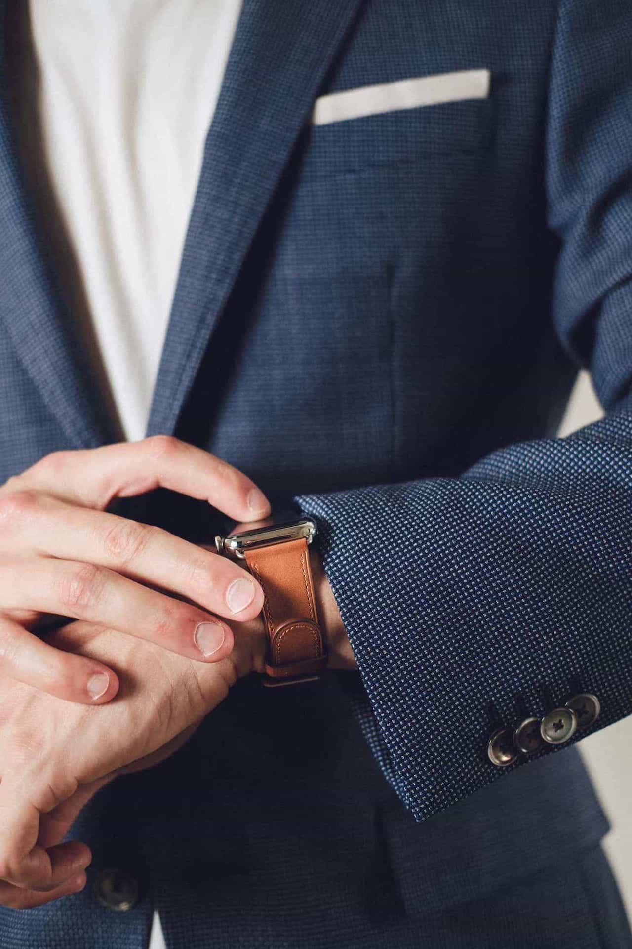
I didn’t realize it until the initial 9to5Mac Series 4 leaks, but the big factor on my personal checklist was style. It’s vain, but style may be the single most important factor in what I want from the Apple Watch. No matter how much functionality the Apple Watch houses, if it doesn’t look good in a variety of settings, I’m not going to wear it.
With every generation, it seems Apple swallows up another group of Apple Watch holdouts. If the Apple Watch’s heart health features weren’t evident before, the new focus on irregular, high, and low heart rates, plus ECG/EKG functionality will make the Apple Watch somewhat of an essential device for the elderly. Improved waterproofing and ever-evolving fitness features will continue to scoop up a larger array of fitness users. And, for folks like me, the improved design is sure to catch the eye of potential customers who view the Apple Watch as a fashion piece first.
I’m willing to bet folks who want to track their sleep are next on Apple’s wishlist.
Apple Watch Series 4 is the first Apple Watch that actually catches my eye. It’s the first Apple Watch I’m willing to wear, regardless of setting. And it’s the first Apple Watch I’m going to give the moniker of “timepiece.”
All this extra stuff is just icing on the cake.
-
Chronograph-style traditional watches with buttons are of the type of product I’ll never purchase in my life. Watches with buttons are almost a non-starter, at least for me. ↩
