Apple News from a Canadian Perspective
While those in the United States or the United Kingdom have had access to Apple News for a few years already, Apple News (and News+) only made its debut in Canada last week.
Canadians have had the chance to view News screenshots from our American friends, and those extra-eager users were able to access Apple News if they changed their region to the United States and changed the language to “English – American.” Unfortunately, this didn’t yield a particularly useful Apple News app — most publications (especially American publications) were blocked and the amount of readable content was kept to a minimum.
For a news junkie like me, the debut of Apple News in Canada has been a long time coming.
There were many rumors — and code leaks — showing that Apple News would be coming to Canada with the iOS 12.2 update, so this was a given before the March 25 Apple keynote. But I had a running bet with a friend that Apple’s premium news subscription service wouldn’t launch in Canada for over a year after the March 25 keynote.
Every now and then, I love being wrong.
Not only is Apple News now available in Canada, the premium News+ subscription is also available in Canada, complete with the Toronto Star, Wall Street Journal, and lengthy list of magazines.
From this Great White North chair, the introduction of Apple News has been a dream come true. There are still a few shortcomings which I’ll point out in a bit, but my news-reading workflow has been seriously shored up in the last week.
Design and Readability
Apple News seems to be the hallmark of the latest iOS design principles. Big, bold section and header titles, clean and white reading views, and large and rich imagery and videos dominate the app. The reading view, in particular, has penchant for showcasing custom fonts and call-out sections and quotes.
But it’s not all design rainbows and lollipops — there are some serious design caveats in Apple News, especially regarding readability.
First is font size. Apple News’ default font size is minuscule and has required a size boost 100% of the time.
This wouldn’t be an issue worth mentioning if it wasn’t for the fact that you have to change font sizes on a per publication basis. So if you want to boost the size on the Wall Street Journal article you’re reading, be prepared to boost the size of the font on the Globe & Mail article next, and the Toronto Star article after that, and the Sports Illustrated article after that. Perhaps the reason for this UX decision is because publishers control most of the design of their publication and some may choose larger fonts than others. No matter the rationality, this is an odd annoyance.
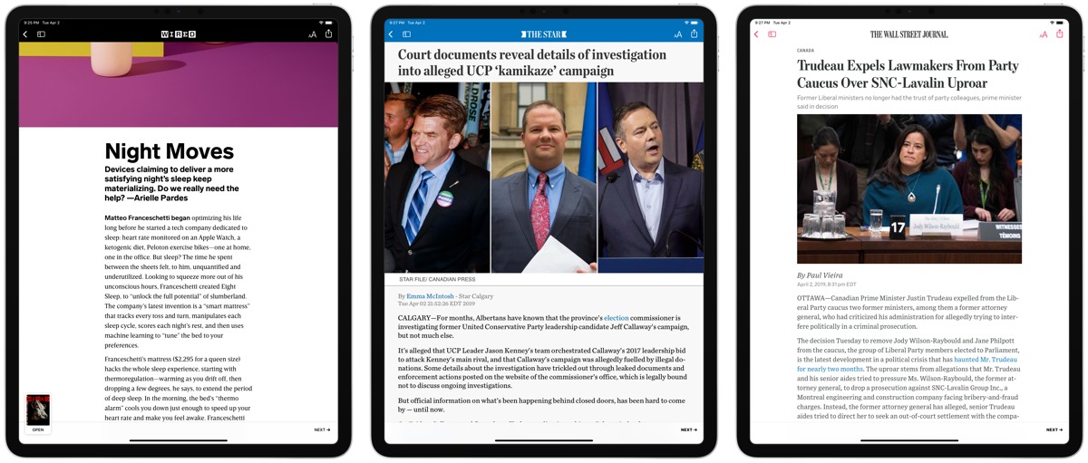
Second is body font width. Some publishers understand the ideal line length for comfortable reading, while others seem to utilize every bit of horizontal screen real estate possible. This is especially noticeable on the 12.9-inch iPad Pro — publications like the Toronto Star have line lengths spanning the entire width of the large iPad Pro, making for the least comfortable reading experiences.
Third is discovery. The left Apple News sidebar (with all your favorites and “subscriptions”) is a long list of publications arbitrarily sorted, following by a long list of what Siri thinks you’re going to like. In the early days, Siri’s suggestions might be a great way to break the ice in Apple News. But as you begin to nail down your favorite sources, I’d love to be able to eliminate this section entirely.
Also, what is the Apple News Spotlight tab and why can’t I get rid of it?
This discovery issue is exacerbated on individual publication splash pages. Just take a look at this New York Times screen:
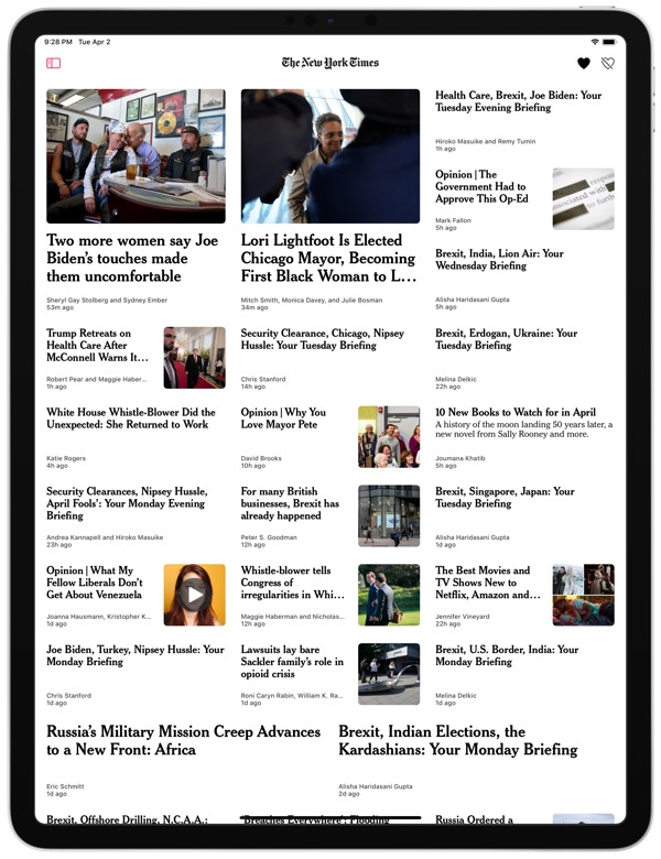
This is a giant waste of space, primed for visual media, and oddly difficult to read due to small font sizes. I assume these design decisions are mostly publisher based (although, the table of contents of each Apple News+ magazine is seemingly designed in the same format, so perhaps the enfranchisement of the publisher is more limited than I think), so it’s hard to point the finger directly at Apple.
Now, while some publishers have opted for sub-optimal reading experiences, others have embraced the beauty fo the iPad’s display and produced publications that look better on an iPad than on their physical, printed counterparts.
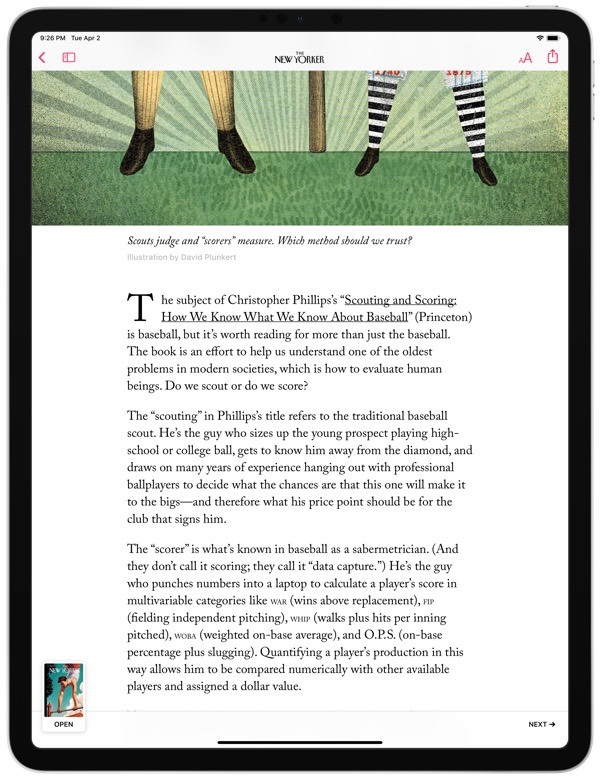
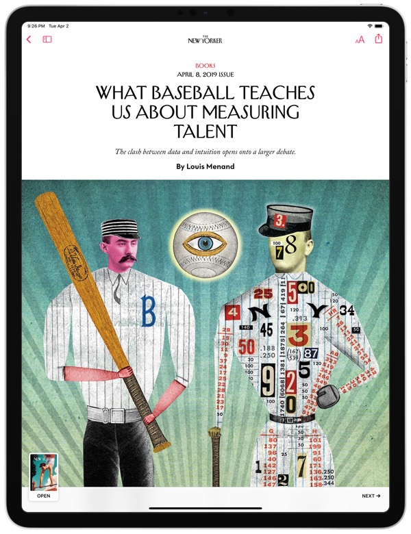
The New Yorker is particularly striking — title fonts and sizes are comfortable and beautiful to read, while images span the proper sizes and articles flow from paragraph to paragraph with ease. So far, in my experience, the reading experience is substantially different between newspapers and magazines, with magazines being far more enjoyable to read and view.
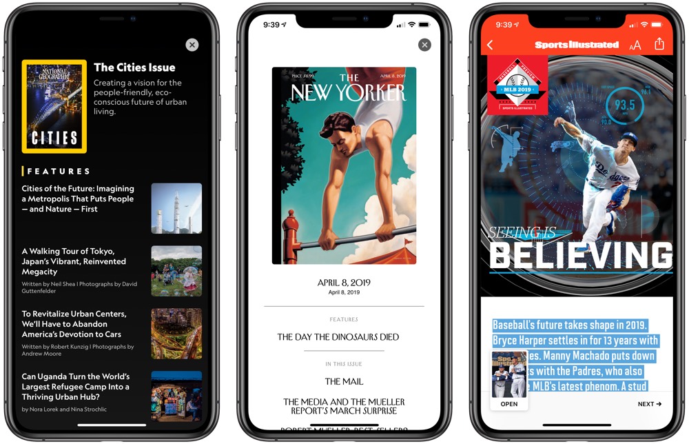
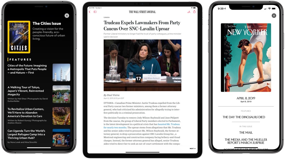
Of course, the digital reality of Apple News+ gives magazines an entirely new medium to explore: video. National Geographic and Wired have given their front covers a digital makeover, providing that Harry Potter feeling to still images.
For every area where Apple News design falls short — namely, in decisions made by the publisher to determine their own reading experience — there’s another area of immense potential. For now, I think it’s worth dealing with the odd reading choices to explore these new magazine formats.
Speed
One of Twitter’s greatest features is its speed — a story can be broken on Twitter faster than anywhere else in the world. For breaking news and the growing conversation around breaking news, I don’t expect Twitter to be uprooted anytime soon.
But Twitter’s moment of glory is stunningly fleeting — once a story has been broken, Twitter provides an extraordinarily large soapbox for all know-it-alls and journalistic-wannabes to shout their opinions. If you’re searching for facts and the corresponding analysis, Twitter should be left behind.
The road to discovering good analysis of breaking news becomes foggy after Twitter has done its job. I’ve long struggled to find a happy medium platform for reading news with a broad range of views, provided semi-quickly after a story has broken, and succinct enough to consume on a weekday evening.
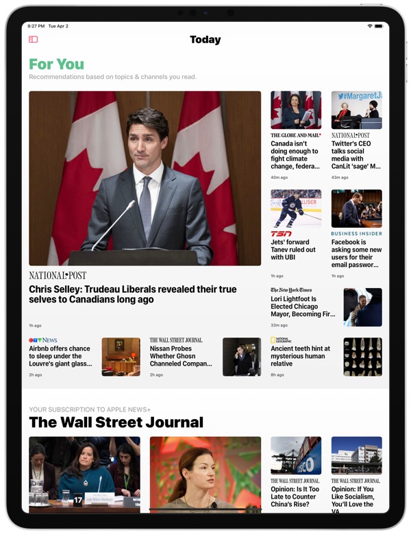
Apple News is the best app I’ve found to provide the middle ground between breaking news and long-form news consumption.
After the work day, my Apple News “For You” section is riddled with pieces regarding the day’s most important news events. Most of the stories are succinct and to the point, but also provide enough analysis to begin digesting the issue at hand. And the “For You” algorithm is particularly sound — I’ve found myself tapping on more stories than ever before.
When I think of “speed” in news, I think of “speed” in terms of delivery, not in terms of how fast I can read a story or how fast a magazine issue downloads. Where Twitter breaks news and where Instapaper or Pocket provide ample long-form content to really exercise your brain cells, Apple News fills that happy middle-ground at the end of the each day.
Bias
There’s so many politically charged opinions in the news world today, and managing your daily dosage of different points of view is one of the most important aspects to healthy news digestion. Plus, I admit to being extra sceptical about the algorithmic decisions being made by large tech companies these days.
I’ve tried Nuzzel, Flipboard, Google News, and more news aggregators in the past, and most of the news stories shared in my “For You” section has skewed majorly to left wing news sources. Again, healthy news digestion requires analysis from both sides of the spectrum.
There could be a few reasons why Apple News has been significantly better in this category than any other news aggregator I’ve found.
For one, Apple News is curated by individual people, rather than social media shares from people you follow or generic algorithms.
Second, the Canadian news landscape, while still dominated by left-wing and right-wing partisan providers, is substantially less charged than in the United States. (For instance, the large SNC Lavalin scandal in Canada is being covered by all news outlets with largely the same analysis — left wing and right wing alike.) Perhaps it’s easier to spread different viewpoints around in our less-politically-charged Canadian environment.
No matter the reason, I’m especially impressed with Apple News’s wide range of coverage and viewpoints. I can read a Globe & Mail article (very neutral, but generally left-leaning) followed by a CBC News article (almost always left-leaning) followed by a National Post article (almost always right-leaning) back-to-back-to-back without one viewpoint being censored or bolstered. This is an ideal scenario for healthy news consumption and helps keep your own knowledge formulation more balanced.
So far, Apple News has nailed the balanced bias of news and magazine coverage — a first in the tech world, as far as I’m concerned.
Saving Articles for Later
Saving articles for later inside Apple News is a ginormous mess.
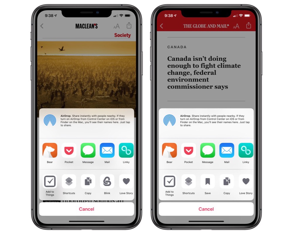
First, I figured “Saved” stories would have its own dedicated “bookmark” button located somewhere in the top title bar (just like the “Love” button). Turns out, the “save” button is located in the standard share sheet on the bottom row on the far right side. You’ll have to edit your share sheet to put the “Save” button in a more accessible spot.
Secondly, you can’t save magazine articles to read later inside Apple News. The best you can do for a magazine article is to save it to a read-it-later service like Pocket or Instapaper. When you’ve found time to read the article, you’ll be met with a giant “Open this article in Apple News” page in Pocket/Instapaper, and you’ll have to open the link inside Safari before being shot over to News for reading.
Round and round the mulberry bush you go.
Saving articles to read later is a giant mess inside Apple News and is a hallmark area that needs to be addressed in a future update. Were you to subscribe to any printed publication or magazine, you’d be able to throw a bookmark in place to come back for reading later, or you’d be able to tear the sheet right out of the publication to save in your own personal archives. There needs to be some sort of digital equivalent that comes to Apple News in the future — there just isn’t enough time in the day to read everything you want to read each evening.
Wrapping Up with My News Reading Workflow
As I touched on earlier, news consumption goes through three stages in my life:
- Breaking news.
- Timely coverage and timely analysis.
- In-depth analysis and topical deep-dives.
Twitter generally provides step number one — stories are broken almost to the second on Twitter.
Both of the major read-it-later players on iOS — Pocket and Instapaper — do a great job of filtering out breaking news/timely coverage and highlight in-depth research articles in their “For You” sections. To that end, Apple News+ also fills this need to a degree — magazine articles are always less timely in nature and provide superb entertainment outside of the breaking news arena.
Apple News has done a great job at filling in the gaps between breaking news and topical deep-dives. Stories are timely — not too new, so as to be devoid of information you can sink your teeth into, and not too old so as to be stagnant — and coverage is provided to a wide range of view points.
If I find enough time to get through the major stories in my “For You” section, Apple News+’s ultra-valuable subscription provides ample magazine articles that both entertain and round out stories with different viewpoints and analyses.
I’ve quickly learned what we Canadians (and the majority of the rest of the world, for that matter) have been missing over the last years — Apple News is one of the best additions to my news-reading workflows in a long, long time. Attention could be given to the reading layouts and designs of some publications, not to mention the horrid inability to properly share and save articles for later, but the current Apple News product feels like a major step in the right direction for those searching for wide-ranging, high-quality journalism.
I personally feel the Apple News+ subscription is the most valuable subscription I (will eventually) pay for. I have already discovered new magazines that have rounded out my knowledge on different topics, and I’ve found myself opting to read new content that was previously hidden behind paywalls on different sites.
From this fresh set of Apple News eyes, I’m extremely impressed with my first week of Apple News. Of all stock apps on iOS, I’m most excited to see where Apple takes this.
Stop losing your ideas and notes to multiple apps…

An online course to help you save time, organize your notes, and master the best writing app for Mac and iOS: Ulysses.